
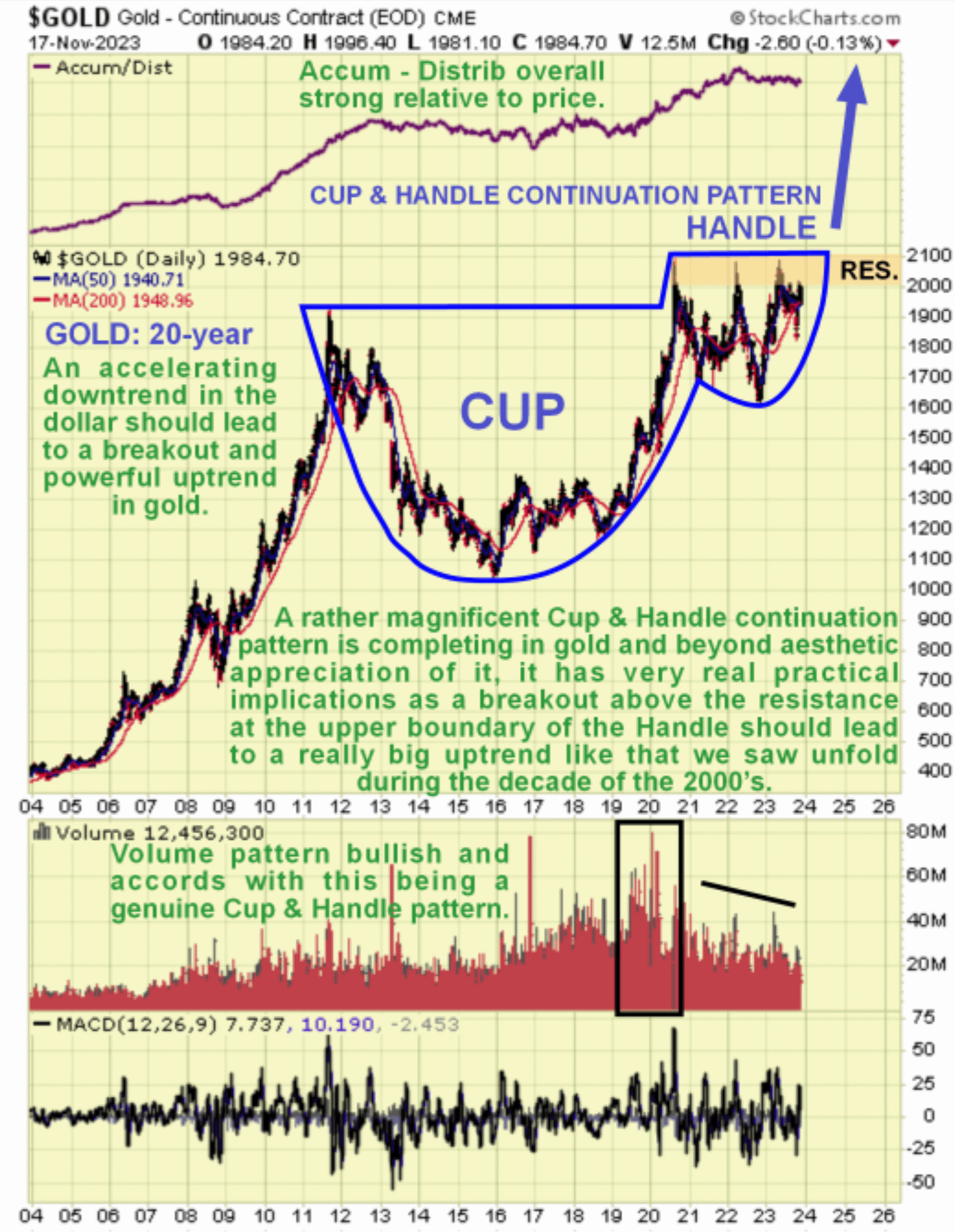
Gold is on the verge of a major breakout and frankly, it would be surprising if it wasn’t given that money creation is in the final vertical stages of a parabolic blowoff. Gold has taken so long to build up to this, having been in a giant trading range since mid-2020, that when it happens it will take most investors by surprise, which is of course what you expect when a major breakout occurs.
On its latest long-term 20-year chart it is crystal clear why gold is so well placed to break out upside into a major new bullmarket very soon, for on this chart we can see that a fine giant Cup & Handle continuation pattern is fast approaching completion and the dollar’s recent breakdown into what could turn out to be a brutal bearmarket caused directly by banana republic level money creation is what will likely trigger it.
The volume pattern is bullish and overall the Accumulation line is positive relative to price which increases the chances of a breakout to the upside. The Cup & Handle pattern looks complete and with a well-defined resistance level approaching $2100 having capped the price for over 3 years now, it is clear that a breakout above this level will be a very significant technical development that should mark the start of a major uptrend that may well exceed the great bullmarket of the 2000s.
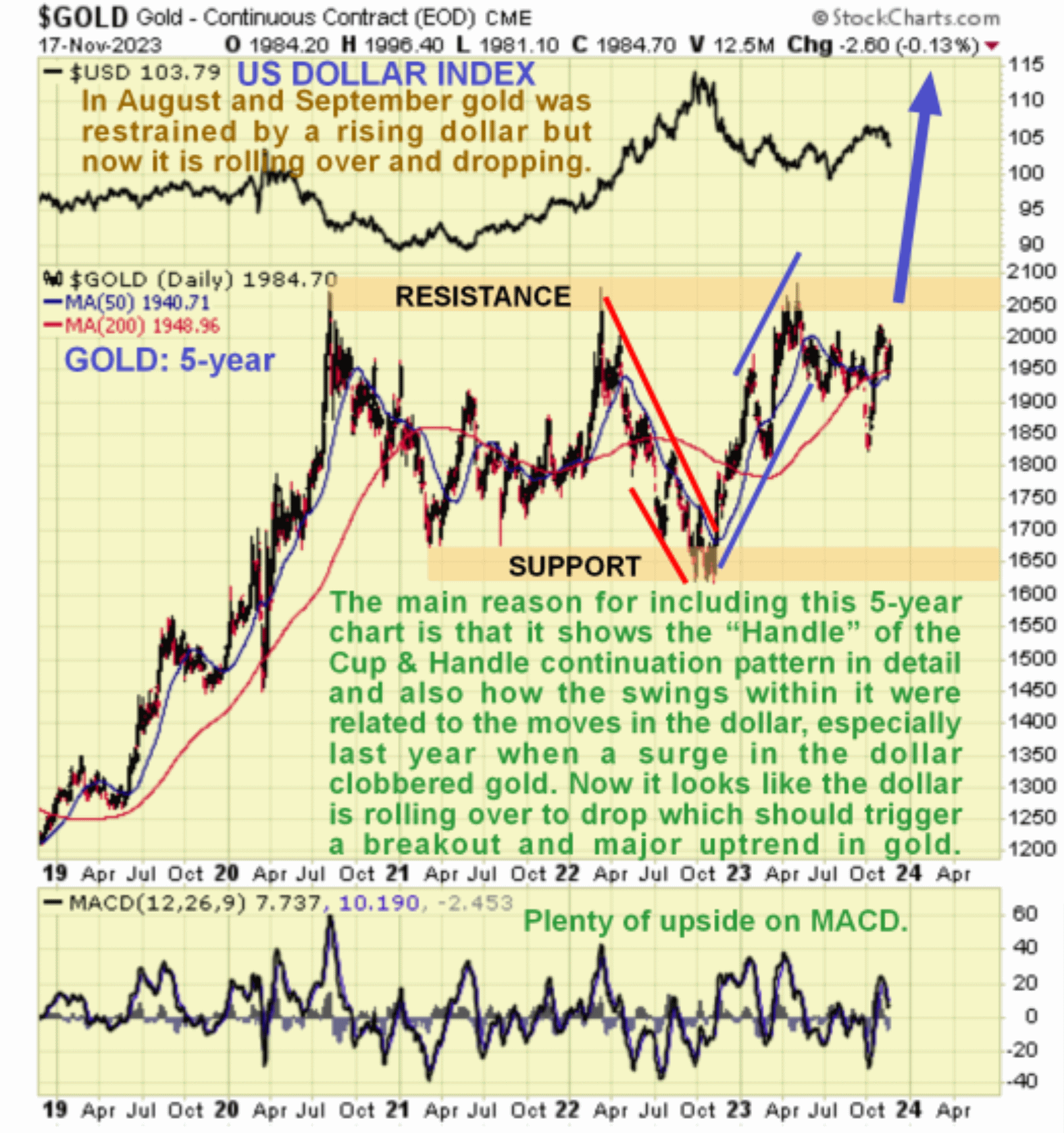
The 5-year chart shows the Handle of the Cup & Handle continuation pattern in much more detail and beyond that the main reason for looking at it is to see the correlation between the movements of the gold price within this trading range and the movements in the dollar, with the dollar index chart added at the top for direct comparison.
Last year in particular there was a strong correlation with a steep and substantial downtrend in gold being caused by a strong uptrend in the dollar. Right now it looks like the dollar is rolling over into a new downtrend as we can see much more clearly on its 6-month chart shown lower down the page and this being so gold looks poised to break out soon above the resistance at the top of the pattern.
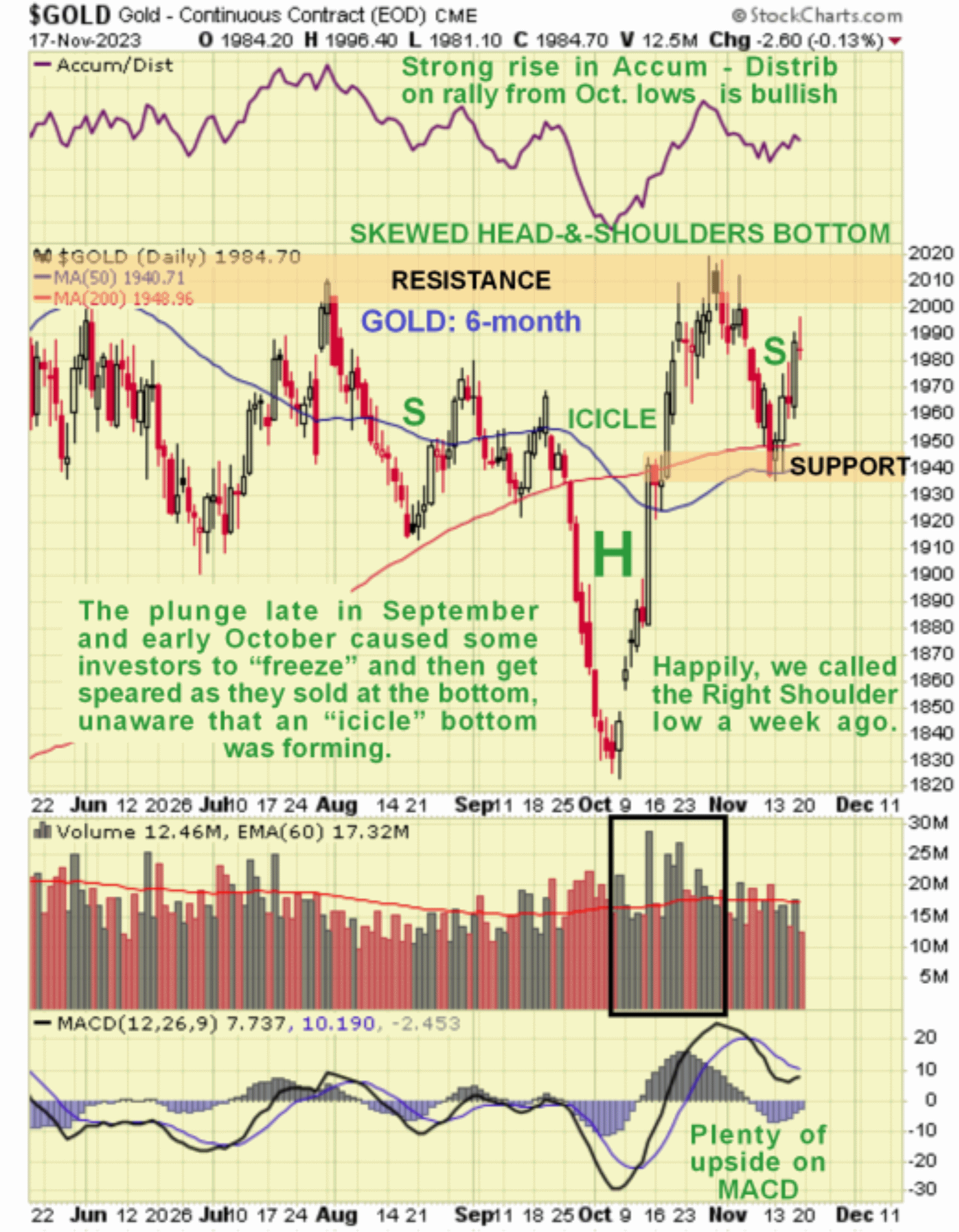
On the 6-month chart, we can see the unusual “icicle” pattern that formed towards the end of September and into the start of October, which involved a steep drop that was almost immediately followed by an equally steep rally. Aware that this pattern was probably the Head of the irregular Head-and-Shoulders bottom pattern shown (regular on the Barrick chart that we looked at yesterday), the low of the Right Shoulder and a top in the dollar was called to the day on the 10th of this month, although it is still to soon to be 100% sure that this call was correct although so far it looks like it was.
The strong volume on the rally to form the right side of the Head is bullish, especially as it caused a strong rise in the Accumulation line and the dip to form the Right Shoulder has allowed the earlier heavily overbought condition to unwind. All this being so, gold is now viewed as being very well placed to break out above the resistance which as we saw on the longer-term charts will be an event of great technical significance that should usher in a major bullmarket advance that could well be unpredented in magnitude if money creation, already at unheard of levels continues to accelerate.
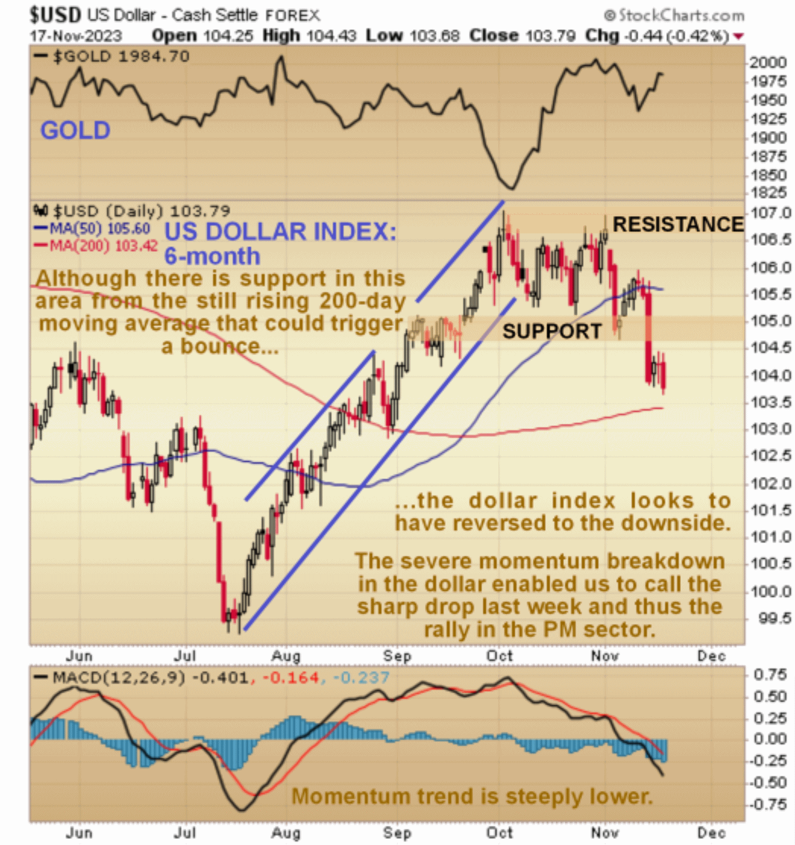
Now to take a look at the dollar. On the 6-month chart for the dollar index, we can see that last week it broke down from an intermediate top area into a downtrend, a development that we predicted based on the severe deterioration in its momentum (MACD).
Whilst we could see a minor bounce here due to its having arrived at its still rising 200-day moving average, this is viewed as a decidedly bearish picture, so any such bounce is unlikely to get far before it starts lower again, and it looks more likely that it will manage little more than a bear Flag before it heads lower.
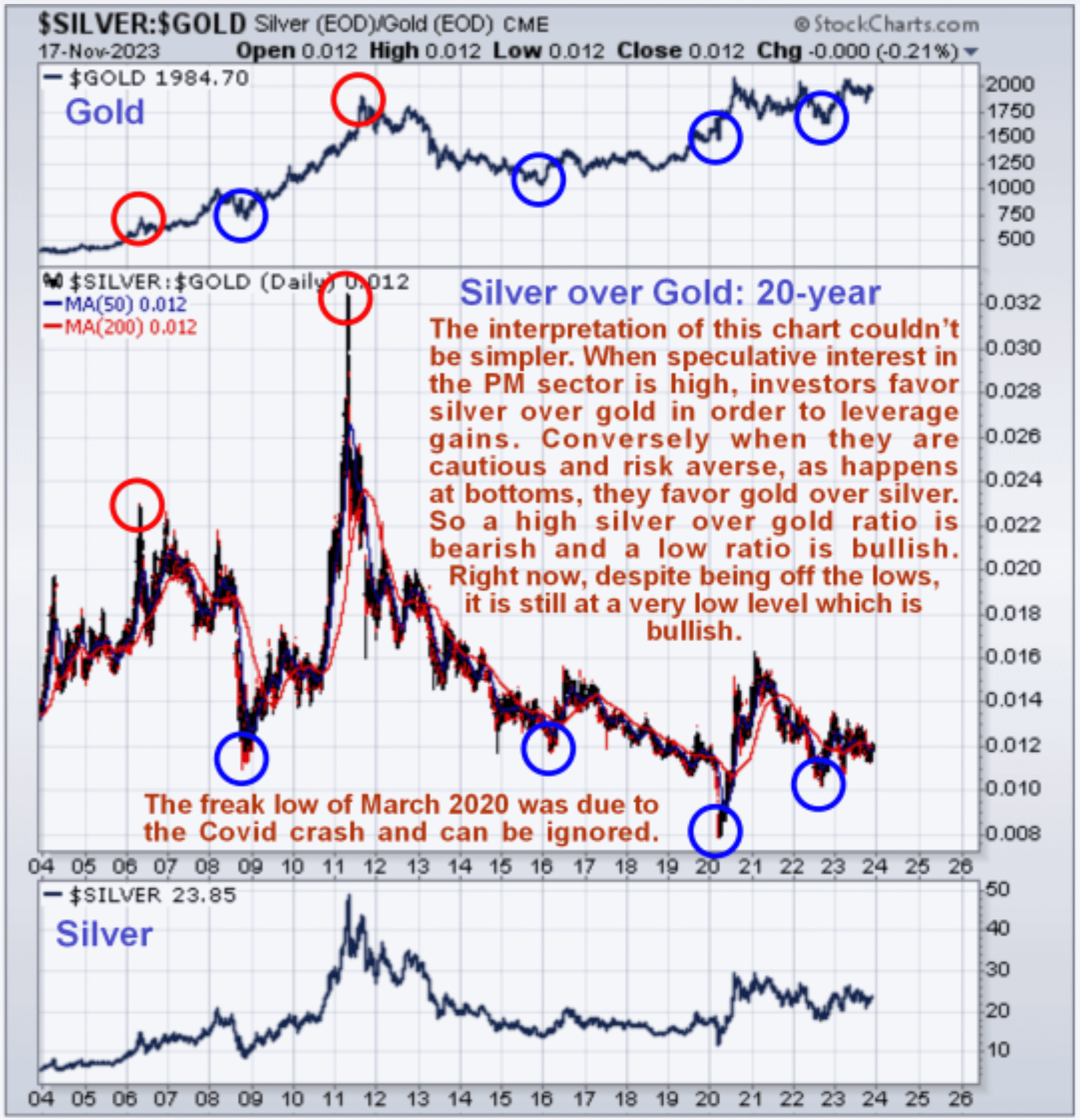
We will end by taking a quick look at the silver-to-gold ratio. The long-term 20-year chart for this ratio enables us to see major inflexion points in the past. The rationale behind the interpretation of this chart is simple – when investors are very bullish on the Precious Metals they tend to to favor silver over gold in order to leverage gains, since silver’s swings tend to be bigger than those of gold, so excessive bullish sentiment as shown by a high Reading for this ratio tends to be seen at tops, such as was the case in May of 2011, but when investors are excessively cautious towards the sector, they tend to favor gold over silver, as it is regarded (rightly) as a safer investment.
So times of excessive pessimism towards the sector are indicated by low readings of this ratio, such as we are seeing now, even though it is off the lows. The current low readings are thus a fertile environment for the birth of a major new sector bullmarket. Note that the freak Covid Crash lows of March 2020, when orchestrated paranoia was at a peak, can be disregarded.
The conclusion is that the outlook couldn’t be better for gold and the Precious Metals sector generally which is believed to be on the verge of breaking out into a major bullmarket that could well be of unprecedented magnitude.
About the author
