
“Men, it has been well said, think in herds; it will be seen that they go mad in herds, while they only recover their senses slowly, and one by one.”
—Charles Mackay, Scottish poet, journalist, author, anthologist, novelist, songwriter, author of Extraordinary Popular Delusions and the Madness of Crowds (1841); 1814–1889
“Don’t be the last bear or the last bull standing, let history guide you, be contrary to the crowd, and let the tap tell you when to act.”
—Jeffrey A. Hirsch, editor of the Stock Trader’s Almanac; b. 1966
“Wall Street’s graveyards are filled with men who were right too soon.”
—William Peter Hamilton, proponent of Dow Theory, 4th editor of the Wall Street Journal 1908–1929; 1867–1929
We read in an article in the Financial Times that global investors lost some $23 trillion in wealth in 2022 (https://www.ft.com/content/64b3d0b6-e0be-4e8c-9b20-c595428267d5). This included both housing, equity and bond assets. Apparently, it represents some 22% of global GDP. It also exceeds what was lost during the financial crisis of 2008, which was apparently only $18 trillion. It seems that what goes up also comes down even harder.
But, as we have so often pointed out, the huge rise in the stock market and ultimately the housing market (plus numerous other assets) was built on record-low interest rates and quite possibly the most massive growth in money and liquidity ever recorded. That was especially true after the pandemic of 2020. But when the Fed took away the punch bowl and started raising interest rates, moving from quantitative easing (QE) to quantitative tightening (QT), the party was over. There has never been a bubble that hasn’t eventually been pricked. Just ask the Roaring Twenties market, the Japanese bubble market of the 1980s, the dot.com bubble of the 1990s, the housing bubble of the early 2000s and, oh yes, tulip mania of 1634–1637. Charles Mackay had it right in his book, Extraordinary Popular Delusions and the Madness of Crowds (1841).
Our chart shows just how much everything has exploded upward since 2000. Most of the U.S. debt and money growth ever created has taken place in the past 20+ years. The Fed’s balance sheet has exploded upwards some 10 times since the 2008 financial crisis. Has all this money resulted in huge GDP growth? No. Compared to the others, GDP growth has been sluggish. All that money, all that debt, to produce so little in GDP growth. The Fed funds rate is actually slightly less than it was going into 2000. Fed funds has spent most of the past 20+ years at or near zero. Cheap money begets borrowings and massive asset inflation.
We started this century with the pricking of the dot.com/high-tech bubble. The pricking of the housing bubble of the early 2000s resulted in the 2008 financial crisis. What will the pricking of what some have called the everything bubble that played out between 2009 and 2022 bring us? So far, it doesn’t seem to be much
except, as the FT article noted, global investors lost some $23 trillion. That’s almost equal to the U.S. GDP and is almost one-quarter of global GDP.
Funds, Money, Fed, Debt, GDP 2000–2023
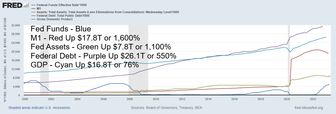
Source: www.stlouisfed.org
Since markets are up so far in 2023, some of those losses may be being recouped. So, is that it? The worst is over? Happy days are here again? After all, the economy still seems buoyant. The job market is still growing. Numerous economic numbers are coming in better than expected. Examples this past week alone are retail sales and both the Philly Fed and the Empire State Index (manufacturing indices). In Canada, inflation is still sticky, coming in above expectations and raising the spectre that the Bank of Canada (BofC) might have to raise rates again. But consumer sentiment is dragging down at levels associated more with the financial crisis of 2008 than a booming economy. A disconnect?
One thing that we have noted before was that inflation in the 1970s wasn’t just one and done. During the 1970s, the first round of inflation, triggered primarily by the Arab Oil Embargo, was followed by a decline as interest rates rose. But then inflation rose again culminating in the Iranian hostage crisis of the late 1970s. That resulted in Fed Chairman Volcker raising rates to 20% to kill that inflationary spurt. But inflation actually started in the 1960s. With the Vietnam War raging, inflation started rising. As usual, the Fed raised rates and that was followed by the mild 1969–1970 recession, which helped cool that initial rise in inflation. Our chart below then labels the three bouts of inflation as 1, 2, and 3. Note then that each recession saw a rise in the federal debt following the recession and peak inflation.
The question then begs: is this merely the first wave of inflation and could two more waves follow over the next decade, similar to what we saw during the 1970s? The 1970s was not only a period of inflation but also a period of rolling recessions, starting with the shallow 1969–1970 recession, followed by the steep 1973–1975 recession, and then the big one of 1980–1982. Could we follow a similar path? We note there was a small pick-up in inflation before the recessions of 2001–2002 and 2007–2009. Once again, a big rise in debt followed each
recession. There was also a rise in inflation into the early 1990s recession. As usual, that was also followed by a rise in debt. Inflation, recession, then debt—in that order.
CPI and Debt 1965–2023 Annual % Change
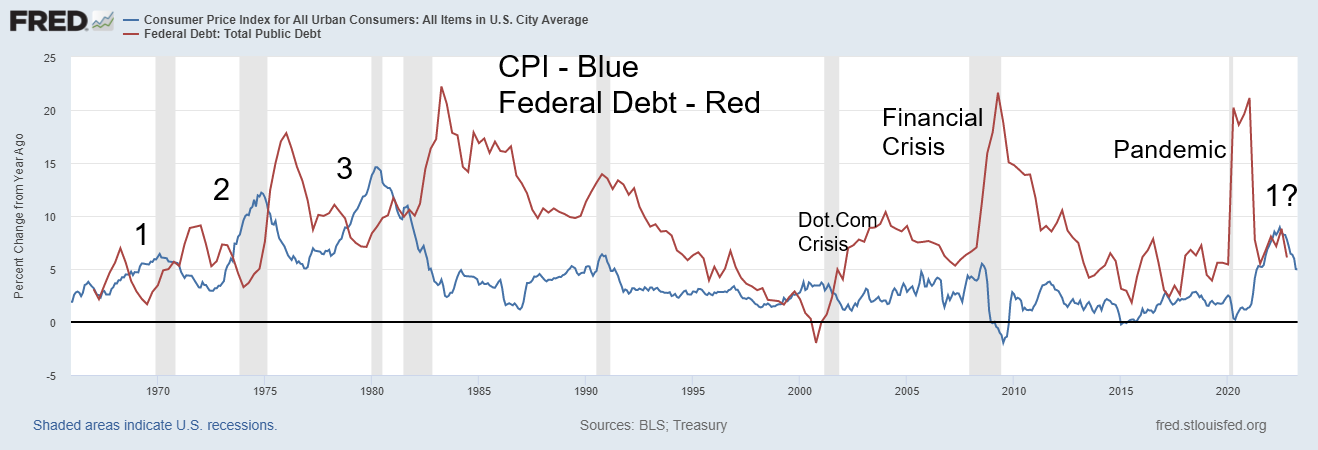
Source: www.stlouisfed.org
Inflation is falling and our expectations are that it could fall further. But will it fall to 2% as the Fed wants? That likelihood is low. Keep on eye on Producer Price Index (PPI) inflation. Note how it started rising sharply out of the 2020 pandemic. The Consumer Price Index (CPI) followed. By 2021, the PPI was outpacing the CPI. Again, the PPI peaked before the peak for the CPI. Once the PPI started falling, the CPI followed. Now PPI inflation is below CPI inflation. But if that shifts, inflation will be rising once again. PPI appears to be the leader.
U.S Inflation – CPI, PPI m-o-m Change, 2018–2023
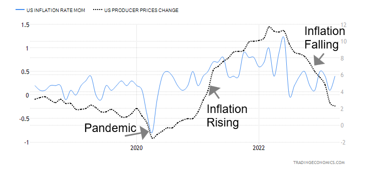
Source: www.tradingeconomics.com, www.bls.gov
The debt ceiling is still not decided as at time of this writing. They announced a pause. Apparently, Republicans walked out. Nobody seemed to know when talks would begin again. Apparently, the Treasury has only some $57.3 billion left, according to Bloomberg. That could be gobbled up in a day.
How will the debt ceiling pass? Treasury Secretary Janet Yellen has consistently argued that the U.S. could default on its debt obligations as soon as June 1, resulting in an “economic and financial catastrophe.” The straight truth, or hyperbole? The key is a small group of Republicans who are insisting that negotiations be broken off unless their demands for huge budget cuts are met. To date, the Treasury has taken “extraordinary measures” to prevent a default. Yellen warns that, unless a deal is in place, the U.S. may be unable to satisfy the government’s obligations as early as June 1. A resolution could also be merely a suspension, a measure that has been used in past debt ceiling wars. Even at that, a debt downgrade could be on the table, depending on how this is resolved. That scenario would not be good as it would raise the cost of borrowing for everyone.
However, the question is, would the Republicans risk a global economic crisis to get what they want? This is a political problem, but the consequences are economic and global in nature. The markets seem to believe that something will get done as stock markets are steady and gold has sold off. But even waiting until the last minute can have negative consequences, given the potential harm to business and consumer confidence, a hike in interest rates sparking higher borrowing costs, plus the risk of a debt downgrade. Failure to pass could lead to a deep recession, global instability, and a financial crisis worse than the one in 2008.
Is the U.S. really that dysfunctional? And would the Republicans really put the global economy at risk? We already have instability in the banking sector, housing, and commercial real estate. But jobs remain buoyant and some other economic indicators continue to exhibit growth. Could all that change quickly?
So, what are the odds of a recession? That is all over the map as there are those who are expecting no recession, others a mild recession, and some a steep recession. The debt ceiling war might decide which one it will be. As the numbers show, there remain few signs of a recession, even as consumer confidence is at multi-year lows.
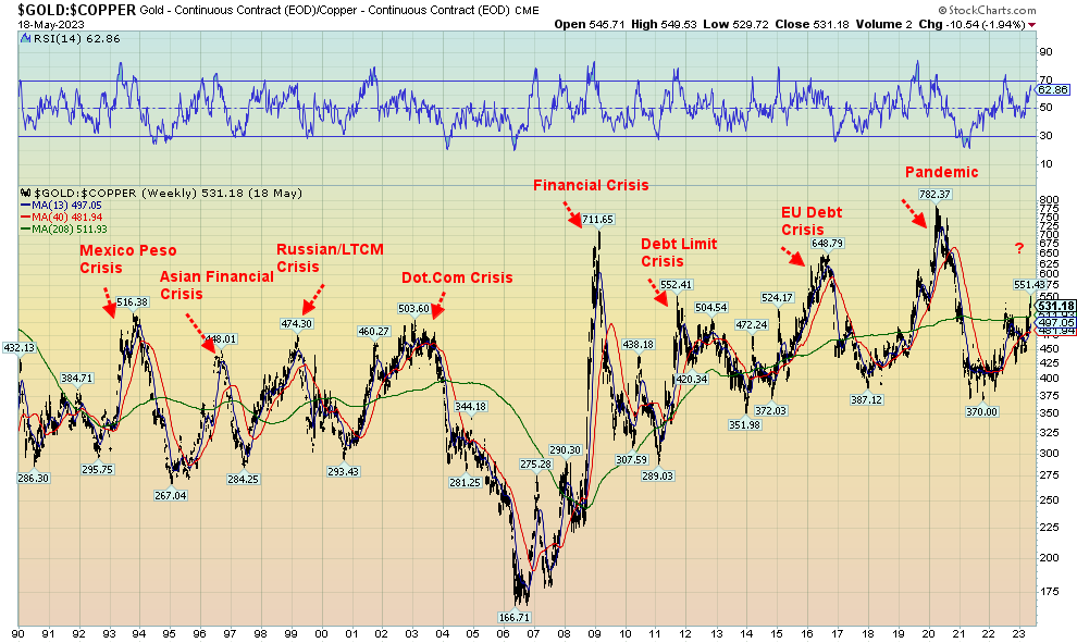
One thing we may want to watch is the gold/copper ratio. Rising gold is a sign of financial instability and rising non-confidence in government. Copper is an industrial metal and its usage rises and falls with the economy. So, if the gold/copper ratio is rising, is a potential crisis brewing? And right now, the gold/copper has been rising and has recently broken back over its 4-year MA. Our chart below of the gold/copper ratio shows how, each time the ratio peaked, a financial crisis broke out.
Peaks were seen at the time of the Mexican peso crisis, also known as the Tequila crisis (1994), the Asian contagion crisis (1997), the Russian/LTCM crisis in 1998, the dot.com crisis in 2001–2002, the financial crisis 2008, the debt limit crisis of 2011, the EU debt crisis in 2014-2016, and the pandemic in 2020. Once the crisis had passed, the ratio fell in favour of copper over gold. It last bottomed in late 2021 and has been rising steadily ever since. Is a crisis brewing?
We still have our share of crises from the debt ceiling war, a potential global debt crisis, a potential global banking and real estate crisis, currency destabilization, potential AI destabilization, a raging war that threatens global peace (cold war or hot war?), raging fires, floods and heat waves being blamed on climate change, and famines along with war sparking huge migrations from south to north. Like a collective nervous breakdown.
Source: www.stockcharts.com
Chart of the Week
Dow Jones Industrials CPI Adjusted 1800–2023
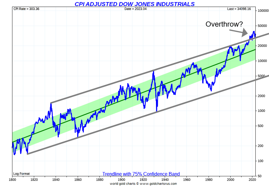
Source: www.goldchartsrus.com
Here is a 200-year chart of the Dow Jones Industrials (DJI) (223 years actually), inflation-adjusted. Inflation- adjusted charts are, we believe, only applicable with long-term charts. You get a different view of the trends when you remove the effects of inflation. Economists often use an inflation-adjusted basis to compare wages, food costs, and more between different periods. For stock indices, it helps to look at them from an inflation-adjusted basis to see how today compares with earlier periods.
The chart above shows DJI using a trendline with a 75% confidence band. We added in trendlines off the top recorded in 1836. That hooked up nicely with the 1929 top and then the 2000 top. But the recent run-up in prices threw the DJI over its long term trendline, not just above the 75% trendline confidence band. Every time the DJI overthrew the 75% confidence band or hit the top of the long-term trendline we drew, markets struggled and then fell. Is this time really different?
Dow Jones Industrials CPI Adjusted 1900–2023
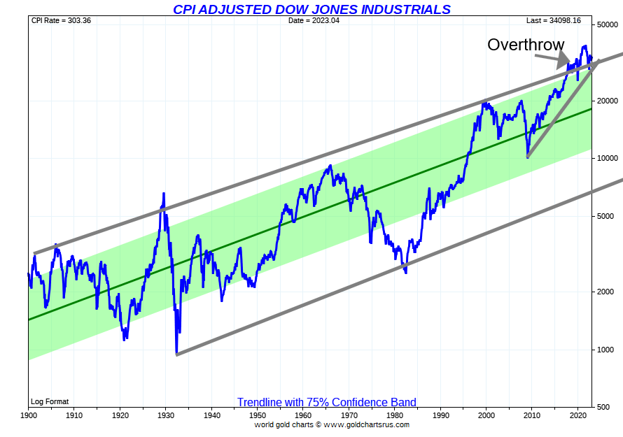
Source: www.goldchartsrus.com
We then looked at the DJI again for 100 years (123 years in reality) and the story was the same. Every time we hit at or near the top of the trendline in 1901, 1906, 1915, 1929, 1966, 1999, and 2021, the market started to struggle. The only difference this time is we have yet to see the plunge that accompanied the market after each of those tops. While the drop in 2022 pulled us back, we have yet to see plunges on the scale of 1929–1932 and 1966–1982.
Note how that 1982 bear, inflation-adjusted, almost equaled the plunge into 1932. But on a nominal basis it was well above the 1932 low. Even the 2008 financial crisis didn’t take us to those depths. Yet a test of the centre line or, worse, the long term trendline from the 1932 low remains possible. The first scenario could take the DJI down to 20,000 or lower on an inflation-adjusted basis or nominal basis. On the second scenario, the fall could near 7,000. On a nominal basis, that could be near 10,000 for the second scenario.
Markets & Trends
|
|
|
|
% Gains (Losses) Trends |
|
||||
|
|
Close Dec 31/22 |
Close May 19/23 |
Week |
YTD |
Daily (Short Term) |
Weekly (Intermediate) |
Monthly (Long Term) |
|
|
Stock Market Indices |
|
|
|
|
|
|
|
|
|
S&P 500 |
3,839.50 |
4,191.98 |
1.7% |
9.2% |
up |
up |
up (weak) |
|
|
Dow Jones Industrials |
33,147.25 |
33,426.63 |
0.4% |
0.8% |
neutral |
up (weak) |
up (weak) |
|
|
Dow Jones Transport |
13,391.91 |
13,909.54 |
0.9% |
3.9% |
down (weak) |
neutral |
up (weak) |
|
|
NASDAQ |
10,466.48 |
12,657.90 |
3.0% |
20.9% |
up |
up |
neutral |
|
|
S&P/TSX Composite |
19,384.92 |
20,351.06 |
(0.3)% |
5.0% |
neutral |
up |
up |
|
|
S&P/TSX Venture (CDNX) |
570.27 |
612.79 |
(0.8)% |
7.5% |
down |
neutral |
down |
|
|
S&P 600 (small) |
1,157.53 |
1,144.79 |
2.2% |
(1.1)% |
neutral |
down |
neutral |
|
|
MSCI World Index |
1,977.74 |
2,132.99 |
(0.7)% |
7.9% |
neutral |
up |
up (weak) |
|
|
Bitcoin |
16,535.23 |
26,817.37 |
1.5% |
62.2% |
down |
up |
neutral |
|
|
|
|
|
|
|
|
|
|
|
|
Gold Mining Stock Indices |
|
|
|
|
|
|
|
|
|
Gold Bugs Index (HUI) |
229.75 |
252.50 |
(5.4)% |
9.9% |
down |
up |
neutral |
|
|
TSX Gold Index (TGD) |
277.68 |
305.74 |
(5.0)% |
10.1% |
down |
up |
up (weak) |
|
|
|
|
|
|
|
|
|
|
|
|
% |
|
|
|
|
|
|
|
|
|
U.S. 10-Year Treasury Bond yield |
3.88% |
3.68% |
6.4% |
(5.2)% |
|
|
|
|
|
Cdn. 10-Year Bond CGB yield |
3.29% |
3.14% |
8.7% |
(4.6)% |
|
|
|
|
|
Recession Watch Spreads |
|
|
|
|
|
|
|
|
|
U.S. 2-year 10-year Treasury spread |
(0.55)% |
(0.60)% |
(13.2)% |
(9.1)% |
|
|
|
|
|
Cdn 2-year 10-year CGB spread |
(0.76)% |
(0.87)% |
(1.2)% |
(14.5)% |
|
|
|
|
|
|
|
|
|
|
|
|
|
|
|
Currencies |
|
|
|
|
|
|
|
|
|
US$ Index |
103.27 |
103.08 |
0.6% |
(0.2)% |
up |
down |
up (weak) |
|
|
Canadian $ |
73.92 |
74.08 |
0.4% |
0.2% |
neutral |
neutral |
down |
|
|
Euro |
107.04 |
108.02 |
(0.5)% |
0.9% |
down |
up |
down (weak) |
|
|
Swiss Franc |
108.15 |
111.11 |
(0.2)% |
2.7% |
neutral |
up |
up |
|
|
British Pound |
120.96 |
124.44 |
(0.1)% |
2.9% |
neutral |
up |
down (weak) |
|
|
Japanese Yen |
76.27 |
72.48 |
(1.6)% |
(5.0)% |
down |
neutral |
down |
|
|
|
|
|
|
|
|
|
|
|
|
|
|
|
|
|
|
|
|
|
|
Precious Metals |
|
|
|
|
|
|
|
|
|
Gold |
1,826.20 |
1,981.60 |
(1.9)% |
8.5% |
down |
up |
up |
|
|
Silver |
24.04 |
24.06 |
(0.4)% |
0.1% |
down |
up |
up |
|
|
Platinum |
1,082.90 |
1,075.76 |
0.8% |
(0.7)% |
up (weak) |
up |
up |
|
|
|
|
|
|
|
|
|
|
|
|
Base Metals |
|
|
|
|
|
|
|
|
|
Palladium |
1,798.00 |
1,523.80 |
0.7% |
(15.3)% |
neutral |
down |
down |
|
|
Copper |
3.81 |
3.73 |
flat |
(2.1)% |
down |
neutral |
neutral |
|
|
|
|
|
|
|
|
|
|
|
|
Energy |
|
|
|
|
|
|
|
|
|
WTI Oil |
80.26 |
71.69 |
2.4% |
(10.7)% |
down |
down |
neutral |
|
|
Nat Gas |
4.48 |
2.59 |
14.1% |
(42.2)% |
up |
down |
down |
|
Source: www.stockcharts.com
Note: For an explanation of the trends, see the glossary at the end of this article.
New highs/lows refer to new 52-week highs/lows and, in some cases, all-time highs.
Special Chart
G7 vs. The BRICS
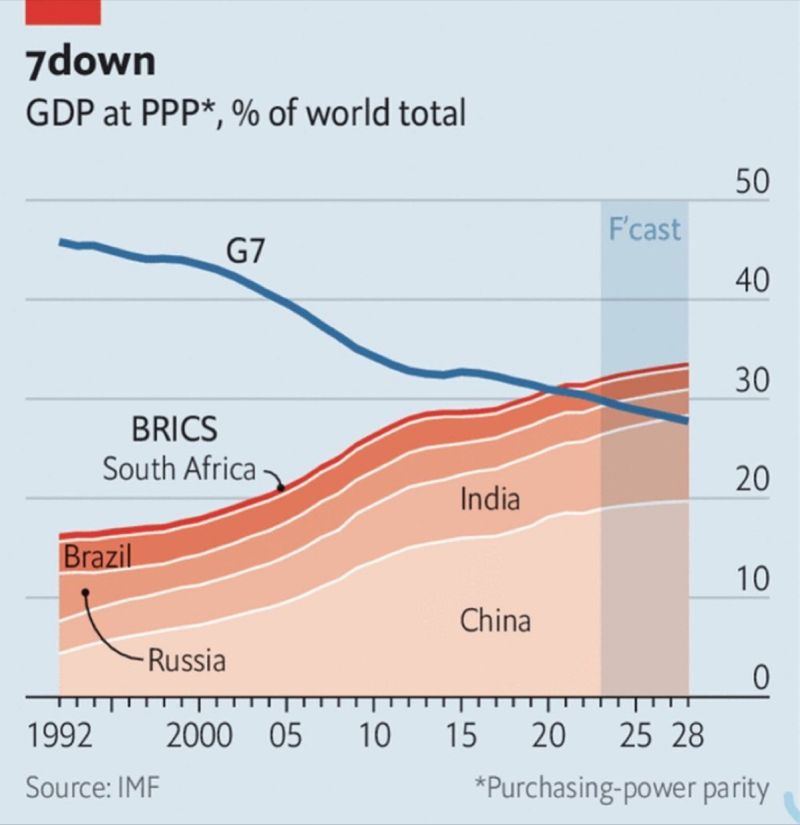
Source: www.imf.org Courtesy of James Wong Fixed Income Portfolio Manager GaoTeng Global Asset Management Limited, Hong Kong www.gaotengasset.com
We found this chart rather interesting. It is showing GDP at PPP (Purchasing Power Parity) of the G7 (U.S., U.K. Germany, France, Italy, Canada, Japan) vs. the BRICS (Brazil, Russia, India, China, South Africa). PPP is defined as a measurement of the price of specific goods in different countries and is used to compare the absolute purchasing power of the countries' currencies. PPP is effectively the ratio of the price of a basket of goods at one location divided by the price of the basket of goods at a different location. The PPP inflation and exchange rate may differ from the market exchange rate because of tariffs, and other transaction costs. (Source: Wikipedia).
On a PPP basis, the BRICS is not only catching up to the G7 but it is passing it. This makes the BRICS an economic powerhouse that rivals the G7. The G7, however, has only about 10% of the world’s population vs. 40% for the BRICS. Yet the two sides have been locked in conflict, particularly vs. Russia and China. The BRICS is not only challenging the G7 on the economics side but also currency and global organizations.
The U.S.’s expelling of Russia from the SWIFT payment system is accelerating the BRICS’ desire to build their own systems of SWIFT, IMF, and the World Bank. They are also increasingly dealing in yuan as the currency of choice, challenging the global domination of the U.S. dollar even as the U.S. dollar remains dominant and is not disappearing anytime soon. As well, numerous countries are clamouring to become members of the BRICS including Saudi Arabia, UAE, Egypt, Algeria, Argentina, Mexico (interesting, as they are a member of NAFTA), Nigeria, Senegal, Iran, Kazakhstan, Indonesia, Turkey (a member of NATO), and Afghanistan. Increasingly, they see their allegiance shifting to China and away from the U.S.
And we wonder why we have growing currency, economic, and military tension between the G7 (along with a few others such as Australia and South Korea) and the BRICS led by China and Russia. In an odd way, it is explained in that chart. We have often noted that the last time the global power was challenged by an up-and-coming power, it resulted in a devastating world war, followed 21 years later by a second world war. Yes, Germany challenging the dominance and global hegemony of Great Britain in the latter part of the 19th century and early part of the 20th century. Today, led by China, it is challenging the global dominance and global hegemony of the U.S. Hopefully, it doesn’t end up as it did the last time.
Source: www.stockcharts.com
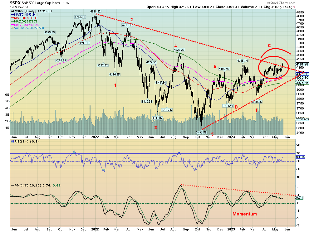
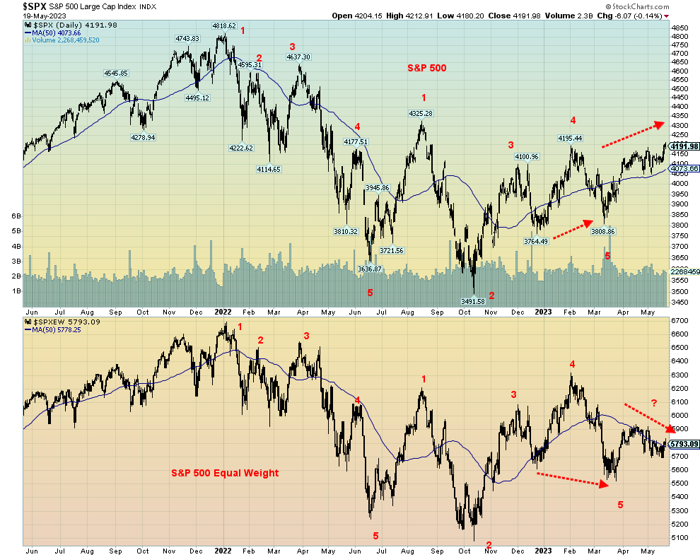
The S&P 500 poked its way above the downtrend line from the January 2022 top on Friday, leading some to believe we were on the verge of a breakout. Except after Fed Chair Jerome Powell spoke, markets reversed and the S&P 500, along with the other indices, finished the day in the red after being in the green earlier. It was not a strong statement for a breakout. Also, the breakout of the S&P 500 was not confirmed by any other index including the Dow Jones Industrials (DJI), Dow Jones Transportations (DJT) and Dow Jones Utilities (DJU). Nor for that matter did the NYSE, the Value Line, or any of the Russell indices (1000, 2000, 3000). The Wilshire 5000 is also lagging. It’s lonely as only the S&P 500 and the NASDAQ breached that downtrend line. At least the NASDAQ has been through it but the S&P 500 failed Friday. Maybe it’ll get another chance. Momentum, as one can see, continues to deteriorate and diverge. The RSI is also making lower highs.
On the week, the S&P 500 gained 1.7%, the DJI was up 0.4%, the DJT up 0.9%, and the NASDAQ gained 3.0%, led by the techs with a number of the major high-tech stocks making new highs (See NASDAQ chart next). The S&P 400 (Mid) gained 1.0% while the S&P 600 (Small) was up 2.3%. Bitcoin tried to rally, gaining 1.5% on the
week but still closed under 27,000 again.
In Canada, the TSX Composite lost 0.3% and the TSX Venture Exchange (CDNX) was off 0.8%. The global MSCI World Index fell 0.7%. In the EU, the London FTSE was flat, the EuroNext gained 1.0%, the Paris CAC 40 was up 1.0%, and the German DAX gained 2.3% to fresh 52-week highs. In Asia, China’s Shanghai Index (SSEC) was up 0.3% and the Tokyo Nikkei Dow (TKN) continued its upward quest once again, making 52-week highs and finishing over 30,000 for the first time since 1990 with a gain of 4.8%. But Hong Kong’s Hang Seng (HSI) bucked the trend, losing 0.9%.
The decline from the January 2022 top appeared to us to fall in five waves to the low in October 2022. This, we believe, completed the A wave down. What followed looked to be a classic ABC correction that topped in January 2023, the B wave. The decline that followed, we believe, was wave 1 down of a larger wave C to the downside. The recent rebound is the 2 wave, even though for the S&P 500 it took out the earlier January high. It’s a hook which, as we noted, is not being confirmed elsewhere. The next wave down should be our 3 wave and it could well take us to new lows below the October 2022 low. The failure to take out 4,200 on Friday, then reverse and close lower may be a sign that this market is weak and the next significant move is to the downside. Our breakdown zones remain under 4,000, then under 3,900. Only a convincing move above 4,200 might keep this alive a little longer.
Source: www.stockcharts.com
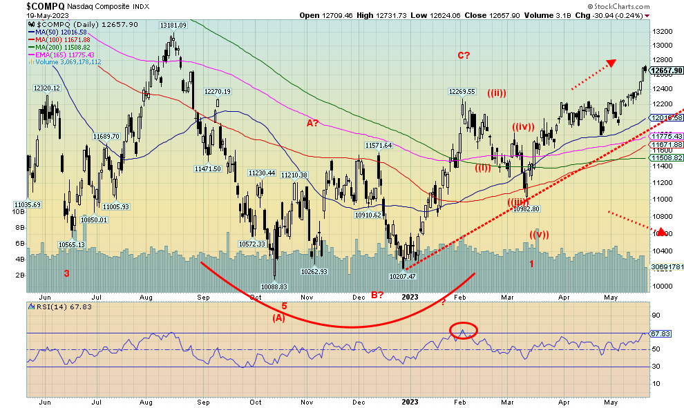
The NASDAQ continued its upward march this past week, gaining 3.0%. As we have noted, it has been a lonely march, joined somewhat by the S&P 500 this past week but no one else. This entire rally has been led by the major high-tech stocks known collectively as the FAANGs. The NY FANG Index was up a big 6.1%, led by new 52-week highs for Meta, Apple, Google, Microsoft, Nvidia, and Advanced Micro. Many of these stocks now have RSIs over 70, indicating they are overbought. The NASDAQ’s RSI is at 68, not quite over 70 yet. Divergences abound as we have noted that the NASDAQ is diverging with new highs/new lows and the NASDAQ Advance/Decline line. NASDAQ is up to new highs, but the indicators are deteriorating, not making new highs, and falling. [
A breakdown might occur under 12,200, but it might take a breakdown under 11,700 to really get this market falling. In the interim, we can’t deny that we could still wiggle higher, but the evidence shows that time is running out. Note as well how volume is falling, even as the NASDAQ goes higher. Just another divergence.
Source: www.stockcharts.com
We’ve noted a number of divergences recently: stock market vs. advance/decline line, stock market vs. new highs/new lows amongst them. Here’s another one. The S&P 500 vs. the S&P 500 Equal Weight Index. Throughout most of the past two years, the two have been largely in sync. Each makes new highs together and new lows together. In 2023 that relationship seems to have ended. In the early part of the year, SPXEW made new lows into March but the SPX did not. Now it’s the SPXEW in a downtrend while the SPX is making new highs. What gives?
We’ve noted this before. This is a very narrow rally. Only a few stocks are taking the indices higher. With the SPX heavily weighted towards large cap stocks, it shouldn’t be a surprise that it is those stocks taking the market higher. But when you apply it to the entire universe of SPX stocks on an equal basis (SPXEW), the market is actually declining. Not shown but also diverging sharply is the S&P 500 vs. the SPDR Barclays High
Yield Bond ETF (JNK). Again, they should be largely in sync with each other. They are not. JNK is falling, even as the S&P 500 is rising. Another warning.
Source: www.stockcharts.com
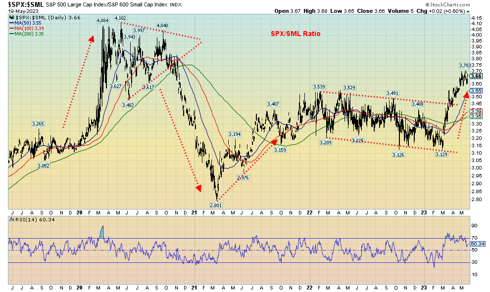
Above is a chart of the S&P 500/S&P 600 ratio. Large cap vs. small cap. SPX/SML. What it shows is, so far, during 2023 large cap is outperforming small cap. When markets rally as they did during 2020 and into 2021, small cap stocks tend to outperform. They did. Then sometime in March 2021 the tide shifted. Was the market warning then of an impending top? Throughout 2022 it became a see-saw battle between the two with still some tendency for the small cap to outperform. But that shifted this year firmly in favour of the large cap S&P 500. To us it is a warning that the bull market we’ve experienced since a low last October 2022 is not one that should be heavily pursued. Unless, of course, you’ve been in large cap stocks. And, as we have seen, those large cap stocks are the big tech names. Note as well on this chart that during 2019, despite markets rallying, the tendency was to be in large cap stocks. Then along came the pandemic.
Source: www.stockcharts.com
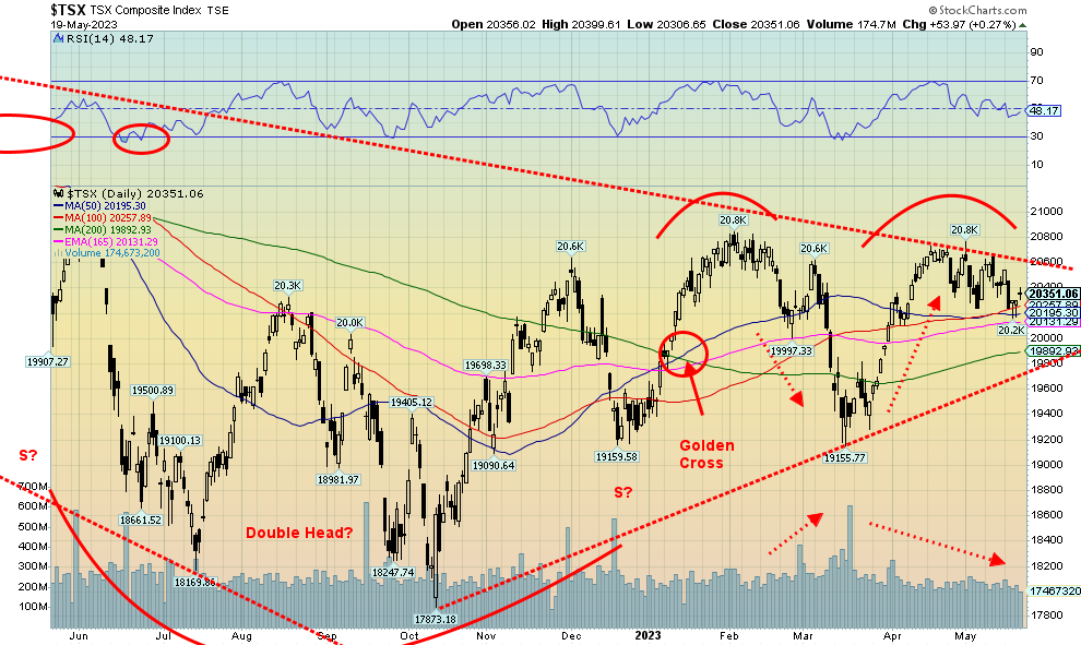
Unlike the U.S. indices, the TSX Composite did not join the party this past week. The TSX Composite fell a small 0.3%. The reason, of course, was the heavy-weighted commodity sectors that fell this past week. Eight of the 14 sub-indices were down this past week while one was flat (Financials TFS). Leading the way to the downside was Golds (TGD), down 5%, followed by Materials (TMT), losing 2.6%. Other significant losers were Consumer Staples (TCS), down 1.3% and Utilities (TUT), also off 1.3%. The upside leader was Health Care (THC), up 6.6%, but THC is a small component. Information Technology (TKK) made fresh 52-week highs, gaining 2.3%. Energy (TEN) was a big winner, up 2.8%. Over at the TSX Venture Exchange (CDNX) it lost 0.8%. The CDNX’s woes continue, but for how much longer?
More and more the TSX is looking like it is making a double top near 20,800. It has failed to penetrate the downtrend from the January 2022 top except briefly intraday. It’s a slow burn with the neckline for this officially at that March low near 19,155. A breakdown under that level could project down to 17,500, a decline of some 14% from current levels. It would also be new lows as the October 2022 low was at 17,873. Note how volume has tailed off on this decline but had risen into that pullback in March 2023. For that March low, volume confirmed the downtrend. But on this upswing volume is not confirming the rise.
Despite the drop this past week for the commodity group (except Energy), they remain the most compelling to own.
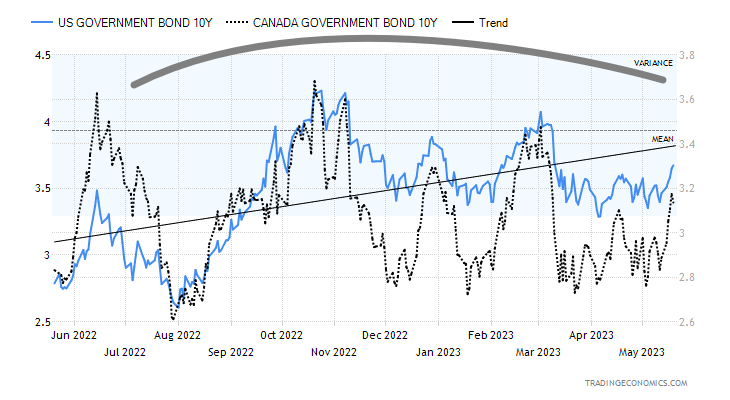
U.S. 10-year Treasury Bond/Canadian 10-year Government Bond (CGB)
Source: www.tradingeconomics.com, www.home.treasury.gov, www.bankofcanada.ca
Bond yields rose this past week as a plethora of economic numbers came in somewhat higher than expected. As well, while Fed Chair Jerome Powell soft-pedaled things on Friday, other Fed officials were more hawkish. It leaves everyone confused as to what the Fed might do at the FOMC on June 13–14. We continue to believe that we are making a huge top, but we now have a big caveat. The debt ceiling war could blast yields sharply to the upside if no deal is made and the U.S. actually defaults. It doesn’t have to be a complete default, but maybe one where the government shuts down. And then there are the rating agencies that could downgrade U.S. debt again. Either way, we are being kept on pins and needles for the next few weeks. The two sides seem far apart, but will cooler heads prevail? A breakdown under 3.00% confirms lower rates, but a move above 3.50% could signal higher yields ahead. Our topping pattern, or what we believe is a topping pattern also has the look of descending triangle. The recession spreads continue at very high levels with the U.S. 2–10 at 60 bp and Canada’s 2–10 at 87 bp. Both were higher on the week—or are they lower since they went more negative?
Source: www.stockcharts.com
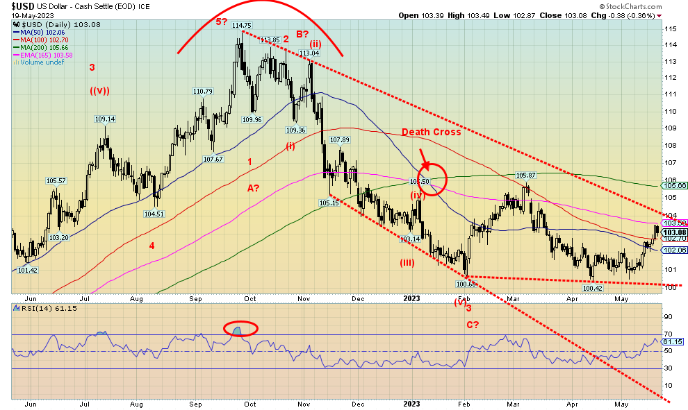
The US$ Index (USDX) moved higher this past week with a gain of 0.6%. The euro lost 0.5%, the Swiss franc fell about 0.2%, the pound sterling was off less than 0.1%, while the Japanese yen fell 1.6%. The Canadian dollar bucked the trend, gaining 0.4%. USDX ran into resistance at the 165-day exponential MA near 103.60. Friday’s comments from Fed Chair Jerome Powell helped push down USDX, even as some stronger than expected economic numbers earlier in the week helped push USDX higher. Above lies the downtrend line from the September 2022 top at 114.75. It is currently at 104. A firm breakout over that level would target up to the 200-day MA near 105.60. On the other hand, a breakdown under 102 would most likely set up a test of that breakdown line near 100. This coming week could prove key for USDX. Upside follow-through is essential to keep this rebound alive and complete what may be an ABC correction of the five waves down from the September top. Right now, we continue to favour a possible test of the March high at 105.87, which nicely coincides with the 200-day MA at 105.55.
Source: www.stockcharts.com
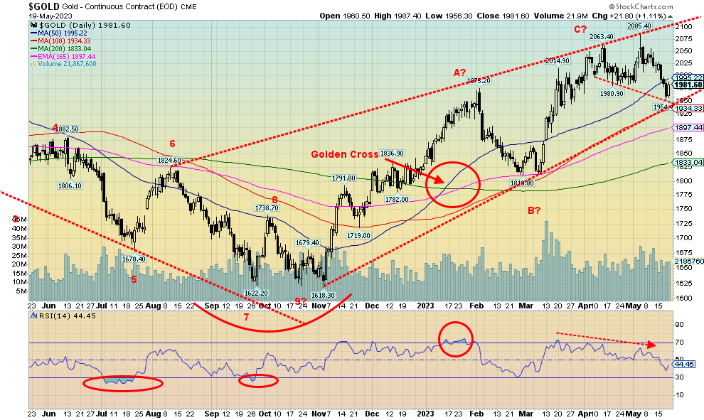
On Friday, Fed Chair Jerome Powell saved the day and ignited gold back to the upside from what would have been a sharp down week. While some Fed officials appeared hawkish, Powell came in far more sanguine and traders lowered their expectations of a Fed rate hike in June. As well, we continue to see bank and commercial real estate jitters. And then there is the debt ceiling which, if not resolved, could causes chaos. Still, the expectation is that they will at minimum suspend the debt ceiling pushing it out to another day.
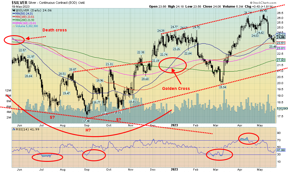
Gold fell 1.9% this past week, but for a change silver outperformed, losing only 0.4%. Platinum surprised, gaining 0.8% while palladium was up 0.7% and copper was flat on the week. The gold stocks were hammered, with the Gold Bugs Index (HUI) losing 5.4% and the TSX Gold Index (TGD) down 5.0%. Gold broke out line at $1,975, but then only fell to a low of $1,954. We noted a potential down line near $1,950 and that level saved it for now. In some respects, it looks like a broadening pattern. If that’s correct, then we could rally to new highs above $2,085 and effectively give us what we call three thrusts to a high. What would follow is another down move. Irrespective of this, a breakdown under $1,950 would most likely target down to $1,890/$1,920. A breakdown under $1,890 could take us down to $1,830 and the 200-day MA.
On a positive note, the commercial COT next was bullish this past week, which could give rise to a further rebound. So, the week ended on a good note after stronger economic numbers, hawkish Fed officials, and thoughts that the debt ceiling will be resolved in some form kept gold to the downside. Powell helped shift it
higher and doubts remain on the debt ceiling, along with Yellen talking about the need for more bank mergers. A move back over $2,000 would be positive and a move back over $2,025 would confirm another up move. Above $2,060 new highs become probable. But, as we note, could it be the three thrusts to high pattern that is forming? If so, then ultimately a bigger drop lies ahead unless gold can forge through $2,100.
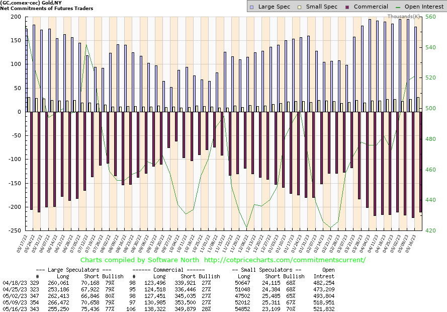
Source: www.cotpricecharts.com
The gold commercial COT (bullion companies and banks) surprised this past week, rising to 28% from 27%. Long open interest rose over 7,000 contracts while short open interest fell about 4,000 contracts. The large speculators COT (hedge funds, managed futures, etc.) fell to 77% from 79% as they shed about 11,000 longs and added about 5,000 shorts. Total open interest rose about 3,000 contracts on a down week for gold. Despite the rise in open interest during a down week, we have to view this week’s COT has somewhat bullish going forward. As usual, it left off the results of the last three days of the week. But the commercials were definitely covering shorts into this past week’s sell-off.
Source: www.stockcharts.com
For a change, silver outperformed gold this past week, losing only 0.4% vs. gold’s loss of 1.9%. Silver tends to lead in both bull and bear markets. So, this might be taken as a positive sign. Further, as we note next, the silver commercial COT was positive this past week as well. Silver’s breakdown a week earlier was nasty, but this week saw some consolidation and then Friday’s up move that took silver back over $24. We constantly see that silver is in supply deficit, but you’d never know it from its price. Silver has more work to do to return to those earlier highs at $26.40. First, we need a move over $24.50, then over $25 to suggest potentially higher prices. We need to get over $25.75 just to think about potential new highs. Silver doesn’t really break out until we go over $27, preferably $27.50. A breakdown now under $23.50 would be dangerous and we could soon be down at $22. Under $21, any thoughts of a rally are truly over.
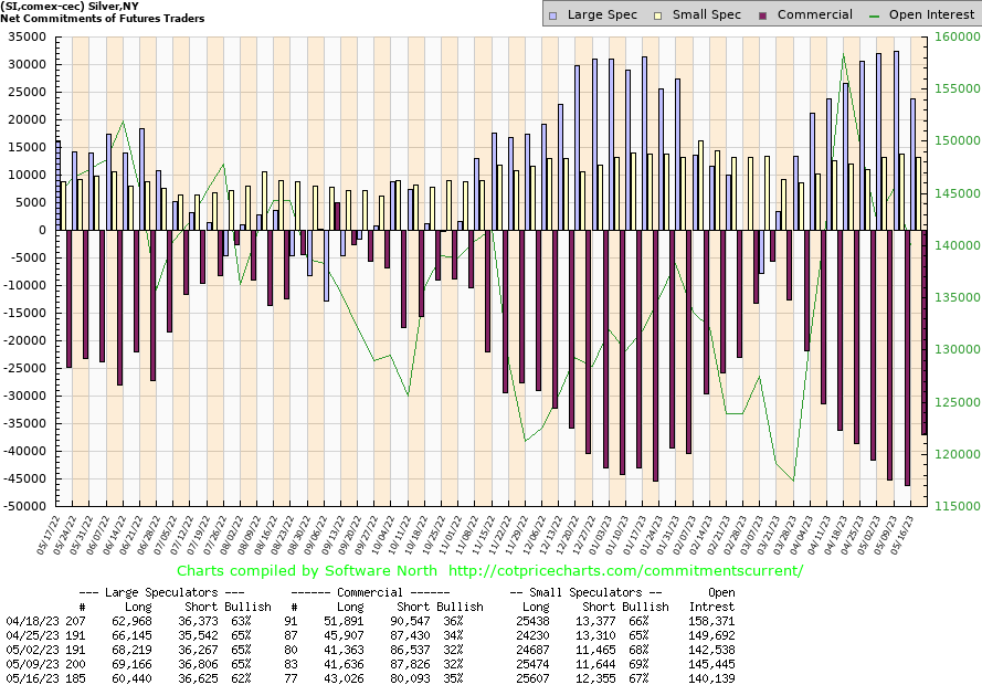
Source: www.cotpricecharts.com
Like the gold COT, the commercial COT for silver jumped this past week to 35% from 32%. Longs were up about 1,500 contracts while shorts fell some 7,000 contracts. The large speculators as well dropped to 62% from 65% as they shed about 9,000 longs while their shorts remained steady. Overall open interest fell over 5,000 contracts on a down week for silver, although the big drop occurred on Monday, a day that would be in this report. We interpret this as bullish.
Source: www.stockcharts.com
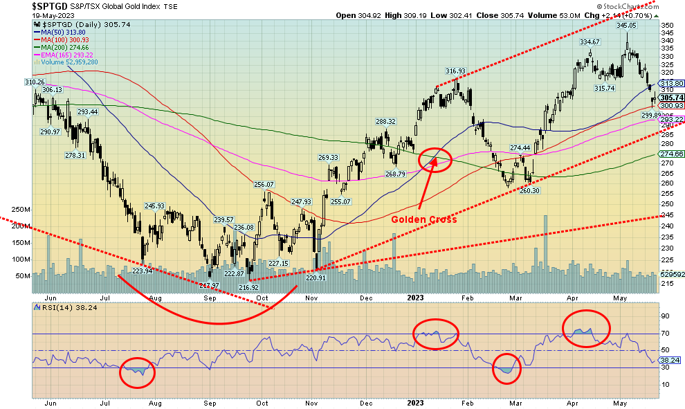
It was not a joyful week for the gold stocks. On Thursday, they gapped down. We are not sure whether at this stage this is a measuring gap, just a normal gap, or an exhaustion gap. The TSX Gold Index (TGD) lost 5.0% this past week and the Gold Bugs Index (HUI) was down 5.4%. The TGD is down over 11% from that high seen only about two weeks ago. They do fall fast. We also remain down about 33% from the 2011 high while the HUI remains down 60% from that high. Gold stocks remain cheap, cheap, cheap compared to gold. We’ve never seen it remain that way for so long. Junior mining stocks are even cheaper. Still, almost daily, we see junior mining companies—explorers, developers, and near producers—raising money. That doesn’t seem to be a problem. And many report excellent results. But the stocks do nothing (with exceptions).
The TGD found support this past week at the 100-day MA. We see further support down to 290, but under that level a bigger breakdown might get underway. The 200-day MA is at 275. Above that, we need to regain 320 and 325 to suggest to us that a low might be in. Also, we need to fill that gap. Volume in the sector has been low. If there is any good news, we are up in 2023 and up some 40%+ from the September 2022 low. The sector can be volatile and that keeps many out.
Source: www.stockcharts.com
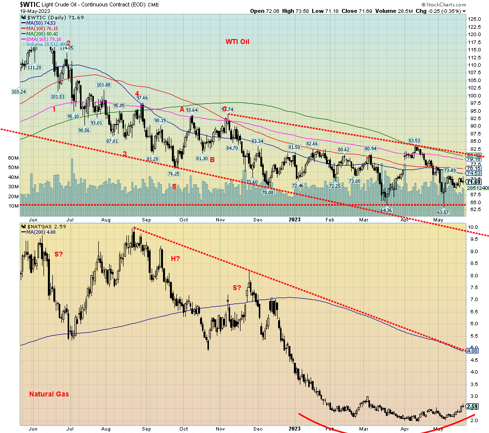
We continue to be positive on the energy markets. For the first time in a while, WTI oil was up this past week, gaining 2.4%. Brent crude gained 0.6%. Natural gas (NG) at the Henry Hub jumped higher, up 14.1%, but NG at the Dutch continues to languish, down 7.9% on the week. We believe bullish sentiment continues to grow in the sector. What’s key for oil as it is for many others are the ongoing debt limit talks. Many believe a deal will be struck, but at worst it will be pushed out for another day with a suspension. The Memorial Day weekend brings us the start of the driving season and demand tends to perk up. WTI oil, we believe, continues to make a bottom pattern and NG continues to make what looks like a rounding bottom pattern. WTI needs to firmly break over $84 to confirm a low, but a move over $75 could start things higher. For NG, we continue to look at $3 as a potential breakout point.
We suppose one piece of good news (not necessarily for oil) is that Turkey helped broker an extension of the Black Sea grain deal. That sent wheat and corn down. As well, rather than object about the transfers of oil between Russian and Iranian ships to get around sanctions, the spectre of oil spills is being raised. In Alberta, the raging fires are beginning to potentially threaten the oil sands. Shut-ins as a result of the fires have already taken some 400,000 bpd off the market. The Biden administration unexpectedly approved a long-delayed pipeline for NG in the Appalachians that had been held up by environmental complaints. Russia has cut some 500,000 bpd from production and that is designed to help push oil prices higher. Saudi Arabia has also cut back.
Overall, we remain positive on the energy market despite the recent woes, but we need breakouts, as noted, to confirm that a low is in.
Copyright David Chapman 2023
About the author


Website: https://www.enrichedinvesting.com
Disclaimer: David Chapman is not a registered advisory service and is not an exempt market dealer (EMD) nor a licensed financial advisor. We do not and cannot give individualised market advice. David Chapman has worked in the financial industry for over 40 years including large financial corporations, banks, and investment dealers. The information in this newsletter is intended only for informational and educational purposes. It should not be considered a solicitation of an offer or sale of any security. The reader assumes all risk when trading in securities and David Chapman advises consulting a licensed professional financial advisor before proceeding with any trade or idea presented in this newsletter. David Chapman may own shares in companies mentioned in this newsletter. We share our ideas and opinions for informational and educational purposes only and expect the reader to perform due diligence before considering a position in any security. That includes consulting with your own licensed professional financial advisor.