
Because gold has not done all that much since its April – May peaks many investors are unaware of the magnitude of the upleg that has begun so the purpose of this update is to make it crystal clear why this upleg is destined to be so massive, for both fundamental and technical reasons.
With regard to the fundamental reasons why gold’s still nascent major upleg is set to be so enormous, Doug Casey has just done an excellent and timely job of setting it all out in Gold’s Next Explosive Move which relieves me of this task, freeing me up to concentrate on the technical aspects, although I may add a few observations of my own.
The first and by far the most important point to be made in this update is that taking the inflation of the past decade or so into account, gold had been stuck in a gigantic trading range until as recently as the Spring of this year that dates all the way back to its 2011 peak which capped its great 2000’s bull market as we can see on the long-term chart below that goes all the way back to the start of the millennium on the 1st January 2000.
Observe the skewed grey-shaded support and resistance zones marking the upper and lower boundaries of the trading range – skewed to take account of inflation during the years that this range formed. While various commentators made a big deal of gold’s nominal new highs in 2020 and late last year, these were not new highs when inflation was taken into account – real new highs have occurred just since the Spring of this year.
It is thus clear that the decisive breakout that occurred this Spring was of momentous importance as it has ushered in what promises to be gold’s most spectacular bull market to date which is hardly surprising considering what is going on in the world with money creation having gone parabolic that is set to drive rampant inflation trending in the direction of hyperinflation and attendant extreme currency devaluation and the proliferation of war partly as an act of desperation as a gambit to deflect the public’s attention away from the real causes of the ballooning global economic crisis which is of course the past reckless actions of Central Banks, none more so than the Federal Reserve.
In short, we are looking at a perfect storm that will lead to gold doing a “moonshot.” Notice that this chart is free from unnecessary and distracting clutter like the proliferation of trendlines and silly overcomplicated wave counts, although it is worth clarifying that the giant trading range has taken the form of a “Cup & Handle Continuation Pattern” as drawn on the chart which parallels a similar pattern on the long-term silver chart.
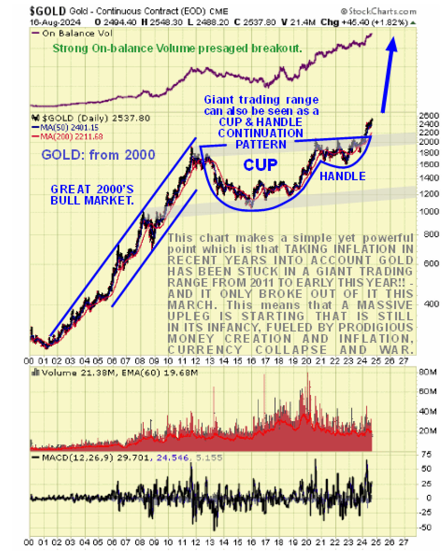 True gold aficionados will probably like this chart very much – please feel free to print out a large-scale version of it to place on the wall, and you may of course want to frame it.
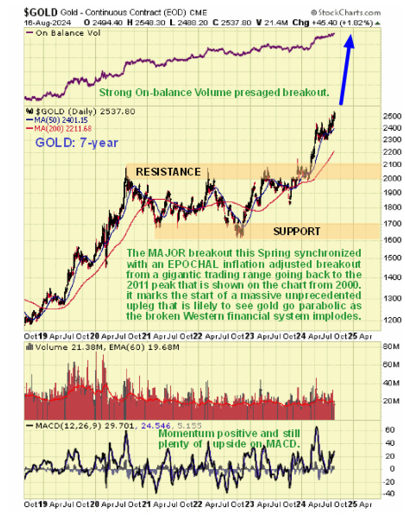
Armed with the understanding gleaned from gold’s very long-term chart we can put the action of recent years into context. So on the 7-year chart, we can see that the reason it kept “hitting a wall” at $2100, which started with the 2020 peak, was that it was bumping up against the top of the giant upsloping range that we delineated on the very long-term chart, and waiting for things to get bad enough for it to break higher into the next major upleg, which it has now clearly done. The reason that the gold price spluttered sideways over the past several months is that it stopped to consolidate the March – April breakout which resulted in an extremely overbought condition as shown by its MACD indicator. Now that this has unwound it is starting higher again and as it advances away from the trading range, the rate of advance is likely to accelerate.
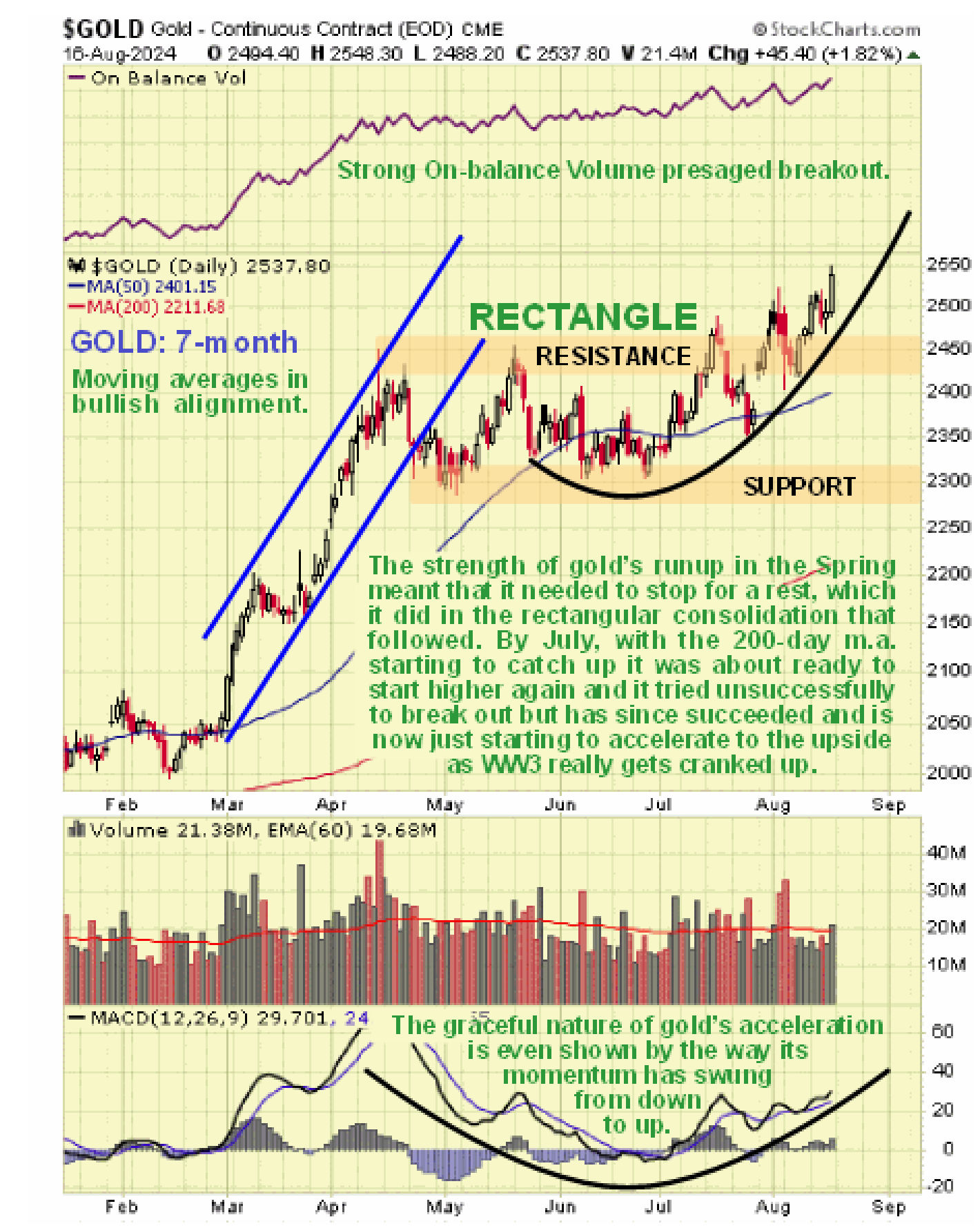
 The shorter-term 7-month chart is very useful as it helps us to appreciate that the new upleg that is following on from the consolidation into June – July is now well underway with the price making new highs, but is still in its earliest stages with the parabolic uptrend shown set to slingshot gold higher. Everything on this chart supports continued and accelerating advance – the new highs, the moving averages being in bullish alignment, the strong On-balance Volume line also making new highs and improving momentum with the MACD showing that there is plenty of room for continued gains.
 Investors can therefore buy gold and most gold-related investments with confidence.
About the author
