As on occasion we do, let's start with stocks, in opening with one of our infamous pop quizzes: Ready?
The day before it all went wrong for the Silly Con Valley bank was 08 March. The S&P 500 settled that date at 3992, after which came Silly, Signature, First Republic, Credit Suisse, Deutsche Bank and "Who's Next?" --['71] The quiz question is: given all the subsequent hand-wringing and fear mongering, in tow how low did the S&P go?
A) No less than -5%
B) Lower than -7%
C) Lower than -9%
D) It only went higher
E) It never re-opened after 08 March
F) It is never going to re-open
G) "Do we get fries with that?"
H) All of the above
I) None of the above
Clearly "A" is the only correct answer, the S&P down no less than -4.6% (to 3809 intra-day on 13 March). Astute followers understand there was no imminent crash because "conventional wisdom" was primed for a crash. And 'twas all there waiting in the media blitz from a "Monday Market Massacre" to "Financial Market Wreckage". Rather, the S&P per yesterday's (Friday's) settle sits at 3971, an essentially immaterial -0.5% net loss dating back to 08 March. But at the other extreme, beware the "Nothing to see here" crowd.
We've yet to have the crash. Oh to be sure, 'tis coming under our newly revised moniker of the "Look Ma! No Money!" crash. But it shan't commence until our MoneyFlow differential for the S&P 500 swings from its still firmly positive state to that which is negative, (updated later below from a week ago, as 'tis daily at the website). Thus the S&P nets inflow.
"But again, what does 'No Money!' mean, mmb?"
Simple, Squire: the market capitalization of the S&P 500 per yesterday's (Friday's) settle is $34.6T whereas the StateSide liquid Money Supply ("M2" basis) is only $21.0T. Thus marked-to-market, one may be worth millions; however marked-to-reality, one ain't worth diddley-squat, (unless one cashes-out before everyone else).
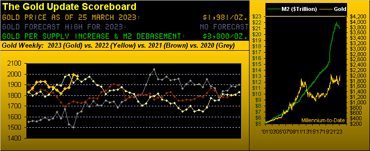
But then there's Gold: Good Old Gold! (For which 'tis said 'twill make you old). And old Hobson did its thing when a week ago Gold closed on its daily (and in that case weekly) high, for which we penned: "...a so-called 'Hobson Close', i.e. price closing on its high ... The technically-oriented Hobson purest takes such occurrence as a 'sell signal'..." And just like that, Gold having then closed at 1994 dropped like a stone to an intra-week low of 1937 (-2.9%). Yet come Wednesday, the Fed tipped its expected hand (+25bp), but the Treasury took a stand (no intention to extend bank bailout parameters), and resilient Gold regained upside land in settling this week at 1981, (albeit off a wee -0.6% or -13 points).
Of more import (as herein inferred a week ago), coming out of the woodwork are more otherwise non-Gold folks, their broaching the subject with texts to us as simple as "How's Gold?" Interest in Gold is growing even as interest rates also grow, (but as you already know that doesn't stop Gold when it decides to go).
Which got us to thinking: back when The Gold Update was conceived in 2009, we regularly heard from a well-placed investment banker that only some 5% of managed portfolios had exposure to Gold (i.e. some 1 out of 20 clients). Then from the depths of the Black Swan's FinCrisis as the S&P recovered, corporate earnings became meaningless -- as long as they beat "estimates" --, "Me!-Me!" stocks became the rage, and Gold got relegated to relic status to be replaced with cryptocrap. In turn, that 5% of portfolio Gold exposure has purportedly dropped today to just 0.5% (i.e. some 1 out of 200 clients). We don't really know from where these summarized portfolio percentages come, but clearly Gold ownership has been less representative from what is was some 14 years ago. But now with growing sensitivity to bank blowups, the question becomes: is that 0.5% of portfolio Gold ownership to grow? We sense so. To wit below:
From pre-COVID-to-date, this graphic shows discrete (rather than cumulative) snapshots of Gold's moneyflow (the green bars) taken every 21-days (a trading month). The Gold line is price on the day each snapshot is taken. And the rightmost six moneyflow bars with ascending price tell the story: between those two red lines we've Gold's best price move (+319 points) in tandem with steady (instead of erratic) increasing monetary inflow. Folks are buying Gold as banking cracks unfold, (rather than on price spikes due to COVID or RUS/UKR all told):
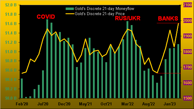
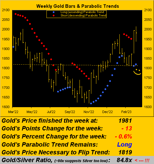
Yes, the COVID spike brought Gold to as high as 2089 and the RUS/UKR war to as high as 2079, those levels not reflected in the above chart as price is shown in 21-day discrete snapshots. But our next chart is remindful of our anticipating Gold to rise further still into the mid-2100s, indeed 'round mid-year if not sooner, price's fresh blue-dotted parabolic Long trend having competed its second week. Also note that the dashed linear regression trend line across the whole series has almost rotated back to positive, which it has not been for the past 28 weeks (since that ending last 09 September). Now that's something about which to smile:
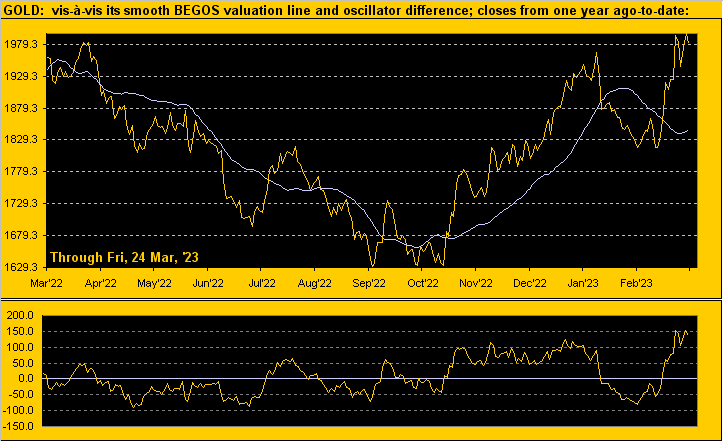
'Course to be fair, we offer this from the "Markets Don't Move in a Straight Line Dept." The following graphic (from both the website's Gold page and its Market Values page) depicts the daily closing price of Gold from one year ago-to-date. The smooth grey line is a valuation for Gold, the notion being where price "ought be" by its movement relative to that of the four other components that comprise the five primary BEGOS Markets (Bond / Euro / Gold / Oil / S&P). And whilst penetration by price of the smooth line is the side upon which to be (notwithstanding our long-time saying that "shorting Gold is a bad idea"), when price deviates unusually far from valuation -- as shown in the lower panel of price less valuation -- a pause if not a recoil can be expected. And at this writing, Gold shows as +137 points "high", i.e. price is somewhat stretched, (which in itself can be viewed as very positive). Still, a bit of pullback shan't refrain us from more broadly singing "Let the Gold times roll!":
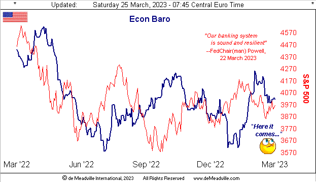
But not rolling so well of late is the Economic Barometer, albeit this past week was quite scant of incoming metrics, the attention grabbers otherwise being the Fed, the Treasury and bank illiquidity. But peeking ahead to next week, look for the Baro to work lower given consensus readings on balance are worse than prior period results:
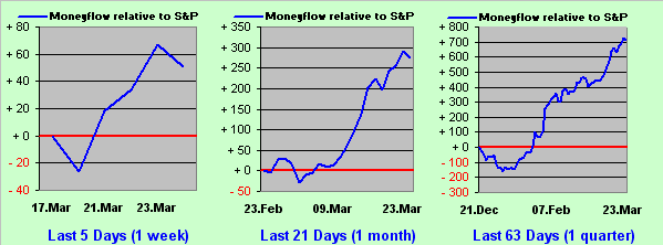
As for the S&P 500 itself, we alluded earlier to its "MoneyFlow differential" being positive to changes in the Index itself. So as we similarly showed a week ago, here next is the updated three-panel graphic. And for all three time frames, the blue line -- which is the difference be between the cumulative changes in the S&P and its actual MoneyFlow regressed into S&P points -- is positive across the board. Seems impossible given the S&P's "live" price/earnings ratio having settled yesterday at 46.1x; but dough has been flowing into the S&P. One wonders if money is being pulled from commercial banks and placed into investment banks such that it ultimately ends up in the stock market. After all, we've herein written for years that the stock market has become the Great American Savings Account. We remember when "savings accounts" were supposed to be safe. "Not anymooorrre..." --[Chief Inspecteur Clouseau]. Either way, here's this "leading indicator" graphic:
Which in turn leads us to our two-panel graphic for Gold. On the left we've the daily bars from three months ago-to-date along with the baby blue dots of trend consistency: note yet again the phenomenon of Gold rising faster than it falls. On the right is Gold's 10-day Market Profile, suggesting the 1980 apex is a critical level to hold near-term, lest price pullback to the 1911 apex:

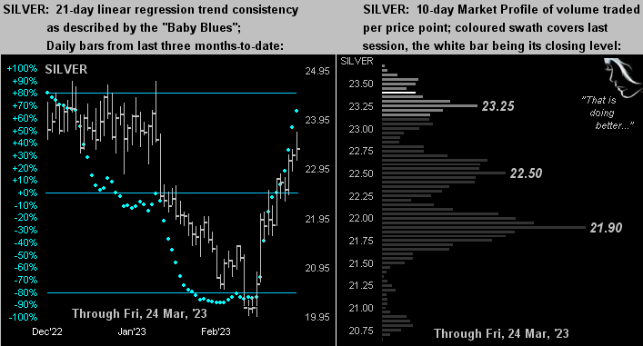
And here is the like graphic for Silver for whom the last three weeks have finally found her trying to catch up to Gold. Indeed, the Gold/Silver ratio -- which just 11 trading days ago (on 09 March when Silly et alia went over the cliff) was 91.2x -- has narrowed to now 84.8x, Silver today priced at 23.37. Further, were Silver to revert to the ratio's mean (67.4x), she'd be priced today at 29.38 ... just in case you're scoring at home. "Got Silver?"
We'll close with this annoying observation. Over here, the 24/7 news is akin to watching a live sequel of the epic film from back in '66 "Is Paris Burning?" --[Marianne/Transcontinental/Paramount]. Having to work two additional years (from 62 to now 64 such as to gain one's pension) has led to inner-city unrest and damage, garbage piling up, transit dilemmas, lack of fuel, etc. Down here, folks are driving over to Italy just to get petrol. We wonder if to pay for it all, France shall up the retirement age yet another two years to 66... As for the old film from that year, what a Golden cast: Belmondo, Boyer, Caron, Delon, Douglas, Ford, Fröbe (Goldfinger!), Montand, Perkins, Signoret, Stack and even Orson Welles!
So before you're too old, cast your net over Gold!

Cheers!
...m...
About the author