
“In the long run we are all dead.”
—John Maynard Keynes, British economist, 1st Baron Keynes CB FBA, Opus – The General Theory of Employment, Interest and Money (1936); 1883–1946
“Economics has never been a science—and it is even less now than a few years ago.”
—Paul A. Samuelson, American economist, Nobel prize winner, contributed to the mathematical foundations of economics, book – Foundations of Economic Analysis; 1915–2009
“Stock prices have reached what looks like a permanently high plateau.”
—Irving Fisher (three days before the 1929 crash), American economist, statistician, inventor, eugenicist, progressive social campaigner, neoclassical school of economics; 1867–1947
The most hated stock market rally in the world just keeps on going higher. Will anything stop it? Or do we now take our cue from Irving Fisher whose quote is above? Or is our cue from economists Carmen M. Reinhart & Kenneth S. Rogoff who wrote a book entitled, This Time is Different – Eight Centuries of Financial Folly? We can’t take our eyes off it. Or, it seems, take your money out of it. Assuming your money is in it as many investors are still sitting on a “mountain” of cash that’s under-invested.
After all, how is one to believe the stock market with upwards of 30 million unemployed, a pandemic still in progress, and riots and protests continuing on the streets against the backdrop of an extremely contentious, divisive election now just 64 days away. And dare we mention the hurricanes that hit the coast of Louisiana and Texas, along with wildfires in California causing billions in damage.
But up it is going, with the potential for this to turn into a runaway if the cash on the sidelines panics and decides they have to get in. The non-confirmations in this market are starting to fall. Yes, it is the NASDAQ that has led the way, thanks to what one pundit is now calling the FANGMAN (Facebook, Apple, Nvidia, Google, Microsoft, Amazon, Netflix). What, couldn’t they get Tesla in there too? All have been hitting all-time-highs and their combined market cap is approaching $8 trillion. Our chart below shows the FANGMANs. These seven stocks make up over 25% of the market. As to the other 75%—does it matter?
With the NASDAQ leading the way to all-time highs, the S&P 500 recently joined the party. No surprise that the S&P 100 (OEX) and the NASDAQ 100 are also in record territory. But now joining the party are the Wilshire 5000 and the Russel 1000 and 3000. But the laggards are many, including the Dow Jones Industrials (DJI), the Dow Jones Transportations (DJT), the Dow Jones Utilities (DJU), and the Dow Jones Composite (DJC). Small caps are major laggards and that includes the S&P 400 and 600, the Russel 3000, the AMEX, and the NYSE Composite. The Value Line Composite is also short as is the S&P 500 equal-weighted that remains down on the year. Oh yes, and the TSX Composite is also well short of a new all-time high. Non-confirmation divergences are a major bugaboo as the averages are supposed to confirm each other. But the bulls don’t care when the market has tagged on over 50% from the March lows. So, as money and portfolio managers must know, do you compare your performance to the TSX Composite or to the NASDAQ?
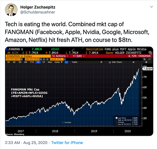
Source: Holger Zschaepitz@Schuldensuehner on Twitter, www.bloomberg.com, www.sevenfigurepublishing.com
The S&P 500 sub-sectors are very similar to the TSX. However, they have 11 major sub-sectors vs. the TSX’s 14. Missing are Golds, Metals & Mining, and Income Trusts. But of the 11 sub-sectors of the S&P 500, five have not made new all-time highs including Energy, Financials, Industrials, Real Estate, and Utilities. That’s no surprise as those sectors have remained weak in the TSX as well.
So, what’s going on that the stock markets (Wall Street) are making all-time highs while Main Street wallows in sharply rising inequality, protests, and a pandemic? Oh yes, the Fed is propping up the market. The president is chortling what a great president he is because of his handling of the pandemic and how his policies have the stock market rising—as he sends more police/troops to quell the protests. How can the stock market be so seemingly detached from the fundamentals? Well, throw lots of money at it. As to the bears—well, only they know they are wrong, but a reminder there is nothing more dangerous then a wounded bear. The bulls? Well, they are gloating about how brilliant they are as they charge ahead.
We are reminded once again that, with consumer confidence plunging, stock markets usually don’t survive if Main Street is depressed. The most recent consumer confidence numbers underscore that reality. The Conference Board’s Consumer Confidence Index fell to 84.8, the lowest level since 2014. The market had expected a reading of 93 vs. the previous month’s 91.7. We also can’t help but notice that the number of retail closures is growing, maybe even exponentially. The expectation now is that there could be upwards of 20,000 to 25,000 closures in the U.S. in 2020. That’s over twice as many as were seen in 2019 and over three times as many from 2018. While much of the buying has shifted to the internet, the resulting closures are leaving malls without tenants, including anchor tenants. Could shopping malls go the way of the dodo bird?
Consumer Sentiment and the Dow Jones Industrials 1995-
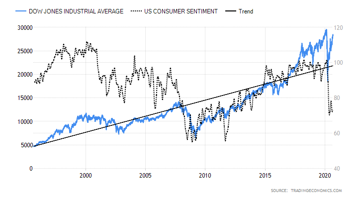
Source: www.tradingeconomics.com
Can the stock market survive when everything else appears to be unraveling? The central banks are trapped. Their attempts to stimulate the economy through quantitative easing and suppressed interest rates have only resulted in a stock market bubble. The debt has grown enormously in an attempt to keep the economy afloat and prevent millions from becoming homeless and living like squatters in the favelas and slums we see in Latin America. The debt that can be monetized is a burden that can never be repaid. Inflation could make the debt disappear, something the Fed now appears to be willing to accept, given Fed Chairman Jerome Powell’s comments from the Jackson Hole symposium. But how can you get inflation with interest rates near zero? Irrespective of that, if inflation did rise it would be good for the stock market but not necessarily for the economy if it triggered even a mild rise in interest rates from the current low levels.
Given the rise to new all-time highs by some of the indices at least, it does remind of us in some ways of the 1987–1990 market. At the time the 1987 stock market crash stood out as one of the shortest bear markets in history. Everyone was expecting a recession to quickly follow—except it never happened. The stock market began an irregular recovery, even as it took to 1989 to fully recover the August 1987 highs. The final top came in October 1989, although the nominal top (slightly higher high) was not seen until July 1990. A combination of Gulf War 1 and a sharp spike in the price of oil helped trigger a drop of 20% over the next three months to a low in October 1990. A relatively shallow recession followed into the early 1990s.
S&P 500 1987–1990
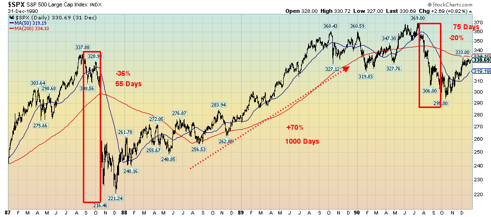
Source: www.stockcharts.com
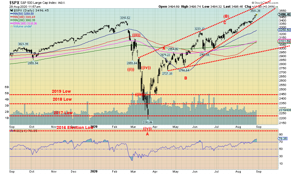
Between the end of the stock market crash of 1987 and the top in 1990, the S&P 500 rose 70%. A comparable rise today could take the S&P 500 to over 3,700. That cannot be ruled out. The February/March 2020 collapse lasted a mere 33 days, surpassing the 55 days of the August/October 1987 crash. The drop in 2020 was 35% comparable with the 36% drop of the S&P 500 in 1987. So far, the S&P 500 has regained 59% so it is not a stretch to suggest that a gain of 70% is impossible. The S&P 500 is plowing higher and it is dragging other indices up with it. However, as our chart of the S&P 500 shows, the RSI is now well over 70 and numerous other indices, particularly the DJI and DJT, have not confirmed the record high for the S&P 500 nor the NASDAQ. The Investors Intelligence Advisors’ Survey is showing the highest extreme in bullish sentiment since January 2018. The stock market, as one pundit put it, is over-believed, over-bought, and over-internally divergent. Nonetheless, it continues to go higher, putting truth to the statement that the market can keep on going higher even as the bears go bankrupt.
Yet it keeps going up. And if all that cash on the sidelines panics and decides it has to get in then it could spark an even sharper rise. However, in 1987 there wasn’t a pandemic and the U.S. wasn’t as divided politically and socially as it is today. There were no riots and protests on the streets. And while the Fed came to the rescue in 1987, it was not to the extent that it has today. The political and social divisions have become so entrenched some analysts are suggesting not only could the U.S. fall into civil war, but it could lead to the breakup of the U.S.
Countries breaking up is not unusual, even countries that are 244 years old. The Roman Empire lasted 312 years (27BC to 285AD) before it was split into two parts—the Eastern Roman Empire which eventually became the Byzantine Empire and the Western Roman Empire. By 476 AD the Western Roman Empire had also collapsed. Recent examples of countries breaking up include the Soviet Union (1922–1991) and Yugoslavia (1918–1992), although clearly both lasted for a shorter time than the U.S. has. The U.S. also has a history of splitting up, as witnessed by the creation of the Confederate States of America (1861–1865). The U.S. fought a civil war that killed between 600,000 and 850,000. The memory of that civil war lives on with today’s deep political and social divisions.
Source: www.stockcharts.com
MARKETS AND TRENDS
|
|
|
|
% Gains (Losses) Trends
|
|||||
|
|
Close Dec 31/19 |
Close Aug 28/20 |
Week |
YTD |
Daily (Short Term) |
Weekly (Intermediate) |
Monthly (Long Term) |
|
|
Stock Market Indices |
|
|
|
|
|
|
|
|
|
S&P 500 |
3,230.78 |
3,508.01 (new highs) |
3.3% |
8.6% |
up |
up |
up |
|
|
Dow Jones Industrials |
28,645.26 |
28,653.87 |
2.6% |
0.4% |
up |
up |
up |
|
|
Dow Jones Transports |
10,936.70 |
11,322.00 |
3.5% |
3.9% |
up |
up |
up |
|
|
NASDAQ |
9,006.62 |
11,695.53 (new highs) |
3.4% |
30.4% |
up |
up |
up |
|
|
S&P/TSX Composite |
17,063.53 |
16,705.79 |
1.1% |
(2.1)% |
up |
up |
up |
|
|
S&P/TSX Venture (CDNX) |
577.54 |
745.31 |
2.1% |
29.1% |
up |
up |
up |
|
|
S&P 600 |
1,021.18 |
912.02 |
1.9% |
(10.7)% |
up |
up |
up |
|
|
MSCI World Index |
2,033.60 |
1,913.79 |
1.7% |
(5.9)% |
up |
up (weak) |
neutral |
|
|
NYSE Bitcoin Index |
7,255.46 |
11,442.41 |
(2.5)% |
57.7% |
up |
up |
up |
|
|
|
|
|
|
|
|
|
|
|
|
Gold Mining Stock Indices |
|
|
|
|
|
|
|
|
|
Gold Bugs Index (HUI) |
241.94 |
348.72 |
3.5% |
44.1% |
up |
up |
up |
|
|
TSX Gold Index (TGD) |
261.30 |
382.36 |
1.7% |
46.3% |
up |
up |
up |
|
|
|
|
|
|
|
|
|
|
|
|
Fixed Income Yields/Spreads |
|
|
|
|
|
|
|
|
|
U.S. 10-Year Treasury yield |
1.92 |
0.74 |
15.6% |
(61.5)% |
|
|
|
|
|
Cdn. 10-Year Bond yield |
1.70 |
0.64 |
16.4% |
(62.4)% |
|
|
|
|
|
Recession Watch Spreads |
|
|
|
|
|
|
|
|
|
U.S. 2-year 10-year Treasury spread |
0.34 |
0.60 |
20.0% |
76.5% |
|
|
|
|
|
Cdn 2-year 10-year CGB spread |
0 |
0.36 |
38.5% |
3,600.0% |
|
|
|
|
|
|
|
|
|
|
|
|
|
|
|
Currencies |
|
|
|
|
|
|
|
|
|
US$ Index |
96.06 |
92.37 |
(0.9)% |
(3.8)% |
down |
down |
down |
|
|
Canadian $ |
0.7710 |
0.7640 |
0.8% |
(0.8)% |
up |
up |
up |
|
|
Euro |
112.12 |
119.01 |
0.9% |
6.1% |
up |
up |
up |
|
|
Swiss Franc |
103.44 |
110.57 |
0.8% |
6.9% |
up |
up |
up |
|
|
British Pound |
132.59 |
133.50 |
2.0% |
0.8% |
up |
up |
up |
|
|
Japanese Yen |
92.02 |
94.90 |
0.4% |
3.1% |
up |
up |
up |
|
|
|
|
|
|
|
|
|
|
|
|
Precious Metals |
|
|
|
|
|
|
|
|
|
Gold |
1,523.10 |
1974.90 |
1.4% |
29.7% |
up |
up |
up |
|
|
Silver |
17.92 |
27.79 |
4.0% |
55.1% |
up |
up |
up |
|
|
Platinum |
977.80 |
940.0 |
1.5% |
(3.9)% |
neutral |
up |
up |
|
|
|
|
|
|
|
|
|
|
|
|
Base Metals |
|
|
|
|
|
|
|
|
|
Palladium |
1,909.30 |
2,231.50 |
2.4% |
16.9% |
up |
up |
up |
|
|
Copper |
2.797 |
3.02 (new highs) |
3.4% |
8.0% |
up |
up |
up |
|
|
|
|
|
|
|
|
|
|
|
|
Energy |
|
|
|
|
|
|
|
|
|
WTI Oil |
61.06 |
42.97 |
1.5% |
(29.6)% |
up |
up |
up |
|
|
Natural Gas |
2.19 |
2.66 (new highs) |
3.5% |
21.5% |
up |
up |
up |
|
Source: www.stockcharts.com, David Chapman
Note: For an explanation of the trends, see the glossary at the end of this article.
New highs/lows refer to new 52-week highs/lows.
Chart of the Week
Source: www.stockcharts.com
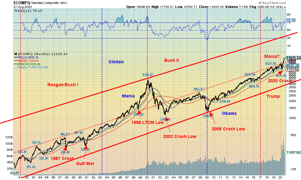
Could the NASDAQ and, by extension, the rest of the stock market be poised to enter another mania phase comparable to what was seen 1995–2000? This question was raised recently by Rambus Chartology (www.rambus1.com). We have simplified the chart above that we saw at Rambus Chartology for ease of reading. The NASDAQ has been in a long rising bull channel during its 49-year history that began back in 1971. That’s not surprising, given that all stock markets have been in rising bull channels over time. What’s interesting about the above chart is that most of the time the NASDAQ has been in the lower bull channel. One can draw a line along the highs seen during the 1980s and it connects up well with the tops during the 2000s and again the more recent tops. That is, until now when the NASDAQ, coming out of the March 2020 pandemic crash lows, appears to have busted out into the upper channel. It did that only once before: in 1995–2000 during the dot.com/high-tech mania. Rambus notes in his lengthy technical article entitled Stock Markets Part 1: The History Chart of the End of the World (With Presidential Cycles) (https://goldseek.com/article/stock-markets-part-1-history-chart-end-world-presidential-cycles) that technical formations are forming in other indices that could eventually confirm the breakout in the NASDAQ. It is a fascinating premise and, of course, very bullish for stocks going forward. We do note that after breaking out in 1995 there was a test of the breakout line with the 1998 Russian default/LTCM crash. No doubt a set-up is coming that will test the breakout line before the possible mania resumes. Long-term support appears to be around 9,800-10,000 on the NASDAQ. We’ll look at other markets, including gold, in the same manner. Long-term charts can be revealing for the big picture.
Could the NASDAQ and, by extension, the rest of the stock market be poised to enter another mania phase comparable to what was seen 1995–2000? This question was raised recently by Rambus Chartology (www.rambus1.com). We have simplified the chart above that we saw at Rambus Chartology for ease of reading. The NASDAQ has been in a long rising bull channel during its 49-year history that began back in 1971. That’s not surprising, given that all stock markets have been in rising bull channels over time. What’s interesting about the above chart is that most of the time the NASDAQ has been in the lower bull channel. One can draw a line along the highs seen during the 1980s and it connects up well with the tops during the 2000s and again the more recent tops. That is, until now when the NASDAQ, coming out of the March 2020 pandemic crash lows, appears to have busted out into the upper channel. It did that only once before: in 1995–2000 during the dot.com/high-tech mania. Rambus notes in his lengthy technical article entitled Stock Markets Part 1: The History Chart of the End of the World (With Presidential Cycles) (https://goldseek.com/article/stock-markets-part-1-history-chart-end-world-presidential-cycles) that technical formations are forming in other indices that could eventually confirm the breakout in the NASDAQ. It is a fascinating premise and, of course, very bullish for stocks going forward. We do note that after breaking out in 1995 there was a test of the breakout line with the 1998 Russian default/LTCM crash. No doubt a set-up is coming that will test the breakout line before the possible mania resumes. Long-term support appears to be around 9,800-10,000 on the NASDAQ. We’ll look at other markets, including gold, in the same manner. Long-term charts can be revealing for the big picture.
Source: www.stockcharts.com
Since our chart of the S&P 500 was featured in our main report, we’ll only look at the NASDAQ. Markets continued their record climb this past week. Well, at least some continued to make records. The S&P 500 was one with a gain of 3.3%, as was the NASDAQ, up 3.4%. Of the remainder we follow regularly, the Dow Jones Industrials (DJI) gained 2.6% while the Dow Jones Transportations (DJT) was up 3.5%. Both indices are closing in on record highs. Both the DJI and the DJT have turned positive on the year. To repeat the others that have joined the S&P 500 and the NASDAQ in record territory are the NASDAQ 100, the Dow Jones Composite (DJC), the S&P 100, the Wilshire 5000, and the Russel 1000 and 3000. The main small cap index we follow, the S&P 600 gained 1.9% on the week but is still down 10.7% on the year. The S&P 500 equal-weighted index gained 2.8% but Bitcoin lost 2.5%.
Elsewhere, the TSX Composite was up 1.1% and, the TSX Venture Exchange (CDNX) gained 2.1%. In the EU, the London FTSE lost 0.9%, but the Paris CAC 40 was up 2.2% and the German DAX gained 1.9%. In Asia, China’s Shanghai Index (SSEC) was up 0.7% but the Tokyo Nikkei Dow (TKN) lost 0.2%. The World MSCI Index gained 1.7%.
It was in some ways a record month. The S&P 500 gained 7%, the best performance for August since 1984. The S&P 500 is up 13% since the end of June. It was an interesting week with the Fed dropping its guidelines for inflation to focus on job recovery. This sparked a hike in bond yields. But, given that the Fed is unlikely to hike short rates, all it did was widen spreads while still leaving negative interest rate yields. The Dow Jones Indices announced a change with Exxon, Raytheon, and Pfizer being booted out and Salesforce, Amgen, and Honeywell joining. That could cause some gyrations for the DJI come Monday, August 31 when all this takes effect. Exxon and Raytheon are down 41.7% and 29.5% in 2020. Exxon is also the oldest DJI component. A previous study shows that DJI stocks booted out gain roughly 17% in the following year.
Records continued to fall. Of the biggies Facebook, Apple, Amazon, and Google all hit all-time highs—again. Tesla did as well. The rich just keep getting richer.
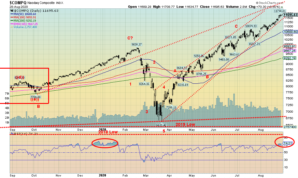
Markets are very extended with the RSI over 70. The S&P 500 and NASDAQ are at the farthest spread to the 200-day MA than at any time over the past decade. As we note below, the AD line is diverging and the put/call ratio is overwhelmingly in favour of calls. August/September is supposed to show seasonal weakness. Well, it wasn’t weak in August, so maybe September will see a decline. As well, with the most divisive election in U.S. history due in barely two months, that could also weigh on the stock markets. In other words, investors shouldn’t be surprised at a drop. But will it be a pullback or something more serious. It has been a “risk on” market since March with barely a pause. Of course, the Fed has be extremely accommodating with massive growth in the Fed’s balance sheet and sharply rising money supply (M2). It is not surprising that the market has taken off. The Fed has made it clear it will remain in easy accommodating mode for years. All this could lead to a mania market followed by a crash.
This week sees the release of the August jobs report. Market expectations are a gain of 1.4 million; however, many economists are already downgrading that number. The unemployment rate forecast (U3) is a rate of 10.2% to 10.7% vs. 10.9% last week. Canada will also release their employment report, looking for a gain of 300,000. None of these gains would bring either the U.S. or Canada back to where they were in February. Over the past week we have seen announcements of pending job layoffs of upwards of 200,000. More could follow. That suggests that future job reports may be less rosy.
Markets continue to climb although there are overhead channels looming. For the S&P 500 there is potentially very strong resistance up to 3,600. For the NASDAQ there is room to climb to 12,200. The breakdown point for the S&P 500 is at 3,400, followed by 3,300. Major support is at 3,000. For the NASDAQ, a break would occur at 11,400 but it would take a breakdown under 10,200 to suggest that a deeper correction may be underway. The 200-day MA for the NASDAQ is way down at 9,300 and for the S&P 500 it is at 3,100.
This has been a very powerful bull market, given that most days are up 80% of the time. While there are numerous divergences and warning signs, they are just that—divergences and warning signs. They do not signal the end of the bull. Speculative buying is endemic, particularly call options in the big tech names that have led the way. History will eventually give this bull a name but, in the end, it may be remembered more for how it ended. And they do end eventually—sometimes dramatically. However, as our chart of the week suggests, we may still be in the early stages of a mania. Even a 1998-type pullback (20%) could shake a few but merely set up another big buying opportunity. As the Fed is inclined to do, throw trillions of dollars at it and, damn, it just might make it go up. Thirty million unemployed (with more to come), a divisive election, and protests and riots are all “who cares” as the long as the stock market goes up.
Source: www.stockcharts.com
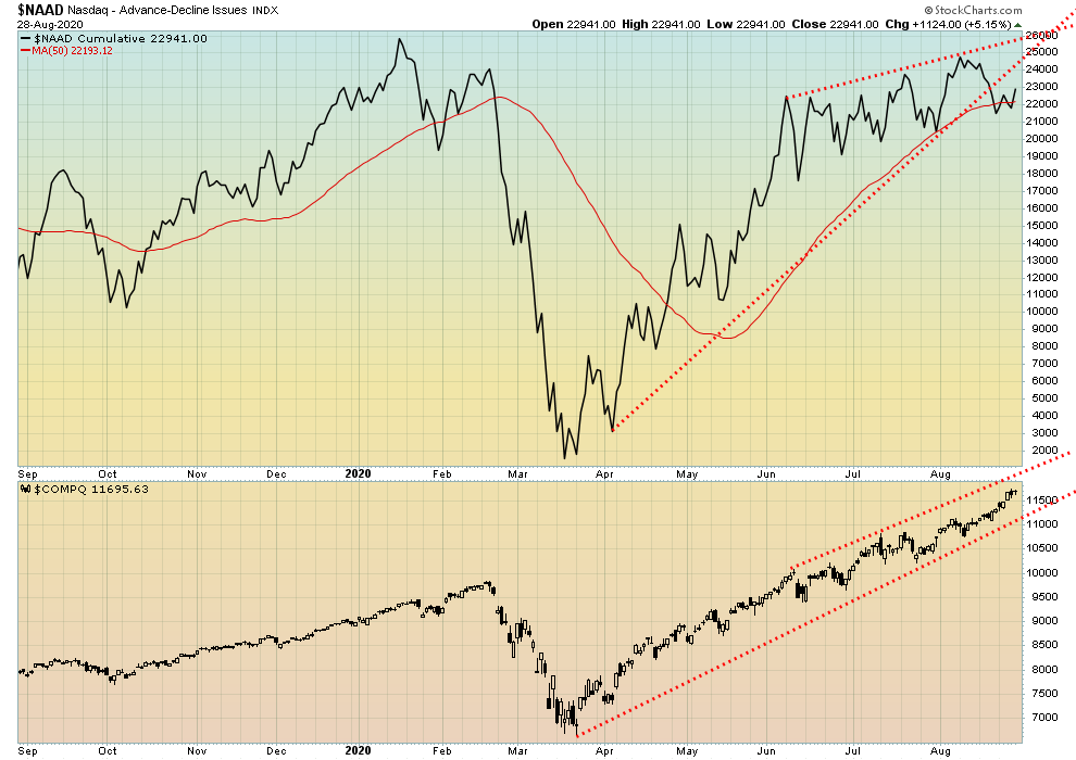
It has taken some time, but the NYSE advance/decline line is finally diverging with the market. Does this signal the end of the bull? That won’t be confirmed until the S&P 500 turns down or, as in the case above, the NASDAQ turns down and breaks under 11,000. Still, we believe this divergence is important because the rising advance/decline line into record territory has been one of the major chimes of the bulls. No, it has not given us a sell-signal nor is it a sell-signal. We treat divergences as warnings. We are now being duly warned that this market could be forming a top.
Source: www.stockcharts.com
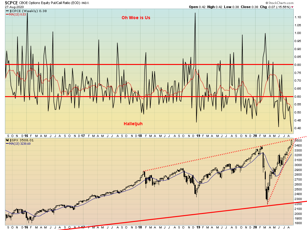
Wow, the CBOE put/call ratio just made a record low this past week at 0.39 with a heavy weighting of calls to puts. Is there a bear left alive? This is not a market where one should be buying. The warning is there, but will anyone heed it?
Source: www.stockcharts.com
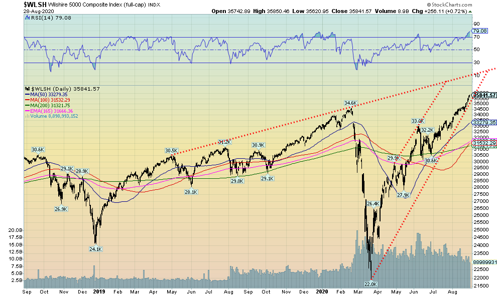
The Wilshire 5000 Composite is the broadest trading stock market of publicly traded U.S. companies. There are currently around 3,500 stocks in the Wilshire, although it has held 5,000 in the past and at one time had over 7,500 in the index. It is a market cap index so it gives higher weighting to major stocks like the FAANGs. They have helped propel the Wilshire into record territory as the Wilshire has joined the NASDAQ and the S&P 500 at record breaking levels. And, yes, the Wilshire could go still higher to the top of that channel near 38,000. Indicators are in overbought territory but that is just a warning. First break comes under 34,500 while the second breakdown would come under 32,500.
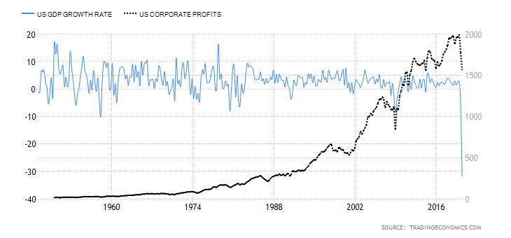
U.S. GDP Growth Rate and Corporate Profits Q2 2020
Source: www.tradingeconomics.com, www.bea.gov
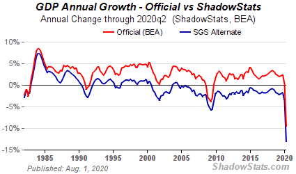
The U.S. Bureau of Economic Analysis reported that the U.S. economy sunk by an annualized rate of 31.7% in Q2 Mar–Jun 2020 vs. a drop of 5.0% in Q1. This was below the forecast of a 32.5% plunge and below the first estimate of 32.9%. Corporate profits sunk at a rate of 11.8% in the same quarter following an 11% drop in Q1. It was the sharpest decline since Q4 2008. The U.S. economy sunk primarily because of the pandemic as it impacted businesses, restaurants, cafes, stores, and factories as business slowed and people stayed home, negatively impacting consumer and business spending. As a result, forecasts are now for a 6.5% contraction for 2020. On a year-over-year basis, the U.S. economy fell 9.5%. Shadow Stats (www.shadowstats.com) showed a drop of 13.1%. Except for a brief period in 2003–2004, Shadow Stats shows that the U.S. has been in an ongoing rolling recession since Q4 2000. For corporations, undistributed profits plunged 50.5% while internal funds available were down 10.6%. Net dividends fell 0.6%.
Source: www.shadowstats.com
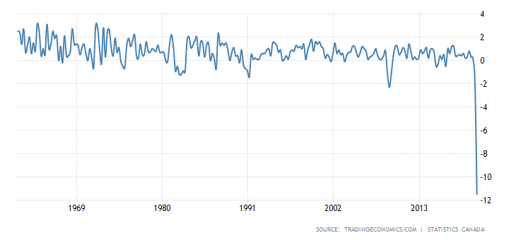
Canada GDP Growth Rate Q2 2020
Source: www.tradingeconomics.com, www.statcan.gc.ca
Canada’s economy sunk at an 11.5% rate in Q2 Mar-Jun. It was the most on record and followed a 2.1% decline in Q1. Consumer spending, business investment, imports, and exports all fell, primarily due to the pandemic. When one annualizes that, it is a 38.7% contraction and the steepest decline on record dating back to 1961. It just pummelled all previous reports. For the consumer household, spending plunged 13.1% in response to job losses and a lack of places to spend due to store closures, and as well travel suffered as one couldn’t fly. Exports fell 18.4% and imports were down 22.6%. Even government spending was down 2.7% following a 0.3% drop in Q1. Meanwhile, the TSX was up 16.0% in Q2 although the TSX remains down on the year.
Source: www.stockcharts.com
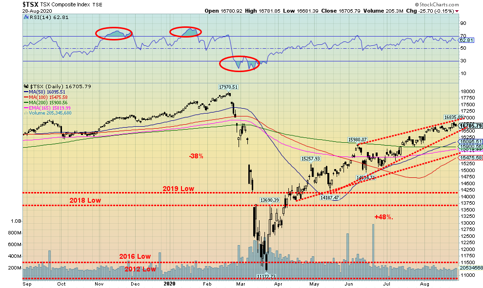
The TSX Composite continued its recent slow rise, gaining 1.1% this past week. The small cap TSX Venture Exchange (CDNX) continued its rise with a gain of 2.1%. The CDNX has been one of the better performing indices, up 29% so far in 2020. Grant you, it is coming from pretty depressed levels, having reached a multi-year record low in March 2020 at 331. Since then the CDNX has more than doubled and appears poised to move even higher. The TSX remains short of its February 2020 all-time high. Indeed, it has struggled just to hold itself above the 200-day MA. A possible rising wedge pattern is also not helpful. A break under 15,900 would be negative, and a breakdown under 15,500 could send the TSX into bear market territory. The record was quite mixed this past week. While nine of the TSX sub-indices were up on the week, the gains weren’t particularly rousing. Leading the way was the heavily weighted Financials (TFS), up 3.8% on the week. Health Care (THC) was up 2.3% and Energy (TEN) gained 2.7%, those two being the only other ones with gains over 2%. Of the losers, Consumer Staples (TCS) surprised to the downside, losing 3.2%. One sub-index was flat, Industrials (TIN).
The failure of the TSX to gain much traction following its break over the 200-day MA, declining volume, and a possible ascending wedge forming makes us somewhat cautious going forward. Only 60% of the TSX component stocks are trading above the 200-day MA. Bullish sentiment is at 81%, high but not extreme. Still the TSX is grinding higher. A break of 16,500 would be the first sign of trouble. After that, under 15,400 would suggest the TSX has entered a bear market. Still, select sectors should do well. We continue to be positive on Golds (TGD), Metals (TGM), Materials (TMT), and Info Tech (TKK).
Source: www.ourworldindata.org/coronavirus
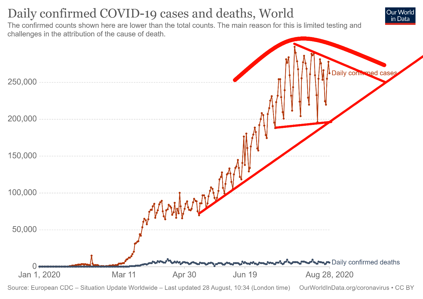
The world is still recording far too many cases each day. Every day there are 250,000 to 300,000 cases. Leadership has changed, however, as India has now moved into first place for cases, surpassing both the U.S. and Brazil. The world adds roughly a million cases every four days. At current rates, we are looking at upwards of 60 million cases by year end and 1.5 million deaths. The uptrend remains intact. But could we be forming a top? Or is this merely an incomplete triangle forming. Patterns like this can either be consolidation patterns or topping patterns. If we broke under 200,000 cases daily, we’d be establishing a downtrend. On the other hand, if we started breaking over 275,000 cases daily, we could be starting a new uptrend in cases and probably deaths as well.
As at Saturday August 29, 2020 22:56 GMT
Number of cases: 25,140,903
Number of deaths: 845,521
Source: www.ourworldindata.org/coronavirus
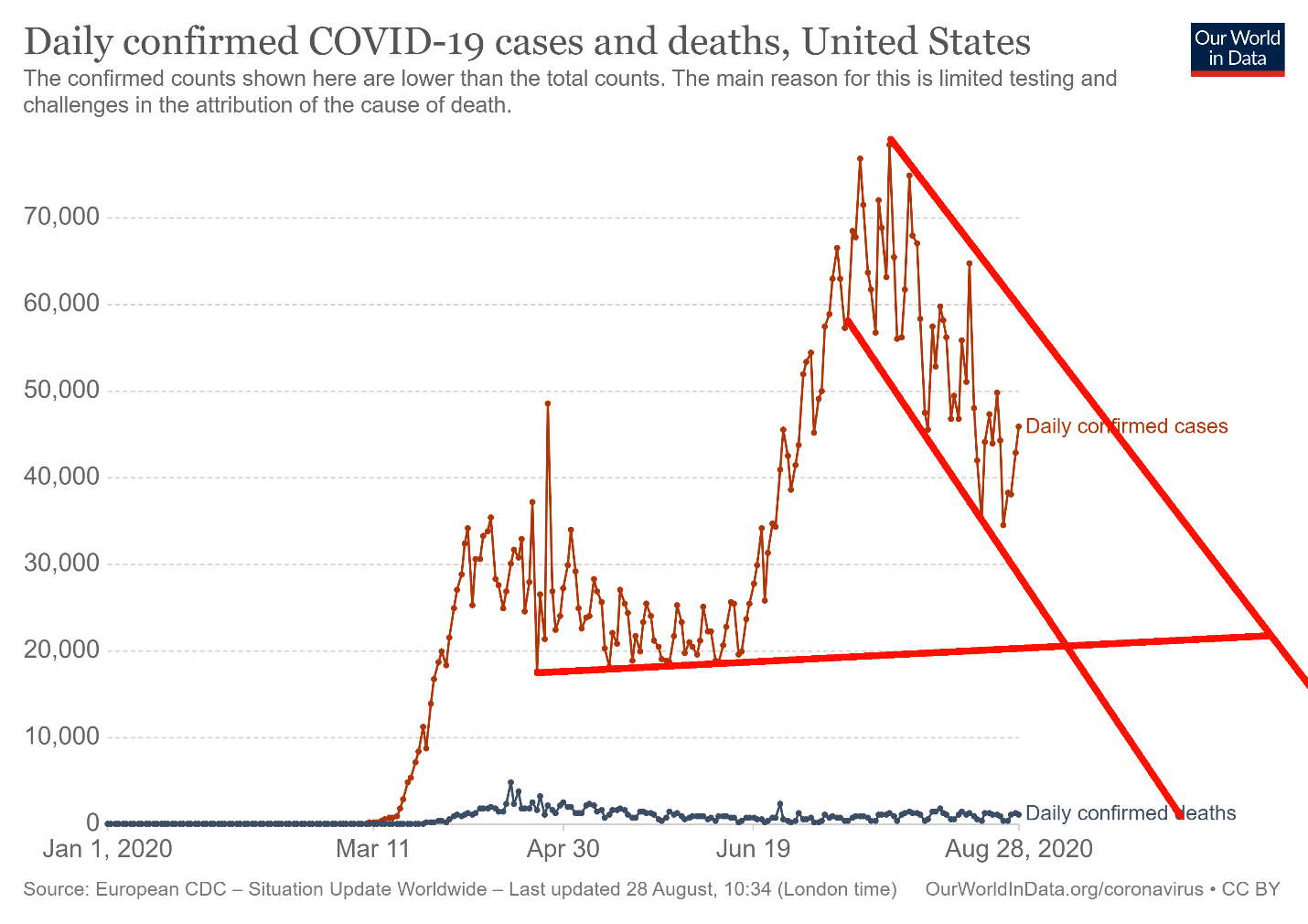
The U.S. cases continue to be in a down channel. Generally, we are down from 50,000–70,000 cases daily to roughly 35,000–50,000 cases daily. It is still a lot. Deaths have slowed somewhat, but there are still too many days where the death count is over 1,000. Long-term support for cases appears to be down around 20,000. A breakout would occur if daily cases started going back over 50,000 once again. The question is, will there be a fresh wave once again when we move into the fall? Many are predicting that the numbers will rise again in the fall.
As at Saturday August 29, 2020 22:56 GMT
Number of cases: 6,135,598
Number of deaths: 186,783
Source: www.ourworldindata.org/coronavirus
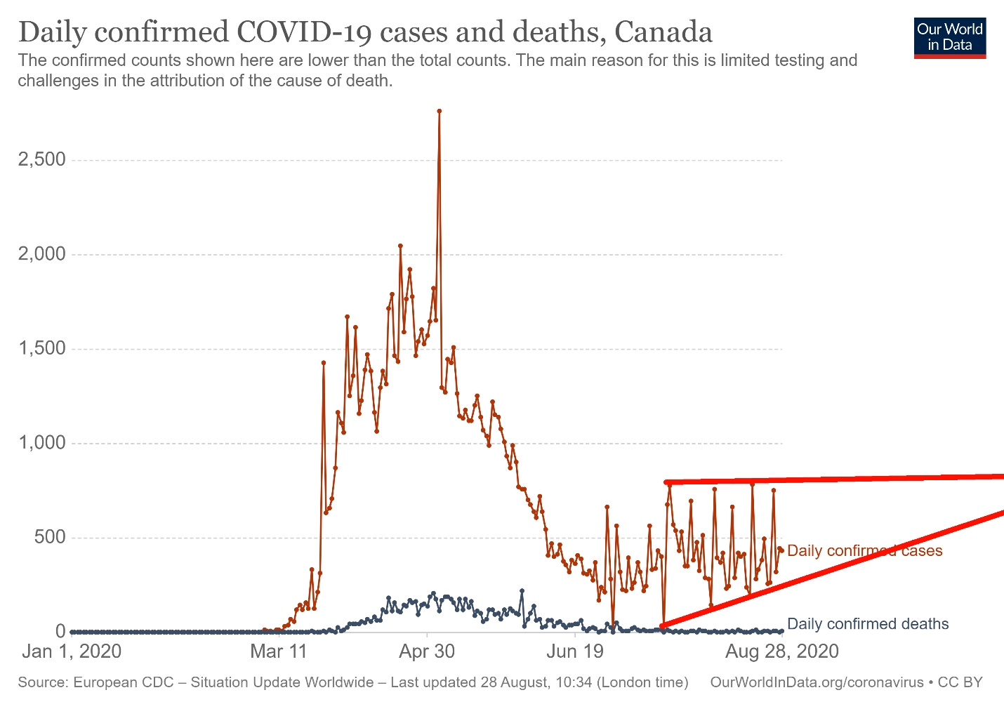
Canada’s COVID cases remain in a box formation, ranging from roughly 200–700 cases daily. Deaths have been steadily falling and have generally been under 10 each day. If there is a little concern here, it is the series of rising bottoms that appears to be forming. This could suggest that a breakout could occur to the upside. Breaking out to over 1,000 cases a day would confirm that. Otherwise the trading range can remain in place for quite some time.
As at Saturday August 29, 2020 22:56 GMT
Number of cases: 127,677
Number of deaths: 9,113
US 10-Year Treasury Note, Canada 10-Year Government Bond (CGB)
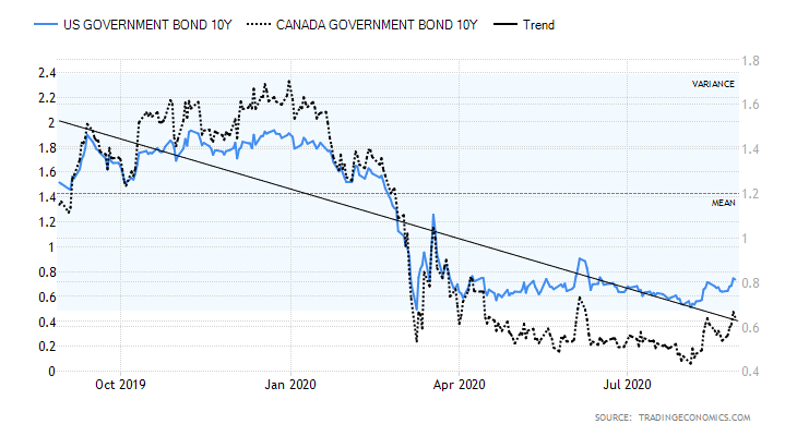
Source: www.tradingeconomics.com
With the Fed moving to trying to rub its tummy and pat its head at the same time, the expectation is that we might start seeing a rise in longer term rates even as short rates are kept artificially low. Inflation is now to take a back seat to job growth while at the same keeping interest rates low. But rising long-term rates are another problem as that is where mortgage rates are priced. It wouldn’t take a big rise in long rates to start to tip things the wrong way. With rates having been kept so artificially low for years, rising rates could in turn negatively impact the economy even if the short rates remain artificially low. Also, with no concern about inflation any longer, just how high would the Fed want inflation? The former target was 2%, but with short rates so low you couldn’t generate 2% inflation. As well, if inflation were allowed to run over 2%, then it hurts those least able to afford it. It would also act to lower real wages. Rising longer dated interest rates eventually force the Fed to tighten but not necessarily right away. Higher rates crimps profit margins. However, rising inflation would be good for the stock market. So, there are some blessings. But it could also create more bubbles.
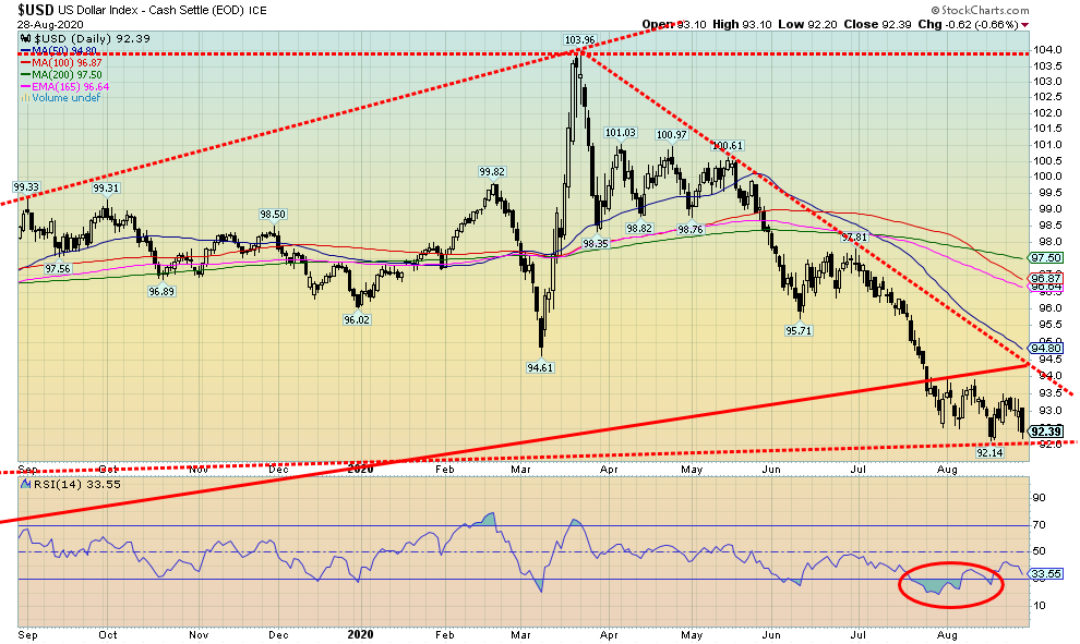
Source: www.stockcharts.com
Thanks to the Fed’s statements about inflation, jobs, and interest rates, the U.S. dollar went on a bit of a ride this past week. It ended poorly, however, as the US$ Index plunged on Friday 0.7%, ending the week down 0.9%. All other major currencies gained against the U.S. dollar with the euro up 0.9%, the pound sterling up almost 2.0%, the Swiss franc up 0.8%, and the Japanese yen gaining 0.4%. The Cdn$ also gained, up 0.8% to its highest level since January 2020. Despite the gains, the euro in particular would need to regain above 122 to suggest to us that it is truly going higher as it would signal a multi-year bullish reversal. Confusion over the effects of the Fed’s latest policies and the ongoing extremely divisive politics in the U.S. are weighing on international markets. On the other hand, the US$ Index is still at a major zone of support that could still generate a sharp rebound. A solid break under the recent low at 92.14 could see the US$ Index fall to 90.50/91. A falling U.S. dollar is bullish for gold. However, if the US$ Index were to regain its recent high at 93.50 then it could test first 94. Over 94 the US$ Index should go higher to 95 and even up to 98. While we suspect that the U.S. dollar is in a major downswing, we shouldn’t be so complacent as to expect it to be a layup. A temporary reprieve is not unusual. Higher interest rates would be a draw for the U.S. dollar, but the penchant for the president to slap trade tariffs or sanctions on any country that displeases him makes investing in the U.S. difficult. However, the liquidity of the U.S. stock market, coupled with its ongoing rise, are an investment draw from all around the world.
Source: www.stockcharts.com
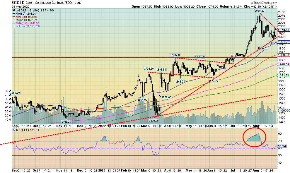
Gold had a volatile week with the past three days seeing some sharp ups and downs. At the end of the week, however, gold gained 1.4%. Silver was up 4.0% while platinum continued to be discouraging, gaining 1.5%. Commercial metals such as palladium were up 2.4% and copper continued its recent strong run, gaining 3.4% and once again printing fresh 52-week highs. Rising copper prices are, by extension, good for gold. Gold reacted positively to the sharp drop in the US$ Index on Friday just as it also plunged on Thursday thanks to a sharp upswing in the US$ Index. The U.S. dollar reacted positively at first to the Fed’s new focus on jobs over inflation, but then sharply changed direction on Friday when the market realized it wasn’t particularly good for the U.S. dollar. The premise is that high inflation, coupled with suppression of interest rates, should see real yields fall. Negative yields are music to gold’s ears as are the rising commitments that will add to the U.S. debt.
Gold has, or is forming what appears to be a pennant formation. It should be a bull pennant as pennants are not normally top formations. A break above $1,985 could project gold up to $2,200. If gold were to break to the downside under $1,925, then we could see gold fall to the $1,775/$1,800 zone. What’s more likely is that gold just moves into what we might call a grinding phase as it waffles through the pennant formation to form something else. Grinding phases can last several weeks. Right now, we need to see gold regain $2,000 and above $2,040 new highs above $2,090 are possible. We are still somewhat concerned by bearish technical reports we read about gold and we are well aware that the 23-year cycle low is due along with the next 7.8-year cycle low. The next 23-year cycle is due 2023+/- 4 years. So, we are in the early stages of that cycle. It would be nice to point to the key low gold made in November 2019 ($1,446) and the March 2020 ($1,450) low and say that could be our cycle low. Since the March 2020 low, gold has gained 36% and moved to new all-time highs. On the 7.8-year cycle low, gold last saw that one in 2015 at $1,045. The next one is due in 2023–2024. Or do the cycles have to be in sync? Possibly not. We point to the fact that gold burst out of the March 2020 low and has since soared to new all-time highs as possible evidence that some of our cycle lows might be in. Rather than be complacent, we should note downside support zones that, if broken, could see gold fall further. The last low at $1,875 is now important as is the June 2020 low of $1,672. The final level of support is the March 2020 low at $1,450. While we are encouraged by bullish forecasts, one is better not to take things for granted. Right now, we needed this pause to work off the extreme bullishness and overbought indicators. Grinds can take some time and gold does have some seasonal weakness into September/October. But we have also seen that weakness last into November/December. That is why we say that gold needs to break above $2,040 to suggest to us that new highs could be imminent, but a break under $1,874 could see gold fall further.
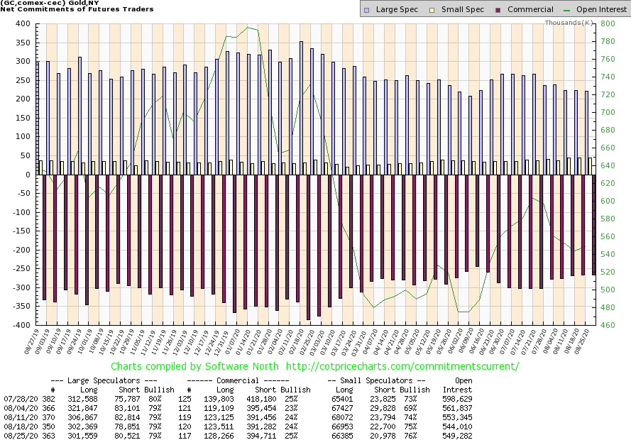
Source: www.cotpricecharts.com
The gold commercial COT improved slightly this week to 25% from 24%. Long open interest rose about 5,000 contracts while short open interest rose about 3,500 contracts. Overall, open interest rose just over 5,000 contracts on a week that gold gained 1.4%. Rising open interest and a rising price are bullish. The improvement in the commercial COT is encouraging but it is still not at a level we’d consider bullish. The large speculators COT (hedge funds, managed futures, etc.) was steady at 79% with only small changes in long and short open interest. Overall, we are encouraged by this week’s COT but it is still not at levels we’d consider to be very bullish.
Source: www.stockcharts.com
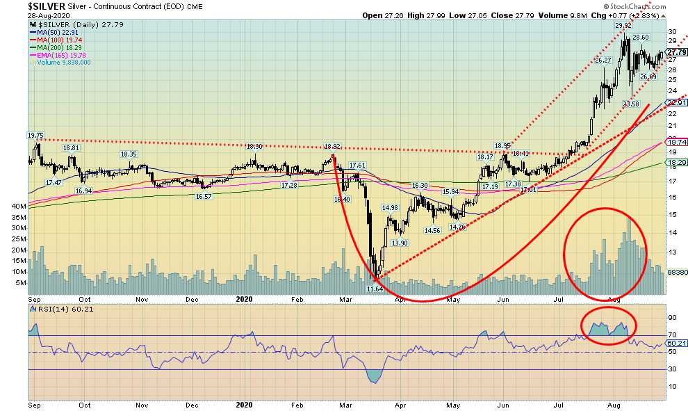
Silver gained roughly 4% this past week to $27.79. Silver has now recouped roughly two thirds of the recent drop. Silver needs to break out over $28.50 to suggest to us that the recent highs at $29.92 might be taken out. Silver, like gold, appears to be forming a pennant. The pennant breaks out over the previously mentioned level of $28.50. However, more likely the pattern will just morph into something else, given it is at the apex of the triangle. Silver breaks to the downside under $26.50. A downside break could see silver fall to the $20/$21 zone. An upside break projects to about $35 which is a previously held target. One thing that should help silver remain high is the drop in production over the past year, caused more recently by shutdowns due to COVID-19. The shutdowns were particularly hard in Mexico, one of the world’s leading producers of silver. Silver prices have soared 140% since the March 2020 low. At $11.64, the March 2020 low was the lowest price silver has seen since the crash of 2008. At that time silver fell to $13.62. The last major low was in 2008 at $8.40. The 2008 low was most likely an 18-year cycle low with the next 18-year cycle due in 2026. The 18-year cycle breaks up into at least three 6-year cycles (5–8 years orb). There was a key low in 2015 so the next one is due anywhere from this year to 2023. Was the March 2020 low the bottom for this cycle? Given that the next move was to break out to the upside with silver making multi-year highs, it is very possible that was our cycle low. If that is correct, then silver could remain in an up cycle for the next few years before cresting.
Source: www.cotpricecharts.com
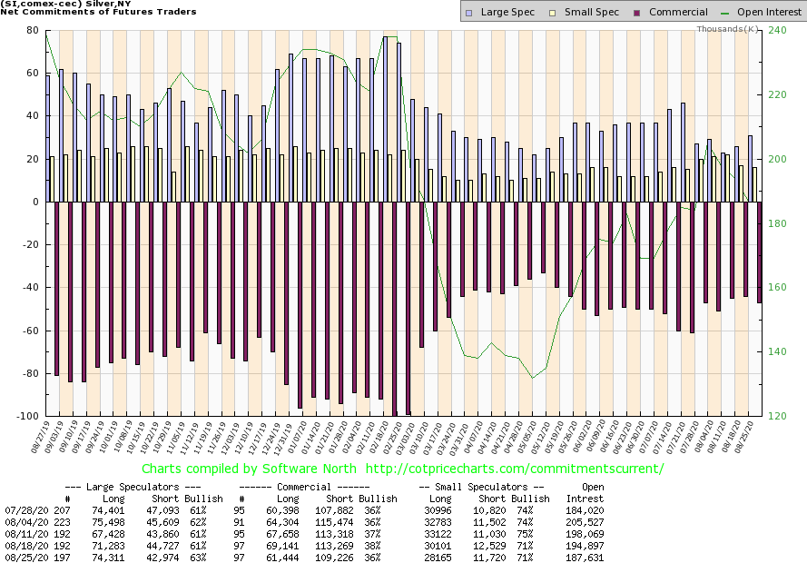
The silver commercial COT slipped to 36% this past week from 38%. Long open interest fell by roughly 8,000 contracts while short open interest dropped about 4,000 contracts. Overall, open interest fell on a week that saw silver gain 4%. The drop in the commercial COT wasn’t encouraging nor was a drop in open interest. The large speculators COT rose to 63% from 61% as large traders put on about 3,000 longs while dropping about 2,000 shorts. This week’s commercial COT for silver was a little disappointing as it broke what had been nice gains. Also, the drop in total open interest is more reflective of a weak market rather than one of strength. The drop wasn’t large, but it was still a drop when one prefers to see open interest rise with the market.
Source: www.stockcharts.com
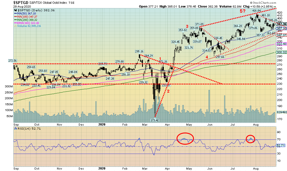
Gold stocks managed to gain this past week with the TSX Gold Index (TGD) up 1.7% and the Gold Bugs Index (HUI) jumping 3.5%. The two can diverge from each other because of different components. The HUI has a more international flavour while the TGD is primarily Canadian companies and also includes a number of small producers. Like gold, the TGD may be forming a pennant. The upside breakout is just above at 390. Above that, the projected target could be 450. The all-time high for the TGD set back in 2011 was at 455. The breakdown point is below 365 and could see the TGD fall to 300/305 which just happens to be where the 200-day MA is currently. The pattern could also morph into something else as well, so it is wise not to jump to conclusions until a break one way or the other occurs. Confirmation of an upside breakout wouldn’t come until we make new highs above 417. Below 300, the TGD could be entering bear market. Indicators are generally neutral here and, while bullish sentiment has come down, it is not what one would call super bearish. The Gold Miners Bullish Percent Index (BPGDM) is currently at 76 a level that keeps it in very bullish territory. The index recently peaked at 100 while the most recent low was at 7.7 at the bottom of the March 2020 mini-crash.
Source: www.stockcharts.com
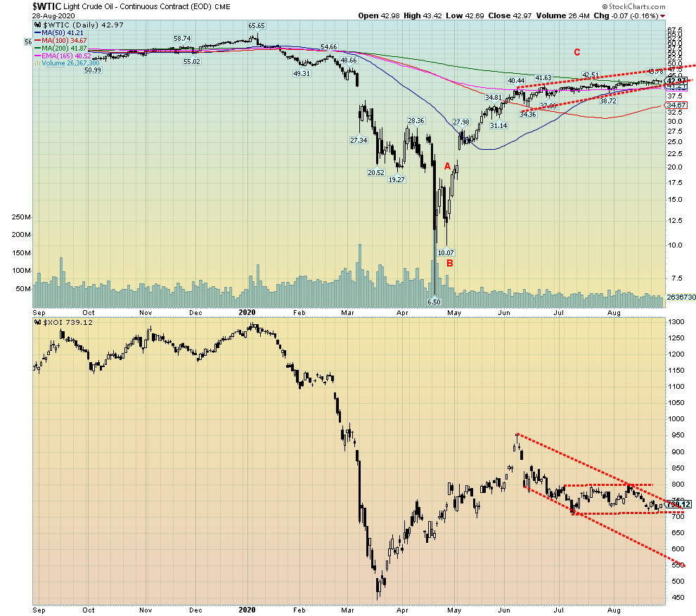
Oil prices rose this past week on fears of the potential damage caused by Hurricane Laura. When the damage wasn’t as bad as was feared, oil prices retreated. Still, WTI oil ended the week up 1.5%. Natural gas (NG) continued its recent upward march, gaining 3.5% and once again making fresh 52-week highs. The energy stocks responded to all the good news as the ARCA Oil & Gas Index (XOI) rose 1.9% while the TSX Energy Index (TEN) was up 2.7%. Still, the energy stocks are lagging as the chart of the XOI shows. It could be close to breaking out over 750 but then it would soon run into resistance up at 800. Only over 800 would the XOI appear poised to move higher with potential up to 900.
Oil appears stuck between $42 and $45. So, there is not a lot to say. The good news is that the pattern forming could be a rising triangle. If correct, the breakout should be up and potentially project up to $50/$52. That would be a relief for the energy sector (particularly Alberta).
But the good news was that the hurricane damage was not as bad as feared and that means far less will be shut-in than what was originally expected. The patterns look encouraging. But the positive seasonals don’t usually kick in until at least November.
Copyright David Chapman, 2020
|
Technical Scoop Charts and commentary by David Chapman Chief Strategist, Enriched Investing Inc. Phone: 416-523-5454 Email: david@davidchapman.com dchapman@enrichedinvesting.com Twitter: @Davcha12 August 31, 2020 |
|
GLOSSARY Trends Daily – Short-term trend (For swing traders) Weekly – Intermediate-term trend (For long-term trend followers) Monthly – Long-term secular trend (For long-term trend followers) Up – The trend is up. Down – The trend is down Neutral – Indicators are mostly neutral. A trend change might be in the offing. Weak – The trend is still up or down but it is weakening. It is also a sign that the trend might change. Topping – Indicators are suggesting that while the trend remains up there are considerable signs that suggest that the market is topping. Bottoming – Indicators are suggesting that while the trend is down there are considerable signs that suggest that the market is bottoming.
|
David Chapman is not a registered advisory service and is not an exempt market dealer (EMD) nor a licensed financial advisor. We do not and cannot give individualised market advice. David Chapman has worked in the financial industry for over 40 years including large financial corporations, banks, and investment dealers. The information in this newsletter is intended only for informational and educational purposes. It should not be considered a solicitation of an offer or sale of any security. The reader assumes all risk when trading in securities and David Chapman advises consulting a licensed professional financial advisor before proceeding with any trade or idea presented in this newsletter. David Chapman may own shares in companies mentioned in this newsletter. We share our ideas and opinions for informational and educational purposes only and expect the reader to perform due diligence before considering a position in any security. That includes consulting with your own licensed professional financial advisor.
About the author


Website: https://www.enrichedinvesting.com
Disclaimer: David Chapman is not a registered advisory service and is not an exempt market dealer (EMD) nor a licensed financial advisor. We do not and cannot give individualised market advice. David Chapman has worked in the financial industry for over 40 years including large financial corporations, banks, and investment dealers. The information in this newsletter is intended only for informational and educational purposes. It should not be considered a solicitation of an offer or sale of any security. The reader assumes all risk when trading in securities and David Chapman advises consulting a licensed professional financial advisor before proceeding with any trade or idea presented in this newsletter. David Chapman may own shares in companies mentioned in this newsletter. We share our ideas and opinions for informational and educational purposes only and expect the reader to perform due diligence before considering a position in any security. That includes consulting with your own licensed professional financial advisor.