
“While the crash only took place six months ago, I am convinced we have passed the worst and with continued unity of effort we shall rapidly recover.”
—Herbert Hoover, American politician and engineer, 31st president of the U.S. 1929–1933, member of Republican Party; 1874–1964
“I was lucky enough to see with my own eyes the recent stock-market crash, where they lost several million dollars, a rabble of dead money that went sliding off into the sea.”
—Federico Garcia Lorca, Spanish poet, playwright, theatre director; 1898–1936
“The economic repercussions of a stock market crash depend less on the severity of the crash itself than on the response of economic policymakers, particularly central bankers.”
—Ben Bernanke, American economist, 14th Chair of Federal Reserve 2006–2014, member Board of Governors Federal Reserve 2002-2005, Chairman Council of Economic Advisors; b: 1953
Is the world headed for a recession? Deutsche Bank (DB) thinks so. Earlier, DB forecasted a mild recession. Now DB is forecasting a deeper downturn, sparked by the Federal Reserve’s desire to knock down inflation. With U.S. inflation running latest at 8.5%, the Fed would need to raise rates to that level or higher just as Fed Chair Paul Volker did back in the early 1980s when he belatedly hiked rates to 20%. The consensus is that the Fed will hike at least 50 bp at the May 4–5 FOMC, although some are now expecting 75 bp. But will the Q1 Advance GDP, which unexpectedly came in at negative 1.4% when they were expecting a 1.1% gain, put a dent in thoughts of hiking interest rates? The prime culprits for the slowdown were supply disruptions, inventory restocking problems, a drop in government spending, and a drop in exports leading to record trade deficits, even as businesses and consumers kept spending and unemployment kept falling.
It takes some time to knock inflation back to the Fed’s goal of 2%. Inflation is rising at its fastest pace in 40 years and the unemployment rate (U3) is down to its lowest level before the pandemic recession of 2020. DB believes the Fed is “behind the curve” and will have to raise rates faster and higher to bring inflation to the ground. All that could spark a steep recession, one that may already be underway. Some think DB is being too pessimistic. Many others agree that it will slow the economy but maybe not as much as DB thinks it will.
DB has identified all the catalysts: the disruption of supply chains sparked by the ongoing war in Ukraine and as a hangover from the pandemic, the slowing of global trade suggesting the reversal of globalization, the COVID lockdowns in China, and the negative impact of climate change, a topic that seems to have fallen off the radar. The problem is the expectation that inflation will stay higher and longer than anyone expects. But that risks the potential for the overshoot and then the economy tips over more than anyone expects.
The stock market is recognizing there is a problem. Just as everyone thinks it is about to recover, it falls off the cliff again. Since topping in early January, the stock market has made a series of waterfall declines—meaning, it falls, recovers, falls again, recovers again, and then down we go again. The 980-point drop on April 22 for the Dow Jones Industrials (DJI) became the 11th largest point drop ever recorded. It was the largest decline since the nightmare of March 2020. No new highs have been seen for four months. So, is the market making a
correction or moving into a bear market? Or is this all just part of an overdue correction?
Typically, a bear market is not defined as one until the market turns down 20% or more over at least a two-month period. Typically, however, a bear market could last anywhere from six months to two years. The bear market of February/March 2020 was the fastest bear market on record dating back to 1900. The DJI fell 37.1%, but it was all over in 40 days. Before that, the 55-day bear market of August to October 1987 when the DJI fell 36.1% was the fastest ever recorded. Compare that to the 959-day bear market of September 1939 to April 1942 when the DJI fell 40.4%. The most recent, longest bear market recorded was the Great Recession bear from October 2007 to March 2009, lasting 517 days or almost a year and a half as the DJI fell 53.8%.
Anything under a 20% decline is considered a correction. The correction of April 2011 to October 2011 lasted 157 days but the DJI only fell 16.8%. From May 2015 to February 2016, the DJI lost 14.5% but the drawn-out correction lasted 268 days or almost nine months. Even with bear markets, while a bear market is defined as a drop of 20% or more, once the market falls more than 30% we consider it to be big bear market. We’ve had 15 such big bear markets since 1900, including three since 2000. That’s one roughly every eight years. Overall, we’ve had 37 bears that were considered either a correction or a bear since 1900. That works out to roughly one every three years.
A secular bull or bear market is different. A secular bull market contains both bull and bear markets while a secular bear also has bull and bear markets. What defines them is a secular bull market is one where the market keeps on climbing with pullbacks (bear markets) never taking out the low of the previous bear market. By that definition we have experienced three secular bulls and three secular bears since 1900. They were the Secular Bull in 1896–1929, 1949–1966, and 1982–2000 and the Secular Bear in 1929–1949, 1966–1982, and 2000–2009. Are we embarking on the fourth secular bull? What’s key is the March 2020 low. As long as that low remains intact on any correction or bear market, the secular bull remains in place. The March 2020 low was around 2,200/2,400 for the S&P 500.
Numerous markets have topped over the past three years with the major North American indices topping from November 2021 to January 2022, although the TSX made its top just this month. However, that top has yet to be confirmed. The NASDAQ at its worst fell more than 20%. As a result, the NASDAQ could be considered to be in a bear market. The NY FANG Index is down over 30% so it is already in a big bear market. One could call the past decade the era of the FAANGs or the Techs, comparing it to the “Roaring Twenties” of 1920–1929, the “Gilded Age” of the 1880s, or the “Nifty-Fifty” of the early 1970s. Often what leads the market up also leads the market down.
Elsewhere, the European stock indices could also be considered to have entered bear markets with the Paris CAC 40 and the German DAX both down 20% or more. The London FTSE topped way back in May 2018 and then fell over 30%. It has since recovered most of that loss but has not as yet taken out the 2018 highs. So, is it
still in a bear market? In Asia, China’s Shanghai Index (SSEC) is now down over 20% and Hong Kong’s Hang Seng Index has been in a bear market since January 2018, having fallen 45%.
Falling Global Markets
|
Index |
Date of Top |
Largest Decline from Top to Date % |
Decline 2022 to Date % |
|
North America |
|
|
|
|
S&P 500 |
Jan 4, 2022 |
14.6% |
13.3% |
|
DJI |
Jan 5, 2022 |
12.7% |
9.3% |
|
NASDAQ |
Nov 22, 2021 |
24.0% |
21.2% |
|
TSX Composite |
Apr 5, 2022 |
6.9% |
2.2% |
|
Wilshire 5000 |
Nov 5, 2021 |
18.3% |
14.7% |
|
|
|
|
|
|
Europe |
|
|
|
|
London FTSE |
May 22, 2018 |
33.3% |
0.7% |
|
Paris CAC 40 |
Jan 5, 2022 |
22.1% |
8.7% |
|
German DAX |
Nov 18, 2021 |
23.6% |
11.3% |
|
EuroNext 100 |
Nov 18, 2021 |
19.9% |
8.5% |
|
|
|
|
|
|
Asia |
|
|
|
|
Shanghai (SSEC) |
Feb 18, 2021 |
23.7% |
16.3% |
|
Tokyo Nikkei (TKN) |
Sep 14, 2021 |
19.9% |
6.8% |
|
Hang Seng |
Jan 26, 2018 |
45.1% |
9.9% |
|
Mumbai Sensex |
Oct 19, 2021 |
16.0% |
1.4% |
|
Taiwan 50 |
Jan 5, 2022 |
12.9% |
8.9% |
|
Australia All Ordinaries |
Jan 5, 2022 |
11.6% |
0.8% |
Source: www.stockcharts.com
Does one quarter of negative GDP growth signal a recession? Not necessarily. A recession is normally defined as two consecutive quarters of negative growth. As we noted, one of the prime reasons for negative Q1 growth was falling exports and a record trade deficit. However, the market was buoyed by robust business, consumer spending, and falling unemployment. Can that continue? The effects of sharply rising inflation and a faltering stock market have not yet been fully built into both business and consumers’ collective psyche. Employment has been robust, but if spending falters could unemployment quickly rise and business cut back, forcing consumers in turn to also cut back?
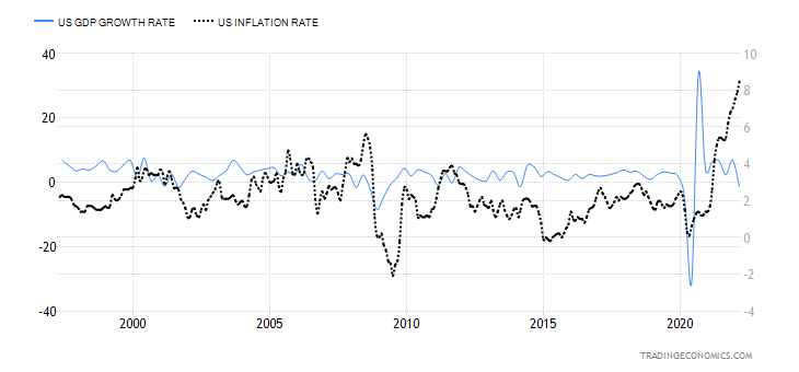
The past decade has seen unprecedented monetary and debt growth, aided by record ultra-low interest rates and low inflation. Monetary and debt growth have helped the economy remain in growth mode and contributed to a record-breaking rise for the stock market. Now all that is changing. Monetary and debt growth is slowing, while interest rates and inflation are rising. The Ukraine/Russia war, coupled with the pandemic and now shutdowns in China, have contributed to global supply disruptions and rising inflation. All that is eventually going to play into GDP growth. In the past, GDP growth tended to periodically exceed
monetary and debt growth. Since the Great Recession it is the opposite as monetary and debt growth have consistently exceeded GDP growth. Yes, it has contributed to a record stock market but the stock market rise has largely benefitted the 1% and the 0.1% of billionaires who own nearly 90% of the stock market. Meanwhile, for years, real wages and living standards stagnated. Inequality rose. The U.S. Gini Coefficient which was near 0.40 back in 1990 is now at 0.48.
We note that since this time in 2008 U.S. GDP has gone up by 75% (5.6%/year), but real GDP (adjusted for inflation) has only gone up about 26% (1.9%/year), the U.S. national debt is up 200% (14.3%/year), total debt (all levels of government, corporate, and consumer) is up 79% (5.6%/year), and M2 is up 186% (13.3%/year). The Fed’s balance sheet has grown an astounding 901% (64.4%/year) and M1 is up 1,351% (96.5%/year). One would find similar numbers for Canada. A huge portion of that rise has taken place since the onset of the pandemic in March 2020, particularly when it comes to debt and money growth. Economic growth has consistently outpaced inflation over the past 25 years. However, that has now flipped and inflation is outpacing GDP growth. The last time that happened was back in the 1970s during a period of rising inflation, a weak stock market, slow economic growth, and severe recessions (1974–1975 and 1980–1982).
U.S. GDP Growth Rate vs. U.S. Inflation Rate 1997–2022
Source: www.tradingeconomics.com, www.bea.gov, www.bls.gov
Yet another danger is lurking. Russia has announced that they will be halting natural gas flows to Poland and Bulgaria. On the surface, this shouldn’t impact North America. Poland has sufficient supplies to carry on for the time being. However, according to GaveKal Research (www.gavkal.com), what it has done is flip the discussion from whether Germany might stop buying gas from Russia to whether Russia might cut off Germany. It’s one thing to cut off Poland or Bulgaria, but Germany is the economic engine of the EU. Poland and Bulgaria were cut off because they refused to pay for their gas in rubles to Gazprombank.
But just this potential threat has sent the euro to new 52-week lows, the US$ Index has soared close to multi-year highs. A sudden stop of gas to Germany could have a profound negative impact on the EU economy and by extension on the global economy. Germany is in no position to replace Russian gas immediately. New sources could take 2–3 years. A sudden cut-off, according to the Bundesbank, could knock 2% off GDP growth
and hike inflation by another 1.6%. Rationing could force many plants to close since continual closings and re-openings can’t be done. Unemployment could then rise. The EU has little wiggle room for new stimulus. Pressure could mount from other EU members in the south or eastern Europe for more stimulus which would be anathema to Germany. If Germany were to continue to send arms to Ukraine, Russia’s retaliation might be to cut off the gas. And Germany and the EU can’t just ramp up to bring in fresh LNG as current facilities are full and it takes a few years to build new facilities. Canada, as an example, has neither the capacity or the facilities to ship NG to the EU. For the U.S. as well it is limited.
The bottom line is, Russia cutting off Germany would be an economic disaster for Germany and by extension the rest of the western world, further disrupting supply lines and adding to inflation. Mass layoffs would result in the EU, resulting in a steep recession. The world is interconnected so a recession in the EU would spill over to North America to the U.S. and Canada. Globalization, which has brought the world peace and prosperity, is, to quip a phrase, “on the ropes.”
Welcome to the new normal. Could all this bring about the “perfect storm”?
Chart of the Week
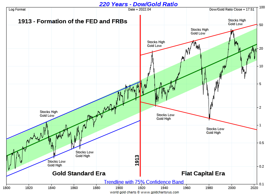
Source: www.goldchartsrus.com
The Dow/Gold ratio is probably one of the best-known ratios that market analysts follow. It has a long history as the above chart attests to, going all the way back to 1800. Although the Dow Jones Industrials (DJI) didn’t exist then, the author of the chart has used proxy stock indices from the period.
For years during the Gold Standard Era the Dow/Gold ratio traded in a nice band, never becoming too extreme. That all changed with the onset of the Federal Reserve in 1913. The stock market of the Roaring Twenties sent the Dow/Gold ratio soaring to about 18.4 by 1929. Gold prices were fixed at the time at around US$20.67/ounce. What that meant was that it took 18.4 ounces of gold to buy a share in the DJI. By 1933, at the depths of the Great Depression, it took only 1.94 ounces of gold to buy a share of the DJI. And gold in 1933 was still fixed at US$20.67. That didn’t change until 1934 when the Roosevelt administration devalued the U.S. dollar and raised the fixed price of gold to US$35/ounce.
The final stock market bottom came in 1942 and the Dow/Gold ratio started its long climb once again, favouring the DJI over gold. It peaked in early January 1966 at 27.78 ounces of gold for one share of the DJI. The inflationary 1970s saw gold soar while the stock market wobbled up and down. The bottom came in January 1980 when one could buy a share of the DJI for only 1.29 ounces of gold. What a deal!
This started the next ride up favouring stocks over gold. The peak came in August 1999 when it took 42.2 ounces of gold to purchase one share of the DJI. The dot.com crash of 2000–2002, coupled with the financial crisis of 2007–2009, sent the ratio tumbling as gold was once again favour over the stock market. By August 2011 the ratio had fallen to 6.36 ounces of gold for one share of the DJI.
The ratio rose in favour of stocks during the era of the FAANGs, peaking at 22.36 ounces of gold for one share of the DJI in September 2018. It hasn’t been that high since. The ratio broke down in 2019 but then bottomed during the pandemic crash of 2020 at 11.01 ounces of gold for one share of the DJI.
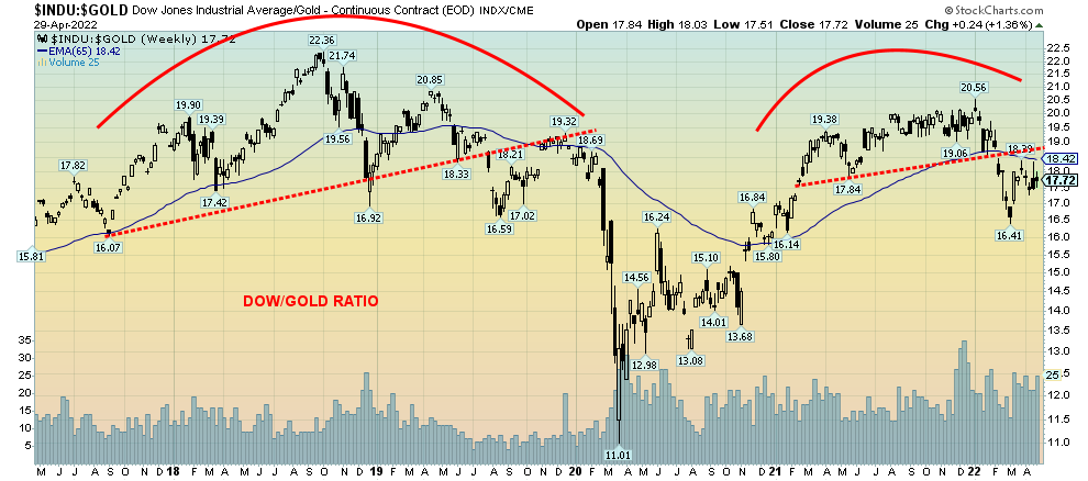
Source: www.stockcharts.com
Once again, oodles of QE from the Fed and ultra-low interest rates sent stocks soaring and the Dow/Gold ratio once again favoured stocks over gold. But for the past number of months, instead of going to new highs the ratio has stalled, forming what appears as a nice top and now it has broken down in favour of gold over stocks. A confirmation of the shift would be in place if the Dow/Gold ratio were to fall under that recent low at 16.41. Note back on the Gold Charts R Us chart that the recent rebound only came back to the mid-line of the 75% confidence band. That suggests to us that this will fail in favour of gold. Note how that mid-line stopped the ratio for a number of years from 1933 to 1949. As well, that famous rebound in 1974–1976 was also stopped by the mid-line. Could we be seeing a repeat? If that mid-line were firmly taken out then, yes, it would shift to favouring stocks over gold.
But right now, the shift appears to be once again in favour of gold over stocks. Our final chart below shows the
TSX/TSX Gold Index (TGD) Ratio. Not surprisingly, it is very similar to the Dow/Gold ratio. It is suggesting that
one should be favouring gold stocks as represented by the TGD over the broader TSX Composite. One can perform this same calculation with the TSX Financial Index or any other sub-index of the TSX Composite to determine whether one should hold gold and gold stocks over other sectors. The time is coming for gold.
Got gold?
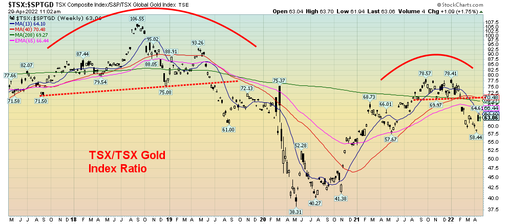
Source: www.stockcharts.com
Markets & Trends
|
|
|
|
% Gains (Losses) Trends
|
|
||||
|
|
Close Dec 31/21 |
Close Apr 29/22 |
Week |
YTD |
Daily (Short Term) |
Weekly (Intermediate) |
Monthly (Long Term) |
|
|
Stock Market Indices |
|
|
|
|
|
|
|
|
|
S&P 500 |
4,766.18 |
4,131.93 |
(3.3)% |
(13.3)% |
down |
down |
up |
|
|
Dow Jones Industrials |
36,333.30 |
32,977.21 |
(2.5)% |
(9.3)% |
down |
down |
up |
|
|
Dow Jones Transports |
16,478.26 |
14,865.06 |
(1.3)% |
(9.8)% |
down (weak) |
down (weak) |
up |
|
|
NASDAQ |
15,644.97 |
12,334.64 (new lows) |
(3.9)% |
(21.2)% |
down |
down |
up |
|
|
S&P/TSX Composite |
21,222.84 |
22,762.00 |
(2.0)% |
(2.2)% |
down |
down (weak) |
up |
|
|
S&P/TSX Venture (CDNX) |
939.18 |
836.63 |
(6.3)% |
(10.9)% |
down |
down |
up |
|
|
S&P 600 |
1,401.71 |
1,214.72 (new lows) |
(3.6)% |
(13.3)% |
down |
down |
up |
|
|
MSCI World Index |
2,354.17 |
2,059.28 |
(5.3)% |
(12.5)% |
down |
down |
up (weak) |
|
|
NYSE Bitcoin Index |
47,907.71 |
38,918.12 |
(2.4)% |
(18.9)% |
down |
down |
up |
|
|
|
|
|
|
|
|
|
|
|
|
Gold Mining Stock Indices |
|
|
|
|
|
|
|
|
|
Gold Bugs Index (HUI) |
258.87 |
282.37 |
(5.9)% |
9.1% |
down |
up |
up |
|
|
TSX Gold Index (TGD) |
292.16 |
330.03 |
(3.5)% |
13.0% |
down |
up |
up |
|
|
|
|
|
|
|
|
|
|
|
|
Fixed Income Yields/Spreads |
|
|
|
|
|
|
|
|
|
U.S. 10-Year Treasury Bond yield |
1.52% |
2.93% |
1.0% |
92.8% |
|
|
|
|
|
Cdn. 10-Year Bond CGB yield |
1.43% |
2.87% |
(0.4)% |
100.7% |
|
|
|
|
|
Recession Watch Spreads |
|
|
|
|
|
|
|
|
|
U.S. 2-year 10-year Treasury spread |
0.79% |
0.21% |
(8.7)% |
(73.4)% |
|
|
|
|
|
Cdn 2-year 10-year CGB spread |
0.48% |
0.25% |
4.2% |
(47.9)% |
|
|
|
|
|
|
|
|
|
|
|
|
|
|
|
Currencies |
|
|
|
|
|
|
|
|
|
US$ Index |
95.59 |
102.96 (new highs) |
1.7% |
7.7% |
up |
up |
up |
|
|
Canadian $ |
.7905 |
0.7791 |
(0.9)% |
(1.4)% |
down |
down |
up |
|
|
Euro |
113.74 |
105.49 (new lows) |
(2.3)% |
(7.3)% |
down |
down |
down |
|
|
Swiss Franc |
109.77 |
102.77 (new lows) |
(1.7)% |
(6.4)% |
down |
down |
neutral |
|
|
British Pound |
135.45 |
125.76 (new lows) |
(2.0)% |
(7.2)% |
down |
down |
down |
|
|
Japanese Yen |
86.85 |
77.02 (new lows) |
(1.0)% |
(11.3)% |
down |
down |
down |
|
|
|
|
|
|
|
|
|
|
|
|
|
|
|
|
|
|
|
|
|
|
Precious Metals |
|
|
|
|
|
|
|
|
|
Gold |
1,828.60 |
1,911.70 |
(1.2)% |
4.5% |
down |
up |
up |
|
|
Silver |
23.35 |
23.08 |
(4.9)% |
(1.2)% |
down |
down (weak) |
up |
|
|
Platinum |
966.20 |
939.60 |
1.3% |
(2.8)% |
down |
down |
neutral |
|
|
|
|
|
|
|
|
|
|
|
|
Base Metals |
|
|
|
|
|
|
|
|
|
Palladium |
1,912.10 |
2,307.00 |
(2.9)% |
20.1% |
down |
neutral |
up |
|
|
Copper |
4.46 |
4.41 |
(3.7)% |
(1.2)% |
down |
neutral |
up |
|
|
|
|
|
|
|
|
|
|
|
|
Energy |
|
|
|
|
|
|
|
|
|
WTI Oil |
75.21 |
104.69 |
2.6% |
39.2% |
neutral |
up |
up |
|
|
Natural Gas |
3.73 |
7.24 |
8.7% |
94.1% |
up |
up |
up |
|
Source: www.stockcharts.com, David Chapman
Note: For an explanation of the trends, see the glossary at the end of this article.
New highs/lows refer to new 52-week highs/lows and, in some cases, all-time highs.
Source: www.stockcharts.com
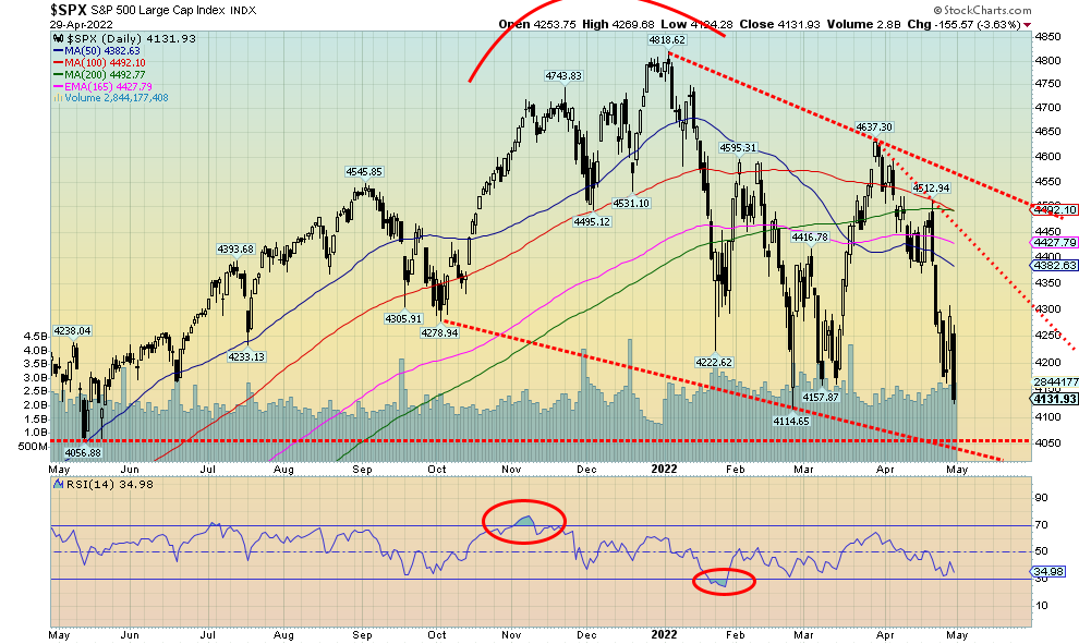
A lousy week at the end of a lousy month. There was no joy. The trends, or at least the short-term (daily) and intermediate (weekly) trends are down but the long-term (monthly) remains positive. If this really is a third wave down, then we have further to go before we might find a bottom. However, we are seeing a number of oversold indicators so we could be at or near a low. The S&P 500 fell 3.3% this past week and 8.8% on the month of April. It wasn’t quite the worst April on record, but it was close. In April 1970 the S&P 500 fell 9.0%. The S&P 500 is down 13.3% in 2022. The Dow Jones Industrials (DJI) lost 2.5% this past week and was down 4.9% in April. That’s well off its record, when it was down 6.3% in April 1970. The Dow Jones Transportations (DJT) 1.3% and the NASDAQ (discussed next) was down 3.9% to fresh 52-week lows. The S&P 600 small cap lost 3.6% and also fell to 52-week lows. The S&P 400 mid-cap lost 3.2% but was just shy of making 52-week lows.
In Canada, the TSX Composite fell 2.0% and the TSX Venture Exchange (CDNX) lost 2.7%. In the EU, the London FTSE was off 0.6%, the Paris CAC 40 dropped 0.7% while the German DAX was down 0.3%. Considering all the problems over there, those were quite constrained. In Asia, China’s Shanghai Index (SSEC) fell 1.3% and the Tokyo Nikkei Dow (TKN) was down 1.0%. The MS World Index fell 5.3% as worries grew about the emerging market countries, especially with the high U.S. dollar, persistent inflation, and ongoing supply disruptions. Add in the draconian COVID lockdowns in China, fears of rising interest rates, and the war in Ukraine and there is little joy on the horizon. But maybe that kind of growing negative sentiment is what makes a low.
The S&P 500 Bullish Percent Index (BPSPX) is at 41%. That’s low, but it is not yet in deep bear territory. In March 2020 at the height of the pandemic crash it fell to 9.4%. The number of stocks trading above their 200-day MA is at 37% but still well above the 6.2% seen in March 2020. The number above their 50-day MA is at 27.7% in bear territory but still well above the 8.2% of March 2020. The CBOE put/call ratio is at .79, just under bear territory at 0.80. We’d like to see that consistently above 0.80 to signal a possible low. The VIX Volatility Indicator is currently below its recent high, despite the S&P 500 trading lower, a possible divergence. All in all, we are seeing some oversold signs (see AAIIBEAR and AAIIBULL chart below) but the indicators are not yet strong enough to signal a possible bottom. However, in this volatile environment and as we saw this past week, fast turnarounds cannot be ruled out. Volatility reigns.
And, as we have noted a number of times, we believe we have come out of a unique era led by the FAANGs. But now they appear to be coming apart, as witnessed by the big drop in Amazon this past week (down 13.8% on the week). The Gilded Age, the Roaring Twenties, the Nifty Fifty, and the dot.com frenzy of the 1990s all eventually came to an end with a crash. Is it the FAANGs’ turn? The early evidence suggests yes. But even in bear markets there is something going up.
We see support down to 4,050. We see little here on the horizon that would turn this market up. Volatility should continue to reign. And that can make for sudden reversals and sharp ups and downs. But no final low or capitulation as they call it.
It’s May. The start of supposedly the worst six months of the year. Sell in May and go away. Except April, which is supposed to be the best month of the year was anything but. May and June are typically not very good months. Although May has a record of more up months then down months. But overall, it’s a very mediocre month. Things do not look good going into May. We see little joy on the horizon but a rebound rally could once again start at any time.
Source: www.stockcharts.com
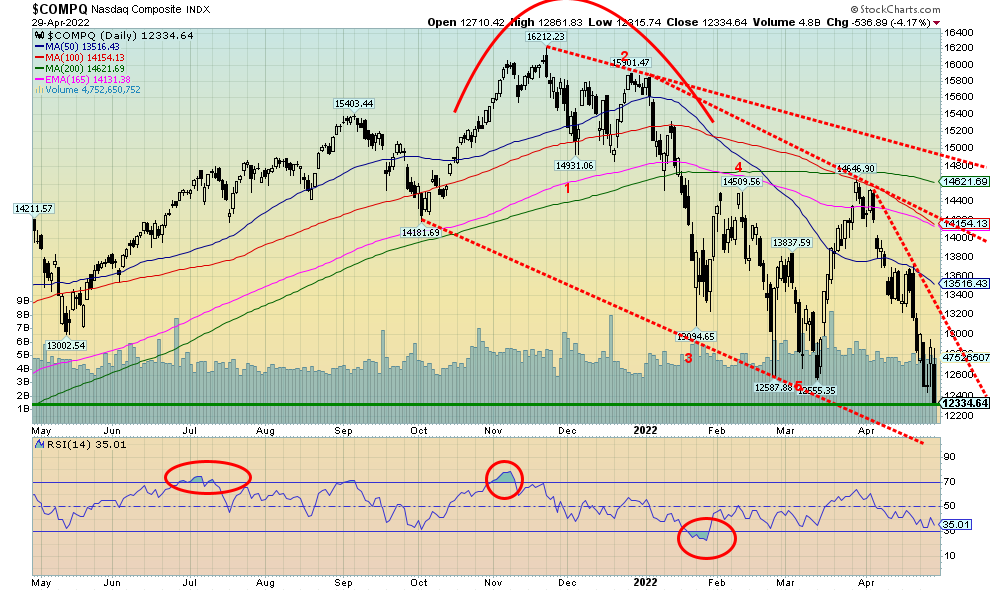
Down, down, down we go. The NASDAQ hit 52-week lows this past week as it lost 3.9% on the week, was down 14.7% on the month, and is now down 21.2% on the year. We are officially in bear market territory. As bad as the month was, it wasn’t a record. In April 2000 the NASDAQ fell 15.6%. Leading the way were the FAANGs. Meta (Facebook) was actually a gainer, thanks to a good report, up 8.9%. That was made after FB made fresh 52-week lows so it was an outside reversal week to the upside, possibly signaling that a low is in. But Apple lost 2.5%, Amazon dropped 13.8% to new 52-week lows, Netflix dropped 11.7%, Google hit fresh 52-week lows off 3.9%, and Microsoft hit fresh 52-week lows and then also reversed, closing up 1.2%. Tesla dropped 13.4% but Twitter was up 0.2%. The volatile Chinese companies were both up with Baidu up 8.3% and Alibaba up 12.4%, but Nvidia was down 5.0%. The bottom of our channel is way down near 12,000 so it is possible we’ll get there. The Index appears poised for further losses this coming week. But in this volatile market it could reverse and close up again. The past few weeks have been quite volatile with five different ups and downs since early January. That green line on the chart is actually a support shelf for the NASDAQ dating back a year ago to May 2021. So, if we are to make a low it could be important that this level holds. But if not, then not only is 12,000 a potential target but we also see targets down to 11,000. The trend is down and now even the monthly trend is wavering but has not yet turned negative.
Source: www.stockcharts.com
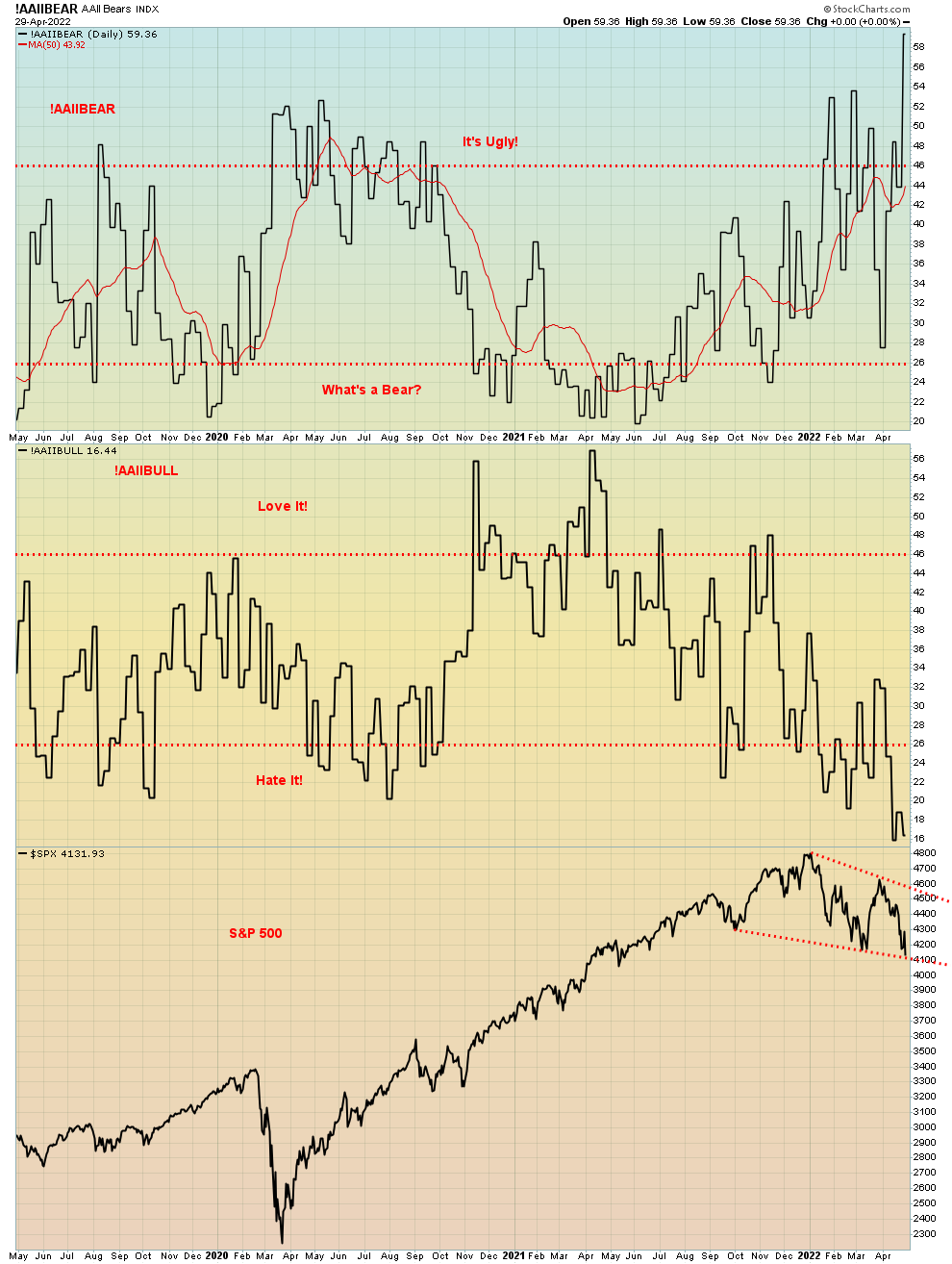
AAIIBEAR and AAIIBULL are really two sides of the same coin. The AAIIBEAR soared this past week into “it’s ugly” territory while the AAIIBULL fell deep into “hate it” territory. If we are lucky, they are both telling us the same thing, that we could be near a low. Note both the AAIIBEAR and the AAIIBULL are at levels below or above the levels seen in March 2020. That’s pretty bearish.
Source: www.stockcharts.com
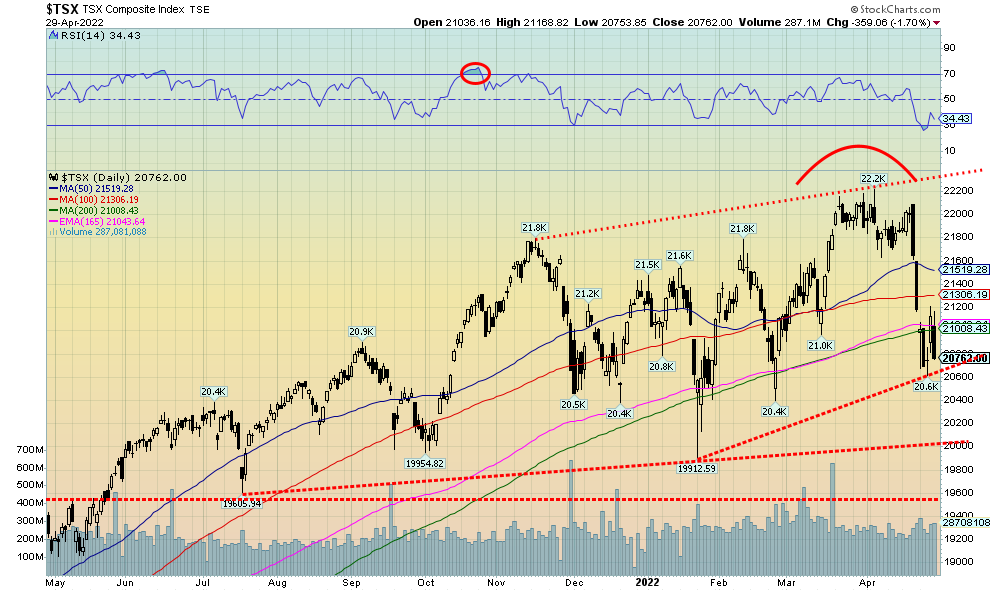
The TSX has very quickly fallen just over 7% from its all-time high seen on April 5. It has been dramatic, but then the TSX was just following the U.S. markets south. Overall, the TSX has fared better than its U.S. cousins. The TSX composite fell 2.0% this past week and is now negative for 2022 by 2.2%. The TSX Venture Exchange (CDNX) lost 2.7% and is now down 13.3% in 2022. Of the 14 sub-indices, only two saw gains this past week and one of them was just barely. Just barely was Consumer Staples (TCS), up about 0.1%. The big winner was Energy (TEN), up 4.5% and helping keep the TSX from an even bigger drop this past week. Leading the way to the downside was Health Care (THC), down 4.3% to fresh 52-week lows. Is the bloom off Telecommunications (TTS) who fell 4.2%? They were the biggest declines, but, significantly, Financials (TFS) lost 2.4% and they are a large part of the TSX along with Energy. Materials (TMT) which holds both Golds (TGD) and Metals (TGM) lost 3.1%. The TSX could be forming support here, but we note there is strong support below near 20,000. That may be a legitimate target zone. Below that, the final major support zone is at 19,600. We have now fallen below the 200-day MA and that is not a good sign. The RSI had dipped below 30 but rebounded with the big up day on Thursday. However, Friday’s big drop could point to further losses this coming week. May 2 is important as usually it is an up day for the market. But breaking under the 200-day MA does not bode well. If we can regain above 21,500, we might be able to argue that a low is in.
U.S. 10-year Treasury Bond/Canadian 10-year Government Bond (CGB)
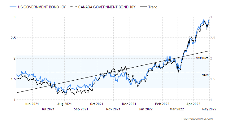
Source: www.tradingeconomics.com, www.home.treasury.gov, www.bankofcanada.ca
Following a short-lived pullback, the U.S. 10-year treasury note rose again this past week to 2.93%. The Canadian 10-year Government of Canada bond (CGB) was pretty flat at 2.87%, off 1 bp. The 2–10 spreads narrowed slightly with the U.S. 2–10 down to 21 bp from 23 bp; however, the Canadian 2–10 rose slightly to 25 bp from 24 bp. Both remain a way from turning negative which could then be pointing to a potential recession. But talk of recession is in the air, especially following the unexpected Q1 decline in GDP to negative 1.4% when the market was expecting a gain of 1.1%. The big culprit was the deteriorating trade balance as imports rose to record levels. The U.S. is seeing a record trade deficit estimated at $1.1 trillion, including a deficit of $125.3 billion in March. While Q1 GDP was negative it is the advance reading. Next month we get the second estimate and in June we’ll get the final estimate. Bulls cite strong continued business and consumer spending and low unemployment as reasons why this might be a one and done negative quarter. Two consecutive monthly negative GDP results would signal an official recession.
Other numbers weren’t so hot either. Durable goods for March were +0.8% but they expected a gain of 1.1%; however, ex defense it was +1.2% above the expected 0.7% gain. New home sales were about as expected at 763 thousand, but that was down 8.6% from February. Retail inventories rose 2.3% in March but pending home sales for March fell 1.2% and were down 8.2% on the year. Weekly jobless claims were about as expected at 180,000. Personal income for March was up 0.5% but personal spending jumped more up 1.1%. The PCE price index rose 6.6% year over year, continuing with the string of higher inflation numbers. The core
PCE was up 5.2% year over year. The Michigan Consumer Sentiment Index for April was 65.2 about as expected and an improvement on March’s 59.4. Still, consumer sentiment remains near decade lows.
2.75% would now be support and if that breaks then we could fall further towards 2.50%. The FOMC meets on May 4–5 and it is widely expected the Fed will hike 50 bp. It could be a pivotal week.
Source: www.stockcharts.com
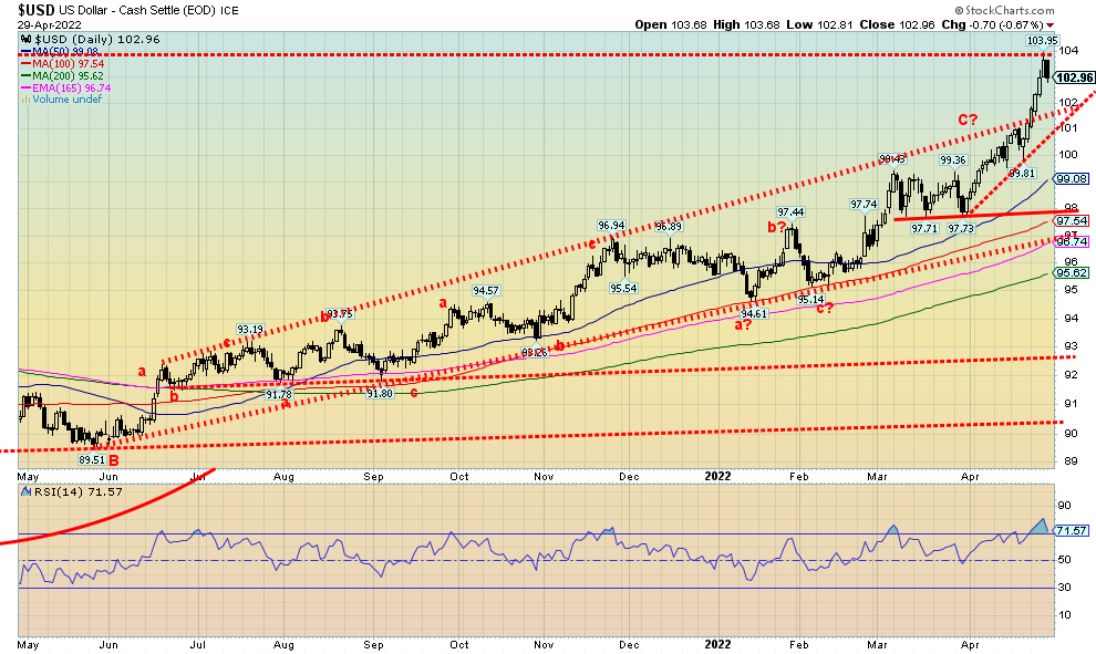
The US$ Index continues to benefit from having the highest interest rates (as measured here by the U.S. 10-year treasury note) of any G7 nation. With the ongoing war in Russia/Ukraine and the Bank of Japan (BOJ) keeping interest rates ultra-low, the U.S. dollar has benefitted from capital flows out of the EU and Japan. And now with the lockdowns in China there have been flows from there to the U.S. as well. The U.S. dollar is still the go-to place to park money that’s fleeing problems elsewhere. So now we have seen the US$ Index break out of its one-year channel and spike to new highs, roughly equaling the highs seen during the pandemic crash of March 2020. The US$ Index was up 1.7% this past week to new 52-week highs. As to the others, well, the euro fell 2.3%, the pound sterling was down 2.0%, the Swiss franc dropped 1.7%, and the Japanese yen was down 1.0%. All made fresh 52-week lows. The only exception was the Canadian dollar that fell 0.9% but at least is holding above its 52-week lows of 77.13 seen in December 2021. But at 77.91 this past week it’s creeping closer.
The question now is, was this most recent move just the culmination of the recent rise resulting in a short blow-off or is this the start of any bigger move to the upside? Friday saw the US$ Index reverse and close lower
although no new high was seen. There is a support line below, first near 102 and then near 101. So those two points may hold the key to the next move. If we break and close under 101, the top could be in. Below 101 we can see support down to 99 and then 98. But if we break higher, we are then looking at the highest levels for the US$ Index since 2002. We are quite overbought with the weekly RSI at 78. That suggests a potential high here. Even the monthly RSI is now at 71 so it too is overbought. Overbought across all three major time frames. But then we’ve always said that conditions can remain overbought longer than the shorts can stay solvent. So, some caution until we see some confirmation of a top.
Source: www.stockcharts.com
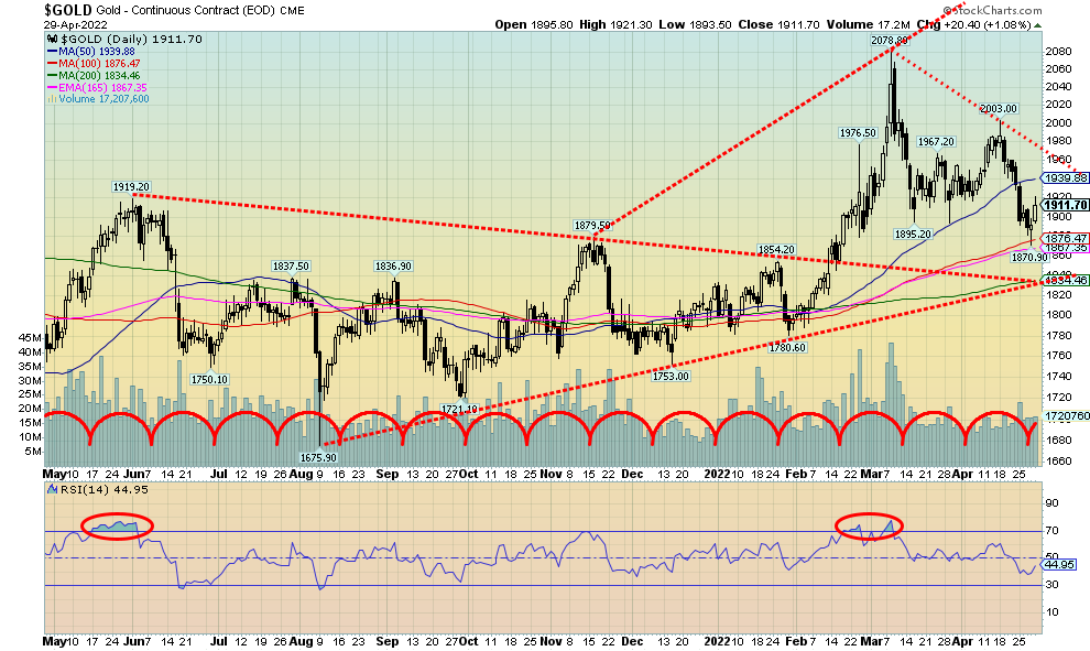
To quip the old Rodney Dangerfield phrase, gold “doesn’t get any respect.” We have geopolitical chaos, rising inflation, signs of stagflation, out of control money printing, which are all positive for gold. However, threats by the Fed to hike interest rates by at least 50 bp this coming week and some rumouring that it could be 75 bp has gold on edge. The question is, is this a “sell the rumour (the Fed is going to hike rates) buy the news (the Fed hiked rates)” scenario? We did see some positive signs Friday when gold closed higher while silver closed lower. Gold did not make new lows but silver did. A divergence? Gold did find support in the $1,880/$1,900 range as we noted previously. But now we hang on the balance as a breakdown under $1,870 would be more bearish. That could see us down to good support near $1,830. A breakdown under that level and in particular under $1,780 would effectively finish the gold market for the time being.
It’s not helping that the U.S. dollar is soaring as well. This past week the US$ Index hit its highest level since 2020, appearing to break out of a slow rising up channel. The US$ Index fell Friday which helped gold. The weak GDP data also helped gold. Gold may be a beneficiary of geopolitical uncertainty, inflation, stagflation, and deflation, but a strong US$ Index knocks it off its moorings. Rising interest rates are also anathema to gold because it raises the cost of carry.
This past week gold fell about 1.2%, but silver was hit harder, down 4.9%. Platinum reversed and closed up 1.3%. Palladium was off 2.9% and copper down 3.7%. The gold stock indices did not fare well with the Gold Bugs Index (HUI) down 5.9% and the TSX Gold Index (TGD) off 3.5%. On the month, gold lost 2.2% while silver was down 8.2%. The HUI fell 9.4% while the TGD was down 5.4%. Not a very good month.
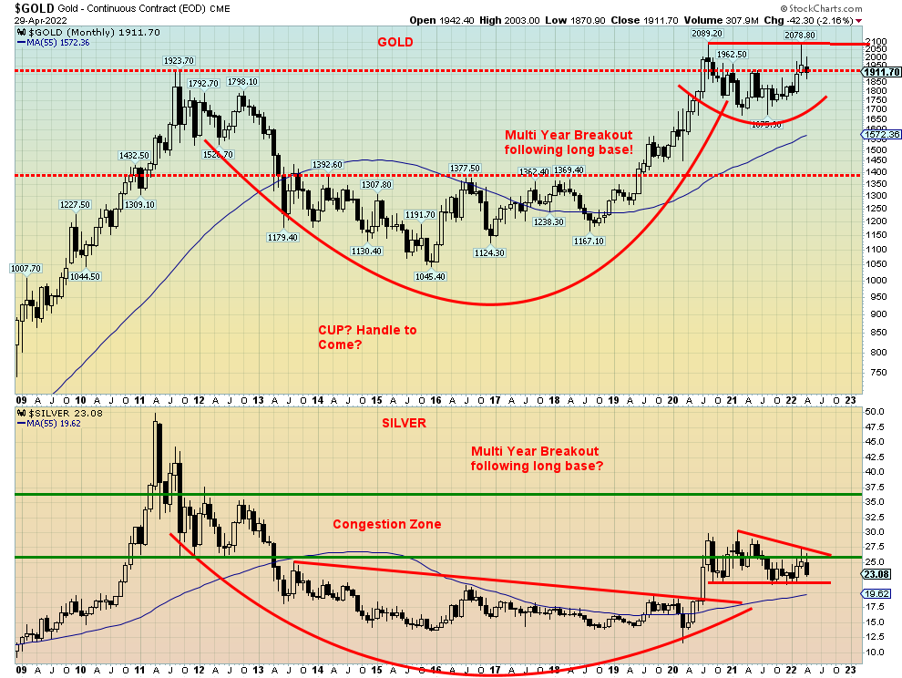
Our monthly chart of gold and silver below remains encouraging and still looks bullish. Silver in particular appears to be forming a flag or pennant formation while gold is making what could be a small rounding bottom. They both could be the handle of a possible multi-year cup and handle formation. For gold, that projects to at least $2,250/$2,300. Silver has a lot more work to do.
Chart on next page
Source: www.stockcharts.com
With the FOMC this coming week, it could be a pivotal week for gold. Given current support zones, it would be important to see them hold. Overall, we remain bullish but are cautious here until we see some confirmation that we are going to go higher. Right now, we need to regain above $1,960 to confirm that a low is in. Then we need to see some closings over $2,000 to suggest new highs. But $1,870 is now looming as important support and we would not want to see that break down.
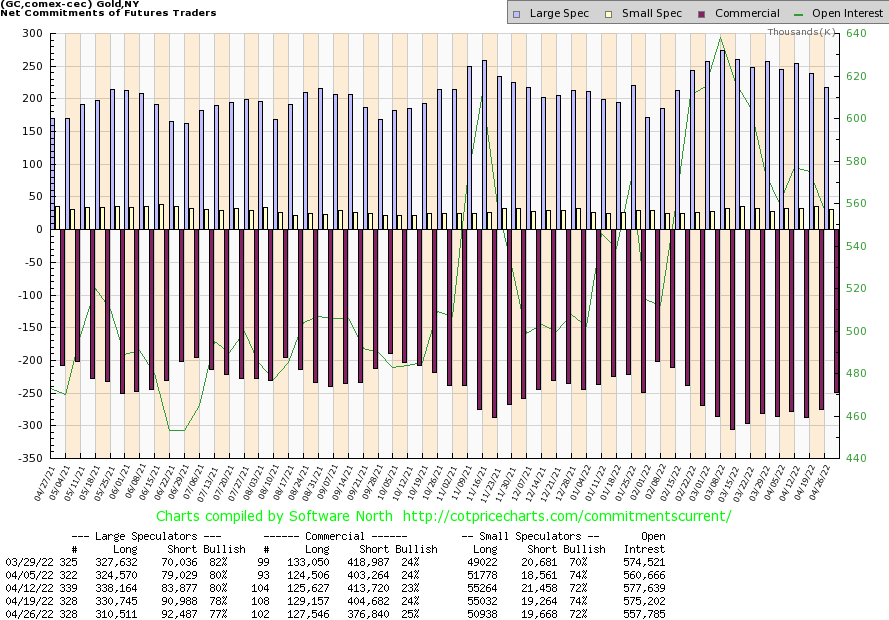
Source: www.cotpricecharts.com
The gold commercial COT (bullion companies and banks) improved to 25% this past week from 24%. It was the second consecutive weekly improvement. The large speculators COT (hedge funds, managed futures, etc.) slipped to 77% from 78%. For the commercial COT, long open interest fell about 2,000 contracts but short open interest fell more, down almost 28,000 contracts. Total open interest was down over 17,000 contracts on a down week, suggesting short covering. We have to view this report as at least mildly positive.
Source: www.stockcharts.com
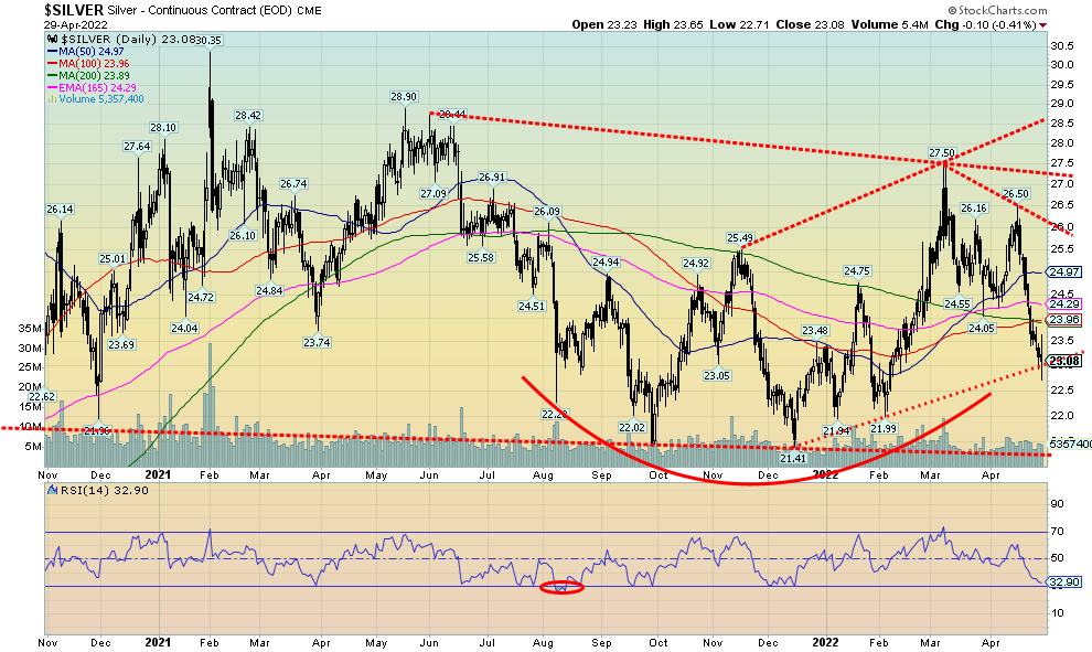
The recent drop in silver prices caught us by surprise. Since making that top in February at $27.50, silver has fallen over $4.40 or over 16%. After futures closed Friday, silver fell further, dropping below $23. That’s the bad news. The good news is that silver appeared to hit an uptrend line coming from the $21.41 low seen in December. Intra-day it did go through but closed above the line. As well, silver put in a new low at $22.71 for this move down, a move that was not confirmed by gold or the gold stocks. Given we closed the week on that note, it is a bit of a positive going forward as the two metals did not confirm each other. That could end quickly this coming week. However, we were encouraged by the good close on Friday by gold and the improved Commitment of Trader Reports (COT). Still, the pattern could have more than a few interpretations. We could see us stabilize here and move higher, or we could move lower. There is bit of ground to recover as silver needs to overhaul potential resistance at $24 and through $25. Above $26.50 new highs are probable. A further breakdown and drop under $22 would be quite negative.
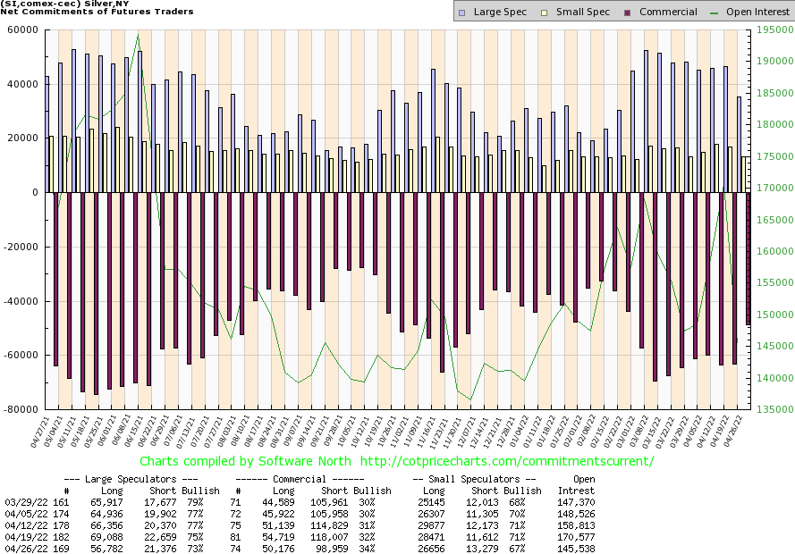
Source: www.cotpricecharts.com
Positive news for the silver commercial COT as well. Last week it improved to 34% from 32%. Both longs and shorts fell. Longs were down over 4,000 contracts but shorts fell even more down almost 20,000 contracts. The large speculators COT fell to 73% from 75% while overall open interest was down 25,000 contacts. What all this tells us is that the week’s action was short covering as silver prices fell under $23. We view this COT report as mildly positive. It will be good to see it improve again this coming week.
Source: www.stockcharts.com
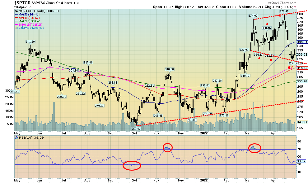
Our argument is that the TSX Gold Index (TGD) appears to forming a broadening pattern and, as well, it may have completed a five-point correction within the pattern (labeled abcde). If this is correct, then we could start a rally this coming week. The weekly low at 324 would now become important support that we should (hopefully) not breach. We do note support down to 310/315 with more support at 300. The gold stocks still fell this past week, adding to the woes of the previous week when the indices (and a number of stocks) reversed, closing sharply lower. This past week the TGD fell 3.5% while the Gold Bugs Index (HUI) was hit even harder, down 5.9%.
To convince us that the correction could be ending, first we need to recover back above 345/350. Above 365 new highs become probable. However, if we are making a broadening pattern, that could be interpreted as bearish. Broadening patterns usually only appear at tops. However, we have seen them as consolidation patterns as well. One thing a top broadening pattern sees is higher volume. But volume has tailed off sharply during this period, suggesting to us that it is a correction only. Since the b wave we drew does not touch the top of the triangle, it may be that this is just a simple abc correction and we may have completed the c wave down. If we burst out to new highs we’ll know for sure. But the suspicion here is that we are completing a correction and a new up leg should soon get underway.
Source: www.stockcharts.com
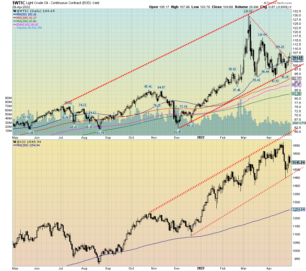
Oil prices rose this past week, ending a short-lived losing streak. Oil prices also put in their fifth consecutive monthly rise. Supply disruption and production problems still plague oil. Russia’s monthly output is down roughly one million barrels/day while disruptions continue in Libya. Iran is nowhere near where they used to be and OPEC is sticking to its production quotas. OPEC does meet this coming week but don’t expect any change in their output. OPEC is expected to keep its target of an additional 432,000 bpd but in the bigger scheme of things it is not really that much. So, OPEC is up a bit and Russia is down.
In China, demand has fallen because of the COVID lockdowns that have effectively shut down entire cities. Setting aside the demand destruction in China, evidence suggests that the supply problems could be worse.
This past week WTI oil rose 2.6%, closing once again over $100. Brent crude hit $110 before closing just under $107. Natural gas (NG) continues to be pressured to the upside as a result of the ongoing EU gas crisis and spat with Russia. NG rose 8.7%, but over in the EU prices are even higher. Some NG prices in the EU reached the equivalent of $600 oil. However, the price settled back later in the week as countries sought workarounds and other sources.
The energy stock indices were mixed. After reversing sharply, the previous week the ARCA Oil & Gas Index (XOI) gapped down further earlier this past week, but managed to recover by end of the week as oil prices rose. The XOI still finished down on the week, losing about 0.6%. The TSX Energy Index (TEN) did not suffer the same fate and gained 4.5% on the week. One of the bright spots in a dismal market.
By now everyone knows Russia has cut gas supply to Poland and Bulgaria. They cut them because of their refusal to pay in rubles as requested by Russia. But would Russia cut off Germany? Russia lost 270,000 bpd after Exxon Mobil was forced into force majeure at their Sakhalin project. They were forced because of the inability to ship crude from there.
WTI oil appears to have broken out of its recent down channel. Oil prices also held the lower channel of the uptrend. This leaves the potential for further prices increases this coming week. A move over $110 could set in motion a move towards $120 and the recent high of $130. Above $122 new highs are highly probable.
High gasoline prices in Canada and the U.S. are beginning to bite. Many expect Canada to surpass $2/litre this summer. In the EU they are quite used to $2/litre or higher. But then you don’t find as many large gas-guzzling SUVs and trucks over there.
Copyright David Chapman, 2022
|
GLOSSARY Trends Daily – Short-term trend (For swing traders) Weekly – Intermediate-term trend (For long-term trend followers) Monthly – Long-term secular trend (For long-term trend followers) Up – The trend is up. Down – The trend is down Neutral – Indicators are mostly neutral. A trend change might be in the offing. Weak – The trend is still up or down but it is weakening. It is also a sign that the trend might change. Topping – Indicators are suggesting that while the trend remains up there are considerable signs that suggest that the market is topping. Bottoming – Indicators are suggesting that while the trend is down there are considerable signs that suggest that the market is bottoming. |
Disclaimer
David Chapman is not a registered advisory service and is not an exempt market dealer (EMD) nor a licensed financial advisor. He does not and cannot give individualised market advice. David Chapman has worked in the financial industry for over 40 years including large financial corporations, banks, and investment dealers. The information in this newsletter is intended only for informational and educational purposes. It should not be construed as an offer, a solicitation of an offer or sale of any security. Every effort is made to provide accurate and complete information. However, we cannot guarantee that there will be no errors. We make no claims, promises or guarantees about the accuracy, completeness, or adequacy of the contents of this commentary and expressly disclaim liability for errors and omissions in the contents of this commentary. David Chapman will always use his best efforts to ensure the accuracy and timeliness of all information. The reader assumes all risk when trading in securities and David Chapman advises consulting a licensed professional financial advisor or portfolio manager such as Enriched Investing Incorporated before proceeding with any trade or idea presented in this newsletter. David Chapman may own shares in companies mentioned in this newsletter. Before making an investment, prospective investors should review each security’s offering documents which summarize the objectives, fees, expenses and associated risks. David Chapman shares his ideas and opinions for informational and educational purposes only and expects the reader to perform due diligence before considering a position in any security. That includes consulting with your own licensed professional financial advisor such as Enriched Investing Incorporated. Performance is not guaranteed, values change frequently, and past performance may not be repeated.
About the author


Website: https://www.enrichedinvesting.com
Disclaimer: David Chapman is not a registered advisory service and is not an exempt market dealer (EMD) nor a licensed financial advisor. We do not and cannot give individualised market advice. David Chapman has worked in the financial industry for over 40 years including large financial corporations, banks, and investment dealers. The information in this newsletter is intended only for informational and educational purposes. It should not be considered a solicitation of an offer or sale of any security. The reader assumes all risk when trading in securities and David Chapman advises consulting a licensed professional financial advisor before proceeding with any trade or idea presented in this newsletter. David Chapman may own shares in companies mentioned in this newsletter. We share our ideas and opinions for informational and educational purposes only and expect the reader to perform due diligence before considering a position in any security. That includes consulting with your own licensed professional financial advisor.