
Dot.com bubble redux? The S&P 500 (SPX) has been up 20% + two years in a row so far. Ok, 3 months to go so things could change. But the last time the SPX rose 20% + two years in a row was 1998-1999. Back then it was the dot.com/high tech stocks. This time it's the MAG7 even if they have come off a bit lately. In Canada, for example, Thomson Reuters Corporation a global content and technology company, reported increased revenues, increased net cash provided and strong cash flow, pays a dividend, and is held in the Enriched Capital Conservative Growth Strategy.* It was a week of all-time highs once again with exceptions and the exception was interesting.
It all had us thinking where are we in the Kondratieff wave cycle? So we took a look and we know we are late in the current cycle. We explain.
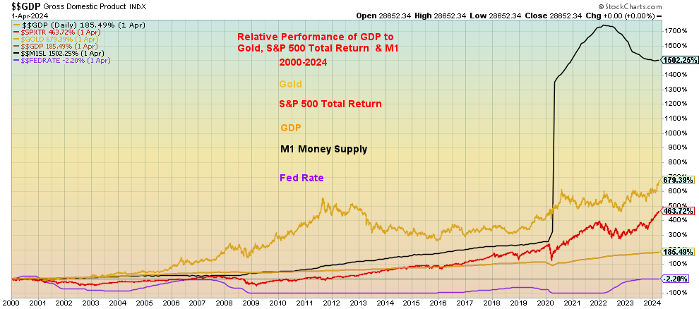
Our chart of the week looks at the relative performance of gold, the SPXTR Index, GDP, and money supply since 2000. While gold has been the best performer the rise in money supply (M1) is nothing short of spectacular. It kept the market together and GDP grew as a result. But it took an increasing amount of M1 (and debt) to purchase a dollar of GDP. Gold, which is hitting all-time highs again, is responding to the massive rise in money and debt.
Markets were up again this past week with a number of indices and gold making all-time highs. There were a few 52-week highs as well. Given the darkening background of geopolitics, domestic politics, massive debt, and an overvalued stock market an accident is waiting to happen. China once again came through with a massive stimulus program and that sparked a big jump in Chinese equities and commodities. The U.S. reported good Q2 GDP numbers but the U.S. manufacturing sector is already in a recession.
Events in the Middle East and Russia/Ukraine have a way to possibly change everything so they need to be closely watched.
This week is the September job numbers. They are expected to be lower.
Fall is here and there is a bit of a nip in the air. Have a great week.
DC
* Reference to the Enriched Capital Conservative Growth Strategy and its investments, celebrating a 6-year history of strong growth, is added by Margaret Samuel, President, CEO, and Portfolio Manager of Enriched Investing Incorporated, who can be reached at 416-203-3028 or msamuel@enrichedinvesting.com
“When September doth soar, you are promised much more. The stronger the defiance of September’s traditional weakness, the more robust is the market’s gallop into year-end.”
—Wayne Whaley, co-owner, Chief Investment Advisor, and head of market research for Witter & Lester Inc. (www.waynewhaley.com), has worked with Yale Hirsch of Stock Trader’s Almanac(www.stocktradersalmanac.com)
“If you don’t make bold moves, you don’t get f***ing anywhere. You’ve got to push the limits.”
—Keith Richards, English musician, songwriter, record producer, original member of the Rolling Stones; b. 1943
“Central bankers are brought up pulling the legs off ants.”
—Paul Volcker, American economist, 12th Chairman of the Federal Reserve 1979–1987, President Federal Reserve Bank of New York 1975–1979, Chair President’s Economic Recovery Advisory Board 2009–2011; 1927–2019
One has to be amazed at the resiliency of the stock market. As of the time of writing, the S&P 500 (SPX) is up over 20% on the year. Yes, we have three more months to go, but it is rare to see an index up 20% two years in a row. In 2023, the S&P 500 gained over 24%. We were reminded that the last time the S&P 500 did that was in 1998 and 1999. Okay, technically the SPX fell just short in 1999, up only 19.3%, but in 1998 it was up 26.6%, so the average for the two years was 23%. But with three months to go, that 20% + gain could also disappear in a hurry if the market turned down.
What struck us, however, was that 1998–1999 was the period of the dot.com bubble. Markets topped in March 2000. The U.S. economy was buzzing along in the late 1990s with few signs of trouble, except for the steaming stock market led by the dot. coms that was all the buzz with the talking heads. Despite some recent fading, the buzz today is the Magnificent 7 (MAG7) which has dominated the markets over the past couple of years. The NY FANG Index is up 30.5% so far in 2024 following a mind-boggling gain of 96% in 2023. Nvidia, the big star, is up 145% in 2024 following a gain of 239% in 2023. Never mind they have struggled a bit of late—they remain the buzz.
But not all boats are rising together. The S&P 400 (Mid) is up only 11.7% in 2024 while the S&P 600 (Small) is up 6.6%. The benefit of the rally has gone to the large-cap stocks, particularly the MAG7. The MAG7 makes up over 35% of the SPX and over 41% of the NASDAQ. And for the NASDAQ, the MAG7 share was at one time over 50%. Talk about the domination of only seven stocks. In 1973, the rally known as the Nifty Fifty was leading the way. But that was 50 stocks, not seven. Okay, maybe not actually 50, but it included the major companies of the day.
One might argue, oh, it’s not just the MAG7 and the SPX and NASDAQ. The Dow Jones Industrials (DJI) has also enjoyed a good year up, but compared to the others it is merely chicken feed. The DJI is up 11.8% so far in 2024 following a gain of 13.7% in 2023. The stars this year include the Gold Bugs Index (HUI) and the TSX Gold Index (TGD), both up over 30% in 2024 so far. But in 2023 the HUI was up only 6% and the TGD up 2.5%.
There are some other statistics comparable with 1999. The S&P 500 PE ratio today is 29.9; in 1999 it was 29.0. The price of sales today is 3.0 compared to 2.4 in late 1999. Price to book is comparable at 5.1 today vs. 5.1 in December 1999. But after reaching that level in late 1999–2000, the price-to-book ratio fell steadily for the next nine years.
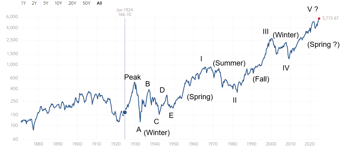
So where are we on the big cycles? Our long-term chart of the SPX on an inflation-adjusted basis shows the long waves quite well.
S&P 500 1929–2024
(Inflation-adjusted basis)
 Source: www.multpl.com,
In looking at this chart, we are not in a particularly good place. We’ve been in an up market for 15 years. The bull market of 1949–1966 was 17 years and the bull market of 1982–1999 was also 17 years. Could we go up for another two years? Yes, we could. But are we getting to the point of irrational exuberance? The market is rising against the threat of expanding wars, a slowing economy, and the potential for growing election violence as we go into the November 5 U.S. election. But this is not an all-boats rising market. As we noted, the DJI and the mid-cap and small-cap stocks are lagging. The Dow Jones Transportations (DJT) is lagging behind the DJI as the DJI makes new all-time highs but the DJT is not even close. As we have often noted, a key tenet of Dow Theory says that the indices must confirm each other. They are not.
We also note that the SPX is not making new highs in all major currencies. Besides the U.S. dollar, the SPX is only making new highs in the Canadian dollar. We checked, and we are not seeing new all-time highs for the SPX in euros, pound sterling, Swiss francs, Japanese yen, Australian dollar, or Chinese yuan. A test of gold in other currencies shows it is making new highs in all major currencies. We consider the failure of the SPX to make new highs in a raft of major currencies a negative divergence. They should all be making new highs to confirm each other. Gold does, but not the SPX.
Nonetheless, we appear to be on the fifth wave up from the low of 1949, the period of the Great Depression and War which was an end-of-cycle market. Or, in Kondratieff wave* parlance, 1949 ended the winter of the stock market cycle. But not all winters of the Kondratieff wave have to look like the Great Depression and war. They can also look at the period 2000–2009 against the backdrop of the dot.com bubble that peaked in 2000, the 9/11 attacks and the so-called War on Terror, including the invasions of Afghanistan and Iraq, the housing bubble, and the 2008 financial crisis that culminated in the Great Recession. The cycle 1949–2009 lasted 60 years, which fits well with the Kondratieff wave theory. The previous cycle started in 1896 from the bottom of the 1890s depression, topping in 1929—only 33 years. Cycles, however, are measured trough to trough so 1896–1949 is 53 years within the Kondratieff wave cycle of 50–60 years.
If that’s correct, then the last cycle 1949–2009 was followed by the Kondratieff Spring 2009–? fueled by ultra-low interest rates and massive liquidity injected by quantitative easing (QE). Technology has been the driver. This has created what is known as the Everything Bubble as assets everywhere go higher—the stock market, the housing market, rare coins, art, etc. Except gold and commodities that have languished for the past 15 years, even as they appear to be coming alive now. The Kondratieff Spring (and Fall) are periods where the stock market does well while gold and commodities do not. That reverses in the Kondratieff summer and winter. Given the stock market has failed to top so far, we can only conclude that the Kondratieff Spring is still in play and the 2022 correction was only a correction within the context of the current up wave that has yet to top.
Once this wave tops, the Kondratieff Summer gets underway and during that period, as we saw in the 1970s stock markets stumble. But gold and commodities soar. The current run-up in gold and commodities is just getting underway and is a warning sign that all is not well.
An explanation of Kondratieff waves follows:
The author of Kondratieff waves was Nickolai Kondratieff (1892–1938), a Russian/Soviet economist and a leading figure in Soviet economics. He’s the author of the Kondratieff Wave theory, theorizing that Western economies go through a cycle of 50–60 years divided into four phases (hence, calling them seasons). He flourished under Lenin but lost favour when Lenin died and Joseph Stalin took over. He noted his theory also applied to Russia as well as the Western economies. He was banished to prison in 1930 and died there in 1938.
*What is the Kondratieff wave?
The Kondratieff wave is a concept that was introduced during the Russian Communist era by a sociologist economist, Nikolai D. Kondratieff. He noticed that agricultural products and copper prices underwent long-term economic cycles that he believed to be a result of technological innovation and periods of evolution.
Kondratieff first introduced the concept of long-wave theory in his 1925 book, The Major Economic Cycles. Later in 1939, another economist, Joseph Schumpeter, suggested naming the long waves Kondratieff waves, in honor of the Russian economist’s work.
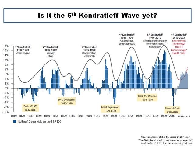
Economists estimate that the waves last for 40 to 60 years, with each cycle showing alternate intervals of high and low growth rates. Since the 18th century, economists have identified five Kondratieff waves, with the first one occurring during the invention of the steam engine and lasting from 1780 to 1830. The second cycle continued from 1830 up to 1880, driven by the growth of the steel industry and the railroads. The third, fourth, and fifth cycles lasted from 1880 to about 2005, and economists believe that a sixth cycle started in 2005.
Source: www.corporatefinanceinstitute.com
Kondratieff Wave 1784–2024
|
Spring (Expansion) Stocks |
Summer (Recession) Commodities |
Autumn (Plateau) Stocks |
Winter (Depression) Commodities |
|
1784–1800 (American Revolution) |
1800–1816 (War of 1812) |
1816–1835 (Era of Good Feelings) |
1835–1844 (Indian Wars) |
|
1845–1858 (Mexican-American War) |
1859–1864 (Civil War) |
1864–1874 (Reconstruction) |
1875–1896 (Indian Wars) |
|
1896–1907 (Spanish-American War) |
1907–1920 (WWI) |
1920–1929 (Roaring 20s) |
1929–1949 (WWII) |
|
1949–1966 (Korean War) |
1966–1982 (Vietnam War) |
1982–2000 (The New Economy, Iraq war, Balkans war) |
2000–2009 (War on Terror, invasions Iraq, Afghanistan) |
|
2009–? (Pandemic, U.S. Interventions in Syria, Libya, Red Sea Intervention, Russia/Ukraine, Israel/Mideast |
? |
|
|
Chart of the week
 Source: www.stockcharts.com
The above chart shows the relative price performance of gold, the S&P 500 Total Return Index, GDP, M1 money supply, and the Fed rate from 2000 to 2024. Some truisms stand out. The more money that was pumped into the financial system and the longer the Federal Reserve held the Fed rate low, the more that gold and the S&P 500 Total Return Index rose. GDP went up as well, but nowhere nearly as much as gold and the S&P 500 Total Return Index. The question begs: would GDP have performed as well without the massive stimulus of money, along with ultra-low interest rates, particularly after the 2008 financial crisis and especially after the 2020 pandemic?
Of course, a raging stock market wasn’t the only thing rising as housing prices also soared, along with numerous other assets. No wonder they gave it the moniker the Everything Bubble. Quantitative easing (QE) became the magic word as the Fed purchased billions of dollars of U.S. treasury securities, along with mortgage-backed securities (MBS) and other securities from banks and investment dealers. All that contributed to the sharp growth in M1 as well as M2. It was the biggest assault on the economy ever, surpassing even the massive monetary stimulation needed to finance two world wars.
The beneficiary was the stock market, along with numerous other assets. The stock market had languished during the 2000s as the period suffered through two recessions, one as a result of the collapse of the dot.com/high-tech market and the fallout of 9/11 2000–2002, and the second as a result of the global financial crisis of 2007–2009. The third rush came after the 2020 pandemic. In all cases, the economy benefitted with GDP growth resuming, but its rise compared to the others was feeble.
Since 2000, gold is up 679%, the S&P 500 Total Return Index is up 464%, and GDP is up 185%. M1 money supply has soared over 1,500%.
What all this implies is that for every 1% gain in GDP, gold rose 3.7% and the S&P 500 Total Return Index 2.5%. It took over 8% of M1 to create that 1% gain in GDP. We could have added in U.S. federal debt as well. U.S. federal debt is up 643% since 2000. Stating this another way, it took at least $1 of M1 to purchase $1 of GDP and it took $1.64 of new debt to purchase a $1 of GDP. If we look at the same number of years but going back from 2000 to 1976, we note that during that period it only took $0.32 of new debt to purchase $1 of GDP and it took only $0.16 of M1 to purchase $1 of GDP. Quite a dramatic change from one period to the next.
Gold, on the other hand, is merely responding to the massive increase in debt and money supply, along with the ultra-low interest rates. Rising gold prices are a sign that something is amiss. By the way, inflation is up only 86% from 2000 to 2024. This suggests to us that inflation is not the problem; instead, it is monetary and debt growth that spawned a huge bubble. Gold is merely responding to this excess and as a result, is outperforming everyone else. We’ve never seen a bubble that didn’t eventually burst. And, despite the rise in gold prices, gold still only represents just over 5% of global assets, according to Gold Charts R Us (www.goldchartsrus.com). Total global assets are estimated at $1.6 quintillion or $1,630 trillion. Total global debt is $315 trillion, while all the gold in the world is roughly only $12.5 trillion. That makes gold roughly only about 0.8% of global assets. All that suggests that the price of gold has a lot further to go.
Markets & Trends
|
|
|
|
% Gains (Losses) Trends |
|
||||
|
|
Close Dec 31/23 |
Close Sep 27, 2024 |
Week |
YTD |
Daily (Short Term) |
Weekly (Intermediate) |
Monthly (Long Term) |
|
|
Stock Market Indices |
|
|
|
|
|
|
|
|
|
S&P 500 |
4,769.83 |
5,738.17 (new highs)* |
0.6% |
20.3% |
up |
up |
up |
|
|
Dow Jones Industrials |
37,689.54 |
42,313.00 (new highs)* |
0.6% |
12.3% |
up |
up |
up |
|
|
Dow Jones Transport |
15,898.85 |
16,185.9 |
2.7% |
1.8% |
up |
up |
up |
|
|
NASDAQ |
15,011.35 |
18,119.59 |
1.0% |
20.7% |
up |
up |
up |
|
|
S&P/TSX Composite |
20,958.54 |
23,956.82 (new highs)* |
0.4% |
14.3% |
up |
up |
up |
|
|
S&P/TSX Venture (CDNX) |
552.90 |
583.14 |
(0.3)% |
5.5% |
up |
up |
down |
|
|
S&P 600 (small) |
1,318.26 |
1,418.14 |
0.2% |
7.6% |
up |
up |
up |
|
|
MSCI World |
2,260.96 |
2,532.73 (new highs)* |
2.7% |
12.0% |
up |
up |
up |
|
|
Bitcoin |
41,987.29 |
65,801.21 |
4.8% |
56.7% |
up |
up |
up |
|
|
|
|
|
|
|
|
|
|
|
|
Gold Mining Stock Indices |
|
|
|
|
|
|
|
|
|
Gold Bugs Index (HUI) |
243.31 |
326.42 (new highs) |
(0.7)% |
34.2% |
up |
up |
up |
|
|
TSX Gold Index (TGD) |
284.56 |
374.52 (new highs) |
(1.1)% |
31.6% |
up |
up |
up |
|
|
|
|
|
|
|
|
|
|
|
|
% |
|
|
|
|
|
|
|
|
|
U.S. 10-Year Treasury Bond yield |
3.87% |
3.76% |
0.3% |
(2.8)% |
|
|
|
|
|
Cdn. 10-Year Bond CGB yield |
3.11% |
2.98% |
0.3% |
(4.2)% |
|
|
|
|
|
Recession Watch Spreads |
|
|
|
|
|
|
|
|
|
U.S. 2-year 10-year Treasury spread |
(0.38)% |
0.16 |
6.7% |
142.1% |
|
|
|
|
|
Cdn 2-year 10-year CGB spread |
(0.78)% |
0.01 |
100.0% |
112.8% |
|
|
|
|
|
|
|
|
|
|
|
|
|
|
|
Currencies |
|
|
|
|
|
|
|
|
|
US$ Index |
101.03 |
100.1 (new lows) |
(0.7)% |
(0.9)% |
down |
down |
neutral |
|
|
Canadian $ |
75.60 |
74.01 |
0.4% |
(2.1)% |
up |
up |
down |
|
|
Euro |
110.36 |
111.66 (new highs) |
0.1% |
1.2% |
up |
up |
up (weak) |
|
|
Swiss Franc |
118.84 |
118.99 |
1.2% |
0.1% |
up |
up |
up |
|
|
British Pound |
127.31 |
133.76 (new highs) |
0.5% |
5.1% |
up |
up |
up |
|
|
Japanese Yen |
70.91 |
70.35 |
1.3% |
(0.8)% |
up |
up |
down (weak) |
|
|
|
|
|
|
|
|
|
|
|
|
|
|
|
|
|
|
|
|
|
|
Precious Metals |
|
|
|
|
|
|
|
|
|
Gold |
2,071.80 |
2,668.10 (new highs)* |
0.8% |
28.9% |
up |
up |
up |
|
|
Silver |
24.09 |
31.82 (new highs) |
1.0% |
32.1% |
up |
up |
up |
|
|
Platinum |
1,023.20 |
1,022.00 |
4.1% |
(0.1)% |
up |
up |
neutral |
|
|
|
|
|
|
|
|
|
|
|
|
Base Metals |
|
|
|
|
|
|
|
|
|
Palladium |
1,140.20 |
1,023.40 |
(5.1)% |
(10.2)% |
up |
up |
down |
|
|
Copper |
3.89 |
4.60 |
6.0% |
18.3% |
up |
up |
up |
|
|
|
|
|
|
|
|
|
|
|
|
Energy |
|
|
|
|
|
|
|
|
|
WTI Oil |
71.70 |
68.18 |
(4.0)% |
(5.0)% |
down |
down |
down |
|
|
Nat Gas |
2.56 |
2.90 |
6.6% |
13.3% |
up |
up |
down |
|
Source: www.stockcharts.com
Note: For an explanation of the trends, see the glossary at the end of this article.
New highs/lows refer to new 52-week highs/lows and, in some cases, all-time highs.
- * New All-Time Highs
Source: www.stockcharts.com
Once again, it was a week of all-time highs. Making all-time highs (again) was the S&P 500 (SPX), the Dow Jones Industrials (DJI), S&P 100 (OEX), Russell 1000 and 3000, the S&P 500 Equal Weight Index, and the Dow Jones Composite (DJC). Notably not making all-time highs was the NASDAQ, the NASDAQ 100, or the NY FANG Index. On the week, the SPX gained 0.6% as did the DJI, while the Dow Jones Transportations (DJT) was up 2.7% but remains shy of its all-time high or even its 52-week highs. It is an ongoing negative divergence with the DJI. The NASDAQ was up 1.0% while the NY FANG Index fell 0.7%. Bitcoin keeps trying to recover and was up 4.8%, closing near $66,000, a resistance zone.
In Canada, the TSX Composite made all-time highs again up 0.4%, but the TSX Venture Exchange (CDNX) continues to struggle, losing 0.3%. In the EU, the London FTSE gained 1.1%, the Euronext was up 2.1%, the Paris CAC 40 gained 2.3%, and the German DAX did make all-time highs, up 2.5%. In Asia, China’s Shanghai Index (SSEC) was up 12.8%, thanks to the stimulus, the Tokyo Nikkei Dow (TKN) gained 5.6%, while Hong Kong’s Hang Seng (HSI) jumped 14.4%, piggy-backing on the SSEC. The MSCI World Index (which excludes the U.S. indices) gained 2.7%, also to new all-time highs.
Can we gain further? The markets seem to be banking on the Fed cutting another 100 bp by year-end. Personal income and spending are softening, along with the manufacturing indices faltering in recession territory and the ongoing wars sparking funds to flee to the U.S. where they’re placed amongst other instruments in the U.S. stock market. That the U.S. stock markets are overvalued at these levels and have most likely been in a bubble doesn’t cross their minds or, if it does, they figure the Fed will come to their rescue as they have in the past with monstrous amounts of QE and ultra-low interest rates. The Fed will do what it takes to prevent a recession, as we saw in both 2008 and 2020. But, as we keep asking, has the Fed run out of bullets?
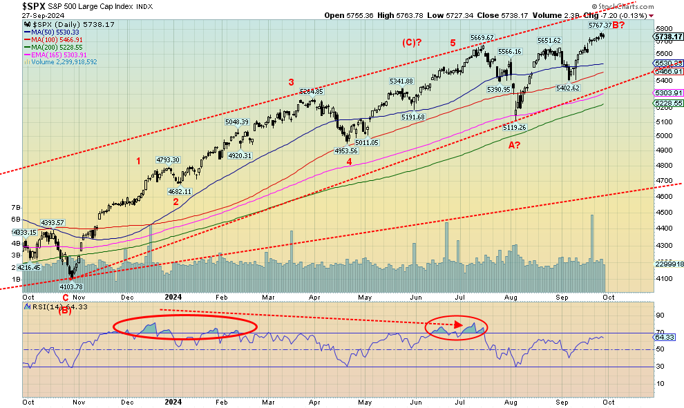
Even after a correction that we saw in July where the SPX fell almost 10%, the market roared right back once again to new all-time highs. So far, we seem oblivious to the seasonal weakness. Okay, there is still October to slam the market. Remember October 1929 and 1987? The SPX had a smaller correction in August, bottoming in September and losing about 4.5%. Then we roared back again to new all-time highs. But this market is long in the tooth. There are numerous divergences. As we’ve noted, the SPX is not making new highs in a raft of other currencies, just in US$ and Cdn$. Breaks under 5,400 signal trouble, but a break under 5,100 could signal the end of the bull. Under 4,900 would seal the deal. Otherwise, the trend is up and the market becomes more overvalued.
 Source: www.stockcharts.com
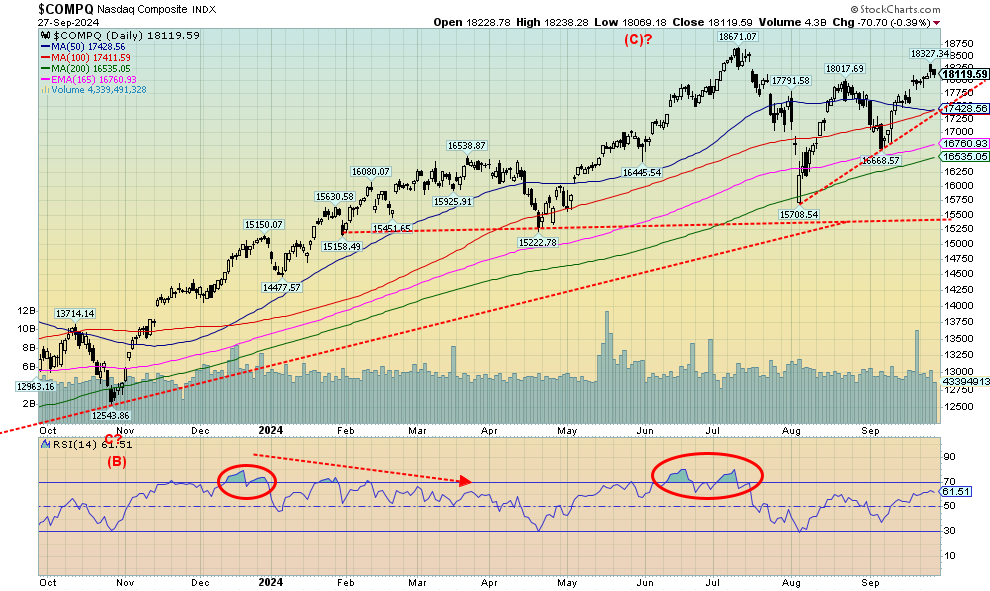
Despite a gain of about 1% on the week, the NASDAQ remains short of its all-time highs seen in July. As a result, the NASDAQ has failed to join its companion indices, the S&P 500 and the DJI, in making all-time highs. The MAG7, along with all the other FAANGs, makes up a significant part of the NASDAQ (estimated at over 40%) and we note that the NY FANG Index fell 0.3% this past week. Losses were seen for Amazon -1.9% and Microsoft -1.7%. Apple was also down. Tesla gained 9.3%. The biggest gainers on the week were the Chinese stocks Alibaba and Baidu, up 21.6% and 22.0% respectively. We cover China further below. We note that, after making all-time highs, the NASDAQ appeared to fall in five waves, suggesting that a possible primary wave to the downside was getting underway. The rebound has not disappointed, appearing to be a corrective ABC pattern. That last low was 16,669 and if that breaks, then the NASDAQ could be embarking on a new leg to the downside. The first solid break comes at 17,430, breaking the current uptrend line. The NASDAQ is making what could be a topping pattern, that still might chop around further. But those break points could signal a shift in direction. Otherwise, new highs are needed to suggest higher.
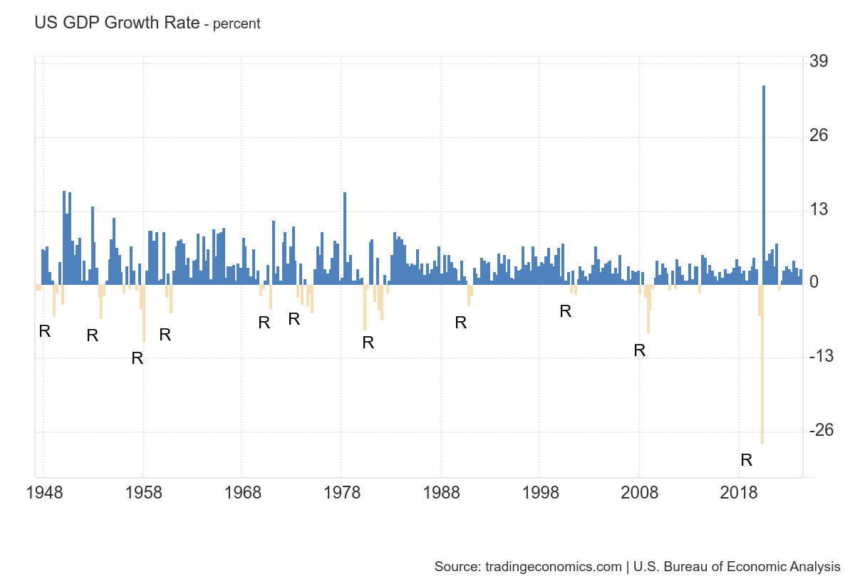
U.S. GDP Growth Rate 1948–2024
 Source: www.tradingeconomics.com, www.bea.gov
It appears that the economy remains strong. GDP growth for Q2 was 3%, unchanged from earlier reports. Q1 growth was 1.6%. Recession, what recession? Durable goods orders, which were expected to fall, came in flat. This week’s job claims report was 218,000, below the expected 222,000. The final Michigan Sentiment Index was 70.1, above the expected 69. PCE prices, which the Fed likes to follow, were up 2.2% year over year (y-o-y), below expectations of 2.4%. Q2 corporate profits were up 3.5% vs. the expected 1.7%, but personal income and spending were up only 0.2% vs. an expected gain of 0.3%. The Conference Board consumer confidence was below expectations at 98.7 vs. the expected 103. New home sales fell 4.7%, but that was better than the expected fall of 5.0%. Home sales along with housing starts are also becoming a drag on the economy as delinquencies, defaults, and bankruptcies slowly rise.
Overall, however, the economy seems to be doing better than expected.
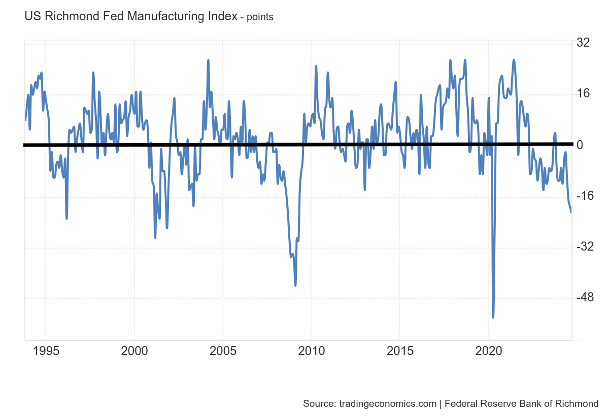
Richmond Fed Manufacturing Index 1994–2024
 Source: www.tradingeconomics.com,www.richmondfed.org
There are chinks in the armour, as shown by the Richmond Fed Manufacturing Index. It is below zero, last at negative 20, vs. an expected negative 17 and down where it was in the 2001–2002 period when the U.S. was in a recession. It is the lowest it’s been since the 2020 pandemic. Indeed, it seems that all of the manufacturing indices are either recessionary, even if they’ve had a temporary bounce-back. The important Chicago PMI last at 45 is in recession territory. But so are the NY Empire State Index, the Philly Fed, the Kansas Fed, and the ISM Manufacturing Index.
This coming week, the job numbers and nonfarm payrolls are expected to be only 130,000, down from 142,000 the previous month. The unemployment rate is expected to rise to 4.3% from 4.2%. None of this is recessionary yet, but the direction is down (nonfarm) and up (unemployment rate).
So, which is it? Is the economy doing well, or is it slowing, sliding into a recession?
 Source: www.stockcharts.com
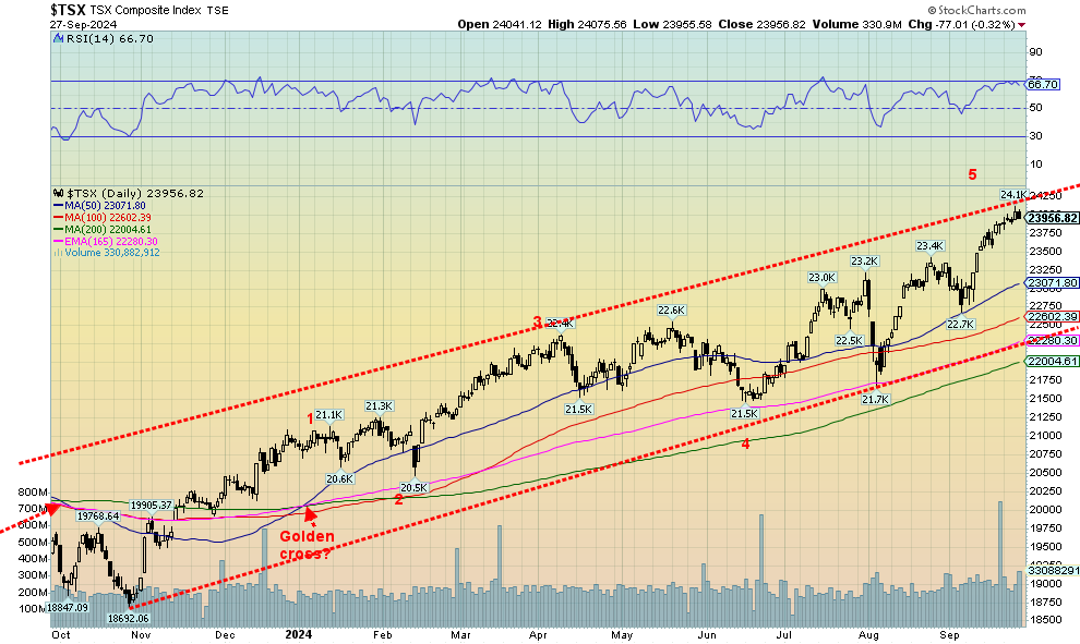
The TSX Composite keeps churning itself to new all-time highs. Once again, new all-time highs were seen. However, we are banging up against a potential channel top. We never became overbought, as periodic pullbacks on the way up kept the RSI from entering overbought territory. In that respect, this has been a good rally and, following another pullback, we could once again churn to new all-time highs. Leading the way in 2024 have been Materials (TMT), up 27.3% in 2024, and Golds (TGD), up 31.7%. But not everyone joined the party. Telecommunications (TTS) is down 3.0% in 2024. Ten of the 14 sub-indices were up on the week while five made all-time highs. The all-time highs were seen by Income Trusts (TCM) +0.9%, Consumer Discretionary (TCD) +1.2%, Financials (TFS) +0.5%, Information Technology (TTK) +.6%, and Utilities (TUT) +2.5%. The best performer during the week was Metals & Mining (TGM) +6.5%, helped by the easing of conditions in China. The most significant loser this past week was Energy (TEN) -1.3%. As we noted, we appear to be pushing up against the top of a channel. However, the breakdown doesn’t occur until we take out that last low near 22,700. A pullback would be healthy and may set up further gains. A breakdown first under 22,700 and especially under 21,700 could set up the opposite, a decline.
Elsewhere, the TSX Venture Exchange (CDNX) continues to struggle, losing 0.3% this past week. The CDNX is undervalued, under-owned, far from its all-time highs set in 2007, and still down 83% from there. For investors in the CDNX, particularly the junior mining stocks that are listed there, it has been a long and very cold winter. Spring, however, does come—eventually.
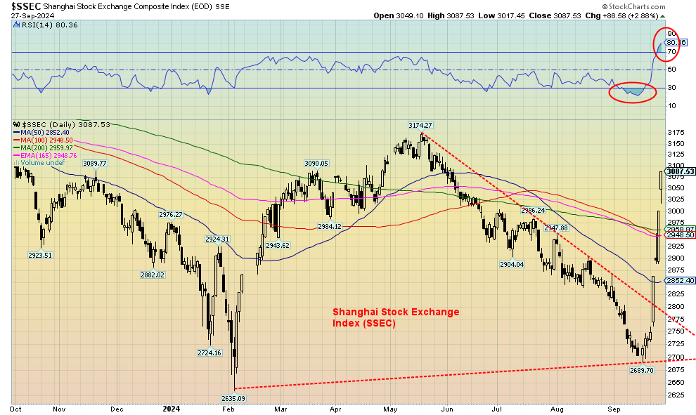 Source: www.stockcharts.com
From zero to hero; from loser to winner. It’s a bird, no, it’s a plane, no, it’s China’s Shanghai Index (SSEC) (along with numerous Chinese equities), soaring into the stratosphere after China announced they are going to save their economy by opening up the spigots (i.e. Chinese version of quantitative easing (QE)). For five months from May 2024 to September 2024, the SSEC fell relentlessly. Yes, the loss was only around 15%, but it felt worse. Witness their collapsing real estate market, an aging population, insufficient domestic demand, a too-tight grip on the economy from the top, and an extreme response to the pandemic that would have had Canada’s Freedom Convoy in an absolute rage. Except that in China, they would have all wound up in prison or worse and the convoy would have been snuffed out in a hurry.
Chinese FAANG stocks got in on the action, with Alibaba up 21.6% to new highs while Baidu was up 22.0%. We read numerous stories of portfolio managers saying they were loading up on Chinese equities. So, what did China do to spark the leap? China announced aggressive measures, backed by PBOC the central bank, to ease its real estate crisis (yes, there are cities where the apartments all sit empty); they cut short-term interest rates, reduced banks’ capital requirements, and increased support for their housing and equity markets. Commodities, especially gold, silver, copper, and oil all responded positively, even if they gave most of it back later in the week. But not the SSEC, at least not yet.
The rapid rise of the SSEC is a pattern we’ve seen before. It is normally a corrective pattern and not the start of anything major. Momentum could soon wane. A pullback and consolidation are to be expected. In no time flat, the SSEC went from very oversold to very overbought. A reminder, however, that the SSEC’s all-time high was set 17 years ago in 2007. Despite this week’s rally, the SSEC is still down 50% from its all-time high. It’s the Tokyo Nikkei Dow (TKN) redux. The SSEC is also still down 28% from its post-pandemic rally that peaked in early 2021. It has a way to go to fill those gaps.
U.S. 10-year Treasury Note, Canada 10-year Bond CGB
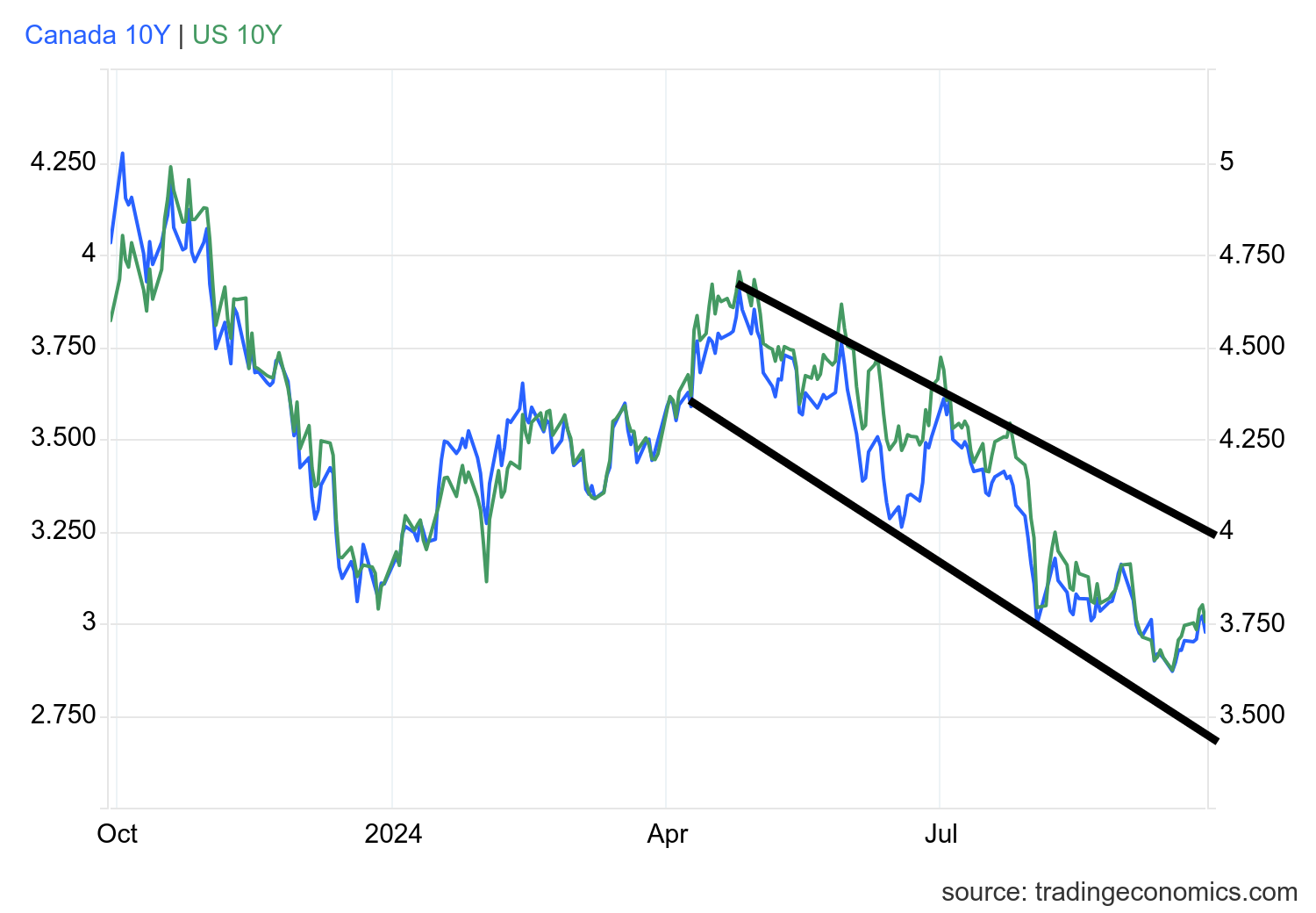 Source: www.tradingeconomics.com, www.home.treasury.gov, www.bankofcanada.ca
U.S. 10-year treasury notes dropped back to virtually unchanged by Friday at 3.76%, after hitting a high of 3.80%. A driver was the PCE prices that came in lower than expected. That in turn prompted thoughts the Fed might cut another 50 bp at its November meeting. Softer personal spending and income also helped. The Canadian 10-year Government of Canada bond also was basically unchanged at 2.98% vs. 2.97%. Thoughts of rate cuts helped lower the 2-year and the 2–10 spread in the U.S. widened to a positive 16 bp from 15 bp, while in Canada the 2–10 spread widened to a positive 1 bp from flat. With the yield curve turning positive after a long period of an inverted yield curve, it has in the past signaled the onset of a recession. Still, we haven’t received any sign of a recession—yet. The U.S. 10-year has room to move higher in the channel up to 4.0% or lower down to 3.50% and even lower. The driver is going to be a weakening economy and thoughts of Fed (and BofC) rate cuts. The caveat is the massive U.S. debt which needs constant refinancing. If there is any slowdown in re-financing, that debt along with raising new debt could put upward pressure on long rates even as short rates move lower. The U.S. continues to run deficits that are reminiscent of either being in a recession or wartime. Noteworthy is that the U.S. still spends billions of taxpayer dollars in goods and funds to both Ukraine and Israel to finance their wars.
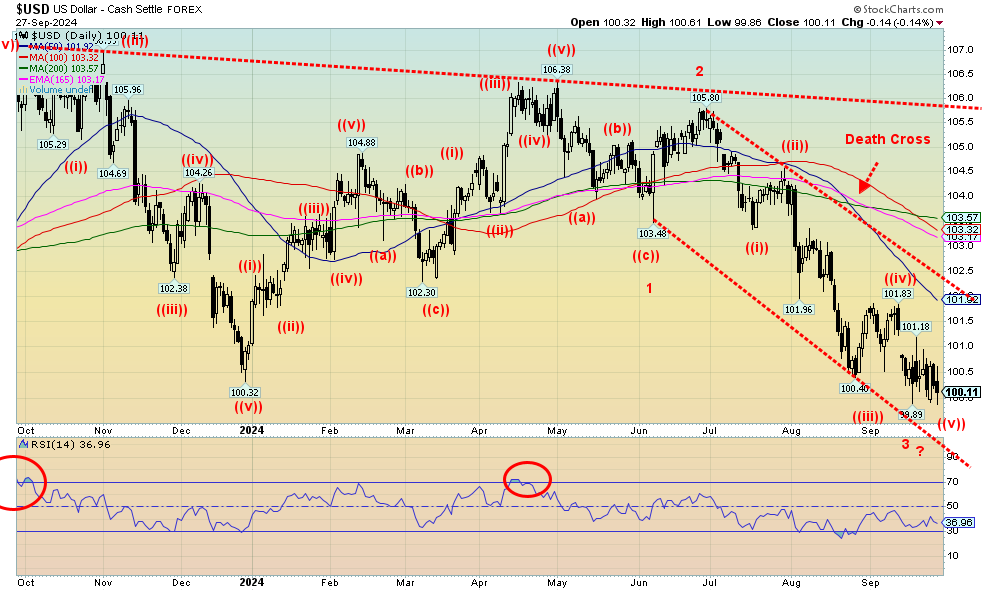 Source: www.stockcharts.com
The US$ Index hit new 52-week lows once again this past week but there was no real downside follow-through. We certainly had room to move lower with the down channel. Only a move over 101, however, would signal that we are least going to get a rebound rally. Resistance is up at 102.00. On the week, the US$ Index fell 0.7%. The big winner was the Japanese yen which rebounded 1.3%, followed by the Swiss franc, up 1.2%. Both the euro and the pound sterling hit fresh 52-week highs, up 0.1% and 0.5% respectively. The Canadian dollar gained 0.4%. Overall, we remain bearish on the US$ Index, but we can’t rule out a rebound rally. The RSI is above 30, suggesting we do have room to move lower. The US$ Index doesn’t have a lot to help it push higher as the specter of Fed rate cuts remains and recent numbers show some slowing, even as some still remain reasonably robust. The Q2 GDP numbers were good, but we await Q3, which may not be as good.
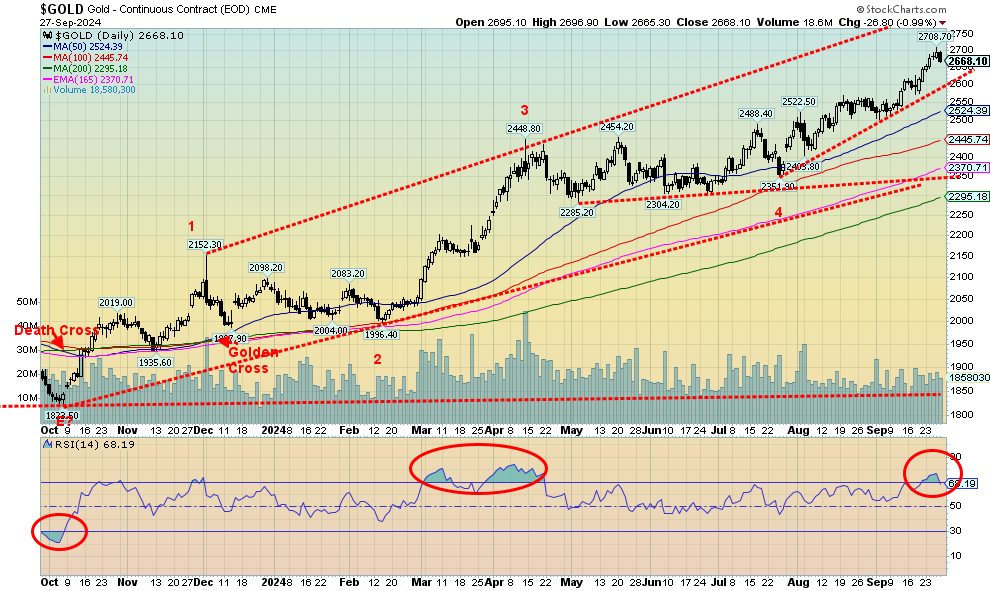 Source: www.stockcharts.com
Gold keeps churning higher to new all-time highs. Yes, once again, gold made all-time highs with Thursday’s high at $2,708.70. Gold has had a good year. Currently up 34.2% in 2024, if it holds it would be the best year since 1979, the year gold took off into the stratosphere, gaining 134.8%. Before that, the best year was 1978 with a gain of 36.5%. In 2010 gold gained 29.8%. This time the Fed cutting rates helped spur the current round of buying. As well the US$ Index recently hit new 52-week lows, also helping gold. Geopolitical uncertainty, domestic political uncertainty, monstrous debt, central bank demand, strong buying out of Asia, China’s stimulus package, and waning confidence in all governments are helping the rise of gold. We also note that fund managers and hedge funds are waking up to having more gold in their portfolios.
After making its all-time high on Thursday, gold reversed on Friday and fell on what appears as profit-taking as no recent news shook it. The US$ Index was down and PCE prices were also down. We are also overbought with the RSI moving over 70. However, as we saw back in March/April, overbought can hang around for some time. Will events in the Middle East on the weekend spark a new rise as the region races towards all-out war? Or do we await the nonfarm payrolls on Friday to see what the Fed might be up to next? The Fed has two meetings left in November and December and a minimum further 50 bp cut is likely, but could it be a 100 bp?
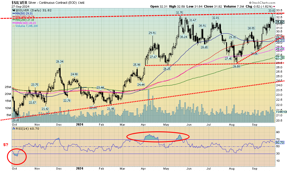
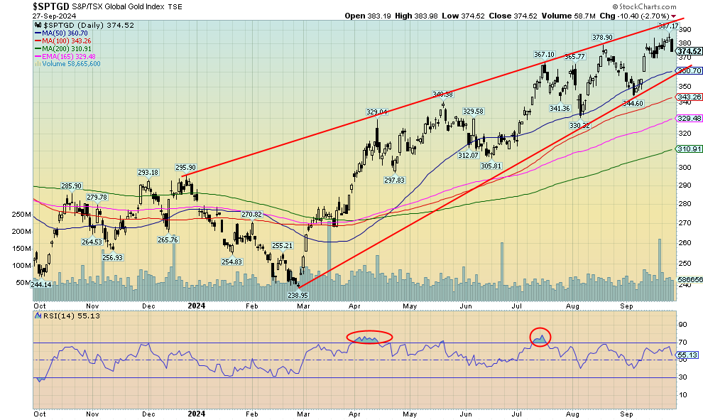
On the week, gold rose 0.8%, silver was up 1.0% to 52-week highs and the highest level since 2012, platinum recovered a bit, up 4.1%, but palladium stumbled, down 5.1%, while copper soared on Chinese stimulus, up 6.0%. However, the gold stocks hesitated as the Gold Bugs Index (HUI) fell 0.7% and the TSX Gold Index (TGD) was down 1.1% after both made 52-week highs.
Gold has been in a steady uptrend with only shallow pullbacks since breaking above that consolidation pattern that we believe was an ascending triangle. Since July, we have soared to all-time highs. So, is this another shallow pullback or might we pull back even more? A break under $2,600 might interrupt the magic. Under $2,500 we could move lower and under $2,400, and especially under $2,300, the up move would be officially over. First, let’s hold above $2,600.
 Source: www.stockcharts.com
Silver finally broke through to new 52-week highs, but it was short-lived. Silver this past week jumped to a high of $33.02, surpassing the May high of $32.75. But just as soon as one could say “new high”, silver reversed and closed at $31.82. False move? We don’t think so, but a longer connecting line with that May high does come in just above $33. That’s another hurdle to overcome if we are to fulfill targets up to $38–$40. Many think we’ll go even higher, but let’s get to those targets first. Silver has considerable support down to $29, but we wouldn’t want to see a break under that level as that would signal further losses, possibly down to $26. The good news this week was that silver did gain 1.0%. But it was insufficient to burst through the $33 resistance. Now we await the nonfarm payrolls on Friday to possibly point to the next direction. However, October is not noted for being a prime time for gold and silver, with tops in September followed by choppy weakness into December before the next good up leg gets underway. Will this year be different?
 Source: www.stockcharts.com
The gold stock indices once again made 52-week highs, but then promptly saw a wave of profit-taking on Friday, pushing both indices into the red. On the week, the TSX Gold Index (TGD) lost 1.1% while the Gold Bugs Index (HUI) was down 0.7%. A reversal? Yes, but not a key one. However, it may signal another period of consolidation. We would not want to see the TGD break under 360 and definitely not under 345. Both could be signalling that a more important top is in. There is still room to maneuver higher within the channel. The channel goes up to at least 400. But Friday’s move to the downside might set up at least a week of waffling as we go into next Friday’s anxiously awaited nonfarm payrolls.
 Source: www.stockcharts.com
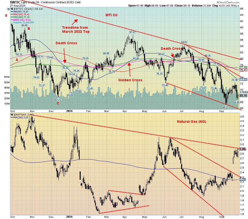
It seemed that WTI oil only had one way to go and that was up. It was driven by the huge Chinese stimulus package and the hurricanes in the Gulf. Then along came Saudi Arabia: are they going to ramp up in order to regain market share? Oil prices plunged on fears of oversupply. Adding to that, OPEC may decide in December to join the Saudis.
The result was that WTI oil fell following gains over the past couple of weeks. On the week, WTI oil fell 4.0%, while Brent crude was down 2.3%. Natural gas (NG), however, was spurred on by the hurricanes in the gulf and rose 6.6%. EU NG at the Dutch Hub was up 11.6%. As for the stocks, the ARCA Oil & Gas Index (XOI) was down 1.8%, while the TSX Energy Index (TEN) also down 1.3%.
This could be a test of the recent lows and not a new leg down. However, we can’t rule out new lows. We note that hedge funds and other professional speculators have loaded up on short oil positions. Do they know something? Or are they going to be surprised and forced to cover these positions. The bottom of that channel is now around $64. We are still in a period of seasonal weakness for oil prices. Not as much for NG, which appears poised to break out to the upside once it’s over $2.90, having closed there.
While we’ve turned bullish on the energy sector, we still may have to go through a further period of corrective action for oil, even as NG appears poised to break out. The Middle East wars remain a potential threat for oil prices, especially if Iran becomes involved.
Copyright David Chapman 2024
GLOSSARY
Trends
Daily – Short-term trend (For swing traders)
Weekly – Intermediate-term trend (For long-term trend followers)
Monthly – Long-term secular trend (For long-term trend followers)
Up – The trend is up.
Down – The trend is down
Neutral – Indicators are mostly neutral. A trend change might be in the offing.
Weak – The trend is still up or down but it is weakening. It is also a sign that the trend might change.
Topping – Indicators are suggesting that while the trend remains up there are considerable signs that suggest that the market is topping.
Bottoming – Indicators are suggesting that while the trend is down there are considerable signs that suggest that the market is bottoming.
Disclaimer
David Chapman is not a registered advisory service and is not an exempt market dealer (EMD) nor a licensed financial advisor. He does not and cannot give individualised market advice. David Chapman has worked in the financial industry for over 40 years including large financial corporations, banks, and investment dealers. The information in this newsletter is intended only for informational and educational purposes. It should not be construed as an offer, a solicitation of an offer or sale of any security. Every effort is made to provide accurate and complete information. However, we cannot guarantee that there will be no errors. We make no claims, promises or guarantees about the accuracy, completeness, or adequacy of the contents of this commentary and expressly disclaim liability for errors and omissions in the contents of this commentary. David Chapman will always use his best efforts to ensure the accuracy and timeliness of all information. The reader assumes all risk when trading in securities and David Chapman advises consulting a licensed professional financial advisor or portfolio manager such as Enriched Investing Incorporated before proceeding with any trade or idea presented in this newsletter. David Chapman may own shares in companies mentioned in this newsletter. Before making an investment, prospective investors should review each security’s offering documents which summarize the objectives, fees, expenses and associated risks. David Chapman shares his ideas and opinions for informational and educational purposes only and expects the reader to perform due diligence before considering a position in any security. That includes consulting with your own licensed professional financial advisor such as Enriched Investing Incorporated. Performance is not guaranteed, values change frequently, and past performance may not be repeated.
About the author


Website: https://www.enrichedinvesting.com
Disclaimer: David Chapman is not a registered advisory service and is not an exempt market dealer (EMD) nor a licensed financial advisor. We do not and cannot give individualised market advice. David Chapman has worked in the financial industry for over 40 years including large financial corporations, banks, and investment dealers. The information in this newsletter is intended only for informational and educational purposes. It should not be considered a solicitation of an offer or sale of any security. The reader assumes all risk when trading in securities and David Chapman advises consulting a licensed professional financial advisor before proceeding with any trade or idea presented in this newsletter. David Chapman may own shares in companies mentioned in this newsletter. We share our ideas and opinions for informational and educational purposes only and expect the reader to perform due diligence before considering a position in any security. That includes consulting with your own licensed professional financial advisor.