—Steve Burns, American actor, television host, singer, musician, host of children’s show Blue’s Clues 1996–2002; b. 1973
“If you can’t take a small loss, sooner or later you will take the mother of all losses.”
—Ed Seykota, commodities trader, early pioneer for systems trading; b. 1946
“The stock market clearly values companies that can deliver disruptive innovation.”
—Steve Blank, American entrepreneur, educator, author, speaker; b. 1953
“I said there’s storm clouds but I’m going to change it. It’s a hurricane. You’d better brace yourself.”
—Jamie Dimon, American billionaire, businessman, banker, Chairman and CEO JPMorgan Chase 2005–present; b. 1956
Jamie Dimon’s quote was part of a series of recession quotes seen in an article in The Globe and Mail Report on Business, June 11, 2022: “We partied all through the pandemic. But are the good times finally over”. What we are reading is recession is in the air. Every day when we pick up the newspaper there is some article about a coming recession. We picked up a poll (U.S.) that said 70% of Republicans believe we are already in a recession and 44% of Democrats think the same.
However, officially, we are not in a recession. Q1 2022 year-over-year (y-o-y) growth in the U.S. was 3.5% vs. 5.5% in Q4 2021. The quarterly growth was negative 1.5% vs. 6.9% in Q4. There is slowing, but nothing yet that signals recession. In Canada, it’s largely the same. Q1 y-o-y growth 2.9% vs. 3.2% in Q4. Q1 growth rate was 0.8% vs. 1.6% in Q4. Again slowing, but no recession. Over in the EU Q1 y-o-y growth was a robust 5.6%, above the 4.9% reported for Q4. But the quarterly growth Q1 was 0.7% vs. 0.5% in Q4. The EU, despite all its so-called problems, appears to be doing fine. However, Q2 will be more interesting as the effects of the Ukraine war trickle in.
But that doesn’t stop people from thinking we could already be in a recession. The Michigan Consumer Sentiment Index was last at 58.4, down from 65.2 the previous month. It’s the lowest level seen in a decade and approaching the depths it hit during the 2008 financial crisis. The world has a litany of problems. The war in Ukraine probably tops the list, along with the sanctions on Russia. The economic war deepens as the military war escalates. However, the extension of sanctions beyond Russia to a number of other countries is helping to divide the world into camps—dangerous camps.
Geopolitical power struggles historically have preceded every major war and many lesser ones as well. What makes the current conflict so dangerous is that the current war is basically a power struggle between two nuclear powers—U.S. and Russia, with Ukraine in the middle as the proxy. Add in the ongoing power struggle
between the U.S. and China and the period holds some similarities to the situation before World War I where Germany, Russia, France, and the United Kingdom jockeyed for global power, with the U.S. in the immediate background.
However, the war in Ukraine may not even be the most dangerous event. Climate change is rearing its ugly head. Whether one wishes to buy into climate change as an issue or not is moot. The past decade has been the hottest recorded. Whether the world went through periods of climate change in the past is also moot. The world did not have 7.8 billion people at any time during other periods of climate change.
The signs abound: Arctic ice is diminishing; it has been the hottest decade on record; oceans are warming both in the air above and on the surface, leading to fiercer and more frequent storms and hurricanes; the oceans are rising and already major cities are experiencing significant problems of flooding and more (Jakarta and Miami are just two of many); rising humidity and heat contribute to more and fiercer storms including snow storms; glaciers are melting; and drought is stalking the world—in North America (Northern Ontario, the Prairies, the interior of BC, California and the Southwest U.S.), Africa (from North Africa and south to South Africa), Europe (in Ukraine and much of Eastern Europe), and Asia (in India, Pakistan, Bangladesh, parts of China, and the Middle East). And we wonder why we are having a food crisis.
Climate change is putting pressure on global food supplies. In Africa, upwards of 450 million are at risk of famine and there is an expectation that 80–100 million migrants could be on the move north towards Europe by 2050. Drought and drug wars are leading migrants to flee Central American countries and trudge north to the U.S. They cannot all be accommodated.
Yes, there are long-term cycles at play where the world does go through periods of severe droughts and more. But again, in the past, none occurred with 7.8 billion people on the planet. The two major problems, war and climate change, are contributing to high inflation, particularly for food and energy. We were always amused at the officials tracking not just inflation but also core inflation ex food and energy. However, food and energy are the most significant.
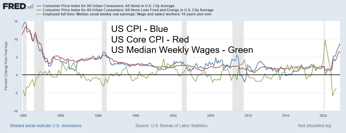
Here's a chart that shows changes in the CPI (inflation) vs. Core CPI and real wages 16 and over (adjusted for inflation). Inflation and core inflation are rising at their highest levels in 40 years. Meanwhile, real wages are actually falling at their fastest level in 40 years. Inflation has become a major concern everywhere and, in a worst-case scenario, could lead to social unrest.
US CPI, Core CPI, Real Wages 1980–2022
Source: www.stlouisfed.org
Commodity prices have been rising rapidly, particularly oil and gas, two key commodities that run our economies. Add in the negative effects of climate change and that puts huge upward pressure on food
prices. Shortages of fertilizers add to the woes. Commodities will be needed in spades to create a greener economy. Hosts of minerals from cobalt to lithium lead the way, but uranium is needed for the growing nuclear energy industry (see Chart of the Week).
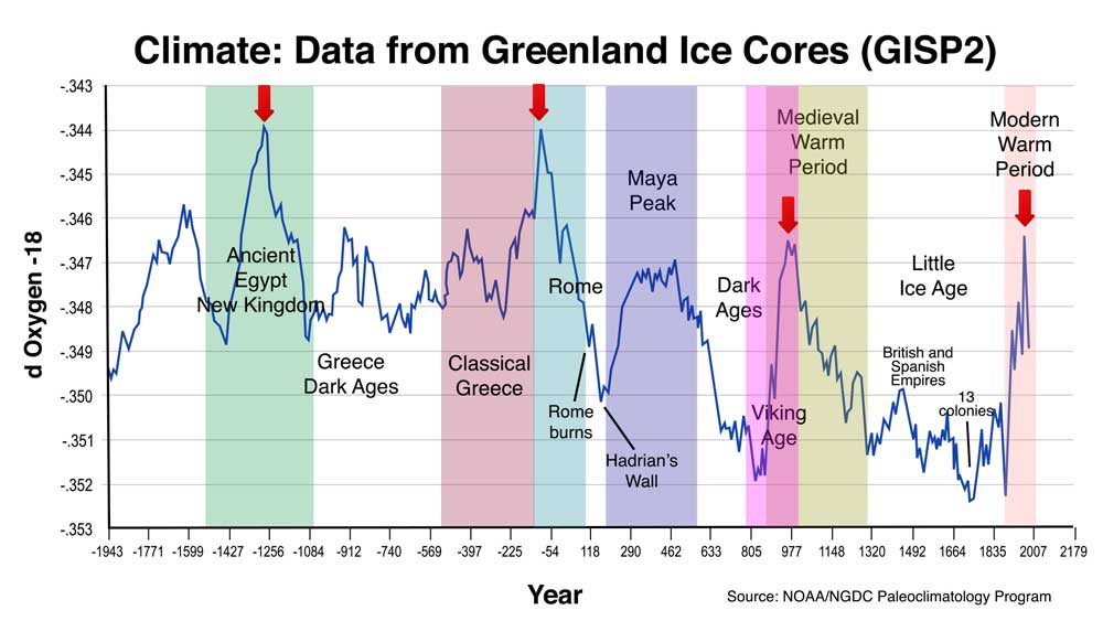
Here is a long-term chart dating from 2000 BCE that shows data from Greenland Ice Cores. Rising periods are periods of global warming while the falling periods correspond to periods of global cooling, even mini-ice ages. Peaks in global warming have historically corresponded to peaks in civilization while troughs have corresponded to periods of dark ages, economic depressions, and wars. Other charts show how this period of warming has been exacerbated by man’s industrial activities, shooting higher than any warming period seen before. This in turn could spell considerable trouble going forward along with massive social unrest, wars, and more. Spending money now to counter its growing impact is helpful, but it most likely won’t solve it. Reacting to it, rather being more proactive is even more expensive. Climate change is cyclical, yes, but it has also been
exacerbated by man’s actions and the rise of the industrial age.
Chart continues on next page
Source: www.worldscyclesinstitute.com
Stock markets are also cyclical. At least, that is what cycle analysts like Ray Merriman of MMA Cycles (www.mmacycles.com) and Martin Armstrong of Armstrong Economics (www.armstrongeconomics.com) have calculated. Cycles are also predictable within a range that could for longer-term cycles be measured in years. We have reviewed these stock market cycles before, but they are worth repeating so everyone has an understanding of where we are. Mostly we’ll be following Merriman’s cycles but not ignoring Armstrong’s. There are many other cycles as well and most flow with each other, regardless of the name.
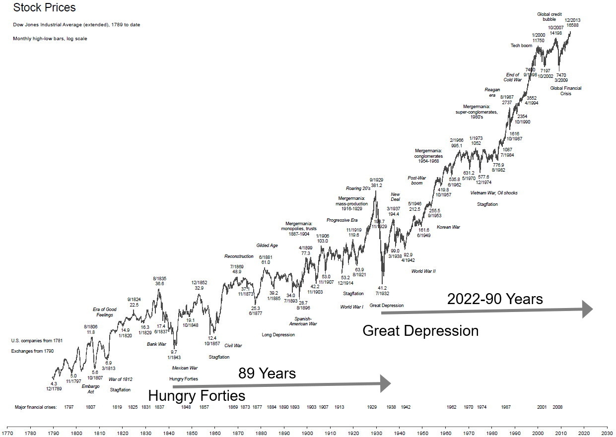
Merriman’s longest stock market cycle is 90 years. Each cycle breaks down into 18-year cycles. So, a 90-year cycle is five cycles of 18 years. The 90-year cycle is harder to quantify because, since the start of the U.S. and major stock indices, there have been only two recorded. The last one was 1932 and the Great Depression. Before that it was 1843 at the height of what was known as the Hungry Forties, stemming from banking collapses and economic panics back in 1837. The years 1843 and 1932 were stock market lows and we always measure trough to trough. Note how, in both instances, the stock market lows were below any previous low, thus highlighting the importance of the collapse. A 90-year cycle doesn’t mean its just one year. The effects linger for years.
The period between 1843 to 1932 is 89 years. We looked at longer charts and noted that major stock market lows were seen in 1761 (82 years before 1843) in a period known for stagflation and wars between Britain and France. Next up was 1672 (89 years before 1761), another period of wars (Netherlands/Britain amongst others), global cooling, and what was known as the Disaster Years. Finally, there was a significant stock market low in 1555, 117 years behind 1761. However, while 1555 was the stock market low, the stock market never
really broke out to the upside for at least another decade. The next predicted 90-year low, according to
Merriman, is 2021–2037. That also fits with Armstrong and some others.
U.S. Stock Markets 1789–2021 Dow Jones Industrials or proxies
Source: www.goldchartsrus.com
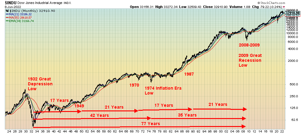
Next is the 72-year cycle (4x18). The range is 73–77 years. We have four observations, starting with the lows of 1789 but the actual stock market low was 1783. Major cycle lows were observed in 1857 (74 years from 1783), 1932 (75 years from 1857), and 2009 (77 years from 1932). What this tells us is that we are currently in the up cycle of the 72-year cycle and any major low seen over the next decade should not be below the 2009 low. That keeps the cycle intact. The 36-year cycle also represented here is the half-cycle of the 72-year cycle. The range is 30–42 years. That fits well with stock market lows of the inflation-driven 1970s where the 1974 low was 42 years from 1932. We also noted an important low in 1970 (38 years from 1932). The 2009 low that followed was 35 years from 1974. Again, as with the 72-year cycle, we appear to be still in the up cycle of the current 36-year cycle.
Source: www.stockcharts.com
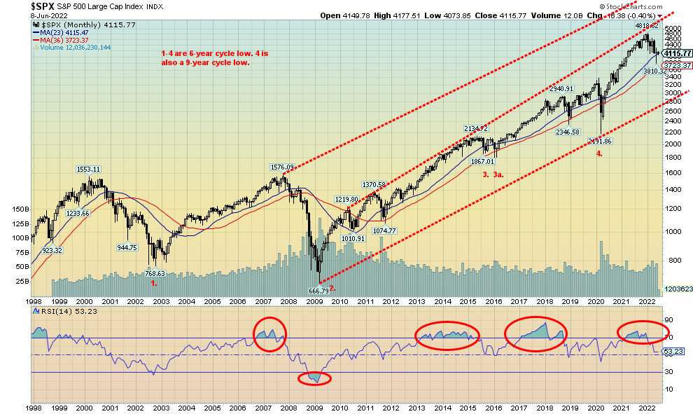
The final one of importance is the 18-year cycle range of 13-21 years. From 1932 we observe significant stock market lows in 1949 (17 years), 1970 (21 years), 1987 (17 years), and, of course, 2009 (21 years). Measuring from the 2009 low, the next one is due in 2024–2030 although if we widen it the range could be 2022–2030. It would also be the first 18-year cycle low of the current 72-year cycle. Our conclusion is that we are currently in the midst of trying to find the 18-year cycle low which is also occurring at the same time as the period of the 90-year cycle low.
The 18-year cycle breaks down mostly into three 6–6.5-year cycles (range 5-8 years), or it could be one 9-year cycle (range 7–11 years). It is not unusual to see both. Our chart below shows that cycle from the major high-tech/dot.com crash in 2002. Lows were seen in 2009, roughly 6.5 years from the October 2002 low, 2015–2016 with the February 2016 low seven years from March 2009, and March 2020 which was only four years from the February 2016 low, although that was just under 11 years from the 2009 low. We suspect the March pandemic low was the half-cycle 9-year low. In theory, we are still within the time frame for a 6–6.5-year cycle, currently six years from the February 2016 low. We could be making a low now followed by an upswing before collapsing into the 18-year cycle low due a little later this decade. Add in the negative effects of the 90-year cycle and we could be in for a difficult decade ahead.
Oh yes, and there is also the debt—over $300 trillion. More than double what was seen before the 2008 financial crisis. Economic collapses and depressions are also debt collapses. Here in Canada, the constant worry is the massive amount of household debt. Household debt to income in Canada as of January 2022 was
179.5%. Household debt to GDP was 108% as of Q4. Both are probably higher now. In the U.S., the concern is the corporate debt where 57% of corporate debt is rated BBB, the lowest investment grade possible. U.S. Corporate debt (non-financial plus financial) to GDP is 144.6%. Compare that to government debt (Federal, State, Municipal) to GDP at 143.2% and household debt to GDP at 98.6%. In a downturn, much of that
corporate debt could fall into junk status and no longer be eligible to be held in pension funds and others. Yes, government debt is also high but corporations and households can’t monetize their debt away as can governments. While the U.S. Federal Government debt to GDP at 129% and ranks amongst the highest in the world, the U.S. is also the world’s reserve currency. Of bigger concern are massive amounts of emerging market debt that are currently teetering on the brink of collapse. A sharply-rising U.S. dollar is not helping.
If we think the past few years have been bad, we could quip “you ain’t seen nothing yet.” The question is, how deep will we eventually go? If we really are in the up cycles of the 72-year and 36-year, this collapse into the 18-year cycle trough may not be as deep as feared. But it doesn’t erase what could still be a rough decade.
S&P 500 1998–2022 6-year Cycles
Source: www.stockcharts.com
Inflation has been rising, particularly for food and energy. But there are no signs on the horizon that is about to end. The war in Ukraine is not going to end tomorrow and there appears to be little will for a negotiated settlement. Consumer unrest could follow because of inflation of sharply rising food and energy prices. Adding to the war woes are a few stories hinting that Israel could attack Iran over Iran’s nuclear programs. If that were to happen, $150 oil may be only a pause place. Geopolitical power struggles are nothing new—only this time the major combatants hold nuclear weapons. No wonder the Doomsday Clock is currently showing at 100 seconds to midnight.
Great bear markets are the product of over-indebtedness and today we have that in spades. But we also have war that could end up in global war, sharply-rising energy prices that impact almost everything else, supply disruptions that originated with the pandemic, the real fear of more pandemics, and the elephant in the room that is climate change. Sounds like a recipe for carrying cash and gold.
Chart of the Week
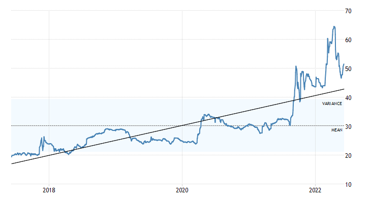
Uranium 2017–2022
Source: www.tradingeconomics.com
Uranium prices have jumped roughly $5 in the past week due to an increase in demand, higher prices for uranium enrichment, and signs that uranium funds could be increasing purchases. Uranium demand has been rising over the past year and in particular since the Russian/Ukraine war got underway, coupled with sanctions against Russia. Uranium is drawing considerable attention because of increased interest in building new nuclear reactors, particularly in China and the EU. It’s also in demand elsewhere as a substitute for oil, which has been under pressure due to sanctions and supply disruptions.
Then along came news that the U.S. is supporting a $4.3 billion plan to buy enriched uranium from domestic producers to wean itself off Russian imports. Yes, Russian imports. That seems odd, considering that Russia is only the world’s seventh largest uranium producer. But they hold the world’s fourth largest reserves behind Australia, Kazakhstan, and Canada. The top three hold over 50% of the world’s reserves. In terms of mining production, the top three are Kazakhstan, Australia, and Namibia. What’s key here is not uranium production
and reserves, but its enrichment. Russia is the world’s largest enricher of uranium with an estimated 43% of the global market. Most of the 500 commercial nuclear plants in operation or under construction require enriched uranium. 90% of the world’s enrichment capacity is with the five major nuclear powers and most of that is with Russia. Interestingly, Ukraine also provides some uranium enrichment. But for the U.S. to increase capacity they must build more plants. And, of course, secure more supply. Add in all the demand increases coupled with supply disruptions and we have uranium prices rising as a result.
With the world in disarray as a result of the Russia/Ukraine war and the sanctions on Russia like oil and gas, it is creating a supply problem just as demand is preparing to rise. Higher prices translate into higher prices for the uranium stocks as well.
Source: www.stockcharts.com
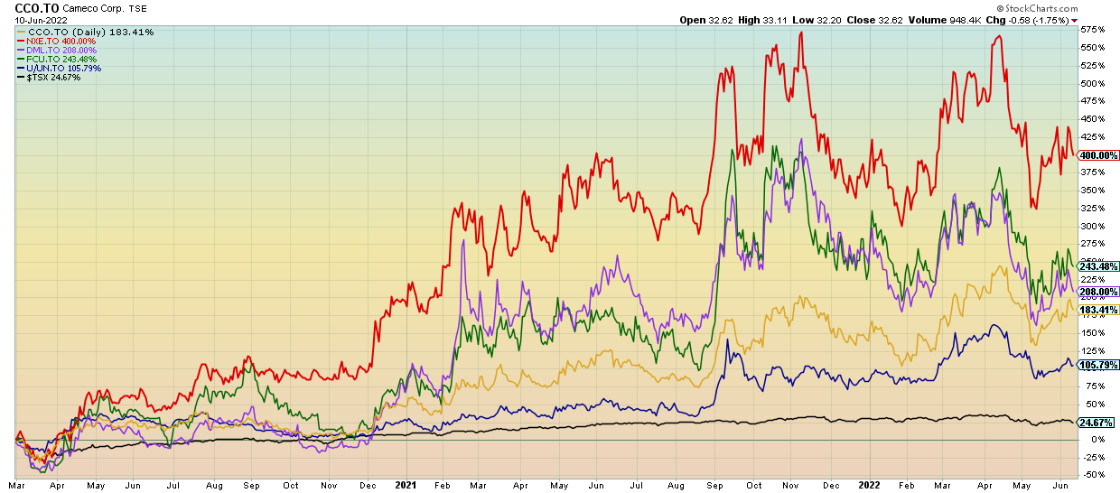
All this tells us is that there should be some focus on holding uranium stocks in one’s portfolio. The above chart features the performance of the five Canadian companies that all trade on the TSX. Performance is marked from March 1, 2020, roughly at the start of the pandemic. Note how prices have dipped over the past few months but are now showing signs of potentially starting a new leg up. The five are Cameco Corp. (CCO/TO), Canada’s largest publicly traded uranium producer that extracts some 20% of the world’s supply, up 183%; NextGen Energy (NXE/TO), a company that acquires and explores uranium properties up 400%; Denison Mines (DML/TO), a large uranium exploration and development company, up 208%; Fission Uranium (FCU/TO), a company that could be on the verge of becoming a significant uranium producer, up 243%; and Sprott Physical Uranium Trust (U.U/TO), an ETF that invests in uranium and uranium stocks. Sprott holds over 48 million pounds of uranium, has a market cap over $2.3 billion, and is up 106%. Compare all that to the TSX over the same time frame, up about 25%.
Canada’s major uranium production comes from Northern Saskatchewan. Nearly 85% of all Canada’s uranium production is exported.
Canada Job Numbers
Source: www.tradingeconomics.com, www.statscan.gc.ca
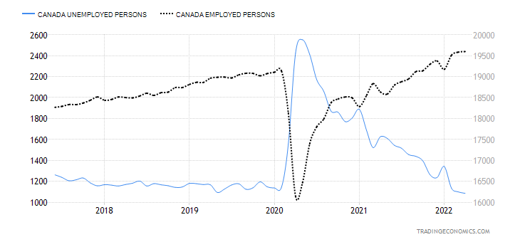
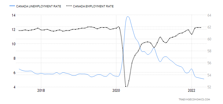
Canada added more jobs than expected in May—in total 39,800 when all they expected was 30,000. It was the fourth consecutive monthly gain and leaves Canada well above the level seen back in February 2020. Better still, the economy added 135,400 full-time jobs while losing 95,800 part-time jobs. The unemployment rate as a result fell to 5.1% from 5.2%. That’s the lowest rate since comparable data became available back in 1976. The R8 unemployment rate, which includes discouraged workers and involuntary part-timers, fell to 7% from 7.6%. That level was 8.6% way back in February 2020. The question is, can this continue?
Despite all this, Canadian employers are still looking for people with specific skills at Canada’s busiest airport, Toronto Pearson International, where customers have sometimes waited hours to be processed through security or customs. Job vacancy rates are at a very high level. The labour force participation rate is 65.3%, which is about where it was back in February 2020. Gains were seen especially in accommodation and services, professional services, education, and retail. Job losses were seen in transportation and warehousing, finance, real estate, etc., and goods producing. 20% of the gains came from back-to-work mandates for workers who had been temporarily laid off.
Wages jumped 4.5% y-o-y, but that is short of the inflation rate of 6.8% last reported for April. We await May’s numbers. The chart below shows Canada’s unemployment rate (5.1%) compared with the employment rate (61.9%). We suspect these levels are going to even out going forward and may even fall (or rise for the unemployment rate). With the levels back to where we were in February 2020, it will get harder to improve them going forward. Still, Canada’s employment performance has been good coming out of the pandemic recession. But with a new recession possibly on the horizon, what happens next?
Canada Unemployment Rate, Employment Rate 2017–2022
Source: www.tradingeconomics.com, www.statscan.gc.ca
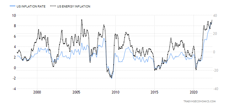
U.S. Inflation (CPI)
U.S. Inflation Rate, Energy Inflation Rate 1997–2022
Source: www.tradingeconomics.com, www.bls.gov
U.S. inflation soared to 8.6% y-o-y in May, the highest since December 1981 and above the expected rise of 8.3%. The markets, as a result, have been brutalized. Energy prices were up 34.6%, the highest since 2005. The gains were largely due to gasoline and fuel oil. Fuel oil was up 106.7% y-o-y, the highest gain ever. Food costs jumped 10.1% y-o-y. In the U.S., they are panicking over $5/gallon gasoline at the pumps. In Canada, we just paid about U.S.$6.20/U.S. gallon. Core inflation was 6%, above the expected 5.9%.
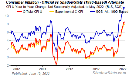
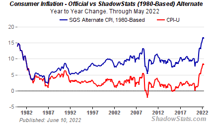
Shadow Stats publishes separate numbers for inflation. Inflation calculations have been adjusted over the years. What they did back then was change measuring inflation on the basis of the cost of living to one based on the ability to maintain a constant standard of living. For example, when steak prices are too expensive, buy hamburger. Based on how inflation was calculated back in 1990, the rate of inflation today is actually around 11%. John Williams of Shadow Stats also calculates inflation on how it was calculated back in 1980. Today that number would be 16.8%.
The reality is, if they want to bring down the rate of inflation particularly as it relates to energy, a solution for everyone for a certain war needs to be found and sanctions need to end. Otherwise, we are going to be facing much higher energy prices and, by extension, food prices to come.
Below is John Williams’ Shadow Stats charts on inflation 1990-based and also inflation 1980-based.
Shadow Stats 1990-Based Inflation
Source: www.shadowstats.com
Shadow Stats 1980-Based Inflation
Source: www.shadowstats.com
Markets & Trends
|
|
|
|
% Gains (Losses) Trends
|
|
||||
|
|
Close Dec 31/21 |
Close Jun 10/22 |
Week |
YTD |
Daily (Short Term) |
Weekly (Intermediate) |
Monthly (Long Term) |
|
|
Stock Market Indices |
|
|
|
|
|
|
|
|
|
S&P 500 |
4,766.18 |
3,900.86 |
(5.1)% |
(18.2)% |
down |
down |
up (weak) |
|
|
Dow Jones Industrials |
36,333.30 |
31,392.79 |
(4.6)% |
(13.6)% |
down |
down |
up (weak) |
|
|
Dow Jones Transports |
16,478.26 |
13,368.91 |
(7.5)% |
(18.9)% |
down |
down |
up (weak) |
|
|
NASDAQ |
15,644.97 |
11,340.02 |
(5.6)% |
(27.5)% |
down |
down |
neutral |
|
|
S&P/TSX Composite |
21,222.84 |
20,274.82 |
(2.5)% |
(4.5)% |
down |
down |
up |
|
|
S&P/TSX Venture (CDNX) |
939.18 |
704.70 |
(2.1)% |
(25.0)% |
down |
down |
neutral |
|
|
S&P 600 |
1,401.71 |
1,189.63 |
(4.3)% |
(15.1)% |
down |
down |
up (weak) |
|
|
MSCI World Index |
2,354.17 |
2,039.02 |
(2.0)% |
(13.4)% |
down (weak) |
down |
neutral |
|
|
NYSE Bitcoin Index |
47,907.71 |
29,547.47 |
0.3% |
(38.3)% |
down |
down |
up (weak) |
|
|
|
|
|
|
|
|
|
|
|
|
Gold Mining Stock Indices |
|
|
|
|
|
|
|
|
|
Gold Bugs Index (HUI) |
258.87 |
261.72 |
(0.2)% |
1.1% |
down (weak) |
neutral |
neutral |
|
|
TSX Gold Index (TGD) |
292.16 |
303.65 |
1.6% |
3.9% |
down |
neutral |
up (weak) |
|
|
|
|
|
|
|
|
|
|
|
|
Fixed Income Yields/Spreads |
|
|
|
|
|
|
|
|
|
U.S. 10-Year Treasury Bond yield |
1.52% |
3.16% (new highs) |
7.5% |
107.9% |
|
|
|
|
|
Cdn. 10-Year Bond CGB yield |
1.43% |
3.35% (new highs) |
9.1% |
134.3% |
|
|
|
|
|
Recession Watch Spreads |
|
|
|
|
|
|
|
|
|
U.S. 2-year 10-year Treasury spread |
0.79% |
0.09% |
(67.9)% |
(88.6)% |
|
|
|
|
|
Cdn 2-year 10-year CGB spread |
0.48% |
0.08% |
(50.0)% |
(88.3)% |
|
|
|
|
|
|
|
|
|
|
|
|
|
|
|
Currencies |
|
|
|
|
|
|
|
|
|
US$ Index |
95.59 |
104.15 |
2.0% |
9.0% |
up |
up |
up |
|
|
Canadian $ |
.7905 |
0.7835 |
(1.4)% |
(0.9)% |
neutral |
neutral |
up |
|
|
Euro |
113.74 |
105.18 |
(1.9)% |
(7.5)% |
down |
down |
down |
|
|
Swiss Franc |
109.77 |
101.19 |
(2.6)% |
(7.8)% |
down |
down |
down |
|
|
British Pound |
135.45 |
123.10 |
(1.5)% |
(9.1)% |
down |
down |
down |
|
|
Japanese Yen |
86.85 |
74.40 (new lows) |
(2.7)% |
(14.3)% |
down |
down |
down |
|
|
|
|
|
|
|
|
|
|
|
|
|
|
|
|
|
|
|
|
|
|
Precious Metals |
|
|
|
|
|
|
|
|
|
Gold |
1,828.60 |
1,875.50 |
1.4% |
2.6% |
neutral |
neutral |
up |
|
|
Silver |
23.35 |
21.93 |
0.1% |
(6.1)% |
down |
down |
neutral |
|
|
Platinum |
966.20 |
971.00 |
(4.5)% |
0.5% |
neutral |
down |
neutral |
|
|
|
|
|
|
|
|
|
|
|
|
Base Metals |
|
|
|
|
|
|
|
|
|
Palladium |
1,912.10 |
1,907.00 |
(4.0)% |
(0.3)% |
down |
down |
neutral |
|
|
Copper |
4.46 |
4.29 |
(3.9)% |
(3.8)% |
down (weak) |
down |
up |
|
|
|
|
|
|
|
|
|
|
|
|
Energy |
|
|
|
|
|
|
|
|
|
WTI Oil |
75.21 |
120.67 |
1.5% |
60.4% |
up |
up |
up |
|
|
Natural Gas |
3.73 |
8.85 (new highs) |
3.9% |
137.3% |
up |
up |
up |
|
Source: www.stockcharts.com
Note: For an explanation of the trends, see the glossary at the end of this article.
New highs/lows refer to new 52-week highs/lows and, in some cases, all-time highs.
Source: www.stockcharts.com
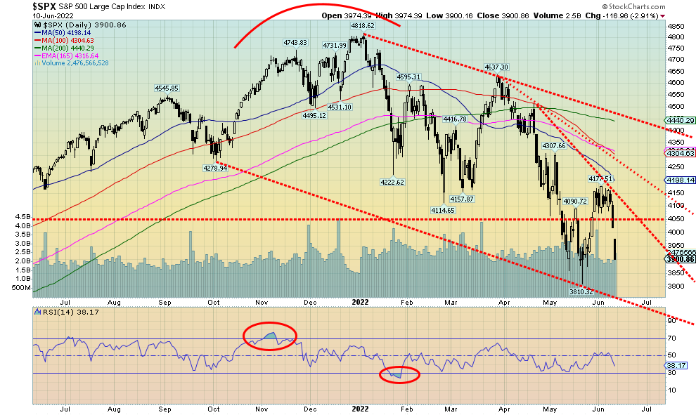
Ugly, ugly week. The higher-than-expected CPI numbers on Friday hammered the markets as the Dow Jones Industrials fell 880 points or 2.7%. On the week the DJI was down 4.6%. And the DJI was one of the better performers. The S&P 500 fell 5.1%, the Dow Jones Transportations (DJT) was off 7.5%, the NASDAQ was down 5.6%, while the S&P 600 (small cap) dropped 4.3%. The S&P 500 Equal Weight Index fell 5.1%. In Canada, the TSX Composite was an outperformer, off only 2.5% and the TSX Venture Exchange (CDNX) was down 2.1%. In the EU, the London FTSE fell 2.9%, the Paris CAC 40 was down 4.6%, and the German DAX was off 4.8%. In Asia, markets actually gained with China’s Shanghai Index (SSEC) up 2.8% and the Tokyo Nikkei Dow (TKN) up a small 0.2%. The MSCI World Index fell 2.0%. Bitcoin gained a feeble 0.3%.
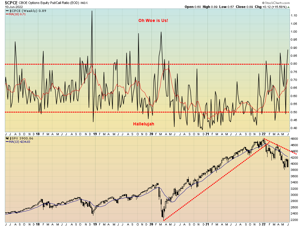
The inflation report was a disaster. Bonds shot up to 52-week highs, the Michigan Consumer Sentiment Index was in the tank, below even 1980’s levels, and recession fears appear to be growing exponentially. When there are too many people on one side, it’s time to start looking at the other side or, in this case, the buy side. The market gapped down this week, so we could have considerable downside follow-through this coming week. If this was a measuring gap, potential targets for the S&P 500 are down to 3,600 which is down around the bottom of that channel. This is, we believe, a mini-panic, a potential capitulation against bearish background news. But it could also set up a buying opportunity as the sell-side trade gets too big. We have noted below the growing put/call ratio, favouring bears. A number of indicators are showing signs of diverging, especially if the stock markets make new lows as we suspect is possible. Divergences mean the indices make new lows but the indicators do not.
This week on June 14–15 is the FOMC and the wide expectation is the Fed will hike 50 bp. The Fed could surprise and hike 75 bp. That would likely trigger more recession fears. Markets are also fearing the Fed is willing to risk a recession in order to bring down inflation. Traditionally that’s what happens. A recession is triggered to ease other bottlenecks. But triggering a recession is not going to bring down the high of cost of oil or natural gas that are prisoners to the war in Ukraine. Could the Middle East also surprise as rumours abound about a possible Israeli hit on Iran? That would raise the heat even more.
This week, besides the FOMC, the PPI is out on Tuesday with the y-o-y expected to be up 11.0%. Housing data comes out on Thursday. And on Friday it’s Industrial production.
It was a very unpleasant week, but we believe the end is in sight and buying opportunity exists. Word of warning that if the market were to charge right through our targets, then the drop could be even worse and we could have a full-blown crash in play. Although June crashes are a rarity. More likely following a summer rally is a fall crash. But we’ll have to wait to see how that sets up. Near term we are looking for a low this week or early the following week. But selling into a panic, even a mini-one is not recommended.
Source: www.stockcharts.com
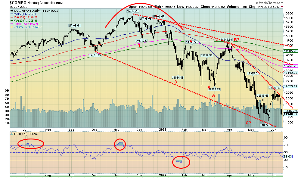
The NASDAQ, like everyone else, was pounded down on Friday. As we have noted, for everyone else it appears to be a measuring or running gap. Targets for the NASDAQ could be down to 10,360, a further 9% decline. Everybody was hit, especially in the FAANGs. But not all were losers. Meta fell 8.0% (do we have to call them the MAANGs now?), Apple was down 5.7%, Amazon after its split was down 10.4%, Netflix down 8.1%, Google down 2.7%, Microsoft -6.3%, Tesla -1.0%, Twitter -2.9%, Baidu -0.4%, and Nvidia -9.3%. Oh yes, there was a winner—Alibaba up 17.8%. But those Chinese stocks can be very volatile. The NASDAQ doesn’t break out until over 12,250 and that would also confirm a low. Markets were disorderly on Friday and none more so than the NASDAQ stocks as they fell 3.5% on the day. Could this be a mini-crash in the process?
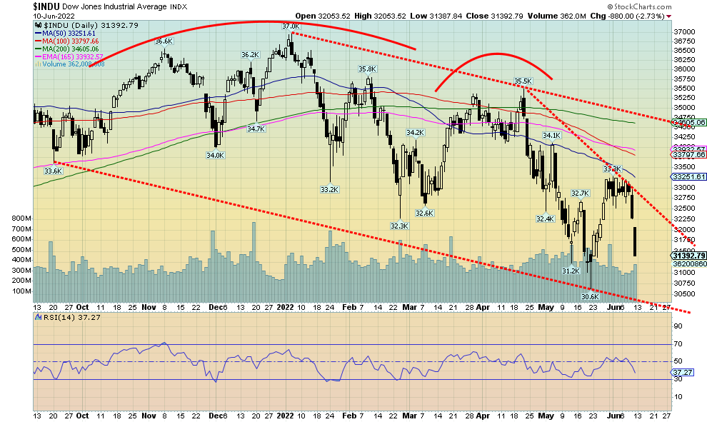
The Dow Jones Industrials (DJI) gapped down on Friday like the others. As with the others, this could be a measuring gap. If that’s correct, then the DJI could fall as low as 29,500, which could put it at the bottom of that channel. It that were to happen, then as with the others it could set up an important buying opportunity. This is a panic-type of move and possible capitulation for this stage of the bear market. We note the failure this week to break out over the downtrend line from the April high near 35,500. There is a quite a gap to fill. We’d have to get above 32,250 to fill the gap. And we’d have to break out over 33,000 to confirm that a low is in place. All we can say is, hang on tight.
Source: www.stockcharts.com
If you want to be a bull, this is more like it as the put/call ratio soared to 0.89 this week, the highest level seen since the pandemic panic of March 2020. A spike now over 1.00 would be, we believe, a good setup for a buy. When there is blood on the streets and fear in their eyes, it’s the time to buy.
Source: www.stockcharts.com
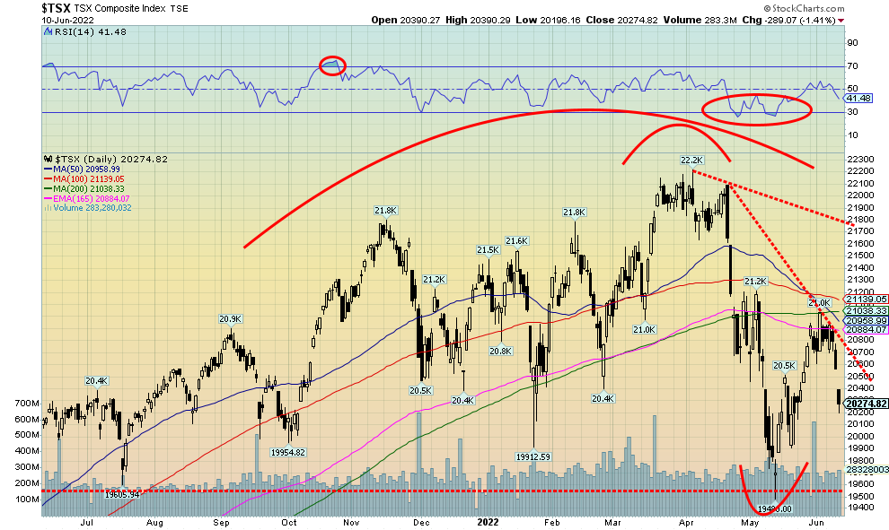
It is no surprise that the TSX followed the U.S. indices lower on Friday. But, comparatively, the TSX held up remarkably well. That’s largely thanks to the Golds that jumped 5.5% on Friday. Metals and Materials also held up. On the week the TSX Composite fell 2.5% after falling 1.4% on Friday. The TSX Venture Exchange (CDNX) also fell down 2.1% on the week. There were only two sub-indices in the green this week: Energy (TEN), up 1.1% to 52-week highs and Golds (TGD), up 1.6%. The big loser was Health Care (THC), down a whopping 10.4% to 52-week lows. Other big losers were Real Estate (TRE), down 5.4%, Industrials (TIN), off 4.5%, Income Trusts (TCM) -3.8%, and Financials (TFS) and Information Technology (TKK), down 3.5%. The TSX gapped down on Friday. This could be a running or measuring gap. If that’s correct, then the TSX could fall as low as 18,400. That would be new lows below the May low of 19,400. We’d be roughly now half-way through the collapse. Note how the TSX ran into a lot of resistance at 200-day MA and the 165-day EMA. It was also just below the 100-day MA. The 50-day MA has crossed over the 200-day MA, giving off what is called the “golden cross.” Regardless of that, if the TSX does fall to the above-mentioned target zone it would set up a great buying opportunity. This has all the earmarks of a panic and capitulation.
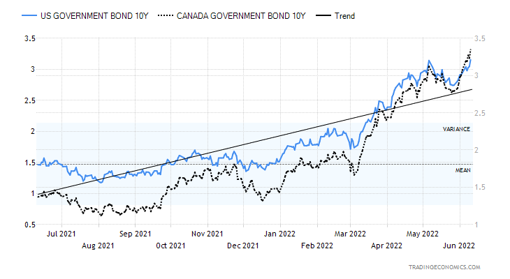
10-year Treasury Bond/Canadian 10-year Government Bond (CGB)
Source: www.tradingeconomics.com, www.home.treasury.gov, www.bankofcanada.ca
Both the U.S. 10-year treasury note and the Canadian 10-year Government of Canada bond (CGB) hit fresh 52-week highs this past week following the release of the somewhat higher than expected CPI numbers in the U.S. (covered earlier). The U.S. 10-year jumped 7.5% and the Canadian 10-year was up 9.1%. But concerns are also rising about the coming recession that we are now seeing a number of calls for. The two-year notes also jumped sharply this past week. As a result, the U.S. 2–10 spread fell to 0.09% from 0.28% and the Canadian 2–10 spread dropped to 0.08% from 0.16%. No, not negative yet as that would be signaling a recession, but we suspect we could go negative this coming week after the FOMC on June 14–15. The wide expectation is the Fed will hike 50 bp, but some are calling for a 75 bp hike. Rising interest rates and the threat of higher rates are starting to bite the markets. The preliminary Michigan Consumer Sentiment Index for June came in at 50.2, way below May’s 58.4 and way below the expected 58. That’s the lowest recorded ever, even below the low of May 1980 at 51.7. And this could fall even lower. It has all sorts of ramifications on consumer spending, the housing market, and more. There could be a revolt over the high gasoline prices that are now over $5/US gallon in the U.S. and well over US$6 in Canada.
Next up for the U.S. 10-year could be a run to 4%. But if recession fears grow, the 10-year might actually fall even as the two-year and other short rates rise. The 3-month–10-year spread is still at 180 bp, nowhere near negative. Many follow that indicator rather than the 2–10. But we’ll see more following this week’s FOMC. Canada has already hiked the BofC rate to 1.5%.
Source: www.stockcharts.com
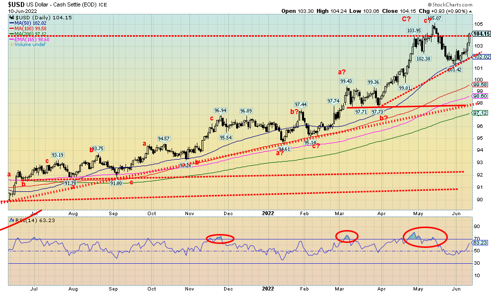
Higher inflation, higher interest rates, and the threat of even higher interest rates helped the US$ Index soar almost 2.0% this past week. Friday saw a big up day as the US$ Index gained 0.9%. The US$ Index broke out over 104. A close over 104.25 would tell us that we are most likely headed for new highs above 105.07. The US$ Index held at the 50-day MA currently at 102. The stronger job numbers the previous week also helped the US$ Index to rise. Overall, despite all the problems, the U.S. economy is performing better than others and U.S. interest rates are higher and are going higher than others. Capital has fled the EU because of the war, fled Japan because of their refusal to raise interest rates, and fled China due to the lockdowns. It all goes into the U.S. dollar, helping push it higher. A strong U.S. dollar is bad for emerging economies and foreign corporations that borrowed in U.S. dollars. They now owe more than they borrowed as their revenue flows are in falling currencies. That is giving rise to potential defaults, including sovereign defaults. As noted, we are not far from raising the possibility of new highs. Above 105 targets could be up to 108/109. Support is at 102.
As for the currencies, the euro fell 1.9%, the Swiss franc was down 2.6%, the pound sterling was off 1.5%, and the Japanese yen fell a sharp 2.7% to new 52-week lows. The Japanese are now becoming concerned about their falling currency. The Canadian dollar dropped 1.4%. A great week for the U.S. dollar, but lousy for everyone else.
Source: www.stockcharts.com
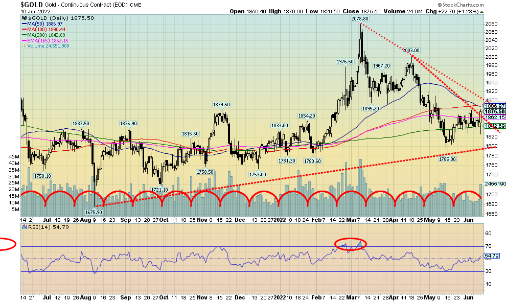
Gold went on a roller coaster ride on Friday following the CPI numbers. The initial reaction was bad and gold fell almost $25 from the open. But then the stock market started to get hammered, fears of recession crept in, and gold rebounded in an amazing fashion, closing up $22.70. On the week gold gained 1.4%. Gold also appears to have broken the downtrend from the March high at $2,078. Long-term support held at $1,785. There remains resistance above to $1,900. Above $1,920 we’ll feel confident that a low is in and our next move is for higher prices. Our major concern is the potential double top in August 2020 at $2,089 and March 2022 at $2,078. It’s a bit far apart but, as we have noted, we believe we could now be on the downside of the bigger 7.8-year cycle and the 23.5-year cycle. What’s key is how we do on this rally. Failure to make new highs above the August 2020 high of $2,089 tells us that we could fall back into a big drop for the lows of both the 7.8-year and 23.5-year cycles. At this point we can’t say where those lows would be. If it happened, we suspect that it would coincide with a stock market crash. In both the financial panic of 2008 and the pandemic panic of 2020 gold and silver both fell along with the stock market. However, gold generally outperformed all. The weakest were the gold stocks that fell more than the stock indices.
Silver gained only 0.1%, lagging gold badly. We’d prefer to see silver outperform. Platinum fell 4.5% on the week. Again, we’d prefer to see platinum rise with gold. The near precious metals of palladium and copper fell 4.0% and 3.9% respectively. Those two may be reflecting recession worries. The gold stocks also reversed: the TSX Gold Index (TGD) closed up 1.6% but the Gold Bugs Index (HUI) didn’t quite make it, off 0.2%.
Gold’s reversal and rise this week was all the more amazing considering the jump in U.S. inflation, rising interest rates as the 10-year hit new highs, and a very strong US$ Index. This week the FOMC meets on June 14–15 for the expected rate hike of 50 bp. But that is built into the market. Friday’s big reversal is quite encouraging. However, more work needs to be done and we’ll feel better once we close above $1,920. The outlook has turned a lot more bullish. Gold might pause, at least on Monday to digest the big reversal. But our preference is that we see gold follow through to the upside this week. Support is now down to $1,820 but major support is at $1,785.
Source: www.cotpricecharts.com
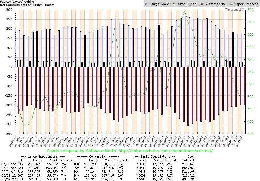
The gold commercial COT (bullion companies and banks) fell to 27% this past week from 29%. Long open interest fell around 18,000 contracts while short open interest also fell roughly 18,000 contracts. Despite the offset, it lowered the bullish percentage. The large speculators COT (hedge funds, managed futures, etc.) was unchanged at 74% with little movement in either long or short positions. Open interest fell almost 20,000 contracts, suggesting to us short covering on the plunge in the early part of the week. The COT only goes to June 7, so Friday’s big up day won’t be incorporated until this coming week’s report.
Source: www.stockcharts.com
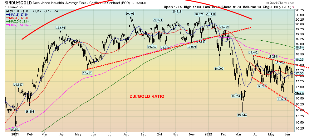
Above is the Dow Jones Industrials (DJI)/Gold Ratio. When the ratio is rising stocks are outperforming gold but when the ratio is falling gold is outperforming stocks. This is just a snap shot over the past year and half. What it shows is that the ratio formed a large topping pattern through 2021. The pattern broke to the downside in early 2022 with the top in the stock market in early January. After plunging quickly in favour of gold the past several weeks did see a rebound. But the rebound has formed what appears to be a descending triangle or a bear flag/pennant. Friday’s action with the DJI down 880 points and gold up about $24 saw the DJI/Gold ratio gap down losing overall 3.9%. This could be a breakaway gap. What is needed going forward is follow through in favour of gold. With the overall pattern bearish favouring gold, one should consider holding gold over stocks. Gold stocks are just a proxy on gold itself, however, while gold has no liability stocks, even gold stocks, have liability. But the message to us is – got gold?
Source: www.stockcharts.com
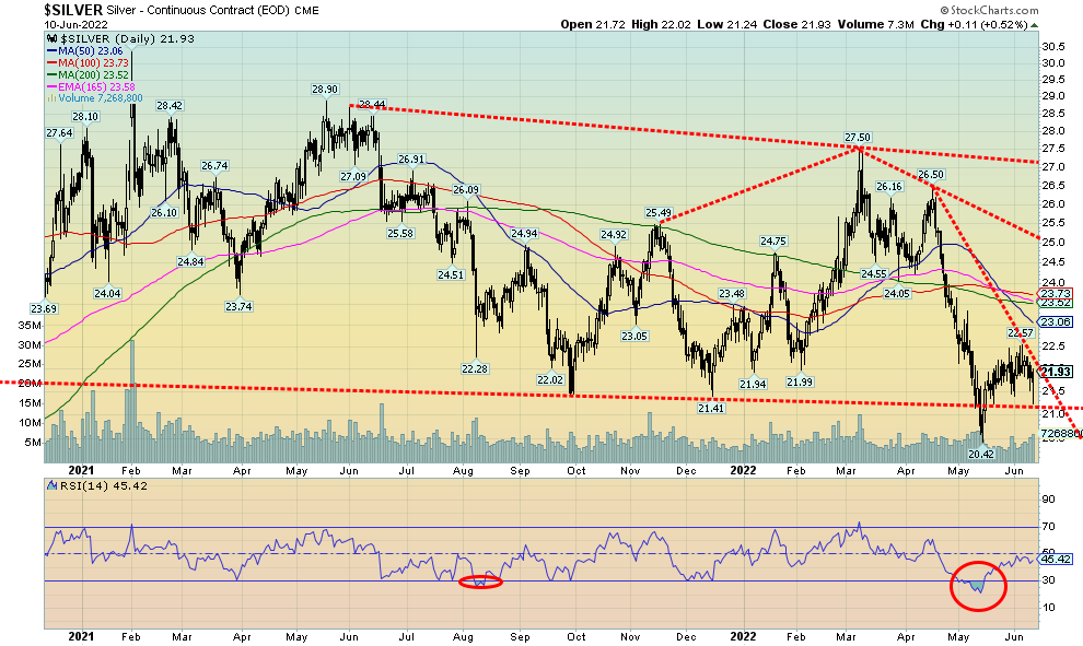
Silver, like gold, responded positively to the big jump in inflation Friday but, unlike gold, failed to really rise over last week’s close. Silver was up barely 0.1% on the week, grossly underperforming gold. We need to see silver outperforming gold in a bull market. Silver also failed to break the downtrend line from the $26.50 high seen in April. Silver did hold its support line near $21 and came close to getting back over $22 once again. The recent high was $22.57. The silver COT remains somewhat friendly. If silver can successfully break back over $22, the next target could be $23, then up to $24. Silver breaks out over $25 and especially breaks out over $27. Support needs to hold at $21 and down to the recent low at $20.42. As with gold, we are positive about Friday’s roller coaster reversal and we are looking for higher prices going forward. A potential important low for the summer may be in place at $20.42. Silver made new lows at the time while gold did not. We view that divergence as bullish for both gold and silver.
Source: www.cotpricecharts.com
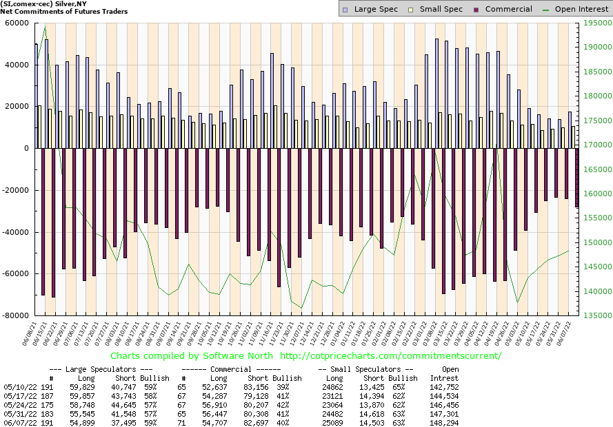
The silver commercial COT slipped to 40% this past week from 41%. Long open interest was down about 2,000 contracts while short open interest rose just over 2,000 contracts. The large speculators COT was at 59% vs. 57% the previous week. The silver COT still appears bullish but we’d like it stay around current levels at least for another week or so, even if silver prices rise from current levels. Overall, silver remains bullish but the drop does give rise for some pause.
Source: www.stockcharts.com
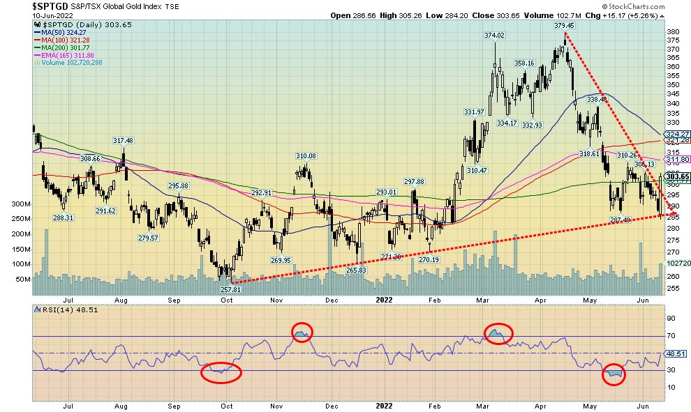
After a week when it appeared that the gold stocks were about to have a big drop, the market was saved on Friday by a massive reversal that saw the TSX Gold Index (TGD) close up 5.3% and the Gold Bugs Index (HUI) jump 4.9%. As a result, it saved the week. The HUI still lost, off a small 0.2% while the TGD was up 1.6%. The TGD appears now to have broken its downtrend from the April high of 379.45. However, resistance is clear above at 312, 320, and 325. Above 330 and especially above 356 new highs are probable. There is considerable work to do. The technical setup, however, appears bullish and we should see further gains this coming week. Support is now down to 285 but a break below 280 would be trouble and a potential decline to 255/260. The pattern to us down from the top appears to be corrective while Friday’s big up day appears to be impulsive. There might be some pause on Monday as the market tries to digest Friday’s big move.
Source: www.stockcharts.com
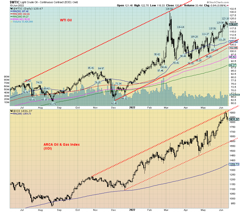
Weakened demand for oil in China as result of all its lockdowns helped to weaken oil prices on Friday. But it didn’t stop the week as once again oil prices rose up 1.5%. WTI oil hit a high on the week of $123.18. We had calculated that getting through $121.50 we could then project new highs above $130.50, the high of March 7. We went through $121.50 but we failed to close over that level. So, for us at the moment we hold our thoughts on new highs until we firmly close above $121.50. Otherwise, we might be setting up for another correction which would not be a bad thing.
If things heat up in the Ukraine, or if threats to sanction Russian oil and gas are carried through, or if Israel did attack Iran, then oil prices are sure to firm further. But if, even for the short-term, China’s lockdowns spark another downside move for oil, the market could use a bit of relief.
We’re not sure about charges being leveled against the oil companies by the Biden administration. They have lambasted the oil companies for failing to quell soaring gasoline prices while raking in huge profits. Suggestions have been for a windfall tax. U.S. firms alone are expected to generate $834 billion in free cash flow this year. Nonetheless, soaring gasoline prices are becoming a problem and could become a social unrest problem.
U.S. crude oil and distillate stocks continue to deteriorate and remain below five-year averages. Ultimately, the U.S. will need to replace those stocks. Others have also been using reserve stocks. All could be the source of future demand increases.
Natural gas (NG) hit fresh 52-week highs, rising 3.9% to $8.85. NG is up 137% in 2022. The energy indices also hit fresh 52-week highs this past week with the ARCA Oil & Gas Index (XOI) actually down about 0.5% following a downside reversal, and the TSX Energy Index (TEN) up 1.1%. As with WTI oil, the energy indices appear poised for a pause. The energy indices once again hit the top of a bull channel. They are even trying to push their way through, but following a decline after the high we are more likely to get a consolidation. There is support for the XOI down to 1,700/1,750.
As to the oil rally, we’d only consider the uptrend in jeopardy on a breech and close below $111.50. Below $105 the rally would be over. If we can get a firm close over $121.50, we could then project up to at least $150. We are seeing higher forecasts.
Copyright David Chapman, 2022
|
GLOSSARY Trends Daily – Short-term trend (For swing traders) Weekly – Intermediate-term trend (For long-term trend followers) Monthly – Long-term secular trend (For long-term trend followers) Up – The trend is up. Down – The trend is down Neutral – Indicators are mostly neutral. A trend change might be in the offing. Weak – The trend is still up or down but it is weakening. It is also a sign that the trend might change. Topping – Indicators are suggesting that while the trend remains up there are considerable signs that suggest that the market is topping. Bottoming – Indicators are suggesting that while the trend is down there are considerable signs that suggest that the market is bottoming. |
David Chapman is not a registered advisory service and is not an exempt market dealer (EMD) nor a licensed financial advisor. He does not and cannot give individualised market advice. David Chapman has worked in the financial industry for over 40 years including large financial corporations, banks, and investment dealers. The information in this newsletter is intended only for informational and educational purposes. It should not be construed as an offer, a solicitation of an offer or sale of any security. Every effort is made to provide accurate and complete information. However, we cannot guarantee that there will be no errors. We make no claims, promises or guarantees about the accuracy, completeness, or adequacy of the contents of this commentary and expressly disclaim liability for errors and omissions in the contents of this commentary. David Chapman will always use his best efforts to ensure the accuracy and timeliness of all information. The reader assumes all risk when trading in securities and David Chapman advises consulting a licensed professional financial advisor or portfolio manager such as Enriched Investing Incorporated before proceeding with any trade or idea presented in this newsletter. David Chapman may own shares in companies mentioned in this newsletter. Before making an investment, prospective investors should review each security’s offering documents which summarize the objectives, fees, expenses and associated risks. David Chapman shares his ideas and opinions for informational and educational purposes only and expects the reader to perform due diligence before considering a position in any security. That includes consulting with your own licensed professional financial advisor such as Enriched Investing Incorporated


