
There are three types of “TIME” lows which everyone is familiar with that form on a chart which will have a different meaning. Lets start with a short term TIME LOW that shows up on a minute or daily chart which will be short term in nature, days to weeks. Then there is the intermediate term TIME LOW that has a much longer time frame that can last for many months to even a year or longer before it comes to an end. The third TIME LOW which we’ll look at tonight, is long term low that can last for many years or mark a major bottom that may never be seen again.
A long term low will generally be made up of the short and intermediate term lows coming together to form a major low. To be able to recognize an important long term low is not the easiest thing to do, but when all the pieces of the Chartology come together it can paint a very bullish scenario. The only problem is that you never know 100% for sure in real time if the long term low is in place until you can look back in hindsight where it will stick out like a sore thumb and be obvious to everyone.
Lets start with this long term weekly chart for Gold which shows the price action starting at the 2008 crash low where the head of the H&S consolidation pattern formed. When that 2008 crash low was established, which formed the head, very few investors could have imagined the massive rally that took place into the 2011 high. When the 2011 high was put in place, everyone was very bullish on gold and and no way could they imagine a bear market was about to unfold that wouldn’t find its low until the bottom was made in 2016 which formed the head portion of the massive H&S consolidation pattern.
Looking at the right hand side of the chart you can see the current 2020 trading range with the 4th reversal point still under construction. At this point in time I’ve been showing the short term double bottom that Gold has formed since the October low. If Gold can reach the top of the 2020 trading range and breakout we’ll be witnessing an intermediate term impulse move that will look similar to the impulse moves that formed during the rally phase between each consolidation pattern after the 2008 crash low that were on a smaller scale.
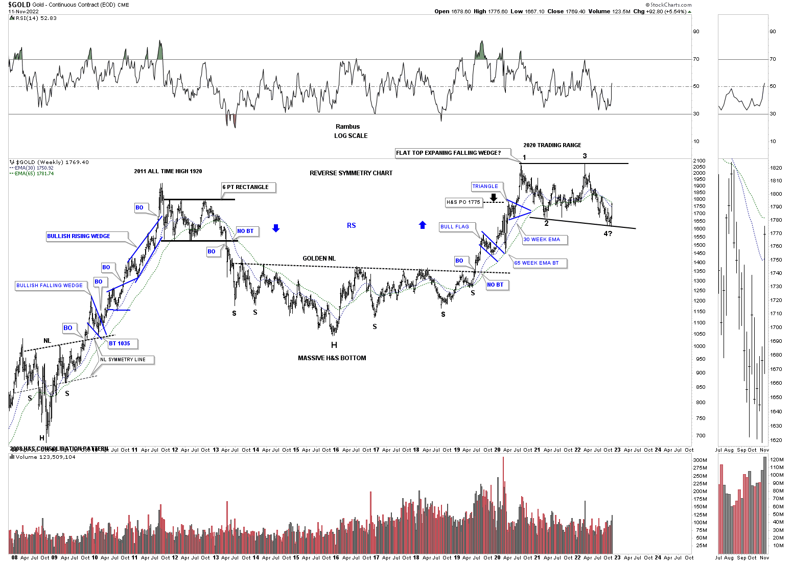
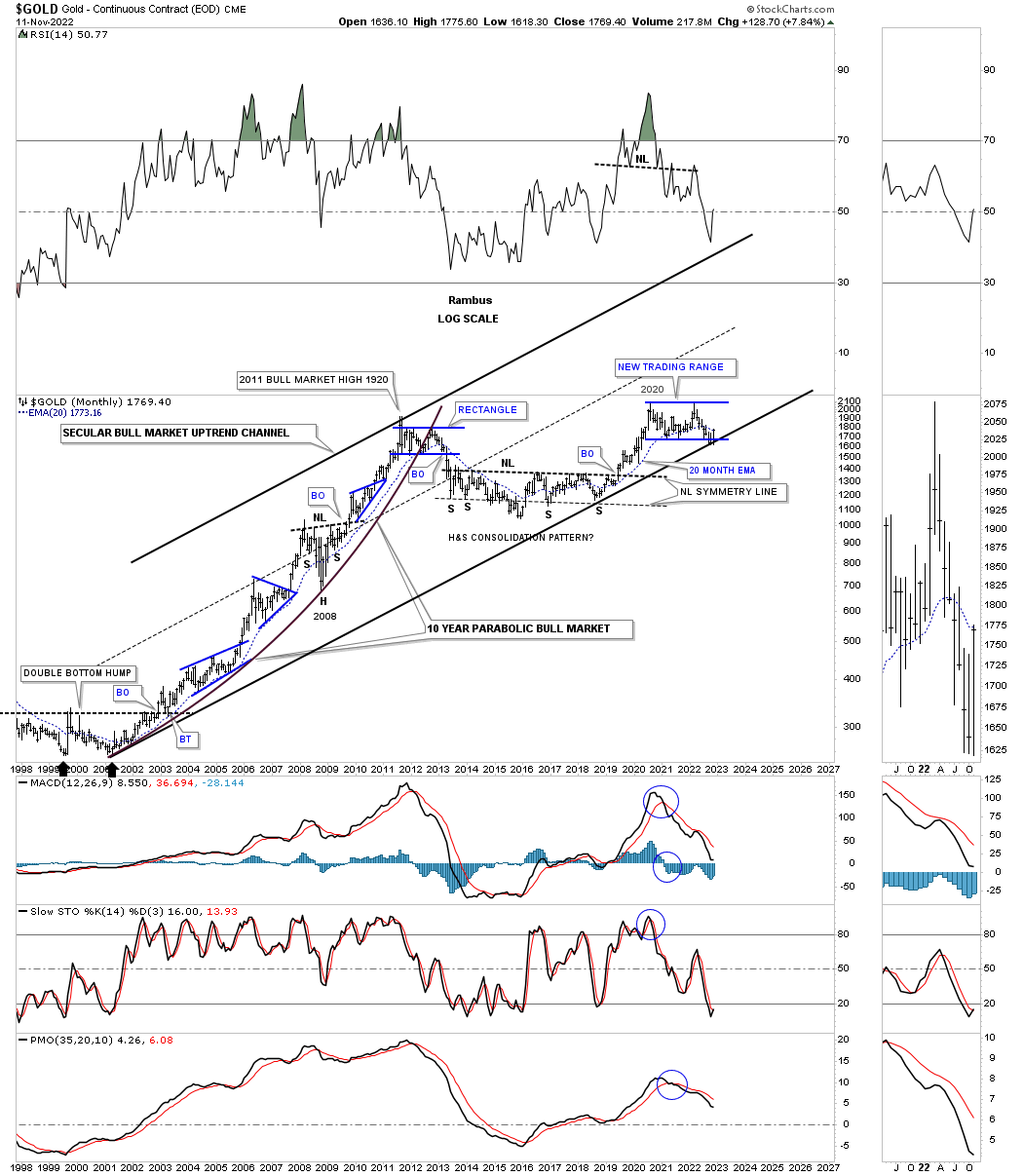
This next chart is a long term quarterly look at Gold going all the way back to the beginning of the first leg up in what I expect to be a long term secular bull market if the 2020 trading range completes its mission of consolidating the gains made from the impulse move out of the very large H&S consolidation pattern.
I added a rectangle around the double bottom base that launched Gold on its bull market journey from the 2000 low to the 2011 high which shows the time and price it took to form that base. I then took that exact same rectangle and added it to the H&S consolidation pattern which shows an almost identical time and price trading range. If the 2000 base had enough energy to launch an eleven year bull market then the big H&S consolidation pattern, with the same time and price characteristics, should also have enough energy to launch a similar bull market.
The first consolidation pattern that formed after the 2000 bull market began was the blue bullish rising wedge which we know shows bullish characteristics of a strong trend. Currently we have the 2020 trading range still under construction with the double bottom, on the short term daily chart, showing us the 4th reversal point may be in place. If that is the case and Gold eventually breakouts out of the 2000 flat top expanding triangle, then it would be the first consolation pattern in a string of consolidation patterns that will make up the 2nd leg up in the secular bull market that began at the 2000 low.
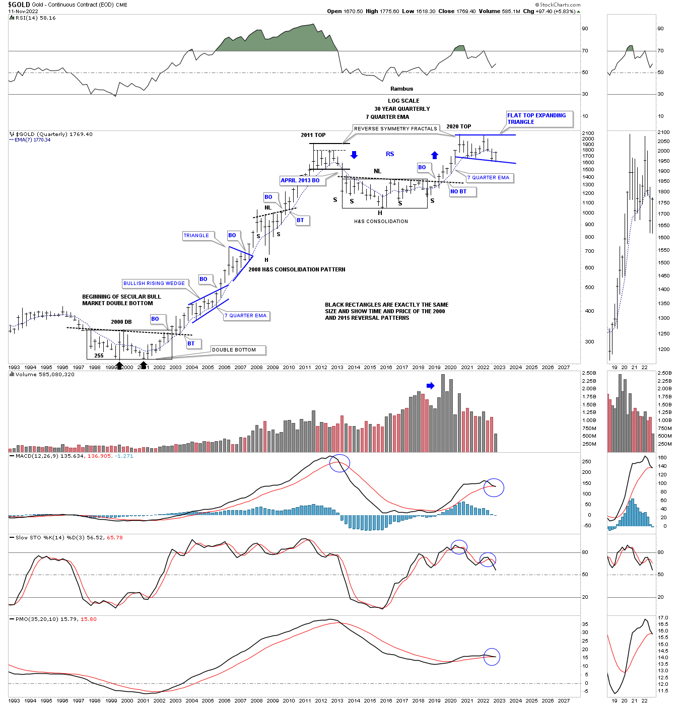
So far we have looked at a short term “TIME LOW” and an intermediate term “TIME LOW” for Gold. Now lets look at a possible long term “TIME LOW” which has slowly but surely been forming since the August 2020 high. After the August 2020 high was established I mentioned that I wouldn’t be surprised if we saw the price action trade sideways until the bottom rail of the 2000 secular bull market uptrend was reached. As you can see Gold has finally reached its destination and the moment of truth is at hand.
If this low holds where the bottom rail of the secular bull market uptrend channel and the bottom rail of the flat top expanding triangle intersect, this low may never be seen again for a very long time. What would you have thought if I showed you the 2000 low, similar to the current low, and said, expect to see a bull market that is going to last for eleven years and reach 1920 before it ends? Gold was trading at 250 back then.
Back in 2000 you would have said I was crazy because Gold had been dead money for 20 years since its previous all time high that was made back in 1980 at 850. In regards to the markets when one is called crazy for thinking outside of the box, I take it as a compliment, because when everyone is thinking the same no one is thinking at all.
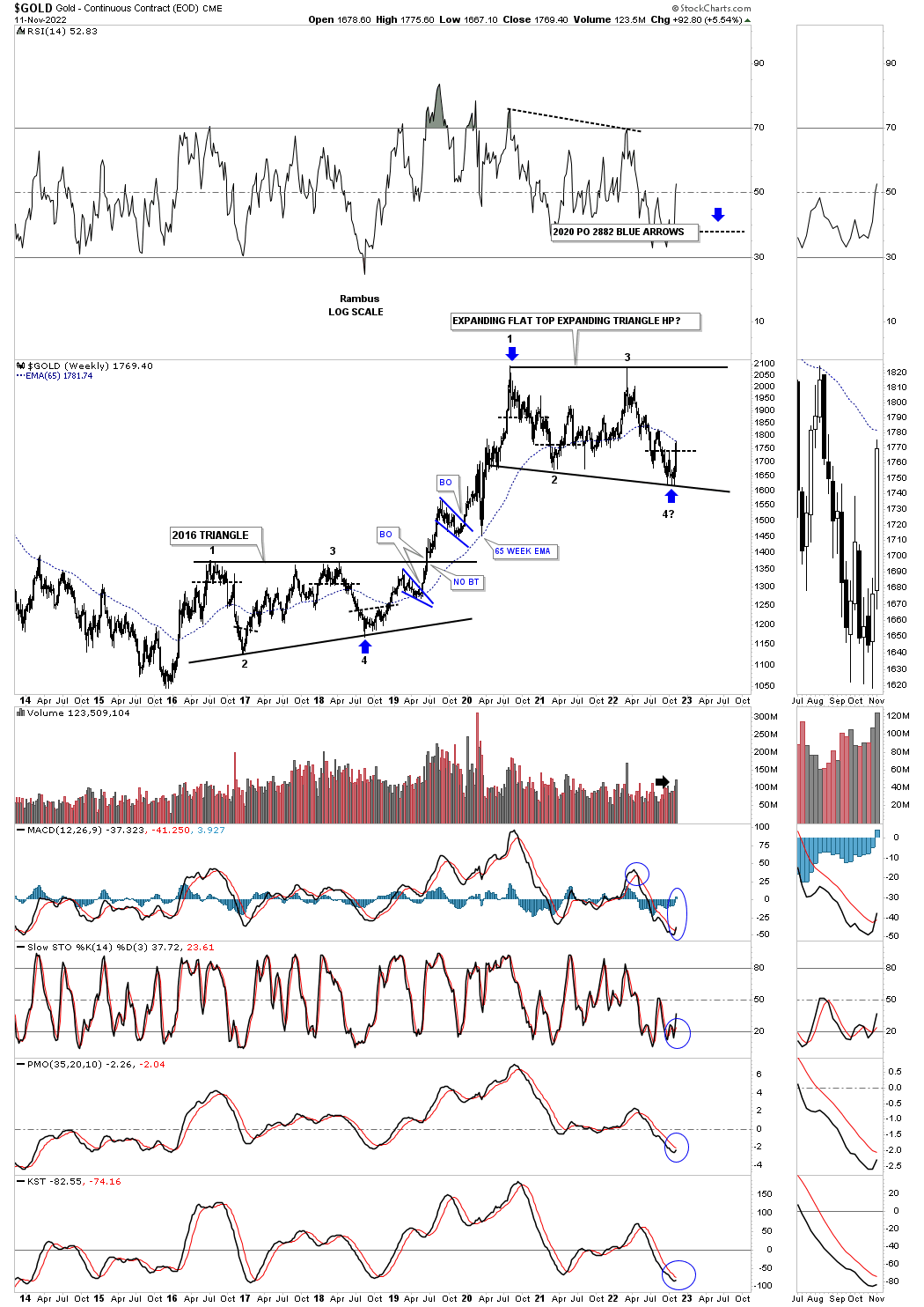
Below is a shorter term weekly chart for Gold showing its 2016 triangle consolation pattern and its current flat top expanding triangle with the double bottom at the 4th reversal point. The 2016 triangle is actually the right shoulder of that massive H&S consolidation pattern. If the 2020 flat top expanding triangle ends up breaking out above the top trendline and completes the consolidation pattern I will view the pattern as a “halfway pattern” as most big consolation patterns end up showing. The blue arrows shows a possible price objective using the impulse method.
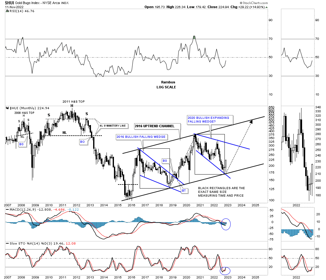
Lets turn our attention to the HUI which is showing some very interesting Chartology. After putting in its very large symmetrical H&S top in 2011 came the bear market from hell for those that didn’t want to believe a bear market was possible in the PM complex. I’m still amazed to this day on how so many analysts missed one of the most beautiful H&S tops ever made. Sir Fullgoldcrown created a list at the time showing all the analysts that said that the H&S top was not the real deal and that the PM stocks still had a long ways to go before they see any trouble.
During the formation of the right shoulder is when the first leveraged eft’s for the PM complex were born. I still have a chart somewhere which shows when we went short using those 3 X etf’s which I ended up calling the ,Kamikaze Stocks ,because the volatility was really insane. It was so insane that they had to reduce them down to a 2 X leveraged etf.
The 2016 low marked the end for the bear market and the slow grind higher which has been playing havoc on investors morale. The 2016 low was marked by a double bottom and a near vertical rally that ended in August about 8 months later. For those members that were with Rambus Chartology back then know how that long drawn out decline, that formed the blue bullish falling wedge, took to complete. Even the breaking out and backtesting process took close to six months to complete before the next impulse move up started which was interrupted by the 2020 covid crash low. The rally then completed in August which has led to our current trading range.
The black rectangles I added to the bullish falling wedge and our current trading range are exactly the same size measuring time and price. So far the two trading ranges, even though different, are exactly the same size in time and price. Note the big white candlestick that formed last week which shows a bullish beginning for the next move higher.
Many times a large consolidation pattern is made up with several smaller consolidation patterns which could be the case with this 2016 parallel uptrend channel.
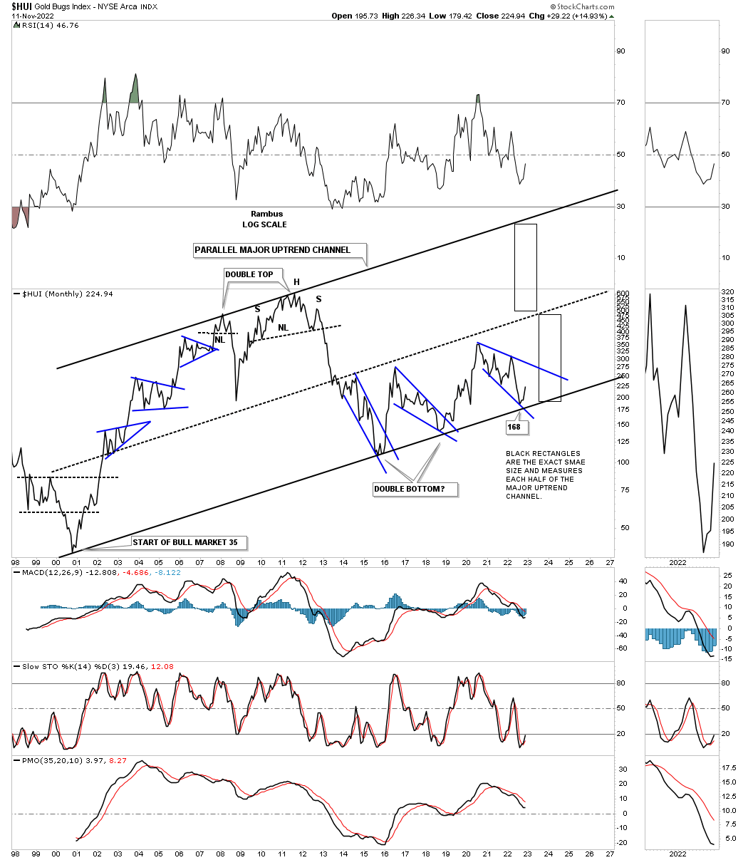
Putting that 2016 uptrend channel on the weekly chart above in perspective, below is a long term monthly chart for the HUI which shows its bull market uptrend channel. Note how the lows on the chart above match up perfectly with the bottom rail of the 2000 bull market uptrend channel.
During the bull market years from 2000 to the 2011 most of the price action formed above the center dashed midline. When the 2008 crash began I used the black rectangles to measure the height of the upper trend channel and added it to the center dashed midline looking for a possible low which turned out to be the 2016 low.
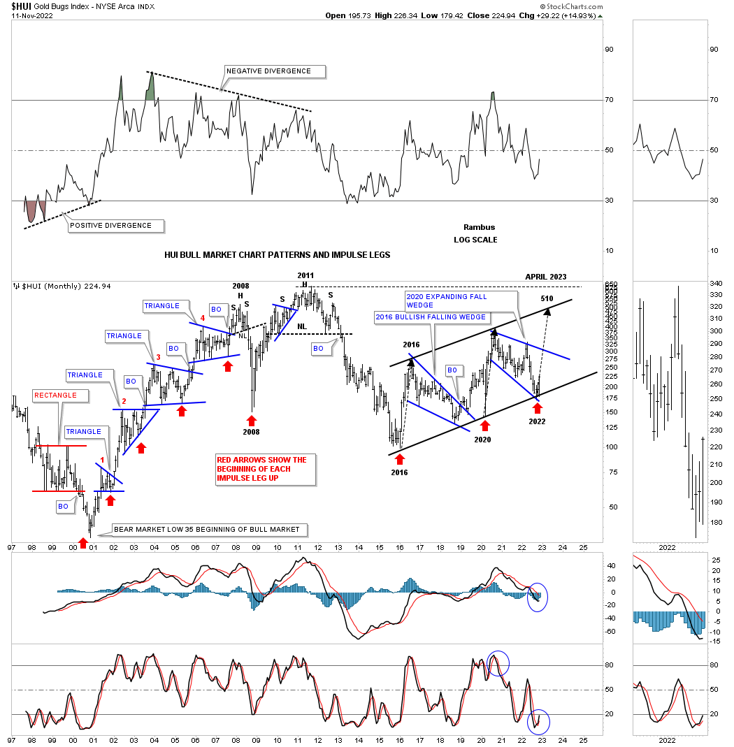
This next chart for the HUI is the history chart which shows all of its Chartology from the very beginning. From the 2000 low you can see how the bull market unfolded showing one consolidation pattern forming on top of the previous one with an impulse move between each consolidation pattern. That is what a classic bull market looks like.
In a bull market there are two good places to enter a trade. The first one, which is the hardest, is finding the low of the consolidation pattern and holding on for dear life. The 2nd best place to enter an intermediate term impulse move is when you see the breakout from the consolidation pattern. The red arrows show the beginning of each impulse move or the last low in each consolidation pattern.
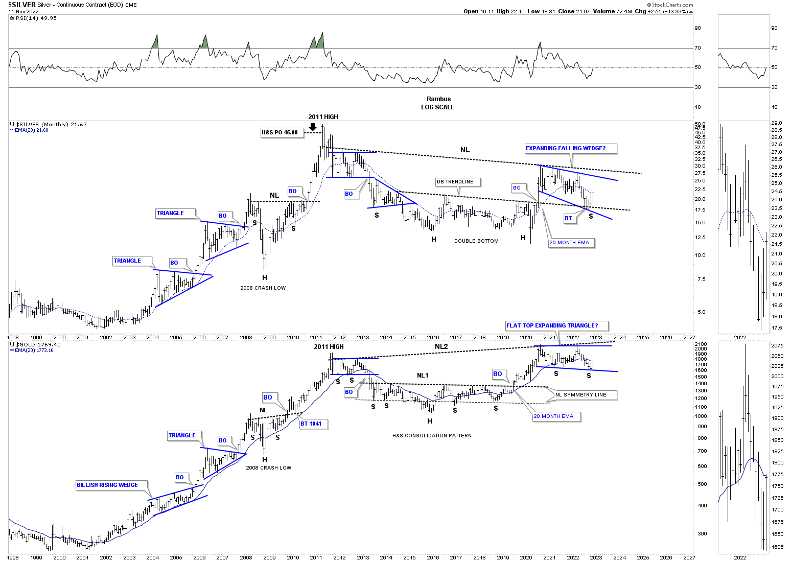
This next chart is a combo chart which shows Silver on top with Gold on the bottom. I originally built these charts earlier this year when it looked like the 2020 trading range could be the right shoulder of a much bigger H&S consolidation pattern. The recent low in the PM complex put the right shoulder low in jeopardy as the price action fell below the neckline symmetry line which can show the low for the right shoulder. With that deeper low now out of the way I’ve adjusted the possible right shoulder low which shows the expanding falling wedge on Silver and the flat top expanding triangle on Gold.
During Silver’s bear market low it formed a massive double bottom while Gold formed that multi year H&S consolidation pattern. Note where Silver just pulled back to? If found support on the backtest to the double bottom trendline which is helping to create the 4th reversal point.
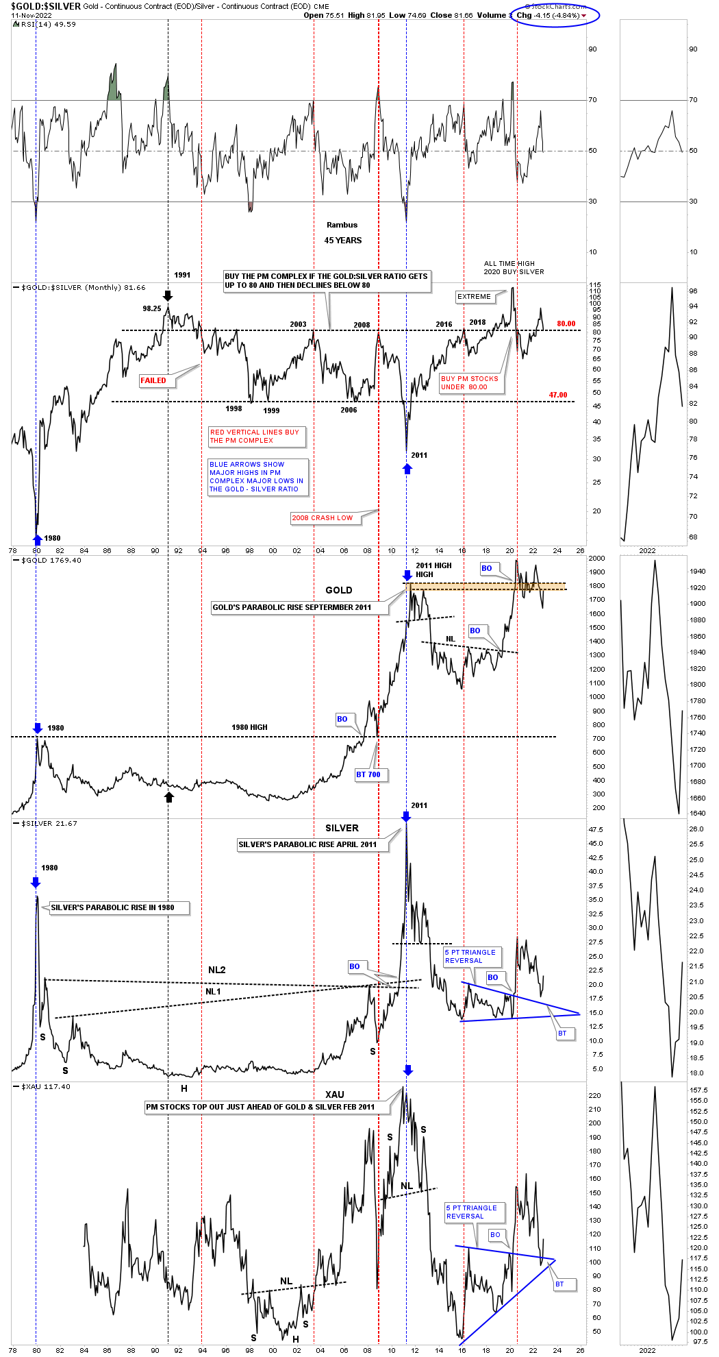
Everyone has their own interpretation on how to use the Gold:Silver ratio. I try to keep it pretty simple. When the ratio is above 80 or so that is generally not a good time to be in the PM complex. When the ratio drops below 80 that can open up the door for the precious metal stocks to show some strength. As you can see the ratio is now approaching the 80 area which could be bullish for the PM stocks.
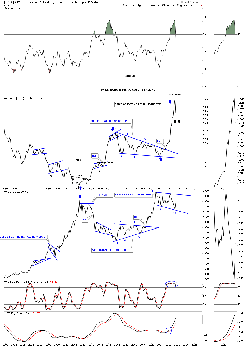
This last chart for tonight is a ratio combo chart which has the USD:XJY on top with Gold on the bottom. Through the years when the ratio was rising there was an inverse correlation and Gold declined. Note the 2011 low in the ratio chart on top and Gold on the bottom where they both reversed direction at the same time. Now look at the rally the ratio had that began on the breakout from the 6 point blue bullish falling wedge which went parabolic. Using the 6 point bullish falling wedge as a halfway pattern you can see the price objective as shown by the blue arrows.
Since the rally was so vertical the chances are very high that we will see reverse symmetry to the downside as there were no significant consolidation patterns that formed on the way up, black arrows This is why parabolic moves end so badly. Its a great ride on the way up, but if you don’t get out its just the opposite journey on the way down.
Has the time finally arrived for the PM complex to have another impulse move higher? The stage seems to be set if the Chartology is going to play out. All the best…Rambus
About the author
