
On Thursday’s, Markets Update, I mentioned that I was beginning to see some possible signs of deflation creeping into the the Inflation / Deflation debate. I know this doesn’t make any sense right now with all the talk going about getting inflation under control, but most of the commodity charts I follow are showing some technical damage with last Wednesday’s price action showing some commodity indexes gapping below short term support.
The energy complex in general has really decayed over the last month or two and is now showing signs of breaking down in a more pronounced manner. This is taking place on the short and long term charts.
There are many charts tonight so I won’t go into great detail explaining what the charts are strongly suggesting. Most are pretty self explanatory.
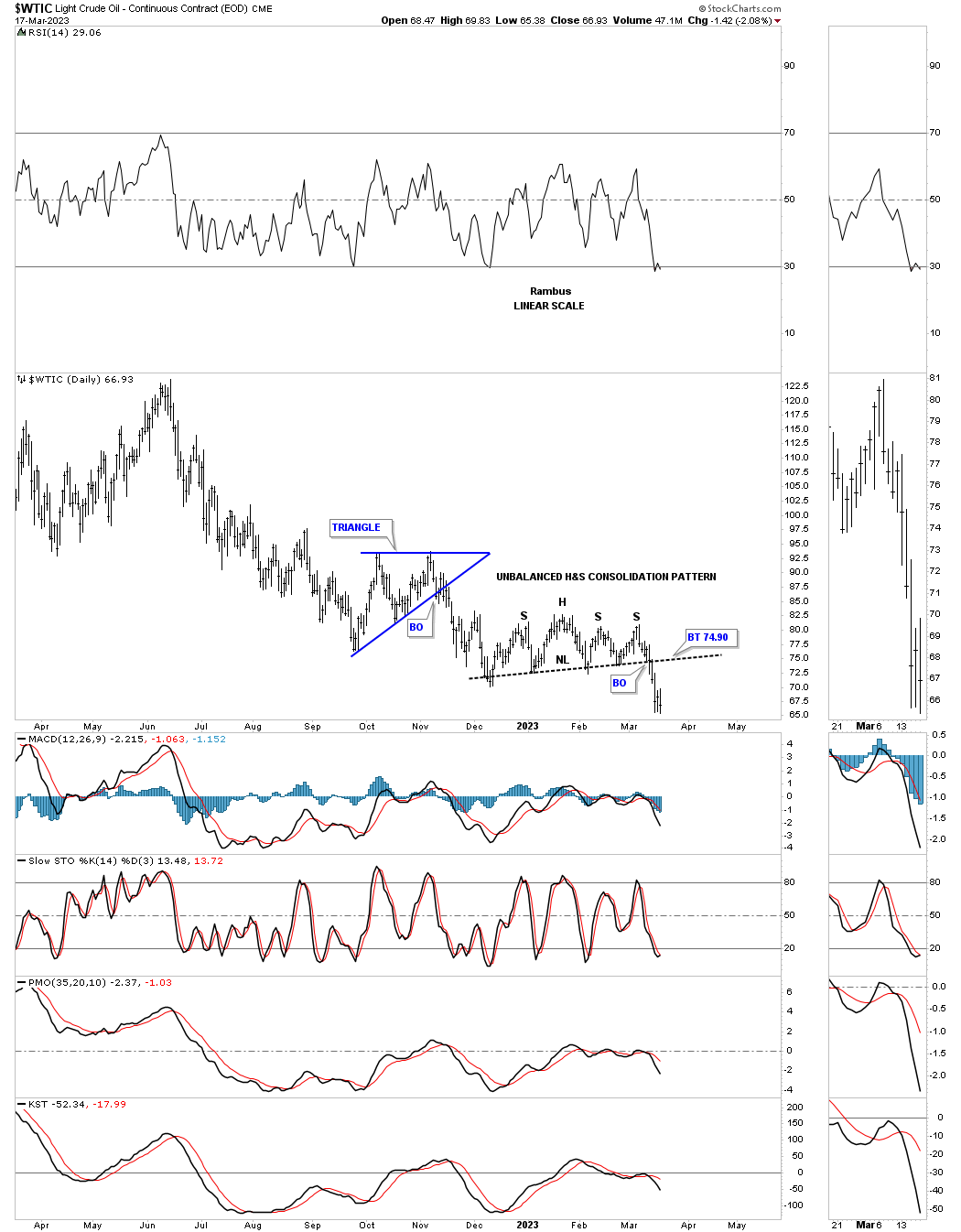
Lets start with the energy complex and look at a daily chart for the WTIC. Last week the price action broke below the neckline of the H&S consolidation pattern with a backtest possible.
This longer term weekly line chart shows a much bigger double H&S top with the neckline giving way last week.
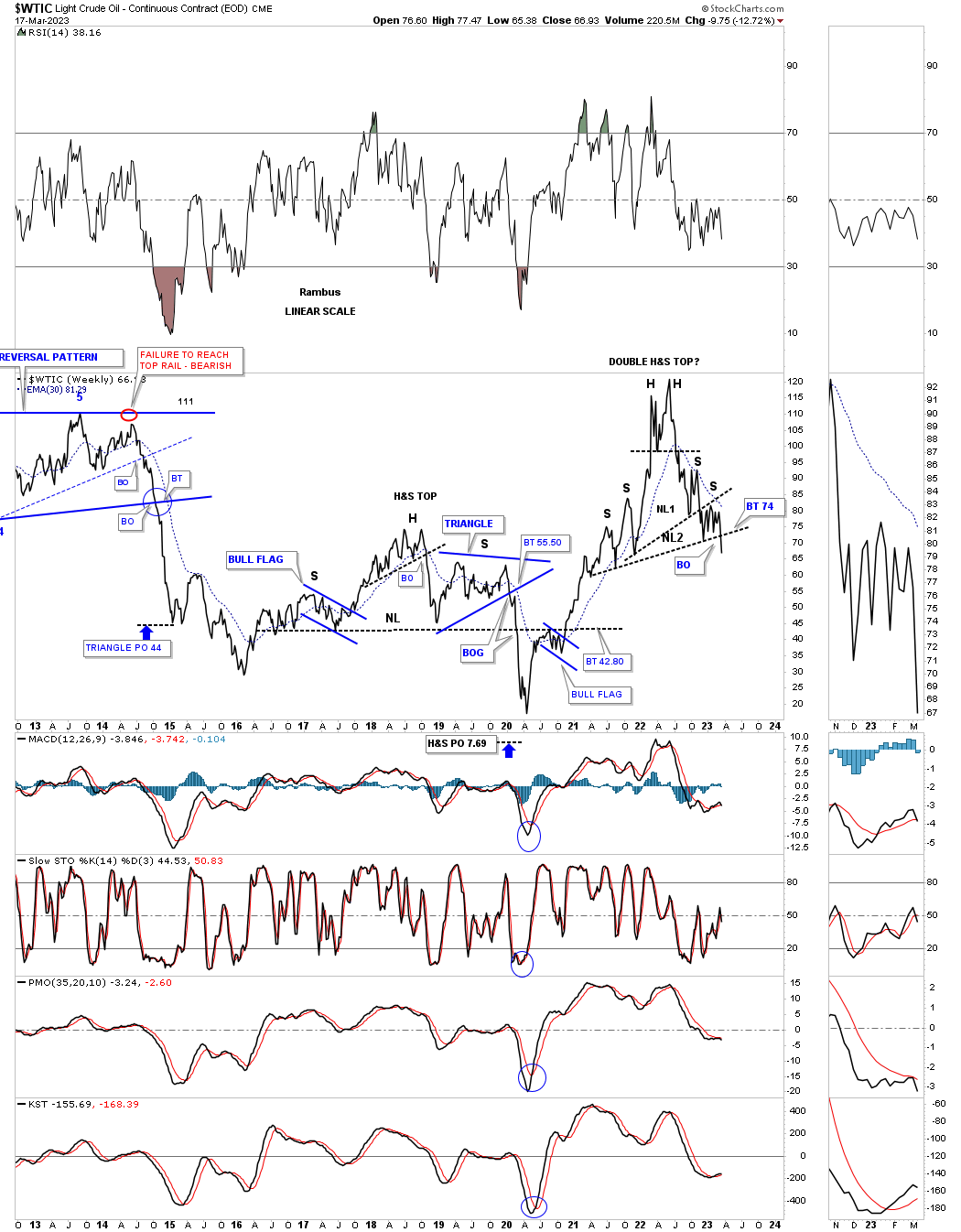
The top rail of the 2008 expanding falling wedge should have held support on this backtest, but it is failing.
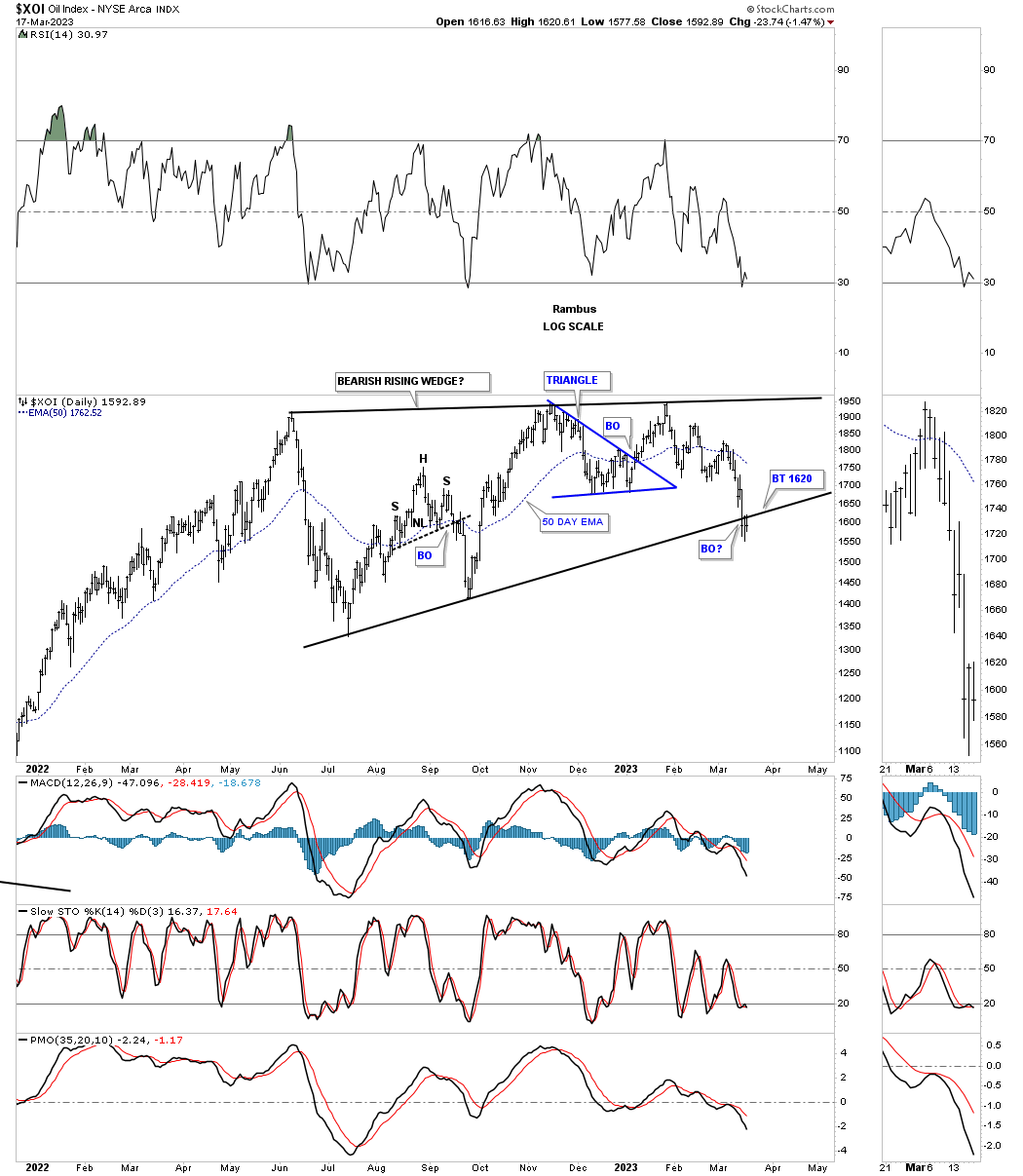
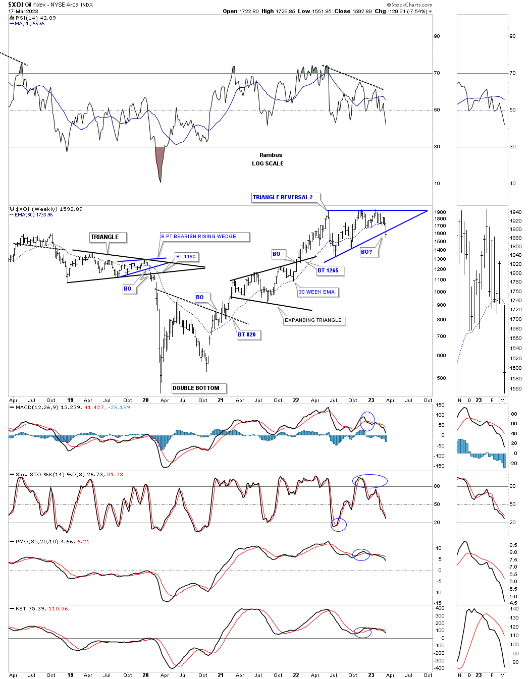
Below is a daily chart for the XOI, big cap oil stocks, which broke below the bottom rail of its June 2022 rising wedge three weeks ago with a backtest last week.
The longer term weekly chart for the XOI.
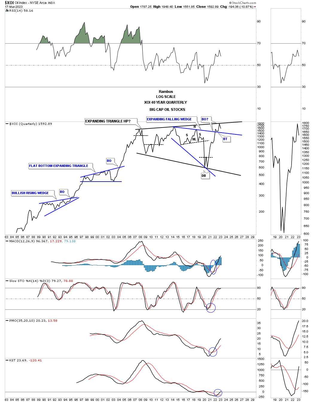
I posted this quarterly chart for the XOI last year when it was attempting to breakout from that massive expanding triangle. At a minimum we should see a ping pong move between the top rail of the black expanding triangle and the top rail of the blue expanding falling wedge.
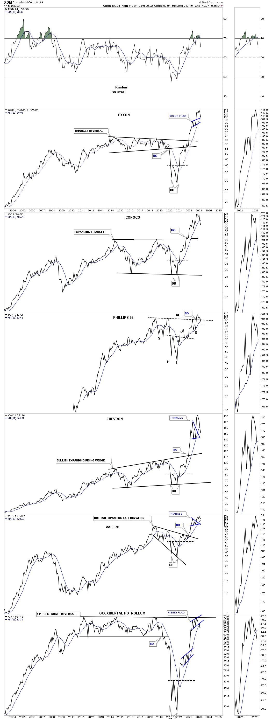
I also posted this long term month combo chart for some of the large cap oil stocks which were pushing into new all time high territory. As you can see they are now beginning to rollover with OXY showing a nice tight reversal pattern at its all time high.
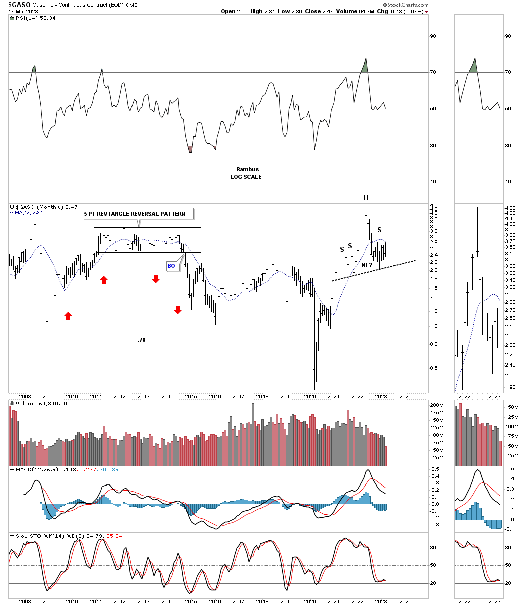
GASO had a massive run out of its 2020 crash low just like everything else related to the markets. It appears to be forming a H&S top with the possible right shoulder under construction.
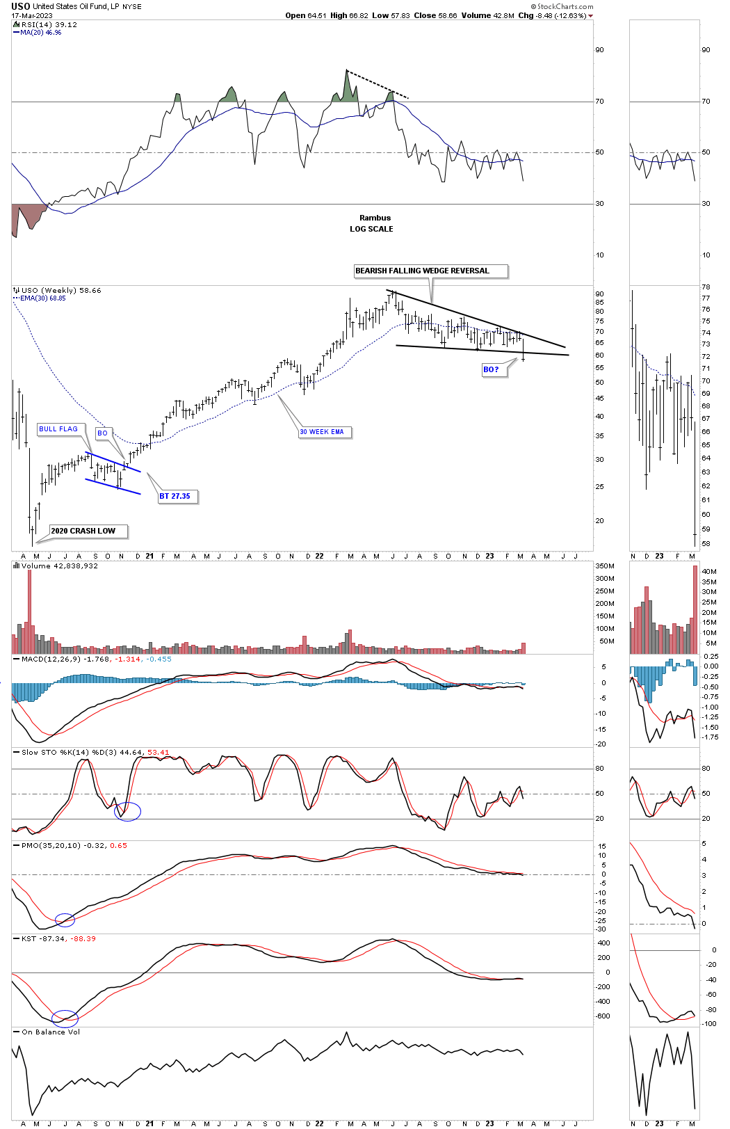
Last week the USO broke below the bottom rail of the bearish falling wedge reversal pattern.
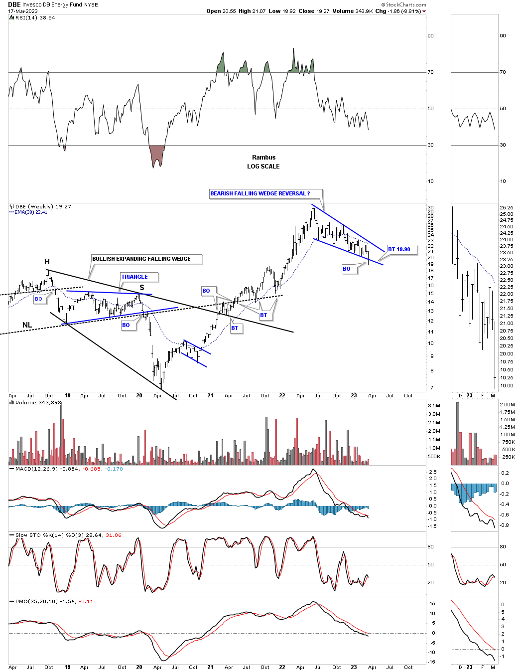
The DBE is an energy fund that gapped below the bottom rail of its June 2022 falling wedge.
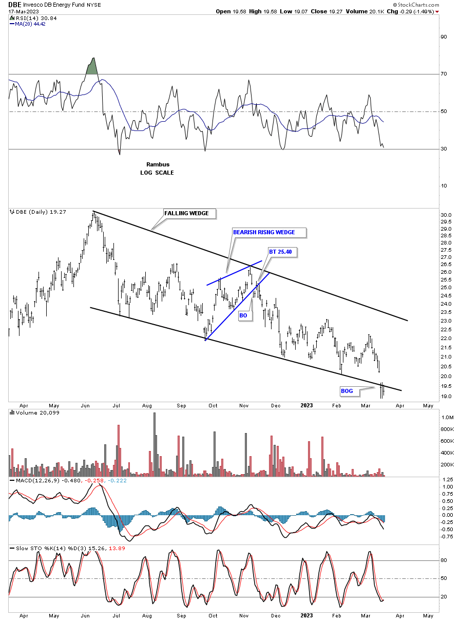
This weekly chart puts that falling wedge in perspective.
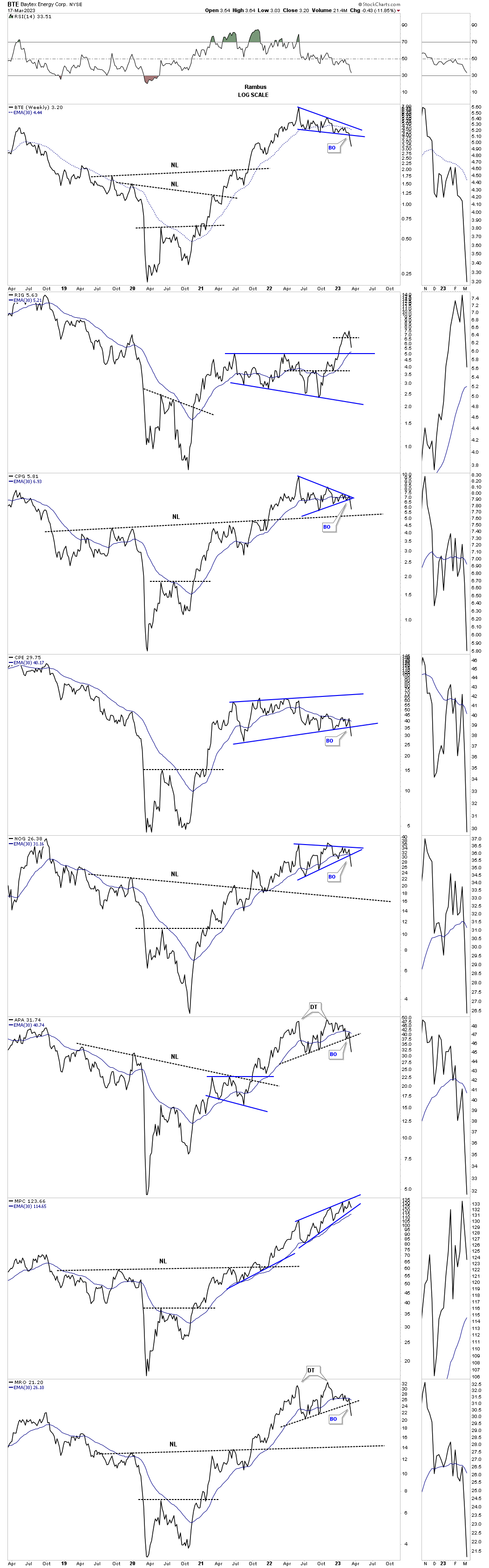
This next chart is an old combo chart I built years ago just to track some oil stocks. Until fairly recently I was looking at those blue trading ranges as consolidation patterns to the upside. Over the last several weeks they now appear to be reversal patterns that are just starting to break down. There are some old necklines that may offer support down the road.
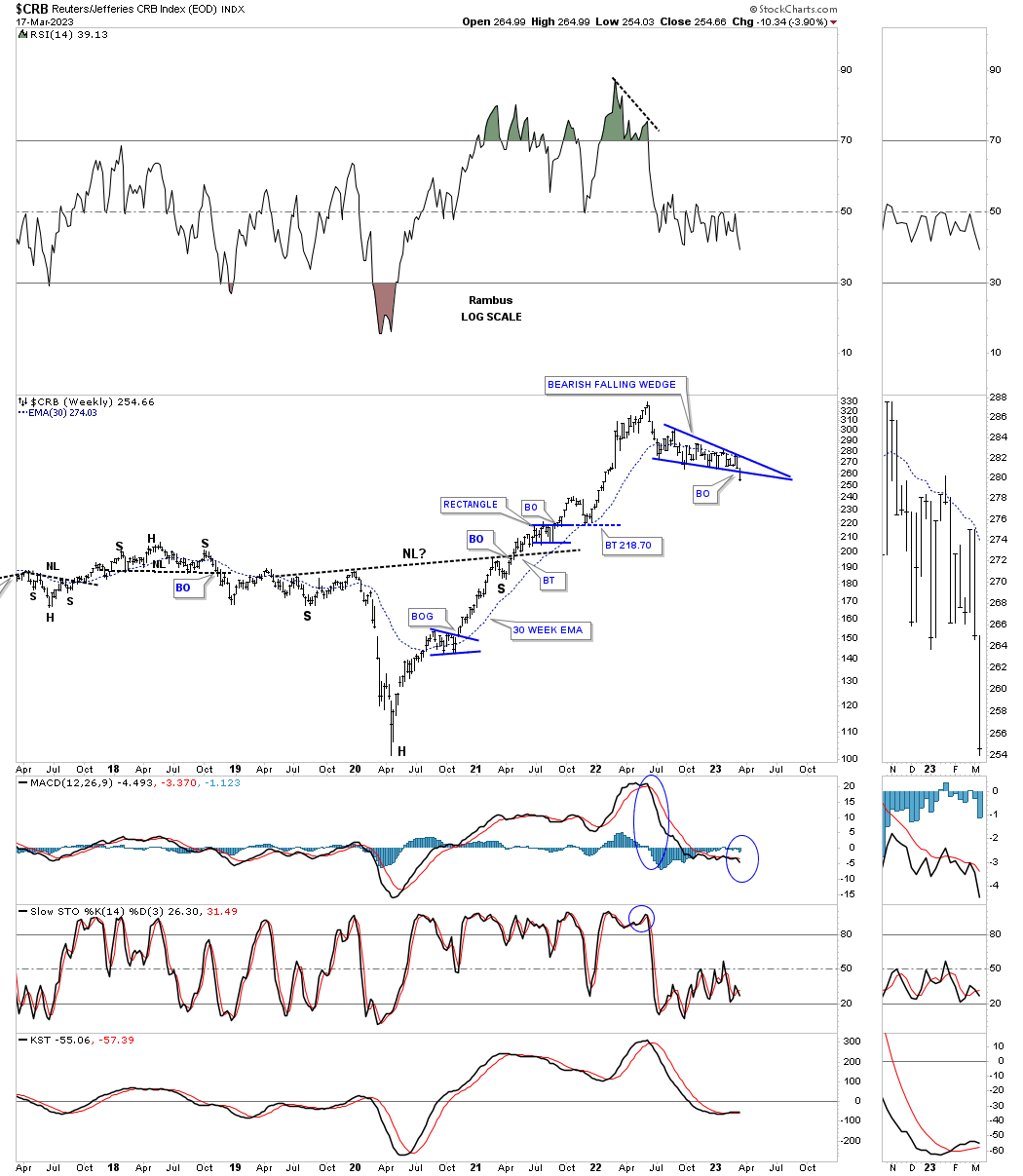
Let’s now look at some commodity indexes starting with the CRB index. As you can see it has a similar blue falling wedge to some of the energy indexes above. Last week the price action took out the bottom trendline.
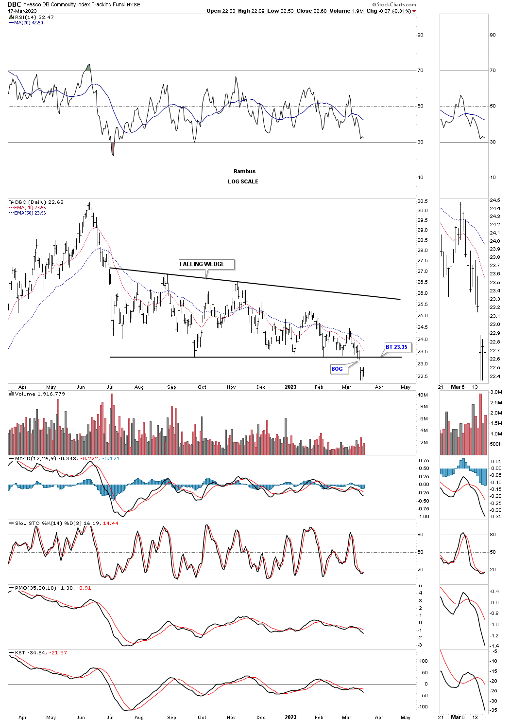
The DBC is a more liquid commodity index which formed a breakout gap below the bottom rail of its falling wedge last week.
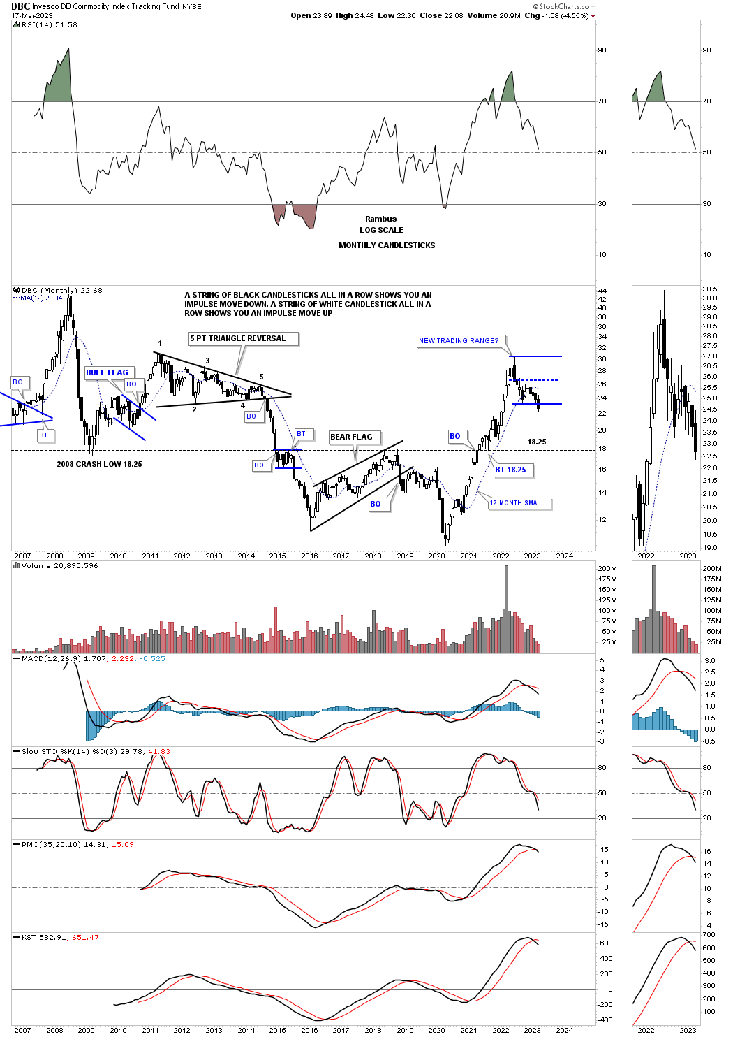
Here again I was looking at the blue trading range to possibly develop into some type of consolidation pattern, but that seems to be fading. Note how fast the decline in 2008 and again during the 2014 commodities crashed formed a sting of black candlesticks all in a row. The opposite happened during the 2020 rally to the 2022 high with mostly white candlesticks forming.
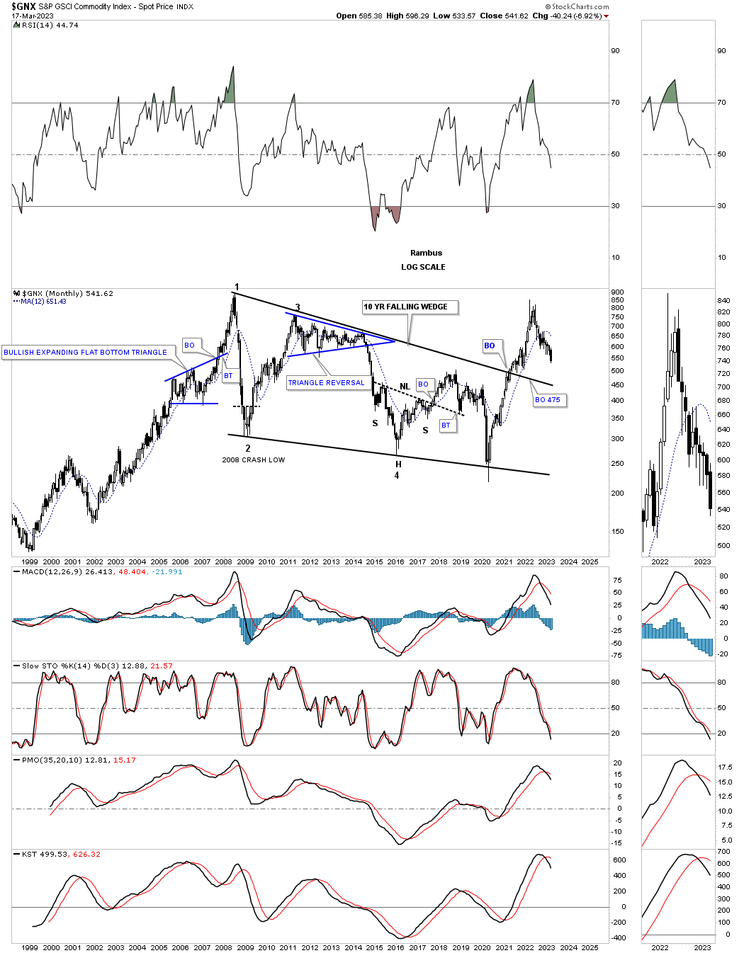
GNX commodity index had a massive move out of its 2020 crash low with the top rail of the black falling wedge being the first area to look for support.
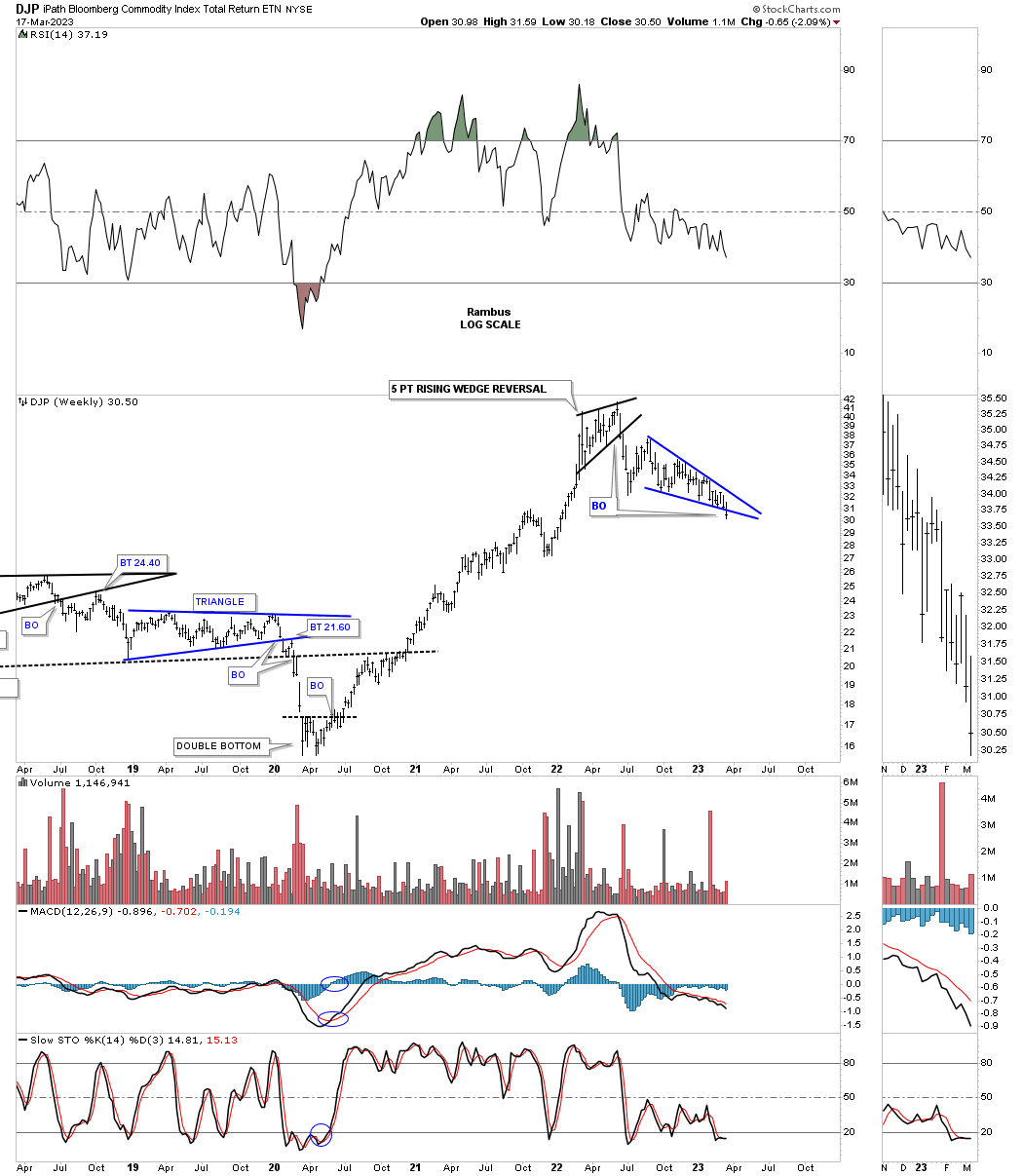
Another commodity index that is widely followed is the DJP which gapped below the bottom rail of its bearish falling wedge last week.
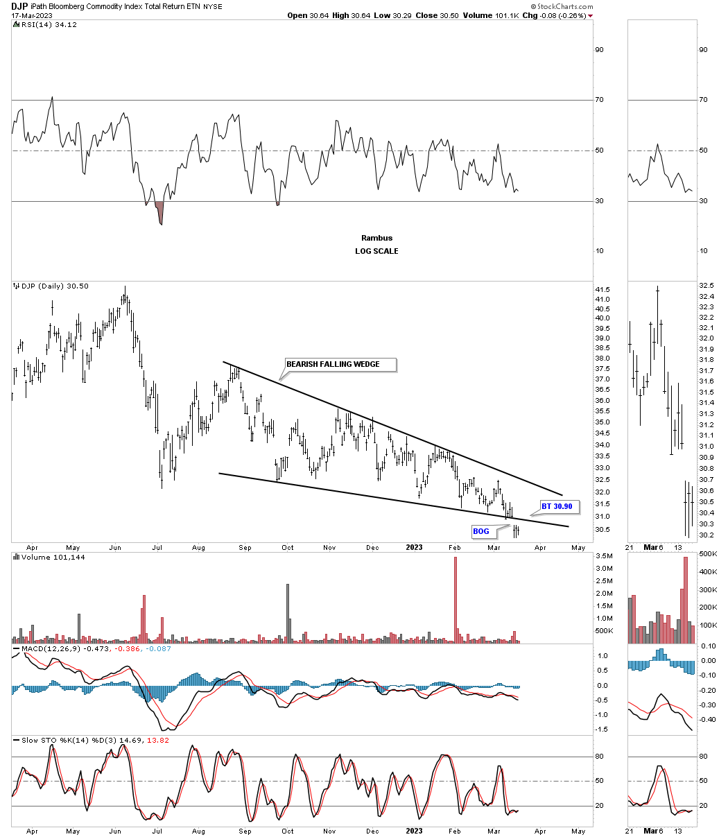
This weekly chart shows how the falling wedge looks on the bigger timeframe.
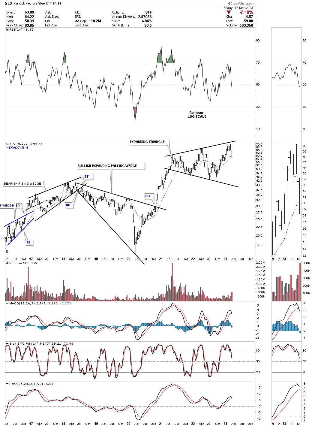
Steel has been one of the strongest areas in the commodities complex. The SLX shows it may be completing the last reversal point in its expanding triangle.
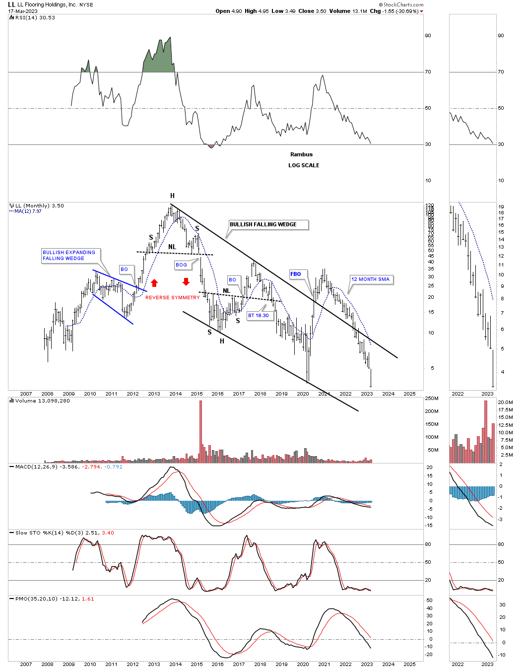
LL, lumber just closed at a new all time low.
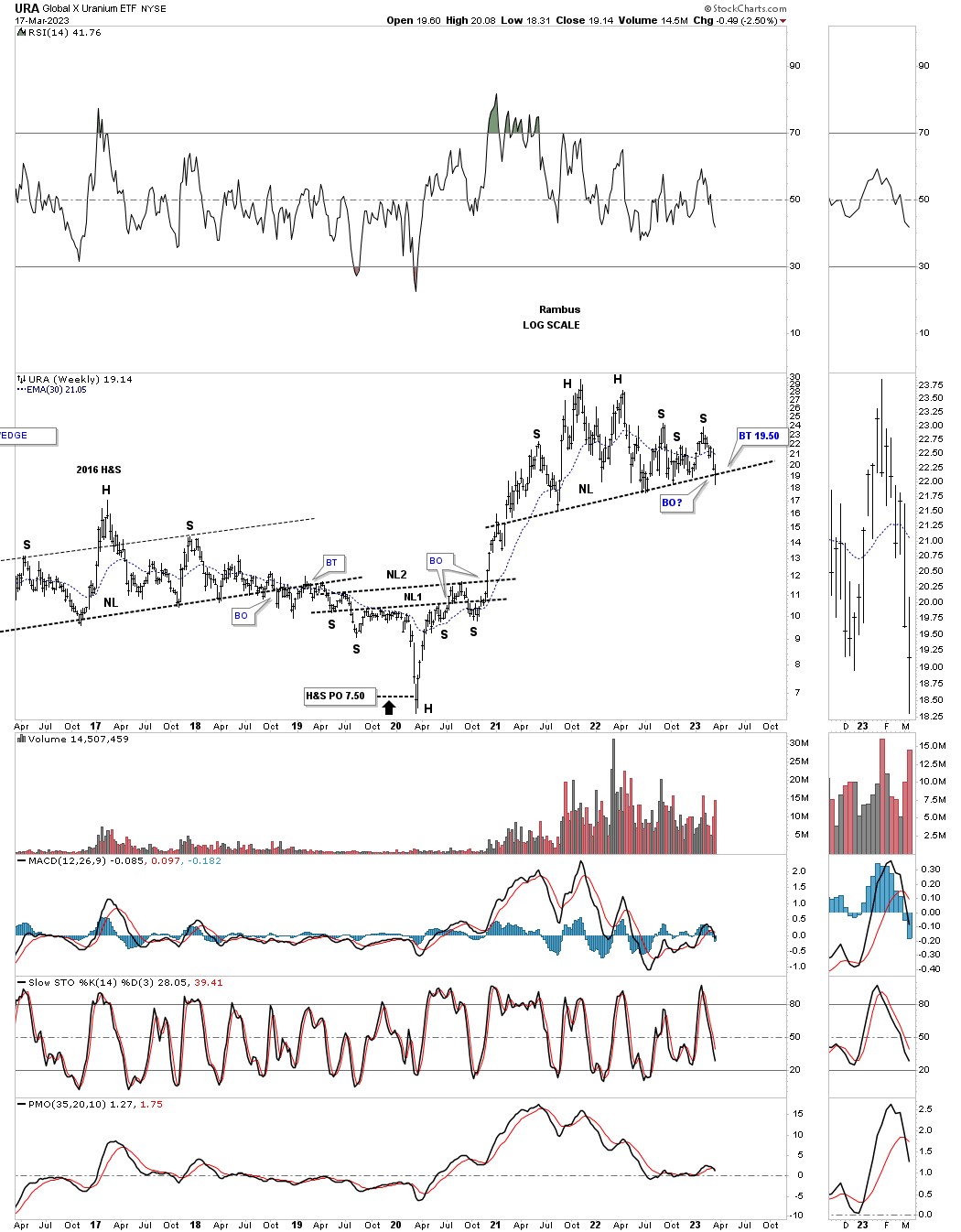
URA, uranium etf, is attempting to break the neckline of an unbalanced H&S top.
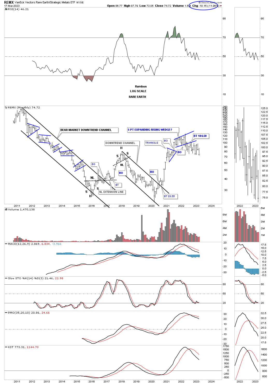
REMX, rare earth etf, broke below the bottom rail of its blue 5 point rising wedge reversal pattern in 2022 and now is making a new lower low this month.
LIT, lithium etf, looks to have completed the breaking out and backtesting process and is getting very close to making a new lower low.

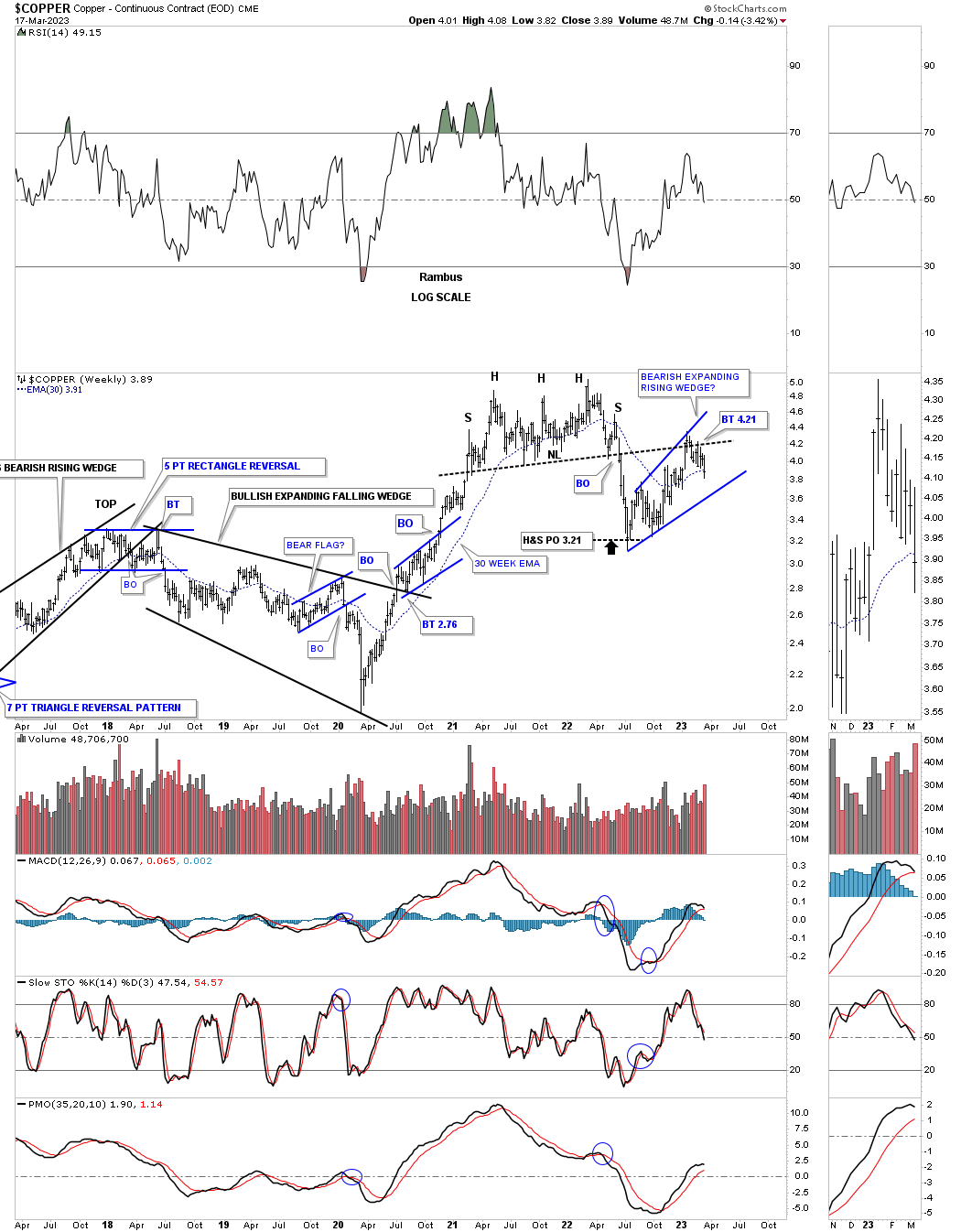
After a massive run out of its 2020 crash low Copper built out a one year H&S top with the backtest forming the blue expanding rising wedge.
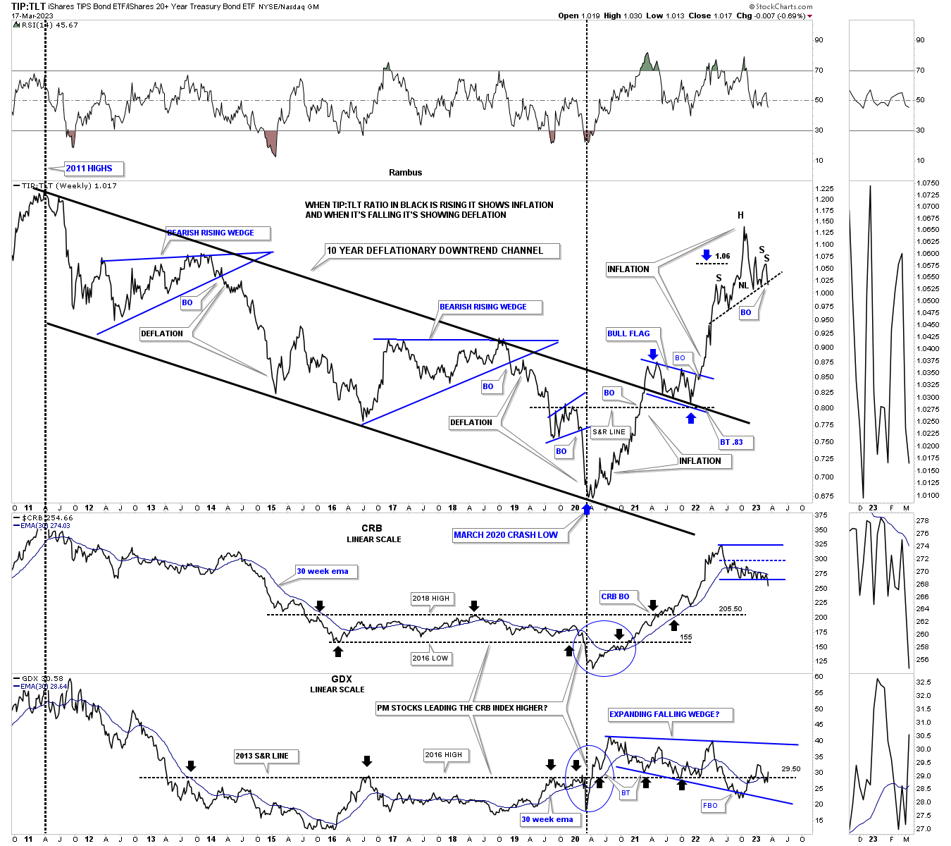
Below is the combo chart which has the TIP:TLT ratio on top with the CRB index below it with the GDX on the bottom. I use the ratio chart on top to help me gauge whether inflation or deflation is has the upper hand. As you can see from the 2011 high to the 2020 crash low deflation held the upper hand. Since the 2020 low inflation took hold with that massive rally.
This is one of those “WHAT IF” moments. What if the current H&S top plays out to the downside? As you can see the rally leading up into the possible H&S was pretty vertical which means if the price action turns down we could see some reverse symmetry down over the same area on the way up.
The CRB index made a new lower low last week, but the GDX is attempting to make a higher low if it can take out that previous high.
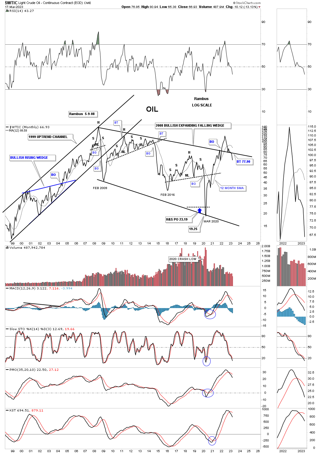
While everyone is debating how high inflation is going to go the Chartology is strongly suggesting how low will inflation will go?
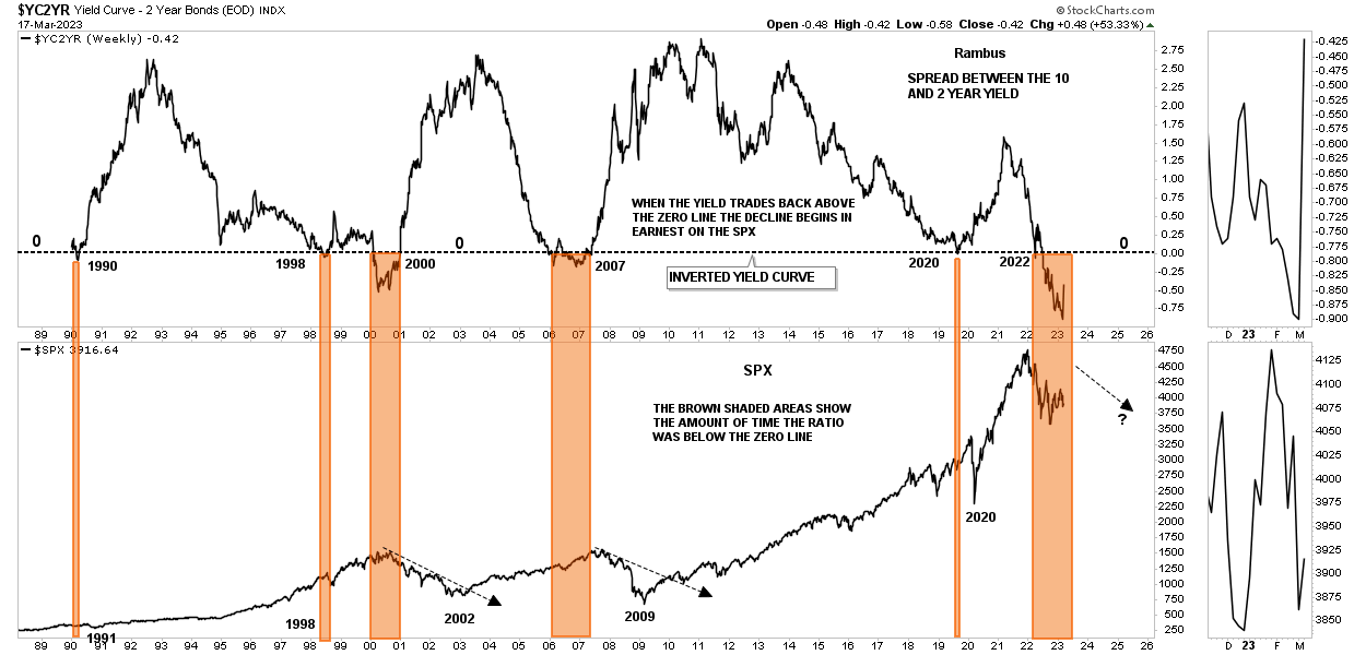
This last chart for tonight shows what happens when the Yield Curve becomes inverted.The brown shaded S&R zones show when the ratio dropped below the zero line and then rallied back above it. As you can see the big declines really took hold after the ratio moved back above the zero line as shown by the black arrows. The current inversion is still well below the zero line, but is beginning to turn up. Will this time be different when the ratio trades back above the zero line and the SPX rallies instead of declining?
The markets are alway right and can do whatever they want. Are the charts above showing us we are about to see some weakness in the economy and may be even a recession? As they say, we’ll know in the fullness of time. All the best…Rambus
About the author
