
Last weekend we looked at the US dollar which was beginning to show some strength as it is trying to find a bottom after a pretty hard selloff which can affect many different sectors in the markets. Today I would like to focus on the TNX, 10 year bond yield, as it too appears to be ready for another move higher.
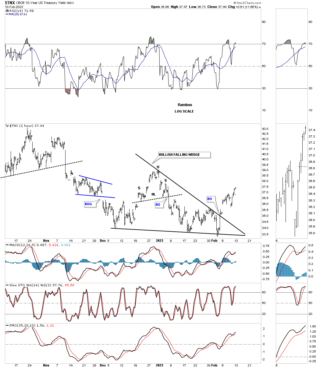
I would like to start out with the very short term 2 hour chart for the TNX and work our way out to the long term 50 year chart to try and understand where the TNX was and where it is likely to go in the long term.
This first chart is a 2 hour look at the TNX which shows the price acting breaking out from the December bullish falling wedge with a breakout gap.
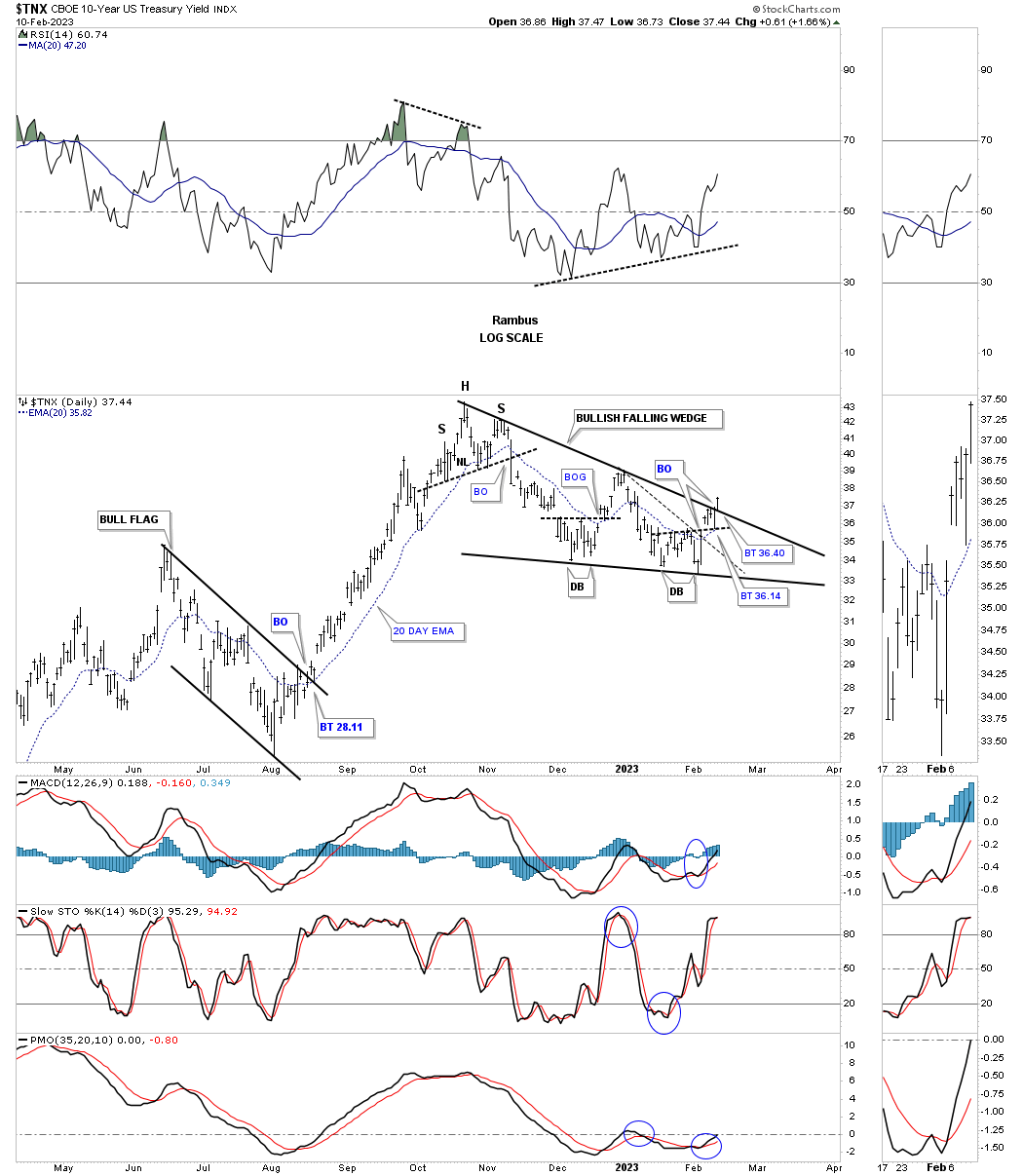
Next is the longer term daily chart which goes back about a year and shows the 2022 bull flag with a nice clean breakout and backtest. The impulse move that followed is what an impulse move is supposed to look like, strong and unrelenting.
That impulse move came to an end with the formation of the H&S top which is the first reversal point in the black bullish falling wedge which shows a breakout above the top rail last week. As you can see the bottom trendline has 2 smaller double bottoms and a backtest before moving higher. Since there are now 4 completed reversal points the bullish falling wedge is complete with a possible backtest to finish the breaking out and backtesting process.
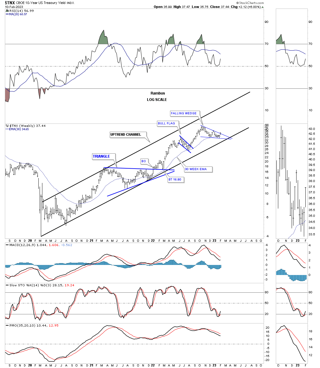
Now we’ll step back a little further in time and look at the price action since the 2020 low. Since the 2020 crash low the TNX has been moving higher in a parallel uptrend channel which shows the triangle consolidation pattern, the bull flag and the current falling wedge. The 30 week ema has also been doing a good job of holding support especially during an impulse move.
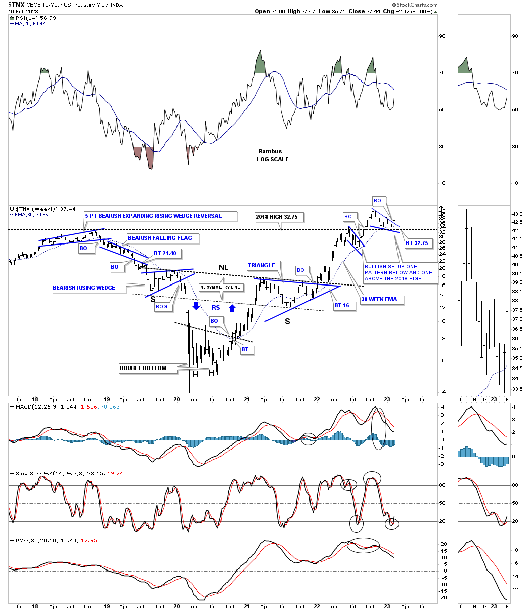
Going back even further in time the TNX built out a pretty large inverse H&S bottom that was pretty symmetrical as shown by the neckline symmetry line which shows the low for the left and right shoulders. Once the breakout and backtest were completed a strong impulse move followed which took the price action up to the previous 2018 high where the blue bull flag formed which is normal. After the bull flag completed its job of consolidating below the 2018 high the price action broke out to a new high for the move off the 2020 low. Since the breakout the TNX has been building out another small consolidation pattern, bullish falling wedge, just above the 2018 high which is usually a very bullish setup.
Keep that three year inverse H&S bottom in your mind as it plays a key role in the very long term picture for the TNX.
Way back in 1981 interest rates began their bear market that would last until the spring of 2020 some 39 year years. As you can see the high in interests rates produced a H&S top that reversed the previous bull market. For the next 39 years interest rates formed one consolidation pattern after another in a steady and relentless bear market.
The last consolidation pattern the TNX formed in its bear market was the black rectangle consolidation pattern. As you can see just before the breakout below the bottom rail there was a small bounce and then the crash / capitulation move into the bear market low. That small bounce off the bottom rail of the black rectangle ended up being the left shoulder of the H&S bottom. That inverse H&S bottom was needed to reverse the 39 year bear market which it did. This H&S bottom is the same H&S bottom on the weekly chart above.
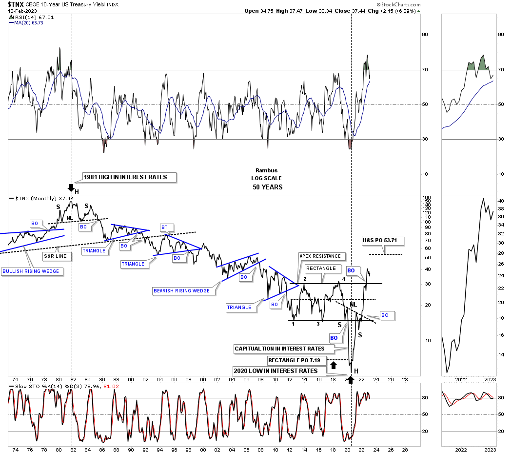
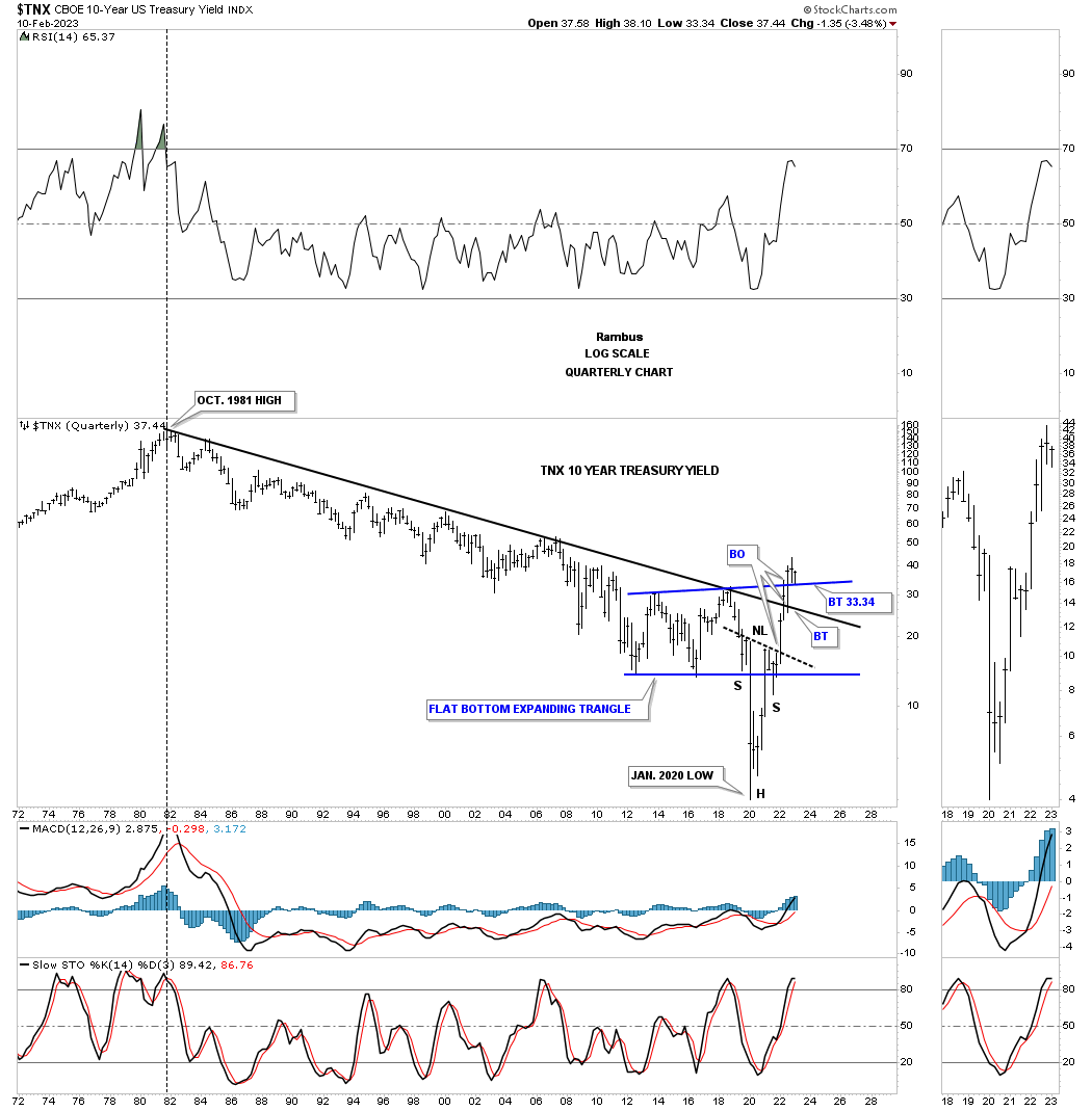
This quarterly bar chart for the TNX shows how clean the top rail of the 39 year decline held resistance. On this bar chart the last consolidation pattern was a flat bottom expanding triangle with the last bounce showing the left shoulder. Note how clean the breakout from the inverse H&S bottom neckline, the top rail of the 1981 downtrend line, and the current breakout and backtest above the top rail of the blue expanding flat bottom expanding triangle.
The TNX is also doing something it hasn’t been able to do since the 1981 high and that is to make a higher high which is pretty incredible when you think about it.
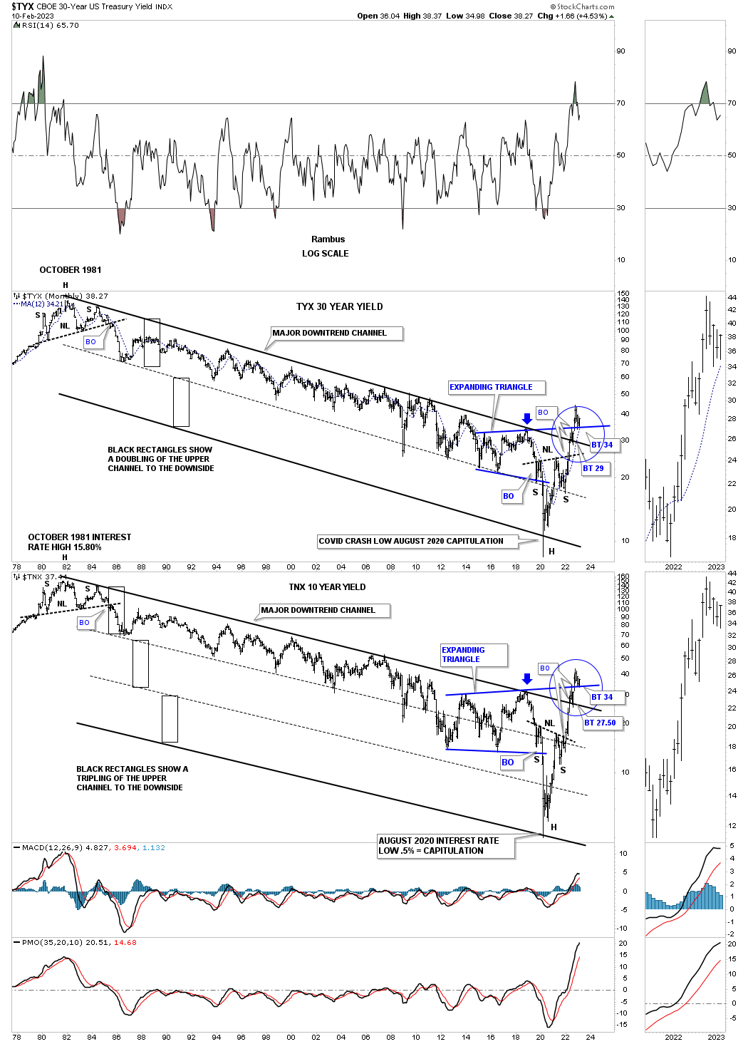
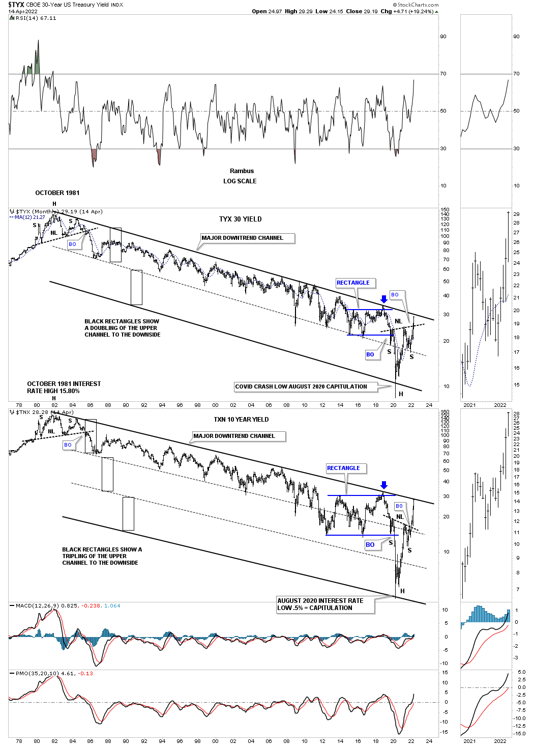
Below is a combo chart which has the TYX, 30 year bond yield on top with the TNX, 10 year bond yield on the bottom. During that 39 year bear market the price action stayed in the upper channel for most of the decline on the TYX.
I’ve shown you this technique many times in the past that when you have a strong parallel channel and the price action breaks below the bottom rail the original upper channel can double in size as shown by the black rectangles. The TNX actually formed two more parallel channels to the downside which shows the low for the 39 year bear market.
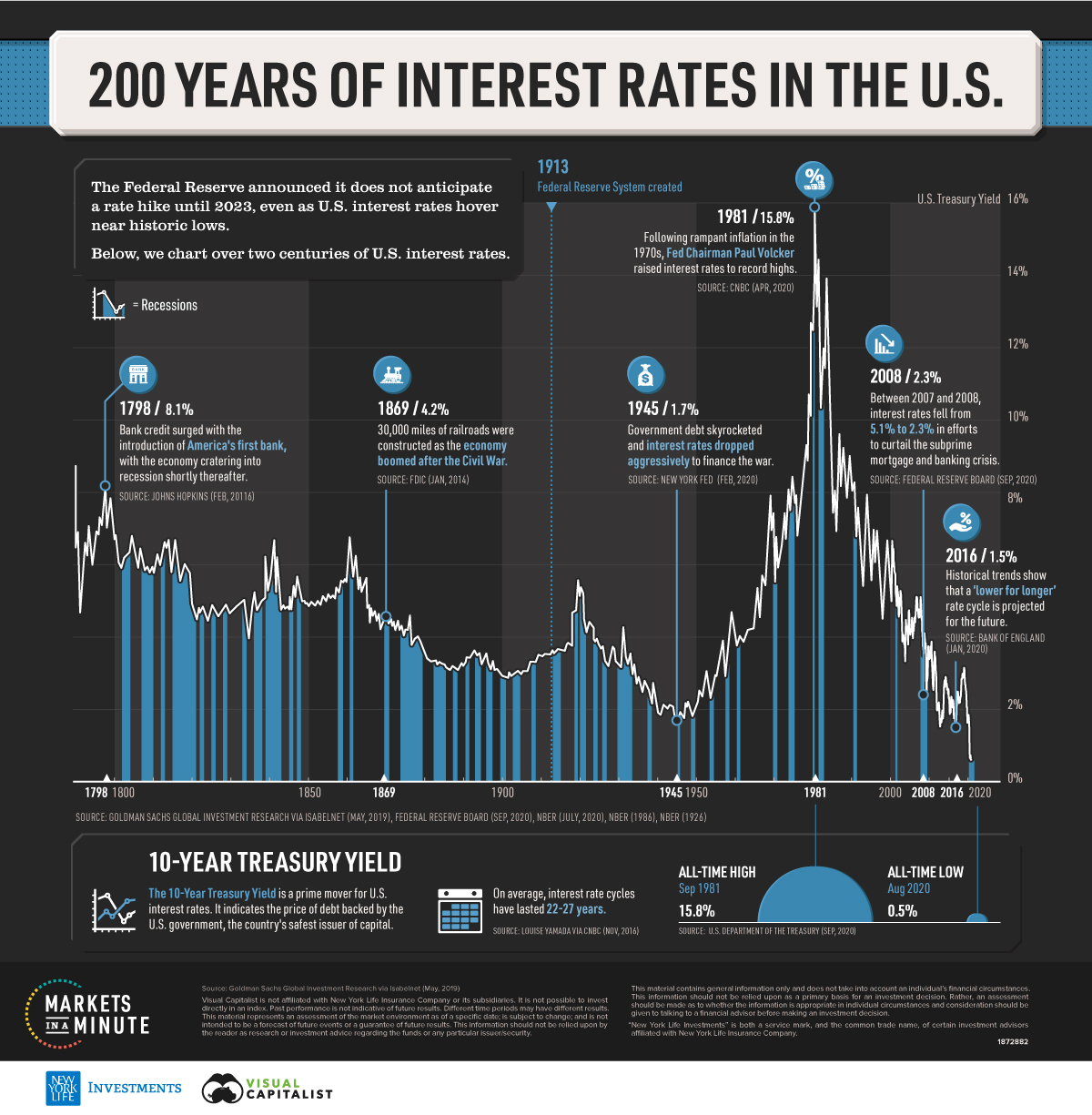
Interest rate bull and bear markets can run for many years before they change direction. Below is a 200 year chart for the TNX which shows its long term bull and bear markets. This 200 year chart ends in 2020 just as the all time low was being put in. Looking at the chart above you can see the rise in interest rates since the 2020 crash low.
This is what I wrote back in April of 2022 showing the TNX. You can compare where interest rates were in April of 2022 below to where they are now on the combo chart above.
APRIL 14th: Monthly long term charts for the TYX and TNX.
Below is a long term monthly combo chart I’ve shown you through the years which shows the 30 year and ten year bond yields trapped inside of the major downtrend channel since their all time high made in October of 1981. First, notice the H&S top that formed at the end of the last cycle in interest rates in 1981. That downtrend lasted 39 years until March of 2020. The end of a major cycle often ends in a capitulation move, blue arrows, with a vertical move, in this case, to the bottom.
We’ve been following that H&S bottom on another weekly chart for the TNX well before the breakout of its neckline which ensures the 39 year downtrend in interest rates has come to a climatic end even though the top rail hasn’t been broken yet.
It took 39 years to go from 15% in 1981 to 1/2% in March of 2020. What an incredible macro event.
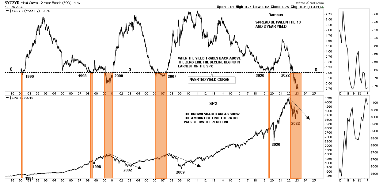
This last chart for today is a long term look at the inverted yield curve. Over the last 30 years or so every time the yield curve got below the zero line the SPX showed some weakness. During the 2000 and 2007 bear markets the yield curve stayed below the zero line for an extended period of time which led to a recession and bear market.
Currently the yield curve is the lowest it has ever been and is still declining. The brown shaded areas show when the yield curve fell below the zero line and then rallied up through the zero line. It wasn’t until the yield curve moved above the zero line did the bear market really take hold as shown by the back arrows on the SPX.
The long term charts above are strongly suggesting that the bear market in interest rates ended during the pandemic crash low in 2020 after 39 years of decline. Note the all time high for the TNX, on the 200 year chart above, which topped in 1981. If you recall Gold topped out in 1980.
Time to get ready for the Super Bowl. All the best…Rambus
About the author
