
Most commodities were in a severe bear market until everything crashed in the spring of 2020 including the PM complex and the US stock markets. What followed next was one of the strongest bull runs in just about everything that crashed. After about two years of strong price action everything needed a rest to consolidate their gains which brings us up to the present.
As you will see on many of the charts to follow the correction or consolidation phase is underway which could take some time to complete because the nearly two year rally was so massive. That leaves the door open for a possible one or two year trading range setting up which we may be able to take advantage of by trading the reversal points within the new trading ranges.
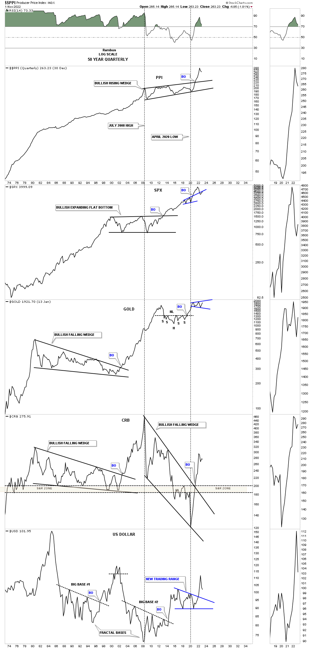
Lets start with the 50 year quarterly combo chart which has the PPI on top followed by the SPX, Gold, CRB index with the US dollar on the bottom. The PPI shows that inflation is just part of the world we live in as a long term secular trend that will likely persist on a relative basis for years to come. For the most part the SPX doesn’t seem to mind inflation as it has been moving higher over the very long term. Gold has also moved higher along with inflation for the most part. The CRB index is a little different as its 2008 to 2020 correction was quite strong until it finally bottomed and then caught fire in 2020 and moved vertical not wasting any time catching up to the rest of the commodities complex. The US dollar on the bottom generally moves inverse to commodities, but there are times when the CRB index and the US dollar can move together for periods of time.
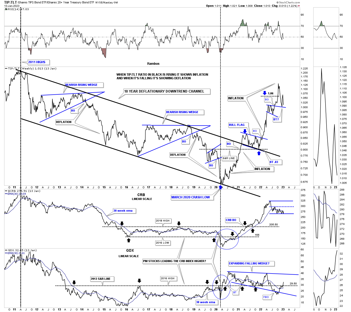
Next is the ratio combo chart which has the TIP:TLT ratio chart on top with the CRB index and GDX on the bottom. I use the ratio chart on top to help gauge if inflation or deflation has the upper hand. From the 2011 high to the 2020 low deflation was in control with bouts of of mild inflation as shown by the blue trading ranges within the parallel downtrend channel. The magnitude of the rally out of the 2020 low on the ratio chart was pretty impressive which shows that inflation has come back into play. After such a strong rally we should expect to see the ratio chart on top start to consolidate.
Note that massive rally the CRB index had just below the ratio chart. It too could use some time to consolidate its gains which could be starting to form a new trading range. The GDX on the bottom has been much weaker off the 2020 low, but has been forming a very large consolidation pattern that won’t be completed until the top trendline is broken. A week or two ago you can see the GDX finally traded back above that massive S&R line at 29.50 which extends all the way back to 2013.
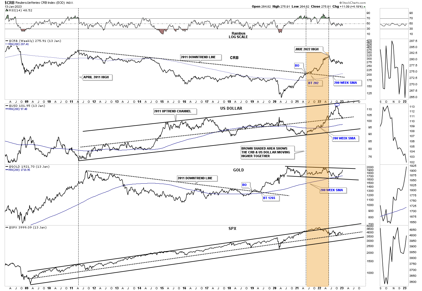
Next is a triple combo chart which has the CRB index on top followed by the US dollar, Gold and the SPX. It is easy to see that massive rally the CRB index had off the 2020 crash low which ended its bear market and could use some time to digest those gains. The US dollar bounced off the top rail of its uptrend channel and is now testing the center dashed midline for possible support. Gold has been just been chopping sideways in a slow methodical style while the SPX has been trending higher since the 2009 crash low. The brown shaded area shows how the CRB and the US dollar rallied together before the CRB finally topped out with the US dollar rallying for a few more months before it finally started to correct.
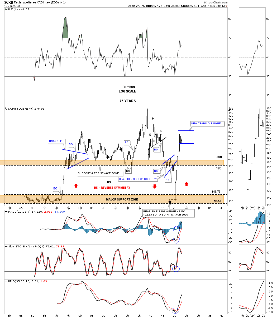
Lets now look at some of the different commodity indexes to put that nearly two year rally in perspective. First is the long term monthly chart for the CRB index which shows the massive two year rally out of the 2020 crash low which ended its bear market. As you can see it would make perfect sense to see some type of consolidation pattern start to form.
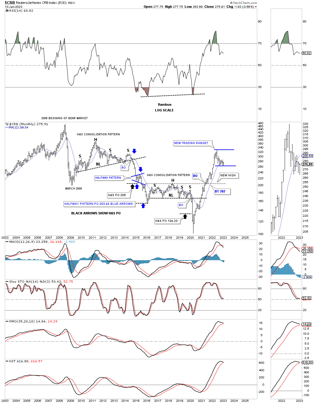
This quarterly history chart for the CRB index shows the vertical move up to the recent high and could be an area to start consolidating those gains, see the mid 1970’s triangle.
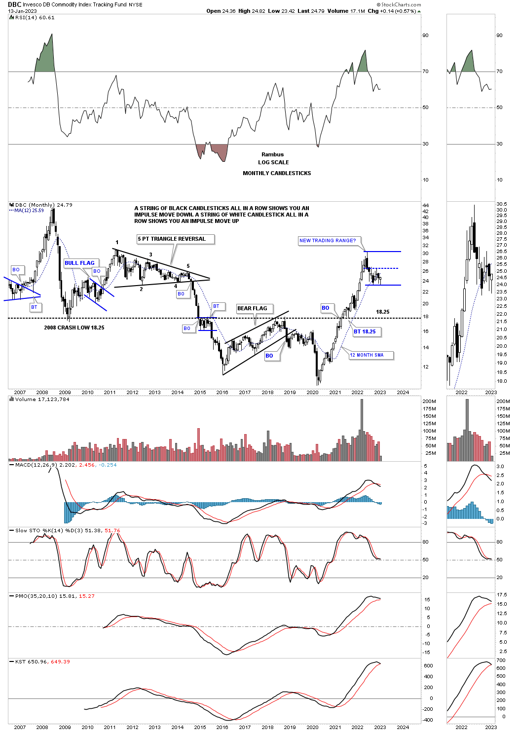
The DBC commodities index also shows the biggest rally in its history could be setting up a new trading range which would be healthy in the long term.
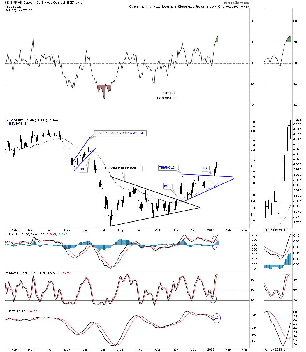
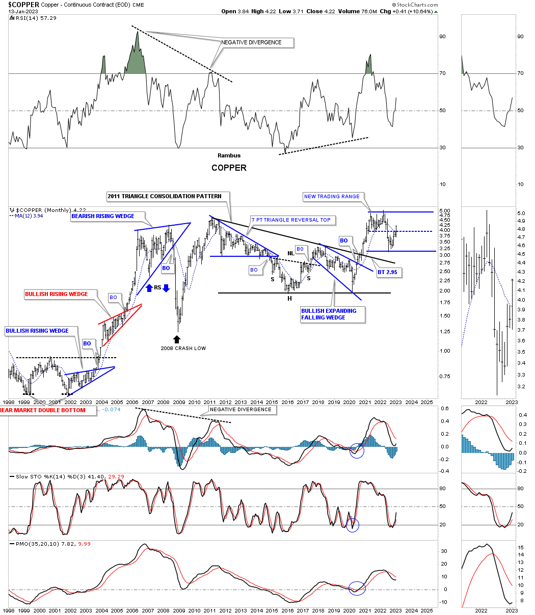
Next is a daily chart for Copper which broke out from a triangle consolidation pattern a week or two ago.
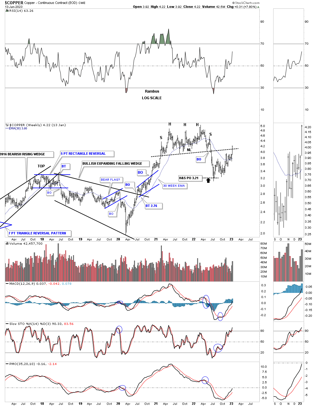
This weekly chart shows Copper forming a one year H&S top and reached the H&S top price objective in July of 2022. Since that low Copper has been in rally mode closing last week back above the neckline and the 30 week ema.
To put the daily and weekly charts in perspective below is the long term monthly chart showing how the daily and weekly charts could be setting up a new trading range which is a little further along than some of the other commodity indexes.
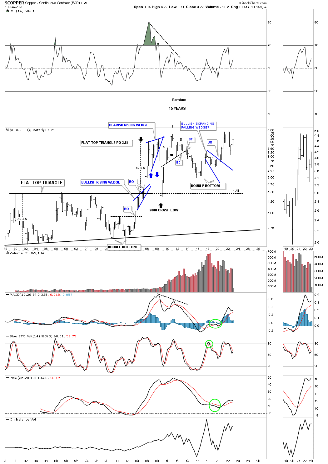
Copper quarterly chart for perspective.
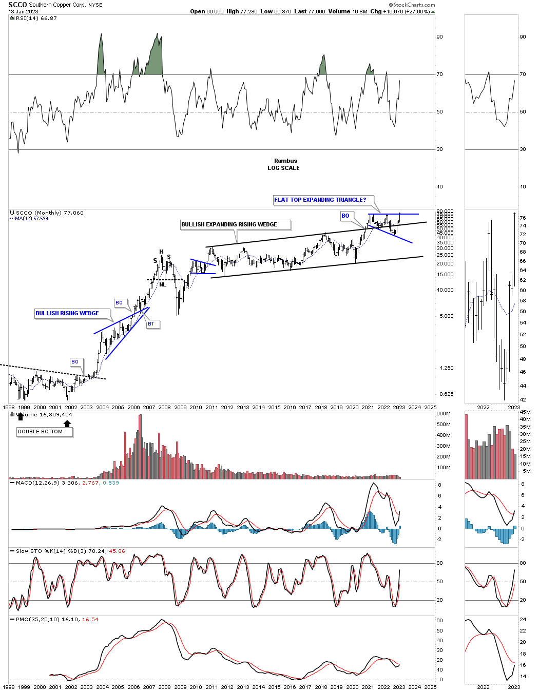
We’ve been following this monthly chart for SCCO for many years watching the expanding rising wedge forming. As you can see the price action has been forming the blue flat top expanding triangle as the backtest with the price action closing at a new all time high last week.
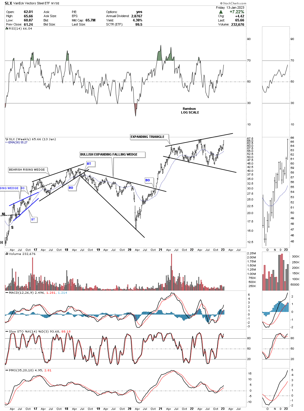
Steel has also been one of the stronger areas as shown by the SLX, steel etf, which has been building out an expanding triangle and is getting close to making a new all time high.
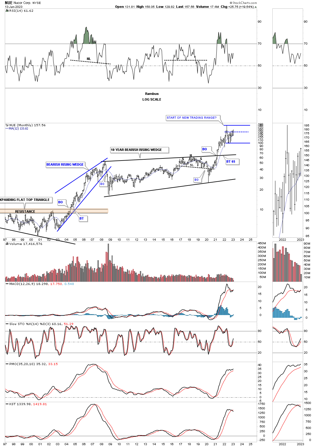
After breaking out from its massive bullish rising wedge in 2020 NUE has been consolidating those gains.
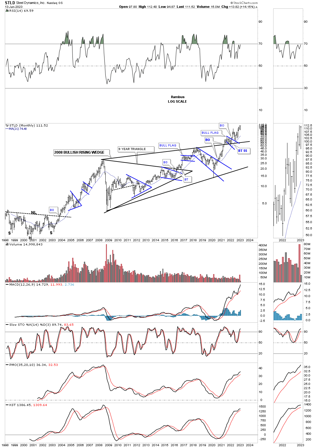
Last week one of the strongest steel stocks closed at a new all time high.
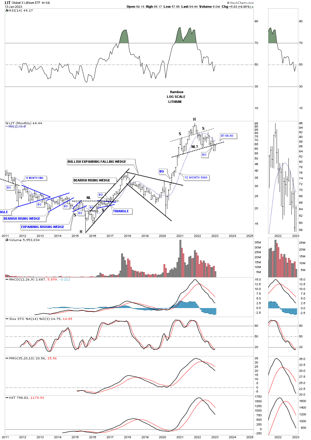
LIT on the other hand could be showing us a H&S top with a possible backtest this month in progress.
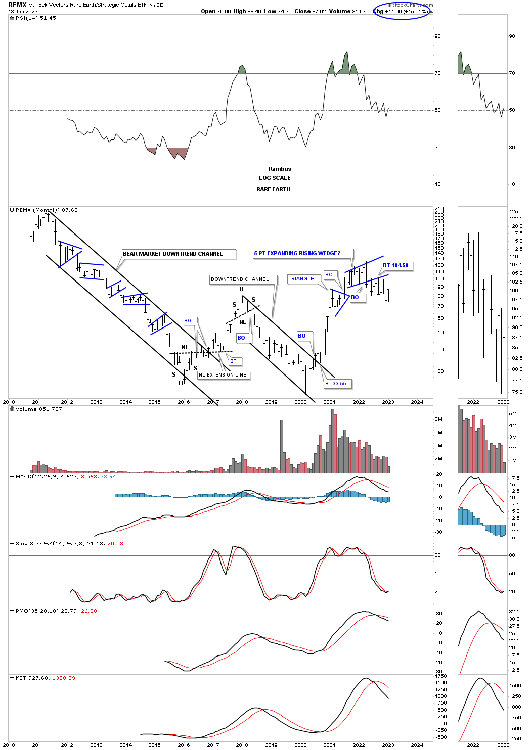
REMX broke down from the blue 5 point expanding rising wedge and has been in backtest mode. There is still a possibility that it could be forming a sideways trading range if the recent lows can hold support.
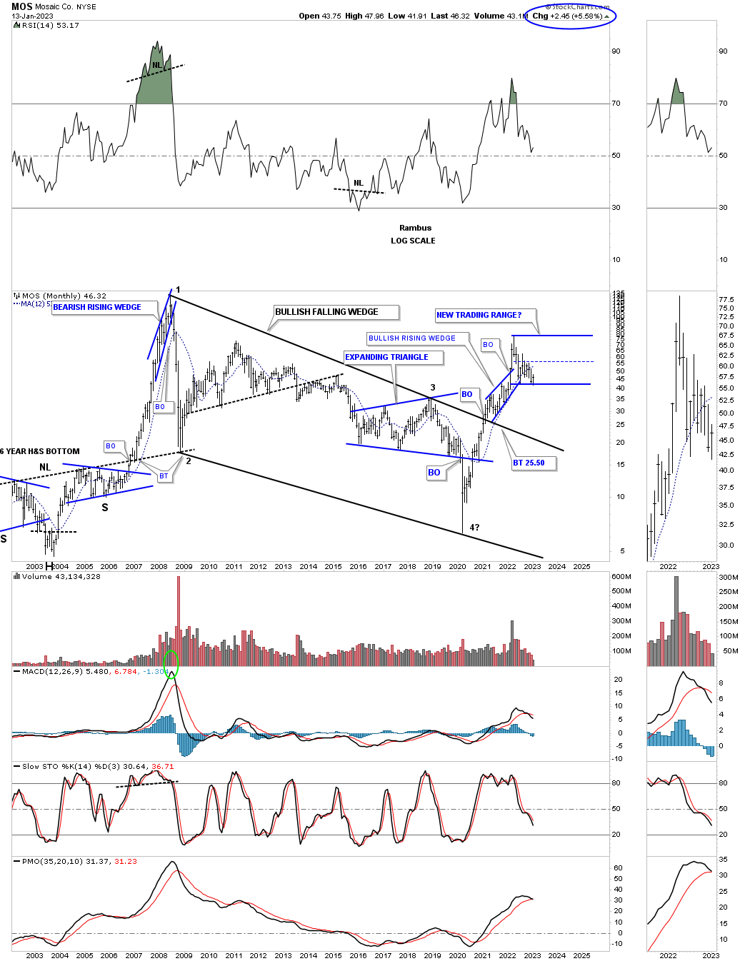
MOS, fertilizer stock, had a massive rally out of its 2020 crash low which ended its bear market. It could be forming a double bottom on the bottom rail of the possible new trading range.
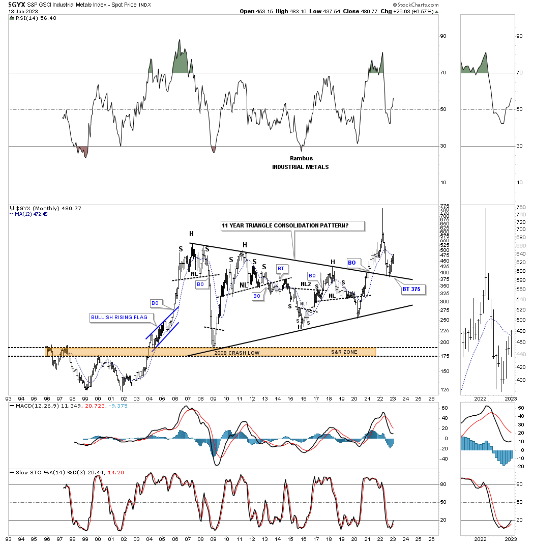
The GYX, industrial metals index, had a massive breakout of its 11 year triangle and has since come back down to backtest the top trendline forming a double bottom as the backtest.
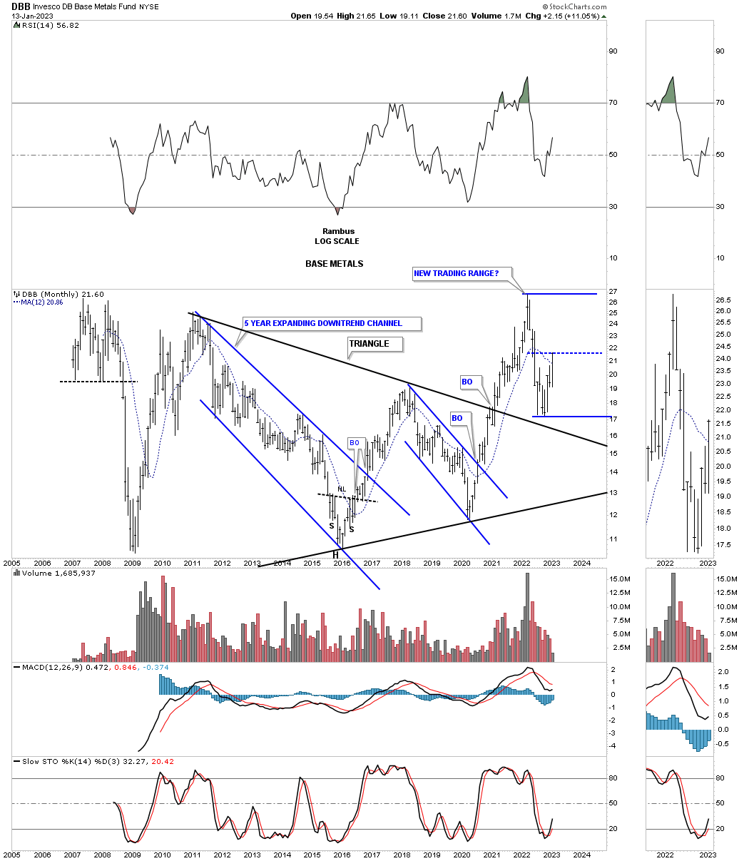
DBB, base metals fund, had a massive breakout and has pulled back to the top trendline forming a possible new trading range.
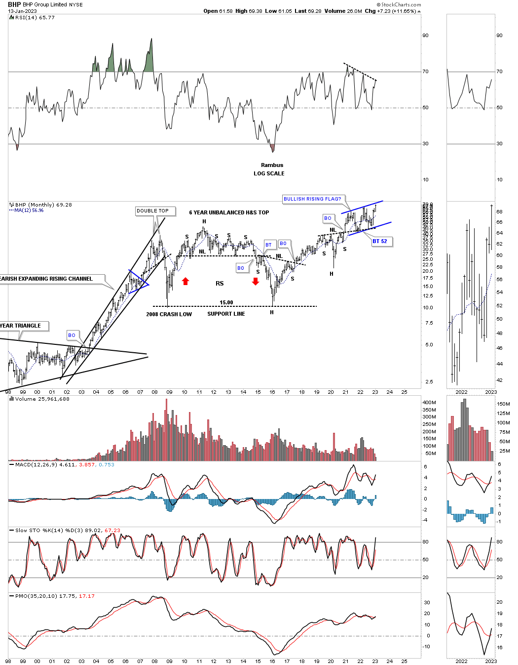
BHP has been building a bullish rising flag closing at a new all time high last week just below the top rail.
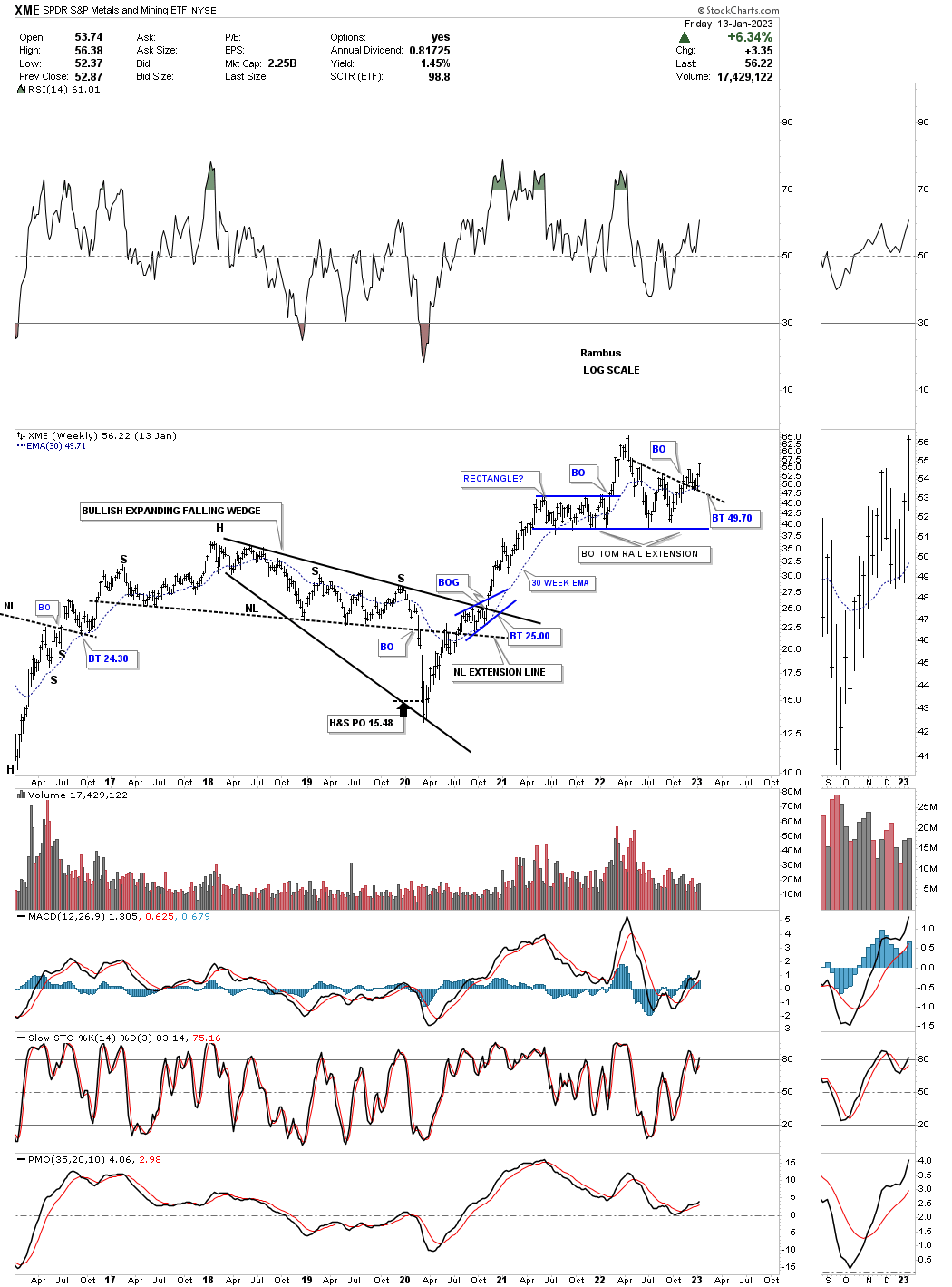
The XME, metals and miners etf, broke out from a double bottom that formed on the bottom rail extension line made from the bottom trendline of the blue rectangle consolidation pattern.
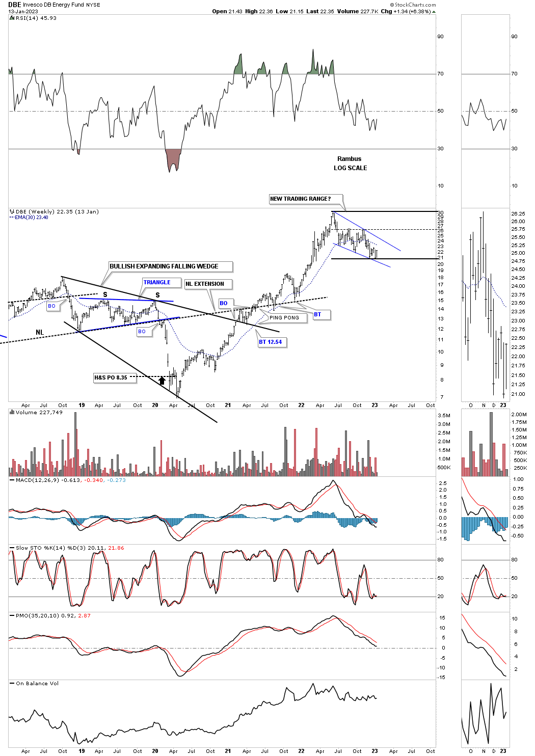
The DBE is the energy fund which has formed the blue falling wedge which could be the beginning of a larger consolidation pattern.
Next is a weekly chart for WTIC which shows the brown shaded support and resistance zone which has been holding support with the formation of a possible expanding falling wedge forming the backtest.
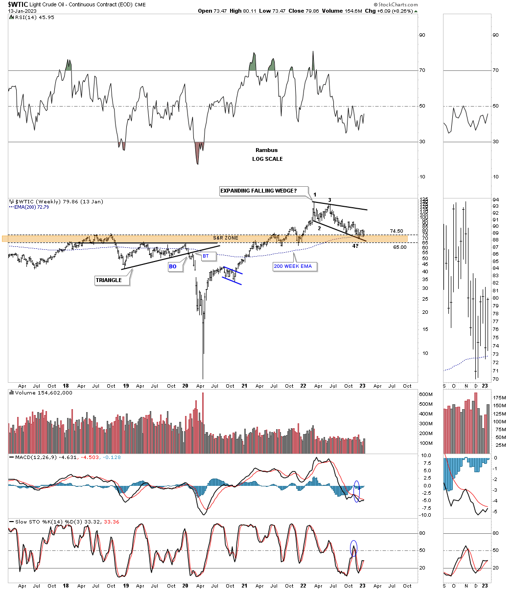
A long term monthly chart showing it could be time for a consolidation phase.
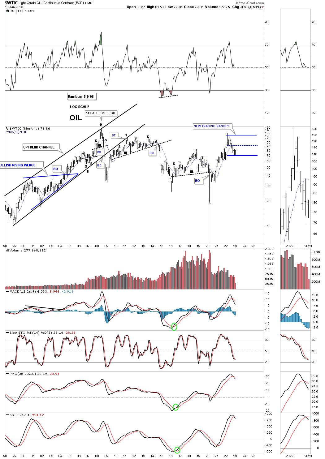
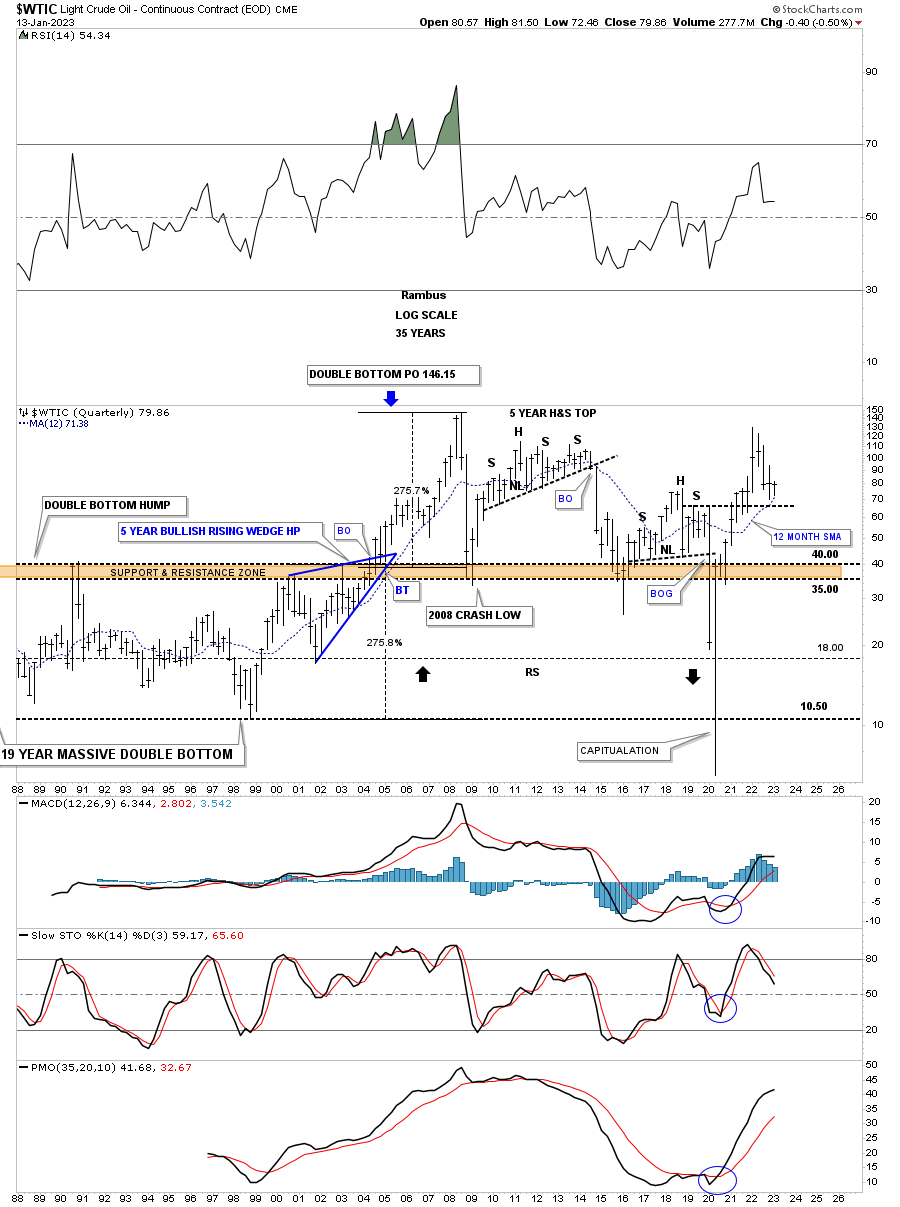
This last chart for tonight is the history chart for WTIC which I originally built back in 2013 during the formation of that massive H&S top looking for an initial move down to the brown shaded S&R zone which we got during the 2014 decline. At that time I also laid out what I thought could happen if the brown shaded S&R zone ever gave way.
After the 2014 low WTIC went on to form another H&S top with the neckline giving way during the 2020 crash. It was always about the reverse symmetry below the brown shaded S&R zone that caught my attention. The current price action is finding support on top of the right shoulder and the 12 month sma which could lead to a bounce back up to the recent high and the formation of a consolidation pattern.
After such a monster move out of the 2020 crash low we shouldn’t be surprised to see most commodities consolidate those gains for awhile. If that plays out it will give us an opportunity to play the swings between the reversal points which can be very profitable if you can figure things out early enough.
When looking at these long term charts above take notice of some of the big bullish expanding falling wedges which the PM complex is currently showing us and why I call these pattern one of the most bullish patterns there is. All the best…Rambus
About the author
