
Before we look at the Gold charts tonight there are a couple of things I would like to explain to our new members. Long term members have heard what I’m going to explain many times in the past when we start a new impulse move. It sounds pretty basic but very important to understand.
First, you have to know what type of trader you are. There are three timeframes you need to be aware of. If you are a short term trader then you need to focus on the short term minute and daily charts for your buy and sell signals. For me personally I’m an intermediate term trader that looks for the big impulse moves between a consolidation pattern or a reversal pattern, that is why I focus more on the longer term weekly and monthly charts. If one is a long term trader then you don’t care about anything else but the big picture and longer term charts. The most important thing for a long term investor is to know with a high degree of confidence if the stock you are investing in is in a bull or bear market.
The other point I would like to make if one is an intermediate term trader is to know as soon as possible when an impulse move begins and ends. Once you have identified an important intermediate term impulse move has begun there is only one thing you need to do which is psychologically hard for most traders. What that simple and psychologically hard thing to do is, NOTHING.
What happens to most traders during an impulse move is first, they don’t understand what an impulse move actually is and try to trade the small consolidation patterns that help buildout the impulse move. If one is a short term trader that is a different story as we are talking an intermediate term move. Yes, they may capture some small profits from time to time but what happens most of the time is that they will get left behind always looking for a way to get their positions back as the stock runs higher.
There is an old Wall Street adage that I completely disagree with. It says, you can’t go broke taking a profit. That is partly true if you take a profit on every trade you make but every trade you take won’t be profitable. In a strong impulse move you can take a small profit but then you have to get back in at some point which I can tell you from first hand experience is a very hard thing to do when the trend is very strong. What usually happens is that you will pay up to get your shares back and lose the difference between where you sold and where you got back in at, rinse and repeat.
The time to trade is during the formation of a consolidation pattern and try to catch the reversal points that make up the internal structure of say, a triangle. An impulse move is an entirely different game altogether.
Everyone has to figure out what type of trader they are and to understand how the market moves. Knowing that can help you make more money than you lose. It sounds simple enough but hard to do in real time.
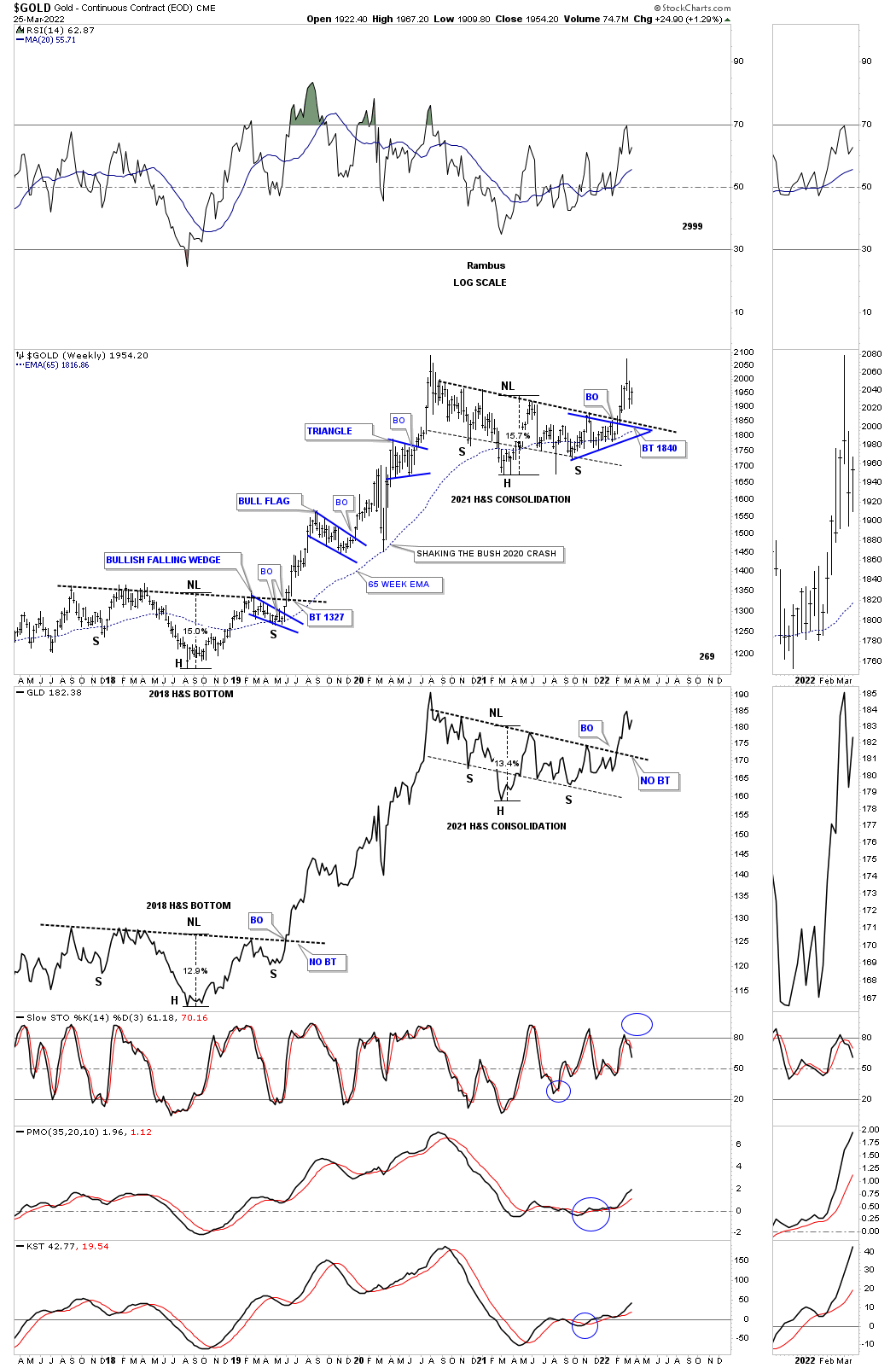
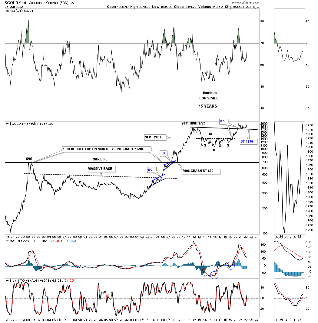
Tonight I would like to show you the many different faces of Gold from the intermediate to the longer term timeframes. We already know that big consolidation patterns are usually made up with small patterns especially in regards to H&S patterns. This first chart is a combo chart for Gold with the top chart being a bar chart and the bottom one being a line chart.
The two dominate chart patterns are the 2018 H&S bottom and the 2021 H&S consolidation pattern. Both of the patterns are almost identical in price and time as shown by the percentage move from the head to the neckline. Time wise the current H&S consolidation pattern broke out above its neckline several weeks earlier than the 2018 H&S bottom. As you can see the 2018 H&S bottom had just a one week backtest before the impulse move really took off in earnest. The current H&S consolidation pattern hasn’t experienced a backtest yet which is still possible. The main takeaway is that the impulse move has already begun regardless if we get a backtest or not.
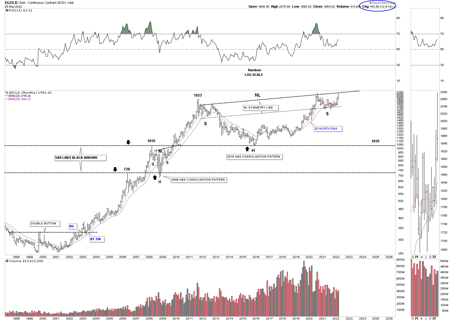
Lets focus on the impulse move between the two H&S patterns that lasted almost two years. Looking at the nearly two year impulse move looks pretty easy in hindsight but I can assure you it is an entirely different game in real life. Put yourself in at any point from the lower H&S bottom to the 2020 high where the impulse move ended. How would you have reacted during those small consolation patterns especially the 2020 pandemic crash low?
What we do know from a Chartology perspective is that first, there was a pretty big H&S bottom which strongly suggested a big move to follow. The first minor impulse move formed the blue bull flag which confirmed the bigger impulse move was underway. The 2020 crash is not typical in a strong impulse move but Gold did find support on the 65 week ema which led to the next small impulse move up. After a couple of months of sideways chopping action formed the last consolation pattern in the big impulse move which was the blue triangle. Normally during a big impulse move you will generally see anywhere from two to four smaller consolidation patterns form.
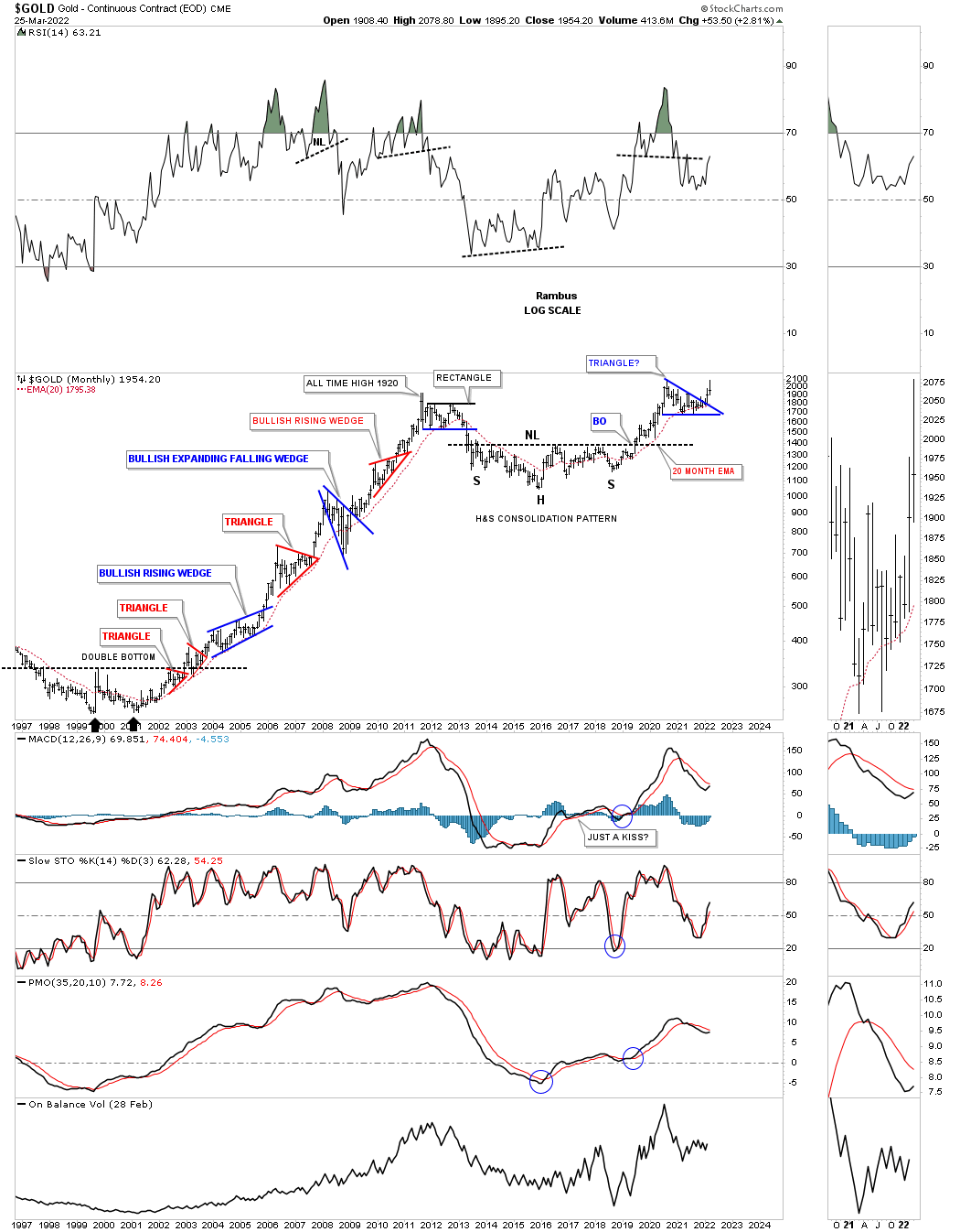
This next chart shows all the consolidation patterns that formed the bull market from the 2000 low to the 2011 high. Again, put yourself anywhere in that ten year bull market rally and how would you have reacted at any point in that bull market? This chart clearly shows you the best time to have been in Gold was during the impulse move between each consolidation pattern. If one is an investor then all you needed to know is that gold was in a bull market and to sit tight during the consolidation phases which could last up to a year. An investor would have done very well if they had spotted the top in September of 2011 and gotten out during the rectangle consolation pattern to the downside.
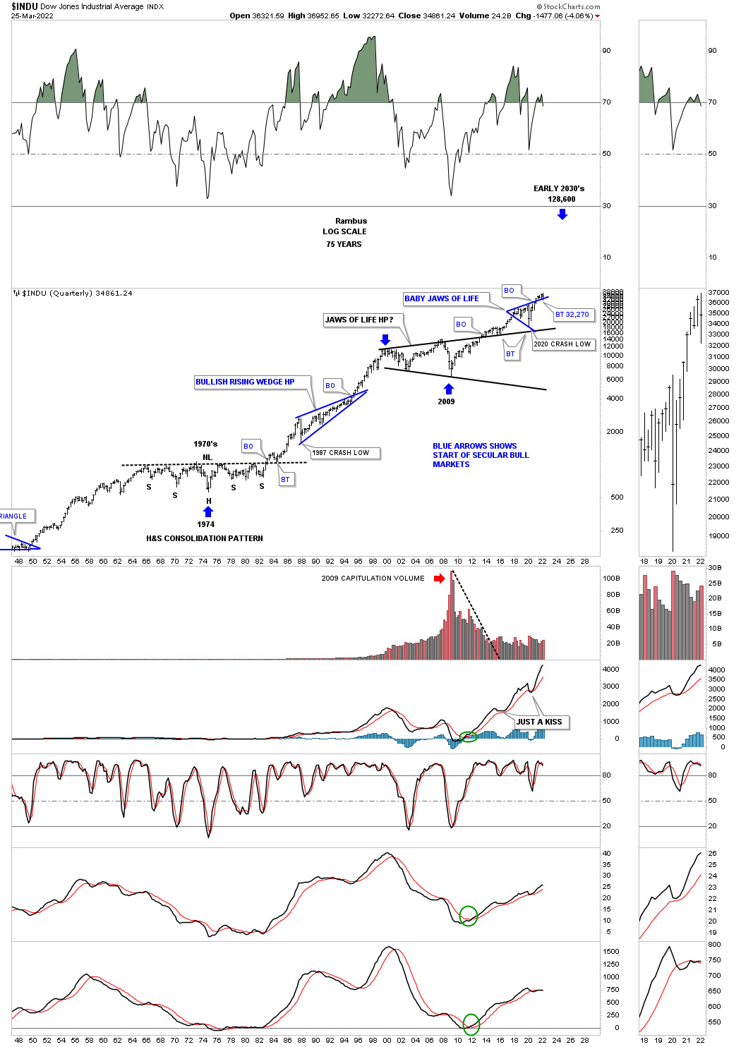
I have shown you many charts for the US stock markets which show the secular bull markets from 1974 to the 2000 top and the current secular bull market that began at the 2009 crash low. The beginning of the 1974 secular bull market lasted nearly 25 years with the current secular bull market currently at 13 years and counting.
Below is Gold’s secular bull market that began in 2000 and is now 22 years old. Time wise if we added the first leg of the bull market that took eleven years to complete and added eleven years to the 2016 low, head portion of the H&S consolidation pattern, that could put the time component out to the 2026 area using the H&S as a halfway pattern.
There is no way to know 100% for sure when the time component will be completed but for now it is a good guide we can use. There will be other things we will be following that will help us in signaling the end of the secular bull market but at this point we should have at least four more years at a minimum ahead of us.
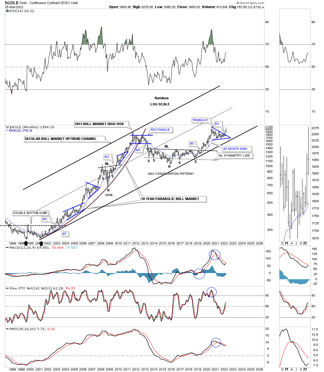
The first quarter of 2022 will end in just four more days of trading for the month of March. Gold is currently trading at the highest level since the 2020 high with the 2011 high holding support, previous resistance turning into support once tested from above. You can see something similar during the breakout of the support and resistance line in 2007, resistance turning into support when broken to the upside.
This face for Gold shows its massive H&S consolidation pattern which I’m viewing as a halfway pattern in the secular bull market that began at the 2000 low. You can measure the distance between the head and the neckline to get a minimum price objective for Gold which again is a minimum.
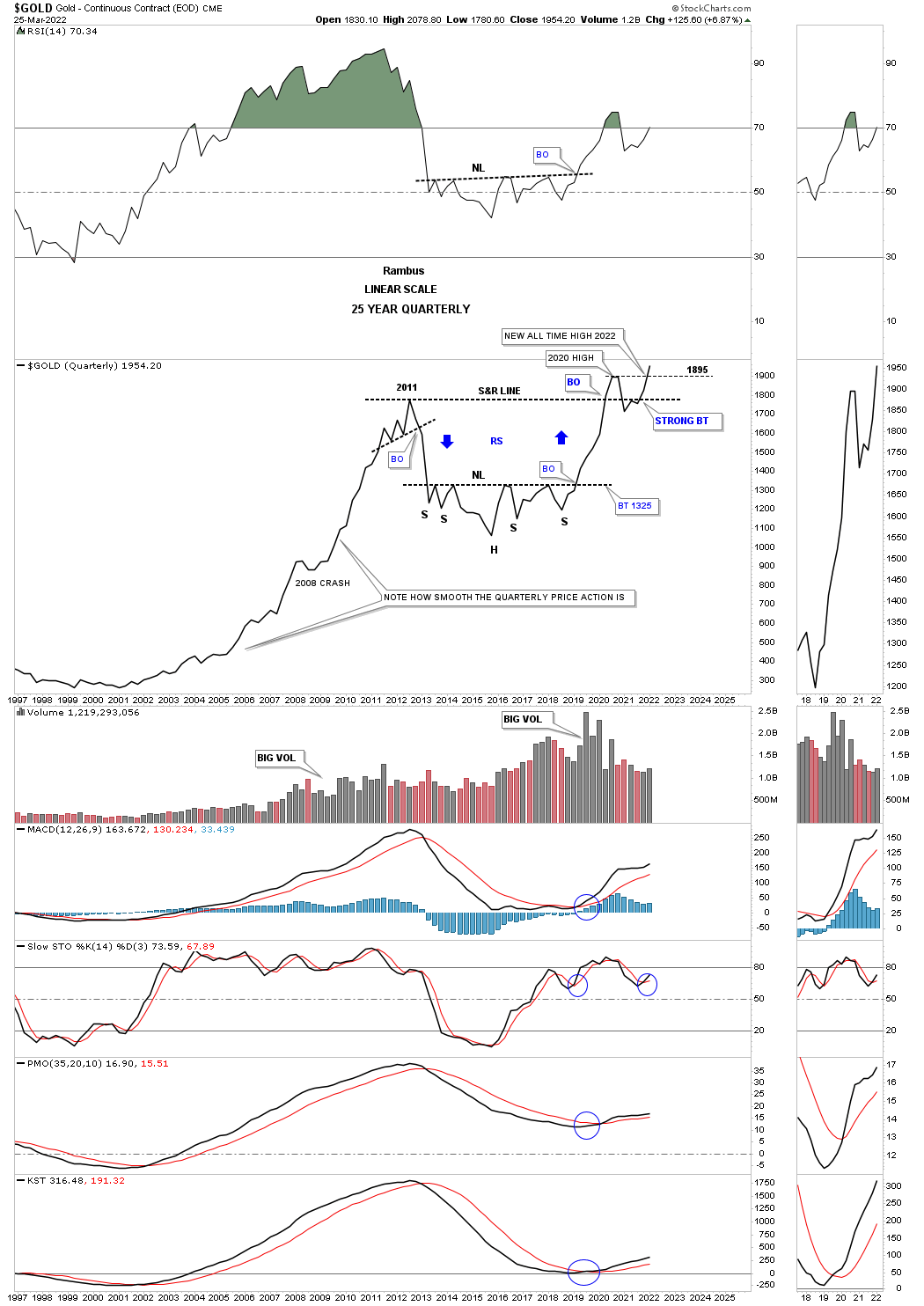
This next chart is a long term quarterly bar chart which is beginning to look very bullish. By that I mean look at the current quarterly bar and how the price action has held support on the backtest to the 2011 high. From my perspective all the work has been done with the backtesting process and now it is time for the real impulse move to take hold which by the end of the next quarter I expect to see the next quarterly bar much higher than the first quarterly bar for 2022. We won’t know for sure until the 2nd quarter is finished but the setup looks extremely bullish especially if we see a new all time high being made in the next three months.
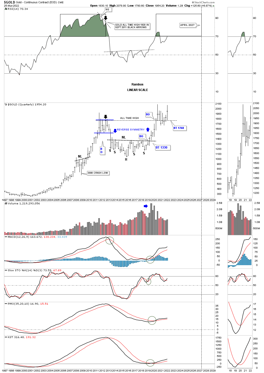
This next chart for Gold is the quarterly fractal chart we’ve been following for over a year or so which compares the 2000 trading range to the current 2020 trading range. Previously I mentioned that the month of March of 2022 we should see Gold trading at the top of the trading range which has happened. Now count the number of quarterly bars in the 2011 trading range and the 2020 trading range which is seven. The eighth quarterly bar made during the 2011 trading range broke through the bottom rail which confirmed the bear market. On April first of this year Gold will be starting to form its eighth quarterly bar which I believe will show a breakout to the upside inversely to the 2011 fractal.
What this chart also reveals to us is how similar the 2000 double bottom base and the 2016 H&S base are in both time and price as shown by the black rectangles. After the breakout from the double bottom base in 2000 the first consolidation pattern to have formed was the bullish rising wedge. If you count the number of quarterly bars in that bullish rising wedge you will count seven which is the same number as our current trading range. So if the blue bullish rising wedge was the first consolation pattern in the 2000 bull market is our current trading range the first consolidation pattern in the 2016 second leg up of the secular bull market?
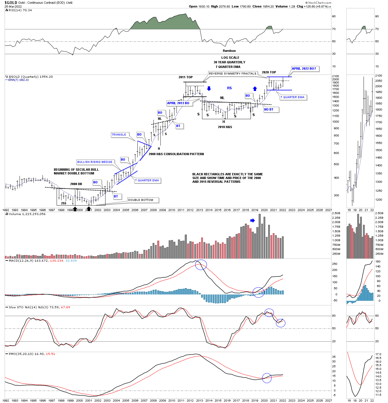
Below is a quarterly line chart which really puts things in perspective for me. Again, in just four more days of trading Gold will begin its next quarterly bar of trading. On a quarterly closing price Gold is trading at a new all time high. Remember a line chart will often show you a breakout before a bar chart does.
Another important aspect of this quarterly line chart is that it shows you how smooth the price action was during the bull market years from 2000 to 2011. The only real hook lower was the 2008 crash low and when the 2011 top was completed. Other than that Gold made a new higher high except for a few minor blips by the end of each quarter. Note the price action starting at the right shoulder low and how smooth it looks except for the backtest to the 2011 high.
If the Chartology plays out as expected the 2nd quarter of 2022 should be something to behold for the PM complex and for those that can ride the bull and not get bucked off. We could very well be in for the ride of a lifetime. All the best…Rambus
Can you afford to navigate this Gold bull without Rambus ?
About the author
