
I know you are tired of hearing this, but it is so true that big patterns lead to big moves for the intermediate to long term trader. One of the toughest things for a trader to understand is if the stock or market he is trading, is in a bull or bear market. I know that sounds overly simple, but it is so true.
Since the 2009 crash low in the US stock markets most of our members have been bearish on the US stock markets, not all but a large number. This was one of the greatest bull markets of all time, but so many refused to believe what the charts were showing. Looking back in hindsight it’s very obvious it was a great bull market.
In 2011 the bull market ended for the PM complex in no uncertain terms, but most PM stock investors refused to believe the PM complex could be in a bear market even to this day. Yes, there have been two very large bear market rallies, but that is all they were over the past eleven years. I even thought the 2016 and 2020 rallies could be the start of the next bull cycle, but I quickly went to cash the minute they started to reverse direction.
It is so much easier to trade with the trend than against it. If one tried shorting the stock markets over the last 11 years it was like a salmon swimming upstream. You can be right, but the trade is usually much tougher because you are trading against the trend. Very few traders have made a killing shorting the stock markets in general, but those that have traded in the direction of the bull market found it much easier, but it is still a tough game to play.
During the bull market years from 2000 to 2011 in the PM complex it was so much easier to buy into the bull market vs shorting the bull market. If you are trading in the direction of the main trend and made a mistake and bought too high you will eventually be forgiven because in a bull market new higher highs will save you and just the opposite if you are short a bear market. The old expression, “The Trend Is Your Friend” applies in spades.
How many times have we heard the words that this time the rally is for real so you better back up the truck or jump on the train before it leaves the station without you. When the PM complex built out that massive H&S top back in 2011 Sir Fullgoldcrown complied a list of analyst a mile long that refused to believe, that one of the most symmetrical H&S tops I’ve ever had the pleasure to build, was valid.
This is what I wrote back on April 26th 2013.
Lets take a look at the weekly log scale chart for the HUI that shows the weekly gap is still in play as the HUI failed to close it completely this week. The black rectangles measure time and price. If the bottom of the halfway gap plays out similar to the top half then the HUI could reach the bottom around the 160 area in October of this year based on both halves being equal.
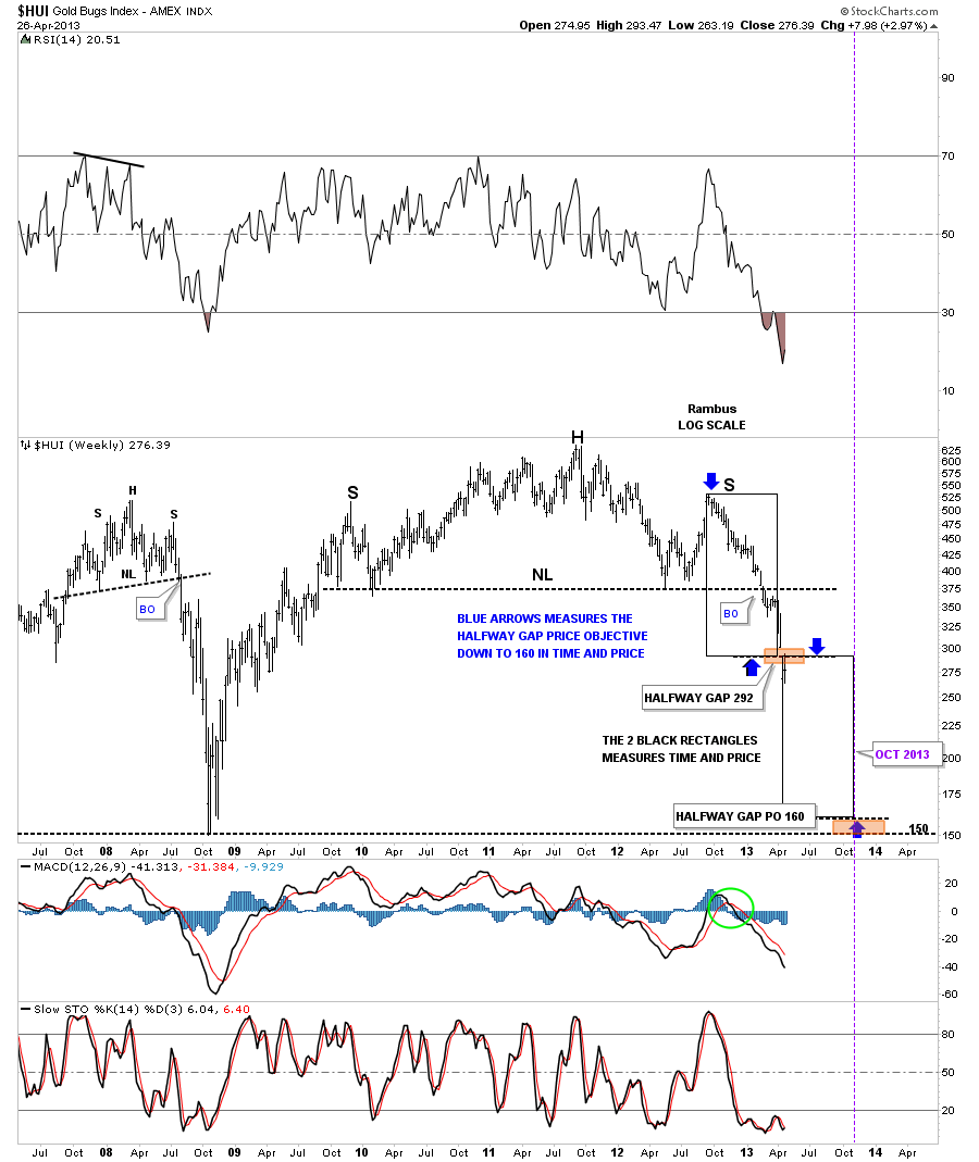
That price objective was achieved at the 160 area, but was only a stopping point in the bear market that followed on the chart above. Also note the 2008 very symmetrical H&S top which I got into hot water when it was forming, at the Tent back then, because no one wanted to believe it was even possible. The reason I’m bringing up this old H&S top for the HUI and the rest of the PM complex back then is because this pattern is showing up on most of the US stock markets right now.
Today October 10:
For those members that have been with Rambus Chartology before 2022 know that I have been a staunch bull for the US stock markets since our inception back in 2011. There were some corrections along the way that made trading tough, but overall I maintained my bullish stance until this year.
I hope I can present the Chartology in a way in which you can see the seachange for me from being a staunch bull to now a bear for the first time since the bull market began at the 2009 crash low. For me it is always about the charts and what they are suggesting, when they change I have no problem changing with them.
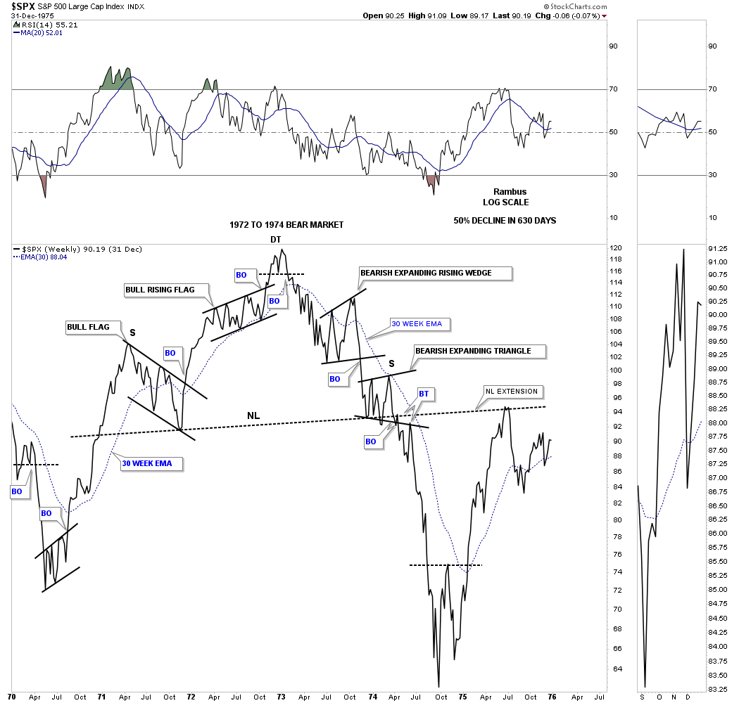
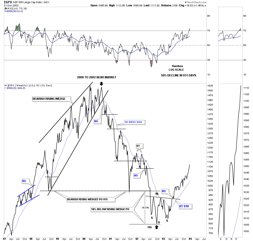
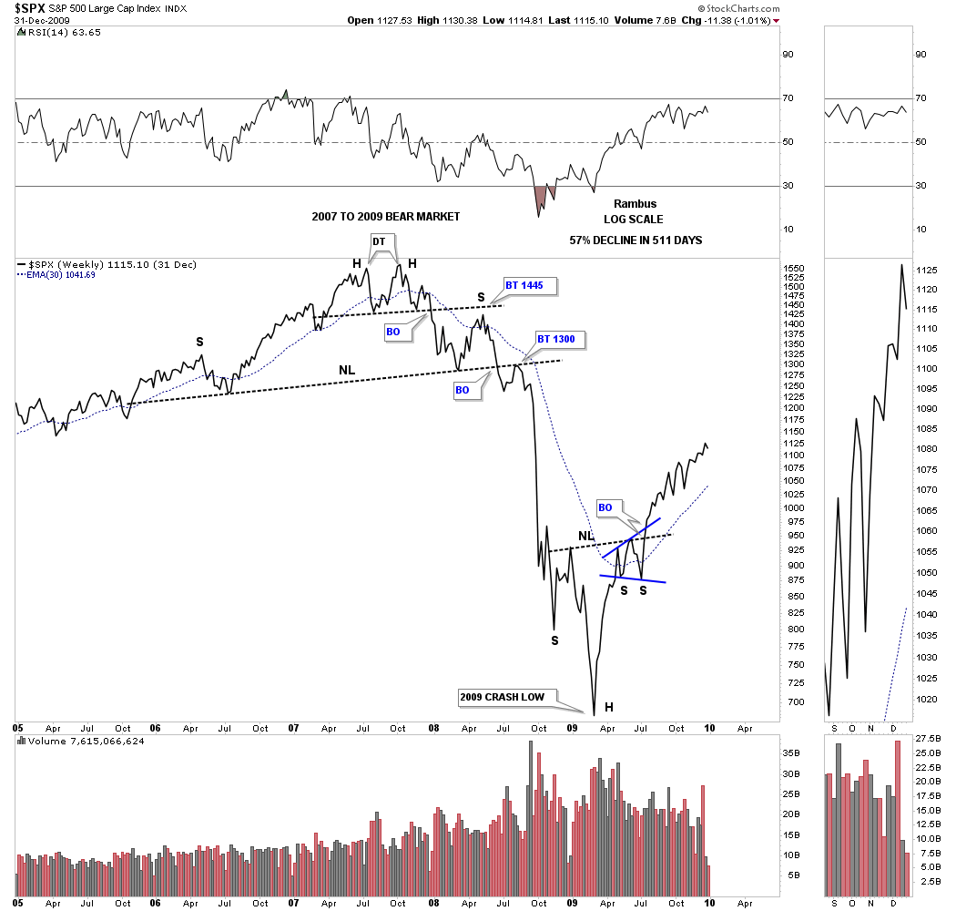
This first set of charts I would like to show you are the tops and bear markets that followed the completion of those tops. Remember big patterns lead to big moves.
This first chart shows the large H&S top that led to the great bear market back in 1972 which bottomed in October of 1974.
I could make a case for a H&S top that ended the bubble in 2000, but the bearish rising wedge does a good job. The price objective for that bearish rising wedge was all the way down to where the wedge began to form which was reached where a strong bear market rally ensued. The bears had one more trick up their sleeves as they took the SPX below the original price objective for another 18% before the bulls were able to form the H&S bottom reversal pattern.
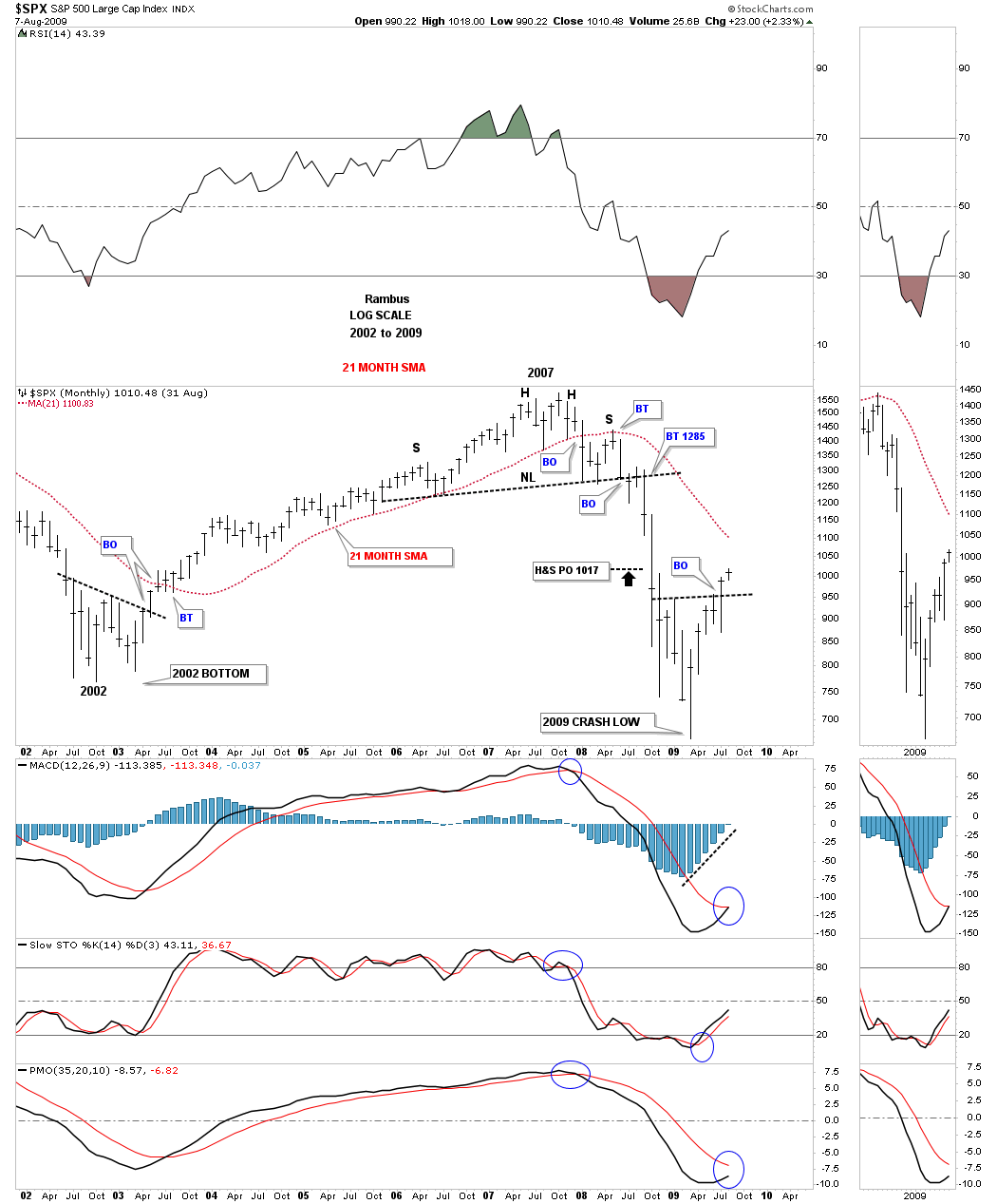
This next chart shows the infamous H&S top that was made in 2007 which led to the Great Recession. After the last kiss to the neckline the bottom fell out and the rest they say is history. The bottom in 2009 formed a H&S reversal pattern that began one of the greatest bull markets of all time.
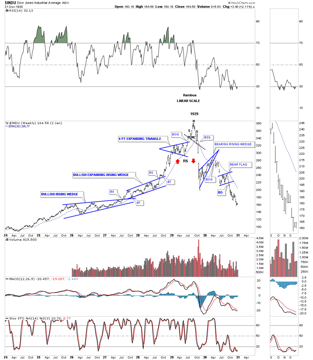
If you ever wondered what the roaring 20’s looked like this chart below shows you the Chartology that formed back then that looks no different than the Chartology today. Note the two blue consolidation patterns that slope up into the direction of the uptrend that we know shows very bullish characteristics which were the bullish rising wedge and the bullish expanding rising wedge. The last consolidation pattern that formed was the expanding triangle which is a pattern that can show indecision in some cases, but it is always about the direction of the breakout that matters.
The actual top was a rather small down slopping H&S reversal pattern which can show a more bearish setup to a neckline that slopes up. The initial crash just took a few weeks to complete before the first consolidation pattern in the new bear market formed which was the bearish rising wedge.
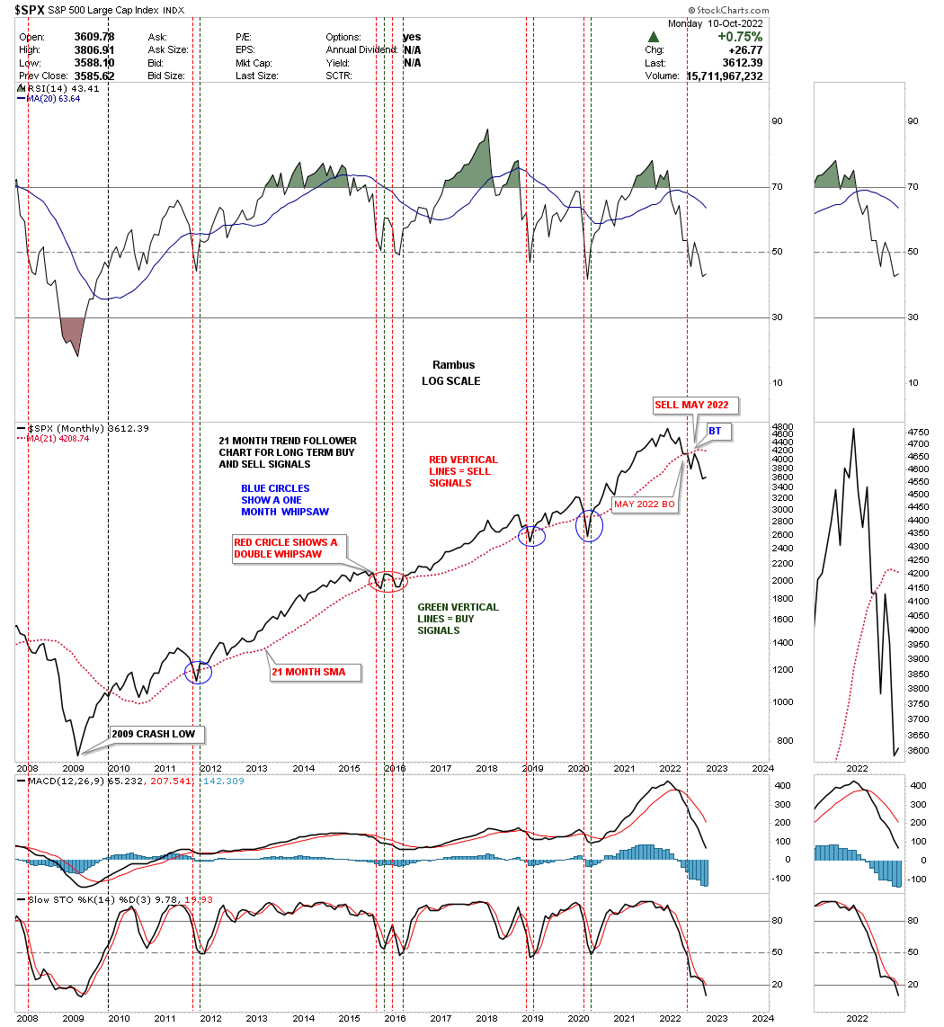
Now I would like to show you the 2000 and 2007 tops that led to the bear markets using the 21 month sma along with the price action. You can think of the 21 month sma as a moving trendline unlike a straight trendline. As with a straight trendline or the 21 month sma when the price action is trading above a straight trendline or 21 month sma you are on a buy signal and when below, a sell or go short signal. If you follow the red 21 month sma with the price action you can see how it reverses it role from support to resistance when broken to the downside and just the opposite to the upside where it holds support.
If you were following the red 21 month sma during the topping process you would have sold all your stocks on the first close below the 21 month sma and stayed out of the stock markets until it gave a buy signal. The other thing you could have done is to go short when the 21 month sma crossed below the price action.
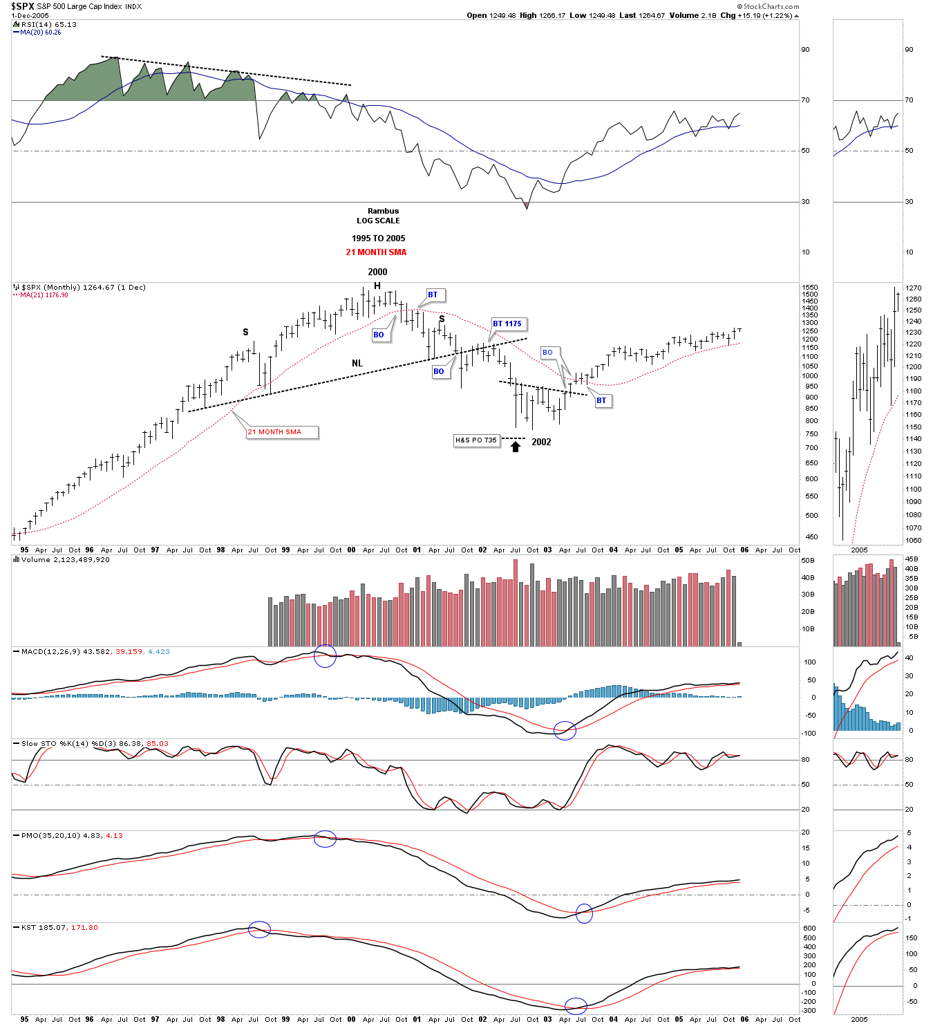
This monthly chart shows the price action beginning at the 2002 bear market low to the H&S top made in 2007. Again, notice how the 21 month sma held support from the 2022 bear market low until it finally gave way during the formation of the right shoulder . You would have gotten out of your stocks when the SPX closed below the 21 month sma during the initial move down from the H&S top. Including the initial break below the 21 month sma it still took 5 months of backtesting the 21 month sma which formed the right shoulder. So you could have been sitting on the sidelines waiting for the next bullish cross above the 21 month sma or you could have been short using the 21 month sma as your sell/stop if you didn’t have any other technical tools to use.
Now I would like to show you the price action from 2013 to the present. There were a couple of whipsaws during that phase of the bull market, but my goal is to show you the current H&S top that has now broken out to the downside. Again, note where the 21 month sma has been trading during the formation of the H&S top. Just as we saw in the 2007 H&S top above, the 21 month sma is holding resistance while the right shoulder has been building out.
There are no guarantees when it comes to the markets, but the odds are strongly suggesting there is a large H&S top in place after a 12 year bull market. There is also a very tight line in the sand using the neckline, above is bullish and below is bearish.
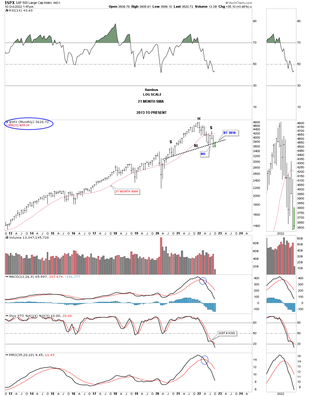
This longer term monthly line chart shows the 2009 bull market using the red 21 month sma for buy and sell signals. As you can see the last sell signal was given in May of this year 2022 with a backtest in place from below.
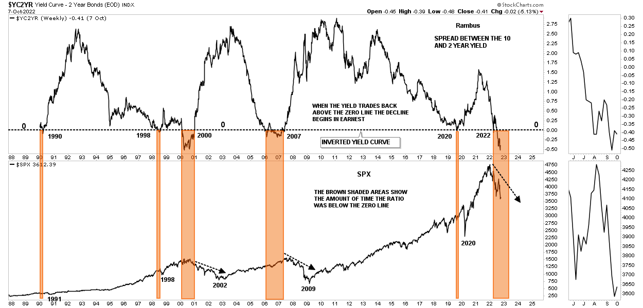
This last chart for tonight is a long term weekly chart which shows the yield between the 10 and 2 year bonds or the yield curve. Whenever the yield falls below the zero line there is an inverted yield curve which generally shows a weak market or a recession as shown by the brown shaded areas.
As you can see the yield curve is trading at the lowest point since the bull market ended at the 2000 high. What is interesting when you take a closer look is that the decline in the SPX really doesn’t pick up steam to the downside until the yield trades back above the zero line. I used the brown shaded area from the 2007 inversion and added it to the 2022 inversion until we see the yield trade back above the zero line.
I believe what all the charts above are showing us is that the US stock markets and the rest of the world are headed for a recession. How long and how deep remains to be seen yet, but something in brewing that I haven’t seen since the H&S top made in 2007.
Now you can see why I’ve changed my stance from a bull to now a bear. It is all about the charts and not what I think or what other analysts think, but the price action itself. As I mentioned earlier there are no 100% guarantees when it comes to the markets, it is all about getting the odds in your favor and taking it from there.
I will post Part 2 this weekend. All the best…Rambus
About the author
