
“Buy when you are scared to death; sell when you are tickled to death.”
—Market Maxim, The Cabot Letter, April 12, 2001
“In a bear market everyone loses. And the winner is the one who loses the least.”
—Richard Russell, Dow Theory Letters; 1924–2015
“Buy when others are despondently selling and sell when others are greedily buying.”
—Mark Mobius, American German emerging markets fund manager EVP Templeton Emerging Markets Group, founder Mobius Capital Partners; b. 1936
If we were to follow the advice of Market Maxim and Mark Mobius above, we should all be heading for the hills. Since the bottom of the stock market in March 2009, the Dow Jones Industrials (DJI) is up 405%. The S&P 500 is up 497%. The great bull market of the “Roaring Twenties” saw the DJI gain 497% 1921–1929. The “Roaring Twenties” stock market was considered a bubble. The NASDAQ, of course, was up 1,451% from 1990–2000. We are quite a way away from that. That was also considered a bubble. However, the NASDAQ in 2009–2021 is doing its best to catch up. It’s up 956% since March 2009. And how about the FAANGs? Netflix leads the way, up 9,939%, Amazon is up 5,225%, and Apple has gained 4,748%, all in the same period 2009–2021. Facebook and Google are “chumpers” by comparison, up 717% and 303%. And as for Google, it is up only 303%.
Many are calling Canada’s housing market a bubble. Economist David Rosenberg, Chief Economist and Strategist of Rosenberg Research says Canada’s housing market is entering the same bubble territory as the U.S. housing market that topped out in 2006 and led to the 2008 financial crisis. Using the same metric as above, the Canadian Real Estate Price Index has gained 105% from 2009–2021. In Toronto it is even higher, up 170%. In the past year Toronto housing prices are up over 10% but that takes into consideration all housing and not just single-family dwellings. There are areas where prices have soared 20% in the past year. Single-family dwellings rose almost 15% in the past year and, if one goes outside Toronto, housing prices are up even more, some 30% in the Brampton/Durham region. Put that against the backdrop of the Canadian economy contracting 3.2% in 2020 and incomes remaining stagnant and, in some cases, decreasing.
As Rosenberg notes, by many measurements such as home-price to rent and home-price to income the numbers in Canada are higher than they were during the U.S. real estate bubble in the early 2000s. Stories have abounded that not only are there multiple offers for houses but some are buying sight unseen (virtually). And some are now being shocked when the bank appraises the house purchase for a mortgage and the appraisal is below what they are paying for it. That requires the buyer to ante up a larger down payment. Apparently 1 in 10 is discovering that, versus 1 in 50 previously. Canada ranks amongst the highest in the world when it comes to household debt to GDP, 113% as of December 2020 (rank 3rd), and household debt to income at 170% also as of December 2020 (rank 4th).
The Incredible Rise of Toronto Real Estate Prices
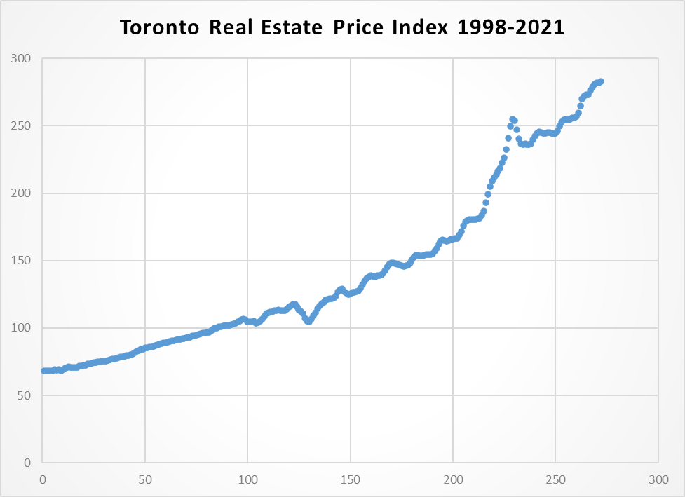
Source: www.housepriceindex.ca
So, what is a bubble? Well, by one definition, it is when market participants drive stock prices above their value in relation to some system of stock valuation. In other words, the stock market exceeds its intrinsic value, not aligning with the fundamentals of the asset. Another says a bubble occurs when investors drive valuations higher without simultaneously adjusting expectations for lower returns (John Hussman, Hussman Investment Trust). As we often note, eventually everything returns to the mean. The S&P 500 returned roughly 8%/year from 1957. If the S&P 500 were to experience a prolonged period of, say 12–20% returns, then eventually the mean is restored with an extended or short-lived but sharp period of underperformance to rebalance to the mean. The same historically occurs in all markets, including the housing market.
As we have also so often noted, the stock market today is driven by the expectation that the Fed (or other central bank) along with the treasury (government) has their back. That they can’t lose because the Fed will bail them out. That is only partially true. The Fed is not going to interfere in the market unless the financial system itself is at risk. We saw that in 1987, 1998, 2008, and 2020. The bulk of stock market trading is carried out by institutions—banks, investment dealers, brokers, mutual funds, pension funds, investment firms, etc. Individual traders make up only a small segment of the market.
That a bunch of traders using their government cheques to trade through Robinhood and others may impact individual stocks like GameStop (GME), but then they are also open to big losses when the market turns against them. The central banks didn’t rush in to save the small cap stocks as represented by the TSX Venture Exchange (CDNX) when it fell 80% in 2007–2008 and 81% in 2011–2015. But if the big financial institutions are threatened with a meltdown, the Fed comes to the rescue.
The recent collapse of Archegos Capital negatively impacted only Credit Suisse and Nomura Securities. The Fed did not ride to the rescue for the entire financial system. Archegos was not a repeat of Long-Term Capital Management (LTCM) the hedge fund that nearly brought down the financial system in 1998. Instead, as we have noted, it may be the “shot across the bow” similar to the collapse of Bear Stearns hedge funds in July 2007 that was warning sign that preceded the 2008 financial collapse and the collapse of Lehman Brothers.
What about inflation? There has been recently a great hue and cry that all the Fed and government largesse in pumping trillions of dollars into the economy is going to set up a spiral of inflation and turn the Western world (Canada, U.S.) into Zimbabwe, Venezuela, or the German Weimar Republic after World War I. The odds of that happening are probably about zero, given that the central banks have the ability to buy the debt, thus increasing the monetary base but not necessarily increasing inflation. The inflation instead is showing up in the stock market or the housing market. Yes, the price of many commodities is rising but not because of demand; instead, it is because of shortages. Rising inflation because of demand is generally good as it usually reflects a strengthening economy. But rising inflation because of shortages is not as good as it just means you pay more with no real net benefit to the economy.
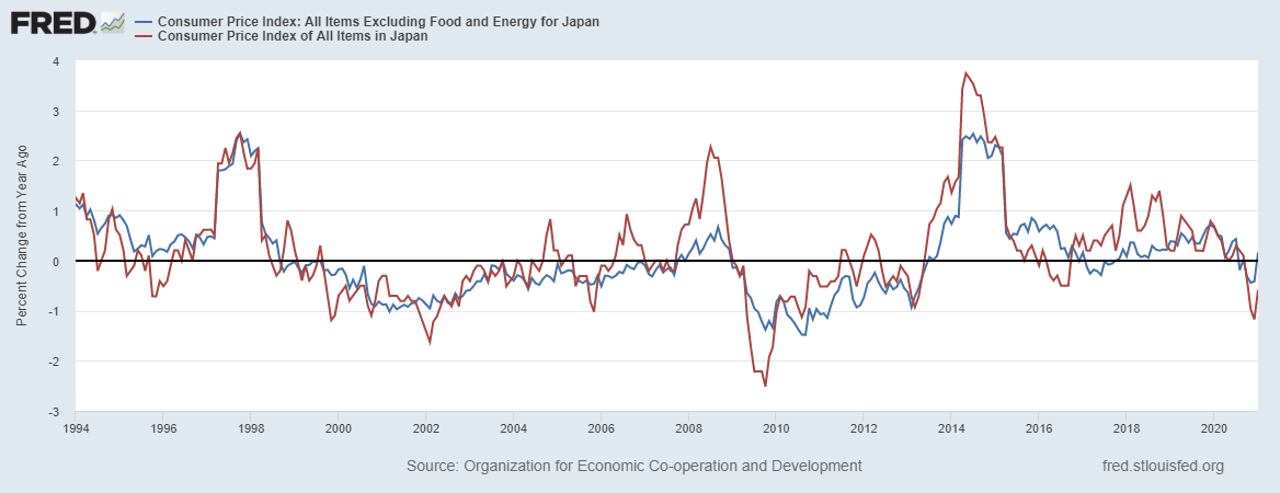
Inflation does have an impact. The price of food and gasoline in particular has been rising, as have a number of other commodities. Our first chart below shows Canada’s CPI (Consumer Price Index) annual growth for all items (red line) vs. the core CPI (ex food and energy) (blue line) for the period 1994–2021. The last report was for January 2021 and it shows the CPI is up 1.50% in the past year and the core CPI is up 1.54%. Not much inflation there. Notice how it fell sharply into 2020 as the pandemic took grip.
Canada CPI: All Items and All Items (core) 1994–2021
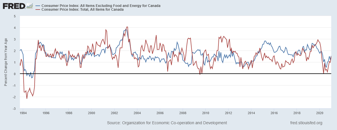
Source: www.stlouisfed.org
Now we turn to the U.S. and the result is so far much the same. The core CPI (blue line) is up 1.28% in the past year to February 2021. The CPI (red line) is up 1.68%. The core CPI is well below the Fed’s target inflation of 2% on average over time. The core is considered as the food and energy component can be quite volatile. The Fed’s focus is on the core CPI, not the CPI. They are on record indicating they’d tolerate a rise for the core CPI to 2.5% before they might take action. The core CPI has been falling, given that back in August 2020 it was 1.70%. The core CPI is falling even as the CPI (and PPI) is rising.
A rising CPI also has an uneven impact. Lower incomes are more negatively impacted by rising food and energy costs than are higher incomes. We have a K recovery and also a K CPI, only the roles are reversed. The wealthy may be paying more and paying the same price as everyone else; however, it has considerably less negative impact on them due to their ability to absorb it easily.
U.S. CPI: All Items and All Items (core) 1994–2021
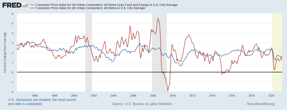
Source: www.stlouisfed.org
But there is little doubt that inflation expectations are rising, as noted by the chart below. The latest inflation expectations (February) were 3.3% over the next 12 months. The 5-year, 5-year forward expectations were only 2.1%. On a month-over-month rate, the latest CPI (January) in the U.S. rose 0.425% or annualized 5.1%. The core CPI meanwhile, month-over-month, was up a mere 0.1% or 1.2% annualized. Quite a difference. The Fed’s focus is on the core rate although it does consider the CPI and the PPI.
Chart on next page
University of Michigan Inflation Expectations (blue line), 5-year, 5-year forward Inflation Expectations (red line) 2002-2021
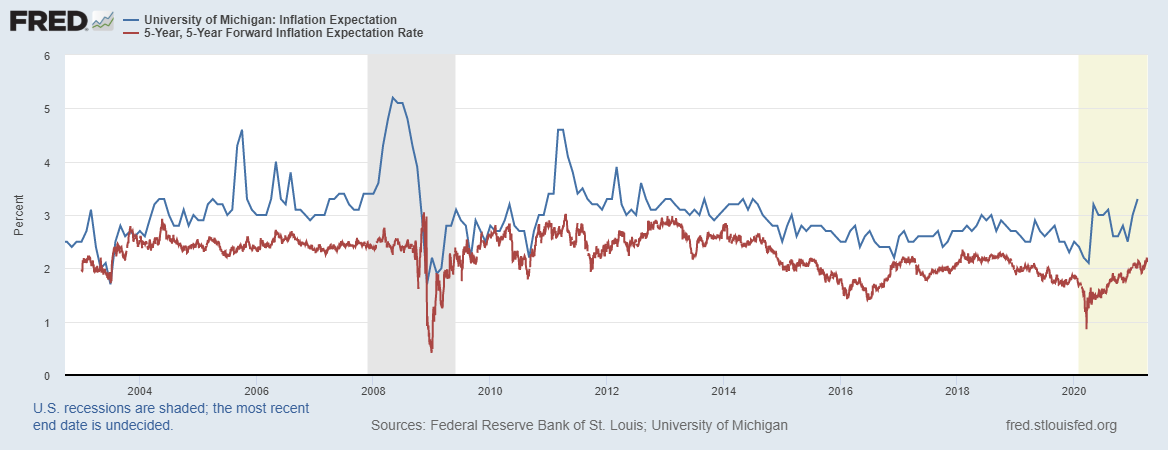
Source: www.stlouisfed.org
Maybe a better comparison is what has happened in Japan since the 1990s. Japan’s Federal debt/GDP is an astronomical 272%. But the BOJ buys most of the debt issued by the government. As well, much of the debt is also purchased by pension funds and other large institutions. So, while the debt is huge, totalling currently US$14.7 trillion, Japan’s most recent inflation rate is negative 0.6% year-over-year (January). It is not inflation they are worried about, it’s deflation. The core CPI (January) is 0.16% year-over-year. Pretty miniscule. Japan is what we call a zombie economy. It’s barely alive and many of its companies and banks are effectively on life support. Inflation? What inflation? Following years of QE to keep the Japanese economy alive. Could the U.S. and Canada become like Japan? Low growth flipping between meagre growth and recession coupled with extremely low interest rates?
Source: www.stlouisfed.org
Inflation expectations have had an impact on long interest rates as the U.S. 10-year treasury note has gone from 0.50% in July 2020 to 1.64% now (hit a high of 1.75%). That means that the there is real-rate differential (36 bp) between the core CPI and the 10-year. In Canada the 10-year Government of Canada bond (CGB) has gone from 0.43% August 2020 to 1.47% (high 1.60%). In Canada the differential with core CPI is negative 7 bp.
Gold preserves purchasing power. As inflation rises, gold tends to rise with it to preserve purchasing power. Gold is relatively stable against other commodities over a long period of time while the commodity itself can have some wild swings vs. fiat currencies such as the U.S. dollar. Our final chart below shows the Gold/WTI Oil ratio vs. WTI Oil (priced in U.S. dollars). The Gold/WTI Oil ratio has ranged from a low of $6.24 in 2005 to a spike high of $145.88 seen at the bottom of the March 2020 collapse. But throw out those extremes and the range was more prevalent between $12–$30. Oil prices have had some extremes as in lows in 1985, 1998, 2008, and 2020 as well as highs in 1990 and 2008. The range was $6.50 seen in March 2020 to the peak in 2008 at $147.27 (differential $140.77). Overall, WTI Oil’s volatility exceeds the volatility for the Gold/WTI Oil ratio, showing gold’s ability to act as a stabilizer.
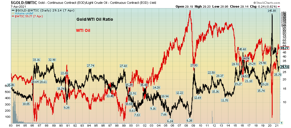
Source: www.stockcharts.com
The Pandemic Rages On!
“On the verge of Collapse.” So says the headline about the situation in Brazil as the COVID rages through the country and the hospitals become overwhelmed. They might have added India as well. As the so called third wave rages India is doing its best to rapidly overtake Brazil in the number 2 spot. Grant you their case number is only about 42% of the U.S. Deaths in Brazil have long surpassed 350 thousand but remains well behind the U.S. who has now passed 575 thousand. The seven-day average for cases is now 657,570/day not far from the peak of Wave 2 and well up from the low count in February of 361,370/day. Deaths are also rising now over 10 thousand/day vs. over 14 thousand/day in January. The U.S. has slowed although despite a big jump on vaccinations the daily case numbers are rising somewhat again although daily deaths are still in decline. Canada has long ago joined the million plus case club (the 23rd) and now Romania has joined as well (the 24th). While Canada’s death toll has not budged much of late (7-day average 35) the case load is now almost back to where it was in January as the variants take hold impacting younger people. Canada’s daily case load is now over 7,800 vs. over 8,800 at the January peak. That’s well off the February low of just over 2,800.
Sunday April 11, 2021 – 14:18 GMT
World
Number of cases: 136,177,783
Number of deaths: 2,941,533
U.S.A.
Number of cases: 31,870,064
Number of deaths: 575,595
Canada
Number of cases: 1,052,539
Number of deaths: 23,287
Source: www.worldometers.info/coronavirus
Chart of the Week
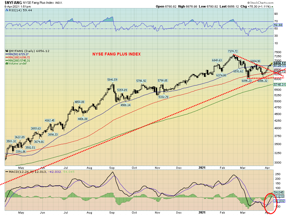
Source: www.stockcharts.com
Following what appears to have been a period of consolidation, the NYSE FANG PLUS INDEX (NYFANG) is breaking out once again. The NYFANG recently broke out of a corrective triangle with potential targets up to 7,820, a 14% increase from current levels. The NYFANG is also now breaking over the 50-day MA and the MACD has crossed over giving a potential buy signal. Note how the correction period held the 100-day MA never challenging the 200-day MA.
So, what is the NYFANG? The NYFANG is made up of 10 of the most actively traded high-tech stocks. The index can be accessed by buying either futures or options. Its components include the FAANGs—Facebook, Apple, Amazon, Netflix, Google—as well as Alibaba, Baidu, Nvidia, Tesla, and Twitter. They have been the top performers and today they dominate the NASDAQ index and the S&P 500. Since the March 2009 stock market low their performance has been huge. The NYFANG, however, only got underway in October 2017. Since the March 2020 low the NYFANG is up 180% vs. the S&P 500 up 87% and the NASDAQ up 108%. For comparison’s sake, gold is up only 19%.
If, as it appears, the NYFANG is breaking out it could imply that we would see continued higher prices and even more all-time highs in the stock markets. After all, they were the leaders on the way up. Of late they have lagged. A big catch-up coming?
Canada’s Job Numbers
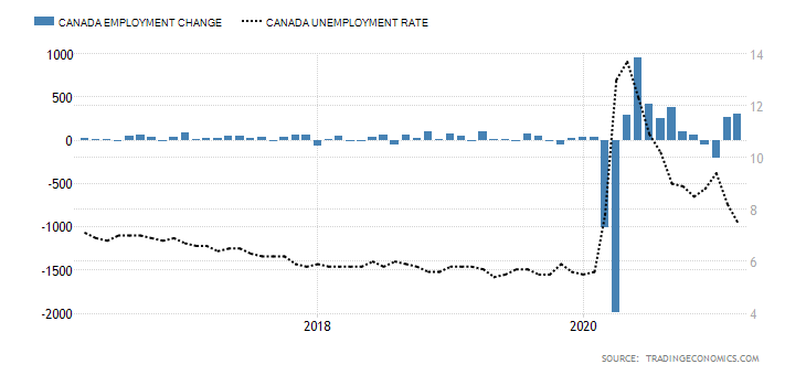
Source: www.tradingeconomics.com, www.statcan.gc.ca
Canada unexpectedly added 303,200 jobs in March as restrictions were eased and things were allowed to open up. The number was well above the expected 100,000 rise. The February increase saw 259,000 jobs added. What this says about April remains to be seen, given that restrictions came back and shutdowns loomed as the third wave roared through the country. Many are now expecting April to show a contraction.
The report, however, can be viewed as positive. Canada lost 3,004.5 thousand jobs in March/April 2020 as the first wave of the pandemic hit, sparking shutdowns across the country. Canada has now recouped 2,724.8 thousand or 90.7% of those lost. That still that leaves Canada some 279.7 thousand short of the February 2020 level. To put the success of Canada in perspective in regaining jobs lost, the U.S. has recouped only 62% of their jobs lost in March/April 2020. By that measurement Canada’s performance has been stellar.
The unemployment rate fell to 7.5% from 8.2% in February. The market had expected 8%. Full-time employment rose 175,400 while part-time employment rose 127,800. Self-employment rose 56,000, the first rise in three months. As more people entered the workforce the labour force participation rate rose from 64.7% to 65.2%. That reflects the fact that more people were employed (+303.2 thousand) vs. the number of new entrants to the labour force (+249.2 thousand). With the drop in the unemployment rate, the R8 unemployment rate also fell to 11.4% from 12.2%. The R8 rate is somewhat equivalent to the U.S.’s U6 rate as it includes discouraged searchers, and those that are part-time seeking full-time employment. The number of people unemployed fell to 1,516.7 thousand, down 148.4 thousand from February. One of the biggest drops in unemployment came in the 15–24 age bracket that saw its rate fall to 14% down from 17.1%. Gains there were almost all part-time. If things shut down in April as appears to be the case, many in this category could lose their newly gained jobs.
The industries the most impacted were retail (+95,000), information, cultural and recreation (+62,000) accommodation and food services (+21,000), goods producing (+43,000) and construction (+26,000). There were also gains in health care and social assistance +47,000. Employment was up in 7 out of the 10 provinces with Ontario leading the way up 182,000 followed by Alberta +37,000, B.C. +35,000 and Quebec +26,000. The number of hours worked rose 2% but average hourly earnings fell 0.9% as the many of the new jobs were low-paying.
More people were going to back to physical work places. Some 600 thousand additions to people working at places other than their home. The number of people working from home fell by 200 thousand. The labour force underutilization rate fell to 14.7%, the lowest level since February 2020. Underutilization refers to those who worked less than half their normal hours, those who wanted a job but did not look for one, those on temporary layoff expecting to return to work, and job searchers.
Economists were for the most part excited and encouraged by the report. But we’ll see after April when the number is expected to rise again due to shutdowns across the country as the third wave takes over.
MARKETS AND TRENDS
|
|
|
|
% Gains (Losses) Trends
|
|||||
|
|
Close Dec 31/20 |
Close Apr 9/21 |
Week |
YTD |
Daily (Short Term) |
Weekly (Intermediate) |
Monthly (Long Term) |
|
|
Stock Market Indices |
|
|
|
|
|
|
|
|
|
S&P 500 |
3,756.07 |
4,128.80 (new highs) |
2.7% |
9.9% |
up |
up |
up |
|
|
Dow Jones Industrials |
30,606.48 |
33,800.60 (new highs) |
2.0% |
10.4% |
up |
up |
up |
|
|
Dow Jones Transports |
12,506.93 |
14,918.33 (new highs) |
1.2% |
19.3% |
up |
up |
up |
|
|
NASDAQ |
12,888.28 |
13,900.19 |
3.1% |
7.9% |
up |
up |
up |
|
|
S&P/TSX Composite |
17,433.36 |
19,228.03 (new highs) |
1.3% |
10.3% |
up |
up |
up |
|
|
S&P/TSX Venture (CDNX) |
875.36 |
959.37 |
(0.2)% |
9.6% |
down |
up |
up |
|
|
S&P 600 |
1,118.93 |
1,334.56 |
(0.4)% |
19.3% |
up (weak) |
up |
up |
|
|
MSCI World Index |
2,140.71 |
2,268.46 (new highs) |
1.9% |
6.0% |
up |
up |
up |
|
|
NYSE Bitcoin Index |
28,775.36 |
58,297.27 |
(1.2)% |
102.6% |
up |
up |
up |
|
|
|
|
|
|
|
|
|
|
|
|
Gold Mining Stock Indices |
|
|
|
|
|
|
|
|
|
Gold Bugs Index (HUI) |
299.64 |
283.08 |
2.4% |
(5.5)% |
up |
down |
up |
|
|
TSX Gold Index (TGD) |
315.29 |
301.87 |
2.3% |
(4.3)% |
up |
down |
up |
|
|
|
|
|
|
|
|
|
|
|
|
Fixed Income Yields/Spreads |
|
|
|
|
|
|
|
|
|
U.S. 10-Year Treasury Bond yield |
0.91 |
1.66% |
(0.6)% |
82.4% |
|
|
|
|
|
Cdn. 10-Year Bond CGB yield |
0.68 |
1.50% |
(0.7)% |
120.6% |
|
|
|
|
|
Recession Watch Spreads |
|
|
|
|
|
|
|
|
|
U.S. 2-year 10-year Treasury spread |
0.79 |
1.50% |
(0.7)% |
89.9% |
|
|
|
|
|
Cdn 2-year 10-year CGB spread |
0.48 |
1.25% |
(2.3)% |
160.4% |
|
|
|
|
|
|
|
|
|
|
|
|
|
|
|
Currencies |
|
|
|
|
|
|
|
|
|
US$ Index |
89.89 |
92.16 |
(0.9)% |
2.9% |
up (weak) |
neutral |
down |
|
|
Canadian $ |
0.7830 |
0.7984 |
0.2% |
1.9% |
up (weak) |
up |
up |
|
|
Euro |
122.39 |
119.04 |
1.1% |
(2.7)% |
down (weak) |
down (weak) |
up |
|
|
Swiss Franc |
113.14 |
108.15 |
1.9% |
(4.4)% |
neutral |
down |
up |
|
|
British Pound |
136.72 |
137.09 |
(0.9)% |
0.3% |
down |
up |
up |
|
|
Japanese Yen |
96.87 |
91.19 |
0.9% |
(5.9)% |
down |
down |
down |
|
|
|
|
|
|
|
|
|
|
|
|
Precious Metals |
|
|
|
|
|
|
|
|
|
Gold |
1,895.10 |
1,744.80 |
1.0% |
(7.9)% |
neutral |
down |
up |
|
|
Silver |
26.41 |
25.33 |
1.5% |
(4.1)% |
down |
neutral |
up |
|
|
Platinum |
1,079.20 |
1,209.30 |
0.1% |
12.1% |
neutral |
up |
up |
|
|
|
|
|
|
|
|
|
|
|
|
Base Metals |
|
|
|
|
|
|
|
|
|
Palladium |
2,453.80 |
2,639.30 |
(0.6)% |
7.6% |
up |
up |
up |
|
|
Copper |
3.52 |
4.04 |
1.3% |
14.8% |
neutral |
up |
up |
|
|
|
|
|
|
|
|
|
|
|
|
Energy |
|
|
|
|
|
|
|
|
|
WTI Oil |
48.52 |
59.32 |
(3.5)% |
22.3% |
down |
up |
up |
|
|
Natural Gas |
2.54 |
2.53 |
(4.2)% |
(0.4)% |
down |
neutral |
neutral |
|
Source: www.stockcharts.com, David Chapman
Note: For an explanation of the trends, see the glossary at the end of this article.
New highs/lows refer to new 52-week highs/lows and in some cases all-time highs.
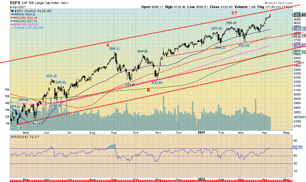
Source: www.stockcharts.com
Up, up and away. Once again markets are making new all-time highs. Okay, not all. Making new all-time highs this past week were the S&P 500 +2.7%, the Dow Jones Industrials (DJI) +2.0%, and the Dow Jones Transportations (DJT) +1.2%. The NASDAQ remains shy of joining the party but it did gain 3.1%. High bullish sentiment (see further discussion under the VIX Volatility Indicator) has not yet deterred the market. Small caps, however, are diverging as the S&P 600 fell 0.4% on the week and the Russell 2000 lost 0.5%. We normally like to see the small caps leading, not lagging. Bitcoin lost 1.2% on the week and continues to trade just under $60,000.
In Canada the TSX Composite also made new all-time highs, gaining 1.3% but the small cap TSX Venture Exchange (CDNX) lost 0.2%. In the EU the London FTSE gained 2.3%, the Paris CAC 40 jumped 1.1% making new all-time highs as did the German DAX up 0.8%. In Asia, China’s Shanghai Index (SSEC) lost about 0.5% but the Tokyo Nikkei Dow (TKN) was up 1.3%. The MSCI World Index made new all-time highs up 1.9%.
While small caps weakening is a concern, it is not a reason to get too concerned just yet. However, it is a possible warning sign. The market is getting long in the tooth and numerous fundamental indicators are very high. The S&P 500 PE ratio is 42, the highest it’s been since 2009. The Shiller PE at 37 has only the PE of 44 in front. That high was made in 1999 before the 2000–2002 dot.com collapse. Price to sales at 3 is as high as it has ever been since 2000. Price to book at 4.5 is also the highest it’s been since about 2000.
Still, in looking at the chart, the S&P 500 still has room to move higher, possibly to 4,200. Right now, the S&P 500 is 5.5% above the 50-day MA and 15.4% above the 200-day MA. In August 2020, just before the correction that dragged on into October 2020, the S&P 500 was 9% above its 50-day MA and 16% above the 200-day MA. But back in February 2020 when the markets topped before the March pandemic collapse the S&P 500 was only about 4% above its 50-day MA and 11.5% above its 200-day MA. So, we are high but we could be higher. The first breakdown point is at 3723 the most recent low. That would also drop us below the 100-day MA. Key support is the 200-day MA near 3,577 and the final line in the sand is 3,400. Below that level a panic could set in.
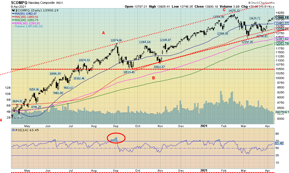
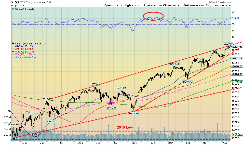
We note the RSI is over 70 on the daily chart so that’s another warning sign that the market is overheating and a setback could occur. The weekly RSI is also now at 70 while the monthly RSI is now over 70 since March. So, all of these are warning signs that, at minimum, a potential pullback is coming. Not helping is the NASDAQ not making new highs as the other indices do, which is a divergence.
Are we approaching a major high as we saw not necessarily in February 2020 but March 2000 or October 2007? We can’t tell that just yet. We’d have to fall, and then after that not make new highs to suggest that a major high was forming. But for the short-term the warnings are there. A decline into May/June could then set up a buy into the summer and more new highs. Or not.
Source: www.stockcharts.com
The NASDAQ continues to be the outlier of the major stock indices. While the S&P 500, the DJI, and the DJT are all making fresh all-time highs, the NASDAQ remains shy of its high of 14,175 seen in February 2021. The NASDAQ gained 3.1% this past week and it was the best performer of the major indices. As usual it was the big high-tech stocks that led the way. Three of them made new all-time highs—Facebook +4.6%, Google +6.9%, and Microsoft +5.6%. Apple gained 8.2%, Amazon was up 6.9%, while Netflix was up about 3.0%. The FAANGs had a terrific week, leading everyone higher. Tesla was up 2.3% and Twitter gained 11.5%. The NASDAQ could be headed back to the highs as it has now made a higher high and a higher low from the low at 12,397 in late February. Support is at 13,450 and down to 12,750. Below 12,750 a more significant decline could get underway.
Source: www.stockcharts.com
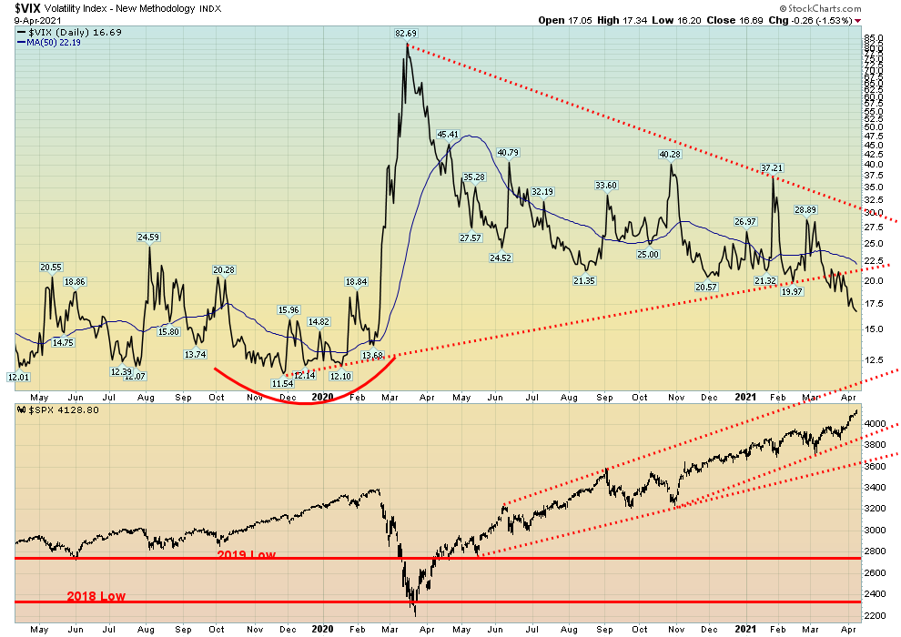
Volatility? What volatility? The VIX Volatility indicator fell to its lowest level since late 2019 this past week, indicating growing complacency in the stock market. It is not yet at the levels seen in late 2019 when it hit a low of 11.54. At the other extreme it peaked in March 2020 at 82.69. The falling VIX is in line with other indicators we see. The CBOE put/call Index has fallen to 0.50, up slightly on the week and off the all-time low seen back in November 2020 at around 0.39. The All-Bears Index is at 20.39, as low as it has ever been in the past decade while the All-Bulls Index is at 56, as high as it has ever been in the past decade. The S&P daily sentiment index is at 86.6, basically where it was last July before a 3-month corrective period into October 2020. As always, these are warning signs only—not necessarily a sign that we are about fall but that a fall could be coming.
Source: www.stockcharts.com
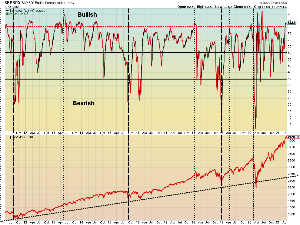
The S&P 500 Bullish Percent Index (BPSPX) is once again over 80% and into territory that often signals at least a temporary top. The top usually occurs at a higher level while the BPSPX makes a lower high. Twice before the BPSPX soared over 80% and each time there was at least a temporary pullback. Except this time, we are getting longer in the tooth whereas the previous times were early on in the rally out of the March 2020 low. Usually, the BPSPX diverges with the price to signal a top. So far, we are at least making a lower high even as the SPX makes new all-time highs.
Source: www.stockcharts.com
Another week, another record for the TSX Composite. The TSX made new all-time highs this past week at 19,229 as it closed up on the week by about 1.3%. Only two of the fourteen sub-indices closed lower on the week: Health Care (THC) down 5.9% and Energy (TEN) off 3.3%. The winners were led by a rebound in Information Technology (TKK) up 4.0% followed by Materials (TMT) up 3.9%. No other sub-index gained over 3%. However, four sub-indices made either fresh 52-week highs or new all-time highs. They were Income Trusts (TCM) +2.2%, Consumer Discretionary (TCD) +1.1%, Industrials (TIN) +0.6% and Real Estate (TRE) +2.3%. The TSX Composite continues to bump up against a possible top channel. The TSX also appears to be forming a huge ascending wedge triangle. The breakdown zone is around 18,750 and could then see the TSX fall to its long-term support line near 16,750. We are getting deep into the triangle so a break should or could come soon. The alternative, of course, is that the TSX just waffles through the triangle and forms a completely different pattern. We are at a point where some resolution could soon come.
Source: www.stockcharts.com
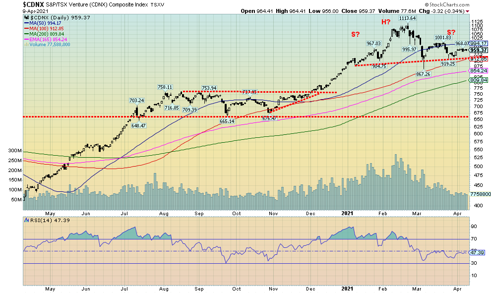
We thought it best to point this out for the TSX Venture Exchange (CDNX). Could it be forming a head and shoulders top? It is an awkward one, as we prefer the left shoulder to be higher than the right shoulder. But it should be noted just in case. The breakdown zone appears to be around 910–915 and could then project down to around 700. A firm breakout back above 1,000 could end the potential H&S pattern. The CDNX fell 0.2% this past week but remains up on the year by 9.6%.
U.S. 10-year Treasury Bond/Canadian 10-year Government Bond (CGB)
Source: www.tradingeconomics.com, www.home.treasury.gov, www.bankofcanada.ca
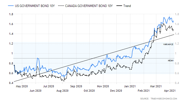
Despite the higher-than-expected PPI, bond yields did not react by moving higher and the U.S. 10-year treasury note closed the week off very slightly at 1.66% down 1 bp. The Canadian 10-year bond (CGB) also fell 1 bp to 1.50%. The PPI for March unexpectedly came in a lot higher at +1% when they only expected a gain of 0.5%. The year-over-year PPI was up 4.2% above forecast of 3.8%. The core PPI was up 0.7% vs. an expectation of a gain of only 0.2%. On Tuesday we will get the March CPI that is expected to be up 0.5% with the core expected up 0.2%. The rise in the PPI should not be a surprise given the rise in a number of commodities. But the core PPI rise of 0.7% was a bit of a surprise as that takes out the volatile food and energy components. For the “inflation is coming” crowd the March PPI was a vindication that they were right and that it will get worse. We are reminded, however, that the Fed is already on record in tolerating a rise in the core rate inflation rate to 2.5%. That would be up from the current level of 1.3% so there is considerable room for inflation to rise before it would spark any kind of a response from the Fed. The Fed is desirous of higher inflation as that usually accompanies a growing economy and, by extension, a rising stock market. Some other numbers this past week were not as rosy. The trade deficit widened to $71.1 billion for February above the January level of $67.8 billion. Not sure where all the benefit has gone from the trade wars initiated by former president Trump. Some manufacturing numbers continued to be positive but weekly initial claims rose to 744.0 thousand above the forecast of 704.5 thousand and the previous week’s 728.0 thousand. Continuing jobless claims also rose, up 3,734.0 thousand above the consensus of 3,650.0 thousand but slightly below last week’s 3,750.0 thousand. Bond yields appear to be consolidating. It would take a breakdown under 1.40% to suggest to us that we may have topped. Our potential target remains up to 2.00%.
Source: www.stockcharts.com
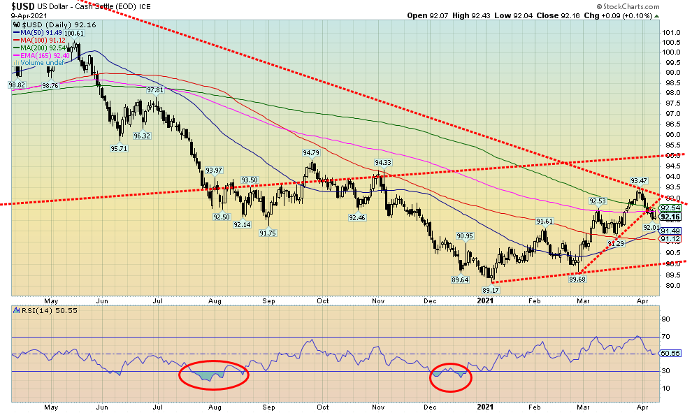
The US$ Index pulled back this past week, breaking the small uptrend line from the low at 89.60 in late February. The US$ Index appears to be possibly failing at the 200-day MA (92.54). The US$ Index fell 0.9% this past week. The major recipient was the Swiss franc, up 1.9% followed by the euro, up 1.1%. The pound sterling lost 0.9% but the oversold Japanese yen rebounded up 0.9%. The Cdn$ rose 0.2% as it continues to flirt just under 80. So, is that it? Has the US$ Index topped? Naturally, we can’t confirm that yet, at least not until we start to decline under 91.30. A breakdown under 91 would most likely set up a decline under the February low of 89.68. Once under that level the January low of 89.17 would be all that stands in the way of new lows for the US$ Index. Regaining back over 93 would suggest that the US$ Index was, instead, headed back up. We note above that level the next good resistance doesn’t occur until 94.25–95.00. That could still be an ultimate target as some suspect. A rising US$ Index is also a warning sign about the markets. If one recalls, the US$ Index bottomed and started rising in 2008, long before the collapse of Lehman Brothers in September 2008. The US$ Index also put in a major bottom in early 2018 and started rising as the U.S. stock market entered a period of instability, culminating in the December 2018 low. The US$ Index made its final top in March 2020 when the stock market and gold were making their pandemic spike lows. A rising US$ Index therefore could be anticipating more trouble. The recent collapse of Archegos Capital could be the first warning sign that something is amiss. Our expectation here is that, rather than just soaring, the US$ Index could, instead, waffle higher over time. However, all that could change if the US$ Index were to break back under 89.68, setting up the potential for new lows.
Source: www.stockcharts.com
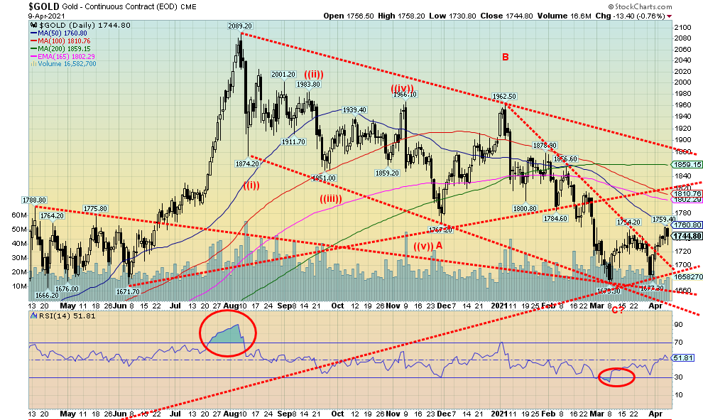
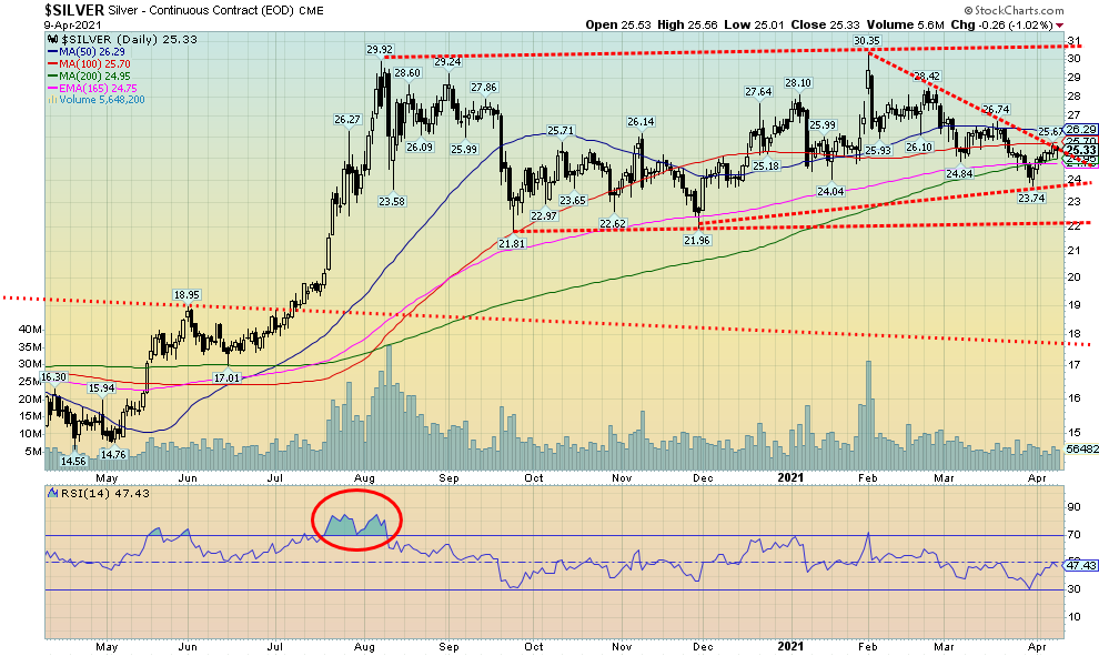
Despite the setback on Friday, gold ended the week up, gaining just under 1.0%. Silver fared even better, gaining 1.5% while platinum held in, up just under 0.1%. Palladium didn’t do well, losing about 0.6%, its steepest decline in six weeks, but copper rebounded up about 1.3%. The setback for gold on Friday was sparked by the higher-than-expected PPI (up 4.2% year-over-year) that helped spark the U.S. dollar and bond yields to rise. That in turn hurts gold. Gold’s rise this past week took it to its first significant resistance zone at $1,750/$1,760. That we failed right there could, on the surface at least, bode poorly going forward. The most recent low was seen at $1,677, so obviously that is the line in the sand. However, we would not want to see gold fall back under $1,700. The most recent breakdown in February did see some increased volume. As well, we note the commercial COT fell this past week, suggesting that the commercials (bullion banks) were sellers into the resistance zone of $1,750/$1,760. Key going forward is that the U.S. dollar rebound on Friday is short-lived. A rising U.S. dollar does gold no favours. But with expectations of higher inflation and rising bond yields, that is shifting funds away from gold and into the stock market instead.
Cyclically, we are still looking to confirm our 31.3-month cycle low that was due April 2021 +/- 5 months according to cycle analyst Ray Merriman (www.mmacycles.com). This would be the second 31.3-month cycle low counting from the critical 7.83-year cycle low recorded in December 2015. The first 31.3-month cycle low was in August 2018. So once this low is determined, and, no, we have not confirmed the recent low at $1,673, we should embark on a good rally. But will it be a weak one, failing at or near the August 2020 high of $2,089, or will it roar through to potential targets up at $2,200 to $2,400? Irrespective of that, once that high is determined the steepest decline since the huge decline in December 2015 should get underway—as not only would we be falling into the 7.83-year cycle low but also the 23–25-year cycle low dating from 2001. For those reasons, we remain upbeat here for gold going forward despite also reading numerous bearish reports that has gold collapsing now rather than later.
The $1,750/$1,760 zone is the just the first of a few challenging zones to surpass to confirm we are on our way up. There is another large band of resistance that stretches from $1,800 up to $1,880. So, really, only a move over $1,900 would absolutely confirm that our low was in. It would also confirm that our cycle is pointed up and new highs could be ahead. To the downside, we’d prefer not to see a decline back under $1,720. Under $1,700 new lows become a possibility and under $1,670 a collapse could get underway, taking us to $1,575/$1,600.
Clearly, gold’s next move will be predicated on the U.S. dollar and bond yields. With both rising, gold is going to run into very stormy weather. With only bond yields rising gold could weather that and also rise. The U.S. dollar remains the key.
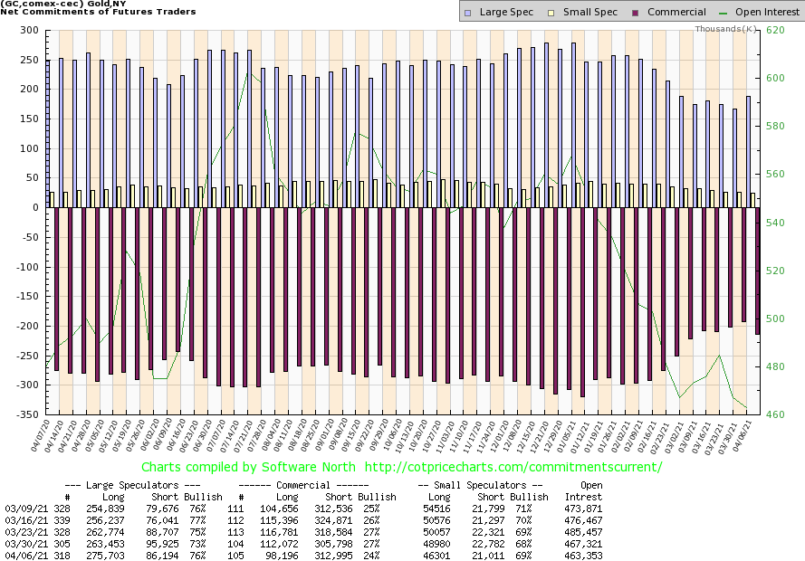
Source: www.cotpricecharts.com
A setback? The gold commercial COT (bullion companies, bullion banks) fell this past week to 24% from 27%. Short open interest rose over 7,000 contracts while long open interest fell almost 14,000 contracts. Overall, open interest fell about 4,000 contracts on an up week, suggesting covering of longs. For the large speculators COT (hedge funds, managed futures, etc.) rose to 76% from 73% as they added over 12,000 longs while dropping almost 10,000 shorts. At this stage, given that it is only one week, we view this as a setback and not the start of a new downtrend adding to shorts for the commercials. This has happened before. We’ll get a better sense with this coming week’s COT.
Source: www.stockcharts.com
A long consolidation pattern? Or a potential large topping pattern? That is how we are viewing silver. There are two interpretations here. The bullish case is that this is a long sideways trading consolidation pattern with a range generally between $24–$27 but outside ranges between $22 and $30. A breakout can be confirmed only with a move above $30. If, instead, this is a large topping pattern, we have a potential double top at $29.92 (August 2020) and $30.35 (February 2021). The breakdown would occur now on new lows below $23.74 the most recent low and under $22 the possible double bottom at $21.81 (September) and $21.96 (December). Naturally, the camps are divided with the bulls convinced we will break out to the upside and some bears we follow convinced it will instead break to the downside. Our cycles, as noted under gold, favour one more good run to the upside before a more substantial correction sets in.
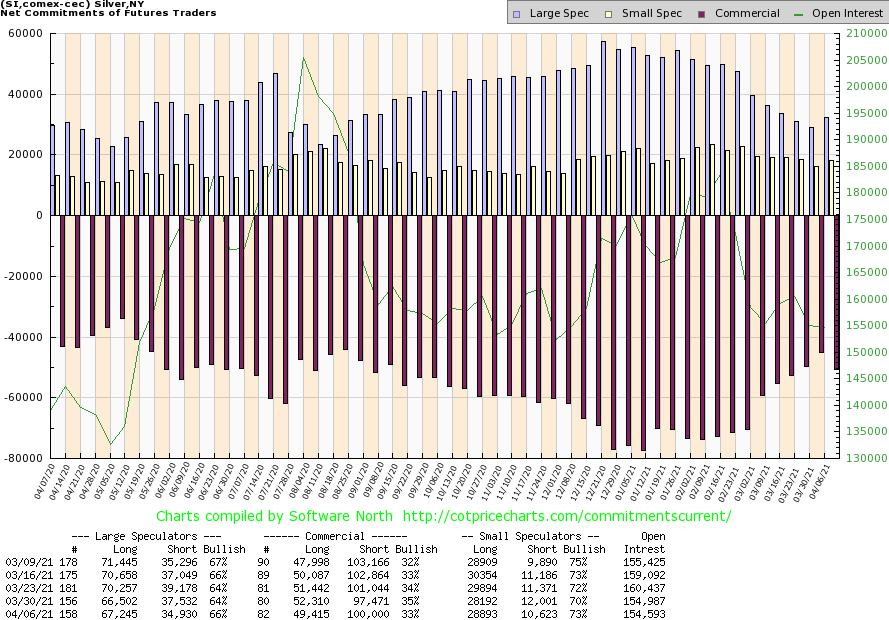
Source: www.cotpricecharts.com
A setback? Or just a pause? Like the gold commercial COT, the silver commercial COT slipped this past week to 33%, down from 35% the previous week. Short open interest rose just under 3,000 contracts while long open interest fell roughly 3,000 contracts. The large speculators COT rose to 66% from 64% but the large speculators were mostly covering shorts as the short open interest fell almost 3,000 contracts. Overall open interest was roughly flat.
Source: www.stockcharts.com
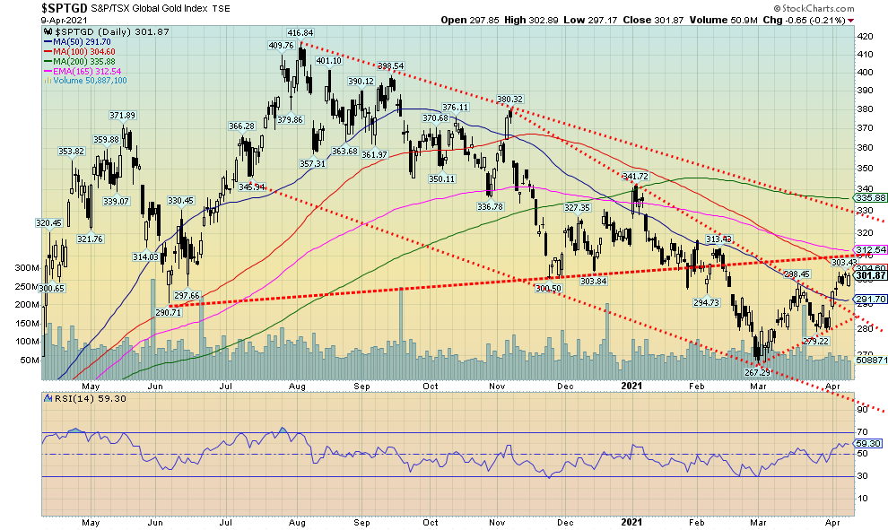
The gold stocks continue to give us encouragement that a more significant rebound could soon be underway. This past week the TSX Gold Index (TGD) posted its fifth up week in the past six with a gain of 2.3%. The Gold Bugs Index (HUI) did the same, gaining 2.4%. The TGD is now up 13% from its recent low and the HUI up 14%. Despite the rebound there is a lot more work to be done. The TGD has resistance up to around 315 where it meets that possible neckline that joins the June low at 290 and the November low at 300. We trust we are not looking at an awkward-looking head and shoulders top. The breakdown under 300 was not met with a huge uptick in volume that normally accompanies a breakdown like that. A successful breakout above 315 could move the TGD to the next area of resistance around 330/335. Above 335 the TGD could break out to challenge the August high of 416. An uptrend appears to be establishing given the TGD made a higher low just recently. As a result, they have started what appears to be an uptrend. Bullish sentiment, while not particularly bearish is now at 40% for the Gold Miners Bullish Percent Index (BPGDM). The recent low was at 24%. Not hugely bearish but just enough to help spark the recent rebound. What is key here is that the gold stocks appear to be leading the way. That is something we need to see if there is to be a new prolonged bull run for gold and silver. But first we need to successfully break out over 315.
Source: www.stockcharts.com
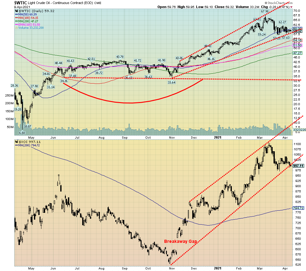
With demand fears rising even as major producers continue their production cuts, coupled with a rise in COVID that has sparked fresh lockdowns, oil prices took it on the chin this past week. WTI oil fell $2.13 (3.5%). Natural gas (NG) joined the decline, losing 4.2% while the oil stocks also took the cue and fell as well. The ARCA Oil & Gas Index (XOI) dropped 4.2% while the TSX Energy Index (TEN) fell 3.3%.
So that’s it? The oil rally is over? Hardly. WTI oil remains up 22.3% on the year while the XOI is up 25.8% and TEN up 28.1%. Oil continues to try and find support around the 50-day MA. A firm drop under $57, however, could see WTI oil fall to between $51-$54. The XOI continues to hold trendline support but a drop through 975 could trigger further declines towards 900. For oil, a return back above $63 would be positive and above $65 new highs above $68 are probable. For the XOI, above 1050 would be positive and above 1075 new highs could loom.
The most interesting tidbit of news we spotted this week was a threat by Royal Dutch Shell (RDS.A) to leave the Texas-based American Petroleum Institute (API) as well as the Chamber of Commerce unless they take a stronger stance on climate change. When major oil and gas companies are on the climate change agenda the broader market will need to pay attention or become increasingly irrelevant. The API and the Chamber are the most powerful oil and business lobby in the U.S. today. The giant French firm Total (TOT) left the groups earlier. We note as well that oil majors are bidding in wind auctions, pushing up prices and crowding out large developers. Large sovereign wealth funds are also driving the climate change agenda, investing in green projects while spurning oil and gas. Large automobile firms such as GM are increasingly focusing on electric cars and trucks (EV).
No, none of that suggests that oil and gas is going to go the way of the dodo bird as, no matter what, oil and gas will remain important as fuels going forward. But the market will change. In the interim, a consolidation following a big runup appears to be taking hold. No, it doesn’t mean an imminent decline and as long as support zones hold the odds continue to favour higher prices. That could rapidly change if the lockdowns killed demand once again or the leaders of the production cuts (i.e., Saudi Arabia, Russia) decide to take the gloves off and pump like crazy again. So far, they are holding the line as both do benefit from higher prices rather than just chasing market share. However, the Saudis have pushed prices lower in the past when it suits them, as they are amongst the lowest cost producers and they have plenty of capacity to pump a lot more.
|
Charts and commentary by David Chapman Chief Strategist, Enriched Investing Inc. Phone: 416-523-5454 Email: david@davidchapman.com dchapman@enrichedinvesting.com Twitter: @Davcha12 April 12, 2021 |
Copyright David Chapman, 2021
|
GLOSSARY Trends Daily – Short-term trend (For swing traders) Weekly – Intermediate-term trend (For long-term trend followers) Monthly – Long-term secular trend (For long-term trend followers) Up – The trend is up. Down – The trend is down Neutral – Indicators are mostly neutral. A trend change might be in the offing. Weak – The trend is still up or down but it is weakening. It is also a sign that the trend might change. Topping – Indicators are suggesting that while the trend remains up there are considerable signs that suggest that the market is topping. Bottoming – Indicators are suggesting that while the trend is down there are considerable signs that suggest that the market is bottoming.
|
David Chapman is not a registered advisory service and is not an exempt market dealer (EMD) nor a licensed financial advisor. We do not and cannot give individualised market advice. David Chapman has worked in the financial industry for over 40 years including large financial corporations, banks, and investment dealers. The information in this newsletter is intended only for informational and educational purposes. It should not be considered a solicitation of an offer or sale of any security. Every effort is made to provide accurate and complete information. However, we cannot guarantee that there will be no errors. We make no claims, promises or guarantees about the accuracy, completeness, or adequacy of the contents of this commentary and expressly disclaim liability for errors and omissions in the contents of this commentary. David Chapman will always use his best efforts to ensure the accuracy and timeliness of all information. The reader assumes all risk when trading in securities and David Chapman advises consulting a licensed professional financial advisor before proceeding with any trade or idea presented in this newsletter. David Chapman may own shares in companies mentioned in this newsletter. We share our ideas and opinions for informational and educational purposes only and expect the reader to perform due diligence before considering a position in any security. That includes consulting with your own licensed professional financial advisor.
About the author


Website: https://www.enrichedinvesting.com
Disclaimer: David Chapman is not a registered advisory service and is not an exempt market dealer (EMD) nor a licensed financial advisor. We do not and cannot give individualised market advice. David Chapman has worked in the financial industry for over 40 years including large financial corporations, banks, and investment dealers. The information in this newsletter is intended only for informational and educational purposes. It should not be considered a solicitation of an offer or sale of any security. The reader assumes all risk when trading in securities and David Chapman advises consulting a licensed professional financial advisor before proceeding with any trade or idea presented in this newsletter. David Chapman may own shares in companies mentioned in this newsletter. We share our ideas and opinions for informational and educational purposes only and expect the reader to perform due diligence before considering a position in any security. That includes consulting with your own licensed professional financial advisor.