
“O Zeus, why is it you have given men clear ways of testing whether gold is counterfeit but, when it comes to men, the body carries no stamp of nature for distinguishing bad from good.”
—Euripides, Greek tragedian, one of the big three of ancient Greek tragedians, along with Sophocles and Aeschylus; 480 BC–406 BC
“O Gold! I still prefer thee unto paper, which makes bank credit like a bark of vapour.”
—Lord Byron, 6th Baron of Byron, English poet, peer, politician, leader of the Romantic movement; 1788–1824
“We have gold because we cannot trust governments.”
—Herbert Hoover, 31st President of the United States 1929-1933, American engineer, businessman, member of the Republican Party; 1874-1964
“Gold is money. Everything else is credit.”
—J.P. Morgan, American financier, banker; dominated corporate finance on Wall Street during the Gilded Age; head of J.P. Morgan, which today is J.P. Morgan Chase; 1837–1913
It was a wild ride. Gold and silver saw their biggest plunge in over seven years on August 11, 2020 when gold fell nearly 6% and silver plummeted 15%. Nightmare visions of April 12 and 15, 2013 were dancing in our head. Oh, yes, those fateful two days in April 2013 when gold collapsed like a wet noodle, losing $208 or 13.4%. Silver fell $4.91 or 17.8%. It was, admittedly, a bit of a shock.
By June 30, 2013 silver had fallen another $4.27 or 19% while gold was down another $150 or 11%. 2013 became known as the year from hell as gold fell 28% on the year while silver was down 36%. But that wasn’t the worst of it. The gold bugs had to endure another two years of pain before the final bottom came in December 2015 with gold down 46% from its 2011 high and silver down 73%. As to the gold stocks, well, that is better left unsaid.
So, is this another April 2013? Not likely. But we freely admit a kind of perfect storm had formed. Both gold, silver, and the gold stocks were massively overbought with RSIs screaming above 80. Sentiment indicators were also screaming above 90%. It was difficult to find a bear anywhere. Resistance levels were being approached. Silver was near $30, having moved upward by over $10 once it busted through $20. Gold was close to $2,100, having blown through $1,900 and $2,000 to new all-time highs. Short-term traders were getting antsy and suddenly exited the market. The bullion banks piled on and the small traders panicked. Weak hands were driven out. The selling? Pretty well 100% paper gold and silver, meaning ETFs, futures, etc. Some $4 billion of silver traded on August 11. Pretty impressive when the entire investment silver market is worth only $71 billion.
At the end of the day gold was still up 28% on the year and silver up 45%. Fundamentally, nothing had changed. Owning precious metals is not for the short term, traders excepted. But the average trader couldn’t cause August 11’s collapse. No, that probably took the bullion banks needing some relief from their short positions.
A more appropriate comparison might be to the high of 2011. Gold soared $418 from a low on July 1, 2011 to a high close on August 22, 2011 for a gain of 28%. The actual high was made on August 23 at $1,918. Gold reversed and, over the next two days, plunged $146 or almost 8%. The recovery began on August 25 as gold opened on a spike lower, then reversed and closed higher on the day. The final top came on September 6, 2011 as gold soared $218 from the spike low or 12.8%. On a close basis the high close was seen on September 2 as gold rose $112 or just over 6%.
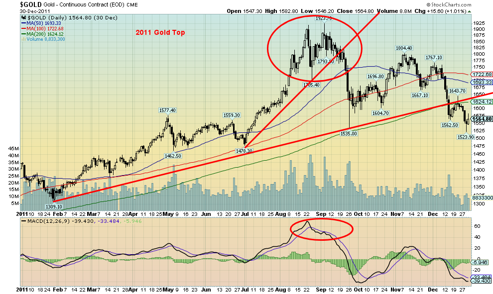
Source: www.stockcharts.com
Following the spike high at $1,923.70, gold plunged $389 to a spike low on September 26. The drop was 20%, although on a close basis gold lost only $246 or 13%. The plunge tested the 200-day MA.
Naturally, there are differences between 2011 and 2020. But the potential similarities are also striking, with one major exception. The story is still playing out for 2020 and the end result may be quite different. Gold made its low on June 5, 2020 and soared $418 or 25% not dissimilar to what happened in 2011. On a close basis the rise was $386 or 23%. The three-day plunge started on August 7 as gold fell $178 or 8.5% over the next three days. Again, that was quite similar to what happened to gold in August 2011. On a close basis gold lost $123 or 6%. If there is a similar rebound as we saw back in 2011, then gold should begin a climb that could take it back above $2,000. New highs for either gold or silver are possible but, we suspect, not both. Following that, a steeper correction could get underway.
But, we emphasize, we do not believe the gold bull run is over. There are too many fundamental reasons as to whey gold and silver should continue to move higher. Many of these reasons were not present in 2011.
There is an old saying from a biblical scholar: “Gold is the money of kings, silver is the money of gentlemen, barter is the money of peasants—but debt is the money of slaves”—Norm Franz, biblical economist, former monetary economist and president of an investment company, author of Money and Wealth in the New Millennium: A Prophetic Guide to the New World. If you hold physical gold and silver, then you are your own central bank.
- Gold and silver both act as a hedge against inflation and deflation and as a hedge against currency devaluation.
- Gold provides a financial hedge and safe haven against geopolitical and economic uncertainty.
- Gold has a history of holding its value against paper assets.
- Gold and silver have supply constraints. We previously noted (Technical Scoop – August 10, 2020) that the value of all of the investment value of gold totals only about $6 trillion, while the investment value of silver totals only about $72 billion. Debt plus the value of global stock exchanges totals about $345 trillion. The gold and silver markets are small by comparison, and much of the investment gold and silver is not available.
- Gold and silver provide portfolio diversification. Gold and silver are generally negatively correlated to stocks and other financial instruments. During the 1970s, gold and silver rose as stocks fell. During the 1980s and 1990s, stocks rose and gold fell. Gold and the stocks both rose together during the 2000s. Since 2011, stocks rose and gold was generally weak. Gold started rising again in 2018 as stocks hit turbulence.
- Gold and silver stocks are leveraged to the price of gold and silver but are paper just like other stocks.
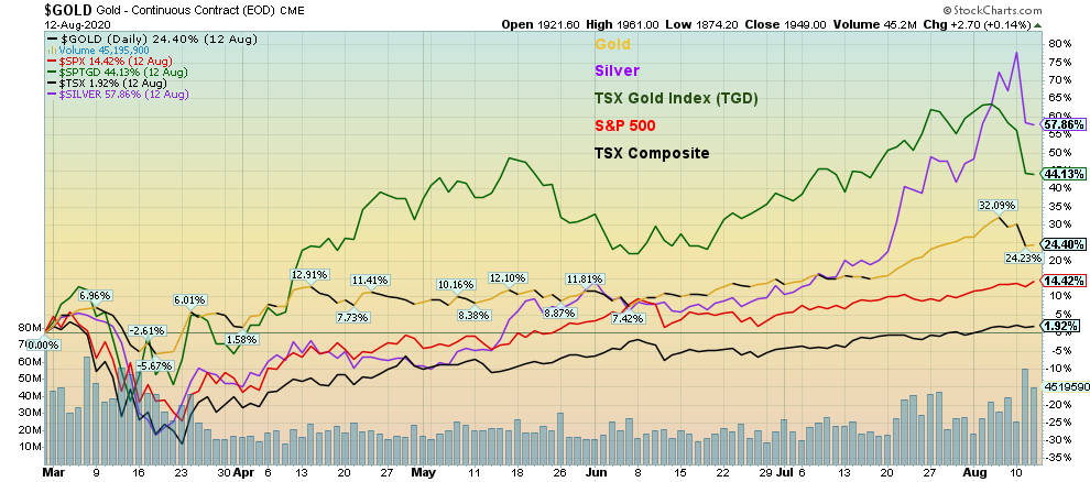
Since the onset of the pandemic in March 2020, gold has generally outperformed. Gold is up 24.4%, silver is up 57.9%, gold stocks represented by the TSX Gold Index (TGD) are up 57.9%, the S&P 500 is up 14.4%, and the TSX Composite is up a small 1.9%.
Source: www.stockcharts.com
Gold and silver have been rising in 2020 because of these reasons:
- The U.S. dollar has been falling. Since January 1, 2020 the US$ Index has fallen 3% but it has fallen 10% from a high in March 2020. Gold and silver have been rising against all fiat currencies in 2020.
- Negative interest rates. Core inflation rate U.S: 1.6% vs. U.S. 10-year Treasury notes 0.70%, negative spread 0.90%. Core inflation rate Canada: 1.1% vs. Ten-year Government of Canada bonds (CGBs) 0.63%, negative spread 0.47%.
- Global debt has exploded during the pandemic, estimated to be over $10 trillion.
- The Fed balance sheet has gone up by $2.7 trillion since March. The Bank of Canada’s balance sheet has gone up $424 billion. Comparatively, these are large moves considering the base from which it started.
- M2 money supply U.S. is up $2.7 trillion since March 2020. Canada M2 is up $201 billion.
- The velocity of money has fallen 25% since the end of Q1. The money being distributed is going primarily to Wall Street, not Main Street. The stock market (Wall Street) has made a V recovery. The economy (Main Street) appears to be working on an L recovery. In the U.S. over 28 million are unemployed.
- The U.S. budget deficit is estimated at 15.9% of GDP or $3.1 trillion. For Canada it is estimated at 11.0% of GDP or US$175 billion.
- Estimated growth levels for 2020: U.S. negative 5.3%, Canada negative 5.6%.
- Rising global tensions between the U.S. and China. Other global hot spots include the Middle East—Lebanon, Israel, Syria, and Iran.
None of these reasons are likely to go away in the near term, making it a compelling reason to continue to hold gold and silver even through a correction period, particularly in the current environment.
One overlooked reason for gold and silver to potentially rise further is the forthcoming U.S. election. The election is shaping up to be the most contentious one in U.S. history. Nightly protests and violence not directly related to the election are occurring on the streets of numerous cities in the U.S. These are expected to continue through until the election. As well, numerous clashes between heavily armed Black Lives Matter supporters and supporters of right-wing groups in the U.S. have been reported. They haven’t erupted into armed clashes - yet. A number of sources suggest that if Trump doesn’t win, heavily armed groups supporting the president will descend on Washington to protect Trump and the White House. Inevitably that could lead to further clashes with authorities. It is difficult to determine the validity of these threats, but in the current environment anything is possible and they are worth noting.
According to many analysts there are numerous moves being made to thwart the election, including:
- Sabotage of the post office. Regional offices are being threatened with closure. The newly appointed Post Master General Louis DeJoy, an ardent Trump supporter, has threatened to slow mail delivery with efficiencies. The cash-strained post office is being threatened with defunding. Given the potential for an unprecedented wave of mail-in ballots and a severely hobbled post office, this could leave ballot-counting in chaos. Trump has threatened to block aid for the Post Office since at least April. He is on record for opposing mail-in voting as fraudulent but absentee ballots are apparently not fraudulent.
- Threats from the Trump administration of criminal indictments against senior Democratic Party officials.
- Voter suppression on a large scale.
Regardless of the outcome of the election, there is major potential for a mountain of lawsuits far exceeding what was seen after the 2000 election that could buckle the court system.
Others we have heard or read about but that are less likely to happen include massive attacks on social media, hacking into computer systems in key states, and the power grid being taken down. There is also the potential for the diversion of war before the election although not likely U.S./China. Possibilities include Iran and Venezuela where the U.S. has long wanted regime change. Geopolitics plays a big role in the rise in price of gold and silver. Geopolitics and domestic politics in the U.S. combined with the economic dislocations caused by the pandemic could unnerve the stock market leading to a sharp sell-off.
The three-day collapse in gold and silver prices most likely came as a bit of a shock to many. But, despite the potential for this to play out in a similar way to 2011, this time it is different because the conditions are quite different than in 2011. None of this eliminates the potential for a corrective period that could last into September. Ideally, we do fall enough to bring the bullish sentiment down sharply and even bring the RSI down to 30 or under.
MARKETS AND TRENDS
|
|
|
|
% Gains (Losses) Trends |
|||||
|
|
Close Dec 31/19 |
Close Aug 14/20 |
Week |
YTD |
Daily (Short Term) |
Weekly (Intermediate) |
Monthly (Long Term) |
|
|
Stock Market Indices |
|
|
|
|
|
|
|
|
|
S&P 500 |
3,230.78 |
3,372.85 |
0.6% |
4.4% |
up |
up |
up |
|
|
Dow Jones Industrials |
28,645.26 |
27,931.02 |
1.8% |
(2.1)% |
up |
up |
up |
|
|
Dow Jones Transports |
10,936.70 |
10,959.54 |
3.6% |
0.5% |
up |
up |
up |
|
|
NASDAQ |
9,006.62 |
11,019.30 |
0.1% |
22.8% |
up |
up |
up |
|
|
S&P/TSX Composite |
17,063.53 |
16,514.61 |
(0.2)% |
(3.2)% |
up |
up |
up |
|
|
S&P/TSX Venture (CDNX) |
577.54 |
737.65 |
(0.3)% |
27.7% |
up |
up |
up |
|
|
S&P 600 |
1,021.18 |
917.90 |
0.7% |
(10.1)% |
up |
up |
up |
|
|
MSCI World Index |
2,033.60 |
1,857.55 |
2.0% |
(8.7)% |
up |
up |
neutral |
|
|
NYSE Bitcoin Index |
7,255.46 |
11,630.52 (new highs) |
0.7% |
61.4% |
up |
up |
up |
|
|
|
|
|
|
|
|
|
|
|
|
Gold Mining Stock Indices |
|
|
|
|
|
|
|
|
|
Gold Bugs Index (HUI) |
241.94 |
330.32 |
(5.8)% |
36.5% |
up |
up |
up |
|
|
TSX Gold Index (TGD) |
261.30 |
369.25 |
(6.3)% |
41.3% |
up |
up |
up |
|
|
|
|
|
|
|
|
|
|
|
|
Fixed Income Yields/Spreads |
|
|
|
|
|
|
|
|
|
U.S. 10-Year Treasury yield |
1.92 |
0.70 |
27.3% |
(63.5)% |
|
|
|
|
|
Cdn. 10-Year Bond yield |
1.70 |
0.62 |
26.5% |
(63.5)% |
|
|
|
|
|
Recession Watch Spreads |
|
|
|
|
|
|
|
|
|
U.S. 2-year 10-year Treasury spread |
0.34 |
0.55 |
31.0% |
61.8% |
|
|
|
|
|
Cdn 2-year 10-year CGB spread |
0 |
0.31 |
47.6% |
3,100% |
|
|
|
|
|
|
|
|
|
|
|
|
|
|
|
Currencies |
|
|
|
|
|
|
|
|
|
US$ Index |
96.06 |
93.11 |
(0.3)% |
(3.1)% |
down |
down |
down |
|
|
Canadian $ |
0.7710 |
0.7540 |
0.9% |
(2.1)% |
up |
up |
up |
|
|
Euro |
112.12 |
118.35 |
0.4% |
5.5% |
up |
up |
up |
|
|
Swiss Franc |
103.44 |
109.96 |
0.4% |
6.3% |
up |
up |
up |
|
|
British Pound |
132.59 |
130.87 |
0.2% |
(1.2)% |
up |
up |
up |
|
|
Japanese Yen |
92.02 |
93.79 |
(0.6)% |
1.9% |
up (weak) |
up |
up |
|
|
|
|
|
|
|
|
|
|
|
|
Precious Metals |
|
|
|
|
|
|
|
|
|
Gold |
1,523.10 |
1949.80 |
(3.9)% |
28.0% |
up |
up |
up |
|
|
Silver |
17.92 |
26.09 |
(5.3)% |
45.6% |
up |
up |
up |
|
|
Platinum |
977.80 |
959.10 |
(1.5)% |
(1.9)% |
up |
up |
up |
|
|
|
|
|
|
|
|
|
|
|
|
Base Metals |
|
|
|
|
|
|
|
|
|
Palladium |
1,909.30 |
2,143.80 |
(1.5)% |
12.3% |
up |
up |
up |
|
|
Copper |
2.797 |
2.86 |
2.5% |
2.2% |
neutral |
up |
neutral |
|
|
|
|
|
|
|
|
|
|
|
|
Energy |
|
|
|
|
|
|
|
|
|
WTI Oil |
61.06 |
42.01 |
1.9% |
(31.2)% |
up |
up |
up |
|
|
Natural Gas |
2.19 |
2.36 |
5.4% |
7.8% |
up |
up |
up |
|
Source: www.stockcharts.com, David Chapman
Note: For an explanation of the trends, see the glossary at the end of this article. New highs/lows refer to new 52-week highs/lows.
Chart of the Week
Source: www.mcoscilator.com
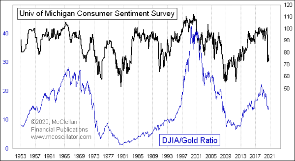
Tom McClellan of www.mcoscilator.com pointed out a rather interesting correlation between consumer sentiment and the Dow Jones Industrials (DJI)/Gold ratio. The two appear to have a tendency to move up and down together. As consumer sentiment wanes, the DJI/Gold ratio falls in favour of gold. As consumer sentiment soars, so does the DJI/Gold ratio. Interesting that the two generally bottomed together in 1980 and again in 2009/2011 while the two topped in 1999/2000 and again in 2019/2020. Consumer sentiment last peaked with a double top in March 2018 and again in February 2020 just as the COVID-19 was getting underway. The DJI/Gold ratio peaked originally in October 2018 and made a lower peak in December 2019.
Key to this would be if consumer sentiment keeps on falling. So far it hasn’t reached the lows seen in 1980 and 2008. In 2011 the consumer sentiment index made a higher low as gold peaked. Based on that, the bet is easy. If you are betting that the DJI/Gold ratio is going to continue falling, then you are also betting that the consumer sentiment index has not yet bottomed. A bottom could typically be down where it was in 1980, 2008, and 2011. We are not there yet. But if a vaccine were found, then the shift might be to see consumer sentiment improve and then stocks would outperform gold.
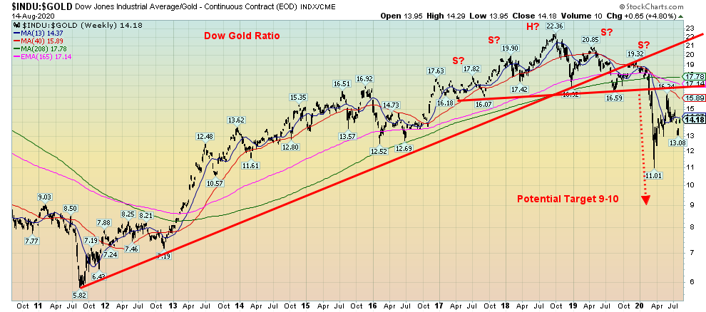
The chart of the DJI/Gold ratio shows that it formed what appears to be a complex head and shoulders top from 2017 to 2020. Once it broke the neckline the projection was down to a minimum 10.40. The low so far has been 11.01. The DJI/Gold ratio, after rebounding, appears to have turned down once again. The recent peak at 16.24 appears to have been a test of the neckline. Currently it is at 14.18 so it has more potential to fall going forward. But, as noted, it also seems to be premised on the consumer sentiment index falling further as well if the correlation is to continue.
Source: www.stockcharts.com
University of Michigan Consumer Sentiment
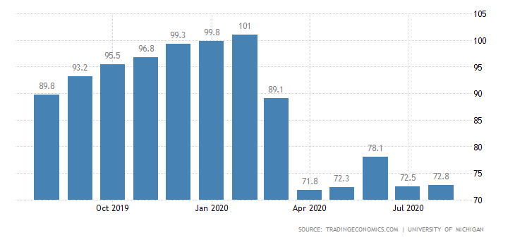
Source: www.tradingeconomics.com, www.umich.edu
Meanwhile, the latest University of Michigan consumer sentiment report was released, showing little change from June. It came in marginally higher at 72.8 vs. 72.5 for June. The market had actually expected it to be lower at 72.0. Two sub-indices of the report are the consumer expectations and current economic conditions. Consumer expectations came in at 66.5 vs. 65.9 in June and economic conditions slipped to 82.5 from 82.8. The failure for the Senate and Congress to come to an agreement on economic relief programs could sour the mood going forward. The persistence and spread of COVID-19 is not helping, either. Consumers are not expecting any return to growth soon over the next five years. If the election becomes more violent as it appears to be headed, consumer sentiment could get even worse.
Source: www.stockcharts.com
The Dow Jones Industrials (DJI) has assumed some leadership with a gain of 1.8% this past week, and the Dow Jones Transportations (DJT) are exhibiting exuberance that a vaccine solution will be found (Russia says they have one, even if they have inadequate trials) as the DJT was up 3.6%. And the DJT is finally positive on the year up, 0.5%. The former leader, the NASDAQ, lagged with an uninspiring 0.1% gain. The small cap S&P 600 tried valiantly and gained 0.7% on the week.
Here in Canada the TSX Composite slipped a small 0.2% while the TSX Venture Exchange (CDNX) finally had a pause, losing a small 0.3%. In the EU things were positive with the London FTSE up 0.9, the Paris CAC 40 gaining 1.5%, and the German DAX up 1.8%. In Asia, China’s Shanghai Index (SSEC) gained 0.2% and the Tokyo Nikkei Dow (TKN) was up a robust 3.9%. Elsewhere, the MSCI World Index gained 2.3% while Bitcoin was up 0.7%. Overall, it was a good week for the stock markets once again.
Along with the possibility of a vaccine solution, there was some other hopeful news. Industrial production was up a better than expected 3%, Q2 productivity rose at an annualized 7.2%, and retail sales for July were up 1.2% although that was weaker than expected. Given that EI support is running out retail sales could suffer further in August. In China, retail sales actually slipped 1.1% which was worse than expected as well. However, the COVID-19 still rages in America with over 50,000 new cases and over 1,000 deaths every day, U.S. politics are still stalemated, and there was no stimulus package as the Senate went on holidays. Looming is a potential crisis as funds run out for millions and mass evictions start. They say “get a job”, but there are an estimated 14 million more jobless than there are jobs available. The rising V stock market is a sharp contrast to what may be an L economy. Wall Street gets richer, Main Street wallows in the pandemic, joblessness, and riots and protests on the streets. Divisive politics headed by a divisive president fractures the nation as it heads into the election, a mere 78 days away.
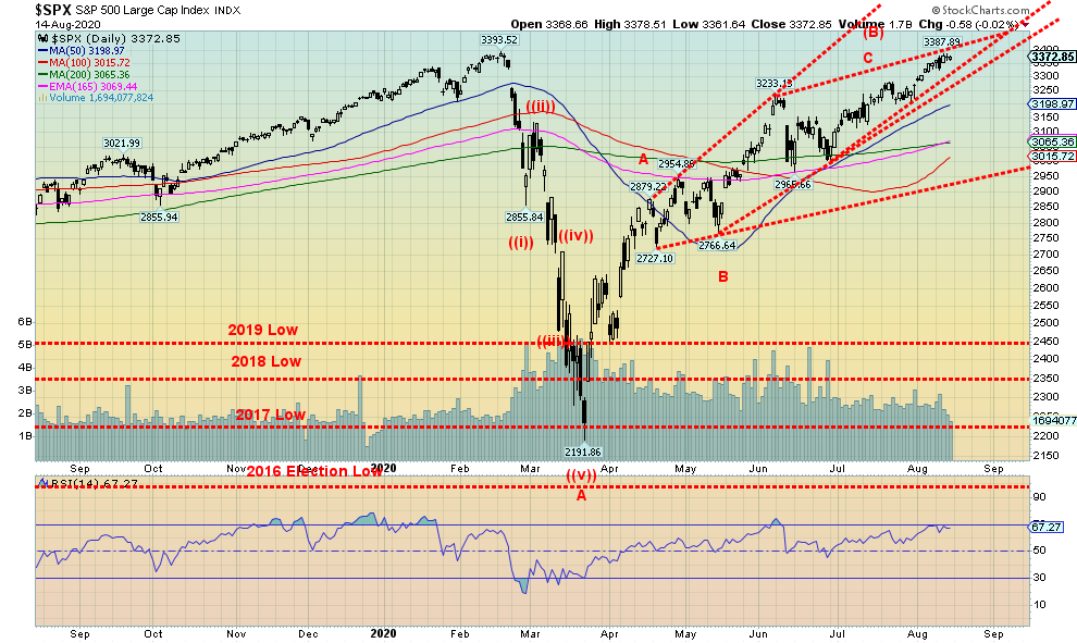
The S&P 500 could be forming a bearish ascending wedge triangle. If that’s correct, then the odds of new highs could rapidly fade. Instead, the downside break could come at 3,325. Confirmation of a breakdown would come at 3,275. A major breakdown could get underway below 2,950. New highs would take the pressure off but, as we noted, we had a chance for that this past week and didn’t do it. August and September tend to be the weakest months of the year with lows in October or November. We could well see weakness into the election and then, depending on the results, see a sharp upward move. With fading momentum, fading volume, and divergences in the indicators, it’s likely that if we did make new highs it won’t be by much. Our risk, we believe, has shifted to the downside.
Source: www.stockcharts.com
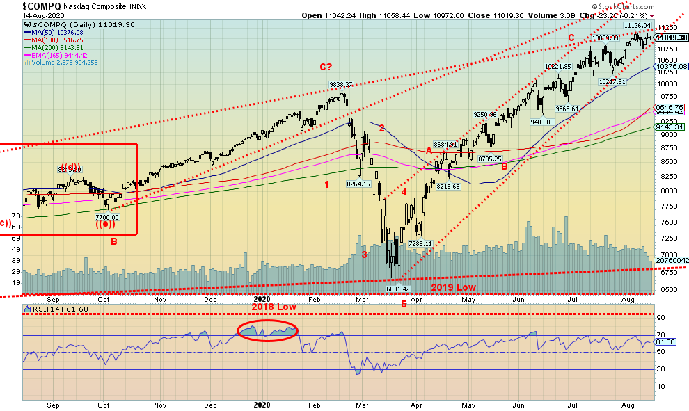
The big leader appears to now be faltering. While the S&P 500, the DJI, and the DJT advanced nicely this past week, once again the NASDAQ, who has been the leader led by the FAANGs was up only a paltry 0.1%. For the first time in a while, the NASDAQ did not make another all-time high this past week. And the FAANGs didn’t either. Okay, Apple did with a gain of 3.4%. But of the big six, four finished the week down. Facebook lost 2.7%, Amazon was down 0.6%, Netflix was off 2.4%, and Microsoft dropped 1.7%. Google bucked the losing trend, gaining 0.9%. A pretty feeble week from the big boys. Tesla, however, was a big winner, gaining 13.6% and news that Berkshire Hathaway had invested in gold through Barrick Gold saw Buffett’s Berkshire rise 0.6%. But if the big boys aren’t going to lead the way, who will? Okay, maybe it doesn’t matter as others assume leadership. But if we start dropping, the big boys could lead the way down just like they led the way up. What happens when others notice the big boys didn’t rise this past week even as the others did?
Source: www.stockcharts.com
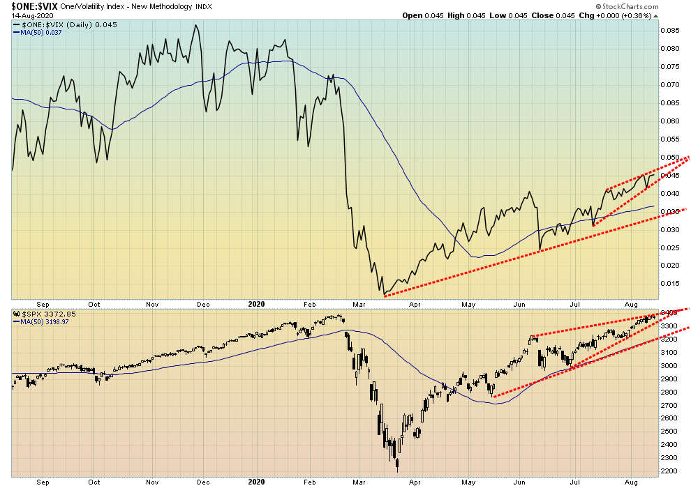
We have to love what appears to be an ascending wedge forming on the VIX volatility index over the past few weeks. It jibes with the one forming on the S&P 500. What that suggests to us is that the potential for a decline appears to be rising.
Source: www.stockcharts.com
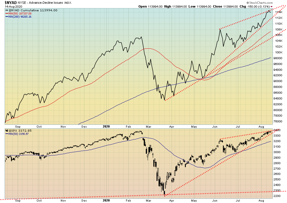
The NYSE advance decline line (cumulative) slipped slightly at the end of the week, although it ended the week up about 1.5%. The S&P 500 ended up 0.6%. The AD line continues to point to higher prices ahead. But we do note the potential for an ascending wedge triangle forming on the S&P 500. There also appears to be an ascending wedge forming on the AD line. This coming week could prove crucial.
Source: www.stockcharts.com
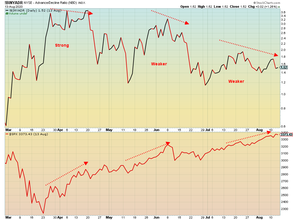
Three advances. And each advance was weaker than the previous advance. At least, that is what the NYSE advance decline ratio appears to be telling us. Each advance saw higher and higher prices on the S&P 500. But each advance was weaker than the previous one. Maybe it’s three strikes and you are out?
Source: www.stockcharts.com
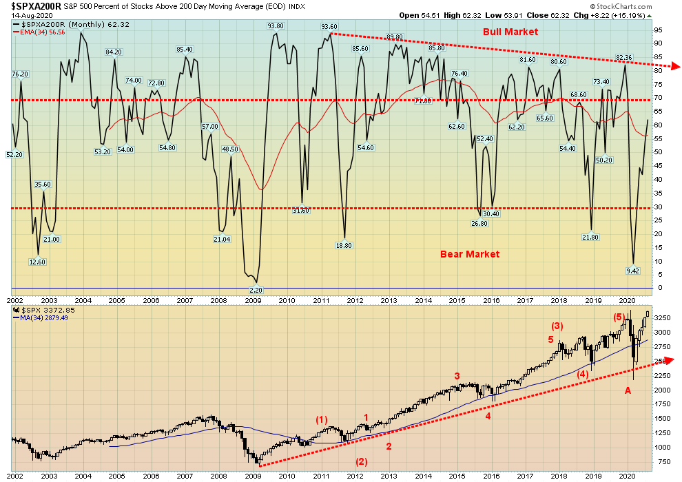
We have always said the rally is impressive, but where’s the beef? The percentage of stocks of the S&P 500 trading over their 200-day MA has only recently crawled up to 60%. The peak was in December 2019 at 82%. We have consistently noted that this rally has been largely led by the FAANGs and a few others. 40% of the stocks of the S&P 500 remain below their 200-day MA. This is not a strong bull market. If it were, we’d be over 80% already. But, as is noted in the next chart, the market is overly optimistic.
Source: www.stockcharts.com
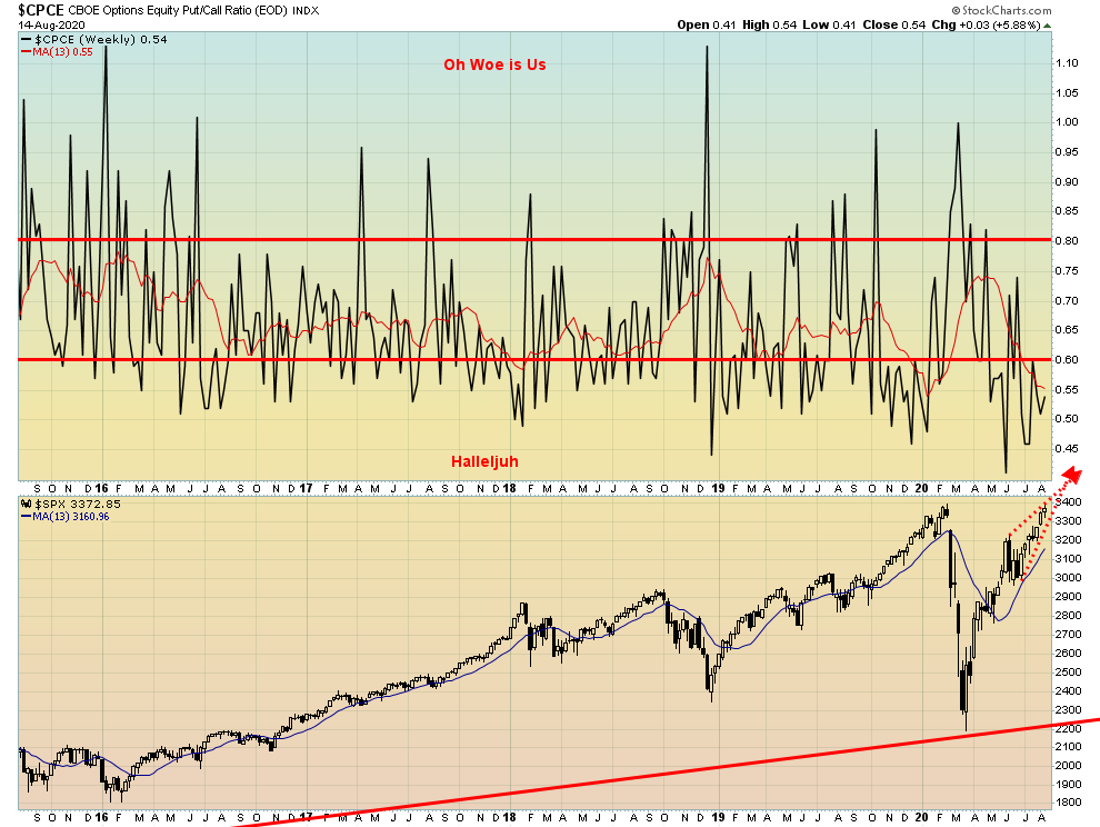
The put/call ratio remains at a ridiculously low ratio, favouring calls. The current level is at 0.54, not far above its record low of 0.40 seen in early June and just above the recent low of 0.46. But all of this remains in favour of calls over puts and ultimately that’s bearish.
Source: www.stockcharts.com
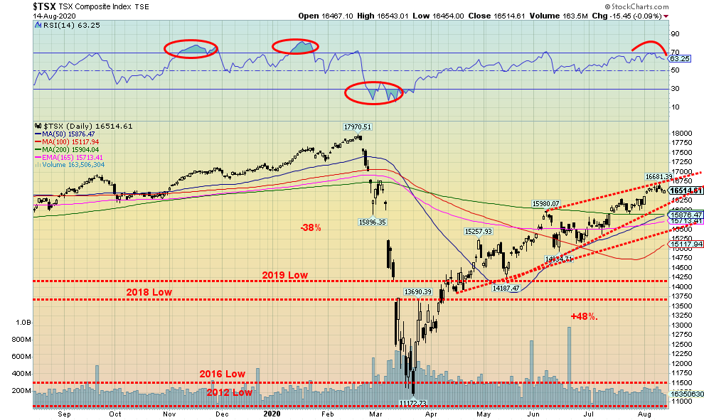
Unlike its U.S. counterparts, the TSX Composite faltered this past week losing 0.2%. The TSX Venture Exchange (CDNX) also faltered off 0.3% but remains up 27.7% on the year. The TSX has struggled to get itself over the 200-day MA and many of its sub-indices remain down on the year. Of its 14 sub-indices it’s a split with 7 down led by Energy (TEN) off 41.6% and 7 up led by Gold (TGD) +41.3%. Golds along with Information Technology (TTK) +40.8%, Materials (TMT) +24.7%, Metals & Mining (TGM) +20.5%, are the big winners. Others up on the year are Consumer Staples (TCS) +6.7%, Industrials (TIN) 4.3%, and Utilities (TUT) +1.1%. The big losers besides TEN are Health Care (THC) -31.6%, Real Estate (TRE) -20.2%, Financials (TFS) -13.5%, Income Trusts (TCM) -16.1%, Telecommunications (TTS) -8.9% and Consumer Discretionary (TCD) -4.2%. The big winner on the week was Energy +3.6% while the biggest loser was Golds -6.3%. The week was split as well with 7 up and 7 down. No wonder the TSX’s loss was a small 0.2%. That’s as good as flat. The TSX like other indices could be forming an ascending wedge triangle (bearish). A breakout over 16,700 would end thoughts of a bear move but a breakdown under initially 16,250 could suggest a downdraft under way. The market begins to break down further under 15,200. The ascending wedge only projects down to around 14,200 to 14,500 at least initially.
Source: www.ourworldindata.org/coronavirus
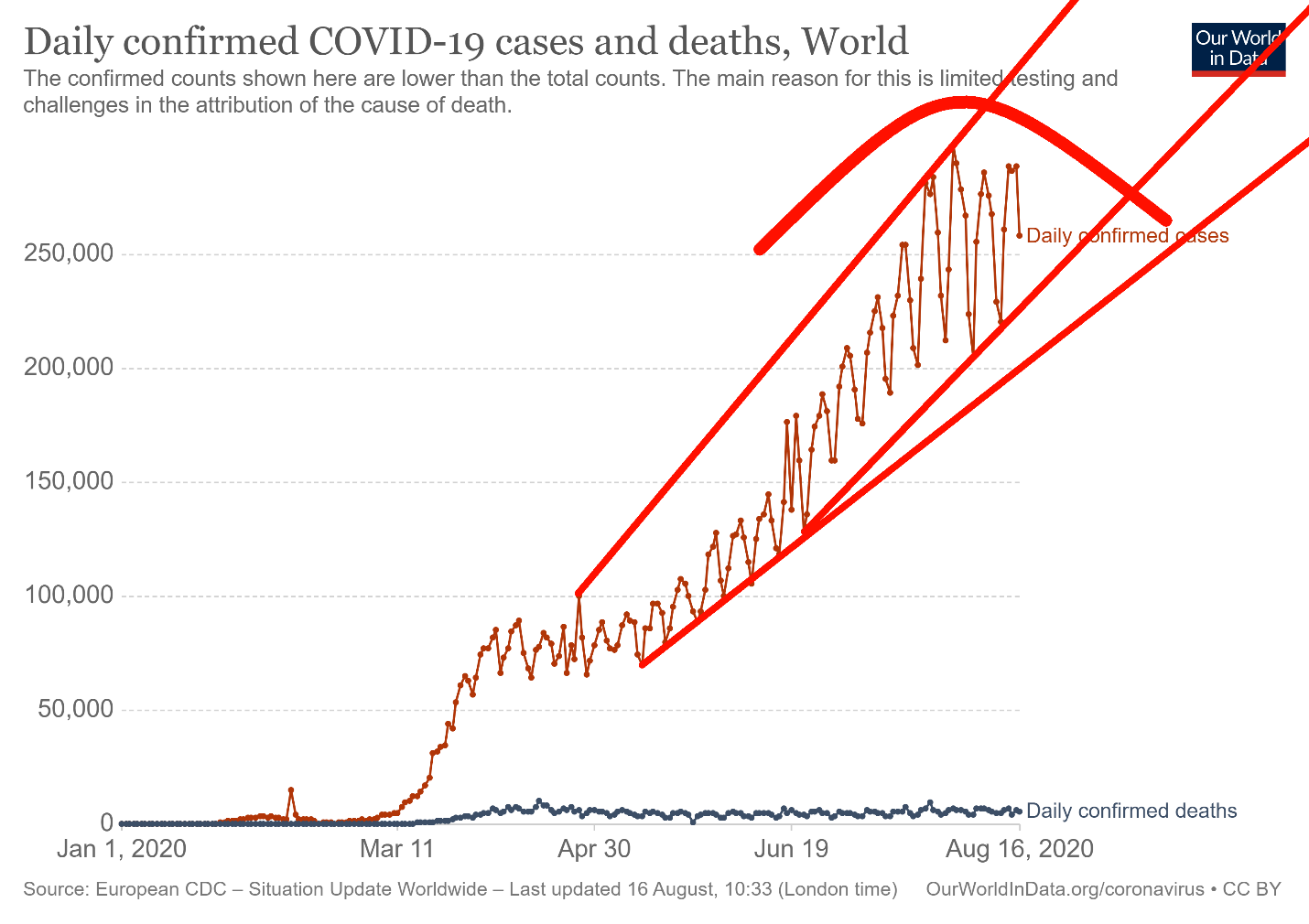
The best one can say about global coronavirus cases is at least it appears to be stabilizing in a range between 200,000 to 280,000. Still we add at least 1,000,000 cases every four days and we regularly record 5,000 or more deaths every day. The pace continues to suggest over 55 million cases by year and upwards of 1.5 million deaths. In a way these numbers are no more drastic than we witnessed during the 1957-1958 Asian flu pandemic. Yes, there was a recession then as well. So, is this merely a consolidation before breaking out to the upside? Or one that will break to the downside. Most pundits expect the number of cases to rise into the fall. India’s numbers are rising. They are now over 2.5 million cases firmly establishing themselves as number 3 in cases and number 4 in deaths. Although if one views India on the basis of cases and deaths per million, they only rank about 88th.
Coronavirus Pandemic 14:27 GMT
Cases: 21,676,071
Deaths: 769,984
Source: www.ourworldindata.org/coronavirus
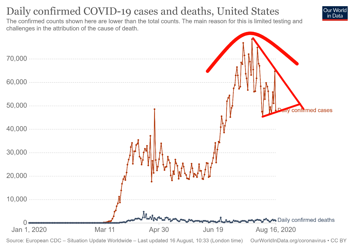
The U.S. continues to be number one in both cases and deaths. California leads in cases and New York in deaths. But Florida with a much lower population is trying hard it seems to catch up ranking number 2 in cases and number 5 in deaths. U.S. is now well past 5.5 million cases and over 170 thousand deaths. They continue to record 50 thousand plus per day and over 1,000 deaths. But as the chart shows for the moment they are down from the highs. But this could be just a consolidation pattern forming and not the establishment of a new down trend.
Coronavirus Pandemic 14:27 GMT
Cases: 5,533,161
Deaths: 172,639
Source: www.ourworldindata.org/coronavirus
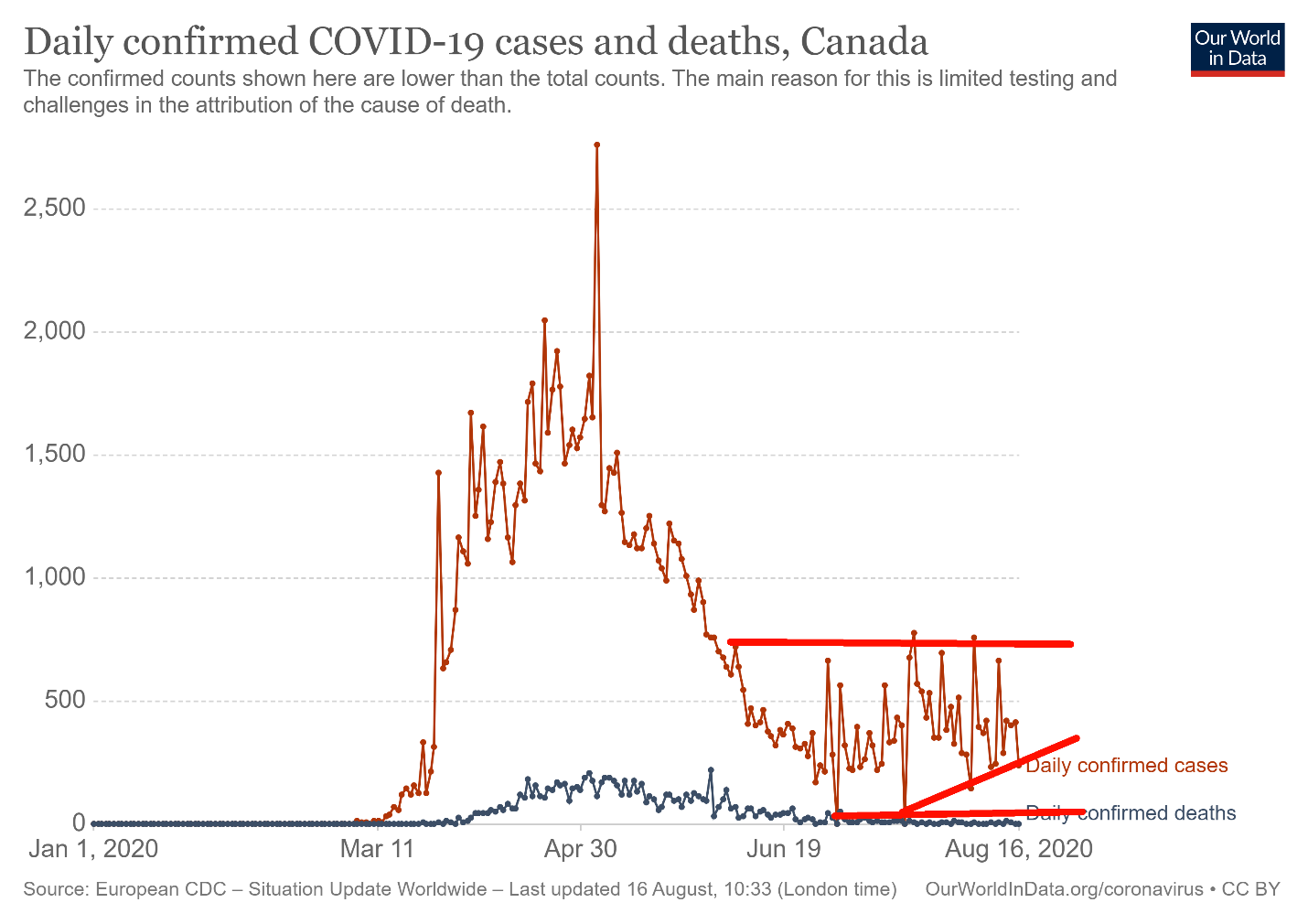
Canada’s cases have at least stabilized but they are still getting 300-700/day. Deaths have also stabilized. Canada ranks 24th in cases but 17th in deaths. But when it comes to cases/million Canada falls to 73rd and for deaths per million Canada is 25th. Enviable? Hardly. Vietnam has less than 1,000 cases and Taiwan less than 500. As to deaths Vietnam is under 25 and Taiwan under 10 – Total.
Coronavirus Pandemic 14:27 GMT
Cases: 121,889
Deaths: 9,024
US 10 Year Treasury Note, Canada 10 Year Government Bond (CGB)
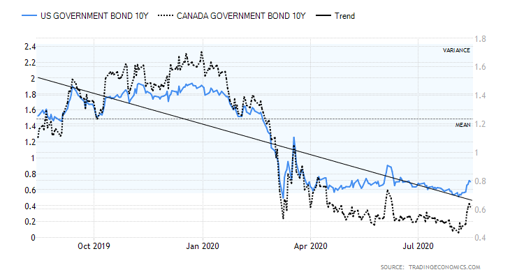
Source: www.tradingeconomics.com
Canadian and U.S. 10-year bond yields did tick higher this past week, thanks to hopes over a vaccine from Russia (although not proven in trials) and thanks to a few economic numbers that were somewhat better than expected. Still, there is little here to suggest that suddenly we are going to have a big upward burst in bond yields. The monetary authorities want to keep a lid on things and suppress interest rate yields. A rise over 1% for the U.S. 10-year treasury note and over 0.80% for the 10-year Government of Canada bond (CGBs) could suggest higher yields ahead. But, given the massive deficits and the huge outstanding of government bonds, the incentive on the part of the monetary authorities is to keep things down. The Fed balance sheet did grow by just over $12 billion this past week so maybe the Fed is returning to its bond-buying days. The peak was June 10 and since then the Fed’s assets have fallen $211 billion.
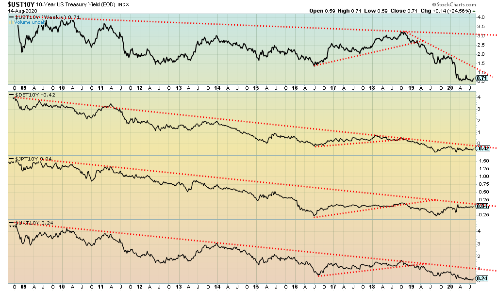
Source: www.stockcharts.com
A little look at the 10-year bond yields of the major economies. It shows that yields in the major economies remain negative. The one coming closest to breaking out to the upside is the 10-year Japanese bond, known as JGBs. They all firmed up a bit this past week but remain in downtrends. Of the four, only the 10-year German bund is below zero. The U.S. is the highest at 0.71. But all remain at or near historic lows. Zero ought to provide support for all of them. We are on a rebound right now so we’ll keep an eye on them in case they break that downtrend.
Source: www.stockcharts.com
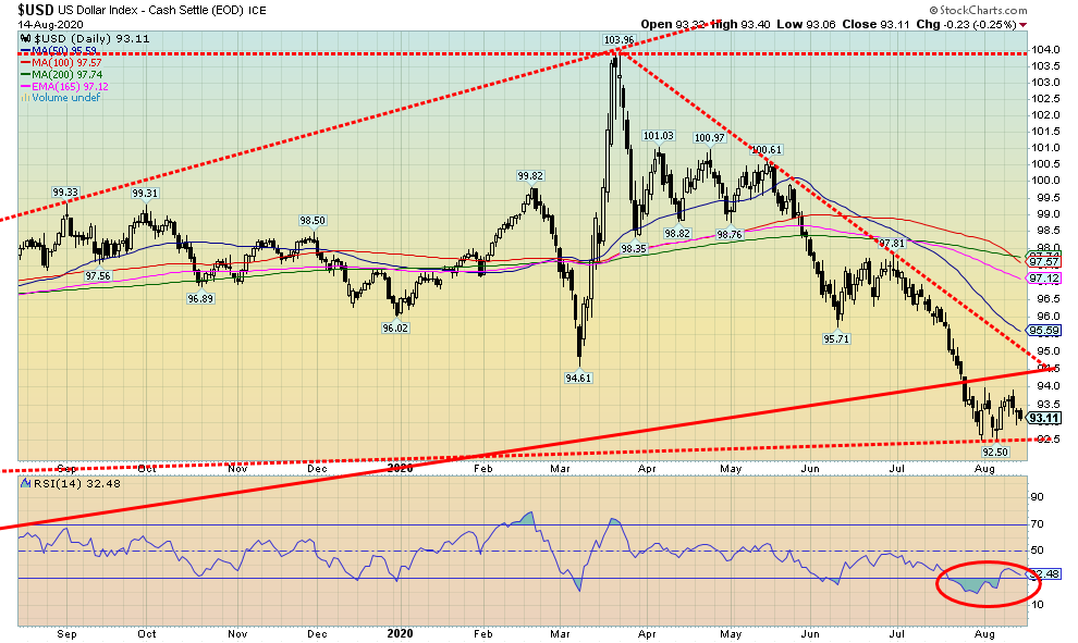
The US$ Index barely budged this past week, continuing its recent consolidation after a sharp decline. All the currencies were pretty quiet. The US$ Index fell 0.3%, the euro rose 0.4%, the pound sterling was up 0.2%, the Swiss franc rose 0.4%, but the Japanese yen fell 0.6%. The Canadian dollar rose 0.9%, continuing its recent winning ways. So, is the US$ Index trying to find a bottom or merely consolidating following a sharp drop? This could be a third wave down or a C wave down. The 1st wave or A wave ended at 98.35, down from 103.96 while the B wave or 2nd wave was the consolidation from March to May. C waves or 3rd waves usually fall in five waves and, if that’s correct, then this could be the start of a wave 4 correction with a fifth wave to come. This wave was expected to fall to at least around 92.74. The current low is 92.50. But if we break that low then the next target could be down to 89.25. A weak U.S. dollar is good for gold. However, any strength exhibited by the U.S. dollar could weigh on gold. The U.S. dollar is weak because of the ongoing terrible pandemic numbers in the U.S., the gridlock in their politics, a divisive president threatening the November election, and protests and riots on the streets of numerous cities. The US$ Index doesn’t start to break out until it is over 95, so that area should act as resistance on any upward move. A breakdown under 92.50 could start the next wave to the downside.
Source: www.stockcharts.com
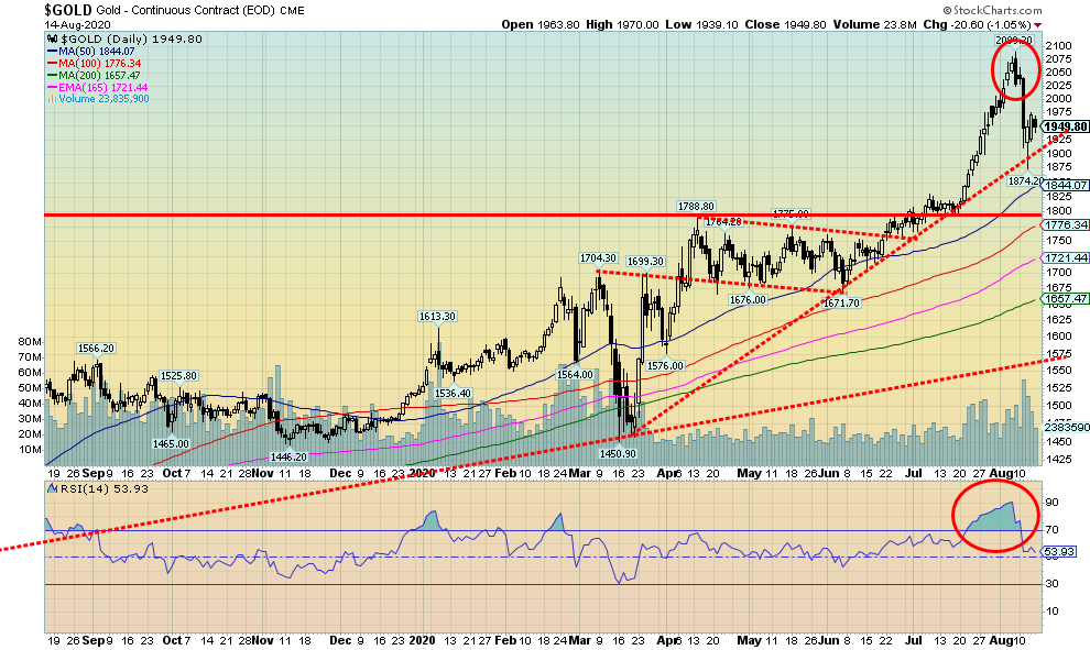
It was inevitable that gold would finally have a correction. Consider the 90% plus sentiment, an RSI at an almost unheard-of 90, and other indicators of gold being extremely overbought. From a low of $1,671 on June 5 gold had soared to record heights, eventually rising $418 or 25% in just two months. Swiftly gone was the high of 2011, and then gold surpassed $2,000. The bulls were panting. Then came the slap in the face. In the space of four days gold collapsed $215 to a low of $1,874. The raging bulls were in mini-shock. So, what sparked the sell-off? Well, Russia raised hopes of a COVID-19 vaccine and treasury yields rose with some better than expected economic numbers. The 10-year U.S. treasury yield leaped to 0.71% from 0.55%. Some described the action as “insane.”
But the drop to $1,874 was only about 50% of the rise from the $1,671. So far, that’s a pretty normal correction. As well, gold held an uptrend line from the coronavirus collapse low of $1,451. U.S./China tensions are still on, U.S. politics continue to be in limbo over a further stimulus package, the COVID-19 is still raging in the U.S., and elsewhere (okay, not everywhere), U.S. cities continue in a state of civil war with protests and riots, the upcoming election promises to be one of the most violent in U.S. history, and the U.S. dollar remains in the doldrums. But a correction was badly needed to cool the market off a bit. Runaway moves are great, but we need reminders. The outlook remains bullish and the fact that the market quickly found some stabilization was encouraging.
So, is that it? Well, probably not. Corrections are rarely one and done. Three waves to the downside are not unusual. We have one wave down and we appear to be working on the return 2nd wave. One of the most encouraging things we saw this past week was that Warren Buffett’s Berkshire Hathaway bought 20.9 million shares of Barrick Gold (ABX/T, GOLD/NYSE). Interesting, as Buffett had in the past mocked gold. The purchase, which we just learned about, occurred in the second quarter and represented 1.2% of the company with a current value of roughly $565 million. Buffett had in the past rejected gold miners because they weren’t land or a real company. Hedge fund manager John Paulson of Paulson & Co. also added to their Barrick holdings in Q2. Barrick’s shares rose. Barrick is up 46% so far in 2020.
So how long might this last? And can it go even deeper? Gold tends to demonstrate weakness into August. Given this drop started later than usual it could last into September. Out of an August/September low the strongest move of the year could get underway. An exception year was 2016 where we saw a strong move into July. The July high proved to be the high for the year. There was then a long descent into December 2016 when gold fell almost 20%. We doubt that will happen this time. The drop this past week was from high to low just over 10%. That’s a good correction right there. Even during the long run-up in 2010–2011 there were some 10% corrections. We note support down to the recent low but a breakdown under $1,844 could lead to a steeper correction. The 200-day MA is way down at $1,657. So that’s long-term support although a scary drop from current levels. The conditions remain good for higher gold prices but one must be aware of breakdown levels. Resistance right now is at $2,000 but a move above $2,040 could lead to new highs. We held our uptrend line which is currently at $1,900. So, a drop under that level would be negative. If we did fall below that level potential targets are down to $1,700, but we believe that is our max downside.
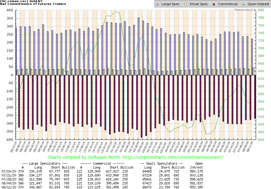
Source: www.cotpricecharts.com
Good news. The gold commercial COT improved this past week to 24% from 23%. Long open interest rose about 4,000 contracts while short open interest fell roughly 4,000 contracts. That’s positive. The large speculators COT (hedge funds, managed futures, etc.) was unchanged at 79% although its long open interest fell roughly 15,000 contracts while short open interest was little changed. The improvement is welcome even if it didn’t turn gold into a raging bull. That tells us that the commercials were adding to their longs and covering some shorts on this recent drop.
Source: www.stockcharts.com
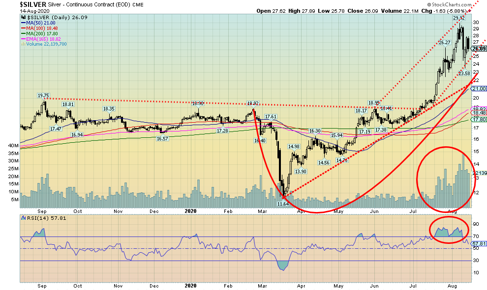
It doesn’t take much to get everyone excited about silver when it makes a $12.90 move from that low on June 15 to the high on August 7. That’s a 76% move in just over a month. But when you have a move like that it is inevitable that there will be a correction, and it could be a sharp one. Well, silver didn’t disappoint, putting in one of its worst drops in years, lowing on the week $1.45 or 5.3% but from the top to the low on the week $6.34 or 21%. That spooks a few players, especially traders and weak hands. Apparently, the volume was so big this past week that all of the world’s investment grade silver was turned over at least three times, an impossible feat if it were physical. But we should note that apparently only eight large traders dominated the trade. A break then sparks further selling and, inevitably, panic selling by smaller players—which greedy players are only too eager to snap up.
A sell-off was inevitable. But, on the other side, we only recently broke out of an almost 5-year trading pattern. The odds of returning to that pattern anytime soon are, we suspect, slim to none. It was a pent-up trade that, when silver finally broke above its restraining line near $20, just burst upward. We had shown a few weeks back the breakout above $20 projected to at least $29. We made that and almost to $30. We also showed last week that the long-term monthly charts were suggesting a potentially huge cup and handle pattern that projects up to around $65 as a minimum. But first we need to consolidate that upward burst. The sell-off was dramatic but potentially short-lived. If the low at $23.58 holds, then we have potentially created a bull channel. We can’t help but note the two roughly parallel lines on top and bottom. So, is that our bull channel? Possibly. So now we have to watch $25 and look to consolidate above that level. The drop to $23.58 was almost 50% of the gain from June 15. A normal correction in any technical analysis book. We could have fallen to $22 and still remained in an uptrend.
We need some more time for the correction to work off the excessive bullishness that was with on the move to $29.92. We even hope the RSI falls to under 30 again, although it is not essential. But what we need is some time to work off the excessive bullishness. And that could take us into September before we find our next low. Right now, as long as we hold above $22, we remain in a bull market. Silver could work its way over to that rising line. The 50-day MA is at $21 so we probably would like to see a test of the 50-day as well. The 200-day MA is way down at $17.80 but we don’t believe that is in danger at this time. We have made a multi-year breakout. These things are not normally over in a mere few weeks. That suggests to us that higher prices are probable but not until after a period of consolidation.
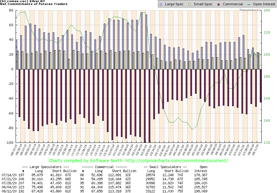
Source: www.cotpricecharts.com
Like the gold COT, the silver commercial COT delivered some positive news this past week. The silver commercial COT rose to 37% this past week, up from 36%. Long open interest rose over 3,000 contracts while short open interest fell about 2,000 contracts. For the large speculators, their long open interest fell around 8,000 contracts while short open interest also fell off about 2,000 contracts. The silver commercial COT is outrageously bullish but the improvement is welcome and suggests that, to a small extent, commercials were adding to longs and cutting shorts.
Source: www.stockcharts.com
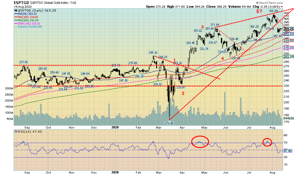
With gold and silver down on the week the gold stocks were hit. The TSX Gold Index (TGD) fell 6.3% while the Gold Bugs Index (HUI) was down 5.8%. They have had quite a run this year and a pullback was almost inevitable. The HUI is still up 36.5% on the year while the TGD is up 41.3%. Many junior exploration, near producers, and junior producers have already doubled this year with some even tripling, quadrupling, or quintupling. The junior mining sector is enjoying its best year in years. The drop this past week eased some of the bullishness with the RSI falling from over 70 to a more neutral 47 this past week. It could still fall further. There is some support down to 350, but below that level a decline to the 200 day MA could happen. It is currently at 293. Have we completed five waves up from the March low? While the April/June correction is quite visible, the pullback in late March/early April was short-lived. As we noted, seasonally gold can be weak in the August/September/October period. The TGD has support just below at 350, but below that level a breakdown could occur. Volume has tailed off on this pullback, a characteristic of a correction. Then again, it may be that investors just don’t believe the rally is over and are continuing to hold. A break under 350 could send the TGD down to the 295/300 area which is just above the 200 day MA. A gap was left on the charts on August 11, 2020 between 389 and 374. If that gap were filled and the TGD were to rise back above 400, then the odds are high that the correction is over and new highs lie ahead.
Source: www.stockcharts.com
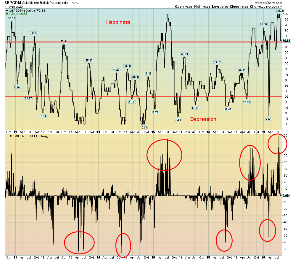
The shakedown this past week in gold, silver, and the gold miners has brought the Gold Miners Bullish Percent Index (BPGDM) down as well. It has now fallen from 100 to a slightly more reasonable 75.85, but it still remains in very bullish territory, suggesting it might have to come down further to set up the next buying opportunity. The Gold Miners New Highs – New Lows Percent Index has also fallen to zero, down from an extreme at 89. Further declines could take it negative. That March low was around negative 60.
Source: www.stockcharts.com
Oil prices firmed this past week on hopes of a slowdown in the transmission of the coronavirus. Surprisingly, the president of the Strategic Energy & Economic Research, Michael Lynch said that it seems to be tapering off. Maybe he should look at our charts of COVID-19 cases in the U.S. and deaths that continue at over 1,000 every day. Also helping was word that Russia was moving forward with a vaccine. Seems that we say we have a cure and then oil rallies, bond yields firm, the stock market rallies, and gold gets hit.
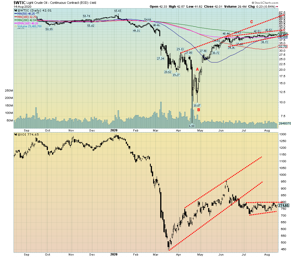
WTI Oil rose 1.9% this past week but remains down on the year by 31.2%. Natural gas (NG) continued its recent climb up 5.4% and now is up 7.8% on the year. The NG rally doesn’t look over yet. All of this helped the energy stocks as the ARCA Oil & Gas Index (XOI) rose 2.3% and the TSX Energy Index (TEN) was up 3.6%. But keep things in perspective as the XOI remains down 39.0% on the year and the TEN is down 41.6%.
Looking at the chart of WTI Oil and the XOI we see the two diverging: the XOI is drifting down while oil is drifting slightly up. But oil has failed to rise above the 200-day MA although it could well do that if this is a rising ascending triangle as it appears to be. If it is successful in breaking out above the 200-day MA (currently at $42.54), we could in theory rise to the $50/$53 zone. But the divergence with the energy stocks is a concern. They look like they want to go in the opposite direction: down. A break of 750 on the XOI could send it tumbling to 550.
Bankruptcies continue in the sector. Apparently, nine more significant oil & gas companies in the US declared bankruptcy in July. That’s 66% more than last year. Occidental Petroleum (OXY) lost $8 billion and announced cutbacks and large drops in production. Oil majors have written off some $50 billion this year and slashed production by 1 million bpd.
We also learned that U.S. sanctions against the Nord Stream 2 project risk its completion. Of course, that’s what the U.S. wants. But it overlooks how much they owe in debt and it impairs interest payments. European banks would be the major victims. The U.S. seized four Iranian oil tankers headed for Venezuela—an act of piracy that raises the odds of further seizures, albeit temporary ones, by the Iranians in the Straits of Hormuz and the Gulf. It raises the tensions and increases odds of a potential inevitable military clash between the U.S. and Iran or the U.S. and Venezuela. Any clash between Iran and the U.S. would also inevitably draw in other players, particularly Russia. Russia also has a base in Venezuela.
Naturally, anything like that would result in sharply higher oil prices. That’s good for the producers, bad for consumers.
Oil breaks down under $40 and breaks out to the upside over $43.50.
Copyright David Chapman, 2020
|
Charts and commentary by David Chapman Chief Strategist, Enriched Investing Inc. Phone: 416-523-5454 Email: david@davidchapman.com dchapman@enrichedinvesting.com Twitter: @Davcha12 August 17, 2020 |
About the author


Website: https://www.enrichedinvesting.com
Disclaimer: David Chapman is not a registered advisory service and is not an exempt market dealer (EMD) nor a licensed financial advisor. We do not and cannot give individualised market advice. David Chapman has worked in the financial industry for over 40 years including large financial corporations, banks, and investment dealers. The information in this newsletter is intended only for informational and educational purposes. It should not be considered a solicitation of an offer or sale of any security. The reader assumes all risk when trading in securities and David Chapman advises consulting a licensed professional financial advisor before proceeding with any trade or idea presented in this newsletter. David Chapman may own shares in companies mentioned in this newsletter. We share our ideas and opinions for informational and educational purposes only and expect the reader to perform due diligence before considering a position in any security. That includes consulting with your own licensed professional financial advisor.