
“We may face more inflation pressure than currently shows up in formal data.”
—William Poole, American economist, 11th chief executive of The Federal Bank of St. Louis 1998–2008, June 2006 speech, senior fellow Cato Institute; b. 1937
“The job of central banks: To take away the punch bowl just as the party is getting going.”
—William McChesney Martin, 9th Chair of the Federal Reserve 1951–1970, served under 5 presidents, previously head of Export-Import Bank 1946–1949; 1906–1998
“In Wall Street, the man who does not change his mind will soon have no change to mind.”
—William D. Gann, known as WD Gann, finance trader, developer of technical analysis methods – Gann angles, Master Charts, Square of Nine, Circle of 360 – based on geometry, astronomy, astrology, and ancient mathematics, author of a number of books on commodities trading; 1878–1955
It is worthy that we add one more quote made just this week:
“It may be that interest rates will have to rise somewhat to make sure that our economy doesn’t overheat.”
—Janet Yellen, American economist, United States Secretary of the Treasury 2021–present, 15th Chair of the Federal Reserve 2014–2018, Member of the Federal Reserve Board of Governors 2010–2018, 11th president of the Federal Reserve Bank of San Francisco 2004–2010, Chair of Council of Economic Advisors 1997–1999; b. 1946
Janet Yellen is not known for making gaffes. Yet that comment set off a mini-firestorm on May 4, 2021. What happened? Ms. Yellen was speaking at an economic forum sponsored by The Atlantic. Her comments sparked an immediate drop in the price of gold, gold being a bit sensitive to rising interest rates. The stock market was already down on the day so there was little further damage. Long-term interest rates rose. Yellen was responding to the huge expenditures by the Biden administration as a part of the trillions of government stimulus spending. So far, Congress has allocated some $5.3 trillion in stimulus spending of which $3 trillion was the budget deficit in 2020 and some $1.7 trillion deficit is seen for the first half of 2021.
$5.3 trillion represents roughly 24% of U.S. GDP. Some $4 trillion is being proposed for infrastructure to rebuild roads, bridges, dams, and more, many which have been neglected for years. Yellen felt the additional spending was (relatively) small to the size of the economy and that, yes, it could cause a modest increase in interest rates. Yellen felt the investment was needed and that the U.S. economy would grow faster as a result.
But it was still an “oops” as Ms. Yellen no longer makes decisions on interest rates—that belongs to Jerome Powell and the Federal Reserve. Maybe she momentarily got her hats mixed up being a former Chair of the Federal Reserve. She later walked her comments back, acknowledging that the Federal Reserve decides interest rates, not the U.S. Treasury. Gold recovered, and so did the stock market. We are sure Ms. Yellen will recover as well.
Still the potential for rising interest rates has been on a lot of minds of late. And so is inflation. Why? Because inflation is going to soar through the roof according to numerous pundits. Maybe too many pundits. It is becoming a lopsided trade. The Fed’s inflation target is 2%. But that inflation target is not just the annual change for the Consumer Price Index (CPI). The Fed looks at what they call the core CPI ex. food and energy. It is not that food and energy are not important but they can be volatile and even transitory. Food and energy prices have proven to be transitory in the past.
In March 2021 the annual inflation rate (CPI) jumped 2.6%. The core inflation rate was up 1.6%, still below the Fed’s 2% target. We note the expectation for April CPI is a rise of 3.6% year-over-year and for the core CPI to rise 2.3% year-over-year. Food inflation was up 3.5% over the past year and we note that oil prices are up 189% over the past year to March 31, 2021. Copper is up 79% and lumber prices have been soaring, up 235%. And that is only until March 31. They are all higher now. While demand plays a role, the real problem has been shortages. Years of low prices force mines to close or at least scale back production, mills to close, etc. So, if demand perks up just a little, it takes some time for production to catch up.
M2, Core CPI, Real GDP, U.S. Federal Debt 1957- (% Change from Year Ago)
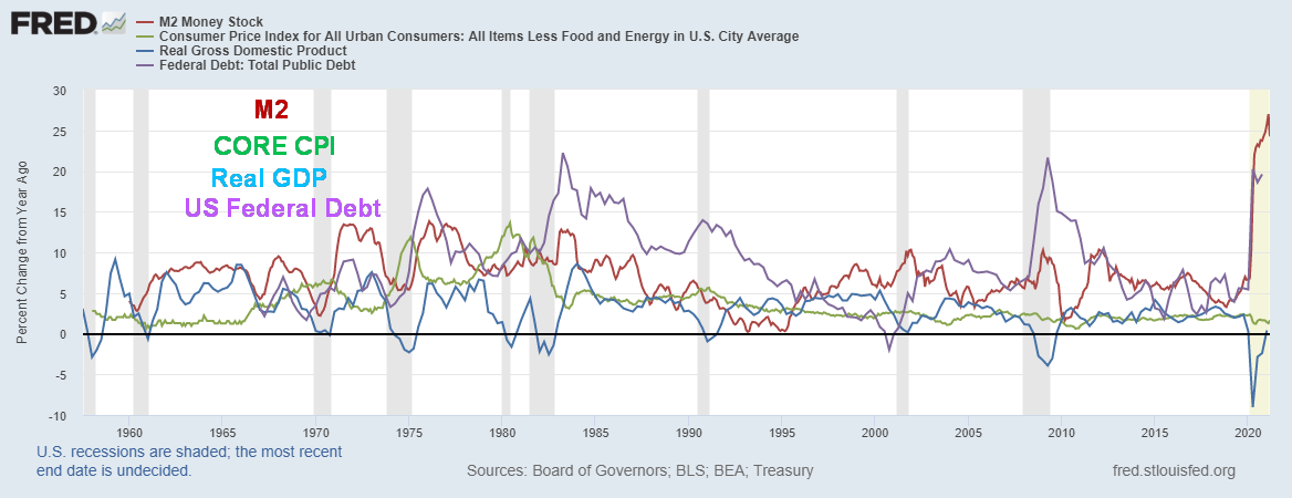
Source: www.stlouisfed.org
The above chart dates back past 1960 and shows the annual percentage gain for money supply (M2), core CPI, real GDP (GDP less inflation), and the U.S. federal debt. A few things stand out. First, while it was excitedly reported that U.S. GDP grew 6.4% annualized in Q1, that translates into a year-over-year gain of only 0.4%. Q2, Q3, and Q4 2020 saw year-over-year gains of negative 9%, 2.8%, and 2.4% respectively. This small gain does not end the recession. At minimum, we’d have to see another quarter of year-over-year positive gains. Officially, the recession has not ended. In looking back at previous official recessions (shaded areas on the chart), the initial GDP gains were good but they all eventually petered out and either flat-lined or began to slide. Since 2000 the average GDP annual gain has been less than 1% annually. Given the huge slack in the economy, we do not expect results to be any different this time.
Given the huge rise in federal debt and M2 over the past year, one wonders whether the GDP growth rate should have been more. Federal debt has leaped 21.6% in the past year while M2 has shot up 24.2% vs. GDP rising a mere 0.4%. What that implies is that it took some $50 of new debt plus $44 of M2 (M1 plus short-term bank deposits and money market funds) to create $1 of GDP. Yet inflation remained benign. Even more astounding was the growth of M1 (physical currency, coin, and demand deposits, travelers’ cheques, chequable deposits, negotiable accounts) which grew some $14.4 trillion in the past year, implying that it needed $144 of M1 to create $1 of GDP. That, to put it mildly, is astounding.
Meanwhile, the velocity of M1 fell some 77% in the past year and for M2 velocity fell almost 19%. Velocity of money is the measurement of the rate at which money is exchanged in an economy. What this means is that the money is not going into the economy at any great speed. The money instead was being saved, as personal savings leaped almost $4 trillion this past year or 86%. The question begs: will this money be spent as the people get vaccines and the economy improves? While it may fall somewhat, the odds are that people will continue to save and/or pay down debt. Call it a fear trade. The impact on the economy could therefore be negligible. Yes, growth will occur, but nothing huge, meaning a return to growth generally under 2%. And that in turn could help keep a lid on inflation.
Furthermore, no one has mentioned technological gains which in turn raise productivity. Given the pandemic and the huge unemployment it generated, many companies are instead working on improving productivity through technological change. That in turn is another lid on inflation, regardless of whether the cost of coffee goes up at the grocery store.
The Fed pays more attention to a monetary indicator called MZM (liquid money supply); however, they have conveniently discontinued publishing that number. They do publish the monetary base (the total amount of currency in either general circulation or in commercial bank deposits held in central bank reserves). The monetary base, currency in circulation only, has increased only $262 billion in the past year or just over 14%. That’s small compared to the growth of M1 and M2. (Note: all data is taken from www.stlouisfed.org).
Note as well from the chart above that following each recession—1974–1975, 1980–1982, 2001–2002, 2008–2009—that both federal debt (purple line) and M2 (red line) recorded a large jump. In all cases, while core CPI (green line) and GDP (blue line) rose as well, they both quickly dissolved down to meagre growth and low inflation. The only one where the core CPI rose sharply was following the 1974–1975 recession. Core CPI eventually peaked in 1980. That was also a commodity cycle peak. The other commodity cycle peak seen into 2008 and a secondary one into 2011 saw the core CPI rise only modestly—not raging inflation as some predicted.
So, what will happen this time? Given the sharp rise in money supply and federal debt, the odds do favour a spike in inflation. The question is, how will the Fed respond and how high will inflation get? The Fed has already indicated they’d be comfortable with a rise of core CPI to 2.5%. That is mostly in line with previous rises in inflation. The Fed’s focus is on the long-term picture not just day-to-day fluctuations.
They also tend to be reactive, not proactive. So, they are not apt to respond, at least initially. What they might do if they see improvement in the economy is consider tapering their current bond buying program. But they are likely to signal that in advance. If interest rates are rising anywhere, it is at the longer end of the curve. So far, the stock markets are responding as they usually do, at least in the early stages of an interest rate rise, by rising as well. It is usually only in the latter stages that the stock market begins to react negatively to rising interest rates.
Our chart below shows the S&P 500 and the U.S. 10-year treasury note from 1981 to present. During the period from 1981 to 2000 the S&P 500 was rising while the 10-year yield was relentlessly falling. We note during this period inflation was also falling. During the 2000–2002 dot.com recession both the 10-year yield and the S&P 500 fell together. The subsequent recovery in 2002–2007 saw both rise generally in tandem. When the 2008 financial crisis arrived, both fell together once again. The 10-year fell mostly between 2007 and 2012. There was a blip upward in 2013–2014 but it had little impact on the stock market as it kept rising. A pause in 2015–2016 by the stock market had the 10-year yield falling once again. Another rise in the 10-year during 2016–2018 saw the stock market continue its relentless rise. The pause for the stock market came in 2018, mostly over the fear of trade wars with the rise in bond yields secondary. Both collapsed in 2020 as the pandemic got underway. So far, the current rise in rates has not impacted the stock market. It is not unusual for a delayed reaction to rising rates. Of bigger concern might be the banks pulling back on bank credit.
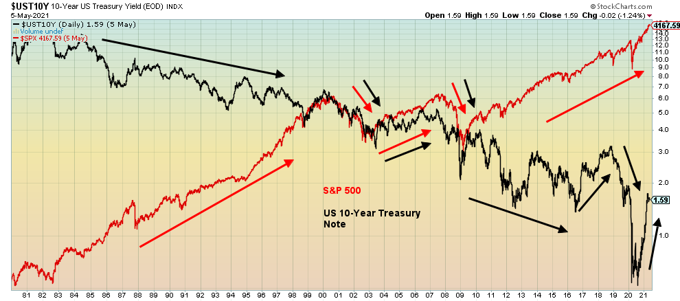
Source: www.stockcharts.com
The chart below shows that bank credit has been slowing throughout the recession. Note how bank credit expansion slowed down sharply through each of the recessions. Only when bank credit began to expand once again did the economy begin to improve.
Bank Credit, All Commercial Banks
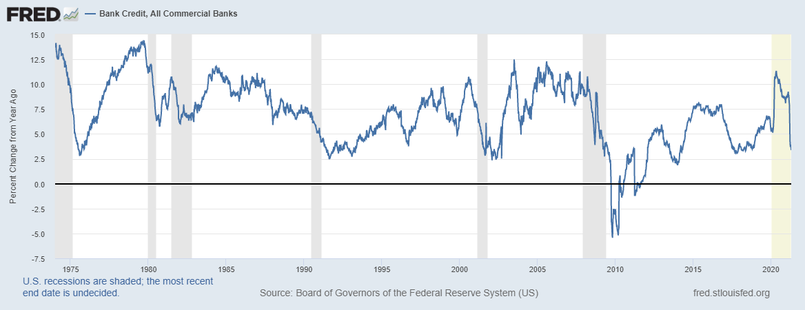
Source: www.stlouisfed.org
Inflation will be impacted by the supply shortages being seen in commodities. While food is necessary for survival and the chip shortage is sparking a hike in prices in automobiles, computers, and anything else that needs computer chips, other commodities such as lumber can be deferred or there are substitutes (hemp?). The unknown here is, what will be the impact of the massive leap in money (M1, M2, etc.)? Never before have we ever seen such monetary inflation. Interest rates are just a price for money and if there is a lot of money around it might spark interest rates to fall, not rise (excess supply). Even at 1.60% bonds are relatively unattractive unless the stock market starts to fall.
However, we note that it is not the market that is buying the bonds, it is primarily the Fed and other central banks. Monetizing the debt. Corporate bond issues tend to go into portfolios and just stay there. In that respect is the rise in interest rates really a concern except for the extent that everyone else (corporations, mortgages. etc.) are priced off of U.S. treasuries? The markets seem almost indifferent to the huge rise in money supply and the federal debt. If interest rates rise too much, the Fed will act.
What all this suggests to us is that we have potential monetary disorder coming down the road rather than inflation per se. And when monetary disorder strikes, the one asset that could retain its value is gold. We found it odd recently that Fed Chair Jerome Powell compared gold to Bitcoin. Gold has been money for upwards of 3,000 years. Bitcoin and cryptos have only been around for about a decade. The end of the gold standard in August 1971 is merely the latest experiment in fiat currencies. All previous experiments failed. Bitcoin is not money. It is merely a manifestation of a lack of trust in fiat currencies. When the market realizes that and trust in fiat currencies collapses not only could there be a switch out of cryptocurrencies (that are not really currencies at all) but also out of fiat currencies and into gold and silver.
Our monetary history over the past 50 years shows both massive debt and monetary expansion. But at no time was it ever on the current scale of expansion. Is this the end game coming? Janet Yellen may have mused about what the Fed might do if the economy overheats. But that was it. A musing.
The Pandemic Rages On!
The pandemic with seeming no end in sight. The 7-day average of cases has slowed marginally to around 788 thousand/day down from 827 thousand/day. Deaths surprisingly have never reached the heights of the second wave currently averaging 12.8 thousand/day vs. 14.4 thousand/day at the peak of the 2nd wave. However, as we have noted India’s numbers are most likely highly undercounted by a factor some estimate of 5 to 30. As well numbers are picking up in Latin America even as they are waning in the U.S. and Europe to some extent. The U.S. has seen its daily case load fall to under 45 thousand and deaths under 700/day. A far cry from the peak of over 250 thousand cases/day and 3,500 deaths/day. Canada too is seeing a decline now down to around 7,500 cases/day from a peak of 8,800/day and deaths down to 46/day a far cry from the 2nd wave peak of 163/day.
Sunday May 9, 2021 – 14:31 GMT
World
Number of cases: 158,491,494
Number of deaths: 3,299,702
U.S.A.
Number of cases: 33,455,544
Number of deaths: 595,606
Canada
Number of cases: 1,279,971
Number of deaths: 24,568
Source: www.worldometers.info/coronavirus
Chart of the Week
U.S. Job Numbers
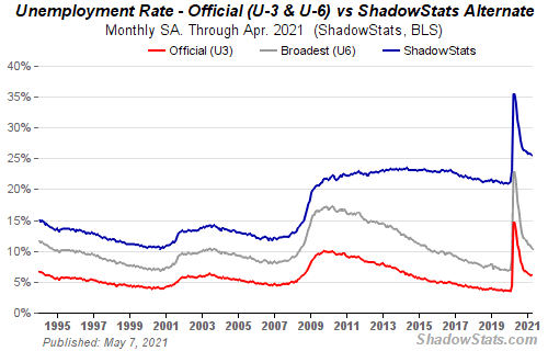
Source: www.shadowstats.com
Well, that was a surprise. The anticipation of a million-plus jobs for the nonfarm payrolls in April had many market participants working themselves up as to how the U.S. economy was heading back to nirvana. Well, not so fast. Instead of a million-plus jobs (officially the consensus was for 978,000 new jobs), what did they get? Only 266,000. Worse, the February/March job numbers were revised downward by 78,000. Instead of nirvana they got purgatory. The so-called V recovery is taking on more of the look of an L recovery or maybe a W recovery. Or how about a rolling bottom recovery.
As much as that 266,000 was at least something, we are reminded that the U.S. lost 22,362 thousand jobs last March and April 2020. So far, they have recovered only 14,225 thousand, leaving them some 8,137 thousand jobs short. Percentage-wise they’ve recovered only 63.6% of the jobs lost after a year. Maybe it’s slow and steady that will get them to where they were before the pandemic.
The official unemployment rate (U3) was actually little changed from March at 6.09% vs. 6.05%. The trouble was that the market had anticipated a drop in the unemployment rate to 5.8%. The U6 unemployment rate which is the U3 rate plus all persons marginally attached plus those unemployed for economic reasons as a percent of the civilian labour force actually slipped to 10.38% from 10.71%. The Shadow Stats (www.shadowstats.com) rate which is the U6 rate plus long term discouraged workers unemployed over one year and those defined out of existence in 1994 came in at 25.5% vs. 25.7%. The U6 rate is the broadest measurement of unemployment from the Bureau of Labour Statistics (BLS). What the April numbers seem to be pointing to is that the U.S. economy is still faltering even as inflation is rising. In the 1970’s we called it stagflation.
The labour force participation rate (LFPR) for April rose to 61.7% from 61.5%, suggesting more people came into the market looking for employment, believing there were jobs. A higher LFPR raises the official unemployment rate (U3). The total civilian labour force in April was reported at 160,998 thousand, up some 440 thousand from March. The jobs in April were primarily full-time, as full-time employment improved by 358 thousand while part-time employment fell 54 thousand. That probably helped average hourly earnings to rise 0.7% in April, giving rise to an 0.3% rise year over year. Both were above expectations. As well, total hours worked was 35 vs. 34.9 in March, the best seen since 2006. The Employment Population Ratio was 57.9% vs. 57.8%. That is a measurement of the total number employed vs. the total working age population. It was the fourth consecutive month of improvement.
The total number unemployed actually rose to 9,812 thousand, up from 9,710 thousand and a gain of 102 thousand. That is the official unemployed (U3). The higher U6 rate would give rise to 16,710 thousand unemployed vs. 17,196 thousand in March an improvement of 486 thousand.
Those not in the labour force totaled 100,501 thousand in April, an increase of 56 thousand from March. Of that total, 55,450 thousand are retired and 9,597 thousand are disabled. It was reported that there were 6,647 thousand wanting a job now but not counted as unemployed and therefore not in the labour force. That was an improvement of 203 thousand from March.
Leisure and hospitality saw big gains in employment in April, up 331 thousand as restaurants and more opened up. But manufacturing employment fell by 18 thousand as auto plants had selectively shut down. There was a sharp 111 thousand decline in temporary help services. Weirdly, there was a decline of 15 thousand jobs in retail. That’s odd, considering things were supposedly opening up. Despite construction supposedly being on fire, there was little change there. Private sector jobs were up 218 thousand while government employment rose 48 thousand.
All of this points to a recovery that is growing but still remains lethargic despite all the hoopla. More consistent with a slow-moving L recovery than anything else. This means the Fed won’t react to this one way or the other, interest rates will remain where they are, and the bond buying will most likely continue. The stock market responded positively, figuring rates will remain low. Gold rose as the U.S. dollar fell while long-term interest rates as represented by the U.S. 10-year treasury note saw yields fall. The biggest risk to inflation is not the economy but the supply shortages and the massive unprecedented increase in debt and money supply. As to the job numbers, it is not so much what they actually were but how the market responds to them. So far, so good.
The job numbers were a disappointment. But as President Biden said, this is a marathon, not a sprint. Maybe the market got too far ahead of itself in expecting upwards of a million jobs. This was one of the biggest misses ever. Some economists are already treating this miss as a fluke. They shouldn’t be so cocksure of themselves. The pandemic continues on despite reduced numbers in the U.S. and vaccines getting into arms. It was noted there were labour shortages in certain places. But that may be more due to a demand/supply mismatch than anything else. There is an argument that government support has been too generous. But the fact that weekly initial claims remain high although down belies that. Maybe some bit the bullet and decided to go back to school and upgrade their skills. Women have not been coming back into the work force as quickly as men. Too many children at home and not in school means someone has to be there. The labour force participation rate for women is 56.1% the same as it was in March. Men’s participation rate was 67.6% in April up from 67.3% in March. Still, that is a far cry from the 80%+ that was regularly seen back in the 1950s. Back then the women’s participation rate was under 35%. Both are well off the peaks seen in the 1990s. Schools have only partially reopened and that may be putting a damper on women coming back to work.
The miss may be a disappointment, but in some respects, it shouldn’t have been a surprise. The effects of this pandemic are not over yet.
Canada Job Numbers
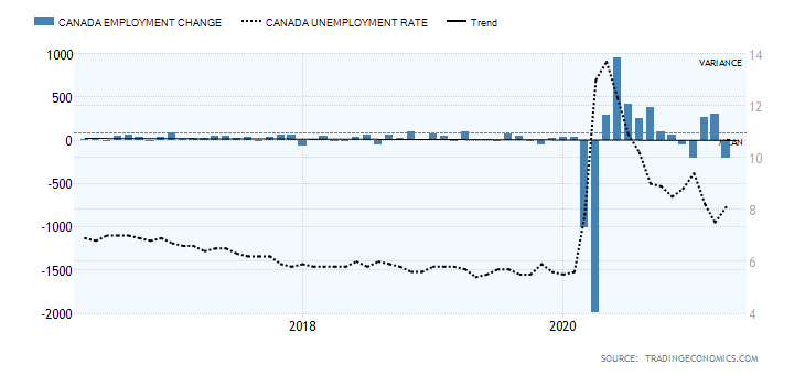
Source: www.tradingeconomics.com, www.statcan.gc.ca
If the U.S. job numbers were a surprise, the Canadian job numbers were an equal maybe even bigger surprise and disappointment. Okay, maybe not that big of a surprise. We suspected back earlier that given tighter restrictions and further shutdowns in April we’d see a jump in unemployment and job losses. The market expected a loss of 175 thousand jobs. Instead, the Canadian economy shed 207 thousand jobs in April. In March, the economy gained 303 thousand jobs. A setback but not a complete disaster. Canada lost 3,004.5 thousand jobs last March and April. To date we have recovered 2,517.8 thousand or 83.8%. To put that in perspective the U.S. has recovered only 63.6% of the jobs lost last March and April. Yes, Canada is outperforming the U.S.
Employment fell for both full-time (down 129 thousand) and part-time jobs (down 78 thousand). The labour force participation rate fell to 64.9% from 65.2%, reflecting the decline in the number of people working. The number of people working less than half their usual hours jumped by 288 thousand. As well, another 100 thousand were working from home, bringing the total to 5.1 million. Also, the number of people unemployed more than 27 weeks rose by 486 thousand.
The industries impacted were no surprise. Retail fell by 84 thousand, accommodation and food services dropped 59 thousand, and culture and recreation was down 26 thousand. Such was the price of stricter restrictions. Ontario led the way, losing 153 thousand while B.C. dropped 43 thousand. Employment among youth 15–24 fell 101 thousand, raising their unemployment rate to 16.1% from 14%. All age groups saw losses with youth suffering the most. All these declines reflect the tighter restrictions and stay-at-home orders.
The official unemployment rate rose to 8.1% from 7.5% while the R8 unemployment rate that includes discouraged searchers, waiting groups, and part-time involuntary workers rose to 11.7% from 11.4%. The R8 rate is the closest to the U.S. U6 rate and is the highest unemployment level reported by Statistics Canada. We do note and emphasize that Canada’s higher labour force participation rate (64.9% vs. 61.7%) reflects the fact that more people are participating in the work force in Canada and are considered a part of the labour force percentage-wise. This then gets reflected in a higher unemployment rate for Canada vs. the U.S.
Given Canada’s better numbers comparatively, maybe it’s no surprise to see the Canadian dollar over 82. It may also be why the Bank of Canada (BofC) has indicated a possible willingness to pare back QE before the U.S. No word, however, that they would hike interest rates. We believe the BofC will defer to the Fed on that. The BofC has pared somewhat in April and is expected to pare again in May. Hopefully, this setback is temporary and as more get the vaccine and the numbers fall Canada can start to open up again into June. That would help unemployment particularly for hard-hit youth.
We should focus on the good news that 18,627 thousand are still working, even as 1,640 thousand are unemployed. On the bad news side, the number of hours worked fell 2.7% again, reflecting the tighter restrictions in place, particularly in Ontario. What to expect for the May jobs report? With restrictions still in place and expected to be in place past the Victoria Day holiday on May 24, we expect that the May report won’t be too rosy either. We may see even more losses. Canada’s recovery is still on track but again, like the U.S., it is more of an L recovery than a V recovery. While GDP numbers initially will look good, they won’t hold.
Rest of page blank
MARKETS AND TRENDS
|
|
|
|
% Gains (Losses) Trends
|
|||||
|
|
Close Dec 31/20 |
Close May 7/21 |
Week |
YTD |
Daily (Short Term) |
Weekly (Intermediate) |
Monthly (Long Term) |
|
|
Stock Market Indices |
|
|
|
|
|
|
|
|
|
S&P 500 |
3,756.07 |
4,232.60 (new highs) |
1.2% |
12.7% |
up |
up |
up |
|
|
Dow Jones Industrials |
30,606.48 |
34,777.76 (new highs) |
2.7% |
13.6% |
up |
up |
up |
|
|
Dow Jones Transports |
12,506.93 |
15,943.30 (new highs) |
3.9% |
27.5% |
up |
up |
up |
|
|
NASDAQ |
12,888.28 |
13,752.24 |
(1.5)% |
6.7% |
up |
up |
up |
|
|
S&P/TSX Composite |
17,433.36 |
19,472.74 (new highs) |
1.9% |
11.7% |
up |
up |
up |
|
|
S&P/TSX Venture (CDNX) |
875.36 |
954.98 |
flat |
9.1% |
neutral |
up |
up |
|
|
S&P 600 |
1,118.93 |
1,374.26 |
2.1% |
22.8% |
up |
up |
up |
|
|
MSCI World Index |
2,140.71 |
2,334.74 (new highs) |
2.5% |
9.1% |
up |
up |
up |
|
|
NYSE Bitcoin Index |
28,775.36 |
57,159.62 |
1.7% |
98.6% |
neutral |
up |
up |
|
|
|
|
|
|
|
|
|
|
|
|
Gold Mining Stock Indices |
|
|
|
|
|
|
|
|
|
Gold Bugs Index (HUI) |
299.64 |
301.72 |
9.7% |
0.7% |
up |
down (weak) |
up |
|
|
TSX Gold Index (TGD) |
315.29 |
316.34 |
7.4% |
0.3% |
up |
down (weak) |
up |
|
|
|
|
|
|
|
|
|
|
|
|
Fixed Income Yields/Spreads |
|
|
|
|
|
|
|
|
|
U.S. 10-Year Treasury Bond yield |
0.91 |
1.57% |
(3.7)% |
72.5% |
|
|
|
|
|
Cdn. 10-Year Bond CGB yield |
0.68 |
1.50% |
(3.2)% |
120.6% |
|
|
|
|
|
Recession Watch Spreads |
|
|
|
|
|
|
|
|
|
U.S. 2-year 10-year Treasury spread |
0.79 |
1.43% |
(2.7)% |
81.0% |
|
|
|
|
|
Cdn 2-year 10-year CGB spread |
0.48 |
1.20% |
(4.0)% |
150.0% |
|
|
|
|
|
|
|
|
|
|
|
|
|
|
|
Currencies |
|
|
|
|
|
|
|
|
|
US$ Index |
89.89 |
90.22 |
(1.2)% |
0.4% |
down |
down |
down |
|
|
Canadian $ |
0.7830 |
0.8240 (new highs) |
1.2% |
5.2% |
up |
up |
up |
|
|
Euro |
122.39 |
121.67 |
1.2% |
(0.6)% |
up |
up |
up |
|
|
Swiss Franc |
113.14 |
111.05 |
1.42% |
(1.9)% |
Up |
neutral |
up |
|
|
British Pound |
136.72 |
140.05 |
1.3% |
2.4% |
up |
up |
up |
|
|
Japanese Yen |
96.87 |
92.09 |
0.7% |
(4.9)% |
up (weak) |
down |
down |
|
|
|
|
|
|
|
|
|
|
|
|
Precious Metals |
|
|
|
|
|
|
|
|
|
Gold |
1,895.10 |
1,831.30 |
3.6% |
(3.4)% |
up |
down (weak) |
up |
|
|
Silver |
26.41 |
27.48 |
6.2% |
4.1% |
up |
up |
up |
|
|
Platinum |
1,079.20 |
1,254.50 |
4.1% |
16.2% |
up |
up |
up |
|
|
|
|
|
|
|
|
|
|
|
|
Base Metals |
|
|
|
|
|
|
|
|
|
Palladium |
2,453.80 |
2,930.20 |
(1.0)% |
19.4% |
up |
up |
up |
|
|
Copper |
3.52 |
4.75 (new highs) |
6.3% |
34.9% |
up |
up |
up |
|
|
|
|
|
|
|
|
|
|
|
|
Energy |
|
|
|
|
|
|
|
|
|
WTI Oil |
48.52 |
64.90 |
2.1% |
33.8% |
up |
up |
up |
|
|
Natural Gas |
2.54 |
2.96 |
1.0% |
16.5% |
up |
up |
up |
|
Source: www.stockcharts.com, David Chapman
Note: For an explanation of the trends, see the glossary at the end of this article.
New highs/lows refer to new 52-week highs/lows and in some cases all-time highs.
Source: www.stockcharts.com
Weaker than expected job numbers did not deter the stock market indices from making once again new all-time highs. What that did was end or at least temper thoughts of an overheating economy and the Fed hiking rates (sorry, Janet) and ended or at least tempered thoughts of the Fed tapering. The S&P 500 jumped 0.7% on Friday and was up 1.2% on the week. The value stocks ruled as the Dow Jones Industrials (DJI) rose 2.7%, and anticipation of cruises and international flights had the Dow Jones Transportations (DJT) jumping 3.9%. But then, who cares about tech as the FAANG-laden NASDAQ actually diverged, falling 1.5% and coming nowhere near all-time highs. The small cap S&P 600 gained 2.1% but did not make new all-time highs.
In Canada, the TSX Composite hit new all-time highs, up 1.9%, while the small cap TSX Venture Exchange (CDNX) was flat, off a tiny 0.03%. In the rest of the world, the MSCI World Index hit new all-time highs, up 2.5%. In the EU, the London FTSE gained 2.6% while the Paris CAC 40 hit new all-time highs and held a gain of about 0.3%. The German DAX gained 1.7% but no new highs. In Asia, China’s Shanghai Index (SSEC) fell 0.8% but the Tokyo Nikkei Dow (TKN) gained 1.9%. Sabre rattling between China and Taiwan saw the Taiwan Index (TWII) fall 1.6% this past week.
The cryptocurrencies continued their incredible run as Bitcoin rose 1.7% but did not see new all-time highs. And as for Dogecoin? Incredible. We couldn’t avoid it so we cover the Woof Woof later.
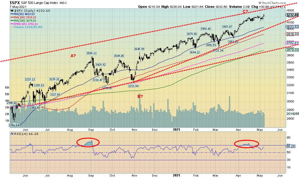
The S&P 500 continues to rise and we appear to have more room to move higher still. The top of that channel is up near 4,300. We can’t rule out a run to that level. But things are getting extended and the market is super bullish. So, all we can say is caveat emptor. If we are forming an ascending wedge triangle, the breakdown is not until just above 4,000. That could spark a decline towards the 200-day MA, currently near 3,700. A breakdown under that level would be much more problematic and could spark a panic.
Our expectations are not for a major decline at this point in time. We’d be looking for deeper trouble later in the year and into 2022 as negative cycles begin to come into play. As well, the expectations on the economy are getting quite high and that is potentially setting the market up for disappointment and a fall. The weaker than expected job numbers this past week may have just been a shot across the bow.
Source: www.stockcharts.com
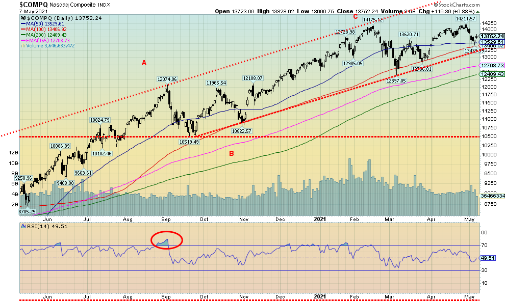
The NASDAQ continues to diverge with the other major indices. Once again, the NASDAQ failed to make all-time highs even as the S&P 500, the DJI, and DJT did make new all-time highs. Blame the FAANGs and the tech stocks. Facebook was down 1.9%, Apple off 1.0%, Amazon whacked down 5.1%, Netflix off 1.9%, Google down 0.5%. Microsoft eked out a little 0.1% despite the news that Bill and Melinda are breaking up. Tesla fell 5.2%, Twitter was down 2.6%. Others in the NYSE FANG index also fell with Baidu off 8.9%, Alibaba down 2.4%, and Nvidia off 1.3%. But value stocks prevailed as Berkshire Hathaway made new all-time highs, up 6.0%. Could the NASDAQ be making a double top despite the marginally higher high seen here a week ago? If so, the breakdown point could be at 13,400 with confirmation under 13,200. Targets could be 11,585, a 16% decline from current levels. Only new highs above 14,212 would end that thought.
Source: www.stockcharts.com
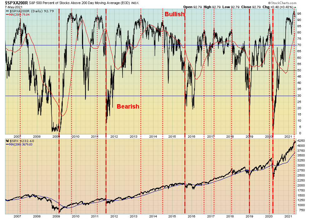
While many of the indicators remain bullish and the above chart is no exception, we do note that the percentage of stocks trading above their 200-day MA for the S&P 500 has hit 97%, a high that’s higher than any we have ever seen before. It’s a warning. We note the S&P 500 Bullish Percent Index has fallen back under 80 so it is a bit of a divergence given new highs for the S&P 500.
Source: www.stockcharts.com
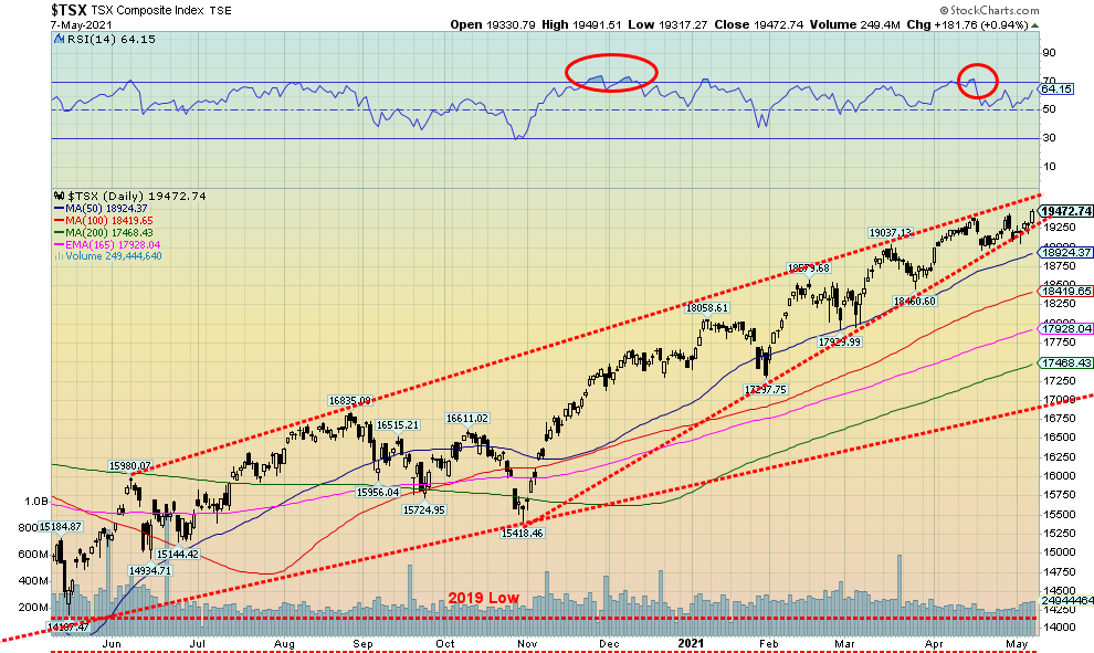
The TSX Composite made another new all-time high this past week: barley. The high was seen at 19,491, just above the earlier high at 19,439 in April and another earlier high at 19,380 also in April. Triple top? They are rare. Usually, it is not and the markets charge through higher. But given we are at or near the top of a channel and we continue to form what appears to us as an ascending wedge triangle, we do not put much trust in a surge to new highs. The ascending triangle breaks down under 19,250 and a potential triple top breaks down under 18,970. If all this happens, potential targets are down to 18,445 for the triple top and at least 17,930 for the ascending wedge for declines of 5% or 8%. Not a lot and fairly normal. But if we break under 17,930, we could fall further to 17,000. A major breakout above 19,700 would end thoughts of a breakdown. We are not expecting that to happen but keep in mind it could.
Of the 14 sub-indices, 11 were up and 3 were down this past week. The losers were Health Care (THC) down 8.9%, Information Technology (TTK) -3.0%, and Utilities (TUT) -1.4%. The big winner on the week was Metals & Mining (TGM) as metal stocks surged, thanks to record prices for copper and rising prices elsewhere for metals. The TGM was up almost 9.0% to 52-week highs. Materials (TMT) jumped 8.5% and Golds (TGD) were up 7.4%. Energy (TEN) was another big winner, up 8.1%. Financials (TFS) made new 52-week highs, up 1.4%, while Real Estate (TRE) also made 52-week highs, up 2.0%. All in all, a good week. But will it last, given the negatives we are seeing?
Source: www.stockcharts.com
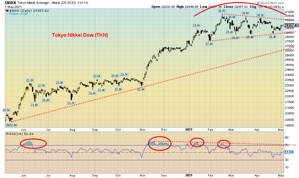
The Tokyo Nikkei Dow (TKN) is making what appears to be a descending triangle top pattern. The descending triangle is characterised by a relatively flat series of lows and declining highs. A breakdown under 28,500 could send the TKN tumbling down to first 26,500 support with targets potentially down to 25,400. A breakout above 30,000 and new highs above 30,700 would negate that.
Source: www.stockcharts.com
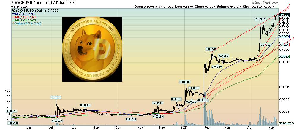
Right! To the moon and beyond! How about pure utter insanity? A joke. A cartoon meme. Nice dog, the Shibu Inu. Or maybe its insane rise is no longer a joke as some would like to say. But then there are only 129.5 billion Dogecoins outstanding. However, they ran the price now to 70 cents, up a mind-boggling 14,000% in 2021 (did we even calculate that right as it closed at $0.005 on Dec 31?). At its peak the market cap soared to $90 billion, making Dogecoin as big as BP plc and making Dogecoin the 170th largest company in the world. Dogecoin is now the 4th largest cryptocurrency by market cap, behind only Bitcoin, Ethereum, and Binance Coin. The world’s largest gold mining company is Newmont Mining with a market cap of about $54 billion. Dogecoin is certainly doing its best to become the Tulipmania of its day. Or is the Bre-X of its day. Does it make any sense? No. But we do see what appears to be a forming ascending wedge triangle. So, maybe its days are numbered after all. Or maybe it really is a big joke with a market cap of $90 billion. A reflection of the times.
Another interesting aside. Bitcoin currently has a market cap of almost $1.1 trillion. That is a market cap larger than all of the gold mining companies in the world. All the gold in the world is estimated to be only around $11 trillion. All the cryptocurrencies are currently valued at $2.4 trillion. Bitcoin’s market cap would make them the 6th largest company in the world, ahead of Facebook.
What is the definition of insanity? Woof!
U.S. 10-year Treasury Bond/Canadian 10-year Government Bond (CGB)
Source: www.tradingeconomics.com, www.home.treasury.gov, www.bankofcanada.ca
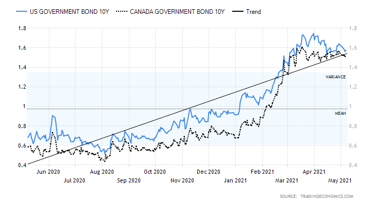
The weaker than expected job numbers this past week helped push bond yields down as the U.S. 10-year treasury note fell 6 bp or 3.7%. The Canadian Government of Canada 10-year bond (CGB) also fell, down 5 bp or 3.2%. Of course, the job numbers were not the only economic numbers out this past week. Earlier in the week we saw the ISM Manufacturing PMI for April that came in at 60.5 but it was below the expected 65 and below the March ISM of 64.7. The March balance of trade was a record deficit of $74.4 billion, about as expected but above the February trade deficit of $70.5 billion. We’ve been around long enough to remember the sharply rising trade deficits in the 1980s that culminated in the 1987 stock market crash when it too came in well above expectations. The U.S. is on pace for a record $850 billion trade deficit and it could be even higher towards $1 trillion. The trade deficit with China is $321 billion. What happened to Trump’s trade wars?
The ISM Services PMI for April was also weaker at 62.7 vs. 63.7 in March and the expected 64.3. At least initial jobless claims were slightly better at 498 thousand vs. 590 thousand last week and below expectations of 540 thousand. All these weaker economic numbers were negative for the U.S. dollar as it fell and bond yields softened. Despite the weakness, many expect the May job numbers now to be gangbusters and things to really pick up into the summer. Could they be setting themselves up for a disappointment?
One overlooked number was consumer credit for March released late Friday. It came in at $25.84 billion above the expected $20.0 billion but slightly below February’s $26.13 billion. Americans are piling on the debt but it does help consumer spending. Bond yields are rolling over, but our breakdown zone remains at 1.40%. A break under that level could send the 10 year down to support near 1.20% and even down to 1.00%. Could there be more surprises on the downside for economic numbers? This week we get the CPI numbers and the market is looking for April year over year to be up 3.6% and the core to be up 2.3%. These numbers would be highest in some time and confirm the inflation fears. Those numbers are out Wednesday. PPI is out on Thursday.
Source: www.stockcharts.com
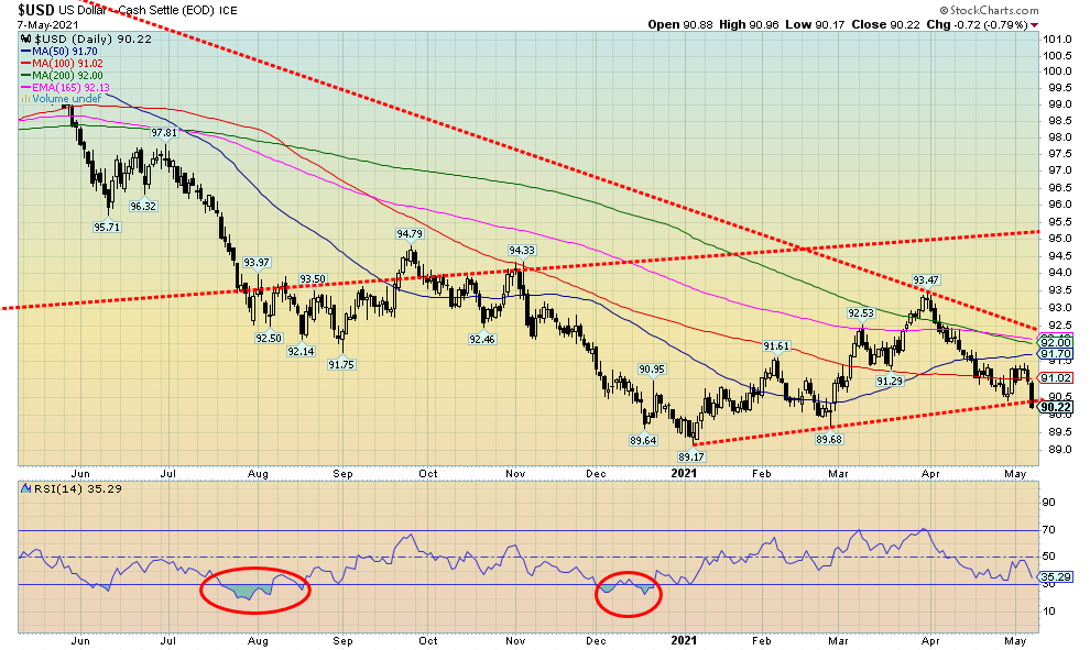
The weaker than expected job numbers on Friday hit the US$ Index as it dropped 72 bp and appears to have broken under a support line, up from the January low at 89.17. We’d need to see another weekly close under 90.50 to help confirm this breakdown. The next zone of support can be seen at the late February low of 89.68. The US$ Index fell about 1.2% this past week. Currencies rallied with the euro up 1.2%, the Swiss franc up 1.4%, and the pound sterling gaining 1.3%, while the Japanese yen rebounded up 0.7%. The Cdn$ (see next) jumped to 52-week highs, gaining 1.2%. We had thought the run-up from the January low was countertrend given its zig-zag look. A zig-zag typically goes abcxabc and that is exactly what took place. Now we could be in the throes of another significant decline; however, we await confirmation on a breakdown under 89.17. If that’s correct, then ultimate targets could in theory be down to 84.50/85.00. A falling US$ Index is positive for gold and commodities. On the other hand, for the U.S., it makes imports more expensive but exports cheaper. Given the U.S.’s negative trade deficit it might help the balance of trade. It is also helpful for foreigners who issued U.S. debt as it could ease their stress on payments if their currency improves against the U.S. dollar.
Source: www.stockcharts.com
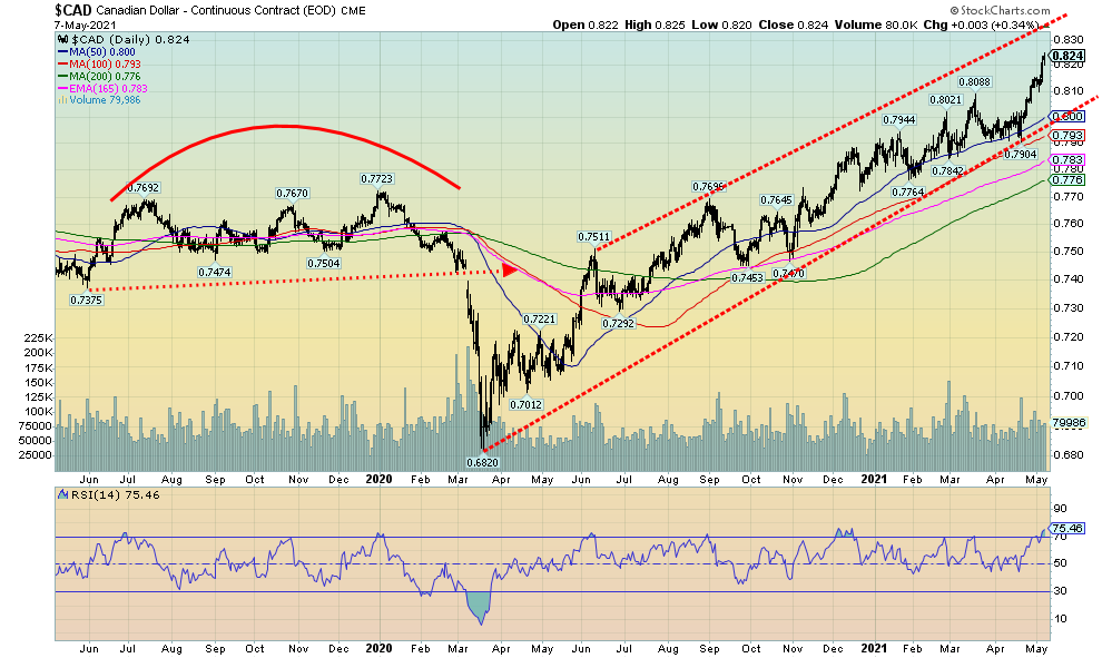
You have to love the Canadian dollar that has now hit 82, its highest level seen since 2017. The 2017 high was at 82.90 so we have a little way to go to overhaul that level. Above that is open territory to run to 88/89. However, we note the daily RSI is now at 75 a level that has seen tops in the past. The monthly RSI is at 68 while the weekly RSI is at 76. So, we are getting warning signs on both a daily and weekly basis but may still have a bit more room to rise on a monthly basis. An RSI above 70 is a warning sign and a top can only be confirmed on a breakdown under a key support level. For the Cdn$, that level would be on the daily charts under 81 and on a weekly basis under 79. Stronger oil prices and jobs’ outperformance have helped the Cdn$ vis-à-vis the U.S. dollar. All in all, we are a long way from the 68.20 low we saw in March 2020 when everyone thought the world was about to collapse. Well, for Canada at least. Still, a higher Cdn$ makes exports more expensive but imports cheaper.
Source: www.stockcharts.com
Gold had its best week in months as the U.S. dollar fell, thanks to the jobs numbers on Friday that were well below expectations. Gold gained about $64 on the week or 3.6%. Still gold remains down 3.4% on the year. Silver jumped 6.2% and is now positive on the year. Platinum rose 4.1% and is up 16.2% on the year. The quasi-precious industrial metals saw palladium lose a small 1% but remaining up 19.4% on the year. Once again, the big star was copper. Copper soared to not only 52-week highs but also made a new all-time high closing at $4.75. That exceeds the $4.65 high seen back in February 2011. Copper prices continue to soar, helped by shortages and demand increase particularly out of China.
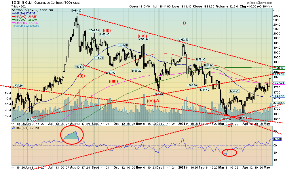
Gold prices, in closing over the $1,800/$1825 resistance zone, have in our opinion now confirmed the low seen in March at $1,673. We believe that could be our 31.3-month cycle low that we have been looking for. Just above current levels are the downtrend line from the August high and the 200-day MA currently at $1,866. We’d like to see at minimum consecutive closes over $1,880 to confirm a breakout and setting the stage for an assault on $1,900. These resistance zones are both key zones to overhaul and also potential failure zones. Gold bears, who are actually numerous, believe the zone $1,850 to $1,880 is the key failure zone. The RSI is up 68, so who knows. That is why we emphasize that overhauling $1,880 next could be quite key to gold’s fortunes going forward. If this move has been countertrend, we’ll fail in here. But if it is the start of a new impulse wave up, we’ll get through $1,880 and then $1,900.
The catalyst was the weaker than expected job numbers on Friday that saw the million new jobs month turn into a mere quarter of a million new jobs. The weak job numbers helped torpedo the U.S. dollar and also helped push bond yields lower, both music to gold’s ears. That inflation may rise as well is also helpful as a weak economy plus inflation is what we call stagflation, something we remember from the 1970s. Grant you, one of the biggest catalysts of the 1970s bull run and the one that helped push gold to $875 was the Russian invasion of Afghanistan in 1979. Could we, as some have suggested, have another international incident? Only this time it could be China and Taiwan? We doubt that because the Chinese and Taiwanese economies are actually quite interlocked, despite China’s rumblings about Taiwan being a wayward province. Taiwan is a major producer of semi-conductors that are already in short supply. There was no such interlock between Russia and Afghanistan. Russia also was invited in by the Afghan government to help them fight insurgents. Not likely Taiwan will invite China in. Still there is a dance going on over there with Chinese planes and ships near Taiwan, Taiwan’s military in preparation, and the U.S. navy patrolling the Straits of Taiwan.
Gold is approaching another key resistance zone that needs to be overhauled if we are to continue this rally. Our belief here is that gold is embarking on a rally that could carry into July. In 2016 a final push to the upside got underway in May and topped in July.
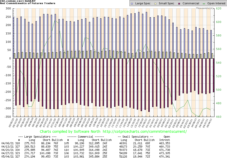
Source: www.cotpricecharts.com
The gold commercial COT (bullion companies and banks) remained steady this past week at 25%. Long open interest was relatively flat while short open interest fell about 5,000 contracts. The large speculators COT (hedge funds, managed futures, etc.) was also relatively flat at 73%. Long open interest slipped a few hundred contracts while short open interest drops about 600 contracts. Overall open interest fell about 3,000 contracts on a week gold rose. At these levels we find the gold COT neutral.
Source: www.stockcharts.com
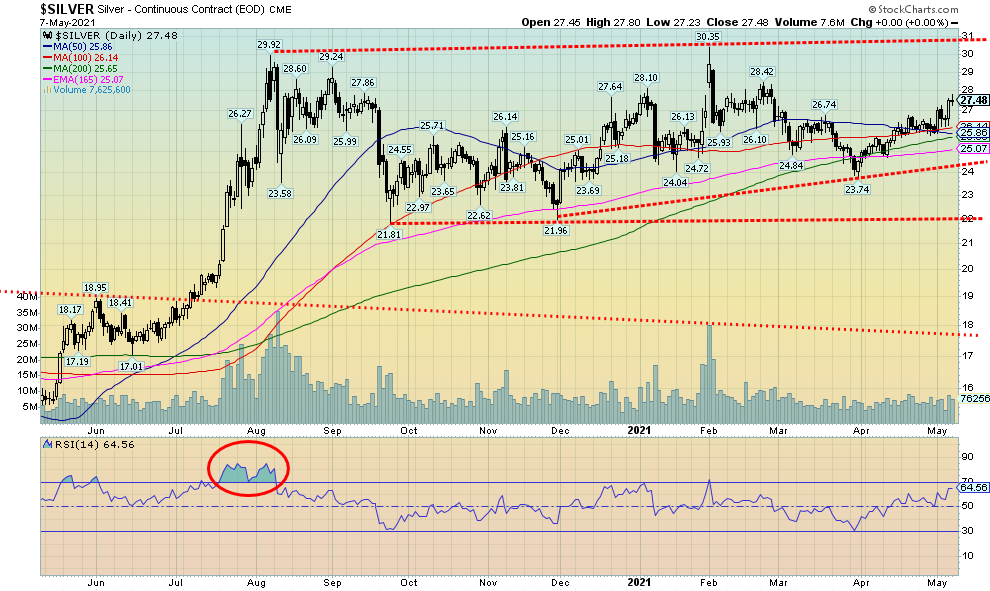
Silver put in a stellar week, gaining 6.2% and flipping silver into the black for the year up 4.1%. Silver is now climbing over the 200-day MA. Another week over the level would help confirm the breakout. Above lies key resistance at around $30. There remains the potential for an ascending triangle forming, given the relatively flat top with rising higher lows. Silver, in clearing above $26.50 has given us another potential confirmation of the March low at $23.74. Next resistance can be seen at $28.50. Above that level, all that remains is the high at $30.35. If the ascending triangle is correct, then a confirmed breakout to new highs could project silver up to about $39. Support is now seen from $25 to $26 although we’d have some concern now if silver were to fall back under $27. We’d prefer that level now holds on any pullback. Silver benefited from the falling U.S. dollar along with gold. The gold/silver ratio is 66.65 still above its recent low of 62.94. The ratio rebounded back to 70 resistance then turned down again, emphasizing that the former support area was now resistance. In a bull market for the precious metals silver and the gold stocks should lead. So far, we are seeing that. The gold/silver ratio is not indicating at these levels that silver has become expensive relative to gold.
Source: www.cotpricecharts.com
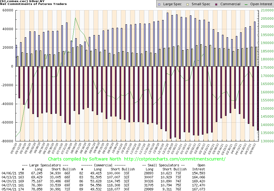
The silver commercial COT slipped to 30% this past week from 32% as silver prices rose. Long open interest fell roughly 5,000 contracts while short open interest was flat. The large speculators COT rose to 72% from 69% as they added over 2,000 contracts to their long open interest while short open interest was cut back by roughly 3,000 contracts. Overall open interest fell over 5,000 contracts on an up week, suggesting to us long covering. We have to view the silver COT as somewhat negative, given we put in up week but the commercial COT fell and overall open interest was also down. We’ll see how next week’s looks.
Source: www.stockcharts.com
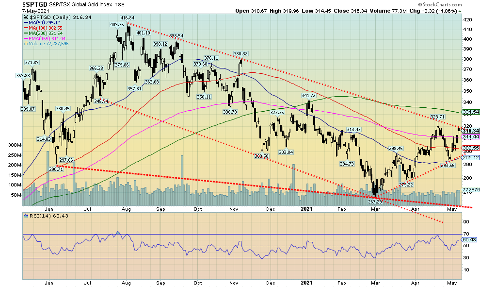
The gold stocks put in a banner week with both indices now positive on the year after spending the first four months in the red. The TSX Gold Index (TGD) gained 7.4% on the week and is now up 0.3% on the year. The Gold Bugs Index (HUI) jumped 9.7% on the week and is now up 0.7% on the year. Both the TGD and the HUI are on the cusp of breaking out over a major downtrend line from the August 2020 high. The TGD’s breakout point is over 320, but we’d feel even better if we could also break out over the 200-day MA at 331. Tests of the 200-day MA in a bear market are not unusual. We’d need to see consecutive closes over the level as well as the index pulling away from the 200-day MA.
For the HUI, the comparable points are at 305. The HUI’s downtrend line from the August 2020 high also intersects at the 200-day MA so the breakout point is the same. The HUI has support down to 295 but a break under that level would now be negative. For the HUI, the breakdown level is at 270. Numerous gold stocks put in a good up week. There were even some musings about a mega-merger between Barrick (GOLD) and Newmont (NEM). If that were correct, it would create a gold mining behemoth. Barrick gained 12.6% on the week while Newmont was up 7.9%.
The TGD has room to move higher as the daily RSI is only at 60. The Gold Miners Bullish Percent Index (BPGDM) is at about 57, still well below potential overbought levels above 75. The result is, we see no bullish extremes at this stage, suggesting to us we have room to move higher. We’ll get our confirmations when we successfully clear the 200-day MA and stay above that level.
The Gold/HUI ratio is currently at 6.07, well down from the highs seen in March 2020 but still nowhere near breaking into more neutral territory. The gold stocks are still cheap compared to gold and the ratio has much further to fall before gold stocks would become expensive. Gold stocks are expensive relative to gold with a Gold/HUI ratio under 2.5.
Source: www.stockcharts.com
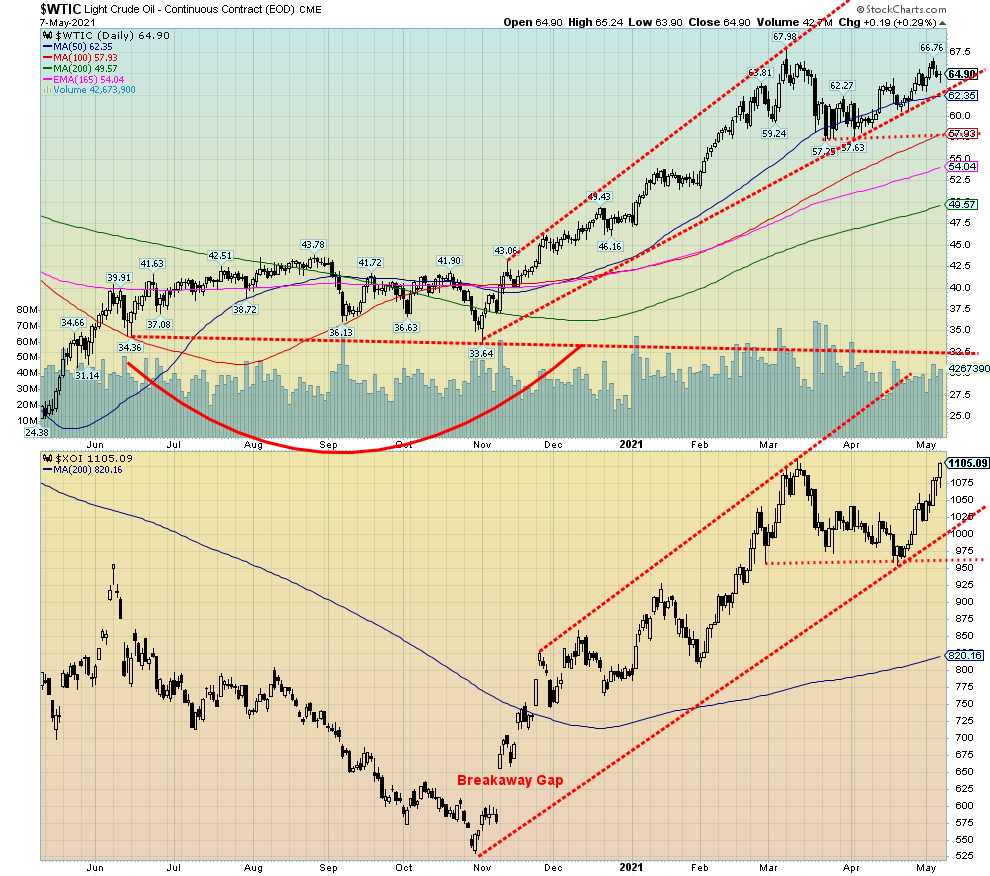
WTI oil made a lower high this past week, setting up the potential for a double top. Brent crude, which approached $70 this past week, has a similar pattern. The XOI could as well but that is undefined at present. This past week WTI oil rose 2.1%, leaving it up 33.8% on the year. Natural gas (NG) also rose up 1.0% and is now up 16.5% on the year. The energy stocks, that were the worst performers in 2020, have been stellar in 2021. The ARCA Oil & Gas Index (XOI) gained 8.4% this past week and is up 39.5% on the year. The TSX Energy Index (TEN) jumped 7.4% and is up 40.0% so far in 2021.
Oil is getting bullish as there are signs the economy is improving and people are getting vaccinated. The expectation is that the summer driving season could be a banner one. But then along came Friday’s jobs report and threw some cold water on the thought. WTI oil is off its highs, setting up the potential for a double top. New highs above $68.00 would end any thoughts of that. The potential neckline is down at $58 so it is not exactly close by. But a breakdown under that level could set up a drop to $47. We are merely citing this as a possibility and not suggesting it will actually happen.
The XOI cannot be said to be potentially making a double top because the XOI closed at the highs on Friday and is not far from the March high of 1,111.12. If the XOI were to fall next week without making new highs then the double top possibility is in play. The neckline is around 965. The TEN closed at 127.42 on Friday, only 0.50 off its March high. Its potential double top neckline is at 112.50.
In interesting news, Michigan has set a May 12 deadline for Enbridge (ENB) to shut down its Line 5. Line 5 runs from Superior, Wisconsin through Michigan and across the MacKinac Straits that divide Lake Huron and Lake Michigan. The line continues through Michigan, eventually crossing into Ontario at Sarnia. The line brings western light crude and natural gas liquids into Ontario and even eventually to Ohio and Pennsylvania from Western Canada. The line is 65 years old and in need of upgrades. The line has had serious leaks in the past and the fear is, if it burst through the MacKinac Straits, an environmental disaster could follow. Enbridge has said they will defy the order, making things even more difficult in court. It could also set off an international dispute between the U.S. and Canada. Enbridge fell 33 cents on Friday, although it was down a lot more earlier in the day before bouncing back.
The potential for a banner summer driving season has brought WTI oil back near the March high. But if it fails here, then there is the potential for a double top.
|
Charts and commentary by David Chapman Chief Strategist, Enriched Investing Inc. Phone: 416-523-5454 Email: david@davidchapman.com dchapman@enrichedinvesting.com Twitter: @Davcha12 May 10, 2021 |
Copyright David Chapman, 2021
|
GLOSSARY Trends Daily – Short-term trend (For swing traders) Weekly – Intermediate-term trend (For long-term trend followers) Monthly – Long-term secular trend (For long-term trend followers) Up – The trend is up. Down – The trend is down Neutral – Indicators are mostly neutral. A trend change might be in the offing. Weak – The trend is still up or down but it is weakening. It is also a sign that the trend might change. Topping – Indicators are suggesting that while the trend remains up there are considerable signs that suggest that the market is topping. Bottoming – Indicators are suggesting that while the trend is down there are considerable signs that suggest that the market is bottoming. |
Disclaimer David Chapman is not a registered advisory service and is not an exempt market dealer (EMD) nor a licensed financial advisor. We do not and cannot give individualised market advice. David Chapman has worked in the financial industry for over 40 years including large financial corporations, banks, and investment dealers. The information in this newsletter is intended only for informational and educational purposes. It should not be considered a solicitation of an offer or sale of any security. Every effort is made to provide accurate and complete information. However, we cannot guarantee that there will be no errors. We make no claims, promises or guarantees about the accuracy, completeness, or adequacy of the contents of this commentary and expressly disclaim liability for errors and omissions in the contents of this commentary. David Chapman will always use his best efforts to ensure the accuracy and timeliness of all information. The reader assumes all risk when trading in securities and David Chapman advises consulting a licensed professional financial advisor before proceeding with any trade or idea presented in this newsletter. David Chapman may own shares in companies mentioned in this newsletter. We share our ideas and opinions for informational and educational purposes only and expect the reader to perform due diligence before considering a position in any security. That includes consulting with your own licensed professional financial advisor.
About the author


Website: https://www.enrichedinvesting.com
Disclaimer: David Chapman is not a registered advisory service and is not an exempt market dealer (EMD) nor a licensed financial advisor. We do not and cannot give individualised market advice. David Chapman has worked in the financial industry for over 40 years including large financial corporations, banks, and investment dealers. The information in this newsletter is intended only for informational and educational purposes. It should not be considered a solicitation of an offer or sale of any security. The reader assumes all risk when trading in securities and David Chapman advises consulting a licensed professional financial advisor before proceeding with any trade or idea presented in this newsletter. David Chapman may own shares in companies mentioned in this newsletter. We share our ideas and opinions for informational and educational purposes only and expect the reader to perform due diligence before considering a position in any security. That includes consulting with your own licensed professional financial advisor.