
When there appears to be a critical inflection point in any market it is always important to go back and look at some long term charts so you don’t lose sight of the big picture. The big picture can also tell you if your long term view is still accurate or it can let you know if there is some deterioration taking place. Always keep in mind in a bull market the surprises will come to the upside and in a bear market the surprise will come to the downside.
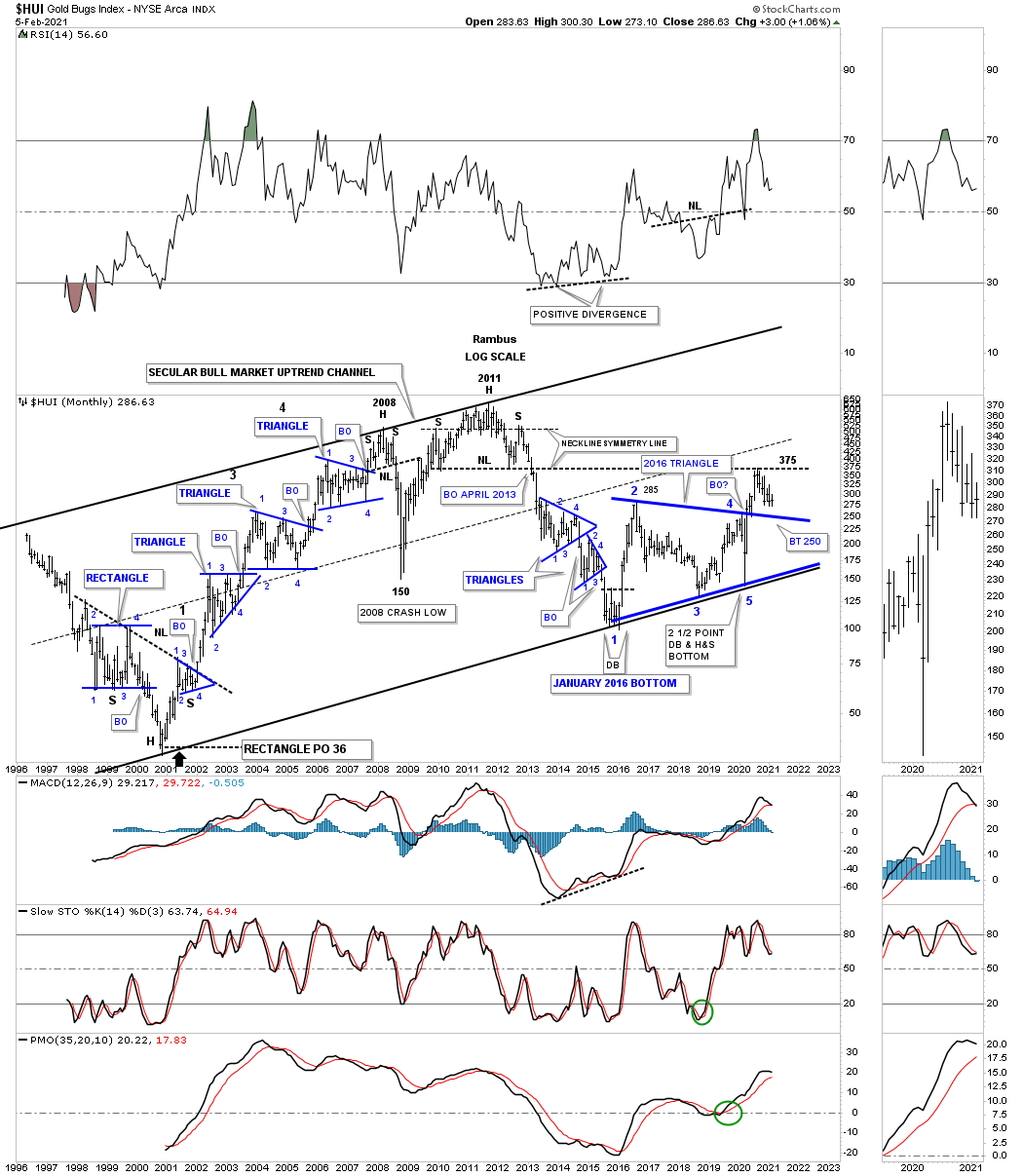
Lets start with the history chart for the HUI which shows all of its chart patterns both consolidation and reversal patterns. The left side of the chart shows all the consolidation patterns that formed the first impulse leg up after breaking out from that massive unbalanced H&S bottom in 2001. Phase 1 of the secular bull market ended at the head portion of the 2011 H&S top. The double bottom low in early 2016 actually marked the bottom of the cyclical bear market. From that double bottom low at reversal point #1 the HUI began to build out that massive 2016 5 point triangle reversal pattern with 3 separate higher highs that formed on the bottom rail of the 2016 triangle and the bottom rail of the 2001 secular bull market uptrend channel. For now the current price action is locked in a battle with the bears between the top rail of the 5 point triangle reversal pattern and the neckline extension line taken from the 2011 H&S neckline.
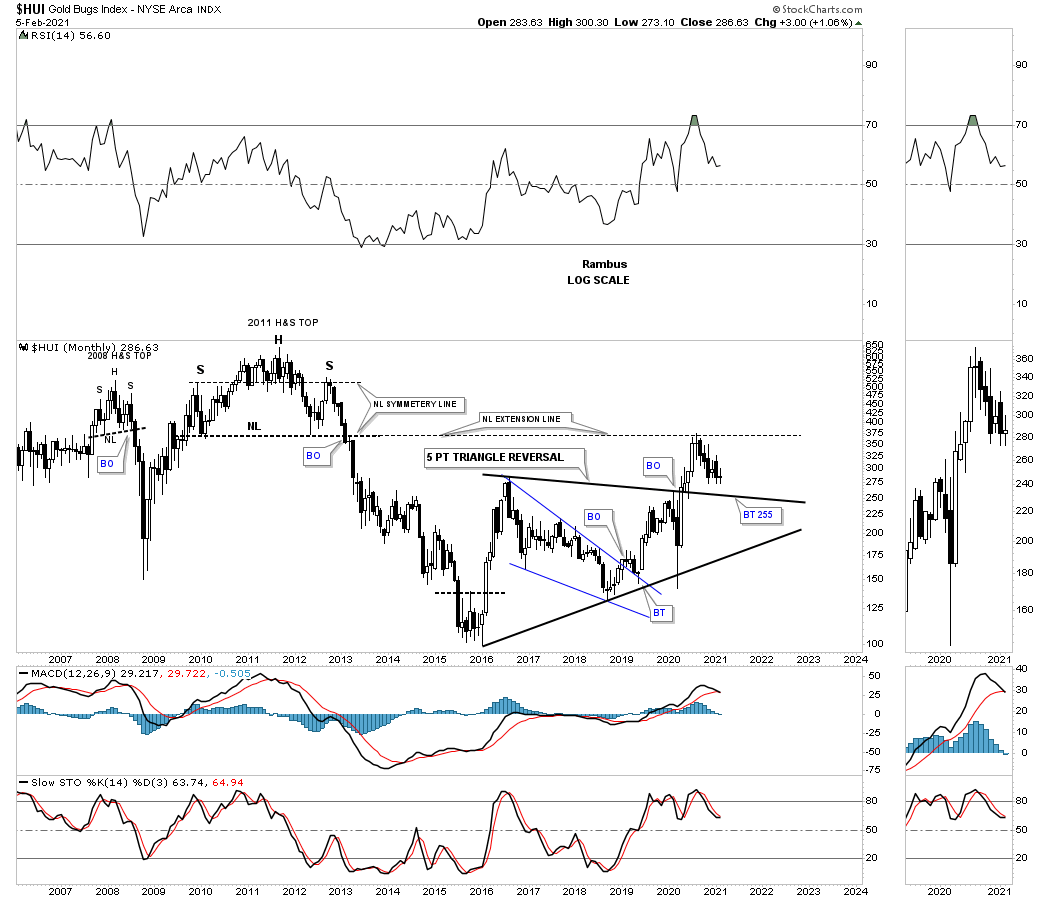
Below is a shorter term monthly chart showing the bear market and the 5 point triangle reversal pattern that ended the bear market.
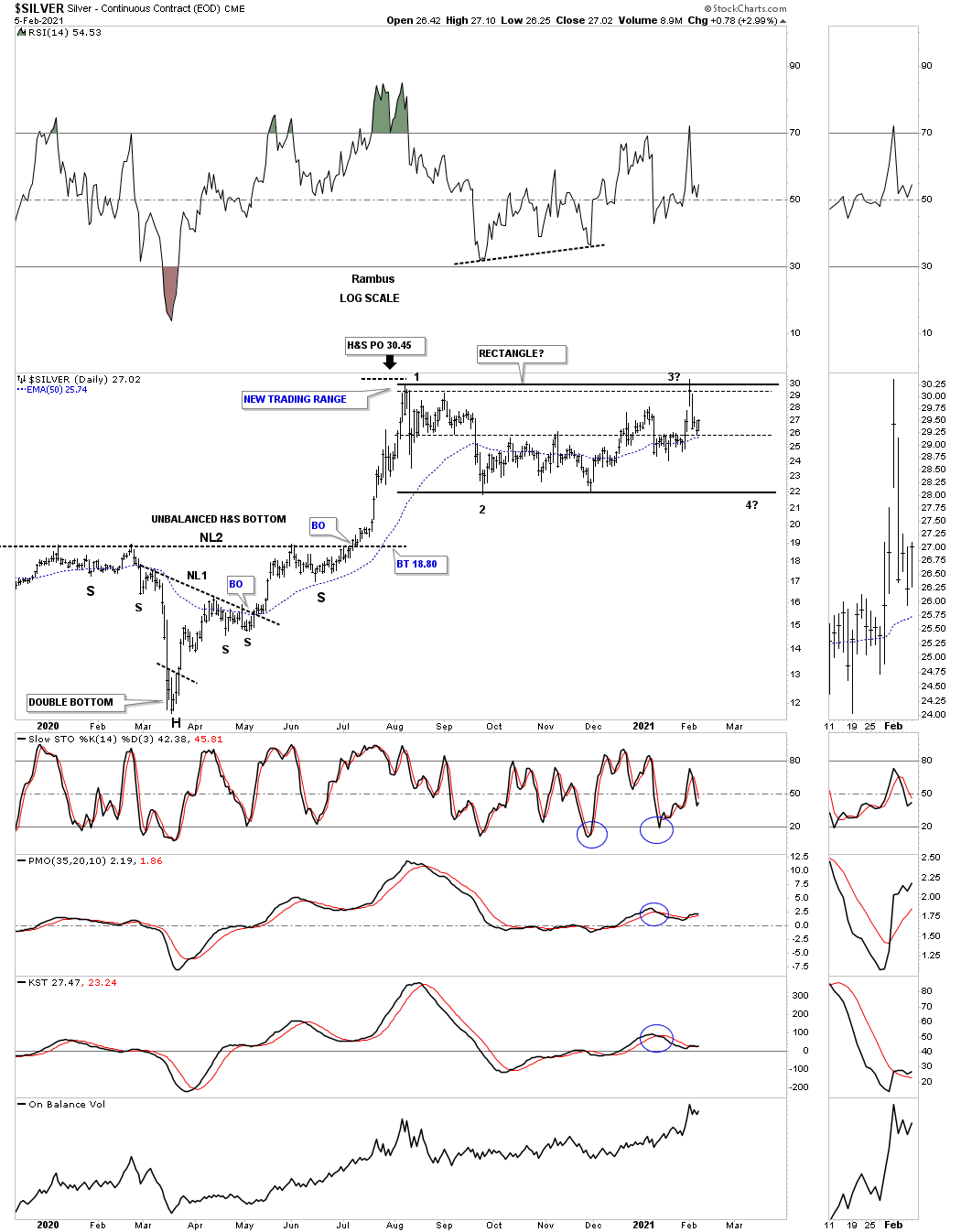
This daily chart for Silver shows the 2020 crash low which formed a H&S bottom that had a price objective up to reversal point #1 in the horizontal trading range that has been forming ever since. Currently the price action is trading right in the middle of the August 2020 trading range which doesn’t represent a low risk entry point either way bullish or bearish. Maybe in a week or 2 depending on what Silver does. The August trading range in now becoming more apparent in how it may finish out the consolidation phase.
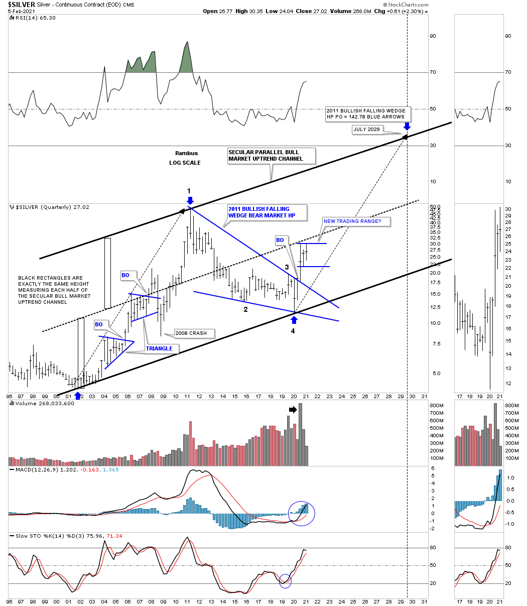
Silver’s secular bull market uptrend channel.
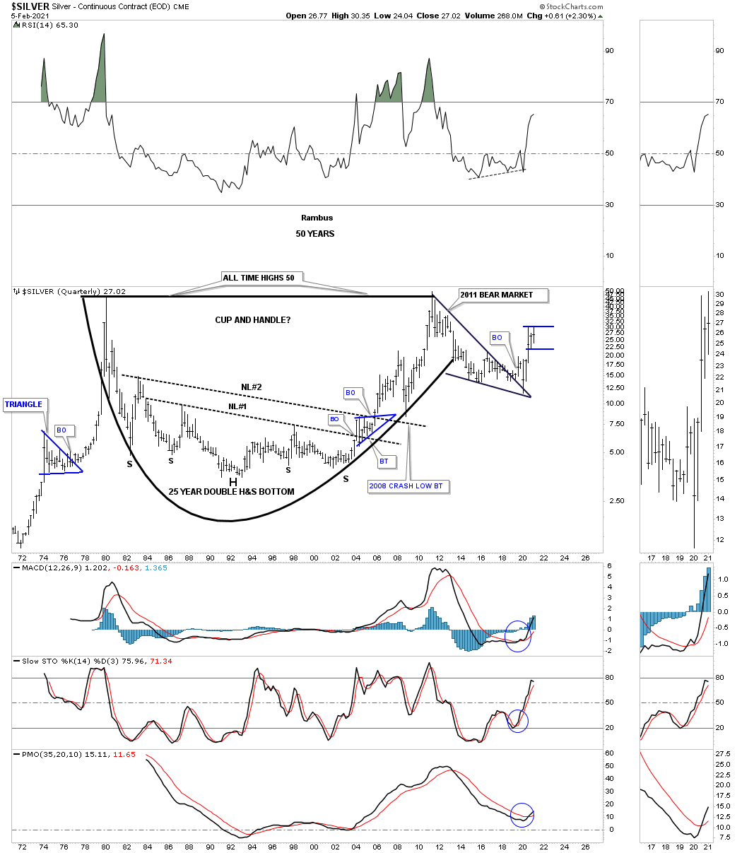
Silver’s potential cup and handle with the current blue trading range under construction. Note the very symmetrical 25 year double H&S bottom with a breakout and backtest to both necklines.
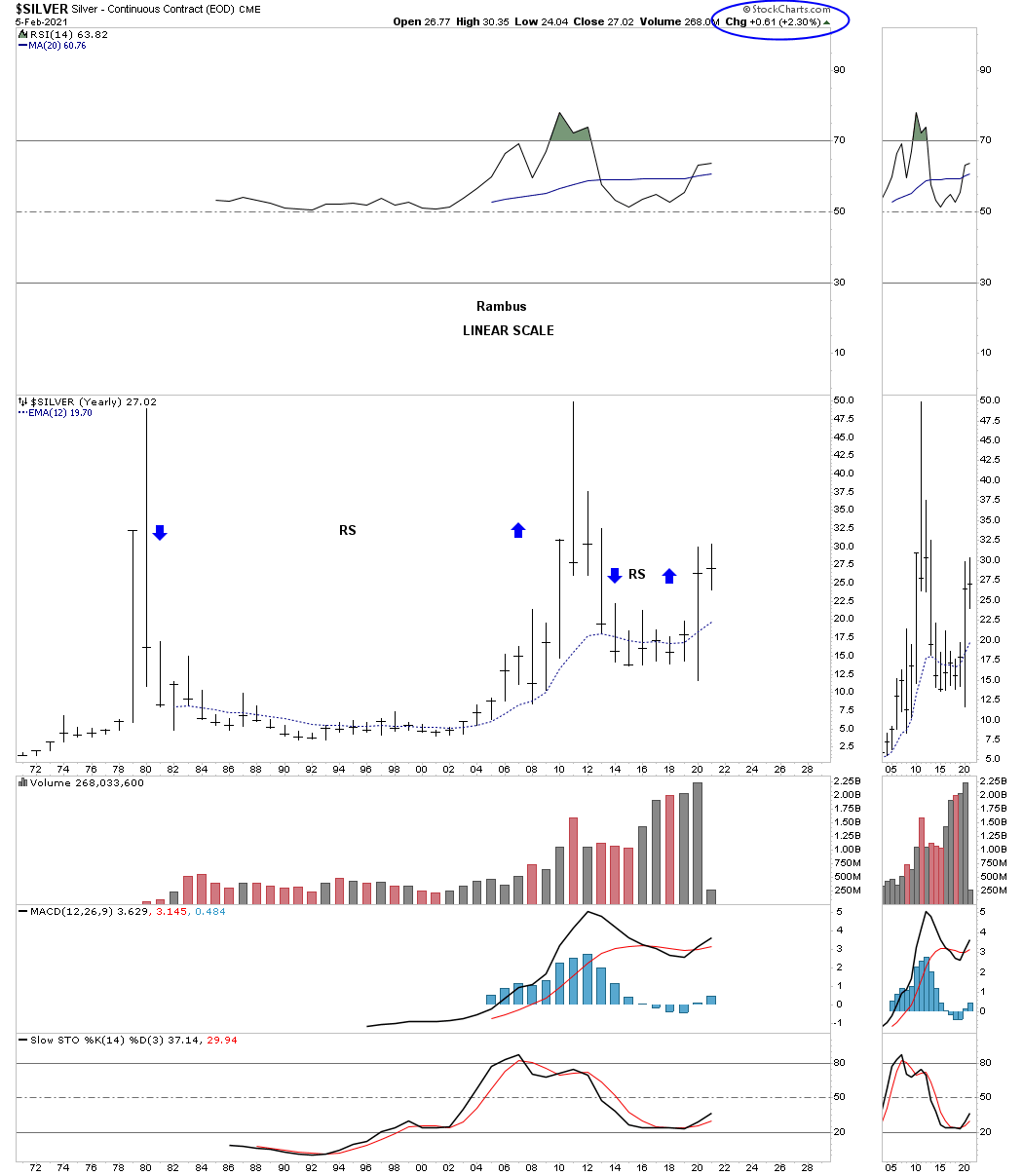
Silver’s yearly bar chart for perspective with each bar showing one year of price action.
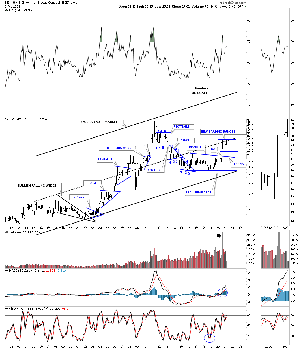
This last chart for Silver shows its secular bull market uptrend channel with the 2011 bear market bullish falling wedge which I’m viewing as a halfway pattern. The biggest problem most investors face in any bull market is the time component. Just because there is a bull market most of the time the price action is building out some type of consolidation pattern which will lead to the next impulse move higher. I’ve mentioned this so many times in the past that the job of a consolidation pattern is to wear you out and is no fun when the price action chops around for weeks or months at a time going nowhere fast.
A good example of this is the first blue triangle consolidation pattern that formed just after the initial impulse move up out of the 2001 low on this quarterly bar chart. That first consolidation pattern that formed during the first leg up in Silver’s new secular bull market took right at 7 quarters to complete which represents a little over 2 years of consolidation before the 2nd impulse move in the secular bull market began. It is the impulse move that is so much easier to trade than a consolidation pattern.
After one year of the impulse move up it was time to consolidate those gains and Silver formed its 2nd consolidation pattern which was another 7 quarter blue triangle. After the breakout the price action looked good with the new impulse move up until everything crashed, stock markets, commodities and the PM complex into the 2009 crash low.
Now lets look to the right side of the chart and our current trading range that is now in its 3rd quarter of construction. There is no law that says this current trading range has to take 7 quarters to complete, but time wise it should take longer than 3 quarters especially if you look at the size of the first impulse move out of the March 2020 crash low. At a bare minimum I would at least expect to see one more move down toward the bottom of the trading range to put in a solid 4th reversal point. How long that takes is anyones guess at this point.
The main point to understand about this long term quarterly chart for Silver is the very strong breakout move above the to rail of the 2011 bear market bullish falling wedge on a massive increase in volume. The stronger a breakout move out of any consolidation pattern, sends a very strong message that you can expect a powerful impulse move higher. The hard part is to have the patience and understanding to know what is happening in real time. For many investors that did well during the impulse move end up giving most of their profits back thinking they can out smart the markets while trading inside of the consolidation pattern. I’m not saying it can’t be done, its just so much harder than holding on during an impulse move.
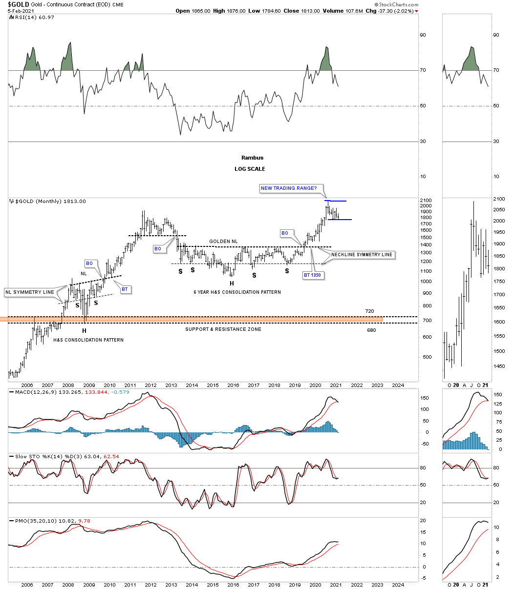
This long term monthly chart for Gold shows you many examples of multiple month consolidation patterns that formed in Golds first leg up in its secular bull market which shows a classic bull market. The red arrows show the tops of each consolidation pattern while the black arrows shows how the top of each consolidation pattern held support on a backtest. On the right hand side of the chart you can see our current trading range still under construction still finding support on top of the 2012 rectangle.
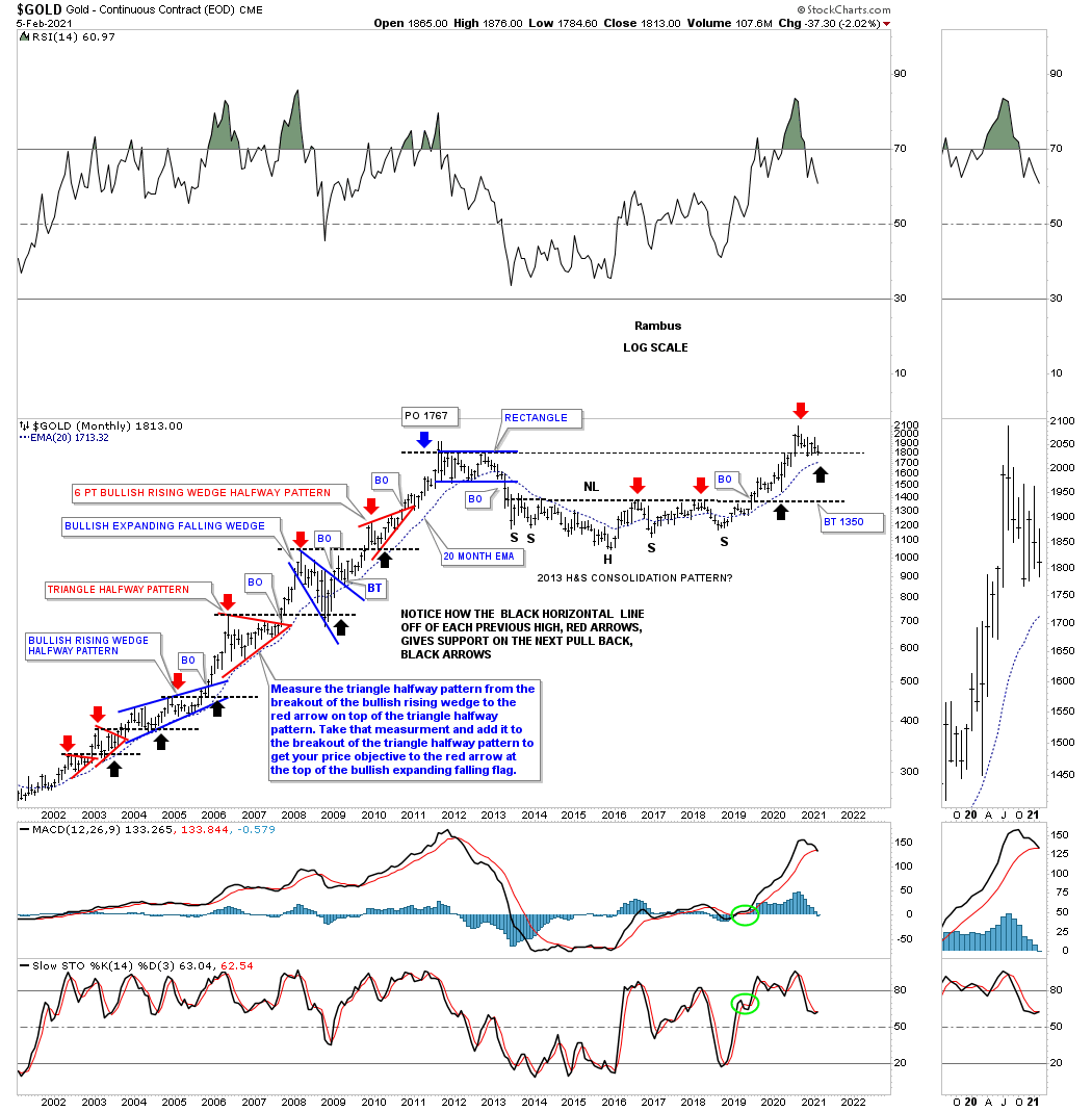
This monthly chart for Gold shows the golden neckline with the current trading range in blue forming. We still don’t know what type of consolidation pattern will finally show itself. We could see a bull flag with lower highs and lower lows or a triangle of some kind but what we do know is that whatever consolidation pattern finally shows its hand there will be no doubt that the impulse move will take Gold up into new all time high territory.
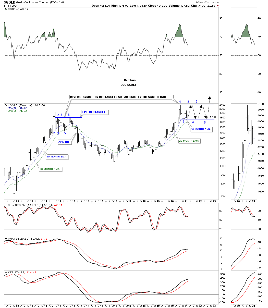
Is it possible that Gold could build out a reverse symmetry rectangle similar to the one it formed in 2012? The price action is current sitting on the 10 month ema which is showing up at the bottom of the potential new trading range.
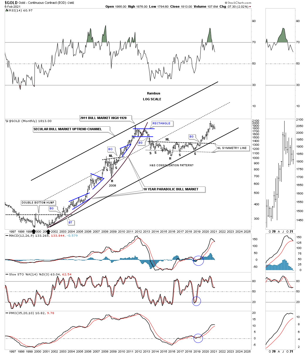
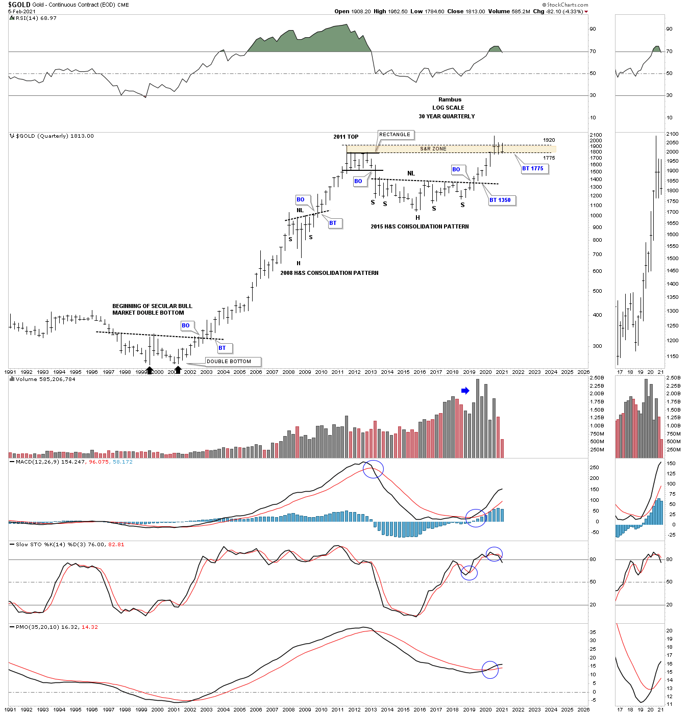
We’ve looked at the secular bull market for the HUI and Silver now its time to look at Gold’s secular bull market. Note how much smaller our current trading range is compared to those in the first led up in Gold’s secular bull market. Again, there is no law that says there has to be a one year plus consolidation pattern but the odds are suggesting one.
If Gold can close the first quarter of 2021 at or above the old 2011 high that would be a very bullish development because if support holds on a quarterly chart that is usually very important support as you can see at the bottom of the 2008 crash low
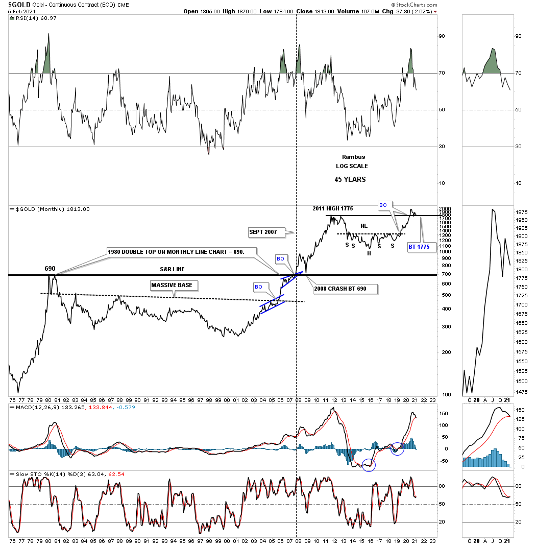
This last chart for tonight is another long term quarterly chart for gold which compares that massive double bottom bear market low to the multi year H&S consolidation pattern. The brown shaded S&R zone is still holding support. Remember the bigger the trading range the bigger the impulse move. Enjoy the Super Bowl and all the best…Rambus
About the author
