
Despite everything going on in the background—rising interest rates, inflation, Fed tightening, wars, tariffs, and perceived overvaluations—the stock market keeps climbing its wall of worry. The market's worry has been choppy the past few weeks. This past week, the NASDAQ made fresh all-time highs. No other index followed. The climb has been narrow, led by a number of AI stocks. Therein lies the problem. Indicators signal trouble ahead, but the market continues to surprise. We take a look at a few of these technical indicators. Irrespective of the indicators signaling trouble, none of this should be taken to mean that the market is about to collapse. For that, we must look at support levels, and as long as we hold those levels, we head higher.
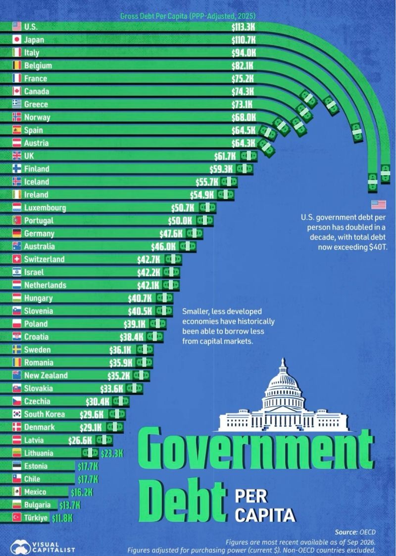
Looking at GDP per capita is a popular economic indicator. But what about debt per capita? We came across an interesting chart that examines debt per capita. It's our chart of the week.
This past week, stock markets were mixed, although mostly up by a small margin. Gold faltered again, challenged by higher interest rates and a surging US$ Index. The market is forecasting that the Fed will continue to tighten. The result is that bond yields have surged to 20+ year highs. Higher yields and inflation can be passed on to customers relatively quickly by retailers such as Loblaw Companies Limited that reported increased gross profit, higher operating income, and stronger earnings before income taxes, pays a dividend and is held in the Enriched Capital Conservative Growth Strategy.* Oil prices eased this past week again. Well, at least WTI oil. Brent gained. The spread between the two widened. A proposed peace agreement between Iran and the U.S. was rejected by the U.S. The Strait of Hormuz remains closed. Trouble continues in the Red Sea and the Bab-el-Mandeb Strait remains somewhat closed, especially for Saudi oil.
This coming week we're up in Ottawa for an economic conference. We hope to get a shortened Scoop out.
It's fall. Lovely weather. Have a great week.
DC
* Reference to the Enriched Capital Conservative Growth Strategy and its investments, celebrating an
8.6 - year history of 193% growth (annual 13.33%) to August 31, strong alpha and second August ranking at www.emergingmanagers.ca, is added by Margaret Samuel, President, CEO and Portfolio Manager of Enriched Investing Incorporated, who can be reached at 416-203-3028 or msamuel@enrichedinvesting.com This information should not be construed as an offer, or a solicitation of an offer or sale of any security. Past performance does not guarantee future returns.
“The oil can is mightier than the sword.”
—Everet Dirksen, American politician, representative Illinois 1933–1949, senator Illinois 1951–1969, Republican party; 1896–1969
“Practically every environmental problem we have can be traced to our addiction to fossil fuels, primarily oil.”
—Dennis Weaver, American actor, president Screen Actors Guild 1973–1975, best known for television roles Gunsmoke (1955–1975), McCloud (1970–1977); 1924–2006
“The truth is, about the Middle East is, had there been no oil there, it would be like Africa. Nobody is threatening to intervene in Africa.”
—Wesley Clark, retired U.S. army officer, 1966–2000, attained rank of general, supreme Allied commander Europe NATO (1997–2000); b. 1944
Let’s get technical. The stock market has long played a role in the development of technical analysis. One of the more famous books about technical analysis and the stock market is Technical Analysis of Stock Trends, by Robert D. Edwards and John Magee. There are, of course, many others. But the Edwards/Magee book is considered a bible. The book was written in the mid-20th century but retains its relevance and importance to this day.
So why technical analysis? The fundamental analyst wants to find intrinsic value. The technical analyst is looking at price trends and chart formations. Chart formations are the language of the market. While the fundamental analyst pores over financial statements and the economy, the technical analyst can largely ignore all of that, focusing on price charts and volume.
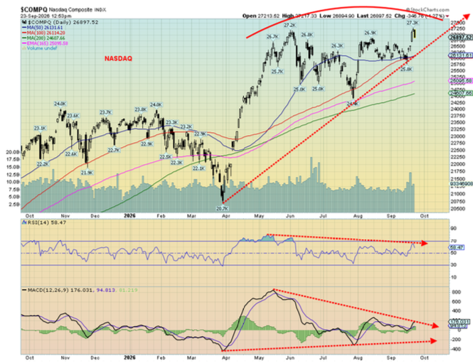
So, with that in mind, we look at a few charts of the NASDAQ. Our first chart shows the NASDAQ in an uptrend that may be topping or may be bottoming. Charts like that are a dilemma. Topping because we’ve had thrusts to highs on mostly reduced volume, but each time the NASDAQ falls back. Bottoming because the NASDAQ has the potential look of a head and shoulders bottom pattern with the left shoulder’s low in May/June 2026, a lower low (head?) in July 2026, and more recently a possible right shoulder formed with, so far, a higher low than the left shoulder.
A few clues hint to us they may be a topping pattern. First, we note the sell-off in May/June was on increased volume whereas the return action was on reduced volume. Sellers appear to be trying to take control. Second, the indicators are diverging with the price action. There are numerous indicators largely based on price and even volume. They are mathematical formulas. Two of the most common are the Relative Strength Index (RSI) and the Moving Average Convergence/Divergence (MACD). The RSI is a momentum indicator that tries to measure overbought and oversold conditions. The MACD tries to identify price trends by examining the moving averages of the price. In both cases, as with many other indicators, the technical analyst looks for divergences between the price action of the stock, index, etc. and the indicator. At tops, we see rising tops but lower indicators; at bottoms, we see the opposite.
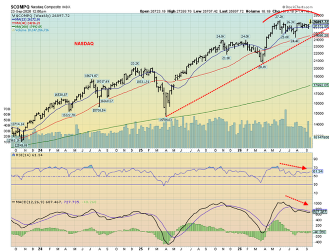
With the NASDAQ, we saw both the RSI and MACD topped in the May/June period with the price but subsequent thrusts higher for the price were met with lower indicators – a divergence. It shows up on the weekly chart as well with the price trying to move higher but the indicators moving lower. No, it’s not a guarantee the market will fall, but it indicates that the odds favour a downside break.
Source: www.stockcharts.com
Once a downtrend is underway, we look for support zones, previous lows, and the moving averages. On daily charts, the common moving averages to follow are the 50-, 100-, and 200-day MAs. A break of any one of them suggests a move lower. They are also support so if they fail to firmly break, the market could return to the upside.
Previous lows are also important. So, we look at the most recent daily, weekly, and monthly low. If they break, then the odds favour a further move lower.
Source: www.stockcharts.com
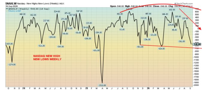
There are other indicators we look at to see if they confirm what we might be seeing with the RSI and MACD above. One we look at is new highs/new lows. The indicator simply takes the number of new highs less the new lows and creates a trend line. As long as the market is moving higher and the new highs/new lows line is moving higher, we know we are in sync. However, in the following case, the market is trying to move higher, but the new highs/new lows index is moving lower. That tells us that, despite the market making new highs as the NASDAQ did recently, more stocks are making new lows than are making new highs. That’s another negative divergence.
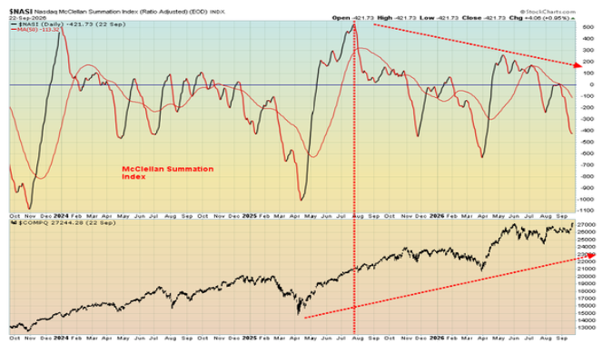
Another favourite is the McLellan Summation (ratio-adjusted) index also known as the RASI or in the case of the NASDAQ the NASI. It’s a cumulative long-term market breadth indicator based off the McClellan Oscillator. Without going into mathematical details, values above zero show positive momentum and below zero show negative momentum. The indicator is showing negative momentum, currently at negative 548. It’s also diverging, making new lows as the market tries to make new highs. That’s another warning sign that the market is weakening and a fall could follow.
Source: www.stockcharts.com
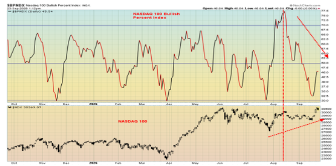
The Bullish Percent Index is another breadth indicator that measures the percentage of stocks within an index that are showing bullish momentum vs. bearish momentum. The index fluctuates between 0 and 100. Overbought is over 70, while oversold under 30. Currently, the bullish percent index is showing bearish momentum under 50 but it’s not yet oversold. Readings below 50 favour the bears. Over 50, they favour the bulls. It’s also been falling, even as the NASDAQ Index is trying to move higher.
Source: www.stockcharts.com
Source: www.stockcharts.com
Our conclusion is we are seeing a lot of negative signs that suggest the market could be poised for a fall. Or, as they say, batten down the hatches. Will the market crash? Or just grind lower? That is harder to determine. A crash needs a catalyst. An out-of-the-blue event no one expected is also known as a Black Swan event. That sparks panic and fear. It could be interest rates, a debt crisis, a geopolitical event, an economic crisis, or a foreign exchange crisis. Those who carry leveraged positions are the most vulnerable. It also triggers mathematical algorithms that also spark a wave of selling. A grinding market decline is just that as the market moves relentlessly lower but doesn’t crash.
The warning? Be prepared. The indicators are suggesting a decline coming. But it doesn’t guarantee one.
Chart of the week
Source: www.visualcapitalist.com, www.oecd.org
Debt, debt, debt. Debt might yet turn out to be the defining disaster of our generation. There is too much debt and it keeps on rising. It wasn’t that long ago global debt was quoted at $343 trillion. Now it’s $365 trillion and it continues to rise. The U.S. leads the world with $115.5 trillion of debt (governments, corporations, and households). That’s 31.6% of all debt. The U.S. has only 4.3% of the world’s population.
Debt is one of the defining risks of our time. Major debt crises of the past fifty years include the Latin-American debt crisis (1980s), the Asian financial crisis (1997), the financial crisis and Great Recession (2007–2009), and the European debt crisis (2009–2012). Today we note that over 50 countries are experiencing debt problems. Many of them are in sub-Saharan Africa, smaller countries in Latin America, several stressed countries in Asia such as Afghanistan and Pakistan, and in Europe, Belarus and Ukraine. And we haven’t even noted corporations, banks, and more.
Not helping all these countries is the sharp rise in interest rates. For many of the developing countries that are debt-stressed, their debt is in U.S. dollars. But their currency has deteriorated sharply against the U.S. dollar. The result is they owe even more. In the U.S., interest on the federal debt has soared past $1.1 trillion and it’s rising, especially considering their budget deficit is now $1.8–$2.0 trillion. That’s some 6% of GDP.
What can they do? Raise taxes? Cut programs? Rapidly expand the money supply (inflationary)? Devalue the currency? None of them are palatable. What happens? Investors lose confidence, demanding higher interest rates on the debt. A loss of confidence in a country’s bonds could lead to a crisis. It’s one thing if that country is Angola or Belize. It’s another if it is the U.S., U.K., France, or Japan. All have government debt that exceeds GDP.
None of this says that major countries are about to collapse. One must look at the overall picture. The currency, interest rates, economic growth, tax base, maturity of debt and how much debt is held domestically vs. foreign held also matter.
We are quite used to reading about GDP per capita. Less so about debt per capita. The table on the previous page outlines debt per capita by country on a Purchasing Power Parity (PPP) basis, as of 2025. Leading the way is no surprise, really: the U.S. at $113.3 thousand. Rounding out the top five are Japan at $110.7 thousand, Italy at $94.0 thousand, Belgium at $82.1 thousand, and France $75.2 thousand. Canada is number six at $74.3 thousand. For Canada that includes not only federal debt but also provincial debt.
Something to note: if the population rises faster than the debt (percentagewise), the debt per capita goes down. It works the same way with GDP. If the population rises faster than the GDP, GDP per capita falls. Canada experienced that with a surge in immigration causing the population to rise faster than GDP (percentagewise) resulting in falling GDP per capita.
We put together a table outlining the debt per capita, GDP per capita (all on a PPP-adjusted basis) for the G7 plus a few select others. Notably, Japan, has the biggest debt problem with a negative differential of negative $62.4 thousand between debt/capita and GDP/capita. Surprisingly, Russia has the best position with a positive gap of $41.9 thousand between debt/capita and GDP/capita. Note: all are on a PPP-adjusted basis.
Government debt/capita vs. GDP/capita PPP-basis 2025
|
Country |
Debt/capita (PPP) ($ thousands) |
GDP/capita (PPP) ($ thousands) |
Differential ($ thousands) |
|
U.S.A. |
$113.3 |
$76.9 |
($36.4) |
|
Japan |
$110.7 |
$48.3 |
($62.4) |
|
Germany |
$47.6 |
$62.8 |
$15.2 |
|
U.K. |
$61.7 |
$54.0 |
($7.7) |
|
France |
$75.2 |
$55.1 |
($20.1) |
|
Italy |
$94.0 |
$53.6 |
$40.4 |
|
Canada |
$74.3 |
$58.0 |
($16.3) |
|
China |
$13.0 |
$28.5 |
$15.5 |
|
India |
$2.4 |
$13.6 |
$11.2 |
|
Russia |
$3.1 |
$45.0 |
$41.9 |
Source: www.tradingeconomics.com, www.visualcapitalist.com, www.oecd.org
Dollar values in bold = highest
Markets and Trends
|
|
|
|
% Gains (Losses) Trends |
|
||||
|
|
Close Dec 31/25 |
Close Sep 25/26 |
Week |
YTD |
Daily (Short Term) |
Weekly (Intermediate) |
Monthly (Long Term) |
|
|
|
|
|
|
|
|
|
||
|
S&P 500 |
6,845.50 |
7,743.41 |
1.2% |
13.1% |
up (weak) |
up |
up |
|
|
Dow Jones Industrials |
48,063.29 |
51,828.62 |
0.3% |
7.8% |
down |
up (weak) |
up |
|
|
Dow Jones Transport |
17,357.19 |
19,572.22 |
(2.5)% |
12.8% |
down |
down (weak) |
up |
|
|
NASDAQ |
23,241.99 |
27,068.72 (new highs) * |
2.1% |
16.5% |
up |
up |
up |
|
|
S&P/TSX Composite |
31,712.76 |
35,800.89 |
flat |
12.9% |
down |
up |
up |
|
|
S&P/TSX Venture (CDNX) |
987.74 |
921.01 |
(0.2)% |
(6.8)% |
down |
down |
up |
|
|
S&P 600 (small) |
1,467.76 |
1,683.26 |
(0.5)% |
14.7% |
down |
neutral |
up |
|
|
ACWX MSCI World x US |
67.18 |
76.87 |
0.8% |
14.4% |
down |
up |
up |
|
|
Bitcoin |
87,576.98 |
83,862.11 |
3.3% |
(4.2)% |
up |
up |
neutral |
|
|
|
|
|
|
|
|
|
|
|
|
Gold Mining Stock Indices |
|
|
|
|
|
|
|
|
|
Gold Bugs Index (HUI) |
701.49 |
786.02 |
(2.4)% |
12.1% |
neutral |
neutral |
up |
|
|
TSX Gold Index (TGD) |
817.76 |
936.31 |
(1.9)% |
14.5% |
neutral |
up (weak) |
up |
|
|
|
|
|
|
|
|
|
|
|
|
Bonds% |
|
|
|
|
|
|
|
|
|
U.S. 10-Year Treasury Bond yield |
4.17% |
5.17% |
3.4% |
24.0% |
|
|
|
|
|
3.3Cdn. 10-Year Bond CGB yield |
3.44% |
3.93% |
1.3% |
14.3% |
|
|
|
|
|
Recession Watch Spreads |
|
|
|
|
|
|
|
|
|
U.S. 2-year 10-year Treasury spread |
0.69% |
0.30% |
25.0% |
(56.5)% |
|
|
|
|
|
Cdn 2-year 10-year CGB spread |
0.85% |
0.59% |
5.4% |
(30.6)% |
|
|
|
|
|
|
|
|
|
|
|
|
|
|
|
Currencies |
|
|
|
|
|
|
|
|
|
US$ Index |
98.26 |
101.04 |
0.9% |
2.8% |
up |
up |
down (weak) |
|
|
Canadian $ |
72.87 |
70.71 |
(1.1)% |
(3.0)% |
down |
down |
down (weak) |
|
|
Euro |
117.48 |
113.93 |
(0.8)% |
(3.0)% |
down |
down |
up |
|
|
Swiss Franc |
126.21 |
120.70 |
(0.8)% |
(4.4)% |
down |
down |
up (weak) |
|
|
British Pound |
134.78 |
132.46 |
(1.1)% |
(1.7)% |
down |
down |
up |
|
|
Japanese Yen |
63.83 |
63.57 |
(0.3)% |
(0.4)% |
neutral |
neutral |
down |
|
|
|
|
|
|
|
|
|
|
|
|
Precious Metals |
|
|
|
|
|
|
|
|
|
Gold |
4,311.97 |
4,283.70 |
(2.3)% |
(0.7)% |
down (weak) |
down (weak) |
up |
|
|
Silver |
71.16 |
64.20 |
(3.4)% |
(9.8)% |
down (weak) |
down |
up |
|
|
Platinum |
2,046.90 |
1,778.40 |
(1.6)% |
(13.1)% |
down (weak) |
down (weak) |
up |
|
|
|
|
|
|
|
|
|
|
|
|
Base Metals |
|
|
|
|
|
|
|
|
|
Palladium |
1,619.50 |
1,276.50 |
(3.2)% |
(21.2)% |
down |
down |
up (weak) |
|
|
Copper |
5.64 |
6.70 (new highs) * |
0.9% |
18.8% |
up (weak) |
up |
up |
|
|
|
|
|
|
|
|
|
|
|
|
Energy |
|
|
|
|
|
|
|
|
|
WTI Oil |
57.44 |
92.44 |
(7.1)% |
60.9% |
up |
up |
up |
|
|
Nat Gas |
3.71 |
3.19 |
10.0% |
(14.0)% |
up |
neutral |
neutral |
|
Source: www.stockcharts.com
* New All-Time Highs
Note: for an explanation of the trends, refer to the glossary at the end of this article.
New highs/lows refer to new 52-week highs/lows and, in some cases, all-time highs.
Stocks
Source: www.stockcharts.com
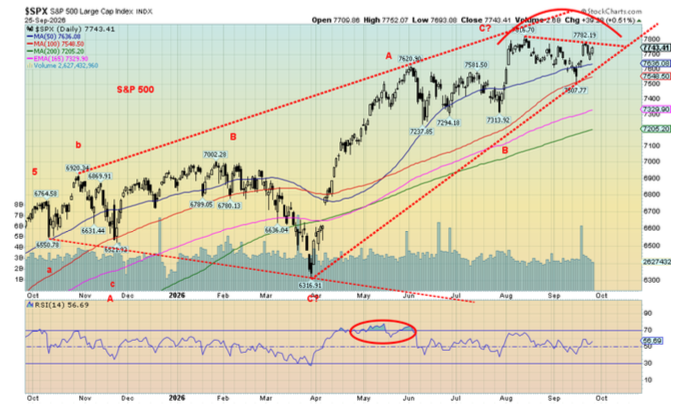
Who cares about rising interest rates? Who cares about the conflicts in the Middle East and Russia/Ukraine? Who cares about the deteriorating domestic situation in the U.S? The stock market climbs a wall of worry, and this past week was no exception. But it wasn’t clean. The NASDAQ, led by AI stocks, made all-time highs. The S&P 500 didn’t. The Dow Jones Industrials (DJI) was weak.
Yes, you read that right. While the NASDAQ was gaining 2.1% to all-time highs, the DJI posted a feeble gain of 0.3%. The S&P 500 gained 1.2%. The Dow Jones Transportations (DJT) was pressured by higher interest rates and high oil prices fell 2.5%. AI led the way with the NY FANG Index up 2.8%, also to new all-time highs. No surprise that a few MAG7 stocks made all-time highs. Joining the party was Meta, up 12.9%, and Apple, up 1.5%. Others making all-time highs were Advanced Micro (AMD), up 12.7%, and CrowdStrike, up 6.1%. The MAG7 ETF MAGS also made all-time highs, up 3.1%. Too bad the rest of the market didn’t get the message as the advance, as we have noted, was narrow, led by a few while the majority languished or fell. Not all high-tech stocks were happy as Baidu fell 2.9% to new 52-week lows.
Elsewhere, the S&P 400 (Mid) fell 0.1% while the S&P 600 (Small) dropped 0.5%. The S&P 500 Equal Weight Index continues to exhibit weakness in the broader market as it fell 0.2%. Bitcoin continued its recent rise up 3.3%, although it remains down on the year.
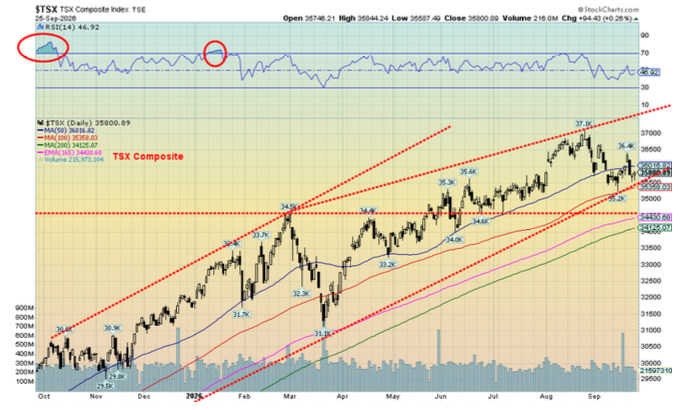
In Canada, the TSX Composite was flat due to weakness for the material stocks but held up by a strong up move of 6.7% by the TSX Information Technology Index (TTK). The TSX Venture Exchange (CDNX) continued its recent woes, down 0.2%. Of the TSX’s 14 sub-indices, eight were down while six were up. Telecommunications (TTS) fell 4.2%.
In the EU, the London FTSE rose 0.3%, the Paris CAC 40 was up 0.2%, the German DAX was up 0.4%, and he EuroNext gained 0.7%. All were up despite beating war drums in the background. In Asia, China’s Shanghai Index fell 0.6%, the Tokyo Nikkei Dow (TKN) was up 2.1%, Hong Kong’s Hang Seng (HSI) fell 1.0%, while India’s Nifty Fifty dropped 0.9%. Some strength in the EU, weakness in Asia, and mixed in North America.
Source: www.stockcharts.com
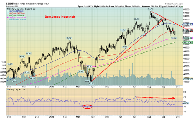
As our opening essay noted, we continue to see weakness in the North American stock markets. No, that doesn’t mean they are about to collapse tomorrow, but we are just seeing too many divergences. The NASDAQ making all-time highs while the others are not potentially is a sign of weakness. The DJI has been weaker than either the S&P 500 or the NASDAQ. The DJI is on a sell signal. And it’s the blue-chip stocks. Yet four of the MAG7 are in the DJI – Amazon, Apple, Microsoft, and Nvidia. The DJI and the DJT continue to make significant divergences. Dow Theory says the indices are supposed to confirm each other. The DJT is falling, leading the down pack.
The S&P 500 breaks under 7,500 and especially under 7,300. The DJI, that we are showing instead of the NASDAQ, has broken under 51,600. Major support is at 50,000 and the 200-day MA. The TSX breaks under 35,000. New highs keeps the wall of worry rising.
Source: www.stockcharts.com
Yet here we are marching towards the crucial mid-terms that continue to suggest the Democrats will win. But stories persist that Trump and the Republicans won’t let that happen. Then what? Interest rates are rising. Inflation persists. The debt keeps on growing. The wars threaten to expand, which could in a worst-case scenario result in global war; i.e., World War III. Outbreaks of war in World War I and World War II resulted in bear markets. Are things different this time? Hardly.
Bonds
Source: www.tradingeconomics.com, www.home.treasury.gov, www.bankofcanada.ca
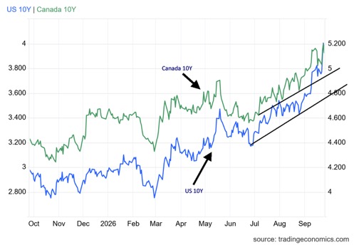
Bond yields have soared to the highest level seen since 2004. This past week the U.S. 10-year Treasury note leaped to 5.17%, up 17 bp on the week. The Canadian 10-year Government of Canada bond (CGB) was up to 3.93%, up only 5 bp from the previous week. The U.S. 30-year Treasury bond jumped to 5.50%, up 20 bp on the week. With interest on the U.S. debt already over $1.1 trillion, it’s about to go even higher.
Bond auctions this past week were poorly received. Demand was weak. Results were even weaker. A hawkish Fed, economic numbers that won’t die, fears of higher inflation, continued tensions in the Middle East, and the Russia/Ukraine conflict all played a role. Manufacturing indices out this past week came in above expectations, even as consumer sentiment fell from the previous month.
The pressure for higher interest rates remains. History shows that the Fed is usually never one and done with rate hikes. More are sure to follow. Where that leaves President Trump and his screams for 1% interest rates is unknown. Will he attempt to fire Kevin Warsh, his own appointee? Note: he doesn’t have that authority.
Gold and silver
Source: www.stockcharts.com
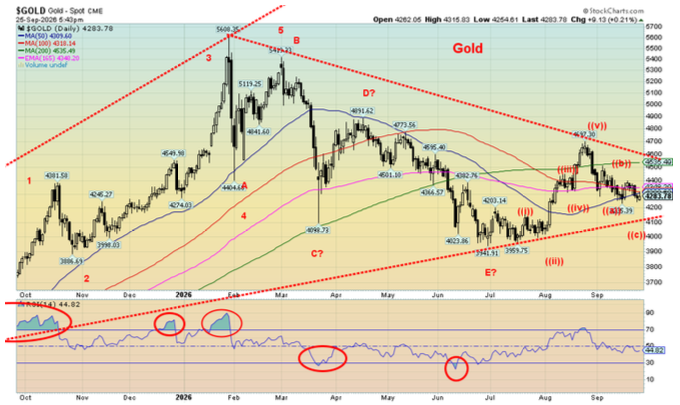
Gold prices continue to struggle due to two prime reasons: interest rates keep chugging higher and the US$ Index keeps chugging higher. The conflict in the Gulf is unresolved and continues to show signs that a solution is far away. The Strait of Hormuz remains shut and the Bab-el-Mandeb Strait remains mostly closed as well. The price pressure for oil and gas is to the upside. That’s inflationary and ensures prices will remain elevated. The consensus is that the Fed will hike rates again, despite the rantings of the president. U.S. economic data remains unexpectedly stronger than expected.
All that begs the question, why gold? Well, $365 trillion of global debt remains a prime reason. The U.S.’s $40 trillion federal debt and yearly budget deficits of upwards of $2 trillion is another reason. The fear of a global debt crisis remains.
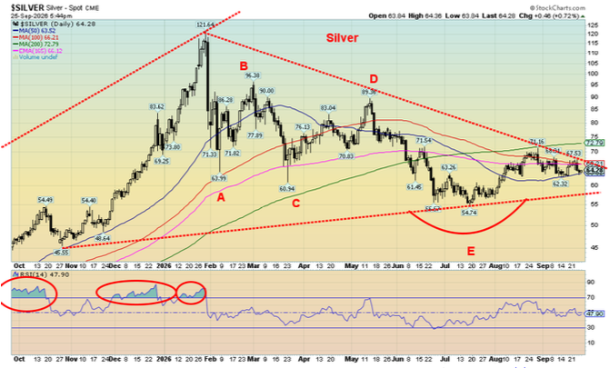
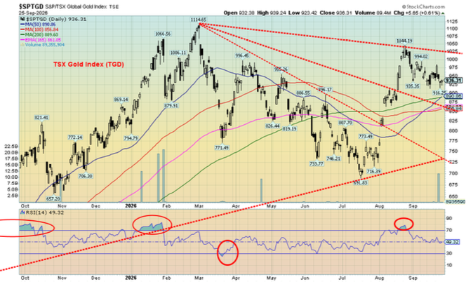
Is all this a gold bull trap? Right now, the expectation is that gold will continue its recent decline, even though it’s a very slow decline. This past week gold fell 2.3%, silver dropped 3.4%, and platinum was off 1.6%. All three are down on the year with gold off 0.7%, silver down 9.8%, and platinum down 13.1%. Palladium also fell 3.2% this past week and is down 21.2% in 2026. But copper, which we view as a leading indicator, made new all-time highs, up 0.9% in the week and up 18.8% on the year. The gold stocks, despite a pullback this past week, remained up on the year. The Gold Bugs Index (HUI) fell 2.4% this past week but is up 12.1% in 2026 and the TSX Gold Index (TGD) dropped 1.9% but is up 14.5% in 2026.
Source: www.stockcharts.com
Our line in the sand for gold is down at $4,100. We believe that needs to hold. Under $4,000 a bigger drop could get underway. To the upside, $4,600 is elusive. Above $4,700 we should get an uptrend under way. For silver, the danger point is a drop under $58. The upside remains elusive, but we need to break above $72 before we’ll feel more comfortable. The TGD continues to form what looks like a huge fan pattern, but the breakout doesn’t come until we are above 1,025. Above 1,050 things look better.
Pressure from rising interest rates, a rising US$ Index, and thoughts the Fed has more hikes in mind will keep some pressure on gold prices. Interestingly, during the inflationary 1970s, gold prices rose in tandem with rising interest rates, both the Fed and the 10-year. Notably, however, was that the US$ Index was falling during this period.
The period into December is notably weak for gold prices. But after that we usually get the best upside moves. Bottoms usually occur in mid-December, but we’ve also seen them bottom in November. All this suggests that we could see continued weakness for gold prices going forward but that also doesn’t mean they’ll collapse. $4,100 is important to hold.
Source: www.stockcharts.com
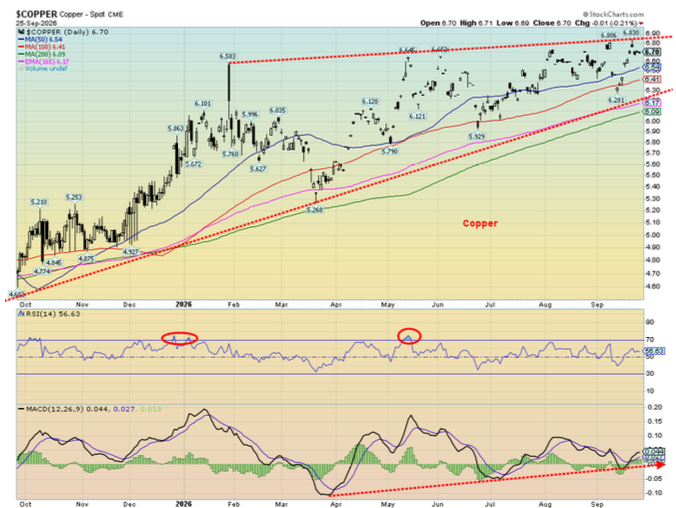
Copper remains in an uptrend. However, there may be overhead resistance at the recent highs near $7. It will be important now to break above $7. The MACD indicator is in a buy mode, and the RSI remains up but nowhere near overbought. Copper continues to be the leader. A note of caution is that while the copper miners remain in an uptrend, we’d have preferred that the Sprott Copper Miners (COPP/NYSE, COPP/TSX) also had made new highs. Like gold, we prefer to see the gold miner’s lead. Freeport McMoran (FCX) remains below its recent all-time highs. FCX is a leading copper company, number two behind the largest BHP Group (BHP).
Source: www.stockcharts.com
Oil and gas
Source: www.stockcharts.com
So, which is it? Peace in our time or just another pause before the shooting gets underway again? Iran has proposed a seven-day deal that would see the Strait of Hormuz open again in return for an end to the U.S. blockade, a ceasefire on all fronts including Lebanon, a restart of nuclear discussions, a lifting of oil sanctions, and an unfreezing of some $12 billion of Iranian assets. Not surprisingly, the U.S. rejected the deal and promised to resume bombing after the mid-terms. They could resume even sooner.
Rumours persist that Iran is running out of money. Yes, they do have a problem, but years of sanctions have already built up a resilient economy. As well, smuggling continues unbated through Iran’s borders with Afghanistan, Pakistan, Turkmenistan, Iraq, possibly even Turkey, Armenia, and Azerbaijan. And let’s not ignore the Caspian Sea, which is a direct route to Russia. Support comes from Russia, China, and possibly others.
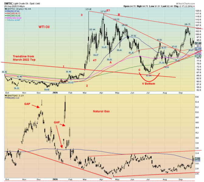
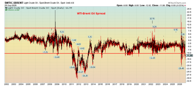
Oil prices were mixed this past week. Brent was up 1.3% while WTI fell 7.1%. Why? Apparently, soaring freight costs in the U.S. as a result of record diesel prices and a proposed ban on diesel exports by the Trump administration would translate into a lower requirement for oil in the U.S. (WTI oil). The spread between Brent and WTI is now $12. No, it’s not a record by any stretch. It hit levels of $26 during the period 2010–2014. It even hit over $20 at the outset of the U.S./Israel/Iran war in February 2026. The record shows that the spread between the two is more likely to favour Brent over WTI. Brent is more sensitive to the ongoing conflicts in the Middle East than is WTI, which is the North American price.
WTI-Brent Oil Spread 2001–2026
Source: www.stockcharts.com
Natural gas (NG) was also mixed this past week as NG at the Henry Hub rose 10% but NG at the EU Dutch Hub fell 10.8%. Yes, even NG fell prey to the supposed opening of talks between the U.S. and Iran. Once those talks fall apart, as they inevitably do, the price is likely to rise once again. Energy stocks, which are more North American-based, saw the ARCA Oil & Gas Index (XOI) fall 4.6% and the TSX Energy Index (TEN) off 2.6%. Both had recently made new all-time highs. That the energy stocks continue to lead the cost of both oil and gas keeps suggesting to us that we will eventually face higher prices.
Despite the recent pullback for WTI oil, the chart remains bullish. A break under $82 would be negative. However, the $105 breakout point remains elusive and is essential to break if we are to go higher. The Strait of Hormuz remains shut irrespective of any claims to the contrary by President Trump. The Houthis have caused the Bab-el-Mandeb Strait to also remain mostly shut. Despite Saudi Arabia supposedly prepared to reopen its East-West Pipeline, it remains vulnerable to attacks from the Houthis as well as Shia militias in Iraq. Saudi Arabia’s refineries also remain targets. The Russia/Ukraine conflict shows no signs of ending soon and here Russian refineries are a target. Calls by the EU and NATO that Russia will attack NATO remain high from the EU, but Russian President Vladimir Putin denies any desire to attack NATO. Nonetheless, there remain fears that war could expand to include NATO.
All of this is a reminder that the price pressure for oil and even gas is to the upside with limitations on the downside.
Copyright David Chapman 2026
GLOSSARY
Trends
Daily – Short-term trend (For swing traders)
Weekly – Intermediate-term trend (For long-term trend followers)
Monthly – Long-term secular trend (For long-term trend followers)
Up – The trend is up.
Down – The trend is down
Neutral – Indicators are mostly neutral. A trend change might be in the offing.
Weak – The trend is still up or down but it is weakening. It is also a sign that the trend might change.
Topping – Indicators are suggesting that while the trend remains up there are considerable signs that suggest that the market is topping.
Bottoming – Indicators are suggesting that while the trend is down there are considerable signs that suggest that the market is bottoming
Disclaimer
David Chapman is not a registered advisory service and is not an exempt market dealer (EMD) nor a licensed financial advisor. He does not and cannot give individualised market advice. David Chapman has worked in the financial industry for over 40 years including large financial corporations, banks, and investment dealers. The information in this newsletter is intended only for informational and educational purposes. It should not be construed as an offer, a solicitation of an offer or sale of any security. Every effort is made to provide accurate and complete information. However, we cannot guarantee that there will be no errors. We make no claims, promises or guarantees about the accuracy, completeness, or adequacy of the contents of this commentary and expressly disclaim liability for errors and omissions in the contents of this commentary. David Chapman will always use his best efforts to ensure the accuracy and timeliness of all information. The reader assumes all risk when trading in securities and David Chapman advises consulting a licensed professional financial advisor or portfolio manager such as Enriched Investing Incorporated before proceeding with any trade or idea presented in this newsletter. David Chapman may own shares in companies mentioned in this newsletter. Before making an investment, prospective investors should review each security’s offering documents which summarize the objectives, fees, expenses and associated risks. Although Artificial Intelligence (AI) may be deployed from time to time, AI output is monitored and adjusted, if necessary, for accuracy. David Chapman shares his ideas and opinions for informational and educational purposes only and expects the reader to perform due diligence before considering a position in any security. That includes consulting with your own licensed professional financial advisor such as Enriched Investing Incorporated. Performance is not guaranteed, values change frequently, and past performance may not be repeated.
About the author


Website: https://www.enrichedinvesting.com
Disclaimer: David Chapman is not a registered advisory service and is not an exempt market dealer (EMD) nor a licensed financial advisor. We do not and cannot give individualised market advice. David Chapman has worked in the financial industry for over 40 years including large financial corporations, banks, and investment dealers. The information in this newsletter is intended only for informational and educational purposes. It should not be considered a solicitation of an offer or sale of any security. The reader assumes all risk when trading in securities and David Chapman advises consulting a licensed professional financial advisor before proceeding with any trade or idea presented in this newsletter. David Chapman may own shares in companies mentioned in this newsletter. We share our ideas and opinions for informational and educational purposes only and expect the reader to perform due diligence before considering a position in any security. That includes consulting with your own licensed professional financial advisor.