
|
|

“The Fed is very smart, but it doesn’t run the markets. In the end, the markets will run the Fed. The markets are bigger than any man or any group of men. The markets can even break a president…”
—Richard Russell, American writer on finance and markets, author of the Dow Theory Letters (1958) covering the stock markets and precious metals markets, quote from the Dow Theory Letters 8/4/04;
1924–2015
“It is totally unproductive to think the world has been unfair to you. Every tough stretch is an opportunity.”
—Charlie Munger, American billionaire, investor, former real estate attorney, vice chairman Berkshire Hathaway, chairman Wesco Financial Corp. (1984-2011), chairman Daily Journal Corp., director Costco; b. 1924
“History must repeat itself because we pay such little attention to it the first time.”
—Blackie Sherrod, American journalist, sportswriter for Temple Telegram, Fort Worth Press, Dallas Times Hearld, Dallas Morning News; 1919–2016
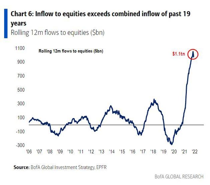
We can only guess that the devil is in the details. Record flows. Yes, that is what we have been reading that the equity markets have received upwards of $1 trillion since the pandemic got underway in March 2020. So what, everyone says. There is always money pouring into equities. But what is different this time is that the inflow is more than the previous 19 years combined.
This, we suspect, was an overlooked story we spotted this past week. Bank of America had posted this chart and a number ran with it. In a way it is no more than what one would expect. After all, because of the pandemic collapse central banks and governments have poured trillions into the economy to prevent a financial meltdown and soften the blow of the shutdowns that saw unemployment soar. Since March 2020 M1 has shot up $16.1 trillion or almost 300%, M2 is up $5.7 trillion or 37%, the Fed’s balance sheet is up $4.5 trillion or 109%, the monetary base (M0) is up $2.9 trillion or 83%, while U.S. government federal debt that now surpasses $29 trillion is up $5.8 trillion or 25%. It has been an explosion of money. For the record the S&P 500 is up 111% since the lows of March 2020. As to GDP? Well, it has grown $1.7 trillion or a mere 8% since the end of Q1 2020. That’s $3.50 in debt to generate $1 of GDP. When one looks at growth per capita (taking population growth into account), the gain is a lot lower. Trillions spent to keep the economy marginally above water while the stock market soared. Great for Wall Street. Not so good for Main Street.
In many ways it is no surprise that the stock market has shot up to continue the stock market rally that got underway following the financial crisis of 2008. Since the rally got underway in March 2009 there have been three interruptions: in 2011, 2016, and 2020. The first two were small with a 16.8% decline and 14.5% drop for the Dow Jones Industrials (DJI) respectively. The March 2020 collapse was steep—37.1%—
but short: 40 days, the shortest bear market on record since 1900, even shorter than the 55-day bear in 1987 and the 45-day mini-bear in 1990.
Note: We consider a bear market a drop of 30% or more for the DJI. A mini-bear is a decline of 15% or more but under 30%. The traditional definition of a bear market is a decline of 20% or more. Since 1900 there have been 37 declines of 15% or more or one roughly every three years. There have been 15 declines of 30% or more or one roughly every eight years.
Funds are always flowing in and out of the equity markets. But not like this. Oh sure, some of this huge inflow is actually just companies buying back their own stock. But this has been like seeing a fire, then pouring more fuel on it just to make sure it keeps going up and getting bigger. According to a report we saw, bond funds saw an inflow of only about $500 billion while money market funds saw an inflow of $260 billion during the same period. So, the equity inflow is quite remarkable. But then printing money through QE and keeping interest rates low near 0% (interest rate repression?) was supposed to help business and households borrow to finance incremental spending and investment. So how has that worked out? Well, commercial and industrial loans at all commercials banks did grow by a small $686 billion from March to May 2020, but since then they have fallen $612 billion. In other words, business did not really borrow much at all. Some businesses borrowed just to buy back their stock, hardly an activity that contributes to GDP. As to households, well, their borrowing is up about $1.1 trillion since Q1 2020 or 6.7%. Those funds appear to have flowed into the housing market. Overall, however, this is not much really considering all the money that has been pumped into the financial system.
Source: www.business.bofa.com, www.marketwatch.com, www.eprfglobal.com
The chart below shows real GDP per capita since 1960 (blue line). The exponential regression line to show the actual trend is the red line. According to the chart, real GDP per capita is now some 8.8% below the long-term trend. What it is signaling to us is that, without all the huge money printing that has occurred since 2008 using both QE and low to zero % interest rates, the economy could have fallen not into a recession but a depression. Those tactics saved the day. The question is, can this continue?
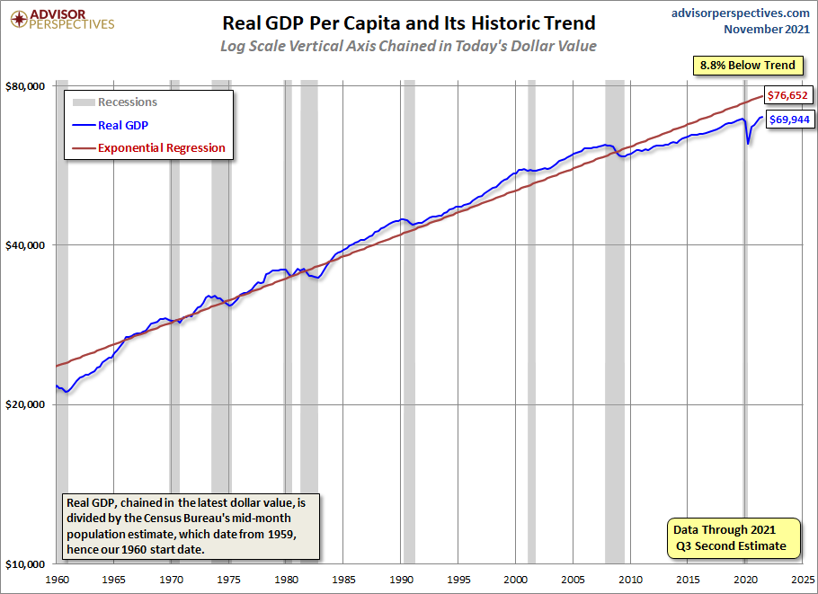
Source: www.advisorperspectives.com
Yes, it can continue as long as central banks continue their money-pumping spree and keep interest rates at or near zero. But now inconveniences are getting in the way. Inflation has reared its head even as the economy stumbles (stagflation?). Central bank heads including the Fed are now advising that inflation may not be so transitory after all. This could last for another year or more. While the money printing may have been a contributor, it was not the prime contributor as shortages and supply disruptions battered the global economy as a result of the pandemic. As well, there were supply shortages of many commodities coming out of the pandemic recession. Numerous commodities, most notably oil, lumber, and agriculture saw large gains. There
are growing global geo-political tensions in Europe (Russia/Ukraine/EU/NATO) and also U.S./China. Russia is threatening to cut off gas to the EU because of the tensions. Some believe those tensions could even result in war. And domestic polarization and tensions continue in the U.S. and the EU in particular.
All this has put the Fed and the other central banks into a serious bind. The Fed is tapering as are others (Canada, Australia) and there is talk of interest rate hikes in 2022. But they risk tipping the economy back into recession. The Fed is tapering first. Some believe instead they should be raising interest rates first. Almost a damned if they do and damned if they don’t. The Fed and the other central banks are effectively trapped. All this makes going forward increasingly risky. Add in the geopolitical tensions and one can only hope that an accident doesn’t occur that leads to war. At the moment it is the tensions between Ukraine/Russia/NATO that are the most dangerous.
While the central banks appear to be trapped, some are hedging their bets with the purchase of more gold. It seems that central banks have expanded their gold holdings by some 333.2 metric tonnes in the first half of 2021. Besides the usual suspects of Russia and China both adding to their reserves, the central banks of Thailand, Hungary, Brazil, Singapore, and Ireland are also adding. The Irish central bank added 2 tonnes, the first purchase in well over a decade. The Singapore central bank increased its gold reserves by 20% and it came as a surprise for most central bank observers. Singapore noted it would ensure the resiliency of its portfolio. Notably absent is the Bank of Canada who has already sold all of its gold reserves, the last being in 2016. For a central bank the move was considered to be unprecedented. No other central bank has followed.
No, that doesn’t mean the stock market will suddenly crash. However, it can’t be ruled out and in the interim the stock market could just keep on going up. The stock market has been in a long-term uptrend since the lows of March 2009 following the 2008 financial crisis that almost brought down the entire financial system. Yes, there have been interruptions along the way but that is no different than previous long-term bull markets. The 1982–1990 bull saw four stock market corrections including the 36.1% (DJI) drop in 1987. The 1949–1966 bull had five corrections including a 27.1% drop in 1960. The 1921–1929 bull really only had one correction in 1923: 18.6%. That one ended with a bang in October 1929.
All of this had us recently reflecting on the Kondratiev wave cycle and where we currently stand with it. So, who is Kondratiev and what is the wave cycle theory? Nicholas Kondratiev (1892–1938) was a Russian economist in the Soviet Union who was tasked by Josef Stalin to study long-term capitalist economies (U.S., Britain, and France wholesale prices and interest rates) and concluded that there were peaks and troughs in economic activity that lasted roughly 50–60 years. Other economists did similar work that traced similar cycles back to the Romans and even the Mayans that all supported Kondratiev’s work. Kondratiev was rewarded for his efforts by being sent to Siberia by Stalin. Stalin didn’t like the fact that his theories also applied to Russia and that the capitalist economies would rise again from their depressions. Kondratiev died in a Siberian labour camp.
Kondratiev concluded that each long wave was driven by technological advances. He identified four distinct phases. Spring—beneficial inflationary growth, stocks rising, commodities and gold weak; summer—stagflation, recession, stock market weak, commodities and gold booming; autumn—deflationary growth,
stocks booming (bubble?), commodities and gold weak; winter—deflation, depression, financial crisis, stock market weak, commodities and gold booming. While Kondratiev’s study is important, we note that many economists do not buy into it. That is, no doubt, the old adage of stick ten economists in a room and you’ll have eleven different opinions. Our table on the Kondratiev Wave Cycles is based on generally consensus as the start and end of each wave. The long Kondratiev Wave is measured stock market trough to trough while the phases are measured trough to top, top to trough etc.
Kondratiev Wave Cycles—The Long Wave
|
Spring (expansion) Beneficial inflation, economic growth, stocks up, commodities weak |
Summer (recession) Stagflation, weak economic growth, recession, stocks weak, commodities up |
Autumn (plateau) Mild deflationary growth, stocks up, possible bubble, commodities weak |
Winter (depression) Deflationary growth and steep recessions/depression, stocks weak, commodities up |
Length of the Long Wave/Technological Drivers of the Long Wave |
|
1784–1800 American Revolution, Indian Wars |
1800–1816 War of 1812, Indian Wars, stagflation
|
1816–1835 “Era of Good Feelings,” Indian Wars, booming stock market |
1835–1844 Indian Wars, the Hungry Forties, depression |
60 years/steam engine, cotton, Industrial Revolution, age of steam and railways |
|
1845–1858 Mexican American War, Indian Wars |
1859–1864 U.S. Civil War, stagflation |
1864–1874 reconstruction, Indian Wars, booming stock market |
1875–1896 Indian Wars, the Long Depression |
51 years/railways, steel, age of steel |
|
1896–1907 Spanish-American War, Philippine- American War |
1907–1920 WW1, Mexican Revolution, Banana Wars, Russian Civil War, stagflation |
1921–1929 The Roaring Twenties, booming stock market |
1929–1949 Great Depression, WW2, China Civil War |
53 Years/electrical engineering, chemistry, age of oil, automobiles, and mass production |
|
1949–1966 Korean War, Vietnam War, Cold War |
1966–1982 Vietnam War, Indochina Wars, Cold War, Arab Oil Crisis, stagflation |
1982–2000 “The New Economy,” Gulf War, Yugoslav Wars, booming stock market |
2000–2009 dot.dom bubble bust, global financial crisis, Great Recession, War on Terror - Afghanistan, Iraq, Syria, Libya |
60 years/ petrochemicals, automobiles, age of information technology, telecommunications |
|
2009-?? War on Terror -Afghanistan, Iraq, Syria, Libya |
|
|
|
??/age of post-informational technology, artificial intelligence (AI), renewable energy?? |
Note how war dominates the Kondratiev cycle. All periods experience war of some nature, whether it be ongoing low-level wars—i.e., Indian wars, War on Terror, etc.—or major wars like World War I and World War II. The last major Kondratiev cycle 1949–2009 saw ongoing wars, opening with the Korean War 1950–1953 and ending with the War on Terror 2001–2021. What war will dominate the next period? NATO/Ukraine/Russia, U.S./China? Or something else?
If Kondratiev’s studies showed that the long wave lasted roughly 50–60 years, it appears to have concluded the last wave right on schedule. The last wave started with the end of the Great Depression and World War II in 1949 and, we conclude (our opinion), ended with the Global Financial Crisis of 2008. The winter of the Kondratiev wave was 2000–2009. The period followed a classic pattern as stocks were weak while commodities boomed. While we didn’t have a depression, we had two steep recessions, culminating in what became known as the “Great Recession” of 2007–2009. This was the result of the financial crisis of 2008 that almost collapsed the financial system. If it had not been for the actions of the central banks and governments a depression might have been a possibility. It is no surprise that all might not agree with this analysis.
We come to that conclusion because the next move was the long bull market that got underway in 2009 and economies once again returned to a period of growth driven by low inflation, QE, and ultra-low interest rates. The stock markets eventually moved to new-all-time highs in 2013, signaling that the long period of weak stock markets was over. Gold topped in 2011, oil had already topped in 2008, and the Commodity Research Bureau Index (CRB) topped as well in 2008 with a secondary top in 2011. Our conclusion is that a new Kondratiev wave cycle got underway in 2009. If the long wave theory continues to hold, the current long wave could end somewhere between 2059 and 2069. As to the current spring phase that has an historical range of 11 to 17 years, average 14.3 years. The current spring phase will have its 13th anniversary in March 2022.
The question now is, are we poised to enter the second phase of the Kondratiev wave—the Kondratiev summer? Given the rise in inflation, the word stagflation now being bandied about, and the recent rise in commodity prices with many of them making multi-year highs we are seeing some of the prime characteristics of the “summer” of the Kondratiev wave cycle. At this time, we cannot confirm as to whether the stock market has topped. Confirmation could take a year or more.
During the last Kondratiev summer (1966–1982) the stock market topped in 1966. However, confirmation of that top didn’t occur until the stock market failed to make any significant new highs, despite strong rallies in 1968 and 1972–1973. Further rallies in 1976 and 1980 also failed to see any new significant all-time highs. It wasn’t until 1983 that the stock market left the period 1966–1982 behind for good. Gold rallied strongly during the period once the gold standard ended in 1971. Oil prices bubbled higher, thanks to the Arab Oil crisis of 1973 and the Iran hostage crisis in 1979. Other commodities also saw huge moves during this period. Gold did not go into a bubble market until 1976–1980. Commodity prices bottomed in 1968 and topped in 1980, rising some 250%.
We believe the Kondratiev wave cycle can be a useful tool, even though we freely admit the cycles of the Kondratiev wave are usually viewed in retrospect as are many cycles. However, what caught our eye was the resurgent commodity prices (CRB bottomed in March 2020) and the return of inflation that is beginning to look a lot more than just transitory. That, and the word “stagflation” keeps coming up. Stagflation has been a key
characteristic of the Kondratiev summer. The period 1966–1982 was a long period of stagflation and ended only when Fed Chair Paul Volker hiked interest rates to unheard-of levels. The result was the very steep recessions of 1980–1982. We have noted that the central banks are trapped following years of ultra-low interest rates. Raising interest rates could spark a steep recession as it could cause problems for the housing market and more. During the last Kondratiev summer 1966–1982 bond prices plummeted (interest rates rose as prices move inversely to interest rates). The U.S. 30-year treasury bond made its final low in September 1981 as the 30-year U.S. treasury bond hit a high yield of 15.1%.
Since the bottom of the pandemic crash in March 2020 record funds have flowed into the stock markets, sparking new all-time highs and what many describe as a bubble. QE and ultra-low interest rates have unleashed a torrent of money printing contributing to the bubble. The pandemic sparked major supply disruptions as economies came back to life. There is the potential for climate change to spark more disruptions. That in turn leads to higher prices and inflation. The resurgence of COVID could also spark more disruptions. We are we believe in the early stages of new phase. If we are right, we are on the cusp of the Kondratiev summer and long period of stagflation, recessions, a weak stock market, and booming commodities.
Nothing, however, is coincidental and each component (stocks, bonds, commodities) will top and bottom at different times. The Kondratiev long wave is always measured from stock market trough to trough. However, phases of the long wave are measured from trough to top, then top to trough, etc. Evidence is surfacing that the spring phase of a new Kondratiev wave that got underway with the bottom in 2009 may be coming to an end. The question is, when will we see the final stock market top?
For those interested, there are numerous articles on the Kondratiev wave theory that can be found on the internet. In particular, one we wrote back in June 2006 may be of interest and appears to still be posted. It was titled “Looking Down the Road” and can be found at http://www.321gold.com/editorials/chapman_d/chapman_d_062606.html.
Chart of the Week
U.S. Job Numbers
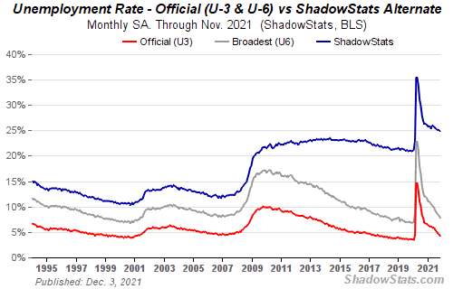
Source: www.shadowstats.com
Well, that was a surprise. November’s nonfarm payrolls grew by only 210,000 when the market had expected a gain of 550,000. Okay, that’s the bad news. The good news, we suppose, is that the previous two job reports were revised up by 82,000 jobs and the unemployment rate (U3) fell to 4.2% from 4.6%. The market had expected the unemployment rate to remain unchanged at 4.6%. Still, it has a way to go to equal the February 2020 pre-pandemic U3 of 3.5%. U6 unemployment, which is U3 plus short-term discouraged workers fell to 7.8% from 8.3%. The pre-pandemic U6 was 7.0%. The Shadow Stats (www.shadowstats.com) number also fell to 24.8% from 25.1%. Pre-pandemic, the Shadow Stats unemployment was 21.3%. The Shadow Stats number is U6 plus long-term discouraged workers over one year defined out of the labour force in 1994. With the nonfarm payrolls growing by only 210 thousand, the U.S. is still short 3.9 million workers from February 2020 pre-pandemic. Compare that with Canada who are 198,000 over the February 2020 pre-pandemic employment level.
Other numbers continued to point to an improving economy despite the miss in nonfarm payrolls. The household survey saw it differently with a rise of 1,136 thousand and a labour force jump of 594 thousand. The BLS has two reports: the employer’s survey and the household survey. The employer survey helps to determine the nonfarm payroll and wage figures. That survey showed hiring slowed. The household survey helps to determine the jobless and participation rates. That one went in the opposite direction, showing that employment leaped as noted by 1,136 thousand. That helped lower the unemployment rate (U3). It also helped tick up the labour force participation rate to 61.8% from 61.6%. That remains short of the pre-pandemic level of 63.5%. The employment population ratio was 59.2% vs. 58.8% in October. In pre-pandemic
February 2020 it was at 61.1%. The all-time peak was 64.7% way back in April 2000. What that means is that, percentage-wise, fewer people are actually working. There are many reasons for that. Retirements have surged during the pandemic. As well, some went back to school and many others are having to become caregivers for people dealing with COVID-related illness and/or care for children. In the U.S. there are listed 9.5 million active cases of COVID. While many of those 9.5 million could be retirees, many are not and now they are not working.
Average weekly earnings rose 4.8% year over year while the average workweek also rose to 34.8 hours up 1/10. Wages for leisure and hospitality rose 15% year over year.
With employment growing in the U.S. and wages growing as well, people are leaving for something better. Leavers rose 12.5% from 11.5%. This is the highest since February 2020 when it was 13.3%. The average number of weeks unemployed rose to 28.9 weeks, up from 26.7 weeks. Back in February 2020 it was 20.8 weeks. The number of people unemployed for 27 weeks or longer did fall to 2,131 thousand from 2,332 thousand. Again, a lot higher than February 2020 when it was 1,185 thousand.
There were 100,472 thousand considered not in the labour force. That is actually higher than in October when it was 100,045 thousand. Of that total, 56 million are considered retirees and 24.5 million are considered disabled.
While the nonfarm gain was sharply below expectations, that miss was offset by a higher participation rate and employment population ratio and a lower unemployment rate. Still, at this point the nonfarm numbers are the weakest following a recession. Indeed, according to John Williams at Shadow Stats, this is the weakest job recovery seen from any recession going back to 1957. But, as noted, the household survey was up sharply, seemingly diverging from the employer survey. Further wage gains were better. As a result, we note gold moved higher, the stock market was lower, and bond yields fell. If things are good, why are bond yields falling? And why are the Michigan Consumer Sentiment Index and the Consumer Confidence Index at their lowest level in over a decade? And this against talk that the Fed could quicken the pace of tapering and hike interest rates sooner? Well, for that we have to wait for talking points from the Fed and the economists prognosticating.
University of Michigan Consumer Sentiment Index
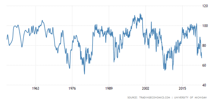
Source: www.tradingeconomics.com, www.umich.edu
Canada Job Numbers
Canada—Unemployment Rate, Employment Rate
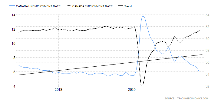
Source: www.tradingeconomics.com, www.statcan.gc.ca
Better yet, the unemployment rate fell to 6.0% and it is now only 0.3% above where it was pre-pandemic. The absolute low was seen in May 2019 at 5.4%. The market had expected an unemployment rate of 6.6%. The October rate was 6.7%. The R8 unemployment rate which includes discouraged workers looking for work and involuntary part-timers fell to 7.6% from 8.1%. That’s even better than where it was in February 2020 as the rate then was 8.6%.
The provinces that saw the best gains were Ontario, Quebec, Alberta, Newfoundland & Labrador, Nova Scotia, and Prince Edward Island. At-home workers remained steady at around 4.2 million. That’s only 400,000 below the level seen in November 2020. At-home workers are primarily white-collar professionals. Wages have increased for the accommodation and food industry, up 8.5% from two years ago for new employees and up 2.3% for established employees. For all employees, wages are up 10% for new employees vs. 6.4% for established employees.
The number of people employed rose, as mentioned, by 153,700 while the number of people unemployed fell by 121,800. The total labour force is 20,560,000 of which 19,316,100 are employed.
The November job numbers were a blockbuster. One could deduce that the big jump in employment was helped by the ending of key support programs as a result of COVID. As a result of the sharp jump in employment the Canadian dollar firmed, but surprisingly bond yields fell, possibly in sympathy with U.S. bond yields. Now the talk is shifting to the possibility of the BofC hiking interest rates sooner rather than later. The original consensus was possibly by next July Q3. Instead, the talk is shifting to Q2 with a few even suggesting Q1. Markets are starting to price in five, yes, five hikes, in 2022 bringing the rate from the current 0.25% to 1.50%. That’s a 500% jump. Still, it was a great report, the sixth successive monthly job gain.
Some other little tidbits from the report: 80.7% of women aged 25–54 were employed, a record. Despite the huge jump in jobs there remain some one million job vacancies, although that is as of September. That may be lower now because of the numbers of the past couple of months.
The report does not take in the effects of the flooding in B.C. That will show up in the December report.
MARKETS AND TRENDS
|
|
|
|
% Gains (Losses) Trends
|
|
||||
|
|
Close Dec 31/20 |
Close Dec 3/21 |
Week |
YTD |
Daily (Short Term) |
Weekly (Intermediate) |
Monthly (Long Term) |
|
|
Stock Market Indices |
|
|
|
|
|
|
|
|
|
S&P 500 |
3,756.07 |
4,538.43 |
(1.2)% |
20.8% |
down (weak) |
up |
up |
|
|
Dow Jones Industrials |
30,606.48 |
34,580.08 |
(0.9)% |
13.0% |
down |
neutral |
up |
|
|
Dow Jones Transports |
12,506.93 |
15,967.24 |
(1.6)% |
27.7% |
neutral |
up |
up |
|
|
NASDAQ |
12,888.28 |
15,085.47 |
(2.6)% |
17.1% |
down (weak) |
up |
up |
|
|
S&P/TSX Composite |
17,433.36 |
22,633.27 |
(2.3)% |
18.4% |
down |
up |
up |
|
|
S&P/TSX Venture (CDNX) |
875.36 |
897.13 |
(5.0)% |
2.5% |
down |
down (weak) |
up |
|
|
S&P 600 |
1,118.93 |
1,341.81 |
(2.5)% |
19.9% |
down |
neutral |
up |
|
|
MSCI World Index |
2,140.71 |
2,264.47 |
(3.0)% |
5.8 |
down |
down |
up |
|
|
NYSE Bitcoin Index |
28,775.36 |
56,167.29 |
3.1% |
95.2% |
down |
up |
up |
|
|
|
|
|
|
|
|
|
|
|
|
Gold Mining Stock Indices |
|
|
|
|
|
|
|
|
|
Gold Bugs Index (HUI) |
299.64 |
245.90 |
(4.0)% |
(17.9)% |
down |
down |
neutral |
|
|
TSX Gold Index (TGD) |
315.29 |
279.37 |
(2.6)% |
(11.4)% |
down |
down |
neutral |
|
|
|
|
|
|
|
|
|
|
|
|
Fixed Income Yields/Spreads |
|
|
|
|
|
|
|
|
|
U.S. 10-Year Treasury Bond yield |
0.91 |
1.35% |
(8.8)% |
48.4% |
|
|
|
|
|
Cdn. 10-Year Bond CGB yield |
0.68 |
1.44% |
(10.0)% |
111.8% |
|
|
|
|
|
Recession Watch Spreads |
|
|
|
|
|
|
|
|
|
U.S. 2-year 10-year Treasury spread |
0.79 |
0.76% |
(22.5)% |
(3.8)% |
|
|
|
|
|
Cdn 2-year 10-year CGB spread |
0.48 |
0.41% |
(38.8)% |
(14.6)% |
|
|
|
|
|
|
|
|
|
|
|
|
|
|
|
Currencies |
|
|
|
|
|
|
|
|
|
US$ Index |
89.89 |
96.11 |
flat |
6.9% |
up |
up |
neutral |
|
|
Canadian $ |
0.7830 |
0.7790 |
(0.5)% |
(0.6)% |
down |
down |
up (weak) |
|
|
Euro |
122.39 |
113.07 |
flat |
(7.6)% |
down |
down |
neutral |
|
|
Swiss Franc |
113.14 |
108.93 |
0.5% |
(3.7)% |
up (weak) |
neutral |
up |
|
|
British Pound |
136.72 |
132.36 |
(0.8)% |
(3.2)% |
down |
down |
up (weak) |
|
|
Japanese Yen |
96.87 |
88.63 |
0.4% |
(8.5)% |
up |
down |
down |
|
|
|
|
|
|
|
|
|
|
|
|
|
|
|
|
|
|
|
|
|
|
Precious Metals |
|
|
|
|
|
|
|
|
|
Gold |
1,895.10 |
1,783.90 |
(0.1)% |
(5.9)% |
down |
neutral |
up |
|
|
Silver |
26.41 |
22.48 |
(2.7)% |
(14.9)% |
down |
down |
up (weak) |
|
|
Platinum |
1,079.20 |
926.20 |
(2.9)% |
(14.2)% |
down |
down |
neutral |
|
|
|
|
|
|
|
|
|
|
|
|
Base Metals |
|
|
|
|
|
|
|
|
|
Palladium |
2,453.80 |
1,812.60 |
1.8% |
(26.1)% |
down |
down |
neutral |
|
|
Copper |
3.52 |
4.27 |
(0.5)% |
21.2% |
down (weak) |
neutral |
up |
|
|
|
|
|
|
|
|
|
|
|
|
Energy |
|
|
|
|
|
|
|
|
|
WTI Oil |
48.52 |
66.26 |
(2.8)% |
36.7% |
down |
down (weak) |
up |
|
|
Natural Gas |
2.54 |
4.13 |
(24.6)% |
62.6% |
down |
up (weak) |
up |
|
Source: www.stockcharts.com, David Chapman
Note: For an explanation of the trends, see the glossary at the end of this article.
New highs/lows refer to new 52-week highs/lows and, in some cases, all-time highs.
Source: www.stockcharts.com
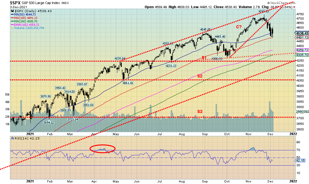
Omicron! The new dirty word. Yes, it has spooked the markets. Then came the jobs report and before that lousy consumer sentiment. And Ukraine and Russia are threatening war, or so Ukraine says. It was a tumultuous week with lots of volatility and some sharp ups and downs. It was the second successive weekly decline. This time the S&P 500 fell 1.2% on the week. However, what was interesting was on Friday following the job numbers the markets initially rallied. Then they reversed and the S&P 500 lost 70 points from the top of the day to close down almost 40 points. That bodes poorly for Monday. Seems Thanksgiving came and went but no one gave thanks. It hasn’t been pretty since.
Losses were the order of the week. The Dow Jones Industrials (DJI) fell 0.9%, the Dow Jones Transportations (DJT) dropped 1.6%, and the NASDAQ fell 2.6%. The small cap stocks fell with the S&P 600 dropping 2.5% while the S&P 500 Equal Weight Index fell 1.3%. In Canada, the TSX Composite lost 2.3% and the TSX Venture Exchange (CDNX) was kicked down 5.0%. In the EU, things were more mixed as the London FTSE was up 1.6%, the Paris CAC 40 gained a small 0.4%, but the German DAX dropped 0.6%. In Asia, China’s Shanghai Index (SSEC) gained 1.2% but the Tokyo Nikkei Dow (TKN) dropped 2.5%. The MSCI World Index lost almost 3.0%. However, crypto gained with the NYSE Bitcoin Index up 3.1%.
The S&P 500 reversing 70 points on Friday was one thing, but the DJI reversed over 200 points and the NASDAQ reversed almost 400 points. All that points to a potentially messy Monday. The nearly 10% drop on Bitcoin over the weekend may prove to be a bad omen for the markets. Or will it start off badly only to see another save? Love the volatility when the market is up, and then reverses and closes down sharply.
We note that when the market broke down on November 26 the DJI gapped. That gap has not been filled and instead the DJI appears poised to fall further. Markets right now are sitting on the cusp of bigger breakdowns. The DJI breaks down under 34,000 and the NASDAQ under 15,000. Under 4,490 the S&P 500 is breaking the 100-day MA. But then further support looms at the 200-day MA near 4,300 which also coincides with the final zone of support for the S&P 500. Under 4,300 the abyss? What goes up can come down in a hurry. Volume has picked up on the down moves supporting the sell-off. While it is unusual to see bear declines in December they have happened before, most notably in 2018 which ranks as one of the worst Decembers ever. December 2002 wasn’t too good either. Both eventually saw the Santa Claus rally but from a much lower level.
There has been a lot of complacency in the markets. Some are even suggesting it has been a mania. Manias always end badly. Unless this time it is different. It never is. We are seeing a lot of sudden weakness—gradually, then suddenly. What will December 6 bring? We believe we are seeing a reversal in the markets that could turn Christmas 2021 into an unpleasant experience.
Source: www.stockcharts.com
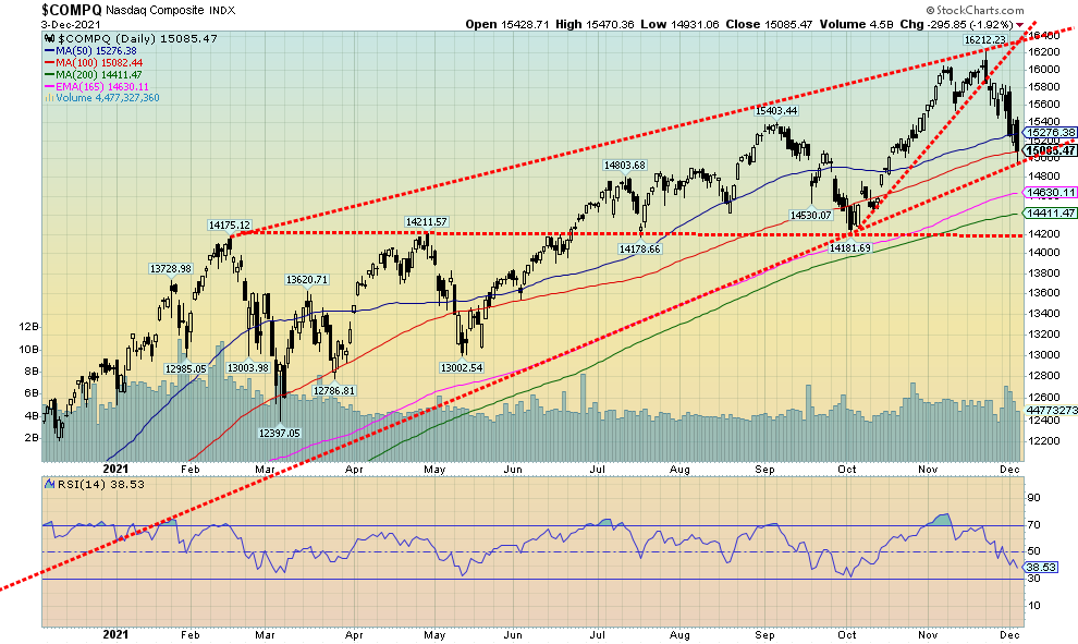
Will the NASDAQ rebound from these levels or will it break the uptrend line that actually comes up from the March 2020 crash low? We hit the line this past week as the NASDAQ broke under the 100-day MA and basically closed on the line. The RSI is suggesting there could be more downside. So, a break now of 15,000 could send the NASDAQ lower to 200-day MA support near 14,400. Further support is seen down to 14,200. A decline to that level would be about 12.5% from the recent top. Key NASDAQ components of the FAANGs struggled this past week. A success was Apple, making new all-time highs and gaining 2.8%. But elsewhere it wasn’t very good. Meta lost 8.3%, Amazon fell 3.8%, Netflix dropped 10.1%, Google looked good, losing only 0.8%, Microsoft fell 2.7%, Tesla dropped 6.5%, and Twitter was down 10.7%, Baidu lost 9.1%, Alibaba was creamed, down 15.8%, and Nvidia lost 3.6%. Note that most lost more than the NASDAQ itself and these are the supposed leaders. They led the market up. Are they about to lead the market down?
Source: www.stockcharts.com
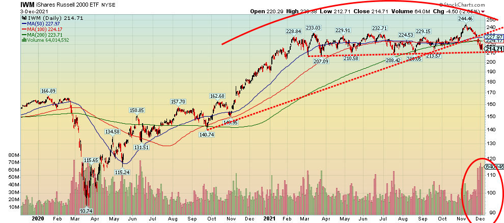
Small cap stocks appear to be making a huge topping pattern. This here is the iShares Russell 2000 ETF (IWM) as a proxy for the Russell 2000 Index of small cap stocks. This is a very lengthy topping pattern. But the recent breakdown that has taken the IWM under its 200-day MA has been made on high volume. This could be suggesting that something more dangerous is at play. Now a break of 210 could spell the end of the rally and a potential breakdown to targets near 170/175 as a minimum.
Source: www.stockcharts.com
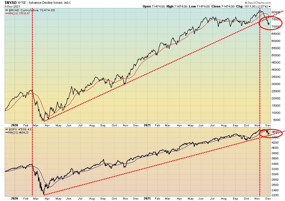
The NYSE Advance-Decline line has broken down under its uptrend line from the March 2020 crash low. The S&P 500 has not yet broken its uptrend but it does sit on the cusp of a possible breakdown. In 2020 they both appeared to break down together, but this time the AD line appears to be leading. Is this a sign that we could fall further?
Source: www.stockcharts.com
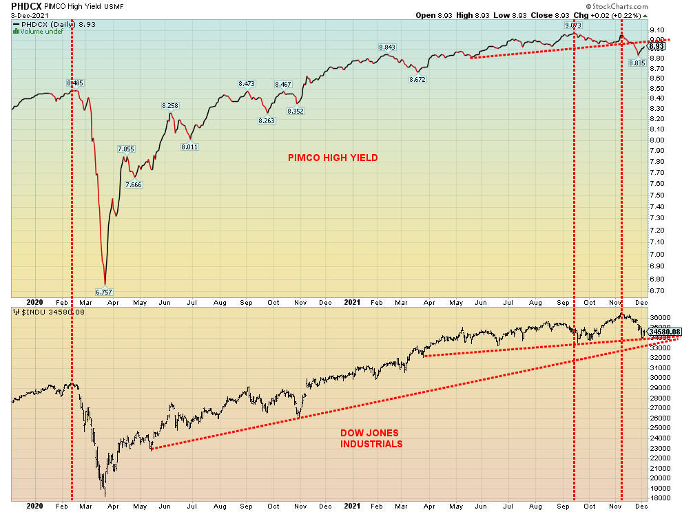
Here’s an interesting chart. This shows the Pimco High Yield Bond Fund vs. the DJI. What we see is how tops seem to line up nicely. Both the Pimco Fund and the DJI topped together in February 2020, before the crash. However, this time the Pimco fund appears to have topped before the DJI and has already broken down from what appears as a head and shoulders topping pattern. The H&S pattern suggests a decline for the Pimco Fund to at least 8.70. Also note the divergence between the two. Junk bonds tend to mirror the stock market. They both topped together in February 2020. But this time the Pimco Fund topped first and made a lower high when the S&P 500 hit its recent top. The Pimco Fund has broken down while the DJI is sitting on the cusp of a breakdown. Will the DJI follow the Pimco fund down? If history is a guide, then the answer is yes.
Source: www.stockcharts.com
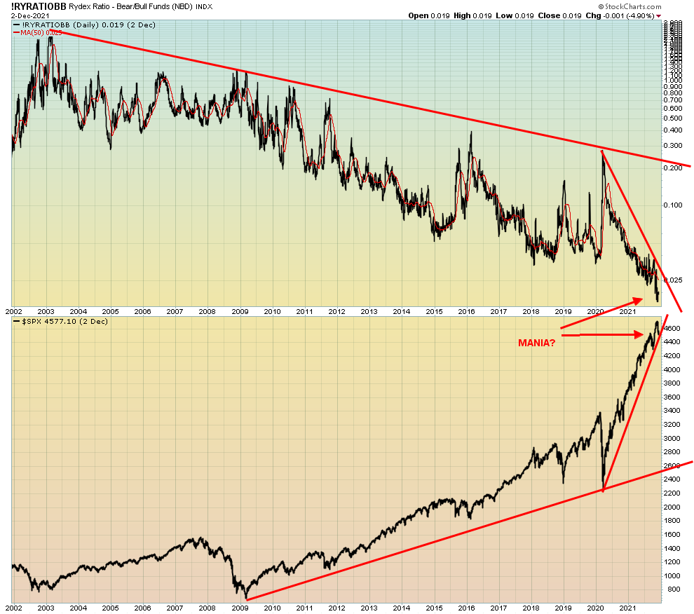
Here’s another interesting one, the Rydex Ratio Bull/Bear Funds Index. The index has fallen to unheard-of levels as the stock market rose from the dead of the March 2020 pandemic crash. Are there any bears around? This chart is suggesting that the market has been in a mania. And manias always end badly.
Source: www.stockcharts.com
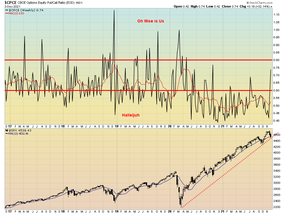
Just before this jump in the put/call ratio, there was a frenzy of call buying. That didn’t work out so well and now we see the put/call ratio rising. It is over 60 for the first time since July and at its highest level since October 2020. Things are getting bad if we spike over 80; then we know we are in a more serious decline. The S&P 500 is on the cusp of breaking its uptrend line from March 2020.
Source: www.stockcharts.com
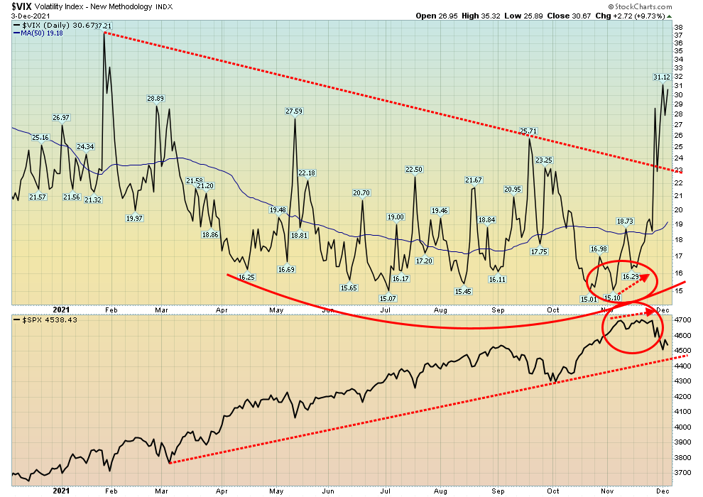
Last week we noted the divergence between the S&P 500 and the VIX Volatility Index when the VIX moved higher in conjunction with the S&P 500 moving higher. The VIX normally moves inversely to the S&P 500. We have now hit our highest levels since last January. Since the March 2020 pandemic crash the VIX tended to top out between 37 and 40. But overall, the VIX was in a downward mode following the March 2020 crash. The VIX broke out to the upside in November and there is no sign just yet of a top. What’s key is the 37/40 level. If we break out above 40, then the stock market could be in crash mode.
Source: www.stockcharts.com
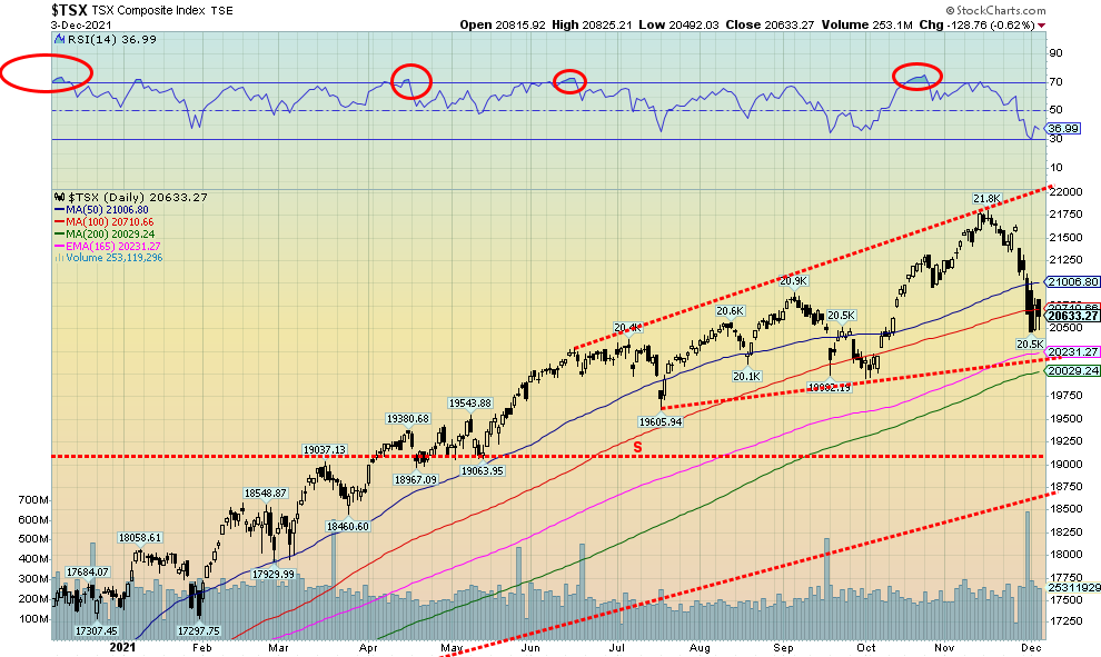
The TSX Composite joined the decline in the stock markets this past week, falling 2.3%. The small cap TSX Venture Exchange (CDNX) continued its recent woes, losing almost 5% and turning the trends down once again. Despite the decline, two of the 14 sub-indices managed gains this past week. Gaining were Consumer Staples (TCS), up 0.5% and Telecommunications (TTS), up 0.9%. All others were losers, led by Health Care (THC), down 9.6% followed by Information Technology (TKK), down 5.8%. Other big losers were: Income Trusts (TCM) down 2.2%, Consumer Discretionary (TCD) -2.5%, Golds (TGD) -2.6%, Materials (TMT) -2.6%, and Real Estate (TRE) -2.2%. The TSX Composite has now fallen below the 100-day MA and is threatening to fall towards 200-day MA support near 20,000. That level would be key as below that a bear market could get underway. The TSX needs to regain 21,000 to suggest a low might be in. There was high volume on November 30. Tax loss selling? Or just a rush to book profits before year end? The chart of the TSX appears to us to be damaged, so lower prices would not surprise us. But next up is support down to 20,000 that must hold if the market is to recover and challenge the highs once again.
U.S. 10-year Treasury Bond/Canadian 10-year Government Bond (CGB)
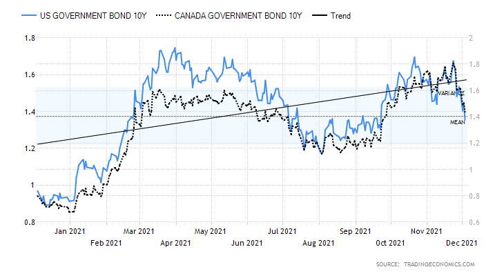
Source: www.tradingeconomics.com, www.home.treasury.gov, www.bankofcanada.ca
If we have inflation, taper talk, hiking interest rates talk, fiscal funds coming, wages rising, and, of course, asset inflation then why are bond yields falling? Does the bond market know something or is anticipating something that we don’t know? Maybe the bond market is seeing the falling consumer sentiment and weak job numbers and thinking that something isn’t right here so “the hell” with inflation: buy bonds as a flight to safety. This past week the 10-year U.S. treasury note fell 8.8% or 13 basis points (bp) to 1.35%. It seemed to be counterintuitive. But as we note, the stock market fell so the funds go from stock market to bond market.
In Canada, our bonds fell as well as the Government of Canada 10-year bond (CGB) fell 16 bp or 10.0% to 1.44%. All of this helped narrow the interest rate curve. The U.S. 2–10 spread fell 23.5% to 75 bp from 98 bp. In Canada, the 2–10 spread fell 26 bp or 38.8% to 0.41%. Are the narrowing spreads portending something? A recession? We discuss the spreads in the next chart.
Economic numbers this past week were a mixed bag. Pending home sales fell 1.4% year over year but rose an unexpected 7.5% in October. The Dallas Fed Index was weak at 11.8 when they expected 25. The Case/Shiller home price index was up 19.1% in September year over year. The Chicago PMI (manufacturing index) was 61.8, but that was weaker than the expected 68.3 and last month’s 68.4. ADP employment was robust, up 534 thousand but less than the expected 580 thousand. The ISM Manufacturing Index came in at 82.4 but again less than the expected 86. Initial jobless claims were 222 thousand higher than the previous week’s 194 thousand but on the good side of the expected 240 thousand. The Markit Services Composite surprised to the
upside at 58, below last month’s 58.7 but above the expected 57. Adding in the job numbers and weak consumer sentiment from the previous week, bond yields appear to be reacting to the potential for a weakening economy. But the talk is taper and inflation and interest rate hikes. And yes, that evil word “stagflation”—inflation with weak economic growth.
This week brings us the trade numbers for October. Higher trade deficits are negative for the economy. The market is looking for a deficit of $66 billion, but last month it was $80.9 billion and has been rising. Watch for consumer credit numbers out on Wednesday. Friday brings us the CPI report, where the market is looking for a year-over-year rise of 6.9% while core inflation is expected to rise 4.9% year over year. The Michigan Consumer Sentiment Index for December (preliminary) is also out. In Canada, the BofC gives us the interest rate decision on Wednesday, December 8. No change is expected but maybe hints on what they are planning for 2022 in terms of interest rates, given the strong job numbers. The BofC is already tapering, one of the first to do so.
With the 10-year falling under 1.40% we could now see a decline towards 1.20%. Only regaining above 1.60% could suggest that we might go higher instead. Downward long yields and the potential for rising short-term yields all add up to a narrowing yield curve.
Source: www.stockcharts.com
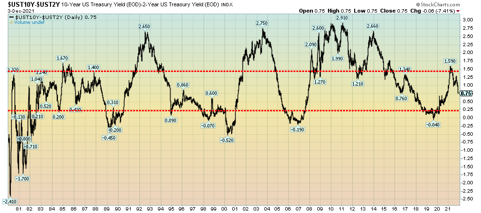
We haven’t noted the 2–10 spread for some time. The 2–10 spread is the spread between the U.S. 2-year treasury note and the U.S. 10-year treasury note. Other important spreads to follow are the 3M–10 spread (3-month treasury bills), the 10–30 spread (U.S. 30-year treasury bonds), and maybe the 5–20 spread (5-year treasury note, 20-year treasury bond). Some even note the Fed Funds – 10-year spread. Nonetheless, what we are seeing is the most significant narrowing of the yield curve in some time. The 2–10 spread last bottomed at negative 0.04% in September 2019. Curiously, that was when the Fed started its repo action in the market. Negative spreads also have a history of portending recessions. Sure enough, the pandemic hit and then we had the pandemic recession. Previous periods of negative spreads portended the 2007–2009 financial crisis recession, the dot.com/high-tech recession of 2000–2002, and the recessionary period of 1990–1992. So, the sharp drop this past week of 23 basis points (bp) or 23.5% caught our attention. We noted that when the yield curve started to fall in previous periods, the decline tended to be swift and soon after the spread went negative, portending a coming recession. Something to watch going forward.
Source: www.stockcharts.com
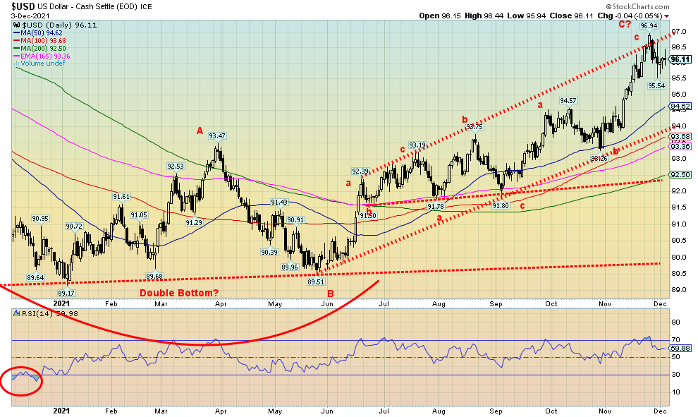
We continue to believe that the US$ Index may have topped. This past week the US$ Index was flat but volatile. Some sharp up and down days were seen. We had the job numbers, the taper talk, and then we saw long interest rates fall and the yield curve narrow. The US$ Index may have overthrown the upper channel line. The overthrow occurs when it appears to break out over the channel line, and then fails and falls back. The high at 96.94 is now the line in the sand because if the US$ Index were to take out that level the message would be simply that it’s going higher. This past week the euro was also relatively flat, the Swiss franc gained 0.5%, but the pound sterling fell 0.8%. The Japanese yen is showing improvement and was up 0.4%. We mused that the stock market sells off U.S. equities and then it may have seen some foreign funds repatriate funds, sell U.S. dollars, and buy their home currency; i.e., euros, yen, Swiss. The Canadian dollar fell 0.5% but was rebounding at the end of the week following the strong job numbers in Canada.
Given the recent low at 95.54, the breakdown level is now defined at 95.50. That could see the US$ Index fall to down channel support near 94. Under 93.50 the US$ Index could then decline to 92.50 and the last good support. Only new highs could keep the US$ Index alive and continue its upward move.
Source: www.stockcharts.com
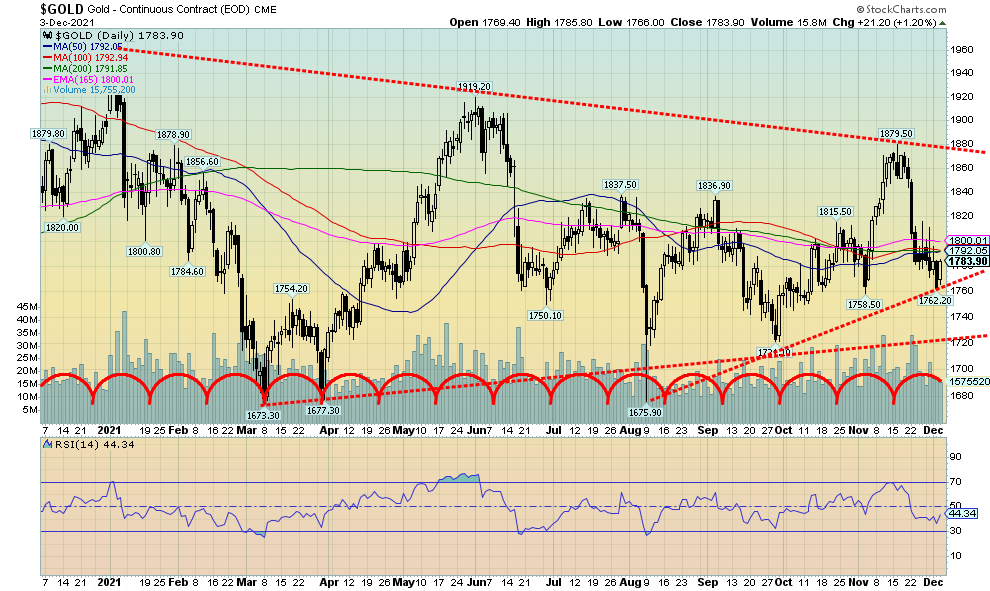
For the third consecutive week gold fell down a small 0.1% and is now off 5% from its recent high. The good news is that gold remains up 2.3% from its early October low. The danger line is under $1,758, below which new lows are possible. Since the last significant low was seen in August at $1,675.90, the danger line for it is under $1,724. Then new lows are possible. Friday was encouraging, at least in the short term as initially gold reacted positively to the lower-than-expected nonfarm payrolls. But when gold looked underneath and saw the drop in the unemployment rate and the big jump in the household survey employment, gold turned down once again. Especially as there was more taper talk and talk of interest rate hikes. But as the day wore on, concern arose over the Omicron variant and U.S. treasury yields fell—so gold rallied again, closing up $21.20 or 1.2%. Gold was benefitting from the now-flattening yield curve and instead of fearing the taper, it viewed the taper as beneficial. Also, as we have noted, consumer sentiment is terrible so maybe gold is noticing that as well. Also helping are the ongoing tensions between Ukraine/Russia. So, the week had both its negatives and positives.
While gold lost a small 0.1%, silver was not so lucky, falling 2.7%. Platinum lost 2.9% but palladium may have found a low as it gained 1.8% on the week. Copper, however, fell 0.5% on talk of copper gluts going into 2022.
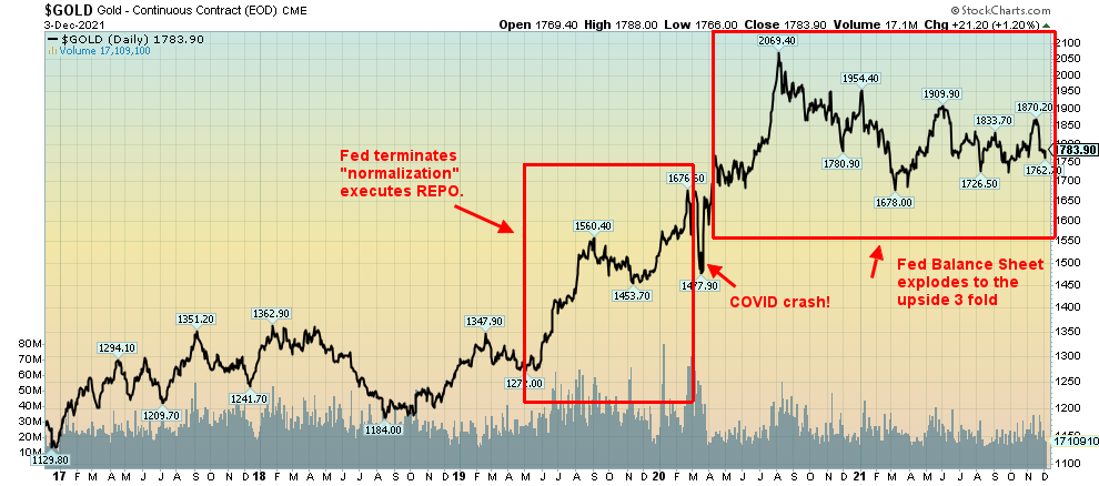
Our colleague Mike Ballanger raised some interesting points in his most recent GGM Advisory missive (email: miningjunkie216@outlook.com, twitter: @MiningJunkie). We reprised his chart below. Mike noted that the mysterious repo operations that started in September 2019 caught the attention of gold. What was going on? Repo operations mean the Fed buys securities from the member banks and hands them cash. Was something going on we weren’t aware of? Well, as it turned out what was going on was the early stages of what became the COVID pandemic. In March 2020 the market crashed. But gold had gone from $1,270 in May 2019 to $1,700 in February 2020, just before the COVID crash. Did the Fed know something we didn’t know? It was all very mysterious. Was there a connection between the repo purchases and the eventual pandemic? We don’t know. Or was it all just a coincidence?
The COVID crash unleashed a torrent of QE and zero-percent interest rates, and gold soared from $1,465 in March 2020 to $2,089 by August 2020. Yet it was coming out of the COVID crash that unleashed the current inflation as money was being printed like crazy to prevent the economy from collapsing into a depression. Shades of 2008, only the steroids are stronger. This is all in keeping with our observation that since the end of the gold standard back in August 1971 each and every recession has been met with varying torrents of liquidity pumping and money printing to prevent a collapse that could send us all back to the Great Depression. Grant you, the Fed is not responsible for the surge in oil prices, chip shortages, or supply disruptions and more that are at the heart of inflation. However, their money printing (monetary policy) coupled with the need to “build back better” (fiscal policy) is inflationary. Then funds “goosed” the stock market in a buy, buy, buy mode and corporations borrowed money to buy back their stock helped goose the stock market even more. As a result, the stock market (DJI) has soared 91% since March 2020. Gold peaked in August 2020 and since then has been going through an extensive correction that turned into a mini-bear market. Gold is up only about 23% from March 2020 while being down almost 15% from the August 2020 high. Silver and the gold stocks are down even more.
Source: www.stockcharts.com
Gold has considerable work to do to confirm a low. $1,800/$1,820 remains resistance. $1,760 is support and we look nervously at gold falling under $1,760 and especially under $1,700/$1,720. Even above $1,800/$1,820 there is more heavy lifting to do. Resistance is seen also at $1,850/$1870. Once over that level things look somewhat brighter. The final hurdle will be breaking above $1,900/$1,920. Over $1,990/$2,000 new highs are probable.
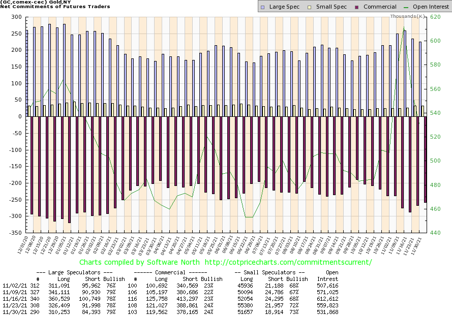
Source: www.cotpricecharts.com
The gold commercial COT (bullion companies and banks) was unchanged this past week at 24%. That’s still a pretty bearish level. Short open interest fell over 10,000 contracts but then long open interest also fell down about 2,000 contracts. Overall, open interest was down roughly 28,000 contracts during a down week. That suggests to us that the market was covering shorts. The large speculators COT (hedge funds, managed futures, etc.) ticked up to 79% from 78% but they too cut their positions. Long open interest was down roughly 16,000 contracts while short open interest was down over 7,000 contracts. The decline in open interest was encouraging as it suggests short covering. Overall, at 24% the COT report remains somewhat bearish but may have found a bottom.
Source: www.stockcharts.com
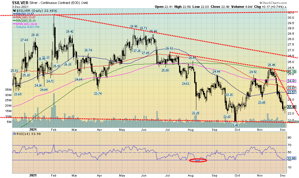
Silver had an unpleasant week, falling for the third consecutive week and losing 2.7%. Silver is now down almost 12% from its recent high. However, silver remains up roughly 5% from the late September low. The danger zone is under $22. Friday saw silver hit a low of $22.03 before recovering and closing at $22.48 up 17 cents on the day or 0.7%. Since the low was a new low for this move and we closed higher we view Friday as a reversal day. That could signal a potential low for silver. However, we need further evidence to confirm a low. That evidence would be new highs above $25.49. Note that the recent high hit the 200-day MA (and also the 40-week MA) before silver turned down again. Hence, the recognition and significance of hitting the 200-day MA. A move back down now that takes out $22 could jeopardize the recent low of $21.41. New lows below that level could see silver fall all the way down to $16. We are not surprised then to see Elliott Wave International suggesting the wave count indicates silver could fall to under $15 even as they expect a bounce here. That places the emphasis back on that high at $25.49 as only taking out that level would end thoughts of a more bearish decline. Until then the risk remains to the downside.
Source: www.cotpricecharts.com
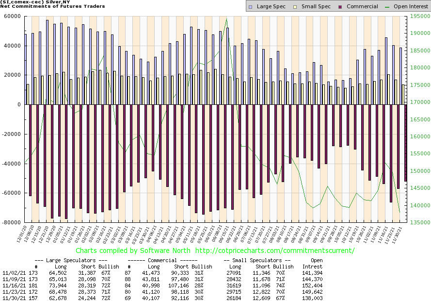
While the commercial COT for silver was unchanged this past week at 30%, we did see some positive signs. Short open interest fell roughly 6,000 contracts even as long open interest also was down but only by around 1,000 contracts. Overall, open interest fell over 11,000 contracts during a down week. That suggests to us short covering. The large speculators COT did tick up to 72% from 71% but even they shed open interest with longs falling about 6,000 contracts and shorts down roughly 4,000 contracts. We continue to view the silver COT has at least mildly bullish.
Source: www.stockcharts.com
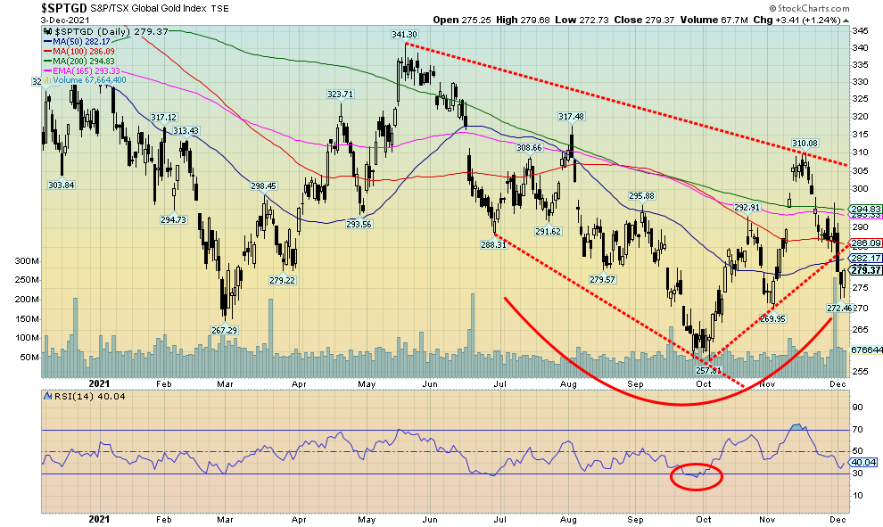
It was another miserable week for the gold stocks as the Gold Bugs Index (HUI) fell almost 4% while the TSX Gold Index (TGD) dropped 2.6%. It was the third consecutive weekly decline. The TGD has now given back roughly a Fibonacci 61.8% of the recent up move. The TGD is down roughly 10% from the recent high although still up 8.4% from the early October low. We did break trendline support for the TGD, suggesting lower prices. A break under 270 for the TGD would be critical as below that level new lows are possible. The low this past week was 272.46 before closing up nicely on Friday 2.5% above the low. We are trading in a broad zone of support and both the TGD and the HUI continue to trace out what appears to us as bottom patterns. Naturally, there is a lot of work to do. The TGD breaks out over 305, but we wouldn’t become more bullish until we see new highs above 341 the May 2021 high. We remain optimistic that we should see a rally of some significance into 2022 but, like gold and silver, the gold stocks have considerable work to do to overcome overhead resistance.
Source: www.stockcharts.com
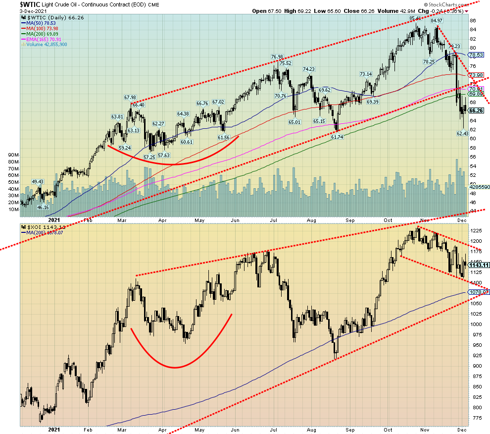
It was a volatile week for the energy sector. WTI did do up and down fluctuations and wound up finishing off 2.8% on the week. Natural gas (NG) crashed, losing a very sharp 24.6%. The energy stocks actually fared better. Maybe the energy stocks are a better barometer going forward. The ARCA Oil & Gas Index (XOI) actually gained about 0.7% on the week while the TSX Energy Index (TEN) was down 2.5%.
OPEC helped steady the oil price even if there are caveats. Going into the OPEC meetings there was some expectation that they might end their monthly 400,000 bpd increase. They didn’t, leaving things unchanged. The caveat—they could change their mind if necessary. They expressed concern over the Omicron variant and said that if market conditions changed, they would reconvene quickly. Fears of a warmer than expected winter coupled with the resurgence of the Omicron variant helped crash NG prices. It was the worst month in three years for NG prices. We had noted previously that NG prices looked very toppy so the collapse in some respects was not a surprise.
The recent sharp drop for WTI Oil (and Brent as well) showed up this past week at the gas pumps. Gas in Toronto fell roughly 10 cents a liter.
WTI oil has now entered bear territory. Prices are down 22% from the recent highs and oil has fallen under the 200-day MA. However, many indicators are oversold and WTI oil has fallen into a broad area of support between $57 and $62. Targets of $71 were easily met. The next target level was $66.50/$66.70 and below that the next target would be $59.50. Low so far $62.43. WTI oil appears to have fallen in an ABC-type pattern, suggesting this is actually just a corrective move and not the start of a major collapse. The fact that the energy stocks have held up so well suggests to us that this is all just temporary and once we complete the correction we could embark on a new up leg.
Seasonally, oil’s best period is, in theory, December to June. It can vary. In 2020, setting aside the March crash, there was a low in early November and a top in March before a mild pullback occurred. The market rallied again and there was a top in early July 2021. After that a sharper correction occurred before the recent rise to the high for the year. Could the low of $62.43 on December 2 mark the bottom of this cycle and could a new up leg soon get underway? Despite WTI oil being down 22% from its high, the TEN is down only 8.5% while the XOI is down only 7.4% from their respective highs. The energy stocks appear to be signaling that this pullback for oil is probably only temporary before the up move starts again.
Natural gas (NG) may not initially follow as its strong seasonals are February to June. In 2020 NG did see bouncing around lows in February to June before embarking on an upward tract topping in November. Another correction set in and, while the absolute low was seen in late December 2020, the final low was not seen until March 2021. That started NG’s sharp climb to the highs in October before the current correction got underway. Our expectations then are that NG could bounce around here for the next couple of months or even work its way lower. NG, like oil, has entered a bear market, trading under the 200-day MA and down some 36% from its October high.
Copyright David Chapman, 2021
|
GLOSSARY
Trends
Daily – Short-term trend (For swing traders) Weekly – Intermediate-term trend (For long-term trend followers) Monthly – Long-term secular trend (For long-term trend followers) Up – The trend is up. Down – The trend is down Neutral – Indicators are mostly neutral. A trend change might be in the offing. Weak – The trend is still up or down but it is weakening. It is also a sign that the trend might change. Topping – Indicators are suggesting that while the trend remains up there are considerable signs that suggest that the market is topping. Bottoming – Indicators are suggesting that while the trend is down there are considerable signs that suggest that the market is bottoming.
|
Disclaimer
David Chapman is not a registered advisory service and is not an exempt market dealer (EMD) nor a licensed financial advisor. He does not and cannot give individualised market advice. David Chapman has worked in the financial industry for over 40 years including large financial corporations, banks, and investment dealers. The information in this newsletter is intended only for informational and educational purposes. It should not be construed as an offer, a solicitation of an offer or sale of any security. Every effort is made to provide accurate and complete information. However, we cannot guarantee that there will be no errors. We make no claims, promises or guarantees about the accuracy, completeness, or adequacy of the contents of this commentary and expressly disclaim liability for errors and omissions in the contents of this commentary. David Chapman will always use his best efforts to ensure the accuracy and timeliness of all information. The reader assumes all risk when trading in securities and David Chapman advises consulting a licensed professional financial advisor or portfolio manager such as Enriched Investing Incorporated before proceeding with any trade or idea presented in this newsletter. David Chapman may own shares in companies mentioned in this newsletter. Before making an investment, prospective investors should review each security’s offering documents which summarize the objectives, fees, expenses and associated risks. David Chapman shares his ideas and opinions for informational and educational purposes only and expects the reader to perform due diligence before considering a position in any security. That includes consulting with your own licensed professional financial advisor such as Enriched Investing Incorporated. Performance is not guaranteed, values change frequently, and past performance may not be repeated.
About the author


Website: https://www.enrichedinvesting.com
Disclaimer: David Chapman is not a registered advisory service and is not an exempt market dealer (EMD) nor a licensed financial advisor. We do not and cannot give individualised market advice. David Chapman has worked in the financial industry for over 40 years including large financial corporations, banks, and investment dealers. The information in this newsletter is intended only for informational and educational purposes. It should not be considered a solicitation of an offer or sale of any security. The reader assumes all risk when trading in securities and David Chapman advises consulting a licensed professional financial advisor before proceeding with any trade or idea presented in this newsletter. David Chapman may own shares in companies mentioned in this newsletter. We share our ideas and opinions for informational and educational purposes only and expect the reader to perform due diligence before considering a position in any security. That includes consulting with your own licensed professional financial advisor.